


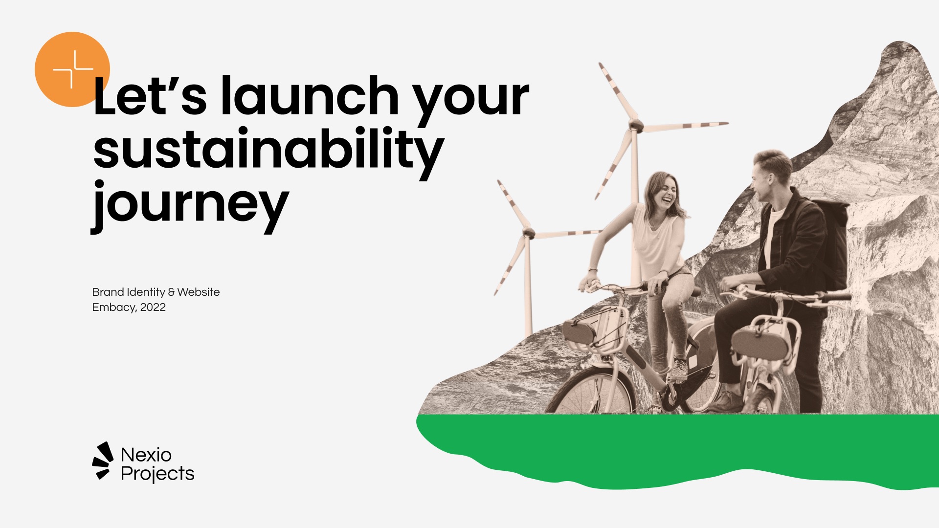
Nexio Projects is an international consultancy and project management firm that helps organizations achieve sustainable development goals. The mission of Nexio Projects is to support organizations on their journey from compliance to purpose. Nexio Projects is almost like an assembly manual. It provides clients with clear and detailed instructions. And by so doing, it supports its clients in building a more sustainable future. Since 2018 Nexio Projects has had more than 300 clients from all over the globe.
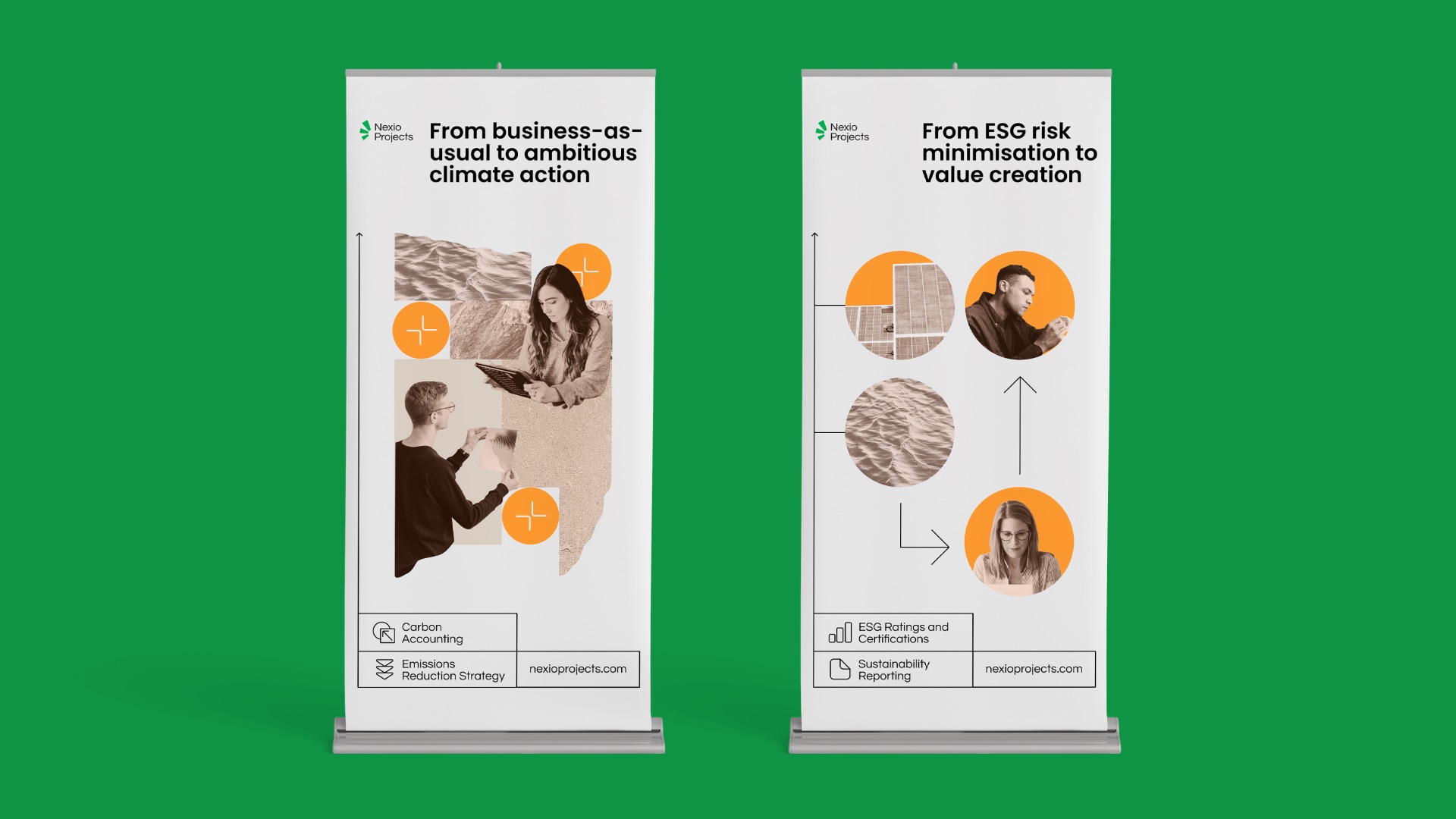
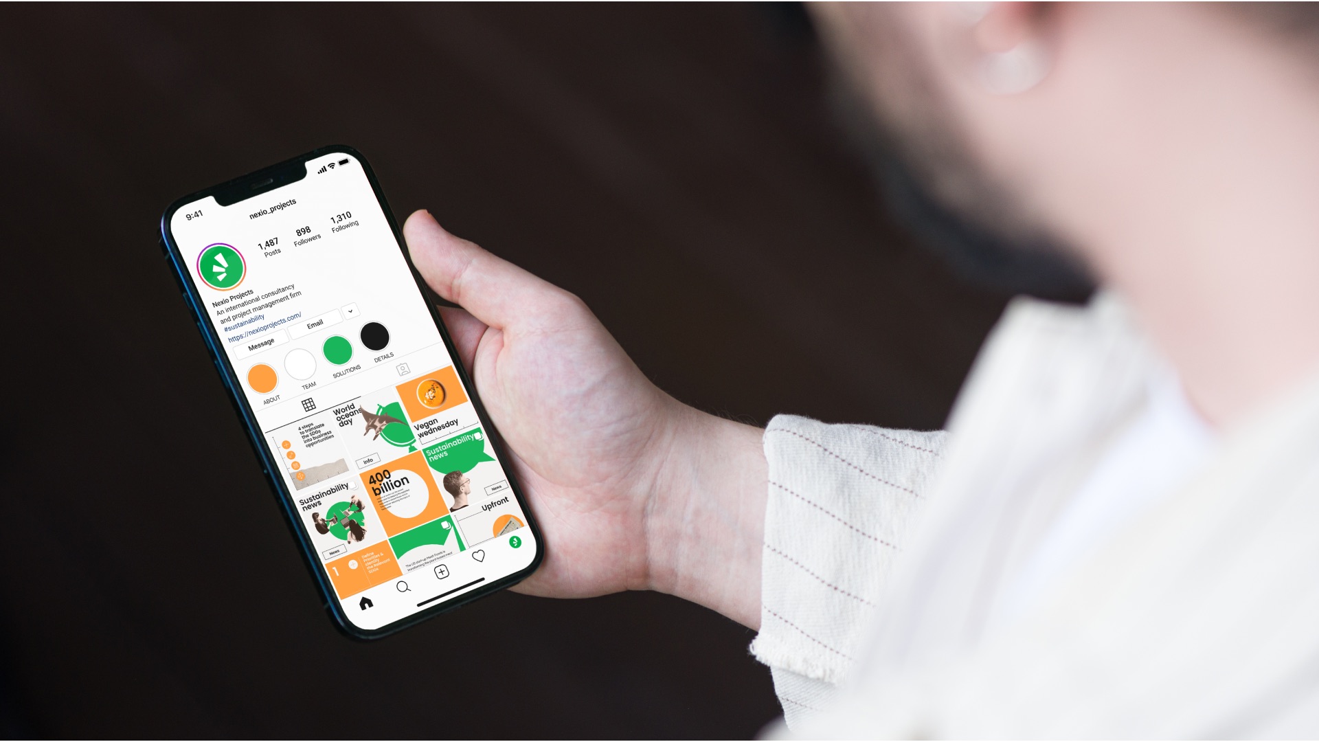
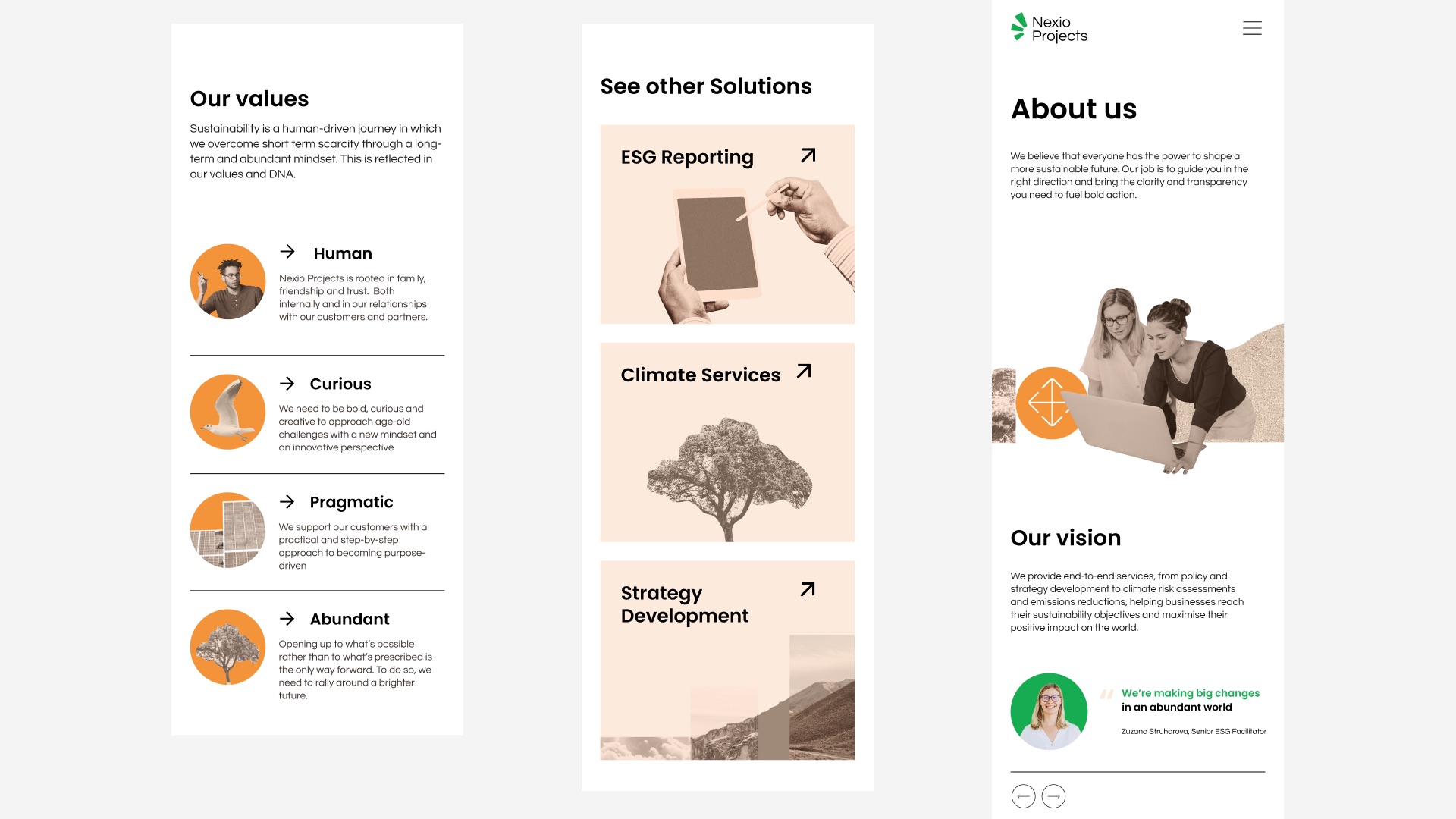
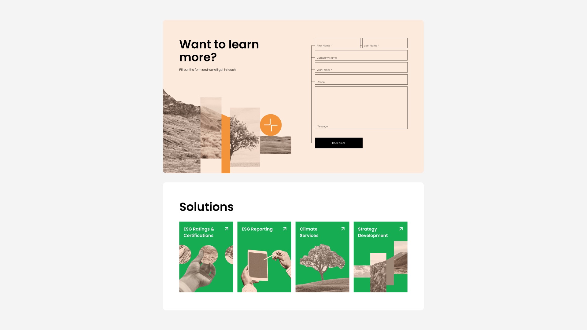
Embacy created a style based on three main concepts: minimalism, simplicity and humanity. Clean design, minimalistic graphics and custom collages represent Nexio Projects’ fresh approach to business, creativity, and most importantly, humanness.
Naming is a significant part of the story. In Latin, nexio means a link; the act of tying or binding together; fastening. Nexio Projects is the link between clients and their sustainability objectives and ambitions.
The logo consists of a symbol and a full company name. The symbol is portrayed as three-plant leaves growing in a circle. The symbol is inspired by the idea of a circular or iterative sustainable development process, which is in constant motion. It also represents the incremental, or “step by step” approach promoted by Nexio Projects. The logo can be used on coloured backgrounds. For this purpose, the logo is converted to a monochrome version.
The brand palette is divided into two global areas: general (green) and services provided by the company (orange). And two additional colours.

CREDIT
- Agency/Creative: Embacy
- Article Title: Brand Identity and Website for Nexio Projects
- Organisation/Entity: Agency
- Project Type: Digital
- Project Status: Published
- Agency/Creative Country: Armenia
- Agency/Creative City: Yerevan
- Market Region: Global
- Project Deliverables: Brand Identity, Brand Naming, Logo Design, User Interaction, Web Design
- Industry: Energy
- Keywords: Branding, Webdesign, Logodesign, Sustainability, Green, Environment, Consulting, Collage, Minimalistic, Clear, Authentic
-
Credits:
Head of Branding: Asya Iljushechkina
Art Direction: Elisey Soloviev
Art Direction: Nastya Galeeva
Project management: Karina Mansurova
Designer: Darya Kirsanova
Designer: Vladislava Dolzhenko
Designer: Miroslav Liamkin
Communication designer: Maria Roshka
Communication designer: Sasha Korshenyuk


