The most exciting journeys in life are never straight. They twist. Loop. Meander. Diverge. Wander. Stop. Restart. Reroute. They make you feel alive. Never walk straight. Meet ZigZag.
ZigZag was conceptualised as an irreverent antithesis to both high-end Vodka brands (Absolut, Grey Goose, Ciroc…) and low-end brands (Magic Moments, White Mischief, Romanov). Sophisticated and design-forward to appeal to a new cohort of drinkers, but without the price and snob-value of imported brands.
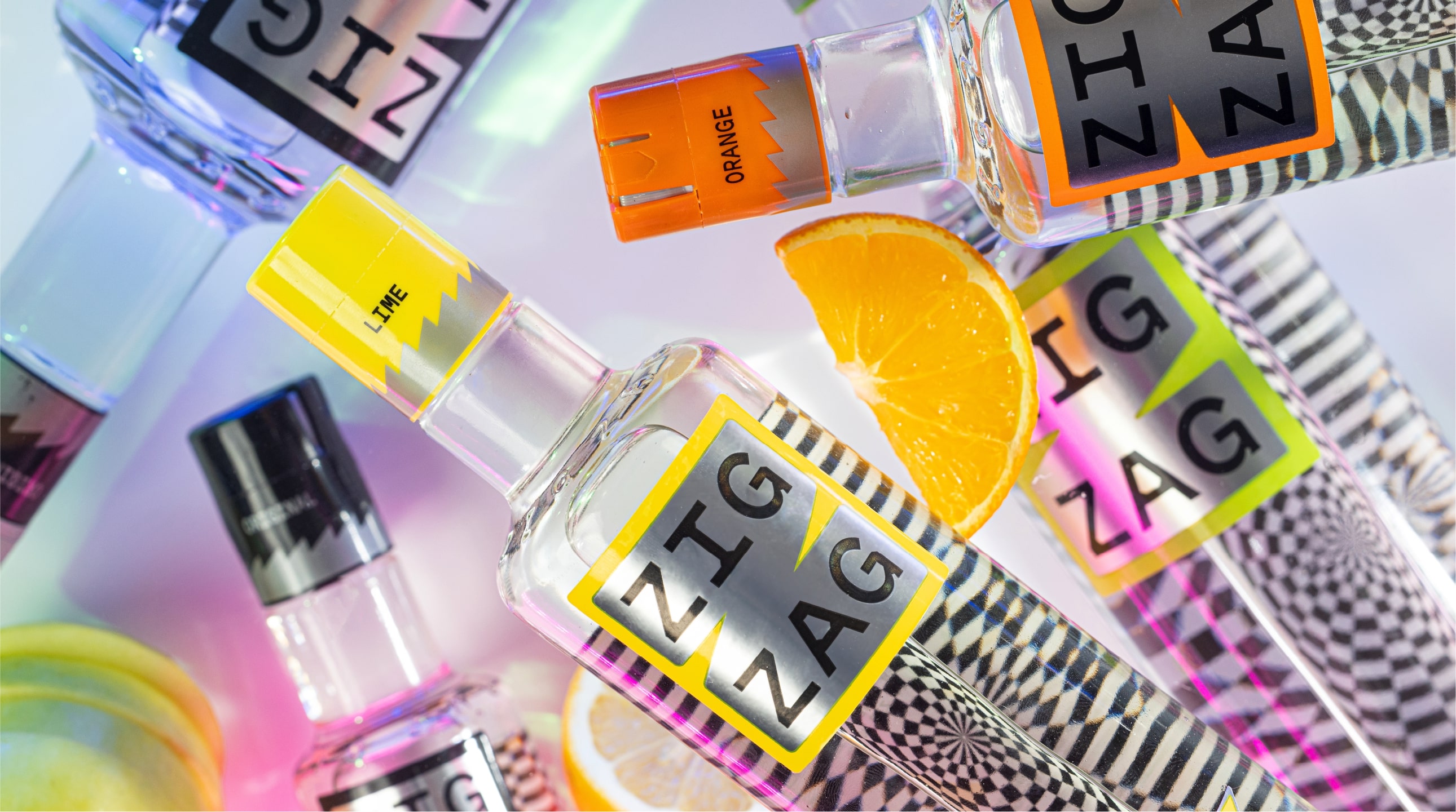
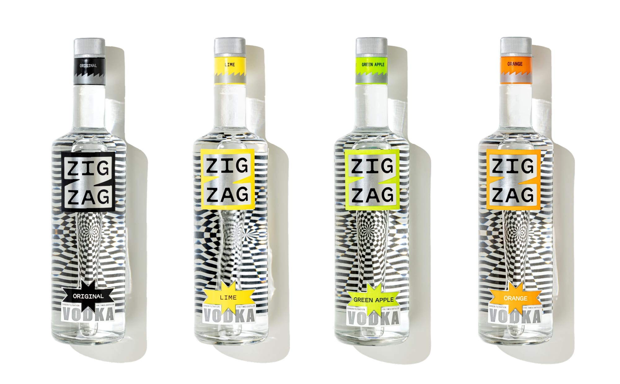
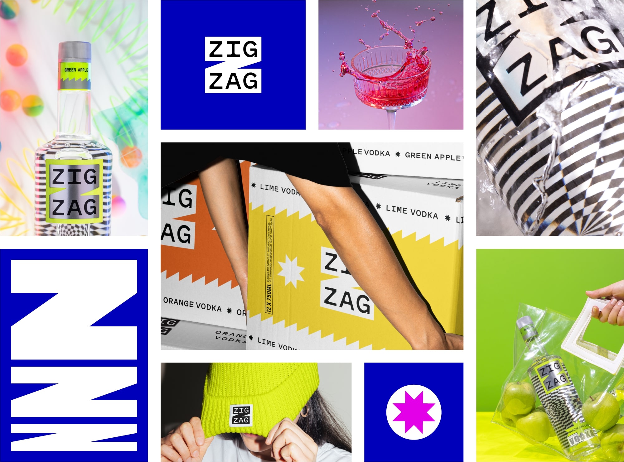
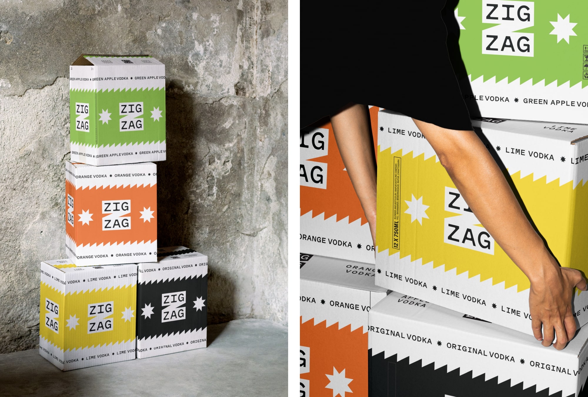
The ZigZag logo is designed to be bold, both on the packaging and off it – on coasters, bar signs, merchandise, everywhere. The two symmetrical parts of the name (Zig / Zag) fit perfectly within the horizontal strokes of the chunky Z holding shape, making the name stand out. The Z holding shape also stretches beautifully to create dynamic graphics for the visual language.
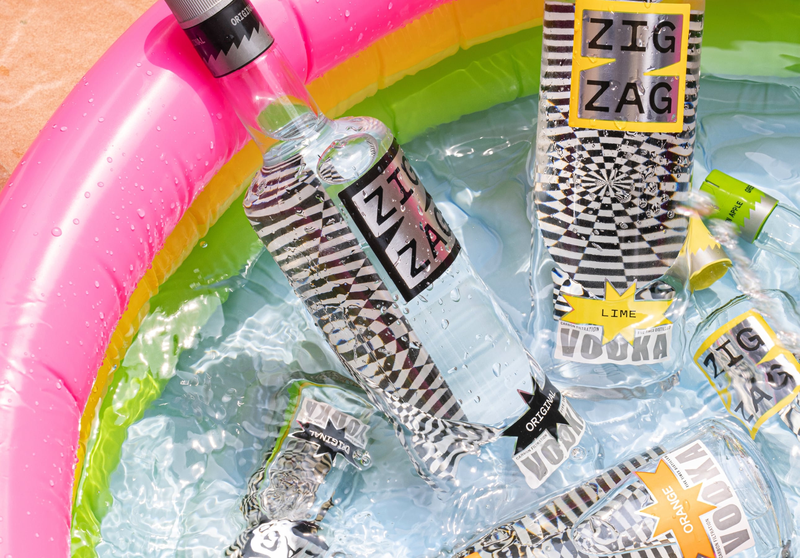
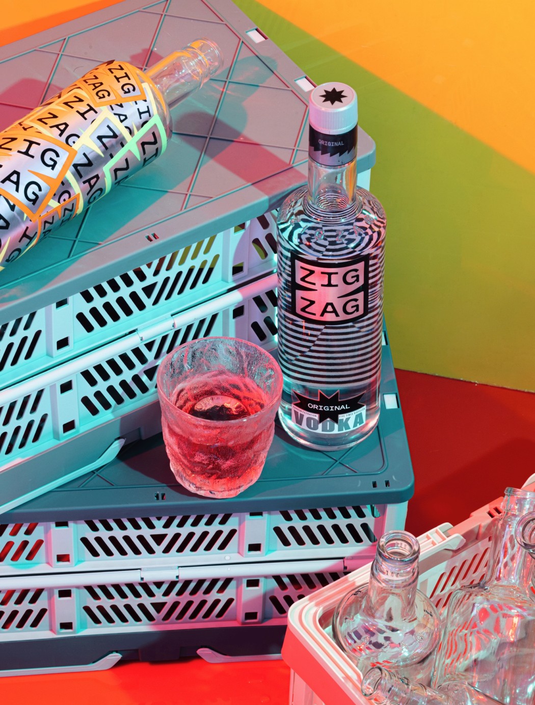
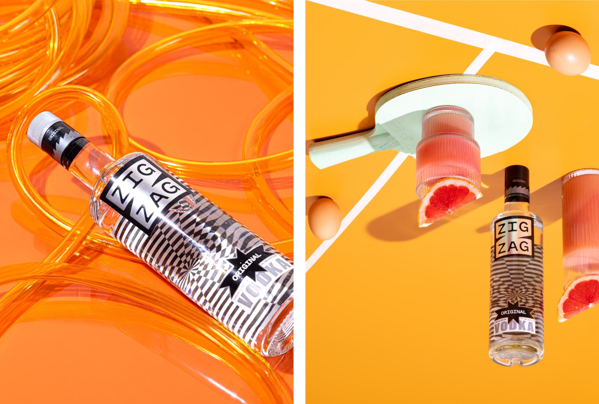
The visual language is all sorts of lively, playful and loud, with an edgy personality that celebrates ‘never walking straight’.
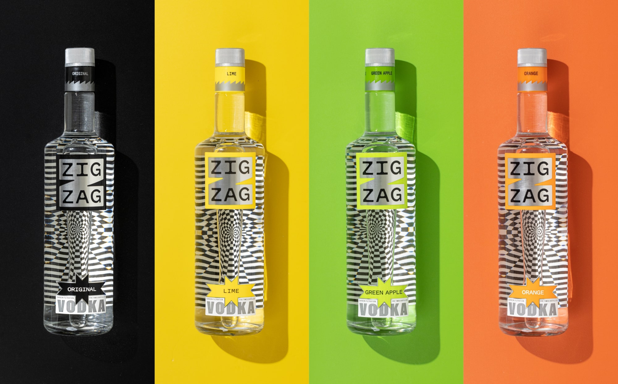
The packaging features a two-part front label, leaving a window in between to peek inside the bottle. The inside of the back label features a groovy pattern that distorts in fun and unpredictable ways through the clear liquid, elevating the bottle to a design piece.
ZigZag is available in four unique flavours: Original, Lime, Orange, and Green Apple. Distilled five times for a smooth and refined finish, and filtered four times using carbon, silver, platinum, and gold, it offers a vodka that’s consistently clean and crisp.
CREDIT
- Agency/Creative: Opposite
- Article Title: Brand Identity and Packaging Design for ZigZag Vodka by Opposite Design Studio
- Organisation/Entity: Agency
- Project Type: Packaging
- Project Status: Published
- Agency/Creative Country: India
- Agency/Creative City: Panjim, Goa
- Market Region: Asia
- Project Deliverables: Brand Design, Brand Identity, Brand Mark, Brand Naming, Branding, Graphic Design, Label Design, Logo Design, Packaging Design, Product Naming, Type Design, Typography
- Format: Bottle
- Industry: Food/Beverage
- Keywords: Alcohol, Spirits, Vodka, Vodka Packaging, Vodka Branding, Alcohol Packaging, Edgy Packaging, Indian Packaging, Pop Colours, Silver Foiling, Optical Illusion, Psychedelic Pattern, Bold Typography, Modern Typography, Pitch Sans Typeface, Graphic Systems, Dynamic Graphics, Indian Vodka Brand
-
Credits:
Design Agency: Opposite


