Background: Italbontà’s history started a long time ago. In 1910, Grandpa Emilio Giraldo opened a shop selling meat and cured meats in the centre of Piove di Sacco in the province of Padua, on the way to the sea. The family business was subsequently created by Aunt Italia, who passed on the secrets of the delicatessen art to her nephew Isidoro, today, passionately continued by his son Gabriele. Since then, the company has respected the recipes of the past, handed down from generation to generation. This choice gives all customers very high quality products, starting from the pigs, born and raised in the Po Valley, through to the selection of the best cuts and the processing without use of preservatives and additives.
Many things have happened and changed in the world since that time but the care and dedication of the Giraldo family in the manufacture of products is the same. It can even be said that now, that passion and fervour for quality ranges wider, looking to the future with special attention on the environment (green for more than 10 years), social relationships (Best Charity Initiative C&C Awards) and regionalism.
Background: The historic Italian family company Italbontà was founded by Emilio Giraldo in 1910, who started business in a shop selling meat and cured meats near Padua in the north-east of Italy. Since then, the secrets of the delicatessen art have been handed down from generation to generation, respecting the recipes of the past. Customers are presented with very high quality products processed without the use of preservatives and additives. Although the world has seen many changes since the company was founded, the care and dedication of the family in the manufacture of products remains the same. Today, the passion and fervour given to quality also looks to the future paying special attention to the environment, social relationships and regionalism.
Strategy: The history, values and quality need to be reflected in the brand’s visual expression and all its design system. In other words, the brand’s communication materials urgently needed to show the rich history and values still serving the public today. The visual language had to find the right balance between the past, present and future respecting the history and brand awareness built over time.
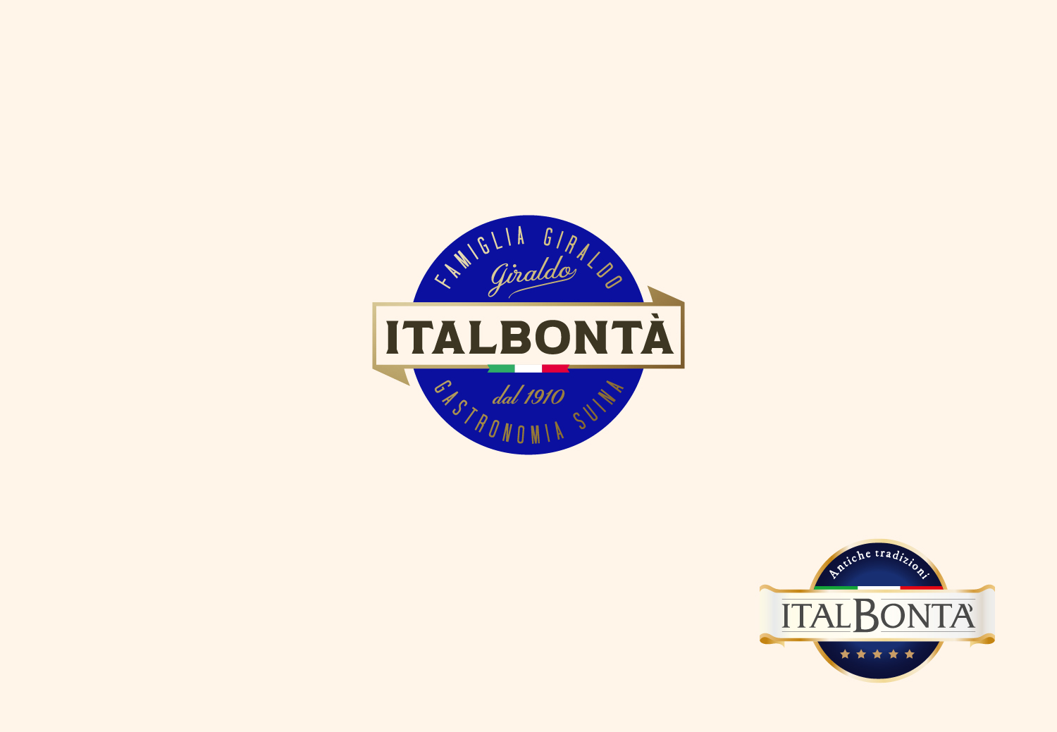
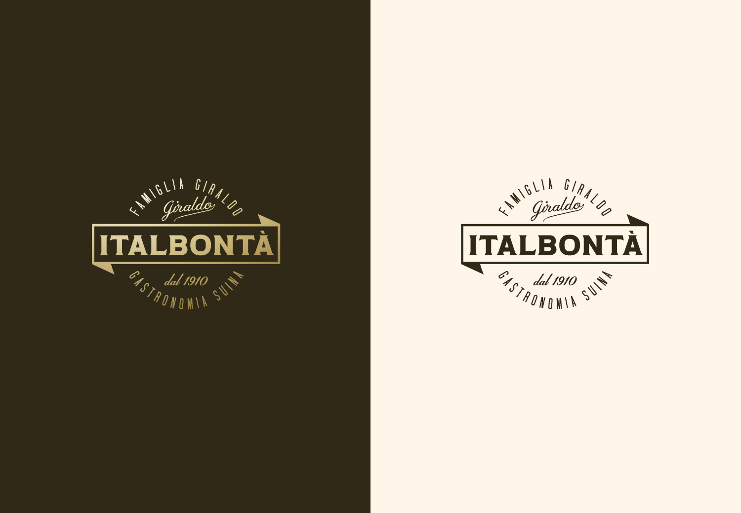
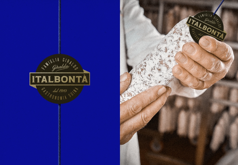
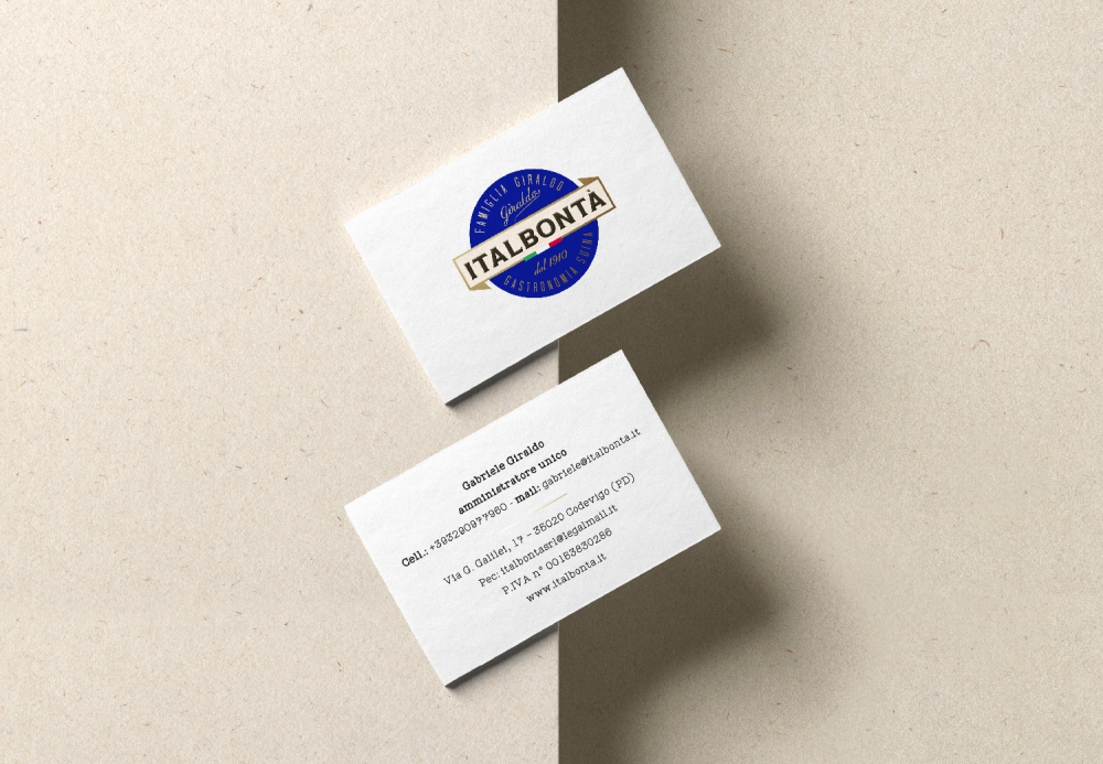
Project: We worked on continuity and less obvious directions to find the right balance. This allowed comparison, windows to be opened on the possible, and different, reasonable directions to be explored with the proposed aim. As far as the brand is concerned, all the indications were to maintain a direction of “healthy and balanced” evolution. In other words, it was considered appropriate to maintain a continuity of structure and colour impact, modifying all the rest. The definition ‘Pork Gastronomy’ was also coined, underlining the innovative entrepreneurial spirit (see the awards for the sausage burger and meatballs in sauce). In the same way, ‘Famiglia Giraldo’ (Giraldo Family) and ‘since 1910’, the year of foundation, were added. A single moment where the key points are summarised and elegantly presented.
The colour choice was made with the same criterion. Colour use is calibrated to transmit value, history, experience and authority with a touch of style – all values inseparably linked to the brand. The throbbing heart forming the background to the title block outlined in gold is an elegant blue. The title block contains the logo written in ‘hot black’, authoritative but not cold. The Italian flag proudly highlights that the company is Italian and the passion for the wonderful country.
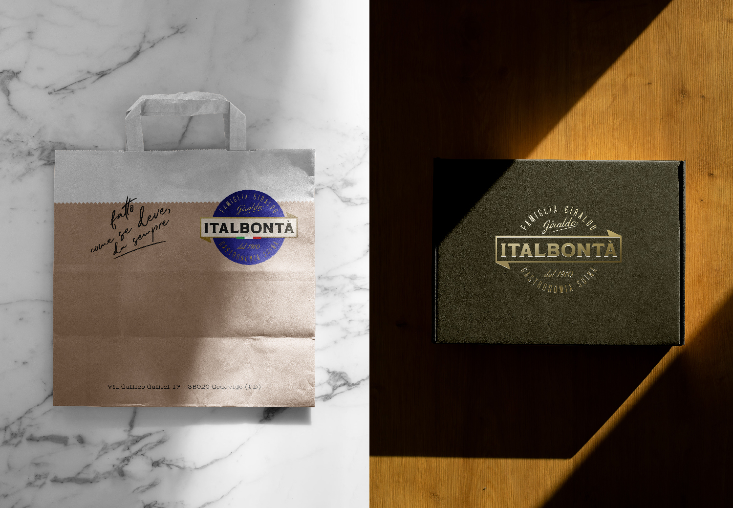
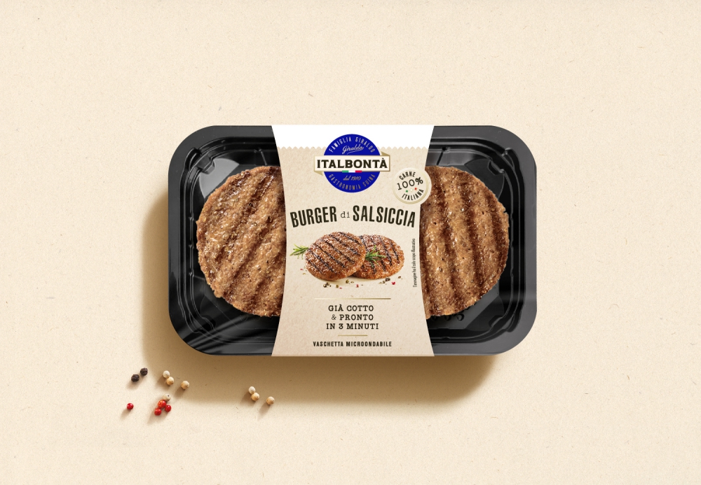
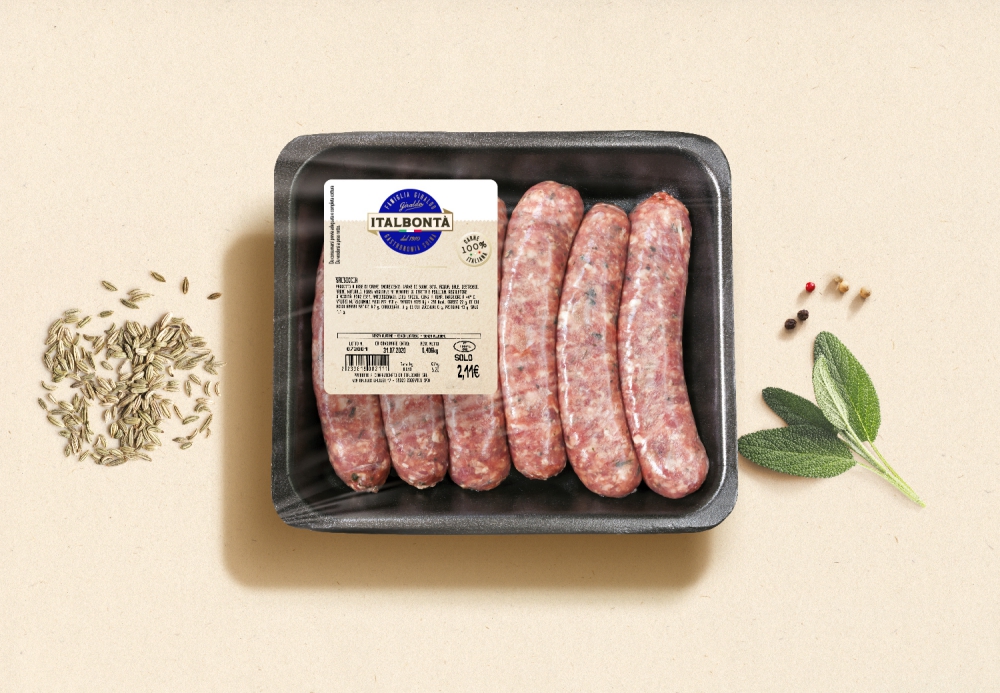
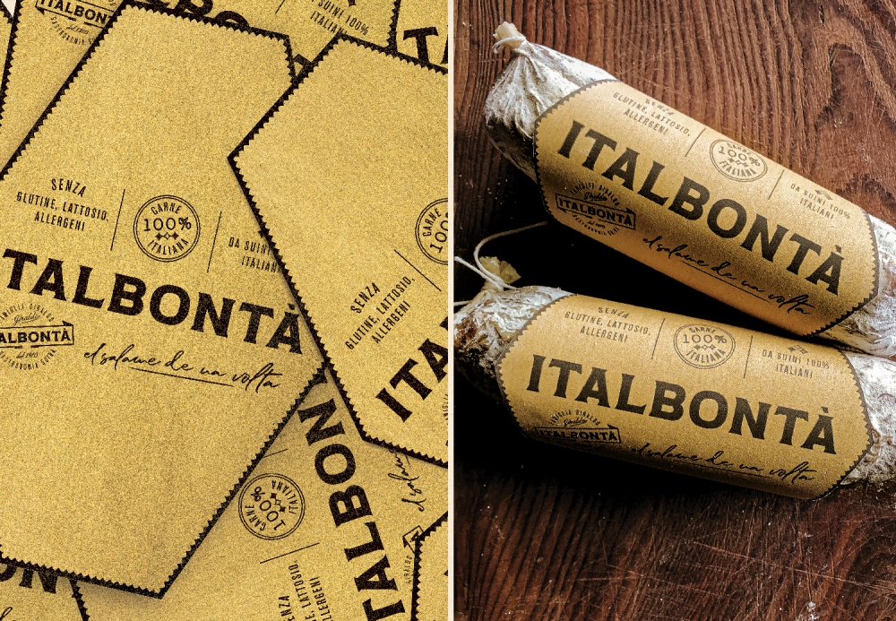
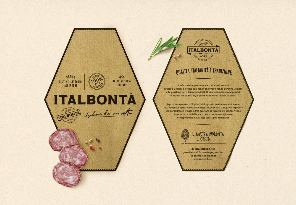
It is slightly different for the Design System which should accompany the brand in all its applications. It acts as a base to highlight the brand thus giving a new texture and structure which allows the brand to emerge and stand out in all its glory. The image of the range of products (mainly Bizerba label), particularly the new sausage burger, something very new in the sector, was developed at the same time as the Corporate Identity. To leave space to the visibility of the burger, and also show how appetising the cleverly photographed finished product is, the cardboard cluster with waisted cut makes the packaging a key player in the display space of mass retailers.
Quoting the maxim that Italbontà loves, “Excellence is the result of group work.”

CREDIT
- Agency/Creative: neom
- Article Title: Brand Identity and Packaging Design for Italbontà
- Organisation/Entity: Agency
- Project Type: Identity
- Project Status: Published
- Agency/Creative Country: Italy
- Agency/Creative City: Padova
- Market Region: Europe
- Project Deliverables: Brand Architecture, Brand Design, Brand Redesign, Brand World, Branding, Packaging Design
- Industry: Food/Beverage
- Keywords: meat salami pig pork packaging branding design
-
Credits:
Partner & Managing Director: Stefano Giuseppe Dell'Orto
Partner & Creative Director: Giacomo Stefanelli


