Nude Brand Creation – Chimes Vermouth by The Surrey Copper Distillery
“The Surrey Copper Distillery has launched Chimes English Extra Dry Vermouth, with brand identity and packaging developed by Nude Brand Creation. This is the second product from the distillery established by Dr Chris Smart and Professor Katherine Smart and follows the release of Copperfield London Dry Gin, also designed by Nude Brand Creation.
Chimes English Extra Dry Vermouth is an English vermouth, hand-crafted from Surrey Sauvignon Blanc blended with a distilled spirit infusion made using twelve botanicals. The recipe is inspired by descriptions of 18th century Turin (Piedmont) vermouths found in various archives and recipes for aromatised spirits, noted in Ambrose Cooper’s The Complete Distiller.
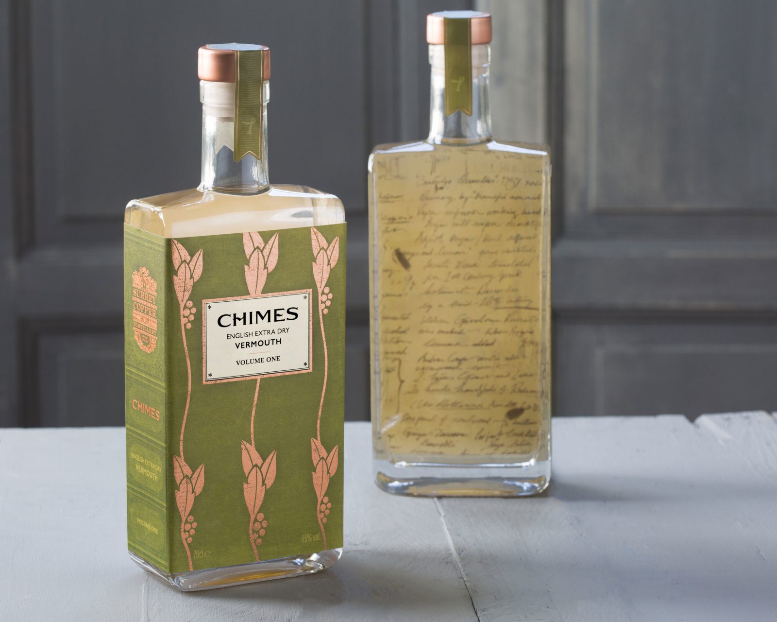
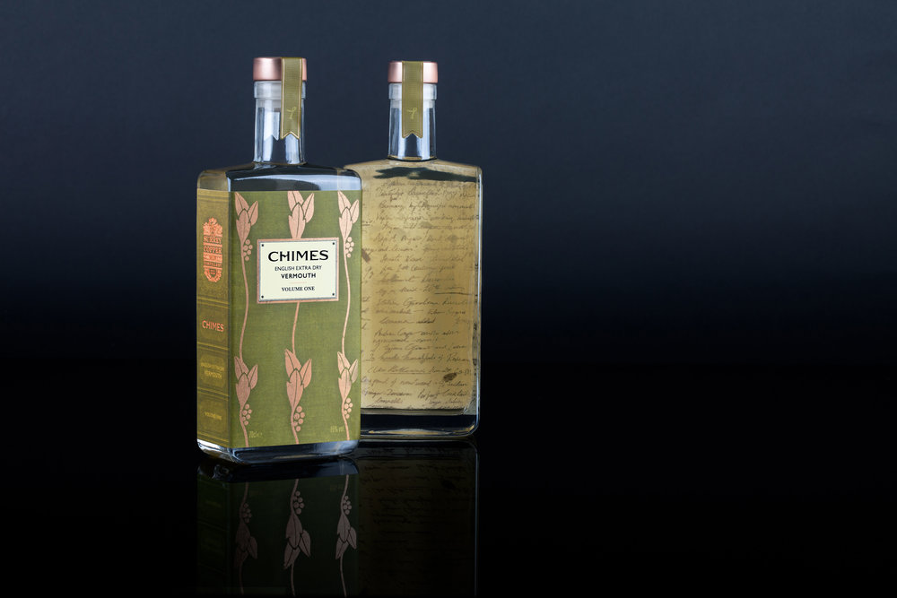
Following the theme set for the distillery and their first release, Copperfield London Dry Gin, the packaging of Chimes English Extra Dry Vermouth is inspired by Katherine and Chris Smart’s background in academia and their passion for collecting rare, vintage books, especially Charles Dickens. The vermouth is named after Charles Dickens’ The Chimes: A Goblin Story of Some Bells that Rang an Old Year Out and a New Year In – a book he penned in 1844 whilst living in Genoa during a year-long Grand Tour of Italy.
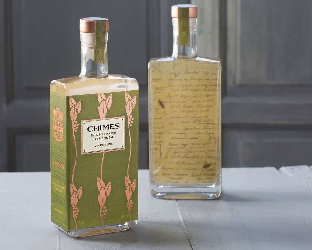
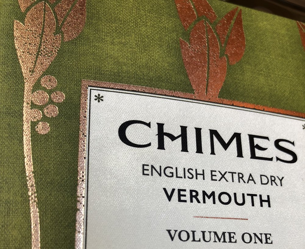
The design is inspired by vintage book covers and draws upon a wide range of influences from the period, including the Arts & Crafts Movement, Art Nouveau and Orientalism. The stylised pictorial representation of grape vines replicate the floral patterns found on book covers from the late 1800’s. Both the lettering and the illustration have been hand-drawn.
The ‘spine’ of the bottle features the identity from The Surrey Copper distillery and allows each volume to be stored as a library. The reverse of the label reveals excerpts from the hand written notes made by Professor Smart whilst researching the recipe and experimenting with different botanicals. Chimes English Extra Dry Vermouth is hand-bottled and hand-labelled before being sealed with a copper stopper and a tamper proof ‘bookmark’.
Tony Enoch, Partner at Nude Brand Creation said: “Our aim was to replicate the feel of an aged and well-loved rare vintage book. As well as all the design details and crafting, the labels are printed on a linen paper with a worn finish, and complemented by a distressed gilded copper. The detailed finish means the bottle not only has impact on shelf but also has a real tactility and sense of authenticity in the hand.”
The new packaging design continues Nude Brand Creation’s work with The Surrey Copper Distillery and Professor Katherine Smart added: “Nude continue to be great partners and have created something stunning with the packaging for Chimes English Extra Dry Vermouth. Their passion and attention to detail has been fantastic.”
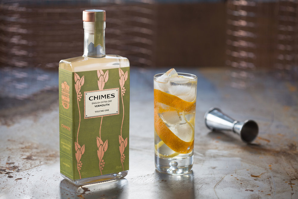
The Smarts have developed Chimes English Extra Dry Vermouth as a ‘sipping vermouth’ that is best enjoyed unmixed over ice. The vermouth is also naturally a great partner to Copperfield London Dry Gin in classic martinis and in a number of specially created cocktails.”
CREDIT
- Agency/Creative: Nude Brand Creation
- Article Title: Brand Identity and Packaging Design for Chimes Vermouth from The Surrey Copper Distillery
- Organisation/Entity: Agency Commercial, Published
- Project Type: Packaging
- Agency/Creative Country: United Kingdom
- Market Region: Europe
- Format: Bottle
- Substrate: Glass, Pulp Paper


