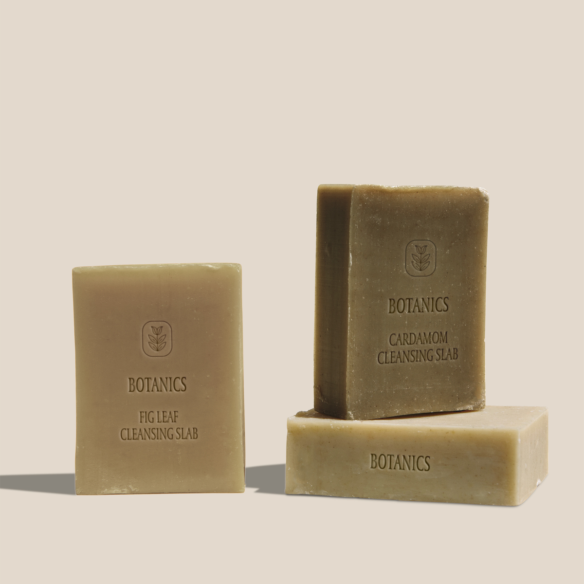
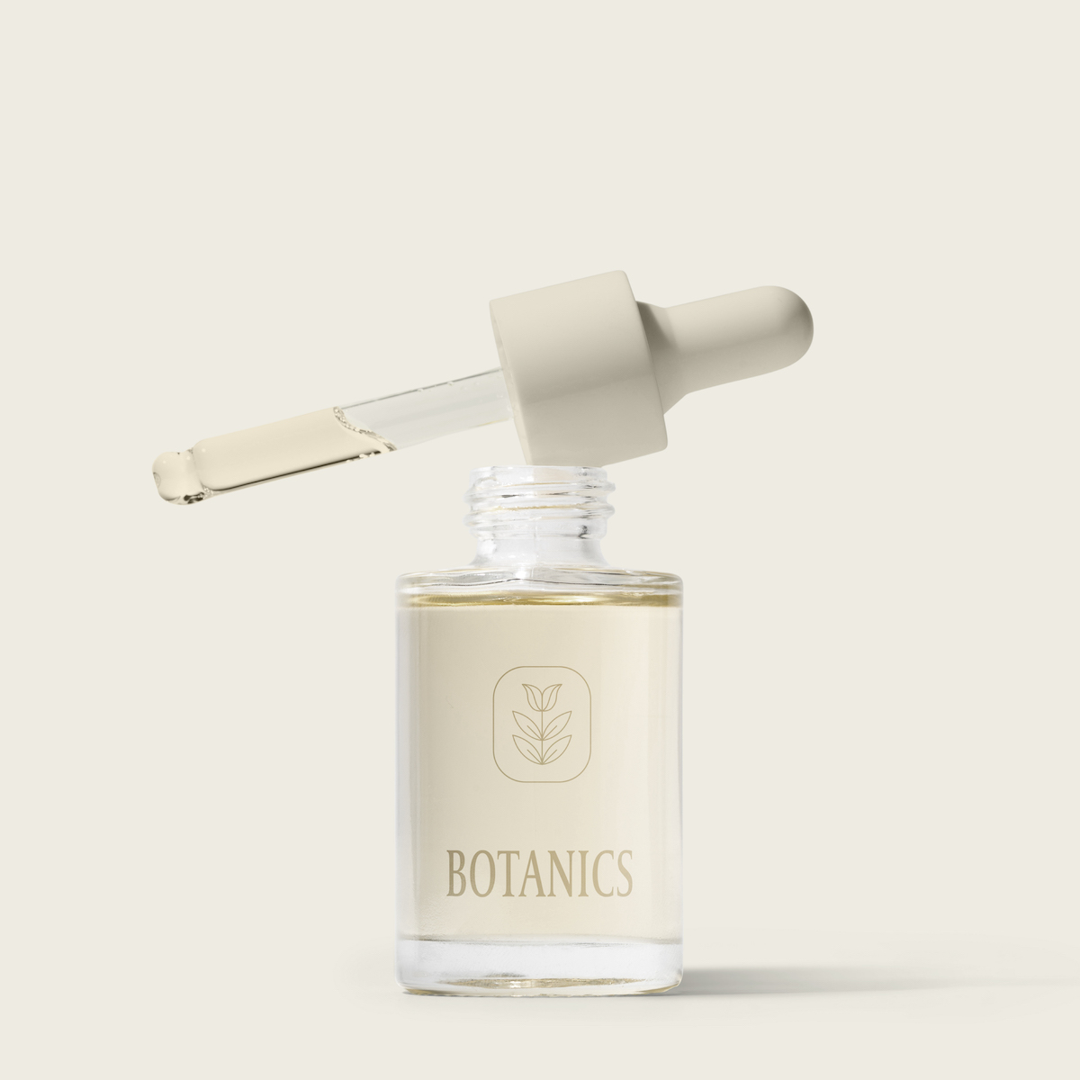
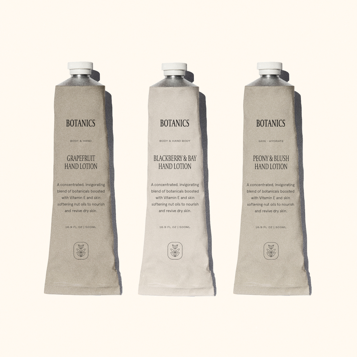
The brand: The aim of Botanics is to reject and breakaway from the world of skincare that is defined by chemicals, false promises and harmful ingredients. The skincare brand goes above and beyond to keep organic ingredients, authenticity and global-betterment at the essence of everything they do. More than just holistic ingredients, the full brand experience aims to be one which is beneficial to a positive lifestyle – from packaging to brand experiences. Botanics is more than a skincare routine – it is lifestyle.
Outline market: Age range: 25-44. Their price point is on the higher end, which makes it more of a lifestyle choice versus an entry level. A brand that people in their mid 20s start getting serious on due to price point and the beginning of real skincare concerns. Gender: Unisex. The packaging and brand lends itself well to both men and women.
Lifestyle: Botanics has a deep rooted focus on organic products, plant and herb based formulations. This lends itself well to people who want to be chemical free, but yet want effective products, and are concerned about what they put in and on their bodies.
Brief and Tasks: The brief had one core one fundamental at the essence of all decisions – the strategy, packaging and website had to all be earth friendly. Botanics wanted to birth a brand that leaves no trace on the environment whilst keeping quality at the forefront of all decisions. Key objectives were to find packaging solutions that have the lowest carbon footprint, packaging methods that would be best for shipping and take up the least volume when sending them globally. The website design set out to make use of servers, hosts and endpoints with environmental and sustainable carbon-offsetting approaches. Botanics aims to be synonymous with consideration, care and luxury formulations.
Key Strategic Decisions: Because so much effort and research went into the products themselves, it was important that the packaging and strategy encompassed this while letting the formulations speak for themselves. Glass, aluminium and Kraft packaging were used wherever possible – we also added in interactive environmentally friendly strategy into the campaign by adding recycling programs and social media campaigns to drive the sustainability in order to create a broader movement and in-turn, brand awareness.
Design Process
Research: Before any actual creative work begins, we conduct extensive research to best understand your goals, audience needs and project expectations. We believe that creative work should be meaningful, and impactful – so much more than just beautiful. Create: When our analysis is complete and you are on board with the initial concepts, creative work begins. We keep your communication needs and priorities at the core of every decision – from colors to image selection to font styles and wording.
Implement and evaluate: Once your work is approved and implemented, we follow up with you to assess the outcome of the project. We are always eager to hear your insights on the outcome and keep an eye on how we can keep our partnership strong. Outline deliverables: Working together, we created an immersive digital storefront as well as physical packaging. Our approach makes the site feel like a natural extension of the brand. Digital product strategy, End-to-end e-commerce redesign, Packaging design, Brand strategy and Brand Guidelines. Highlight results: Increased environmental respect, Securing B Corp certification and increased revenue.


CREDIT
- Agency/Creative: Rebecca Berrington
- Article Title: Brand Identity and Packaging Design for Botanics Earth Based Beauty
- Organisation/Entity: Freelance, Published Commercial Design
- Project Type: Packaging
- Agency/Creative Country: South Africa
- Market Region: Global
- Project Deliverables: Brand Design, Brand Guidelines, Brand Identity, Brand Redesign, Brand Strategy, Branding, Graphic Design, Packaging Design, Research, Tone of Voice
- Format: Bottle, Box, Tube
- Substrate: Glass, Glass Bottle, Metal


