


Macaroni Creative – Besa Mi Vino
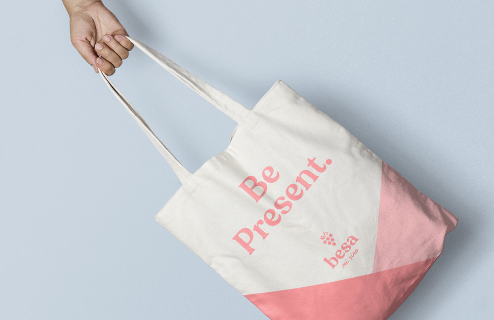
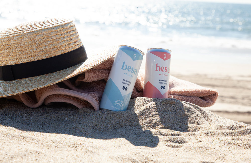
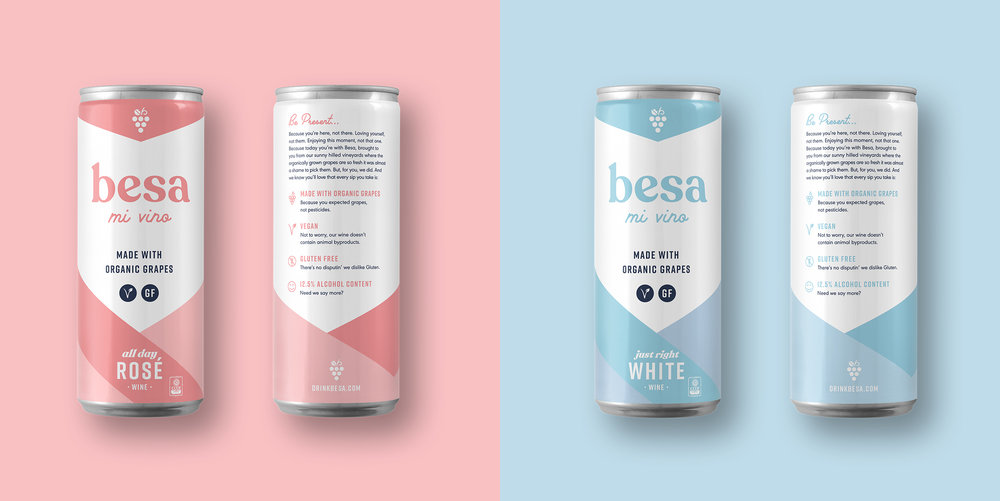
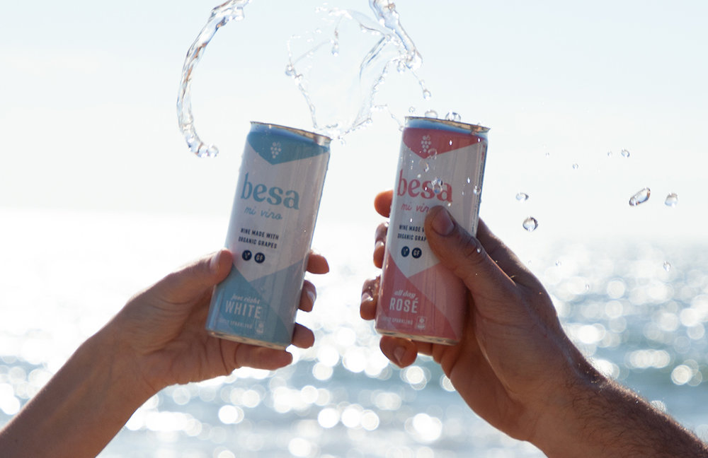
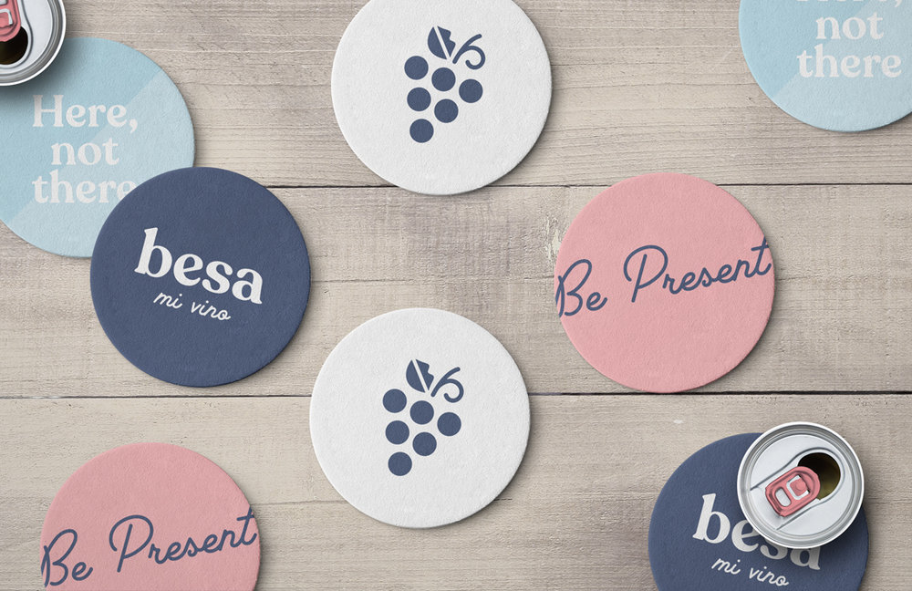
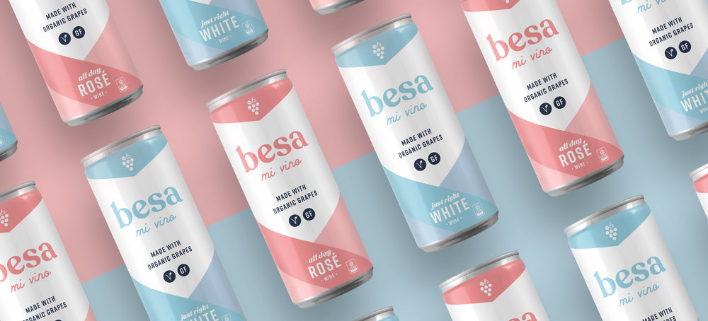
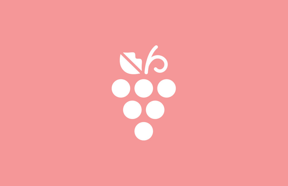
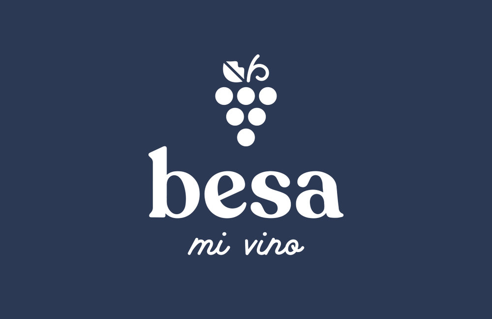
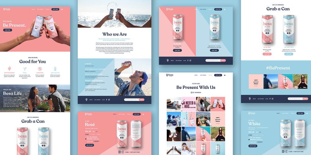
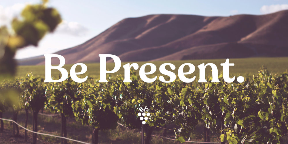
Besa Mi Vino is an organic canned wine from Southern California. Perfect for on-the-go, but packed with natural, healthy ingredients, they needed an identity and packaging system to reflect the premium product with an approachable tone. They contacted us looking to build a brand that speaks to millenials who are invested in their health, but still want to have a good time. We created a warm, pastel color palette and logo type to project their positive, in-the-moment attitude. The negative space on the can creates an arrow, representing their tagline “Be Present” and the logo mark was inspired by the translation of “besa”, meaning “kiss”.
CREDIT
- Agency/Creative: Macaroni Creative
- Article Title: Brand Identity and Packaging Design for Besa Mi Vino
- Organisation/Entity: Agency, Published Commercial Design
- Project Type: Packaging
- Agency/Creative Country: United States America
- Market Region: North America
- Format: Can
- Substrate: Metal


