Brand Identity and Packaging Design for 100 Hectares Old Vines
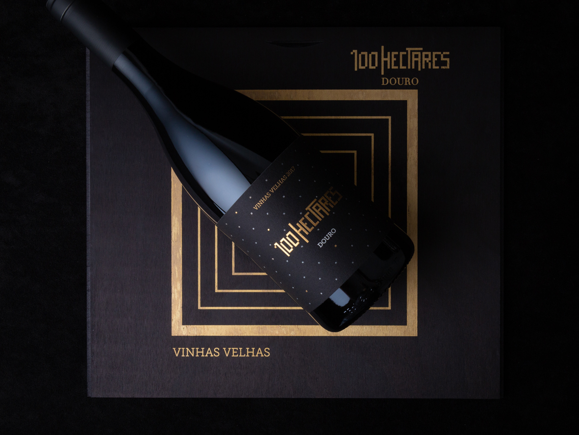
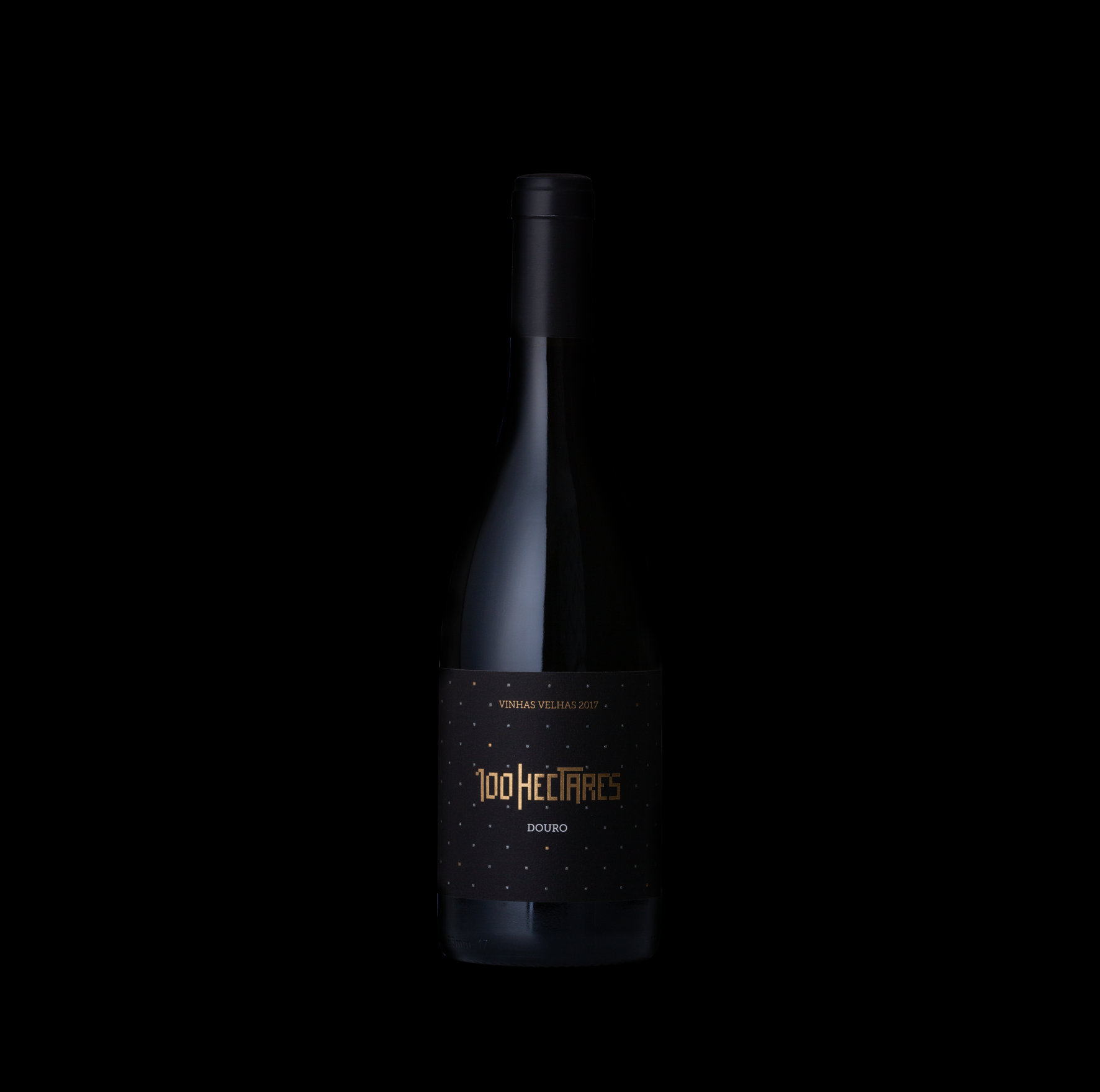
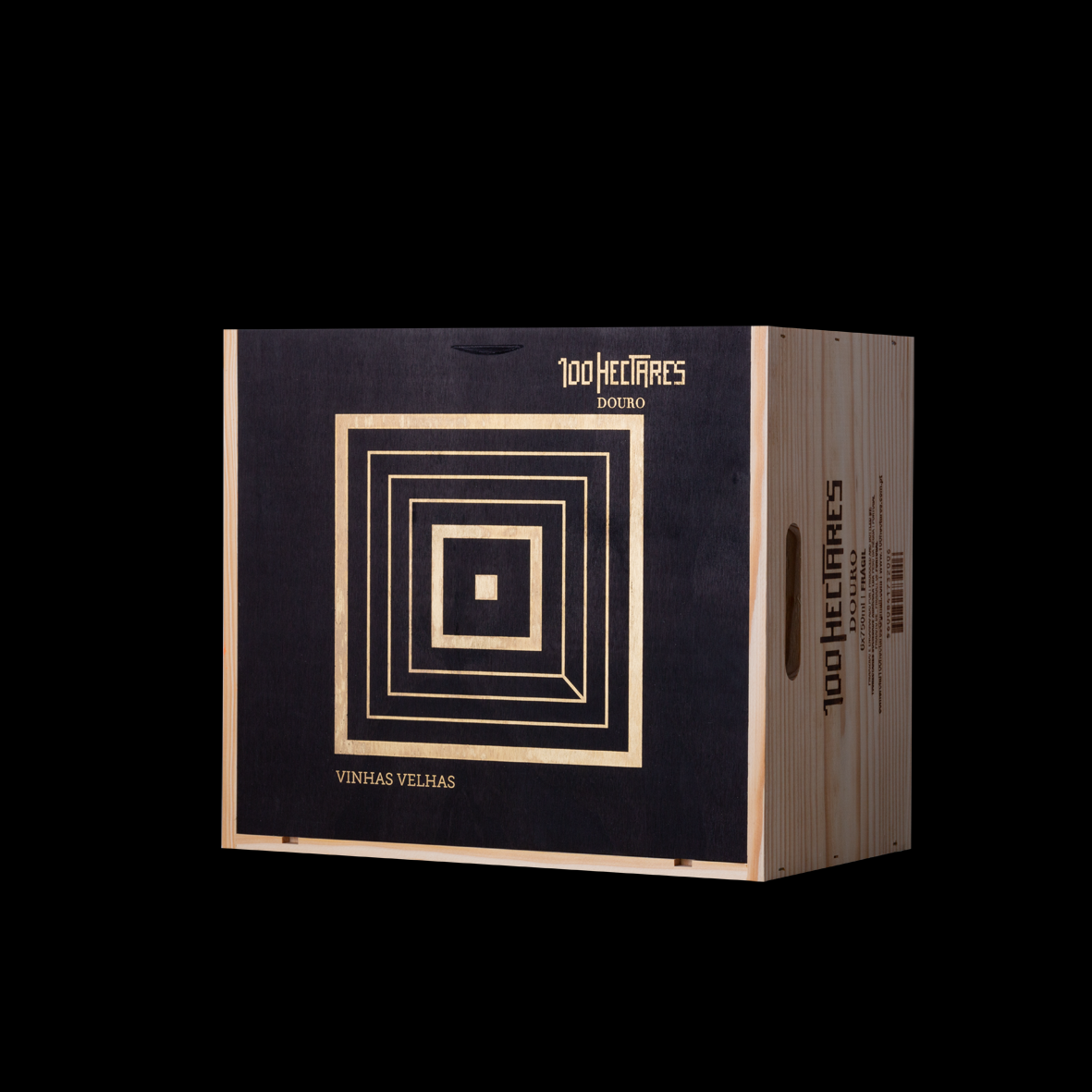
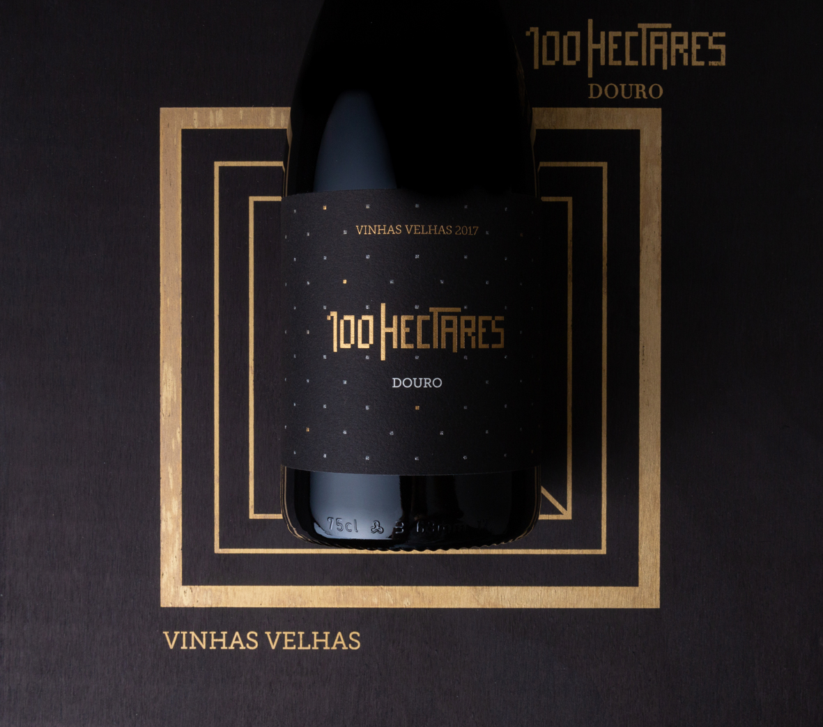
This brand new box is, like we did for 18º Reserva, a new direction we took for these wood boxes using always brand codes of 100 Hectares – simple shapes -and here we decided to use, like the label, the square. The square is the unit, the property in Douro Valley region and 100 Hectares have some properties on the region. And this is the main idea for this black label! Squares around the label, disposed of, like a pattern, like the vineyards viewed from the sky.
And the box is all about this, the squares, the optical illusion of entering a new dimension when you drink this amazing wine.


CREDIT
- Agency/Creative: miguelfreitasdesign
- Article Title: Brand Identity and Packaging Design for 100 Hectares Old Vines
- Organisation/Entity: Agency, Published Commercial Design
- Project Type: Packaging
- Agency/Creative Country: Portugal
- Market Region: Europe
- Project Deliverables: Brand Identity, Brand Strategy, Graphic Design, Packaging Design
- Format: Bottle, Box
- Substrate: Glass Bottle, Wood
FEEDBACK
Relevance: Solution/idea in relation to brand, product or service
Implementation: Attention, detailing and finishing of final solution
Presentation: Text, visualisation and quality of the presentation


