


Fabula Branding – Hoot
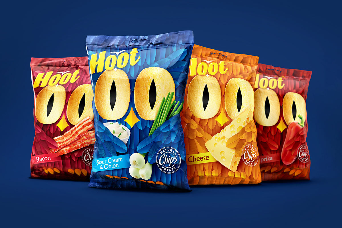
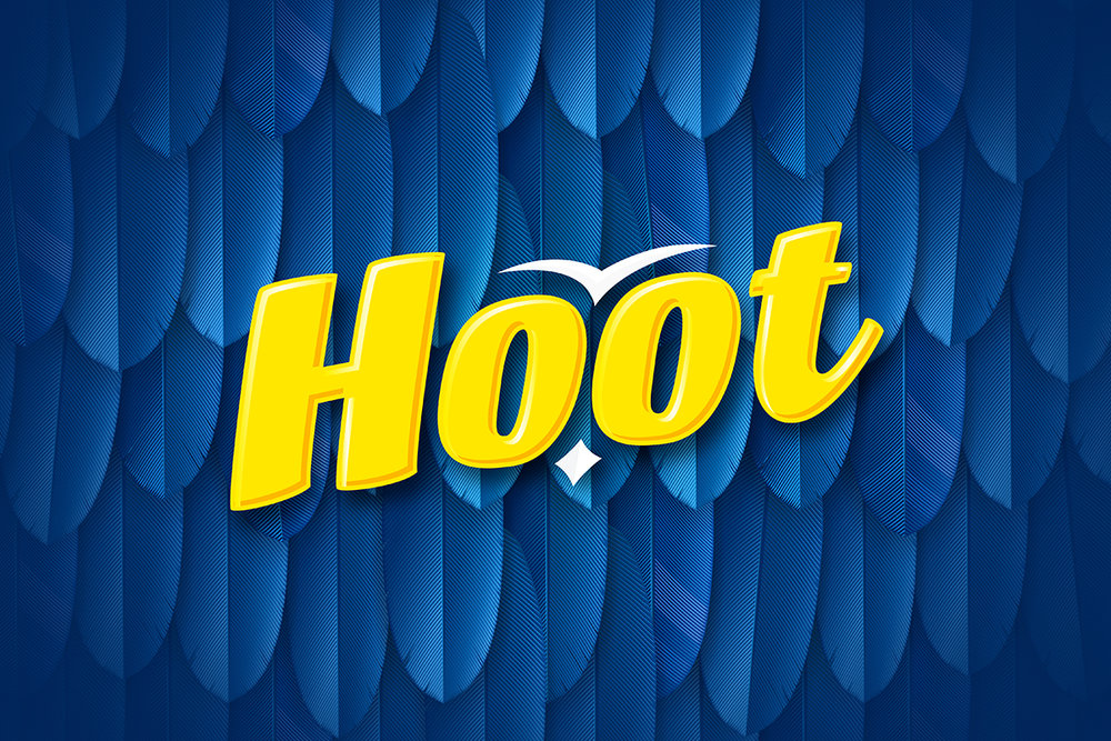
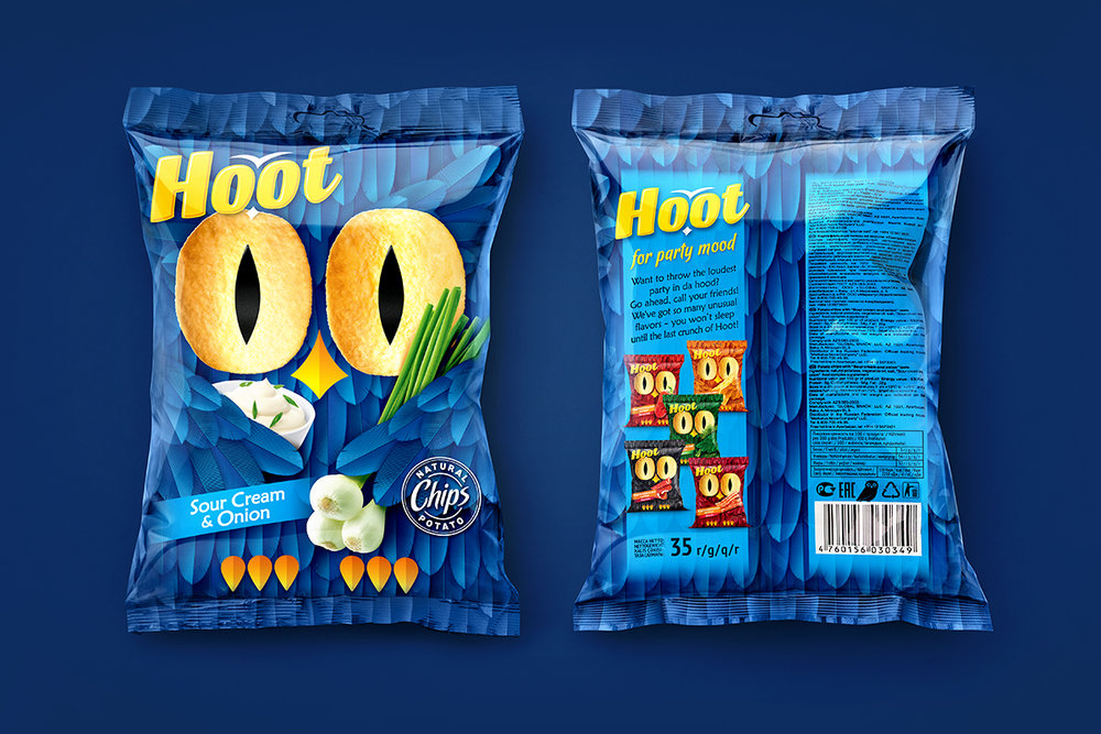
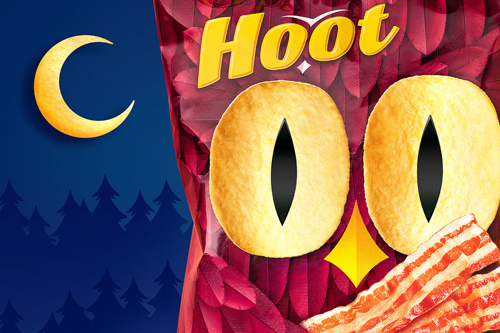
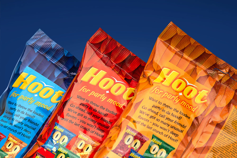
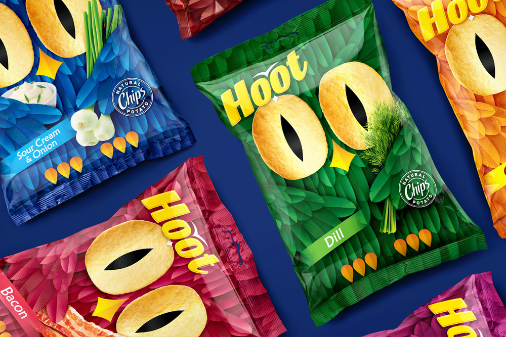
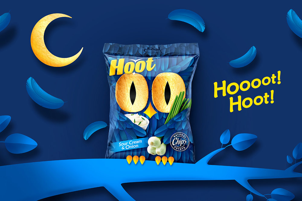
“The task: the development of the design packaging for a line of potato chipsName “Hoot” is an English word to describe a sound made by an owl. The design concept is built around the appropriate brand character. The image of an owl supports the name, helps to create a holistic and stylish appearance of the brand. Packaging stands out for its fun and emotionality – eyes as chips, “hidden” character traits in the logo and an unusual approach to a taste build up attract the attention of the target audience. The rhyming slogan “Hoot. For party mood “and other elements of communication support the youth characteristics of the brand and create a cheerful mood. The visual buildup is carried out in a traditional way with the change in the background colour and use of photo images of the ingredients.Such fresh approach made it possible to truly stand out on the shelves among many competitors – strong, yet rather conservative in its presentation. At the same time, the packaging remains relatable and this helps to build consumer confidence.”
CREDIT
- Agency/Creative: Fabula Branding
- Article Title: Brand Identity and Packaging Design Built Around the Brand Character Hoot
- Organisation/Entity: Agency Commercial / Published
- Project Type: Packaging
- Agency/Creative Country: Belarus
- Market Region: Europe
- Format: Bag
- Substrate: Plastic


