Robin Design Studio – Zebrapets
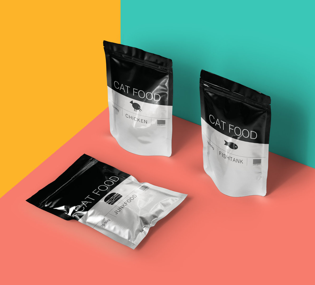
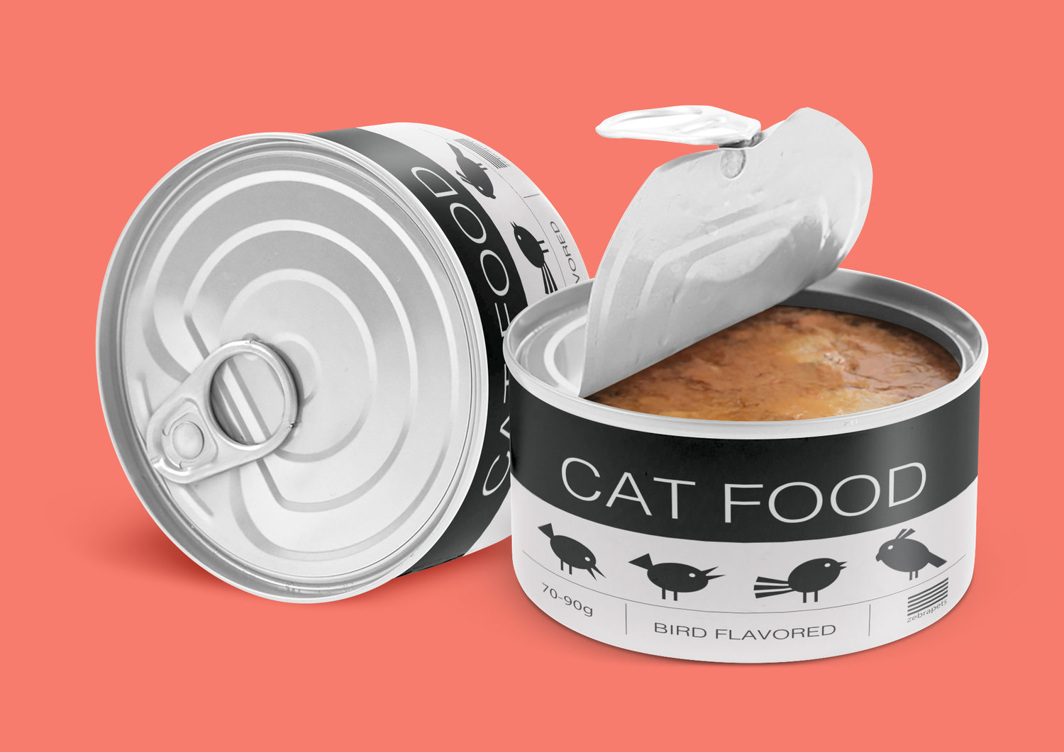
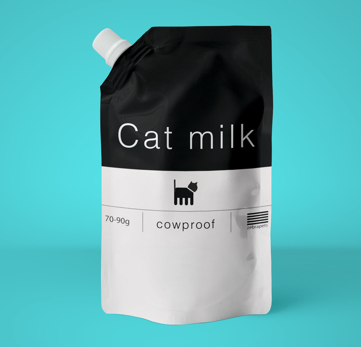
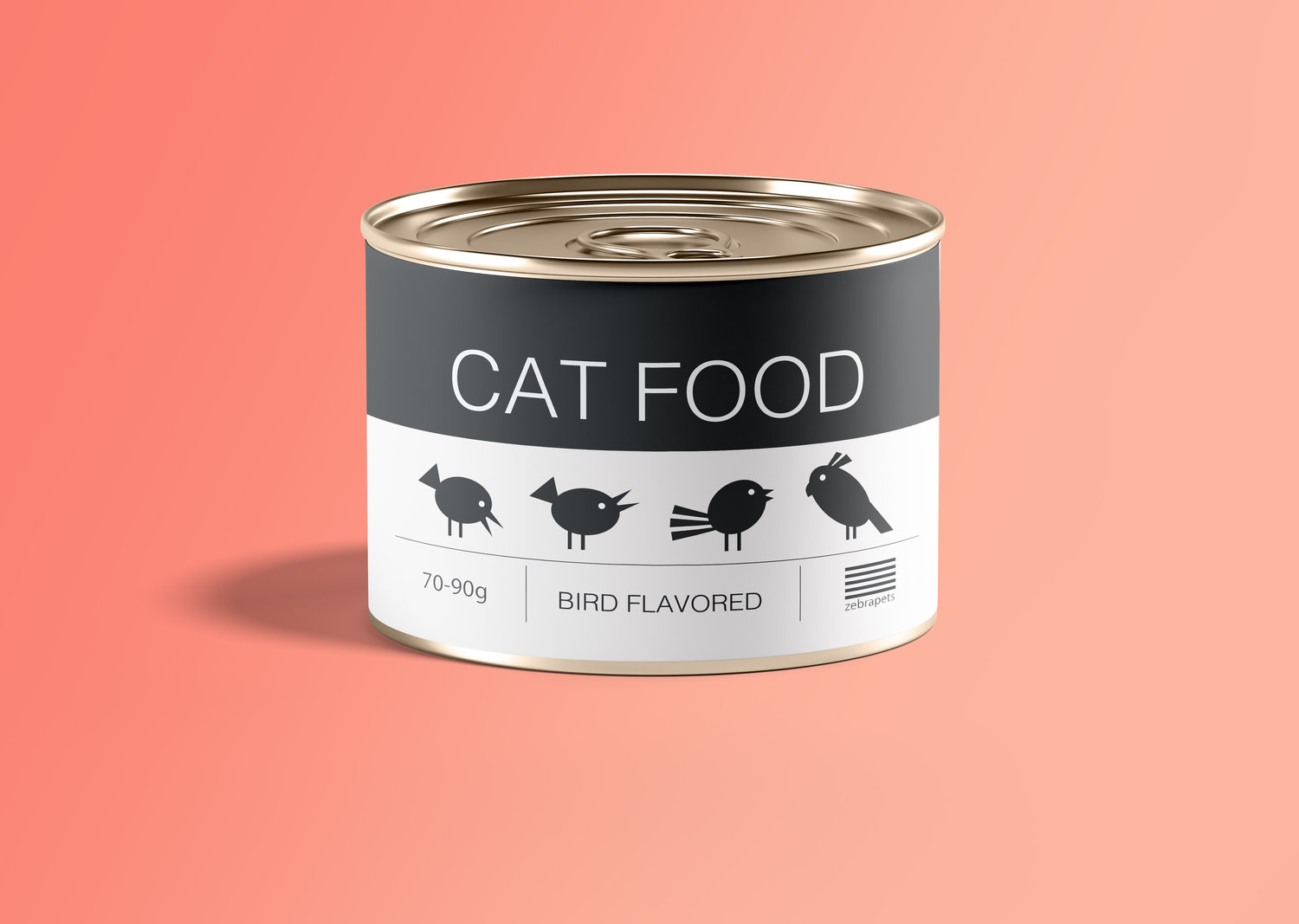
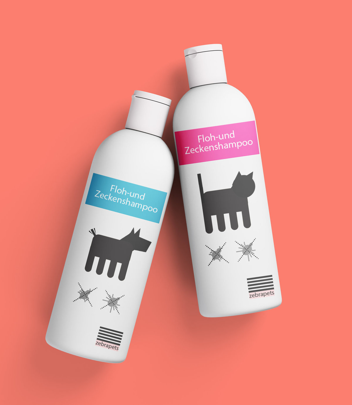
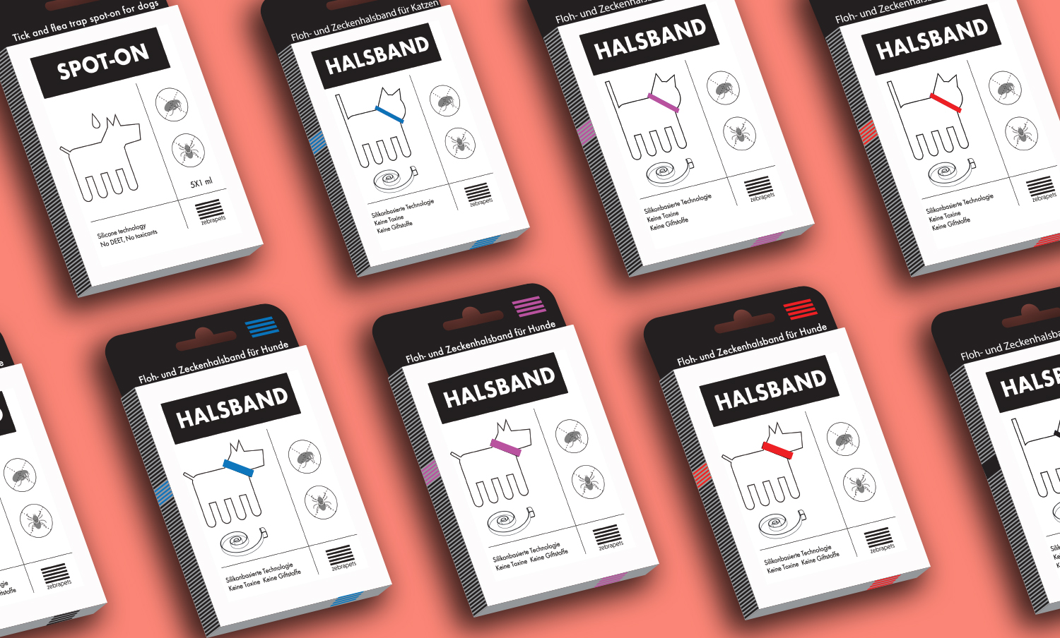
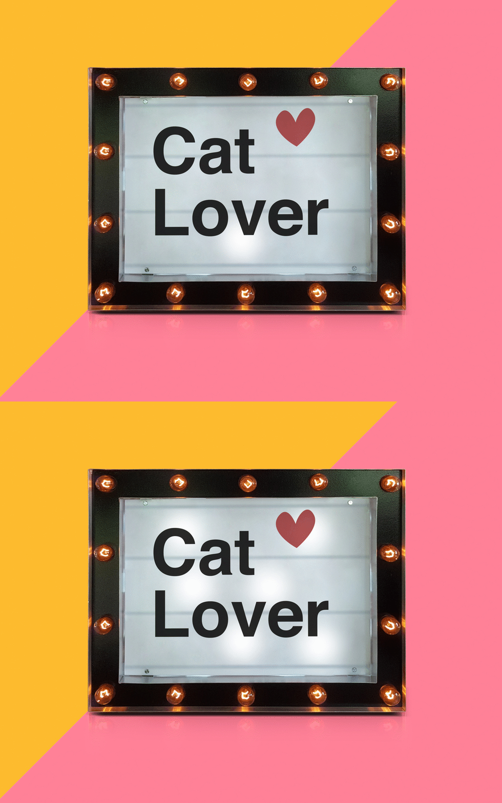
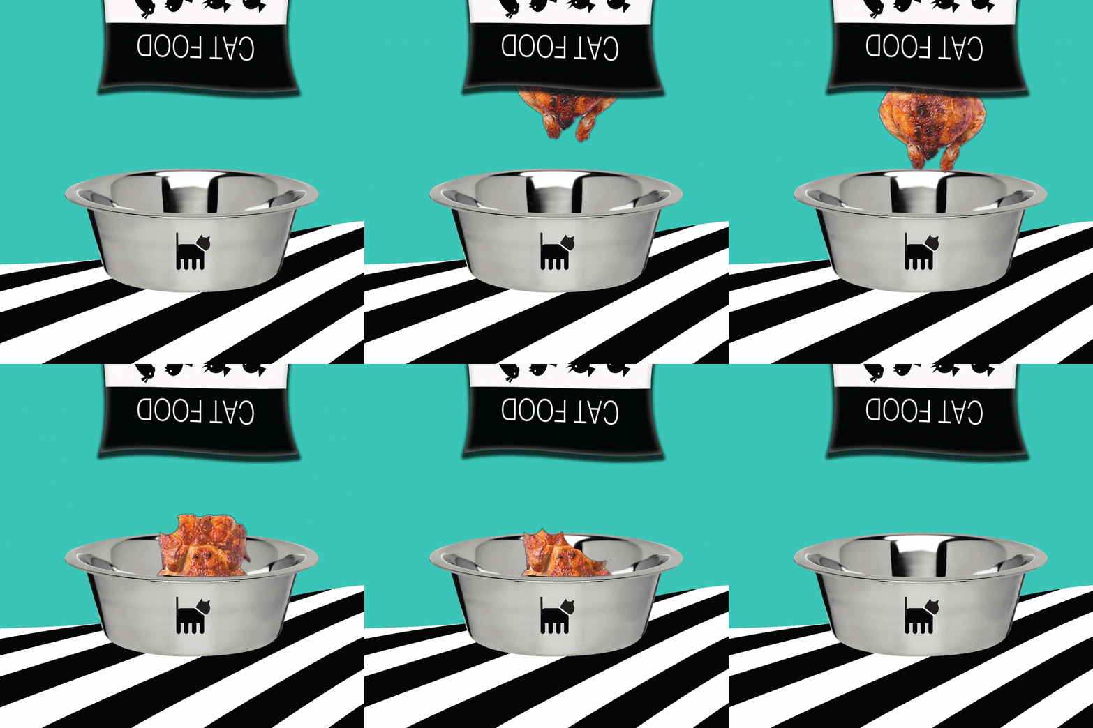
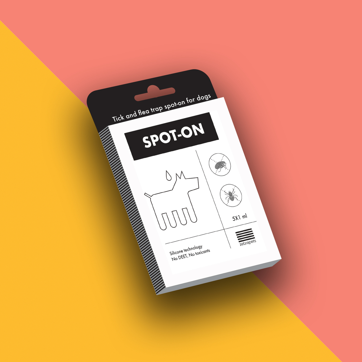
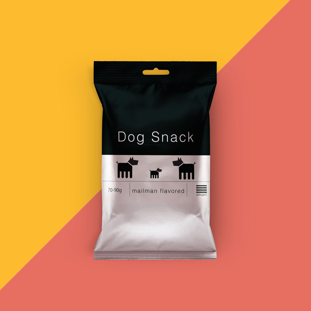
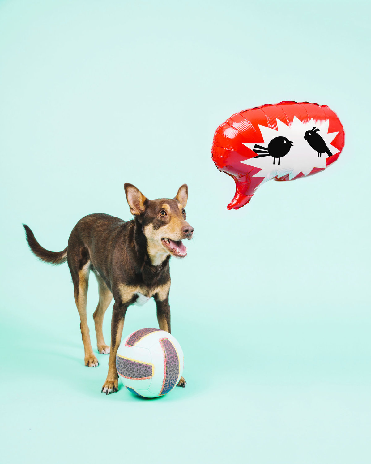
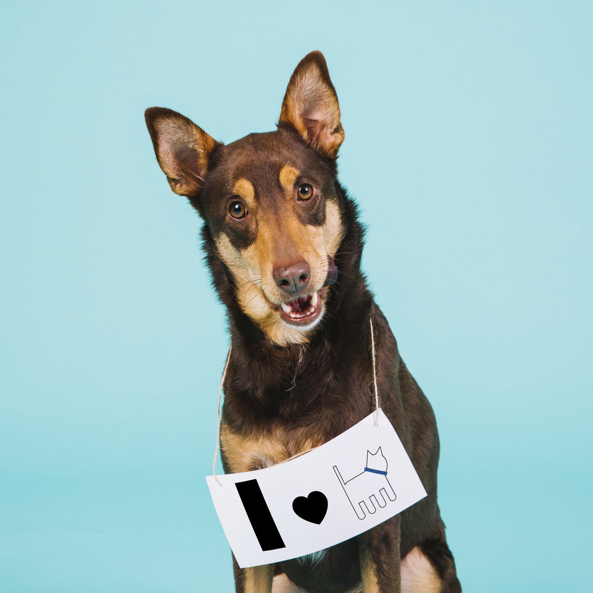
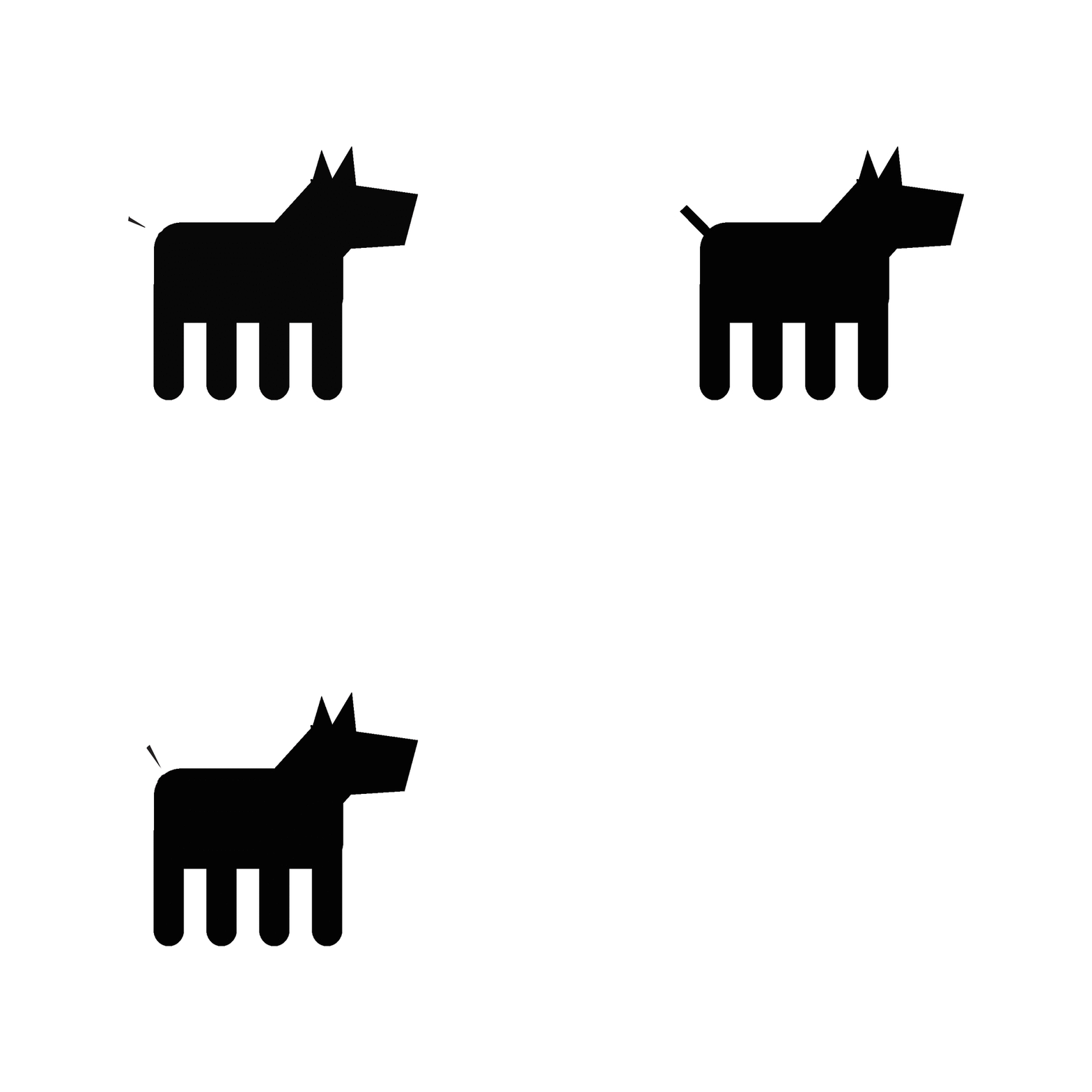
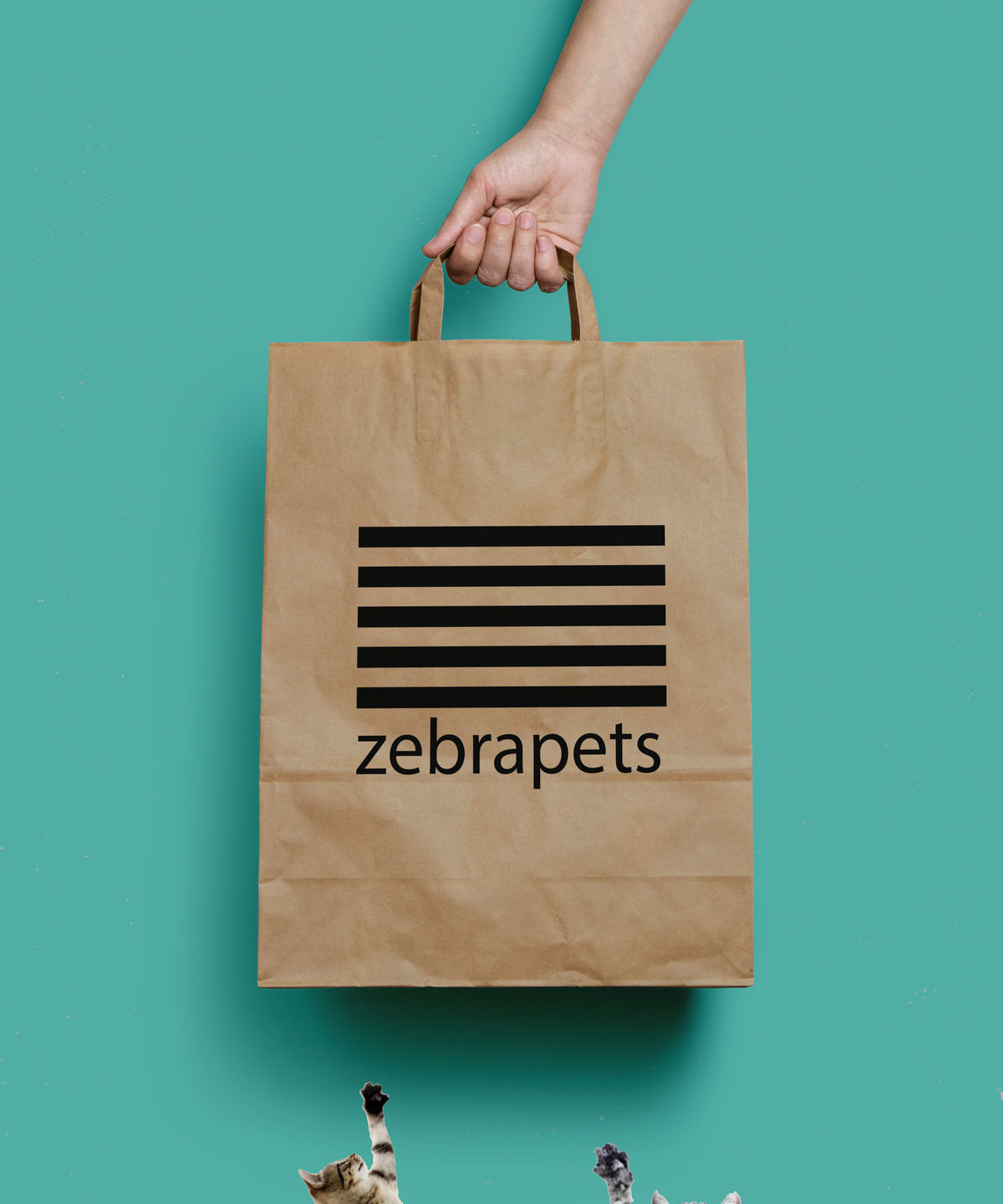
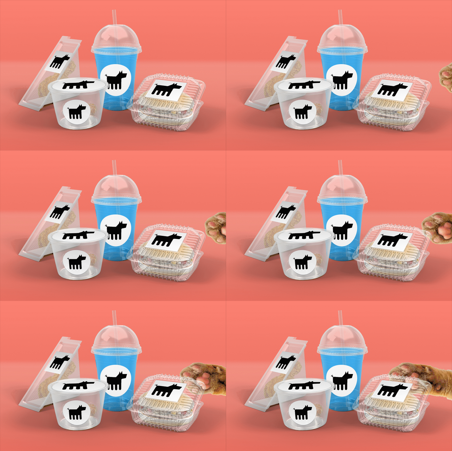
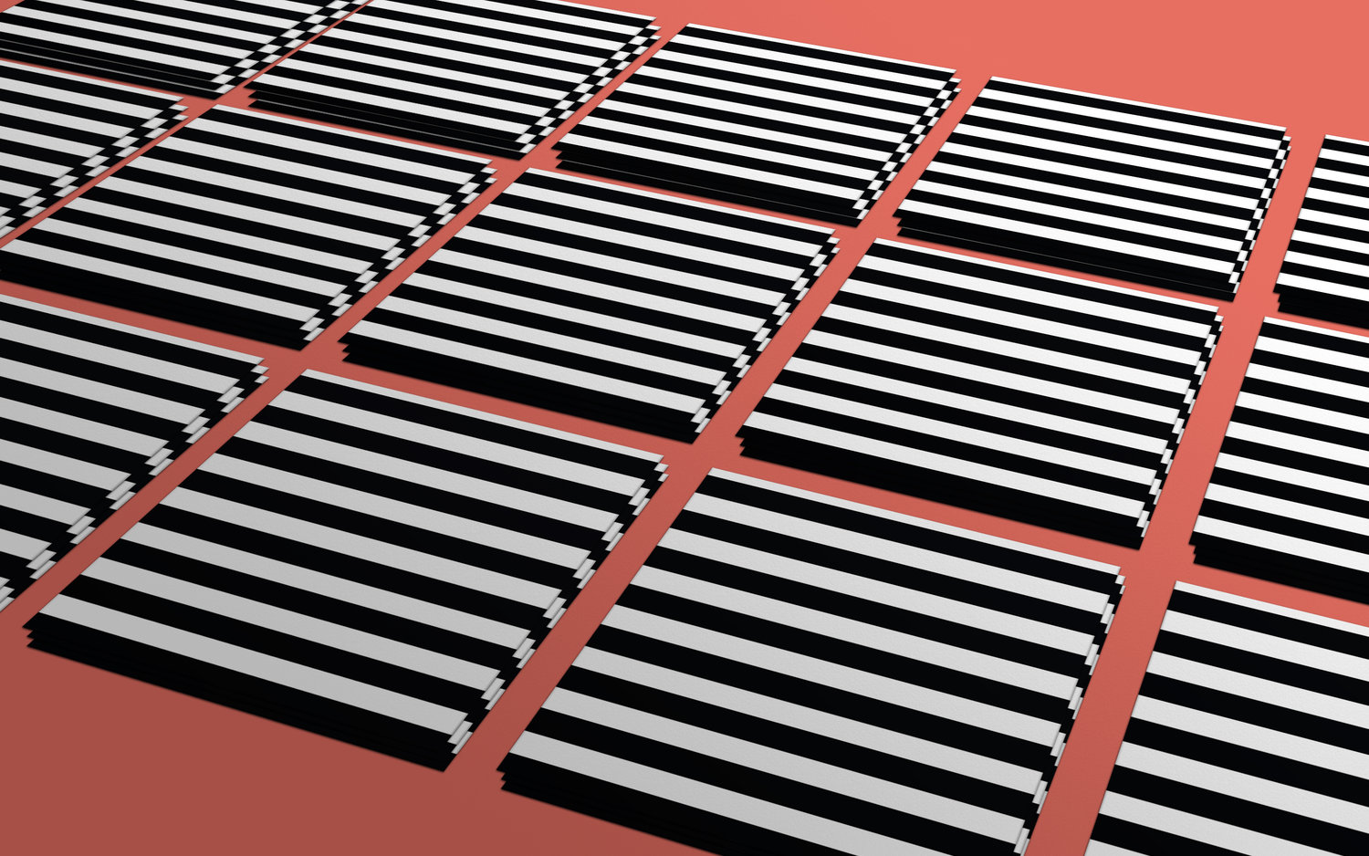
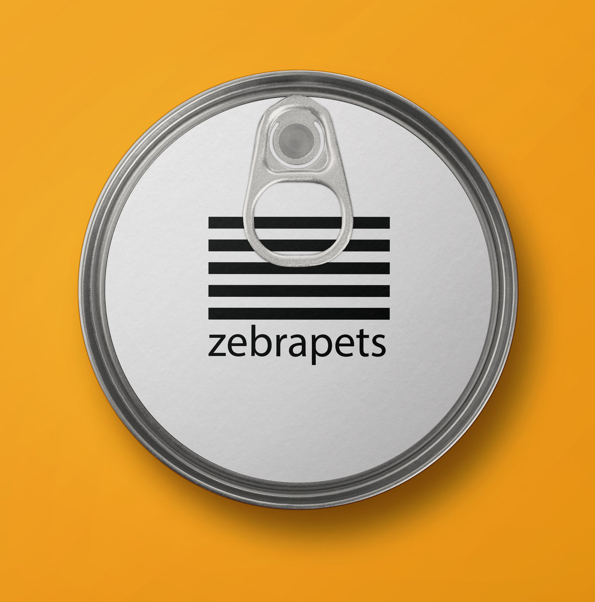
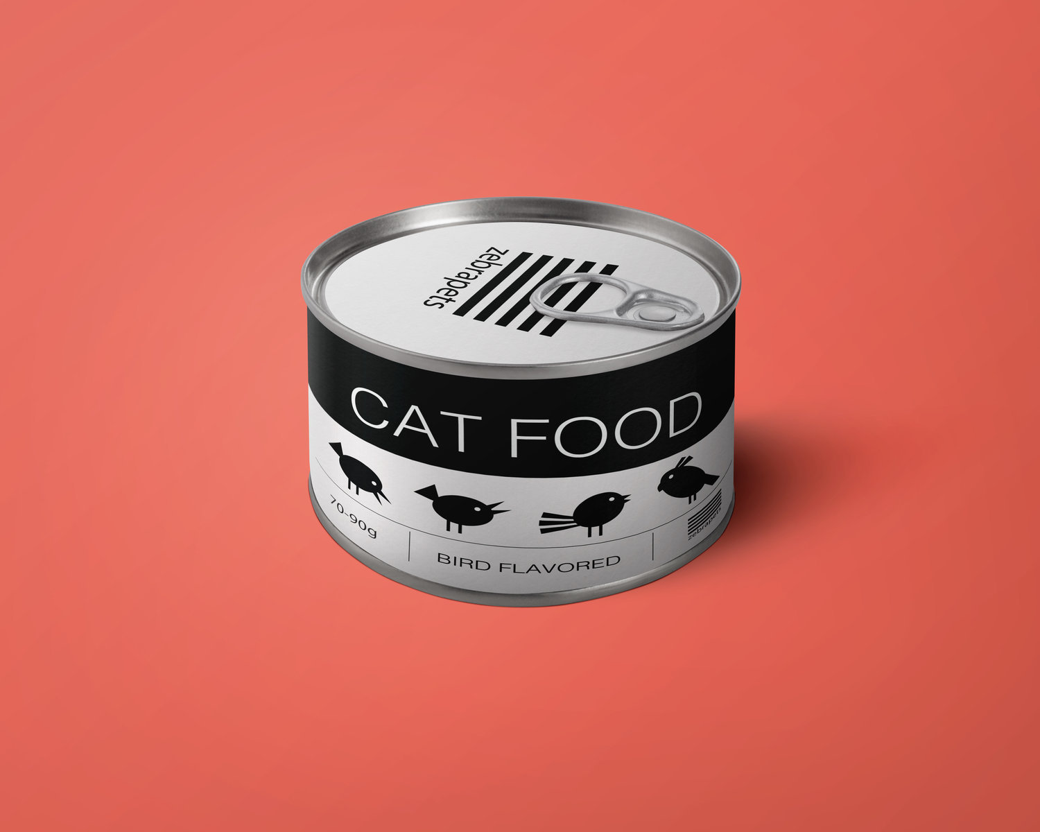
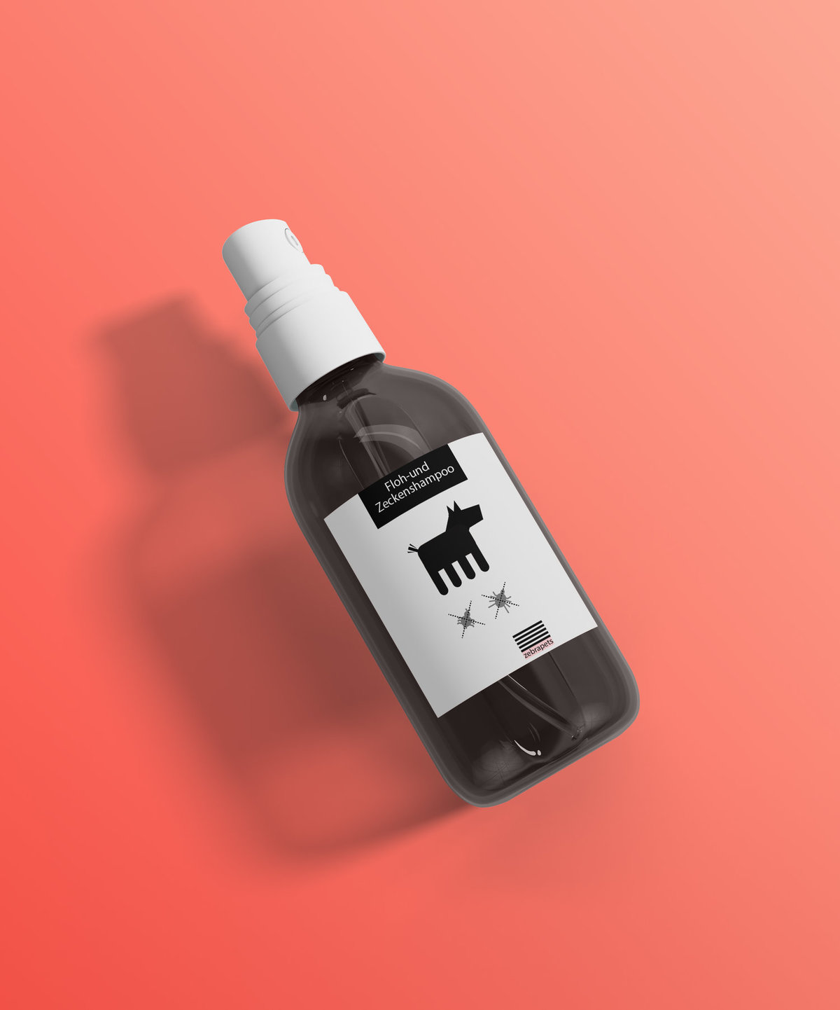
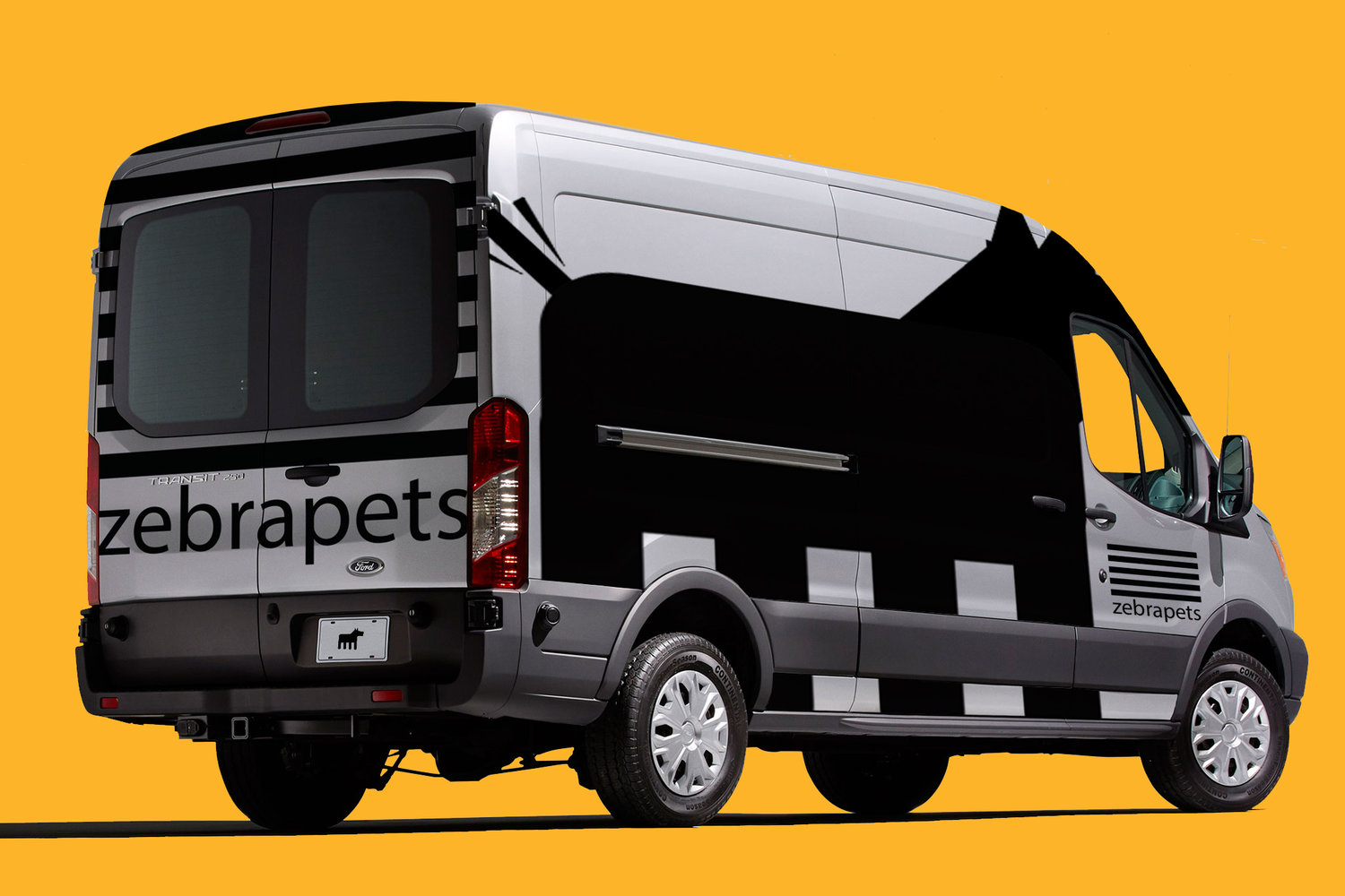
Zebrapets asked our team at Robin Design Studio to create a visual language, concepts, packaging and identity for their brand. The goal was to introduce the new pet brand to the German market in a fresh, bold and minimalist way. We used two basic main colours: black & white, because there is a serious colour-chaos in the shelves of the pet shops (and we all know the Von Restorff Effect). We also conceptualized & designed brand extensions such as landing pages and so on.


CREDIT
- Agency/Creative: Robin Design Studio
- Article Title: Brand Identity and Package Design for a Pet Food and Supplies Brand
- Organisation/Entity: Agency, Published Commercial Design
- Project Type: Packaging
- Agency/Creative Country: Hungary
- Market Region: Europe
- Format: Bag, Box, Can, Jar, Tin, Wrap
- Substrate: Pulp Carton, Pulp Paper
FEEDBACK
Relevance: Solution/idea in relation to brand, product or service
Implementation: Attention, detailing and finishing of final solution
Presentation: Text, visualisation and quality of the presentation


