At Brand Hatch Creative, we thrive when given the opportunity to work on a brand with a freedom of vision and a client willing to push boundaries. JAAR Single Malt Whisky was exactly that kind of project. From the very beginning, we were tasked with transforming a bold concept into a whisky brand capable of making its mark globally. JAAR, meaning “fire” or “ember spark”, became the foundation for a story of tradition meeting innovation, embodied in every detail.
The Brand Story: Born out of fire, JAAR Whisky is a spirited fusion of heritage and bold creativity. It is a brand for those who see whisky not just as a drink but as a journey of discovery. With roots in the time-honoured traditions of whisky-making, JAAR takes a modern approach, offering a fresh perspective on Single Malt whisky.
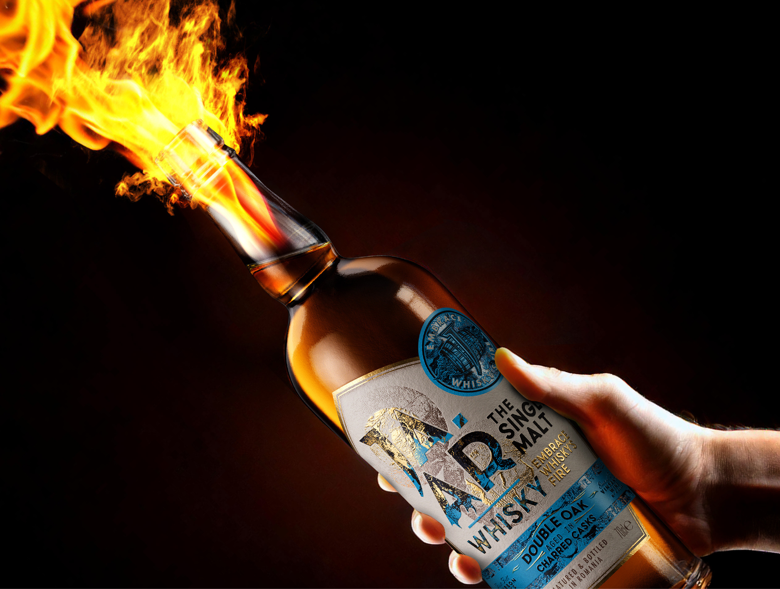
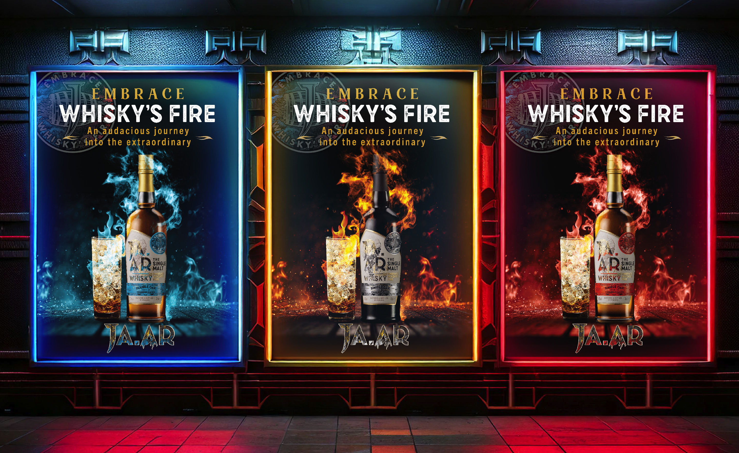
JAAR represents more than just a spirit; it is an invitation to explore. Every aspect of its identity reflects the transformative power of fire, which lies at the heart of the whisky-making process. The brand’s tagline, Embrace Whisky’s Fire, speaks to an audacious journey into the extraordinary.
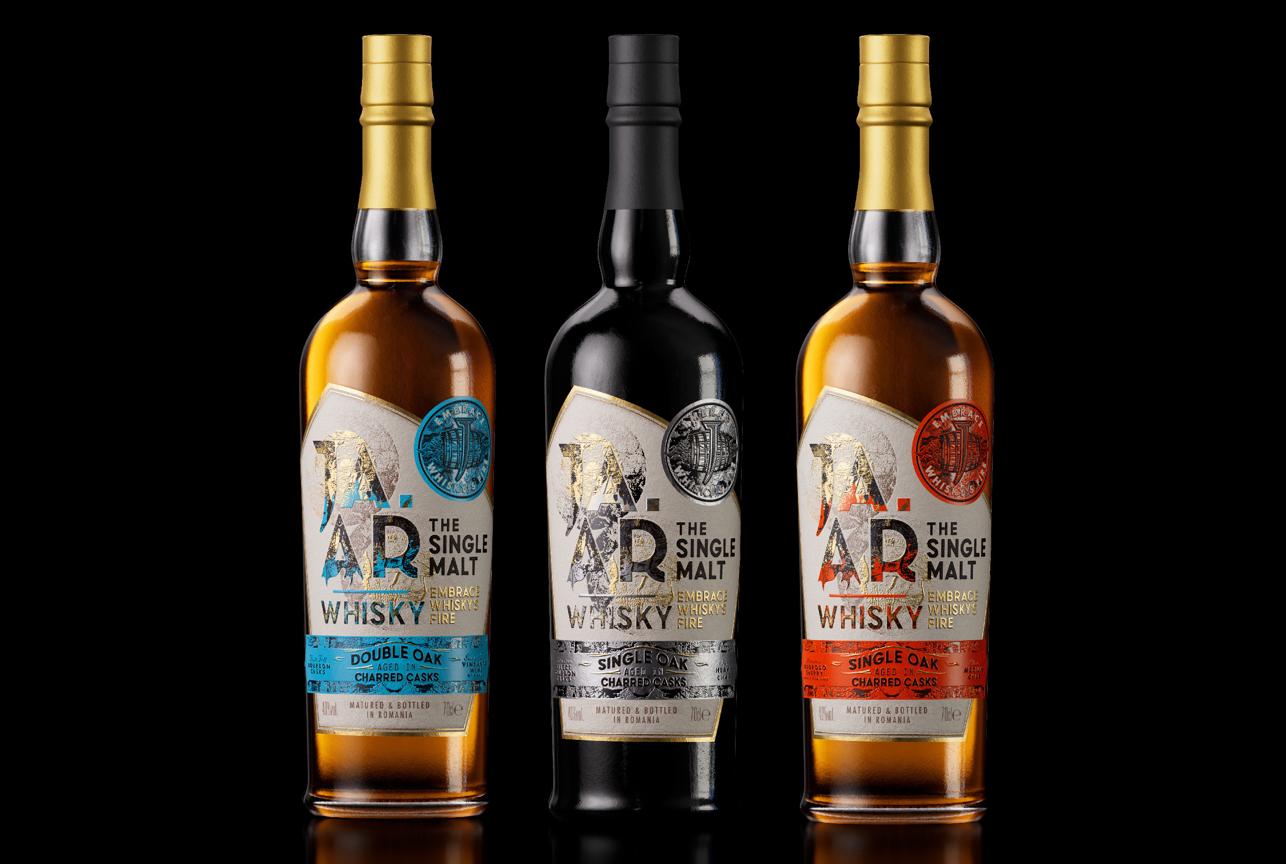
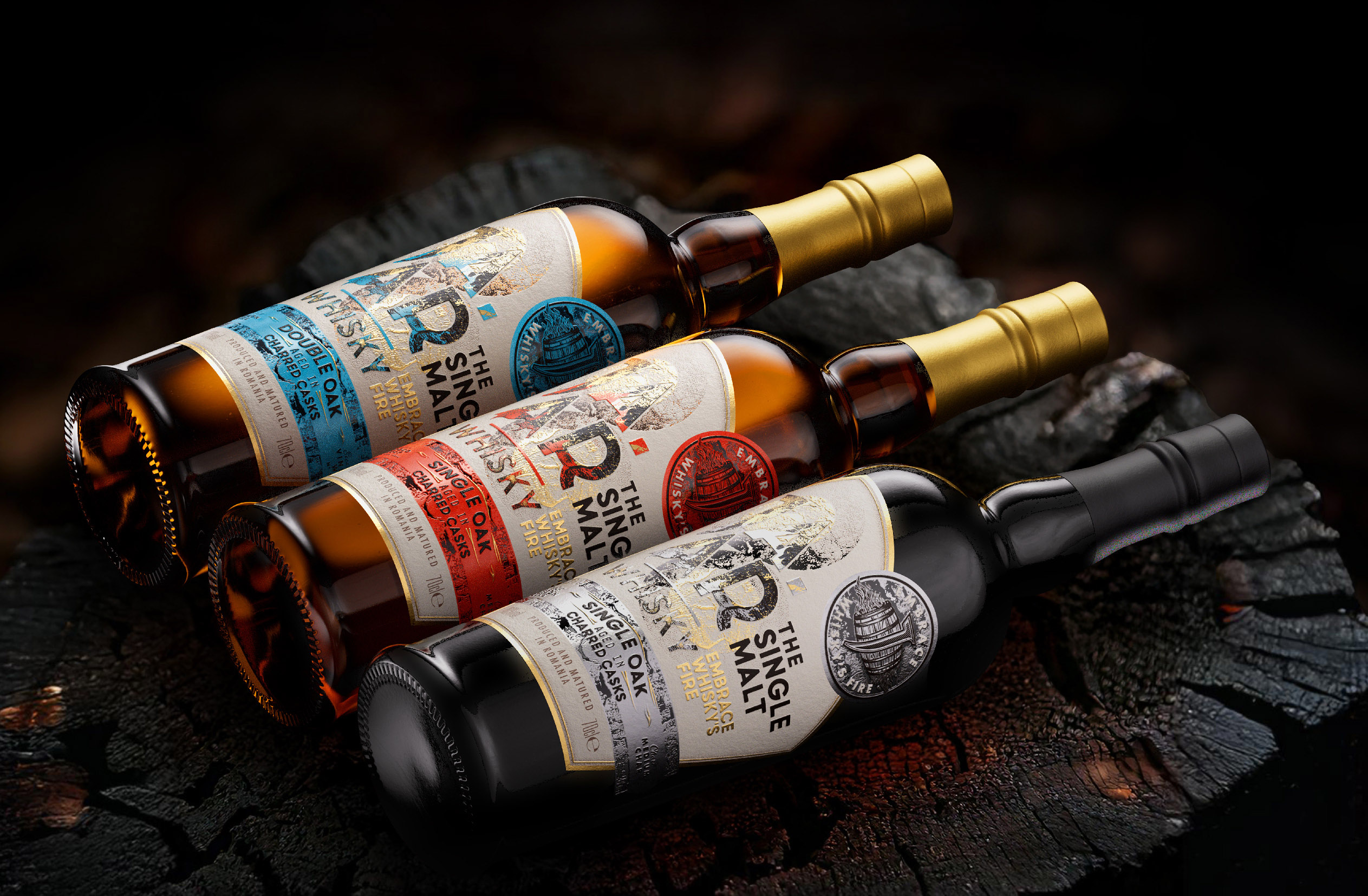
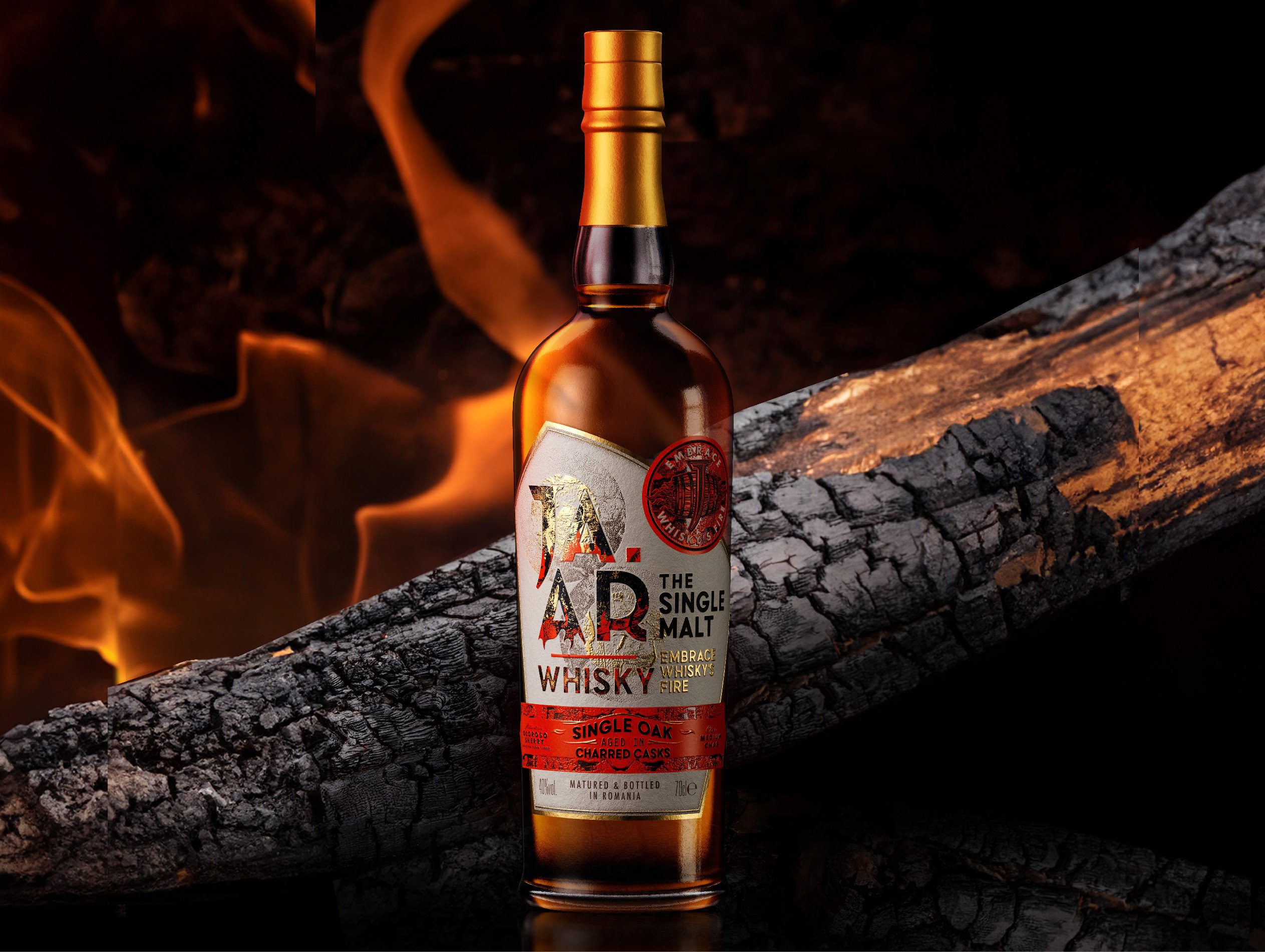
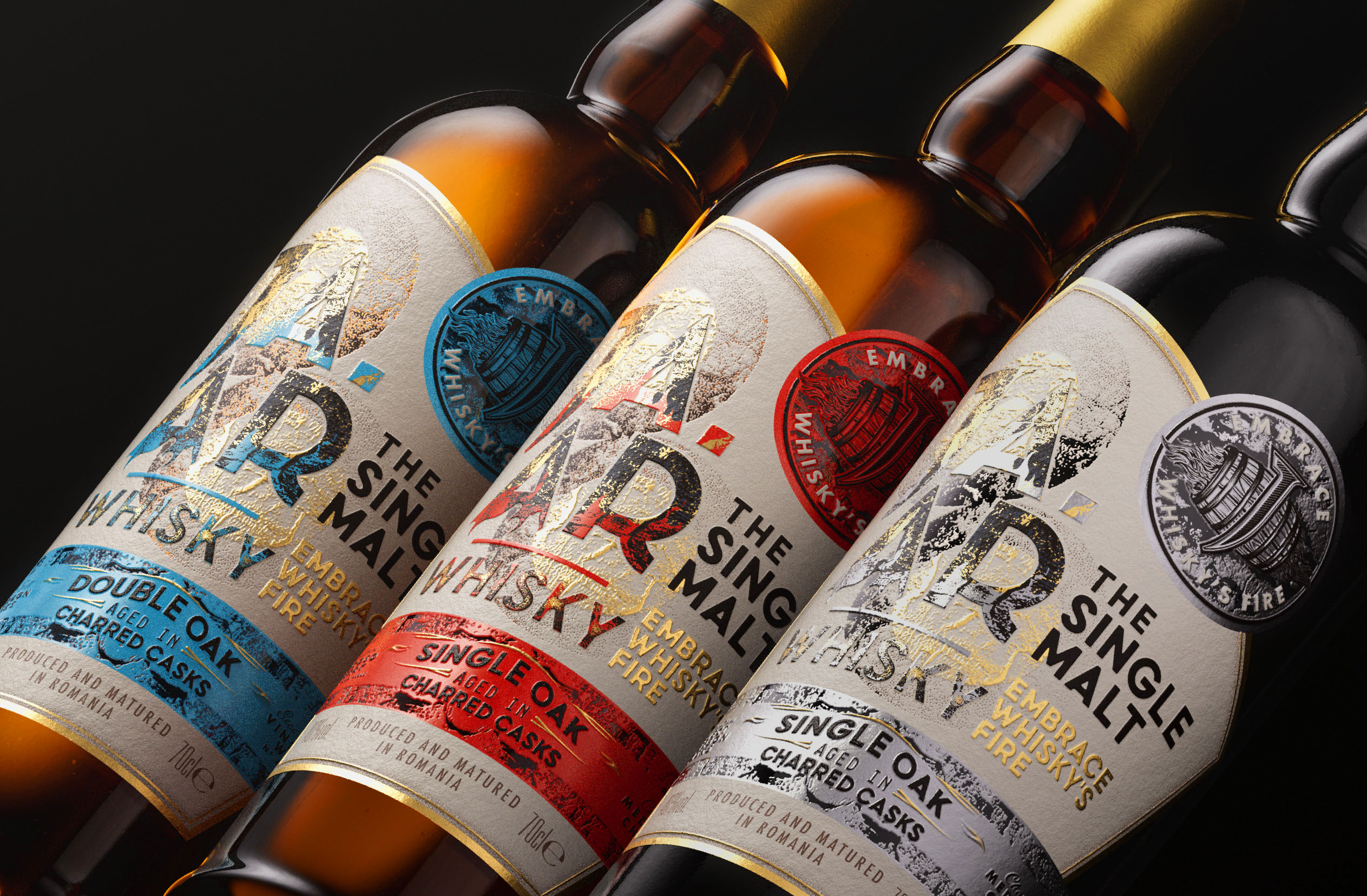
Every detail of JAAR’s packaging was designed to reflect its story and elevate the whisky experience. Each expression—Bourbon Cask, Oloroso Sherry, and Vinsanto Wine—features a unique matte foil that represents the cask finishes. Rich red hues evoke the depth of Oloroso Sherry, while other finishes highlight their distinctive origins.
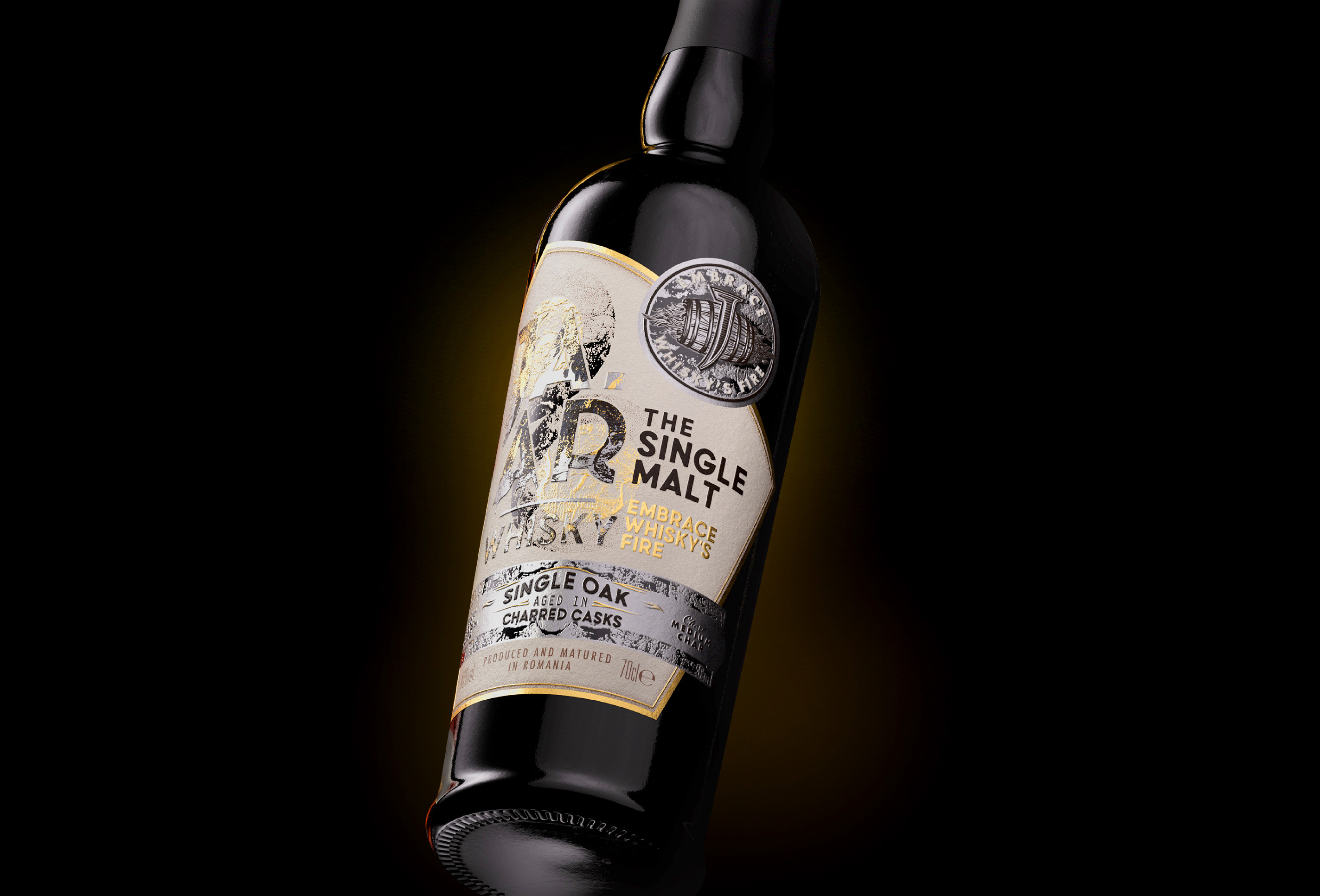
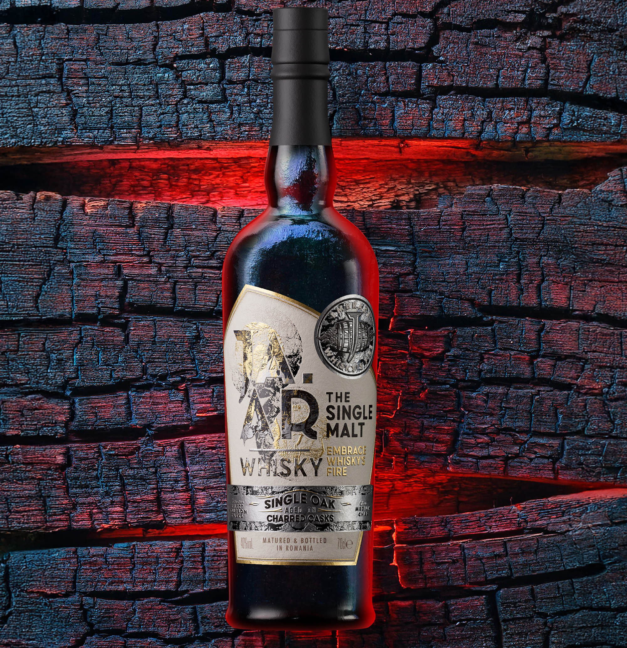
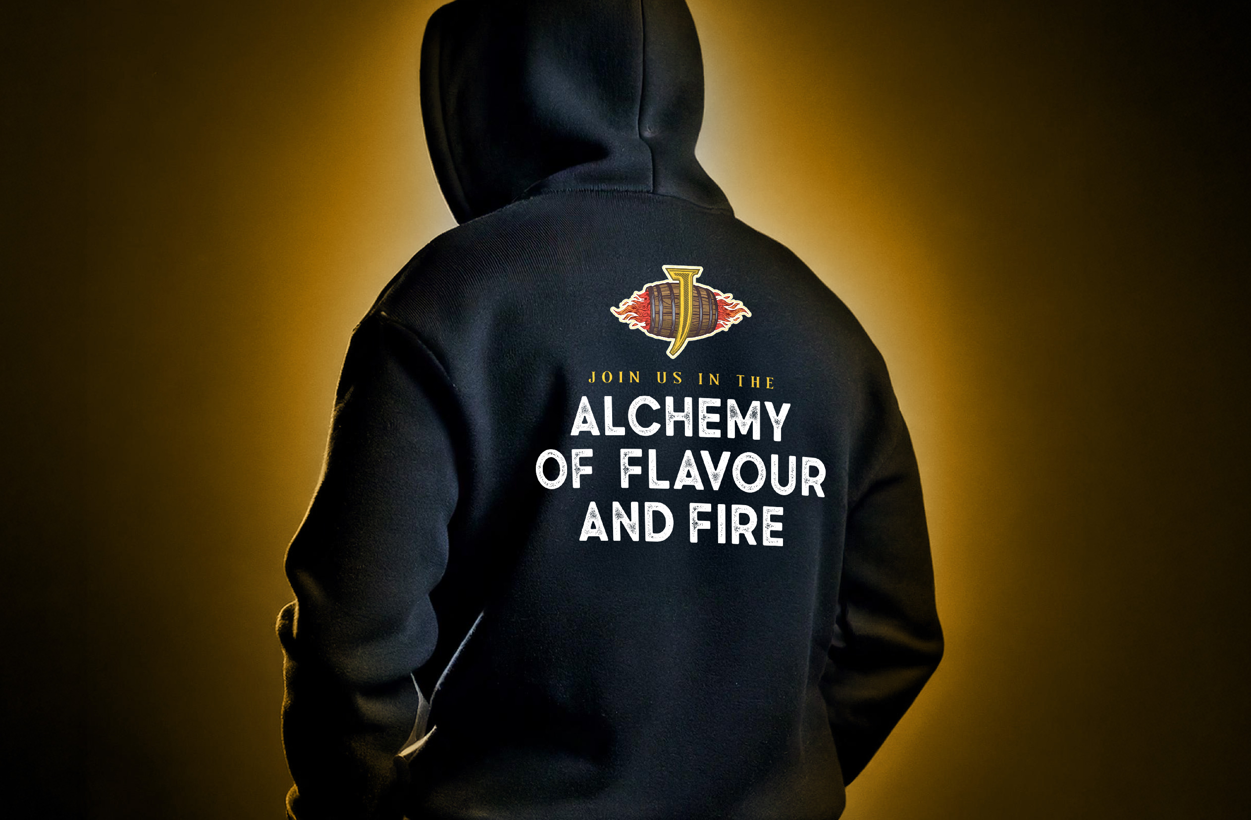
The labels, inspired by flames and charred casks, create a tactile and visual experience that connects directly to the essence of the whisky. A whisky barrel icon with flames and a “J” at its centre, surrounded by the tagline Embrace Whisky’s Fire, is overprinted in two colours on matte foil, adding depth and character.
While JAAR proudly bears the “The Single Malt” designation, it was designed to break free from the traditional constraints of whisky. With a focus on approachability and innovation, the brand appeals to a younger, modern audience seeking quality and flavour without the weight of convention. By reshaping perceptions, JAAR redefines what it means to enjoy Single Malt whisky.
Fire is at the core of JAAR’s identity and process. Often overlooked in the narrative of whisky-making, fire is essential, from charring barrels to unlocking complex layers of flavour. JAAR places fire at the forefront, celebrating its role in shaping both the spirit and the brand itself.
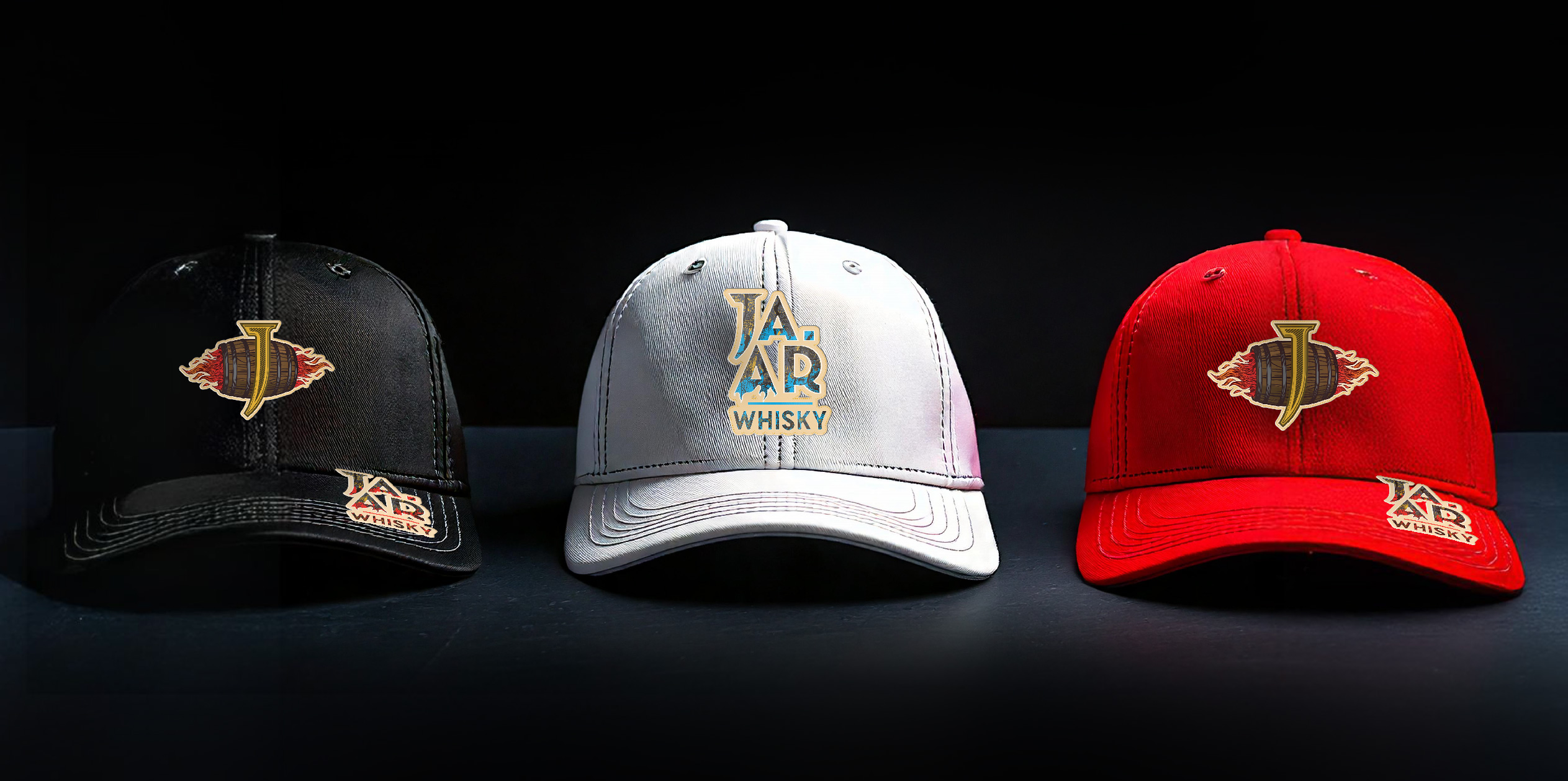
Our role in JAAR’s creation extended far beyond design. We developed the brand strategy, messaging, taglines, and narrative that define the brand. A detailed brand style guide and brand book provide a framework for consistency. We created custom visuals, CGI renders, and key visuals, crafting a cohesive suite of imagery that resonates across platforms. In addition, we designed branded barware, cocktail kits, glassware, in-store displays, and even bar concepts to support the brand’s launch and consumer engagement.
CREDIT
- Agency/Creative: Brand Hatch Creative
- Article Title: Brand Hatch Creative Ignites a New Era of Whisky Branding with Jaar
- Organisation/Entity: Agency
- Project Type: Packaging
- Project Status: Published
- Agency/Creative Country: United States
- Agency/Creative City: Miami
- Market Region: Global
- Project Deliverables: Brand Design, Brand Guidelines, Brand Strategy, Packaging Design
- Format: Bottle
- Industry: Food/Beverage
- Keywords: WBDS Agency Design Awards 2024/25 , Whisky, Cask
- Keywords: WBDS Agency Design Awards 2024/25
-
Credits:
CGI Renders: Tricycle Studio


