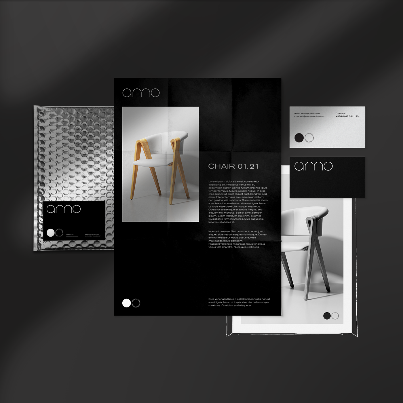
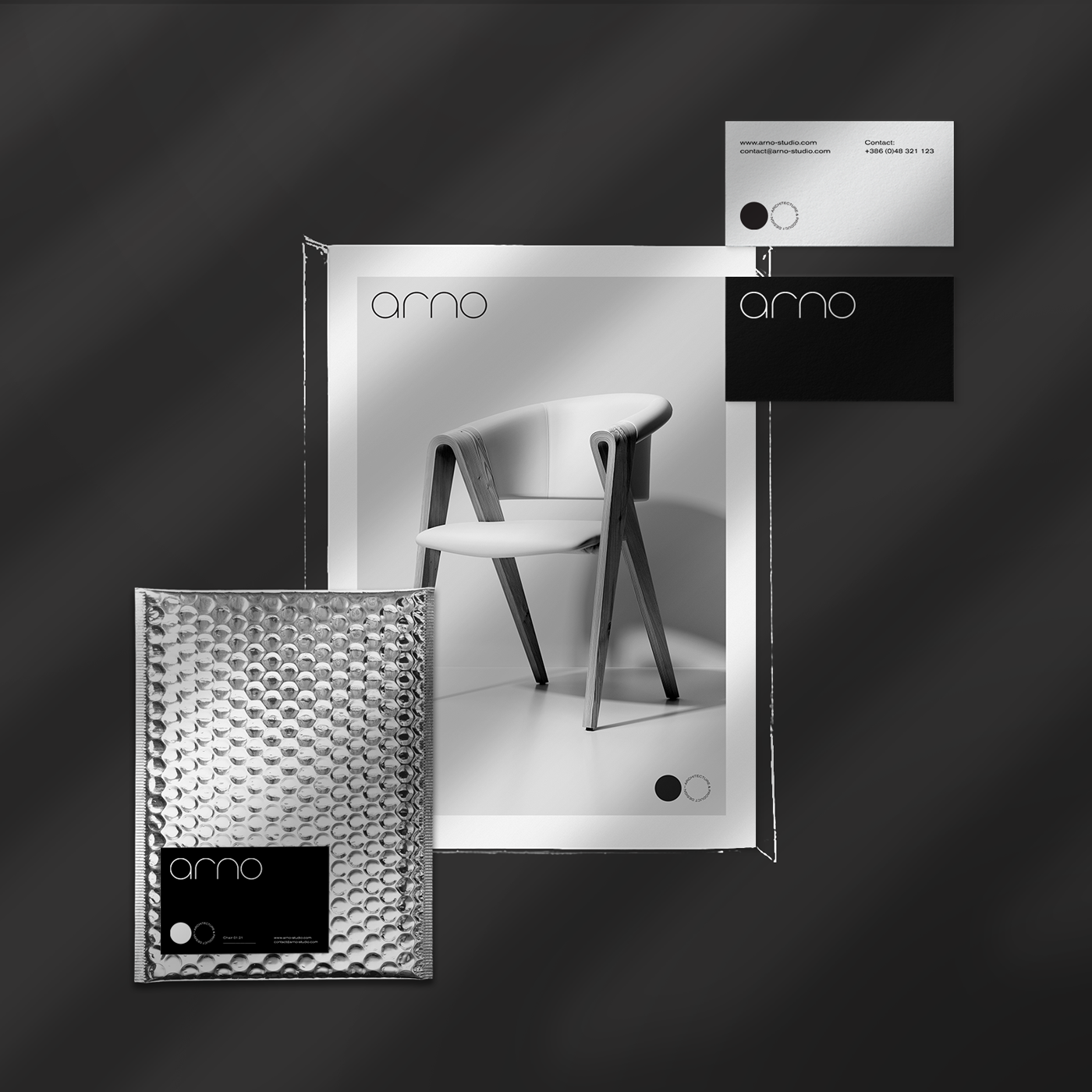
Arno is a new startup creative studio created in Prishtina, Republic of Kosovo. Arno`s team experience and portfolio stands out for unique architecture and product design. Arno`s mantra is – design for humans-. They deliver extraordinary innovative solutions for products of everyday life, home furniture and HoReCa, mixed carefully in terms of aesthetics and minimalism. Their focus is sustainability and usage of recycled materials. They focus on unique solutions for furniture and other product design. Their process of the lifecycle of their creations is manufacturing only a series of a line for their product category. They are planning to expand their portfolio throughout indoor & outdoor furniture.
Naming: Their name comes from ancient times, eg. Ethruscan language (Illyrians) using “arno” for similar words like create & make. Having just 4 letters was a benefit for us in terms of naming and branding. Their name can be pronounced and remembered easily internationally.
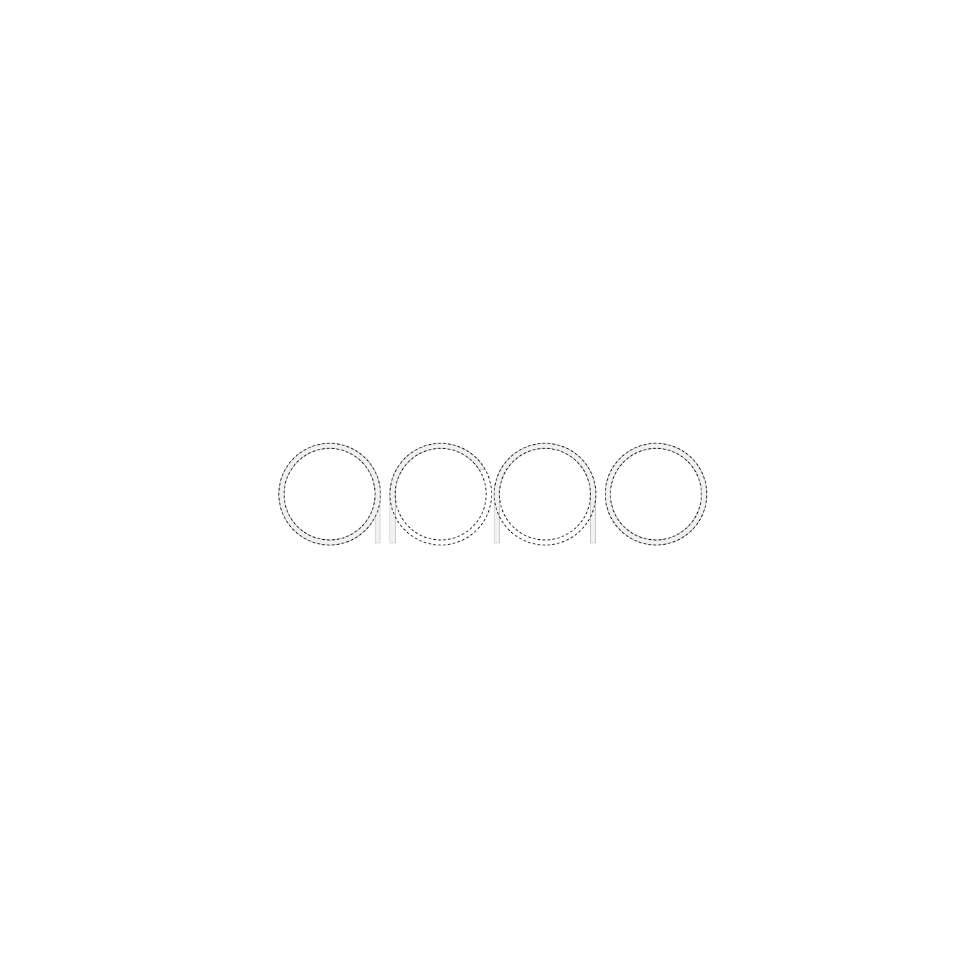
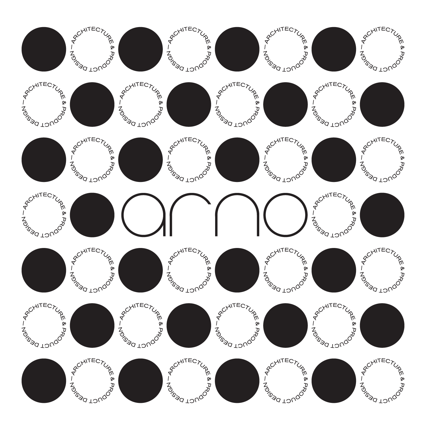
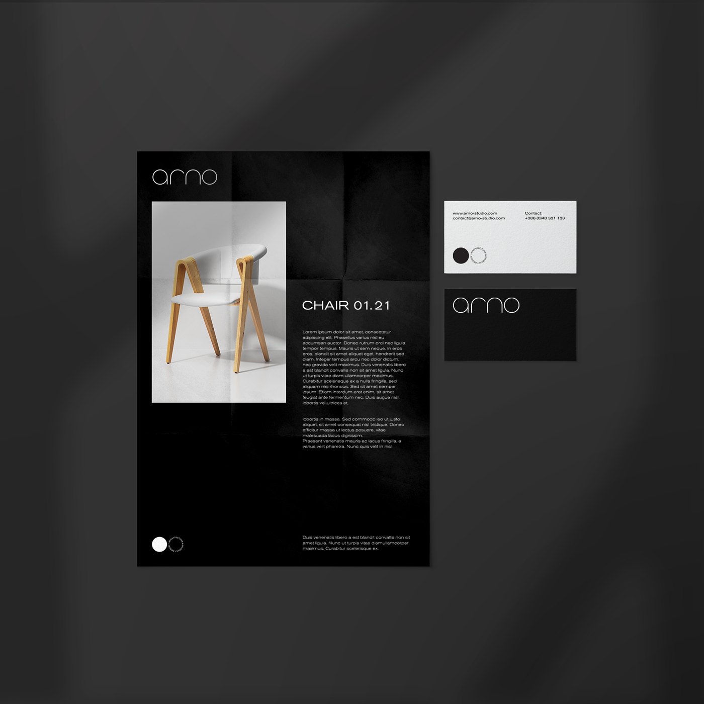
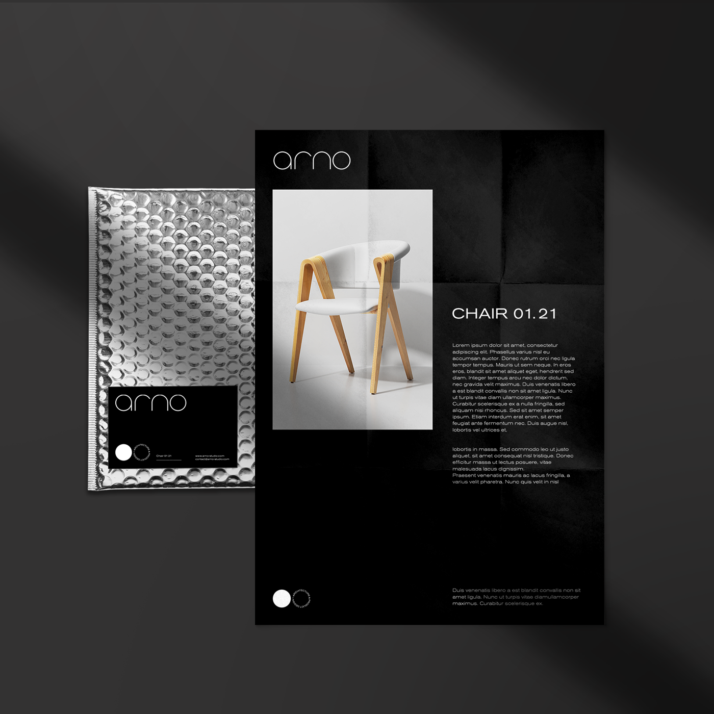
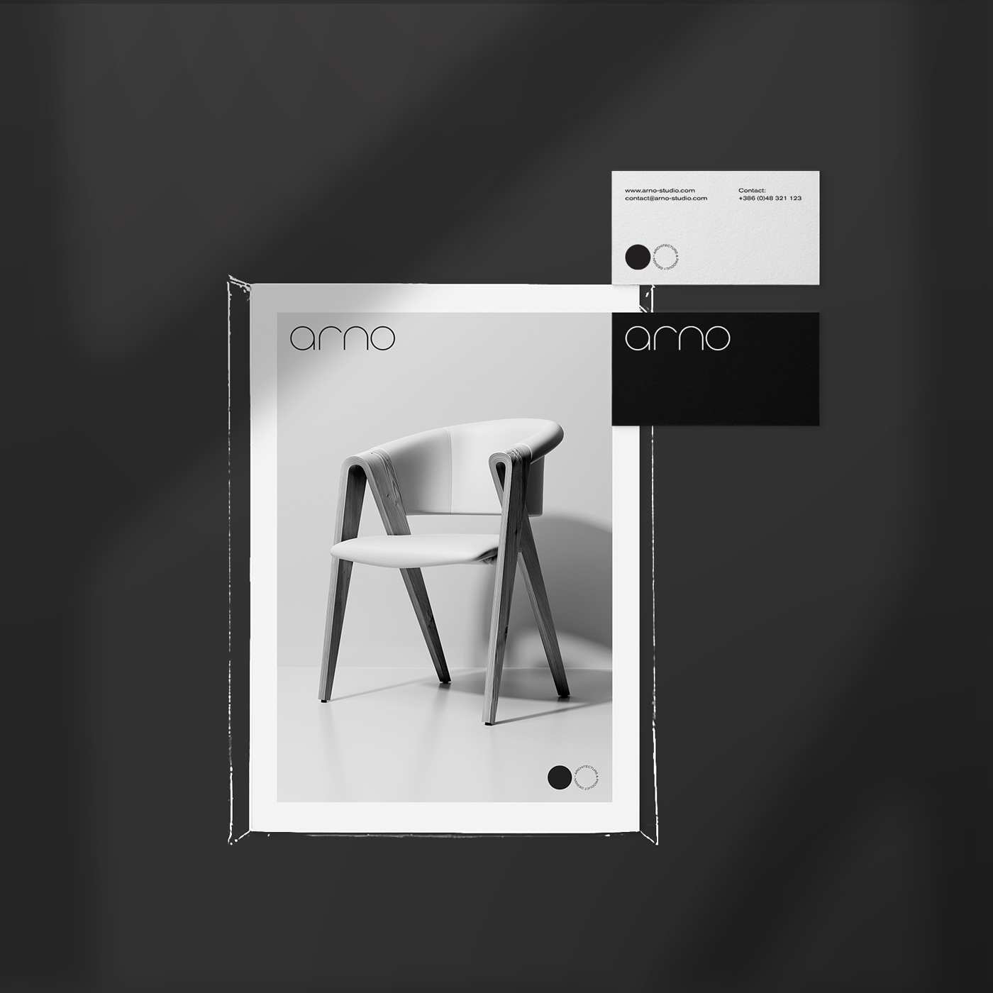
Logo: Their logo is constructed in same circular geometric shapes, communicating minimalism as they do as an approach to their respective projects. Circular shapes are further extended in the usage of visual identity and visual language. We have worked on typographic patterns to create extra assets for the visual language. Arno`s monochromatic color palette is chosen to convey simplicity & style.
Typography: Arno`s written words communicate with Akzidenz-Grotesk, a sans-serif typeface family originally released by the Berthold Type Foundry of Berlin. Originating during the late nineteenth century, Akzidenz-Grotesk belongs to a tradition of general-purpose, unadorned sans-serif types that had become dominant in German printing during the nineteenth century. Also the preferred typeface of many Swiss graphic designers in what became called the ‘International’ or ‘Swiss’ design style.

CREDIT
- Agency/Creative: Yll Hoxha
- Article Title: Brand Development and Visual Identity Design for Arno Architecture and Product Design
- Organisation/Entity: Freelance, Published Commercial Design
- Project Type: Identity
- Agency/Creative Country: Republic of Kosovo
- Market Region: Europe
- Project Deliverables: Brand Creation, Brand Identity, Brand Strategy, Branding, Identity System, Research
- Industry: Manufacturing
- Keywords: #arno #architecture #productdesign #prishtina #design #brandidentity #visualidentity #branding #Logo #icon #pattern #typography #behance #logodesigner #designfeed #graphicdesign #artdirection #brandinginspiration #prishtina #yllhoxha #logobook #architecture #productdesign


