


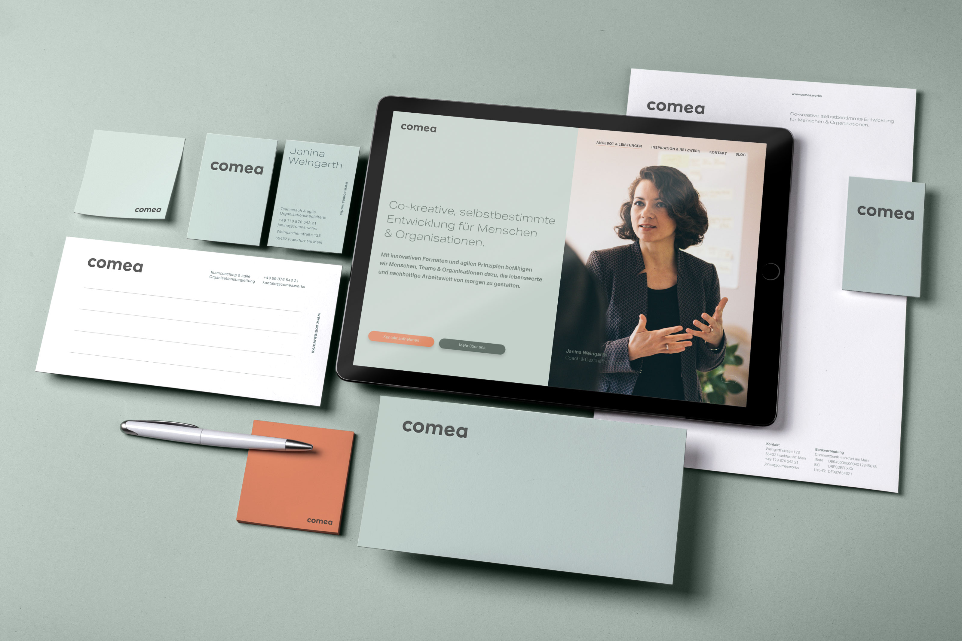
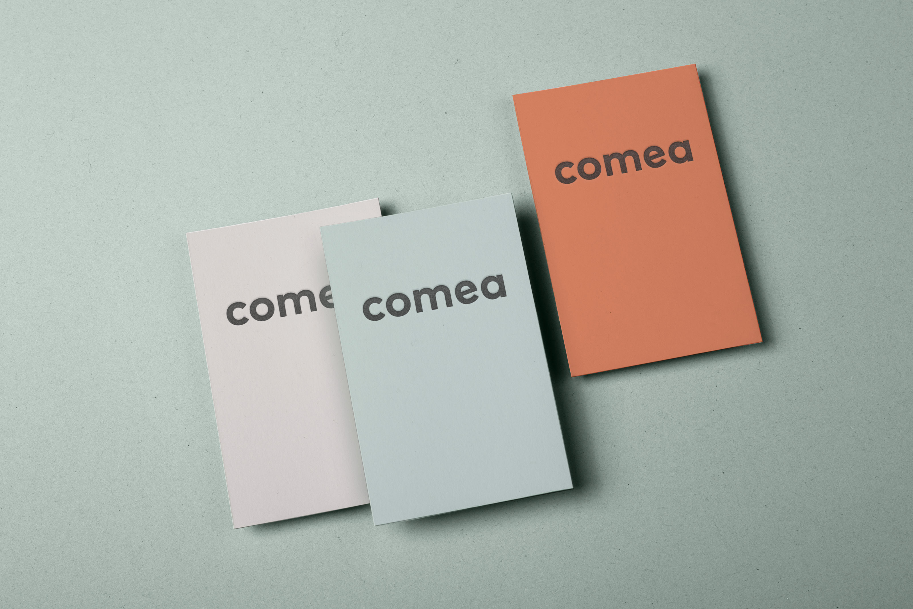
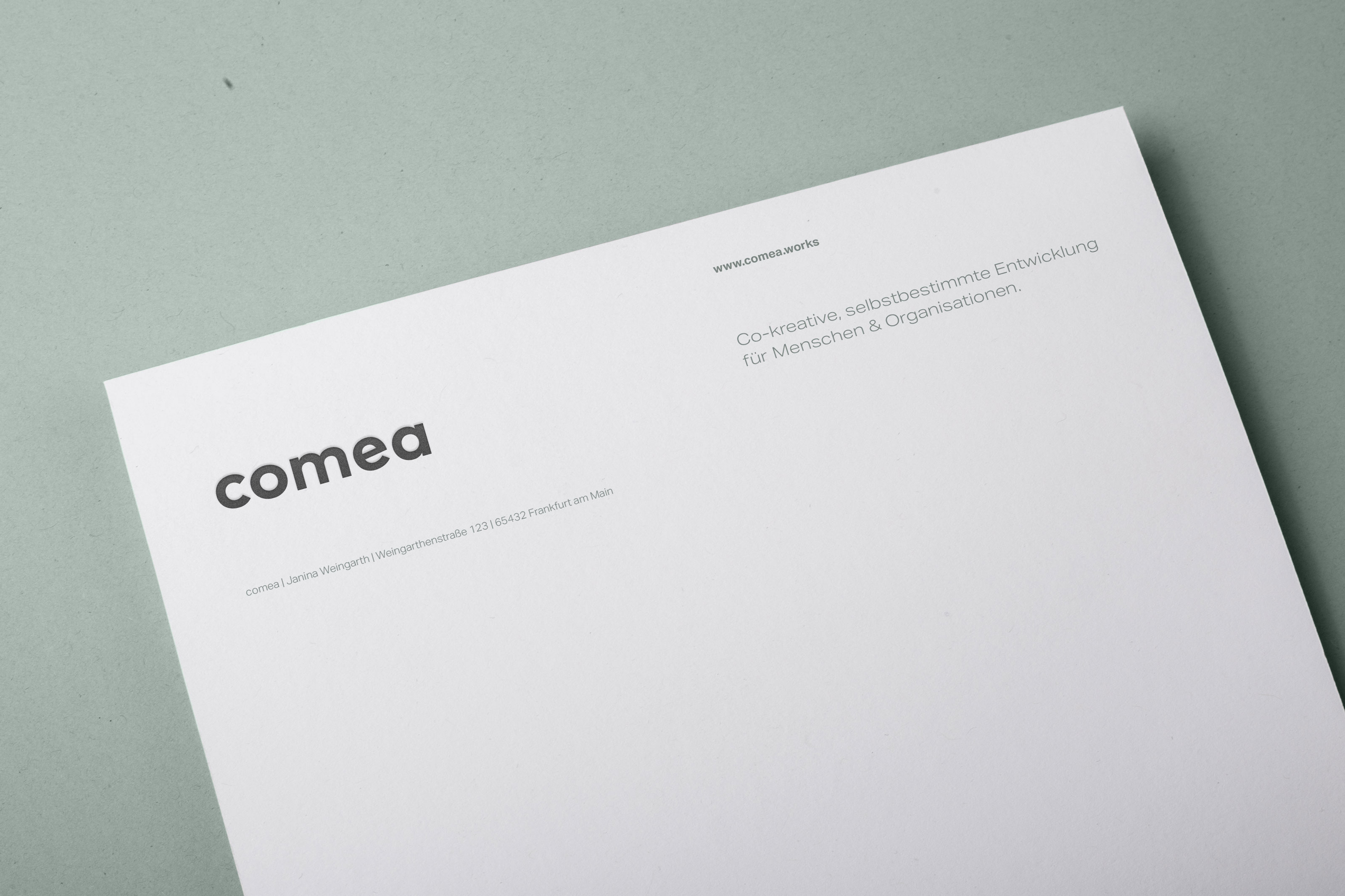
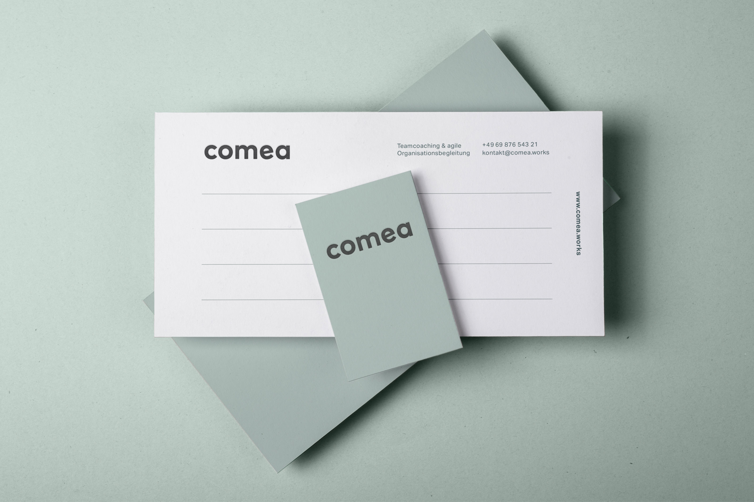
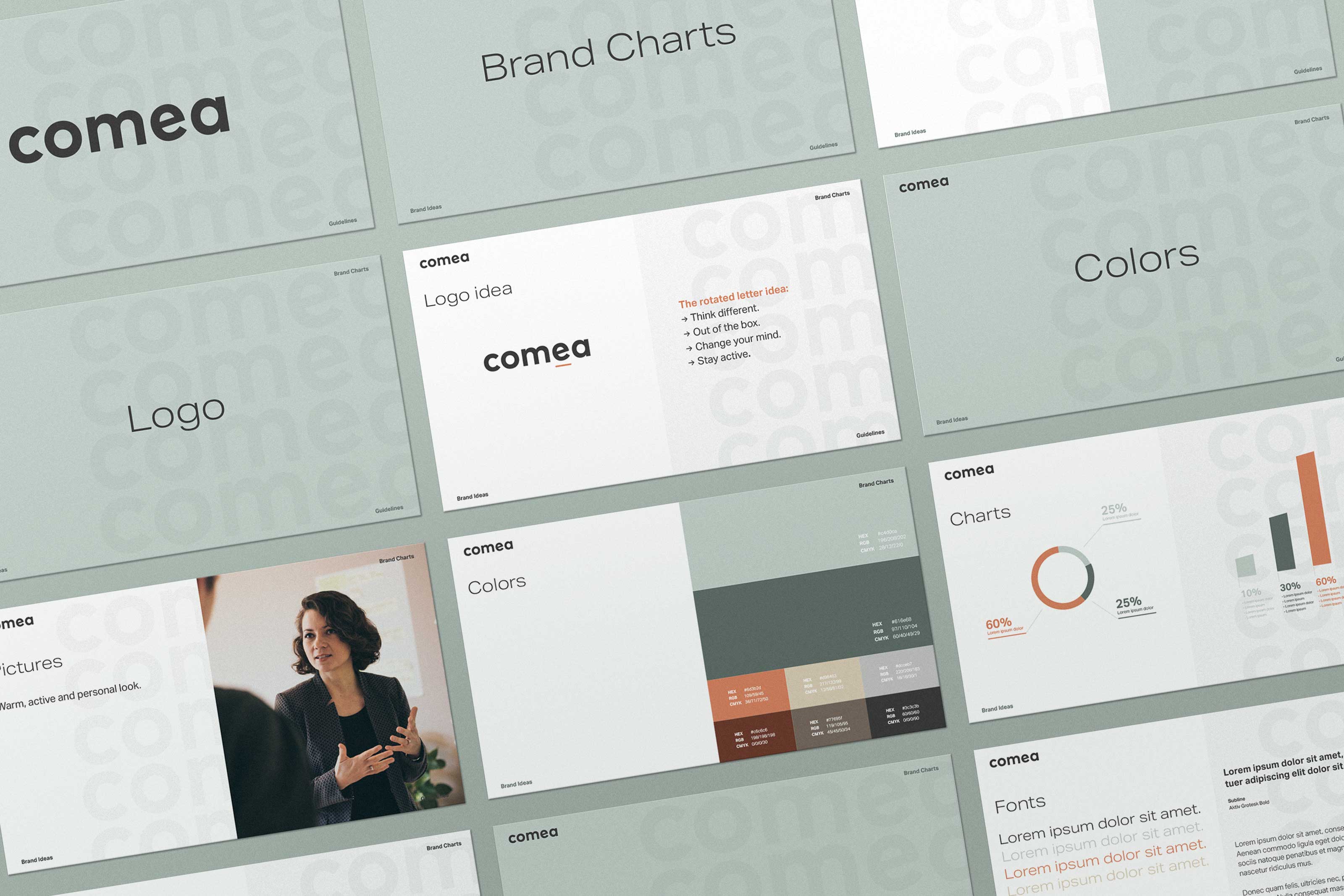
Comea empowers people, teams and organisations to shape the sustainable working world of tomorrow through consulting and coaching. Guided by the theme of „rethinking“, the idea is to subtly visualize the change initiated by the coaching by a slightly turned „e“ in the logo.
With unique monochrome colours, based on the plain colours of whiteboards and post-its and a headline font that bears the progress already in its name („Aktiv Grotesque“), comea takes a step back, looks at existing processes from the outside, gives people the space to think out of the box and carefully navigates teams in the right direction.
Facts: Why is it relevant? Comea empowers people, teams and organisations to shape the sustainable working world of tomorrow through consulting and coaching. Why is the idea appropriate? The design supports the idea that new ideas are created by thinking differently.To be able to think freely, you need space. These two aspects (Thinking out of the box & space) are the basic themes for the simple but ingenious logo idea and the very unique but reserved design.
Why does it look the way it does? The two aspects „Think out of the box“ & „Space“ are the basic themes for the simple but ingenious logo idea and the very unique but reserved design. How does it engage the user? The understated look gives the user the feeling of being able to think freely, enabling him to develop new ideas.
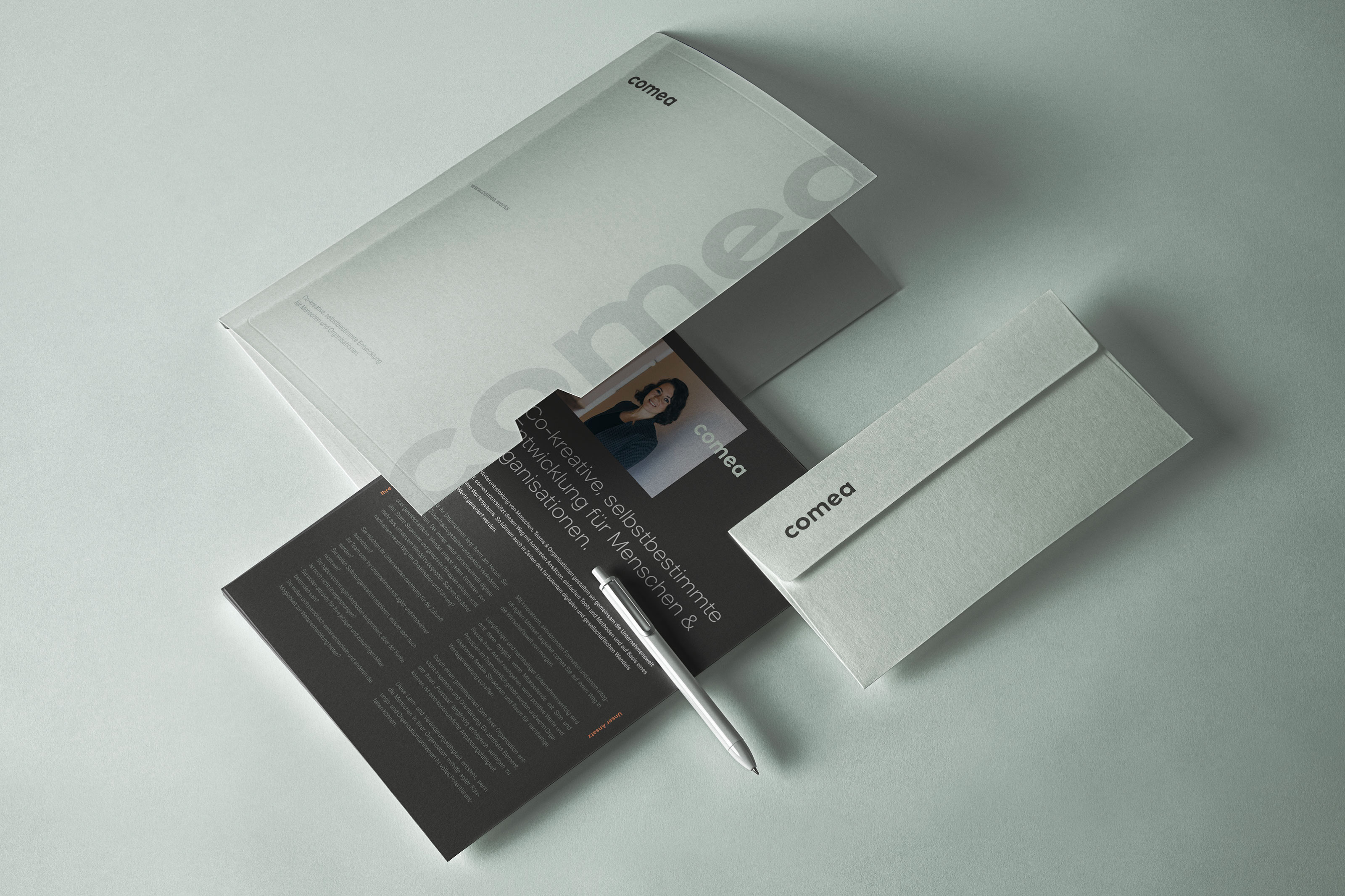
How is it made? In various digital and analogue touchpoints, the brand has a uniform yet flexible appearance. This ensures a high degree of recognition and future-proof communication, regardless of the media used.
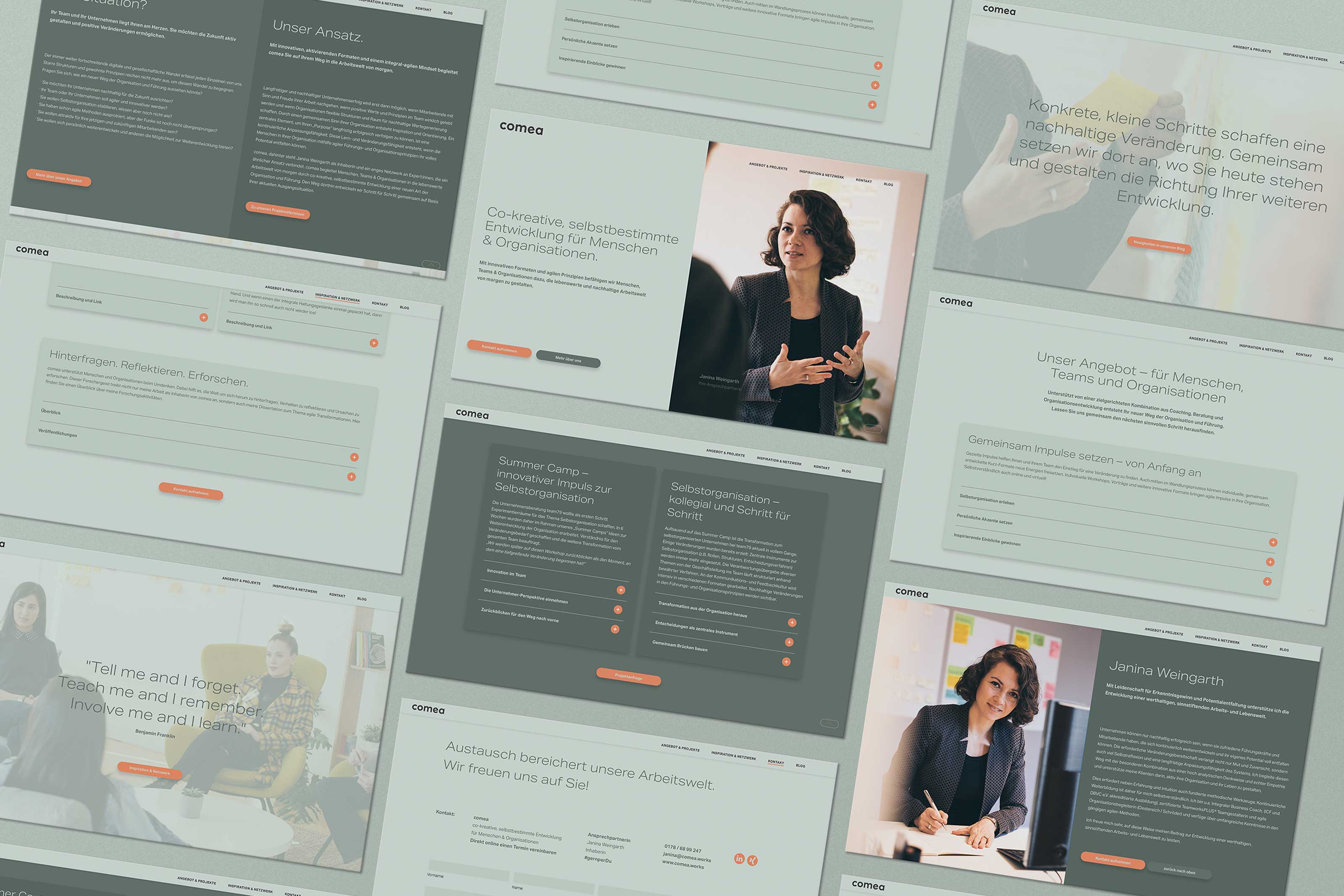
Usability: Why can it be used with ease?All designed media are clearly structured and offers a lot of space for the presentation of extensive information, but also for the emotional appeal to the customer. Efficiency: Why does it work well? On the website there are, for example, usable boxes for extensive content and the clear visibility of C2A Buttons in a distinctive orange colour. User Benefit: How does it serve the user? The understated look gives the user the feeling of being able to think freely, enabling him to develop new ideas.
Innovation & Brand Differentiation: Why is it new and How does it support the brand? With its monochrome design, the intelligent logo idea and the very unique, high-quality and personal approach, comea has an absolute unique position in the agility coaching market.
Social Benefit & Sustainability: How does it serve society and why is it sustainable? Only if people‘s thinking about work changes, work will also be worth living in the future. Comea empowers people, teams and organisations to shape the sustainable working world of tomorrow through consulting and coaching.
CREDIT
- Agency/Creative: new office
- Article Title: Brand Design for the Co-Creative Coaching Company Comea
- Organisation/Entity: Agency, Published Commercial Design
- Project Type: Identity
- Agency/Creative Country: Germany
- Market Region: Europe
- Project Deliverables: Brand Identity, Brand Naming, Brand Strategy, Brand World, Branding
- Industry: Education
- Keywords: Branding, Coaching, Agile Coaching, Co-Active Coaching, Co-Creative Coaching


