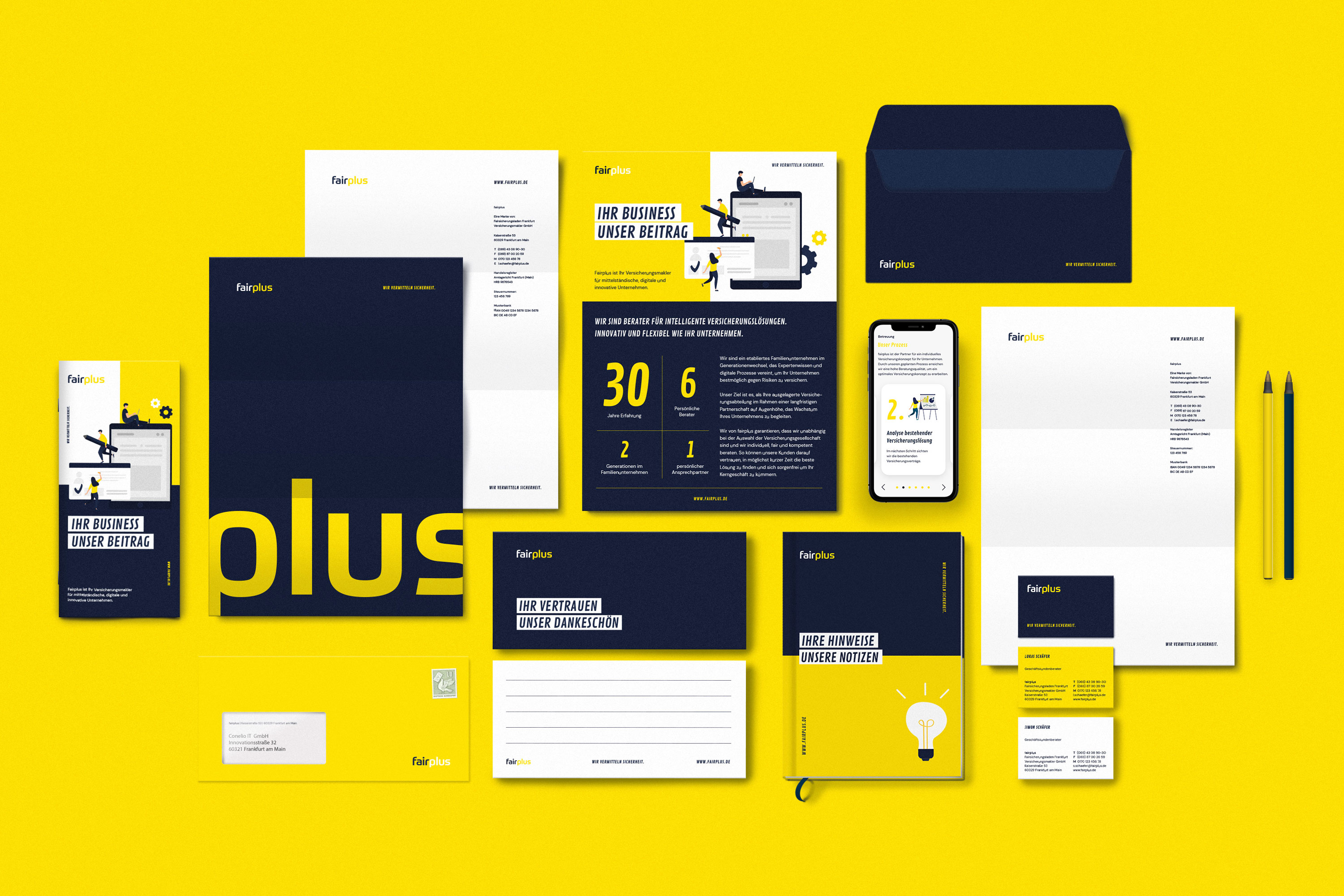
Fairplus focuses on insurance consulting and brokerage for start-ups and technology companies. The young but experienced company positions itself as a fresh brand with new approaches, which opposes the dusty image of insurance brokers. The visual identity enables flexible storytelling across all touch points with maximum differentiation though a world of individual illustrations and a digital-first approach. The brand communicates with the highest level of competence, but exudes a fresh, modern approach that perfectly appeals to the target group in the start-up and tech sector.
Facts: What was the task? We had to develop a brand that appeals to the younger start-up and tech industry and reflects the modern approach of the company. Why is it relevant? The dusty industry of insurance brokers needs new young minds that combine the need for personal advice with the latest technical possibilities to reach the target group. Idea: The visual identity enables flexible storytelling across all touch points through unique illustrations. The brand communicates with the highest level of competence, but exudes a fresh, modern approach that perfectly appeals to the target group in the start-up and tech sector.
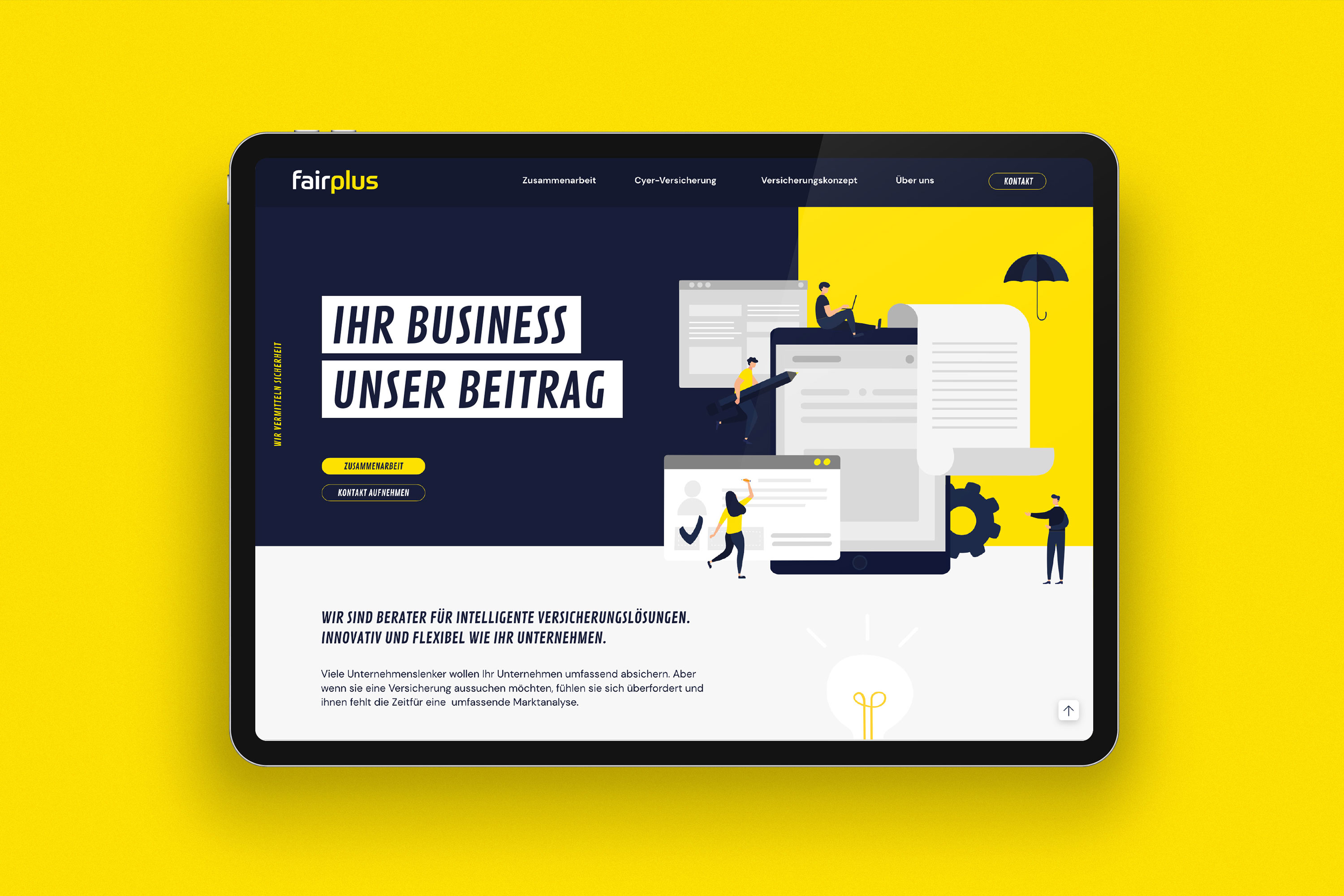
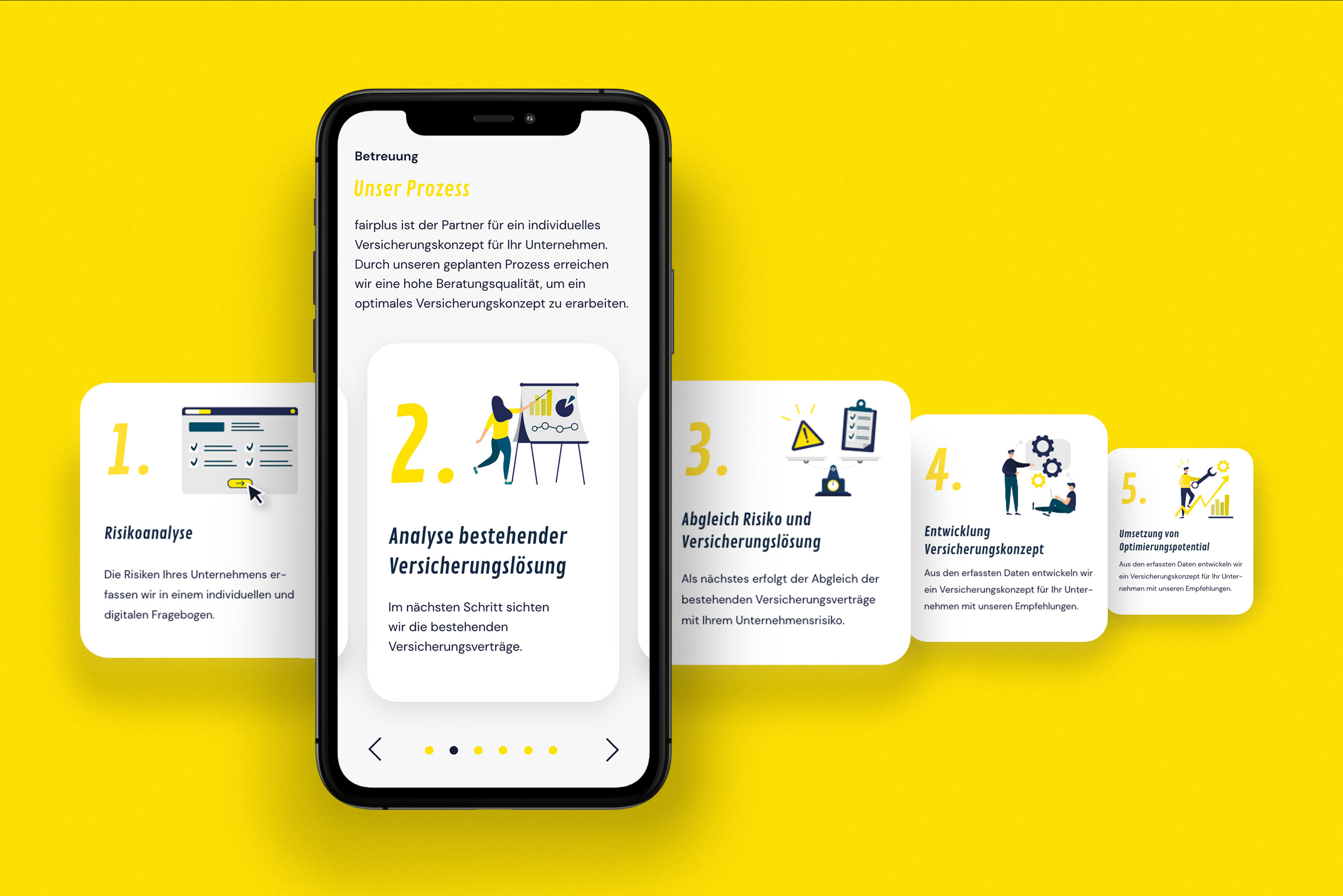
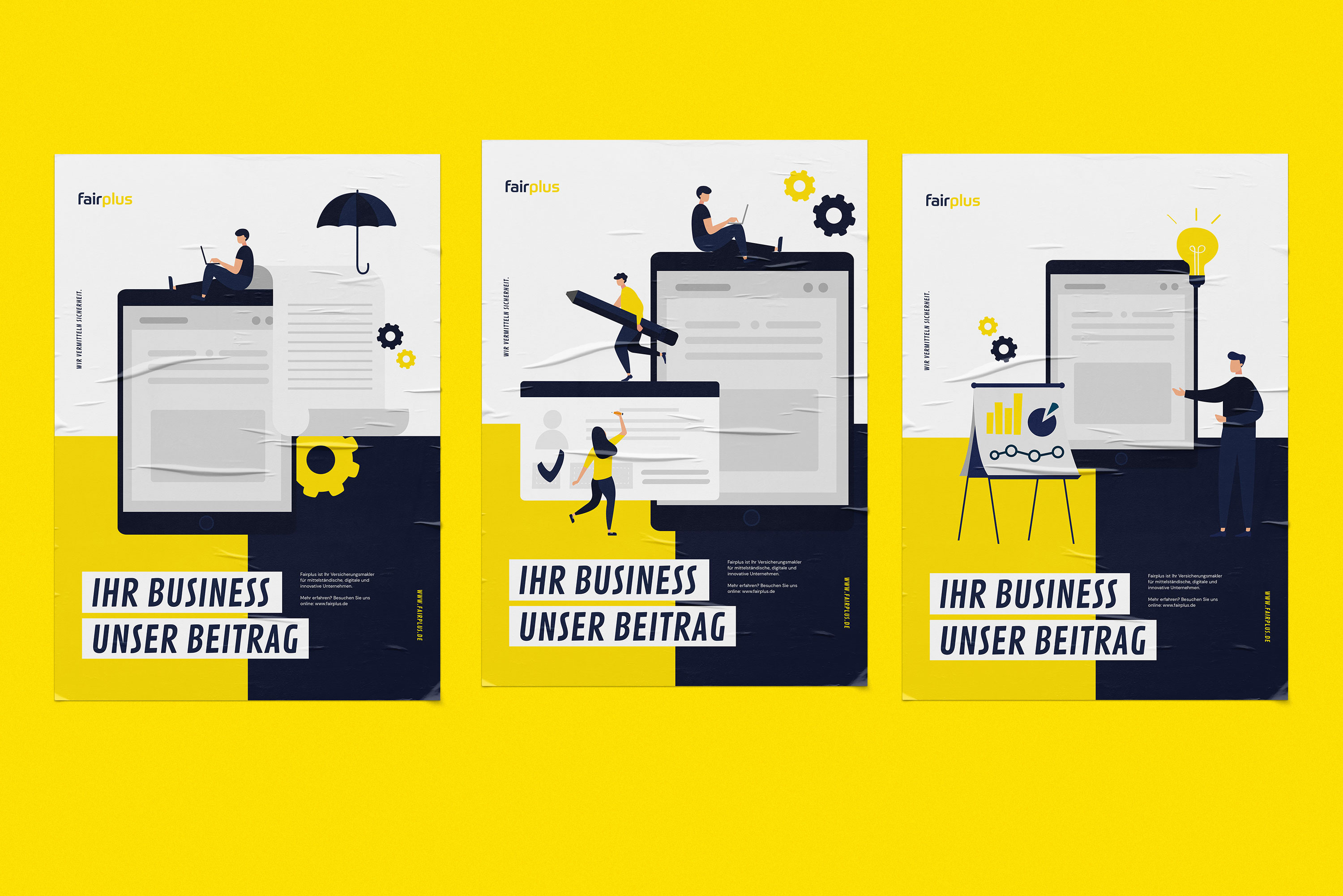
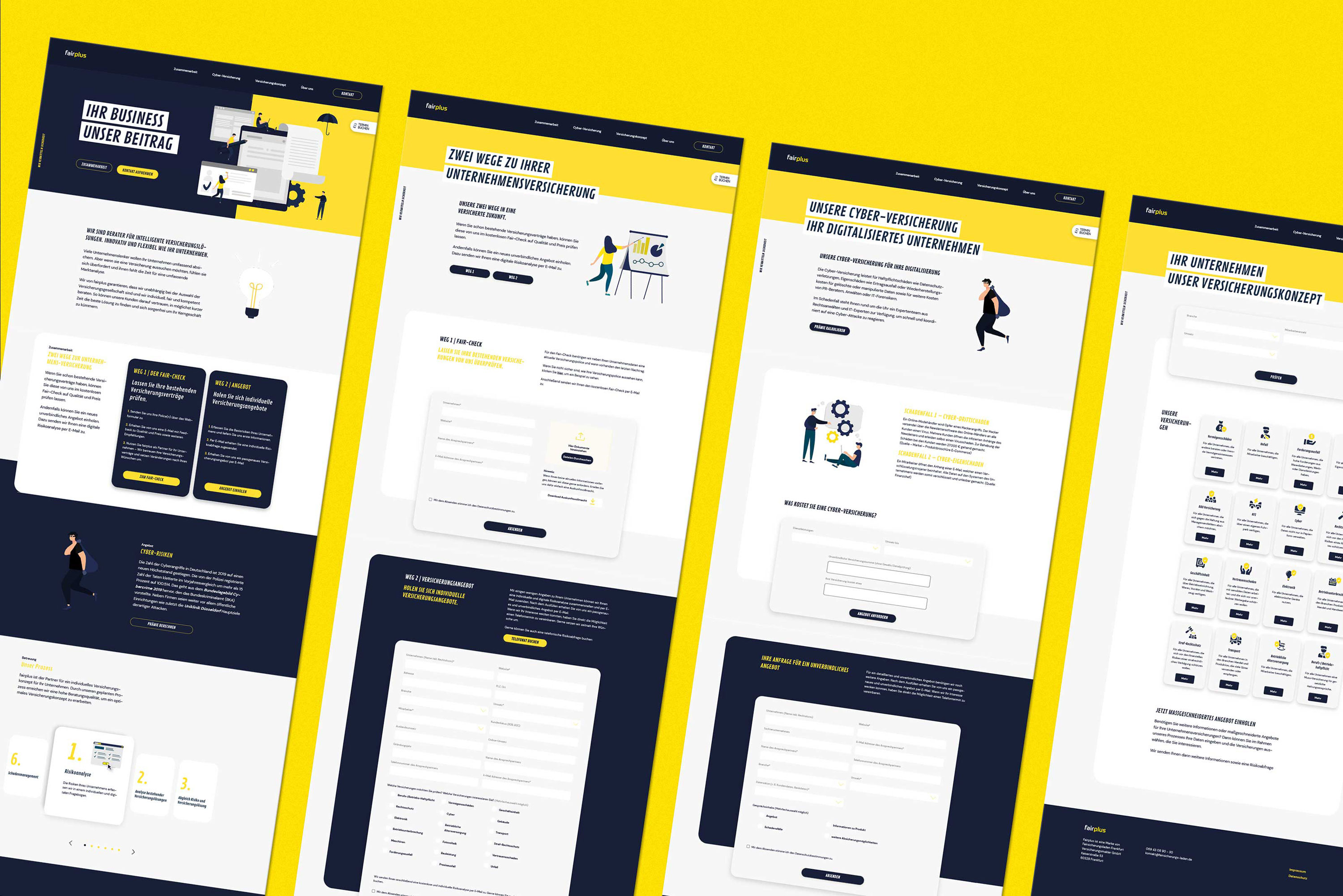
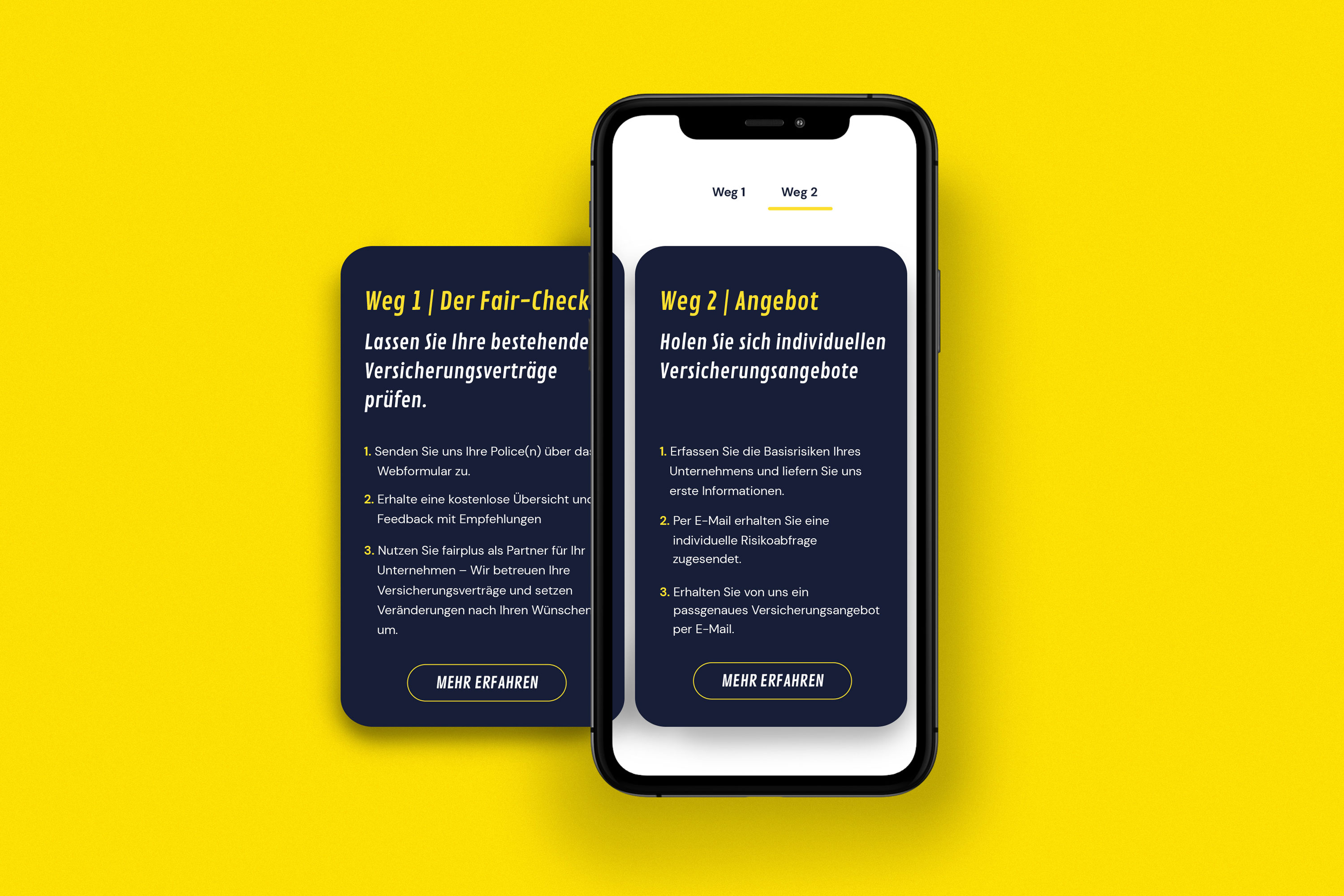
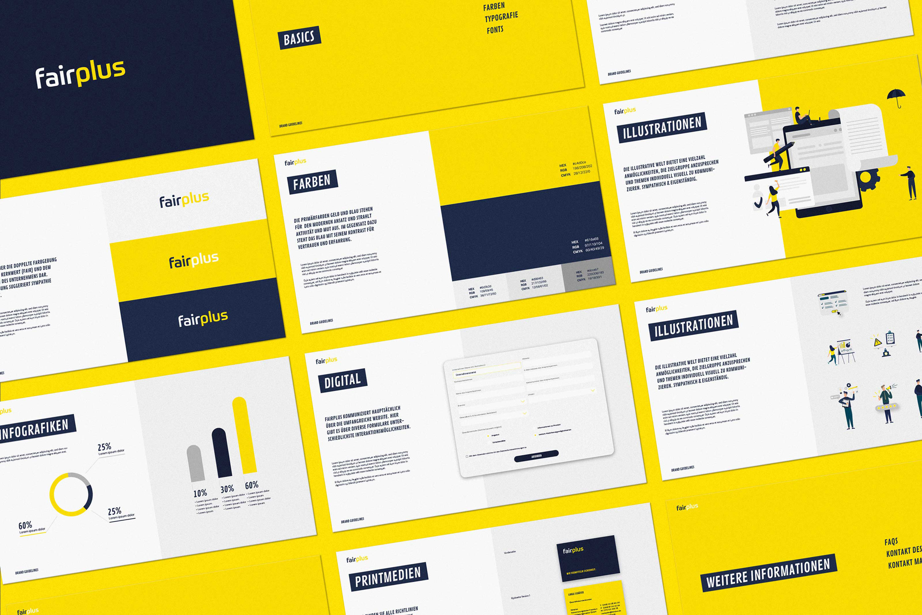
Why does it look the way it looks: The illustrations offer the possibility to communicate in a sympathetic and flexible way in all touch-points, no matter what the topic is. The colours symbolise freshness and trust, the typography appears modern, striking and likeable. Emotional appeal: With its start-up look and young professional identity, it perfectly addresses the young, future-oriented target group in the start-up and tech industry. Execution: Fairplus primarily uses digital touch-points for communication with its customers. Here, the illustrations are individualised according to the topic and combined with the two-line headlines. Function: The user approach is very direct and easy to understand in all touch-poinnts thanks to the individual illustrations and the two-line headline. The customer quickly finds his way around and is encouraged to interact on the website by various interactive modules.
Differentiation: The visual identity enables flexible storytelling across all touch-points by using individual illustrations. The brand communicates with the highest level of competence, but exudes a fresh, modern approach that perfectly appeals to the target group in the start-up and tech sector and which opposes the dusty image of the insurance broker industry. Impact: Fairplus with its young and digital identity reaches a target group, which operates in the range of Start-Ups and Tech and which has new needs of an insurance consultancy. The idea of fairplus will be sustainably successful, because it combines the need of companies for personal consulting with technical know-how and future proof technical solutions.
CREDIT
- Agency/Creative: new office
- Article Title: Brand Design for Tech-Insurance Consulting Company Fairplus by New Office
- Organisation/Entity: Agency, Published Commercial Design
- Project Type: Identity
- Agency/Creative Country: Germany
- Market Region: Europe
- Project Deliverables: Brand Creation, Brand Guidelines, Brand Identity, Brand Strategy, Brand World, Branding, Graphic Design
- Industry: Information


