


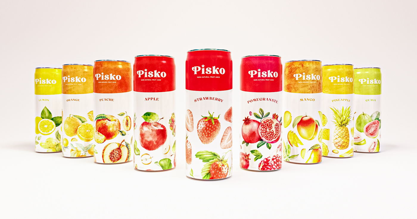
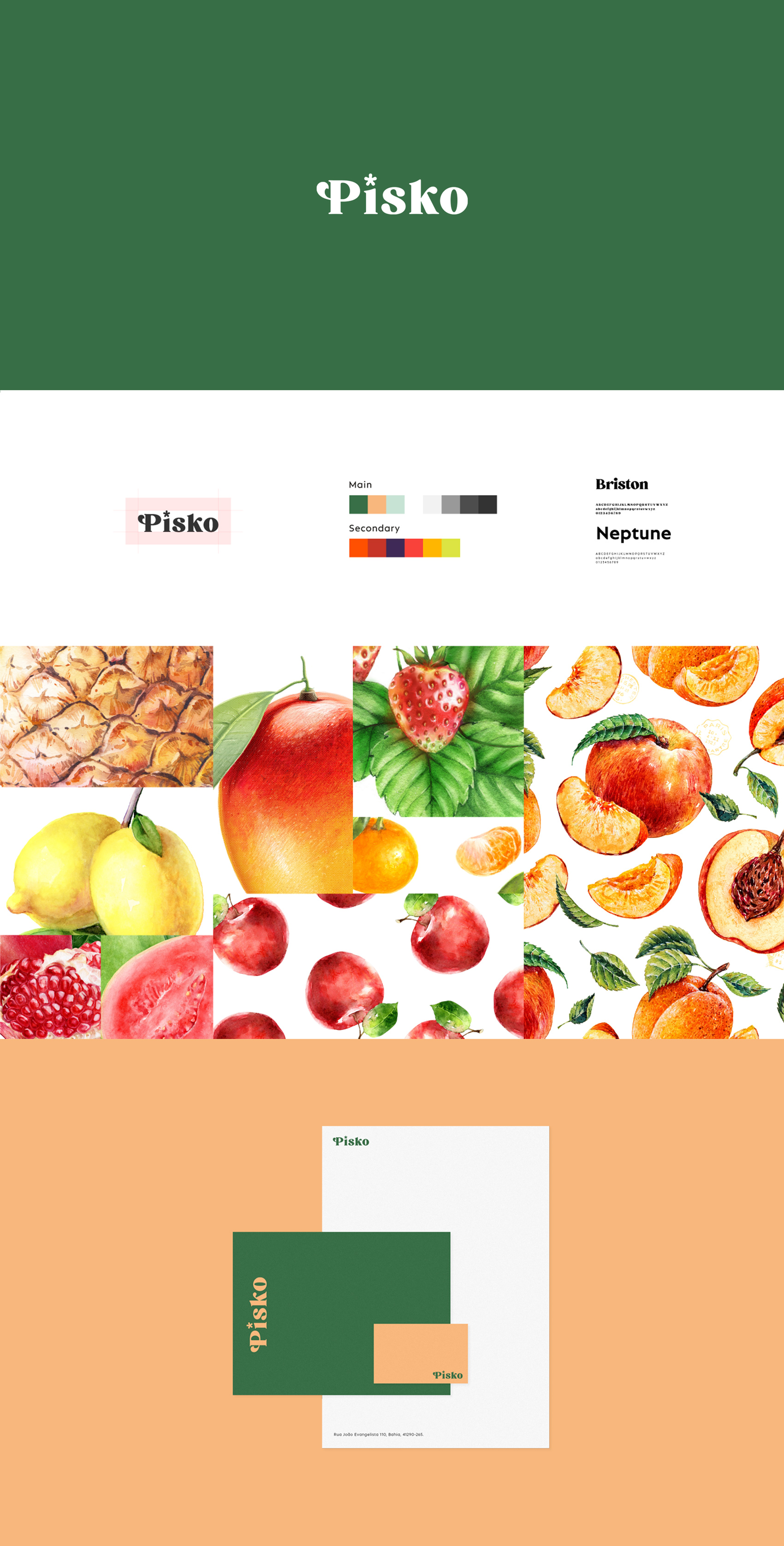
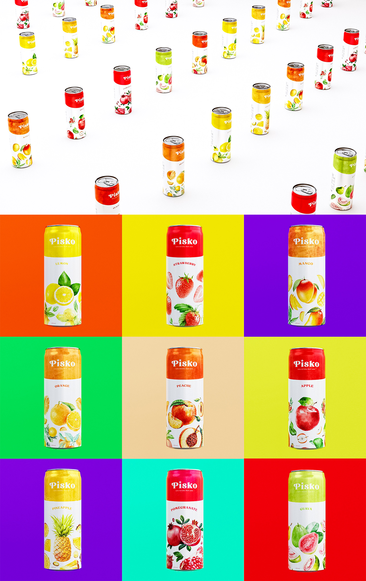
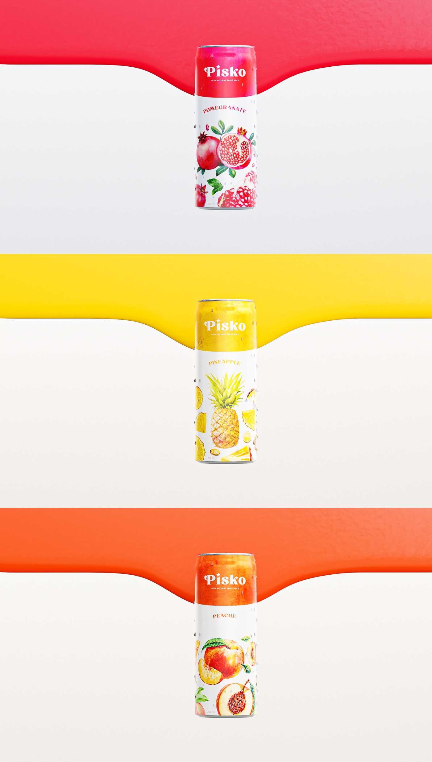
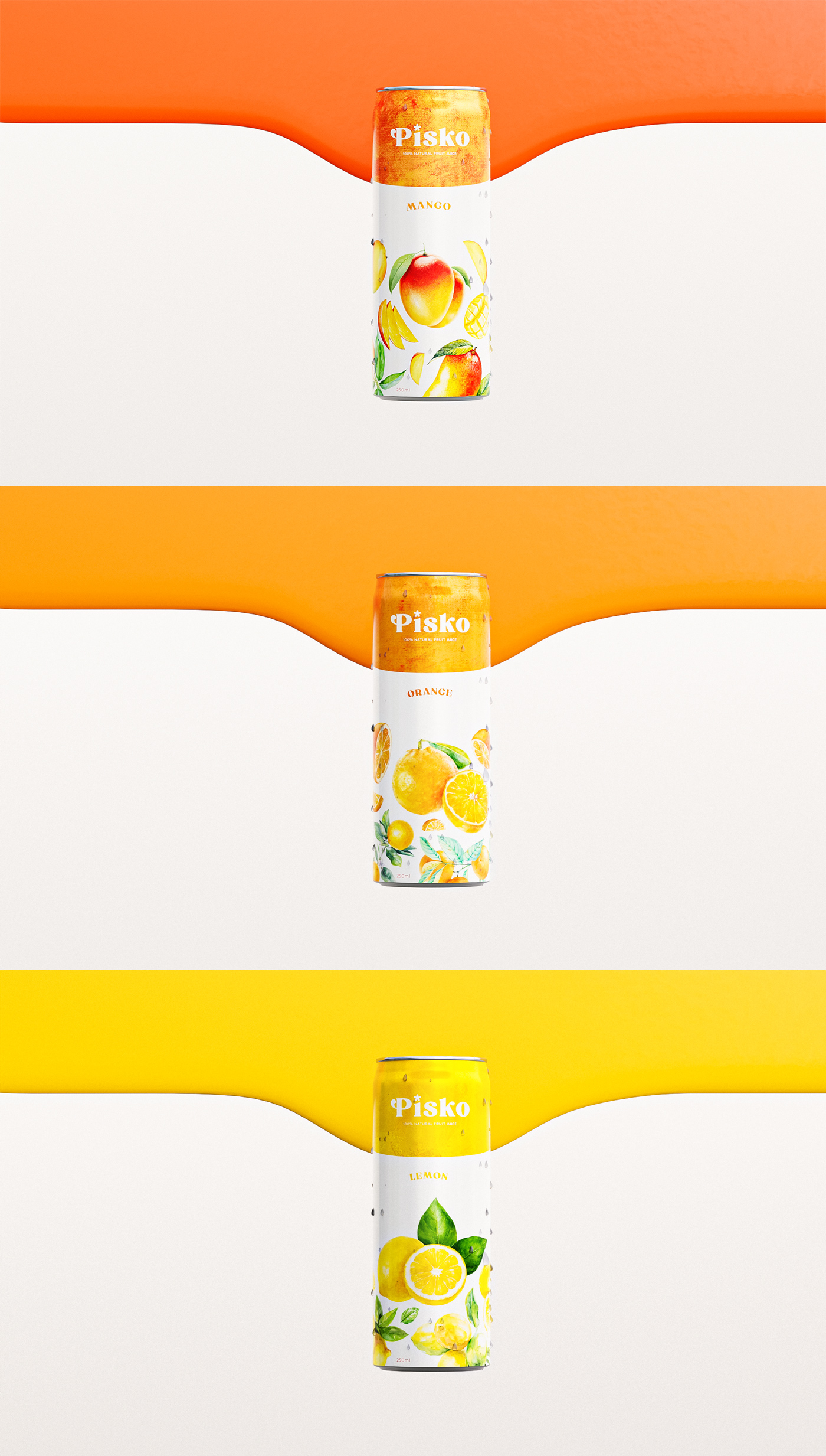
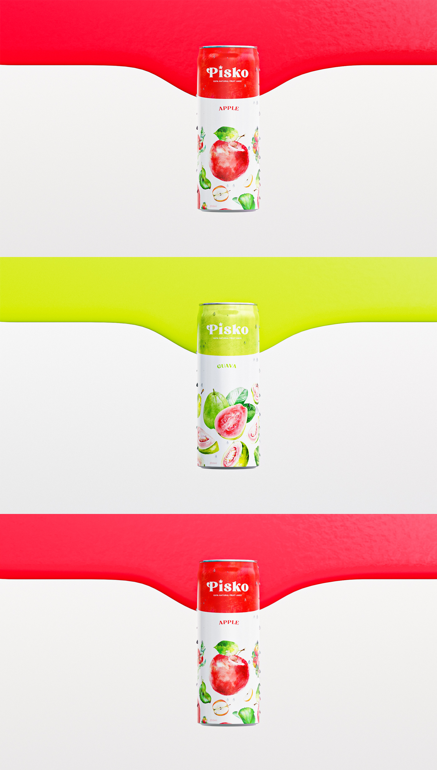
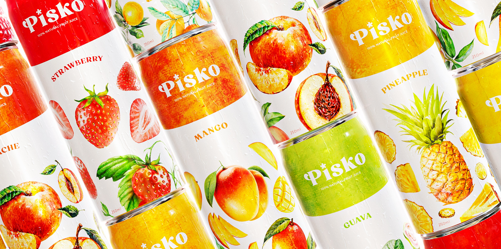
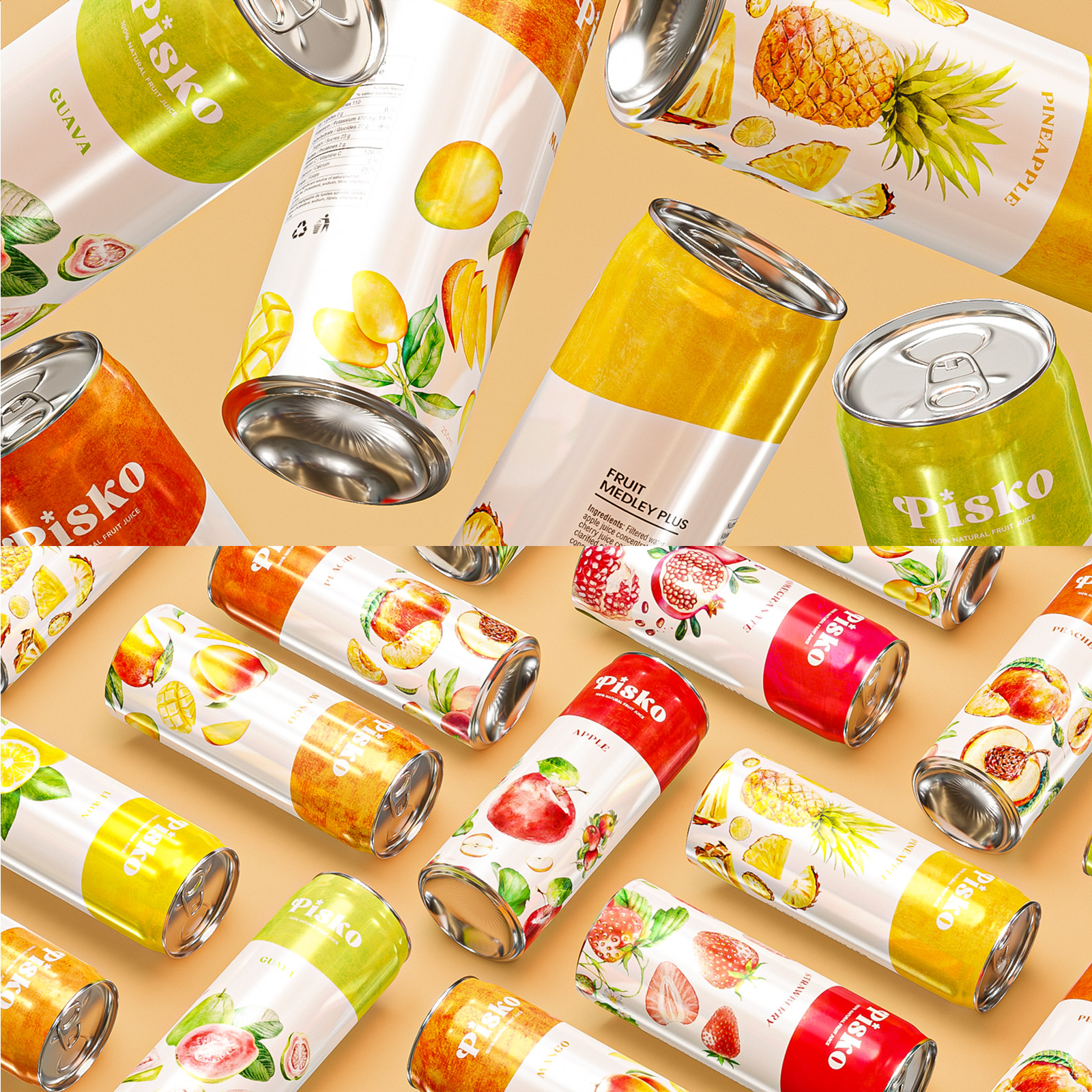
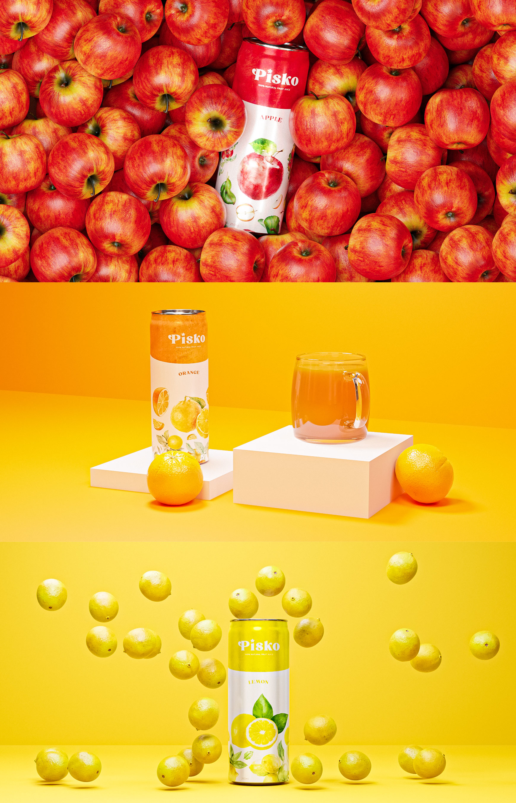
Pisko is premium brand of 100% fresh juices and nectars and continuously explorer into new categories of drinks. Beside the Fruit Juices. We always put quality and reputation in the first place to lead us go ahead. The name is derived from the name of the peach tree in the Italian language. La pesca, il pesco – Peach, peach tree The basic colour was based on nature and one of the shades of the peach colour, which suggests nature and at the same time the colour of the name from which the name of the company is derived, and the other colours differed according to the different flavours such as red for apple, yellow for lemon and green for guava.
The design of the can was based on the color of each separate flavor and then a drawing of the flavor to draw attention to the type of flavor without reading the name, and the color at the top for speed of observation because the color in the mind is associated with the type of flavor and makes it easy to identify Pisko brand.
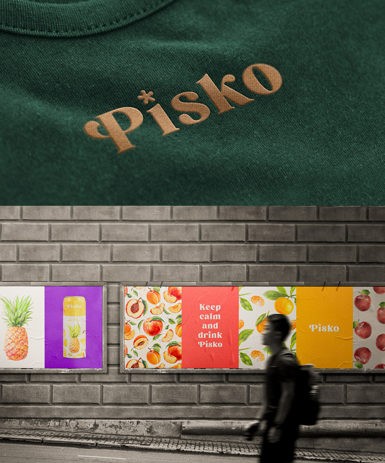
The logo is based on a contemporary font and the fruit sign is based on the second letter. The choice of fonts differed for two fonts, the first being Briston for the titles and the second being Neptune for the content. The entire branding is inspired by the raw and natural look and feels which we have achieved visually by the water colours style. The design of the site was based on simplicity, some colors with simple words and a simple presentation of flavours
CREDIT
- Agency/Creative: Hazem Mahdy
- Article Title: Brand Design for Pisko Juices
- Organisation/Entity: Freelance
- Project Type: Packaging
- Project Status: Published
- Agency/Creative Country: United Kingdom
- Agency/Creative City: Egypt
- Market Region: Europe, Middle East
- Project Deliverables: 2D Design, 3D Art, 3D Motion, Advertising, Brand Design, Brand Identity, Logo Design
- Format: Can
- Substrate: Metal
- Industry: Food/Beverage
- Keywords: Braning, minimal, logo, marine, supply, sail, Soda can, Can, Packaging
-
Credits:
Art Director & Designer: Hazem Mahdy


