


Complete brand strategy and design for Nextus, a native digital platform that connects audio-visuals, education, and technology.
This native documentary on demand service with educational purposes required our strategy team to undergo a full immersion within the vision of the new brand.
Once the internal interviews and the competitor benchmark were fully digested, they configurated a complete brand platform that set up the core essentials of the new brand: its positioning, personality traits, values, purpose, etc.
Afterwards, we defined the Nextus’ claim, ‘learning by documentaries’, and naming, which refers to both students and teachers finding and becoming their next greater version of themselves.
It uses the pronoun ‘us’ as it’s a global brand that aspires to create e-learning consciousness among the student-teacher community and build a better future for all of us.
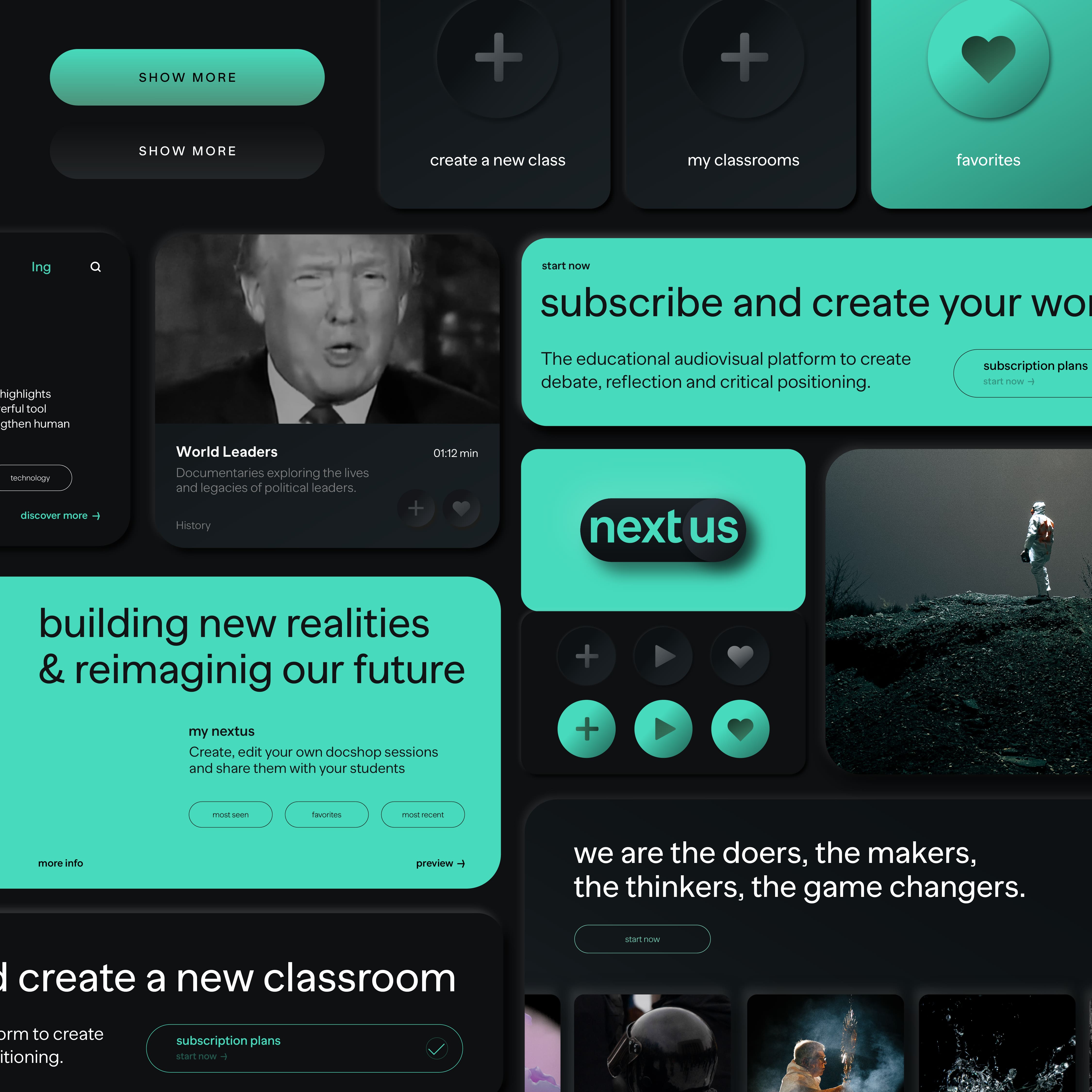
When the strategy phase was completed, it was our creative team’s turn to develop Nextus’ visual identity. The result conveys its digital native soul through a proprietary use of codes, shapes, and colours characteristic from the digital universe.
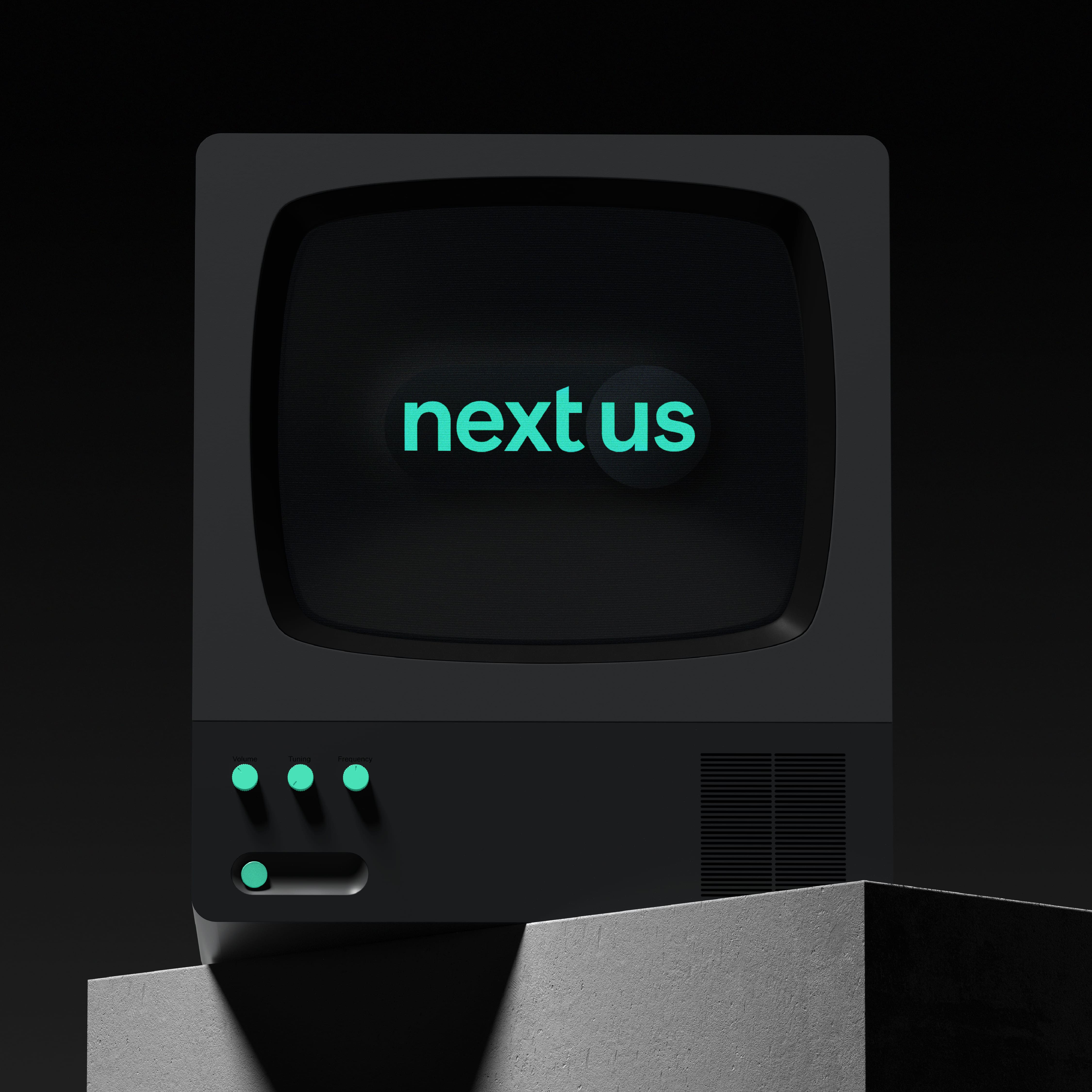
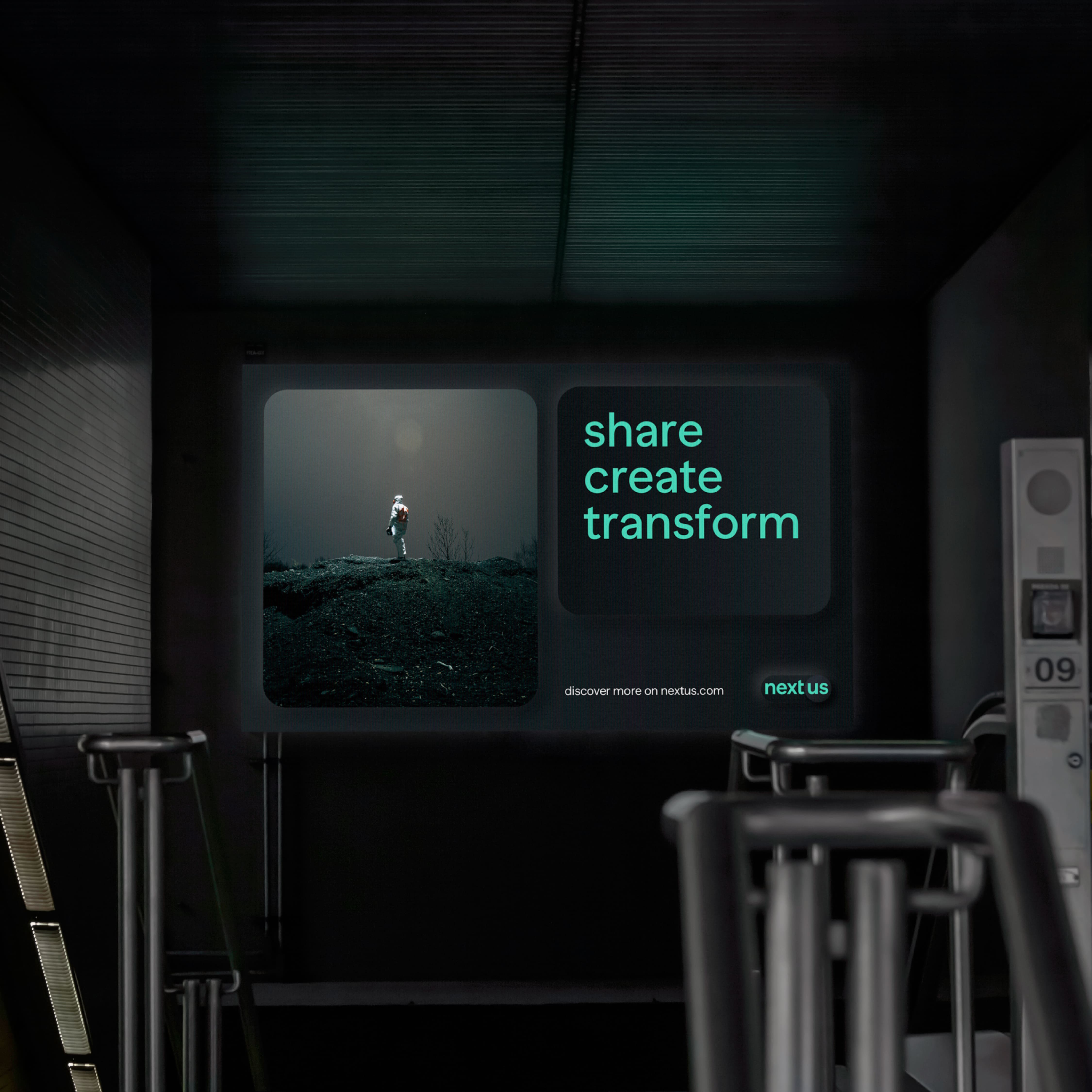
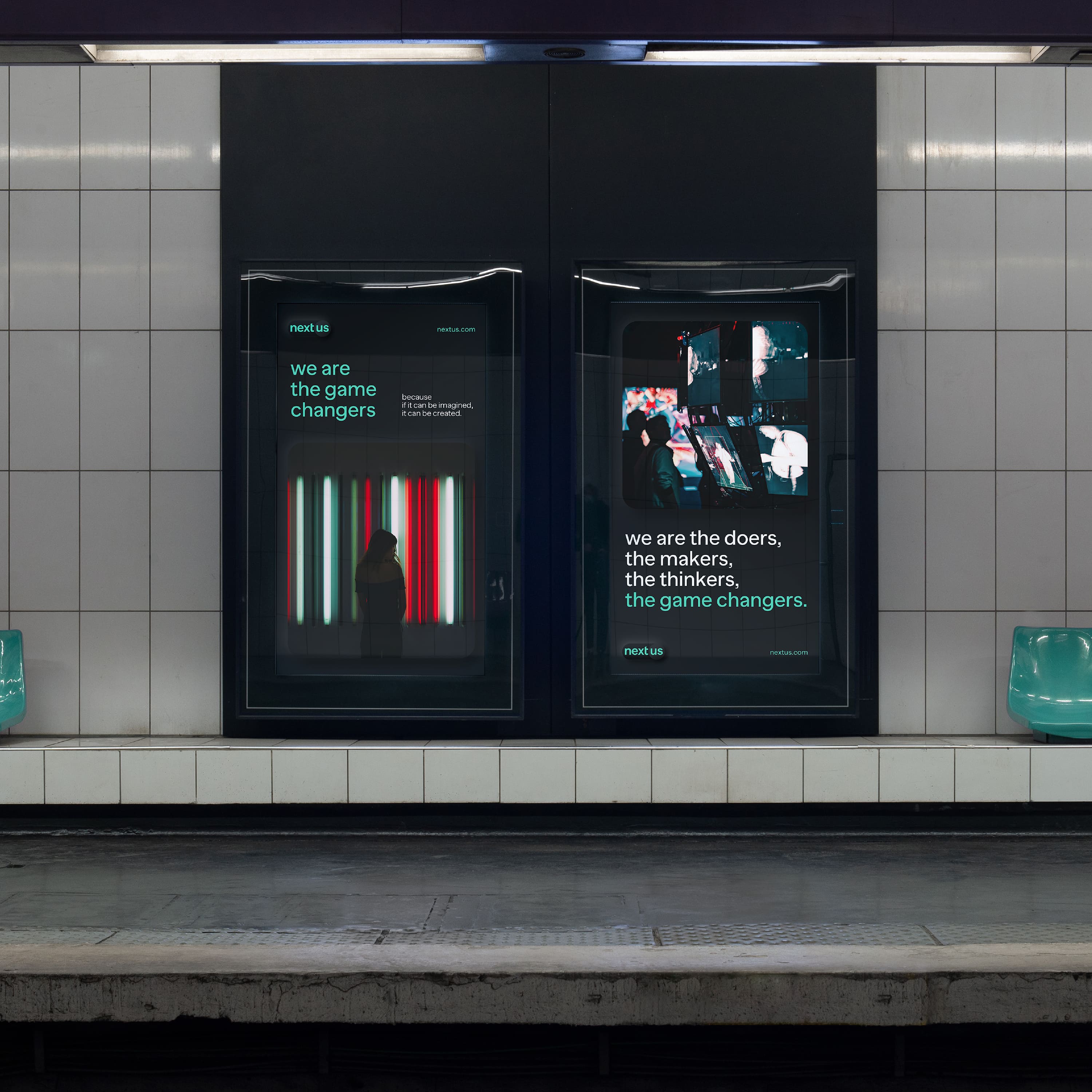
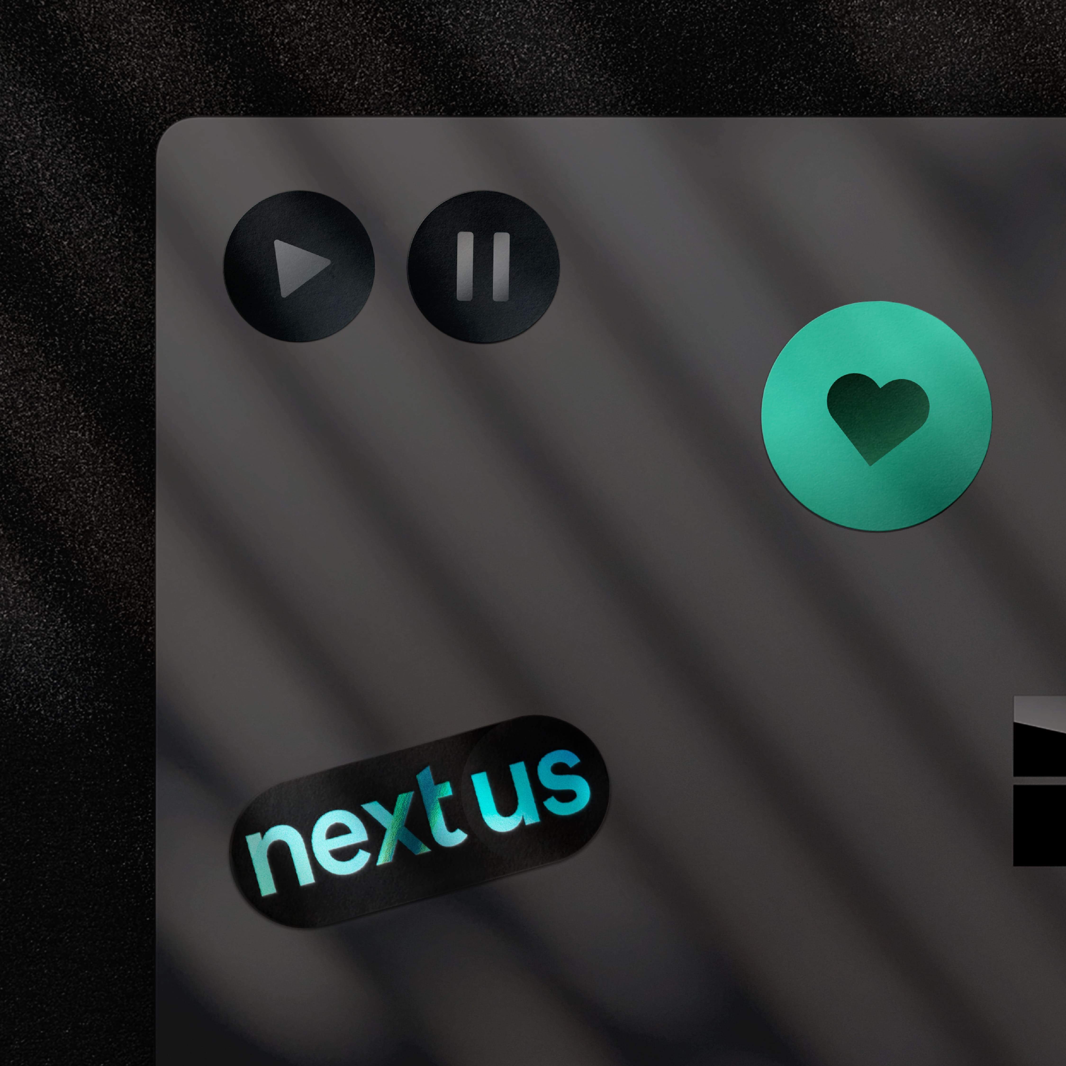
The visual language was heavily inspired by Neumorphism, an on-trend UX/UI design style that focuses on delivering soft and accessible interface through recognizable shapes, cards, slides, and buttons, but most importantly through the colour palette. It features a creative interface design by employing recognizable round shapes as buttons and the inclusion of small widget-like elements that flow through the screen and give the brand a user-centric, digital, and innovative personality.
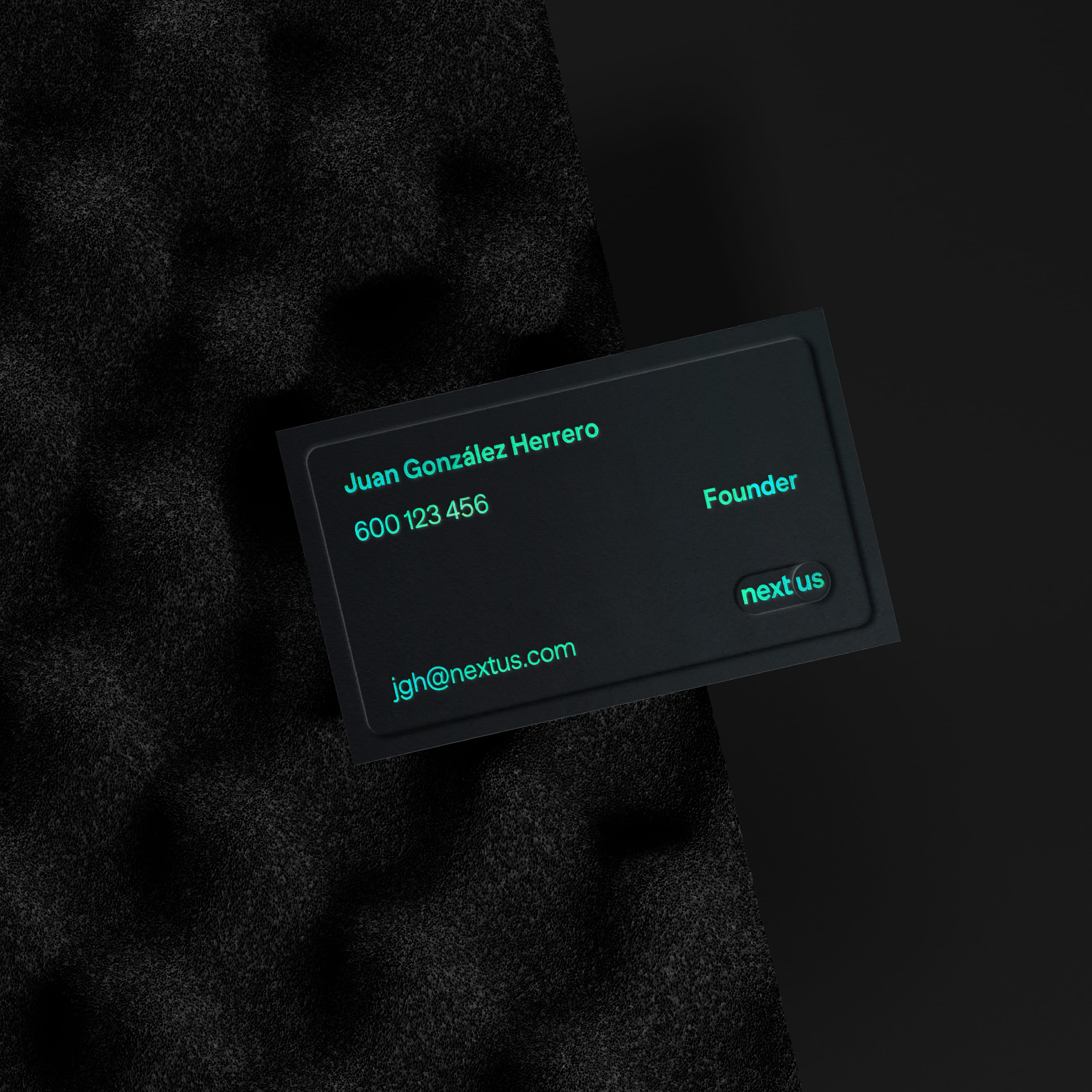
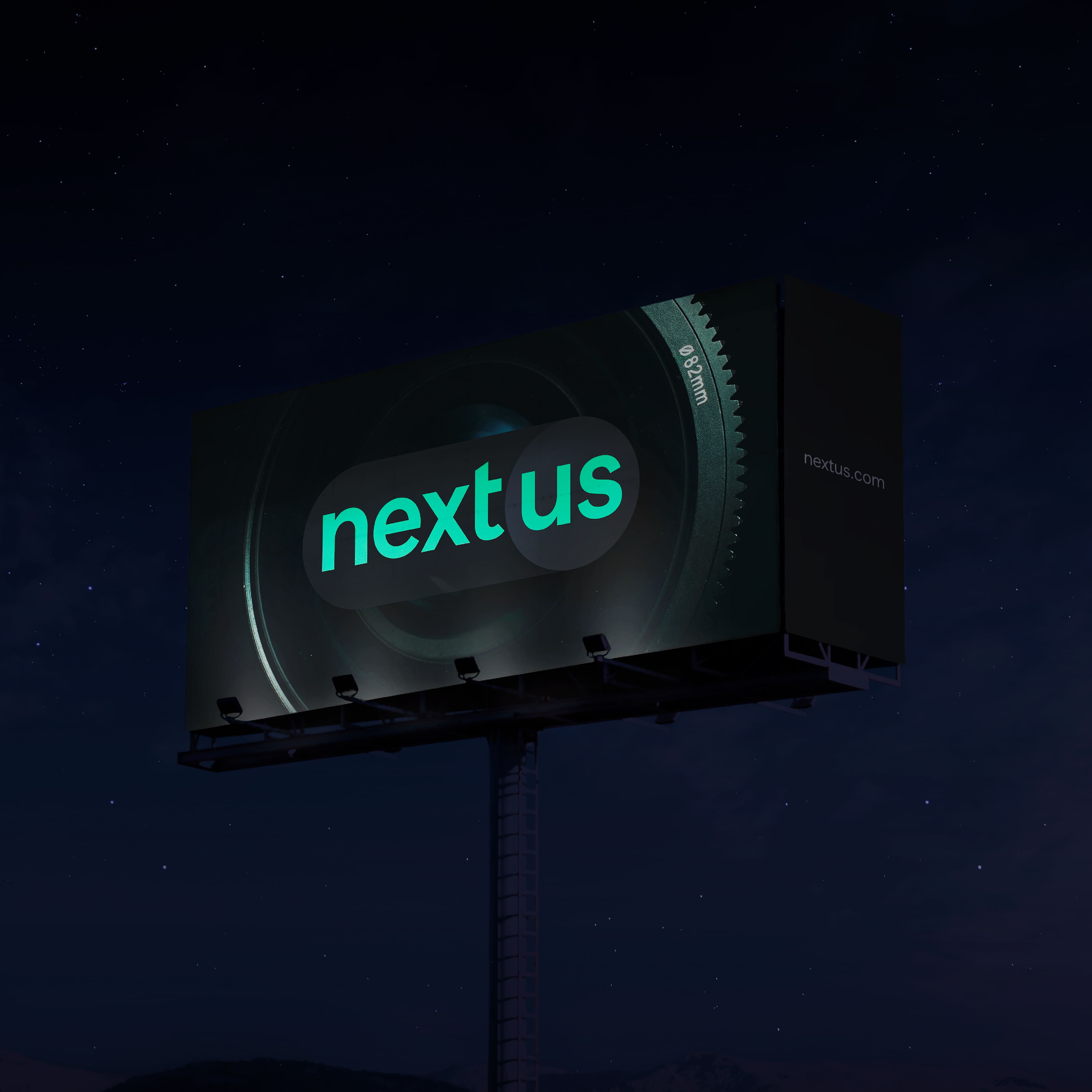
Nextus’ web interface presents a harmonic chromatism with slight contrasts to create objects, distribute light and information, and provide depth. Its use of the colours white, green, and black create a unique look that feels accessible and familiar, vibrant and digital, and comfortable to read, respectively.
The logo itself represents a standard switch within the digital universe and serves as a visual representation of the learning and consciousness shift that the platform aims to achieve with students worldwide.
CREDIT
- Agency/Creative: Morillas
- Article Title: Brand Design for Nextus – Learning by Documentaries by Morillas
- Organisation/Entity: Agency
- Project Type: Identity
- Project Status: Published
- Agency/Creative Country: Spain
- Agency/Creative City: Morillas
- Market Region: Europe
- Project Deliverables: Brand Identity, Brand Strategy, Design
- Industry: Technology
- Keywords: #morillas #createsomethingextraordinary #brandstrategy #visualidentity #brandidentity #branding #brand #nextus #learning #elearning #education #digitalbranding #webdesign #neumorphism #ux #ui #uxdesign #uidesign #graphicdesign #logo #design


