Cerrado is a plant formation biome that has great biodiversity. Known as the Brazilian savanna, it is the second largest biome in Brazil and South America.
The Casa do Cerrado Cooperative wants to contribute to the local economy, for regeneration of the biome’s ecosystem services, the agroecological transition to sustainable food systems, and the defense of the local population and their territories.
The cooperative’s main objective is to promote the preservation of the Cerrado by carrying out educational, scientific, and cultural activities, providing consulting services, developing and executing projects in the social, environmental and cultural areas, and processing and marketing products from agroextractivism and family agricultural production.
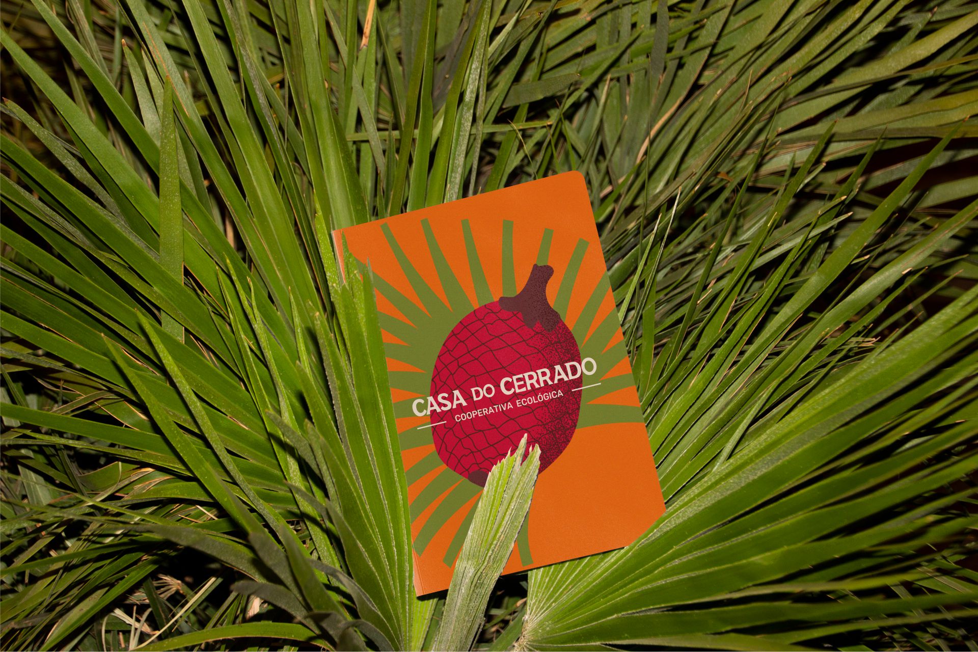
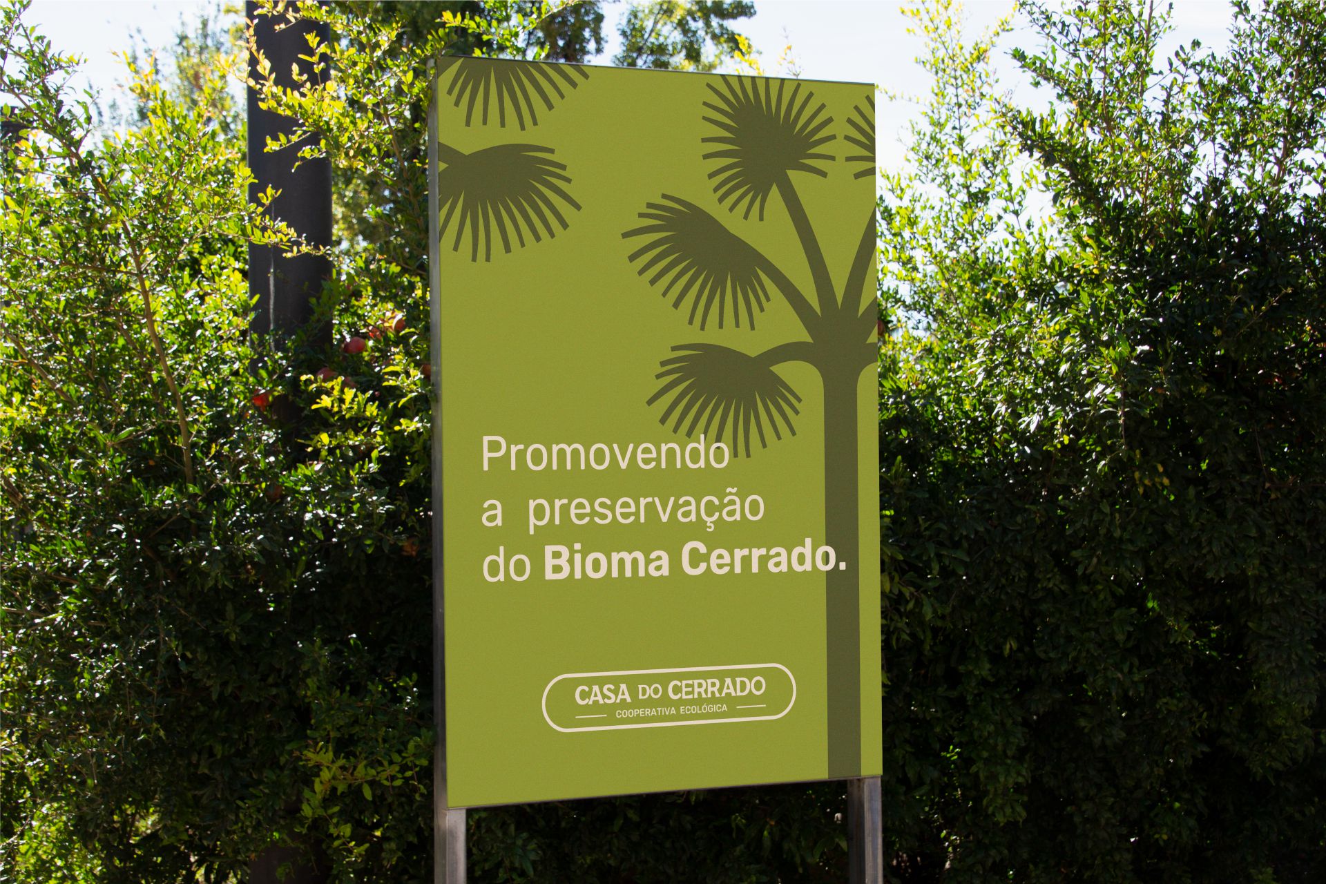
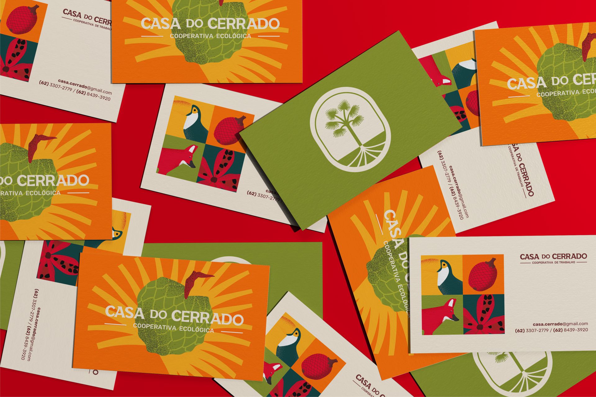
The inspiration for creating the symbol came from Buriti. This palm tree, so abundant in this great Brazilian biome, is also known as the Tree of Life and translates very well the concept of cooperativism and balance, that guide the principles of Casa do Cerrado.
From the buriti tree, everything can be used, from the fruits, rich in vitamins and minerals, to leaves, stems, and trunk for crafts, furniture, and constructions.
The roots of this plant were also an important part of the concept, deep and resistant to changes in seasonal conditions, remaining firm in its purpose of conservation even in the most adverse situations.
The logo typography was created thinking about conveying a simpler look, with irregular curves translating the natural aspect of the brand.
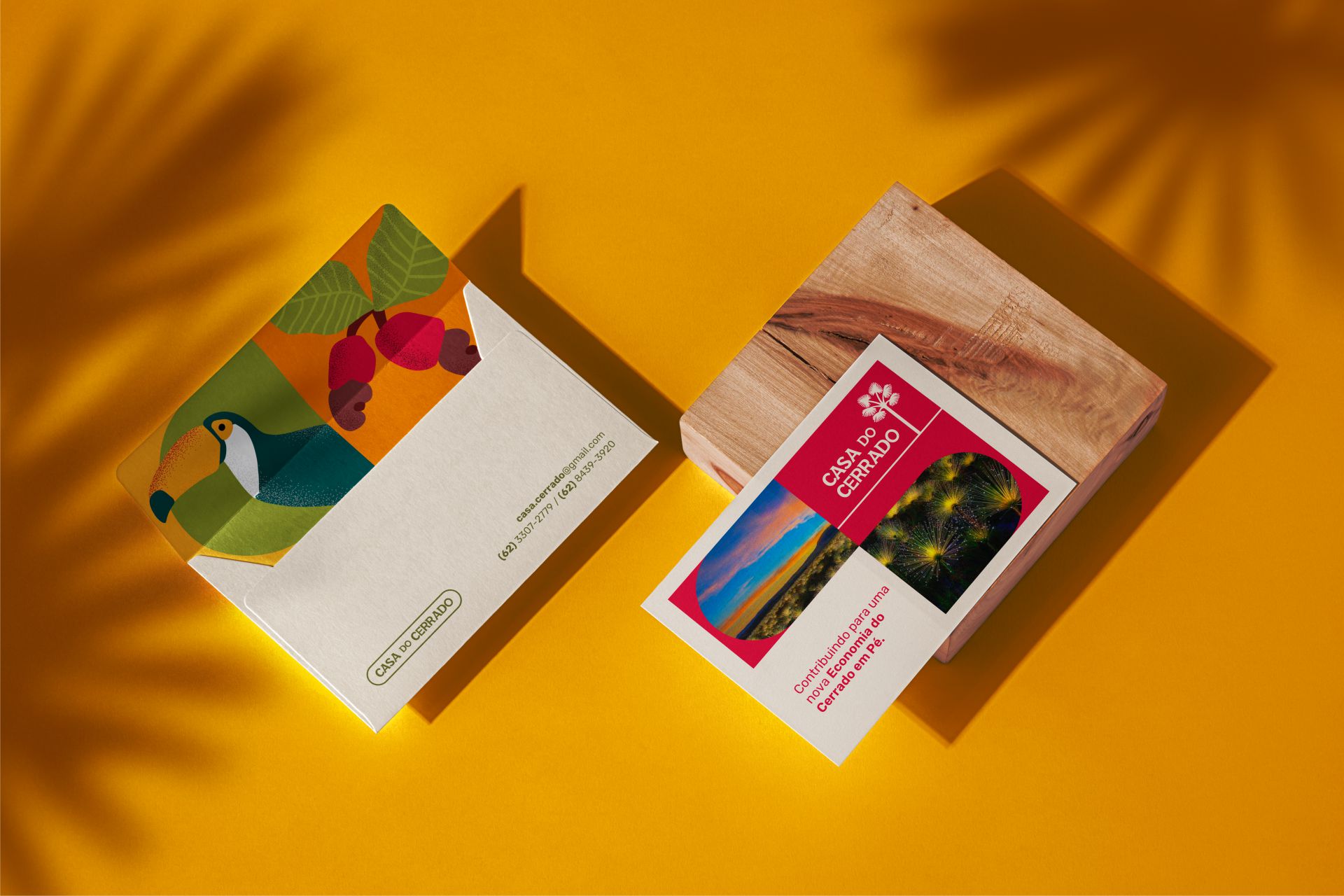
The color palette was chosen in order to match the brand’s characteristics, bringing the richness of the typical coloring of this biome, Cerrado.
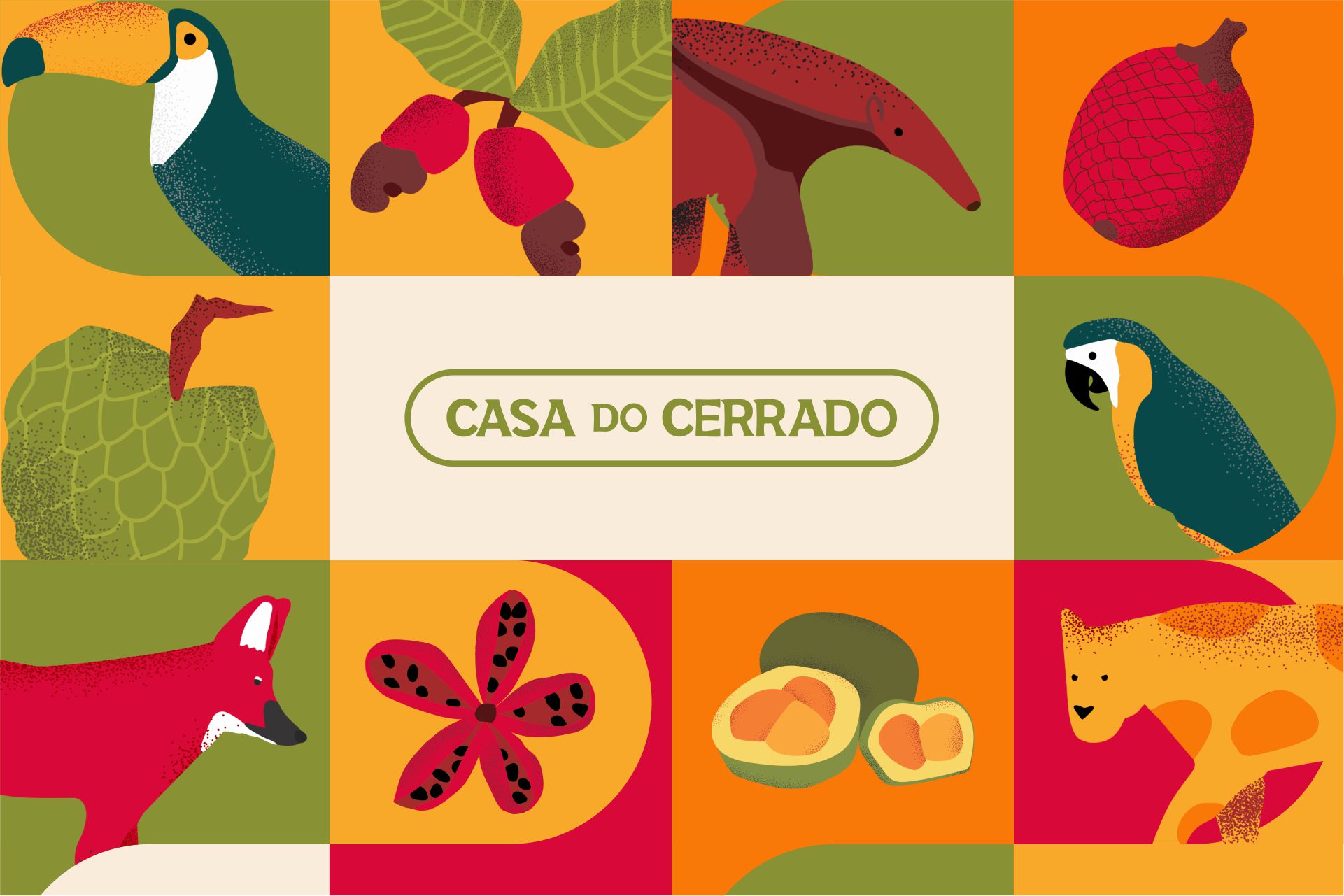
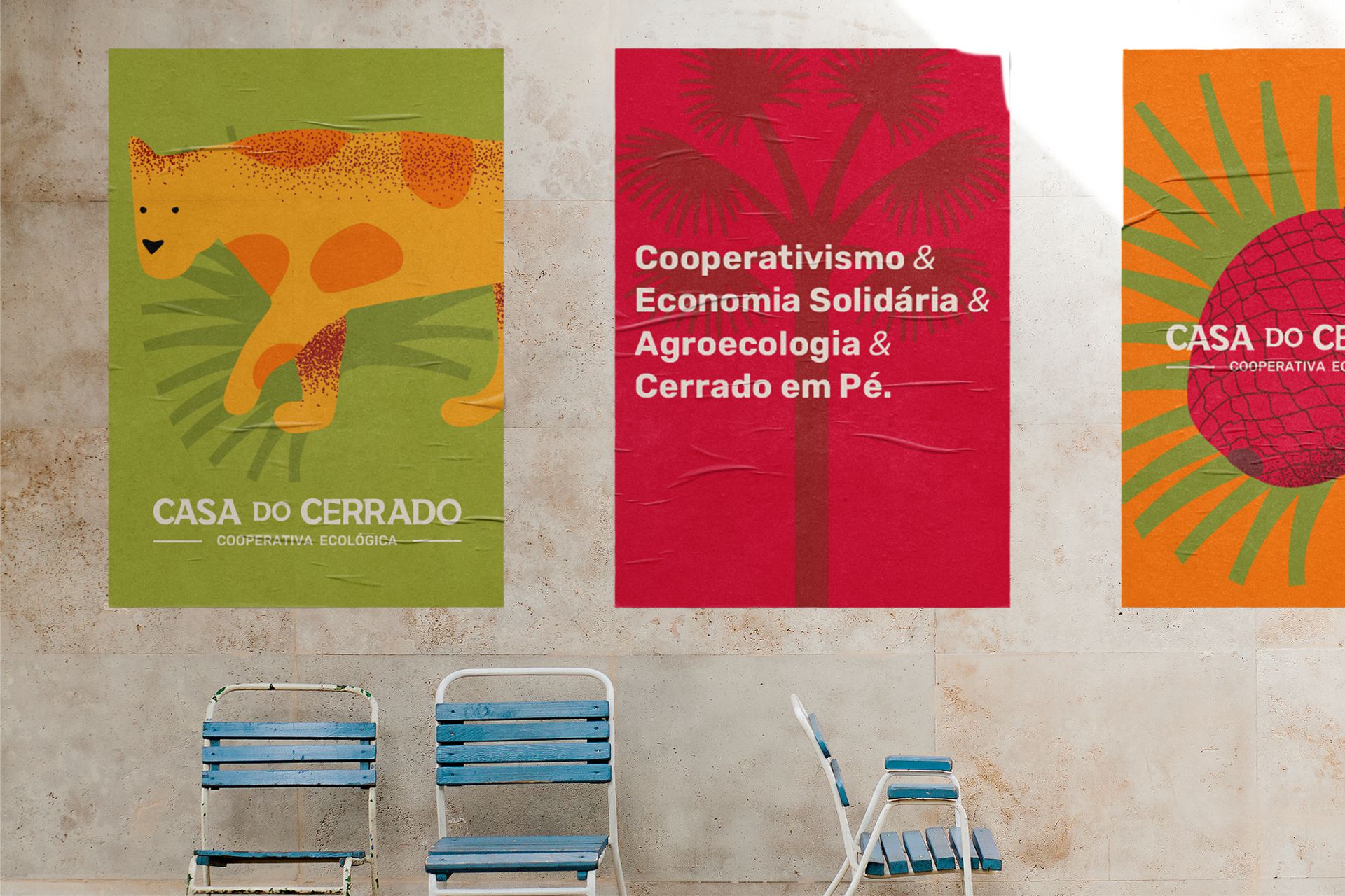
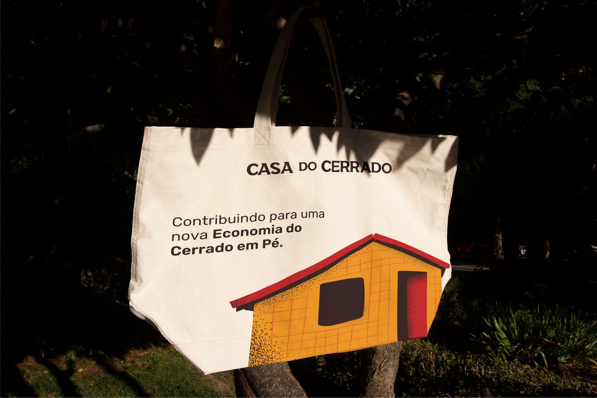
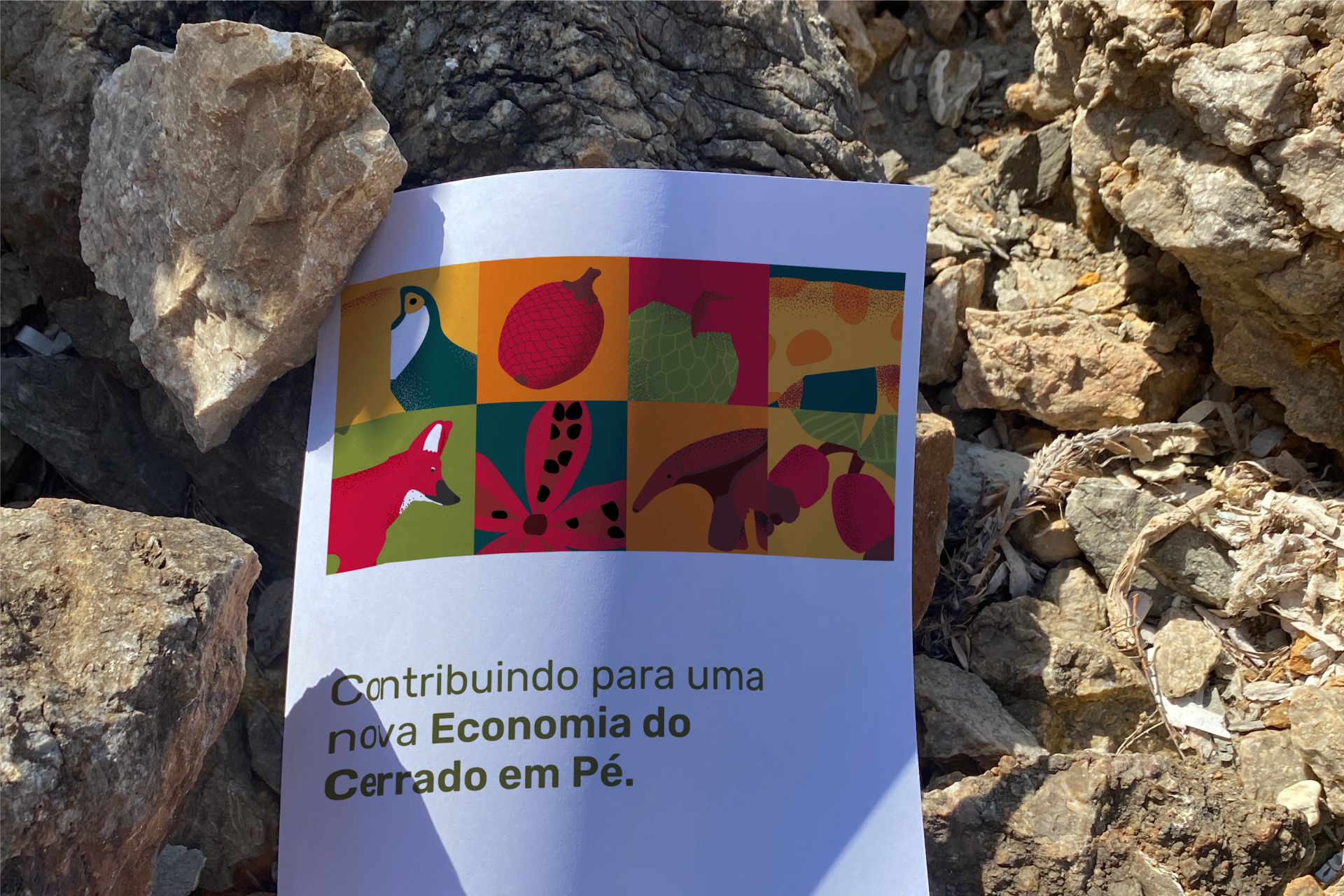
As graphic support elements, exclusive illustrations were drawn of some representatives of the fauna (maned wolf, jaguar, giant anteater, canindé macaw and toucan) and fruits (xixá, pequi, cajuzinho-do-cerrado, araticum and buriti ) of the Cerrado. With an irregular and fluid design, we seek to keep the visual language more organic.
CREDIT
- Agency/Creative: Aratu Design
- Article Title: Brand Design for Casa do Cerrado
- Organisation/Entity: Freelance
- Project Type: Identity
- Project Status: Published
- Agency/Creative Country: Brazil
- Agency/Creative City: Aracaju
- Market Region: South America
- Project Deliverables: Brand Identity
- Industry: Non-Profit
- Keywords: Nature, Animals, Illustration, Colorful, Brand Identity
-
Credits:
Art Director: Arthur Rodrigues de Sena e Silva
Graphic Designer: Mayara Santos Macedo


