


Mexico, as a leading coffee country, strives to develop and improve the culture of quality coffee. In this context, a large coffee festival was created, which attracts more than 30,000 guests from all over the world and contributes to the development of the coffee industry.
As part of the Master’s program in Art Direction at the HSE Art and Design School, I was tasked with creating a visual metaphor for identifying a cultural event, in this case, a coffee festival. After doing a little research, I found that most coffee festivals in general often do not have an identity at all due to the lack of such a need and do not develop their branding, having only logos with coffee beans. Based on this, I decided that my project would not use the usual elements of coffee, and instead I decided to look for inspiration in the bright landscapes of coffee plantations from a bird’s-eye view.
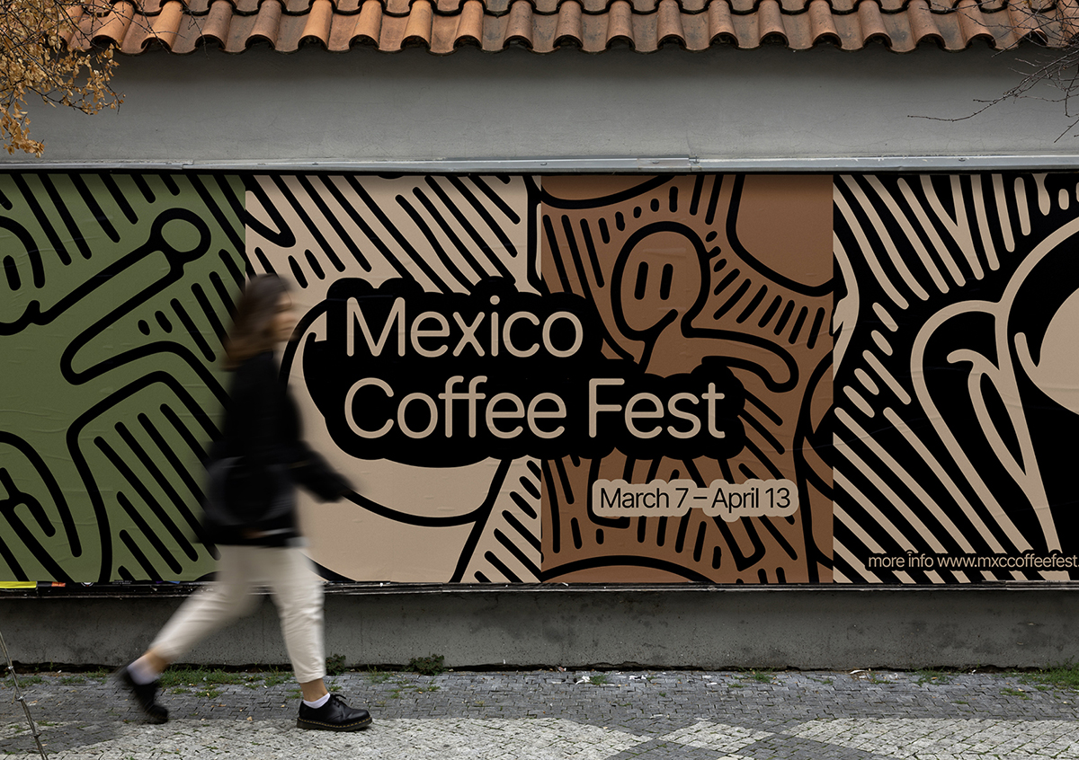
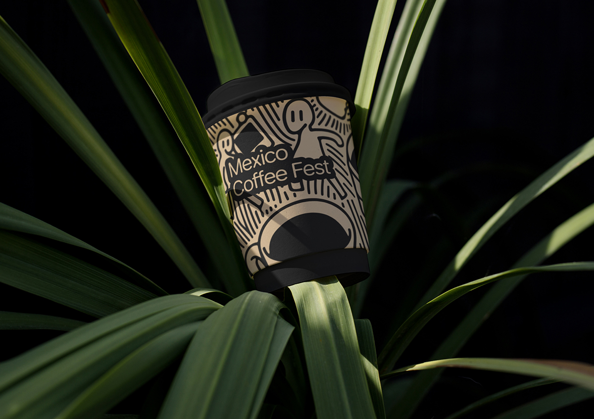
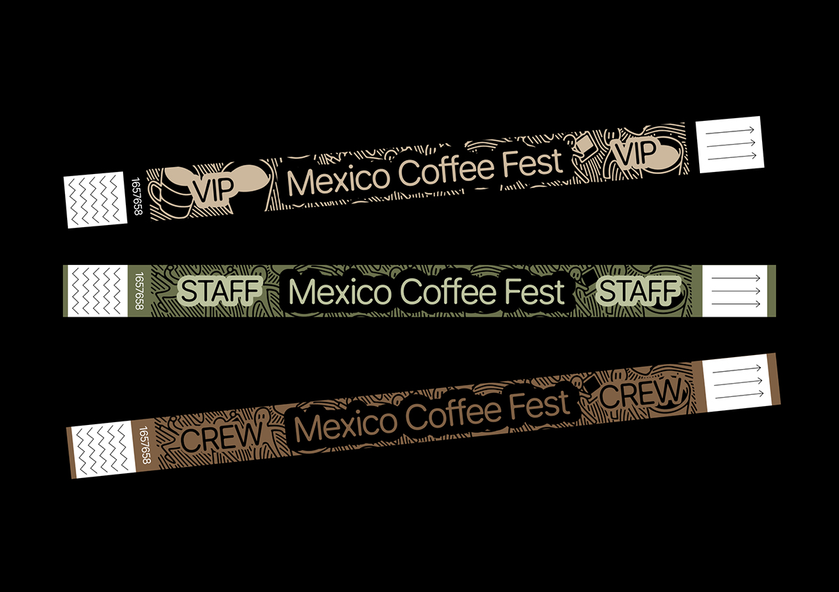
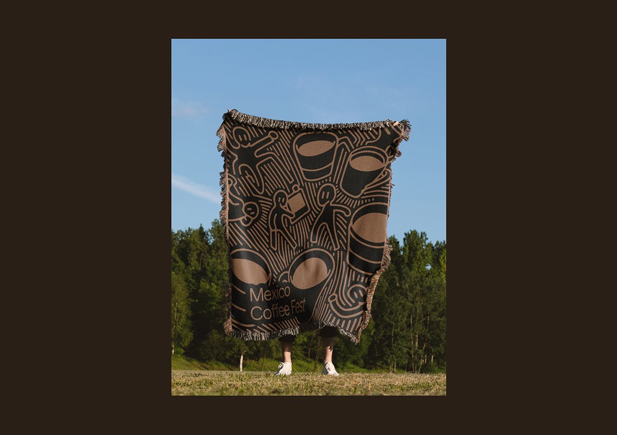
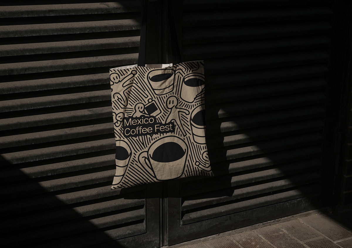
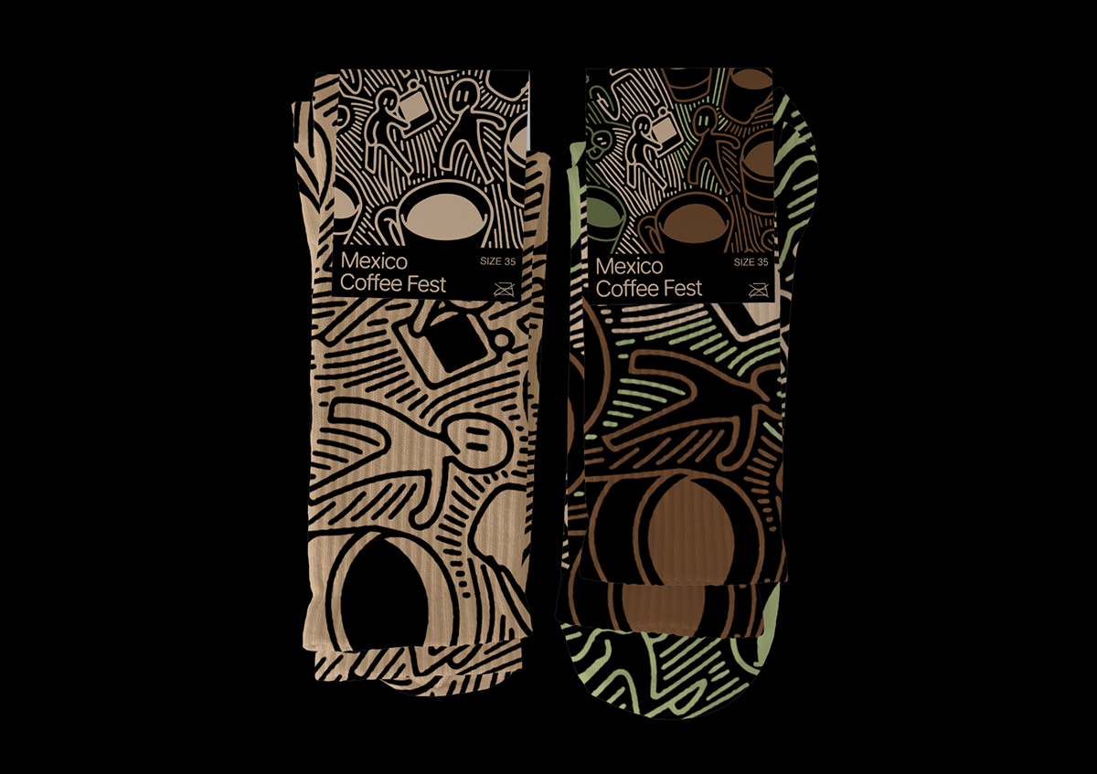
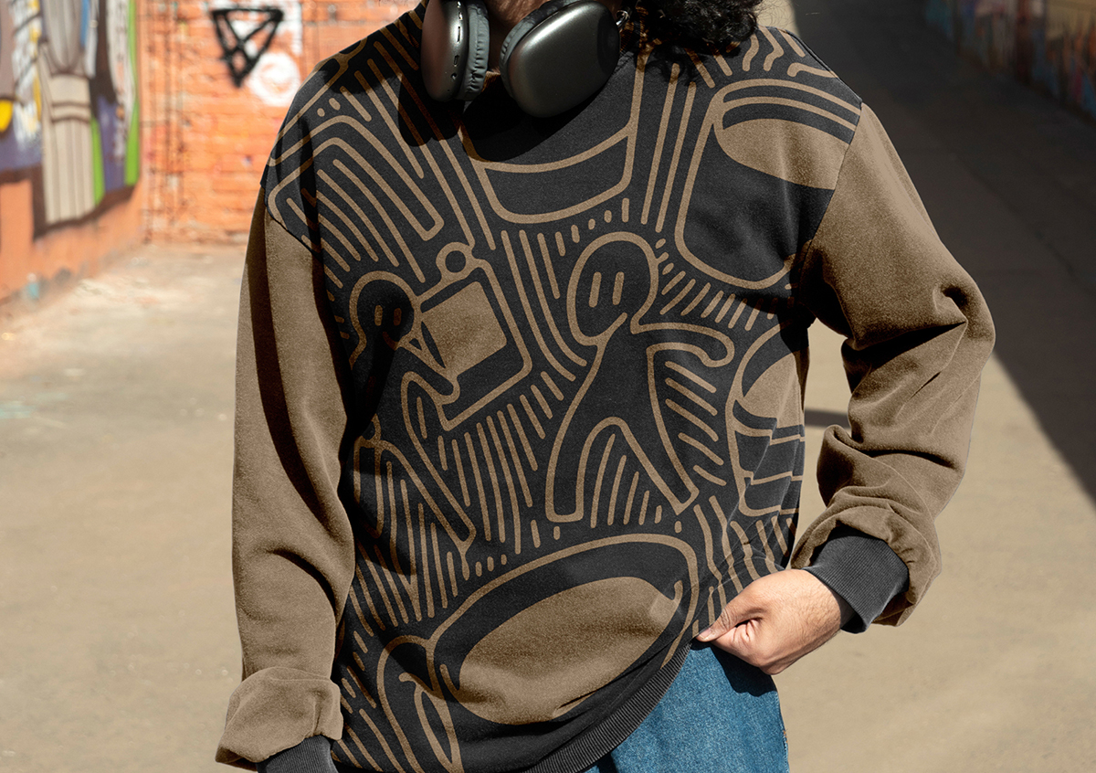
I chose the linocut style as a metaphor for this project. The graphic style of the Mexican Coffee Festival is carefully cut and outlined lines that create a sense of depth and texture, reminiscent of traditional Mexican prints. This style prevails in the design of posters, logos, banners, merch and other elements of the festival. The black contours are enlivened by a pleasant background of shades of brown and green, creating an atmosphere of warmth and comfort. This style with laconic and restrained colors reflects the Mexican coffee culture. Due to this visual approach, the style of the festival creates a magical atmosphere in which participants can plunge into the history and culture of coffee.
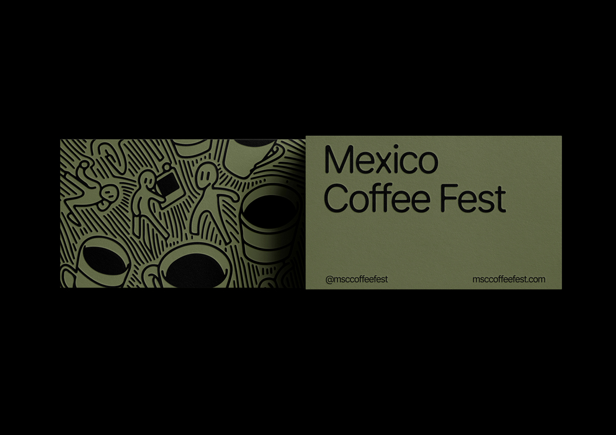
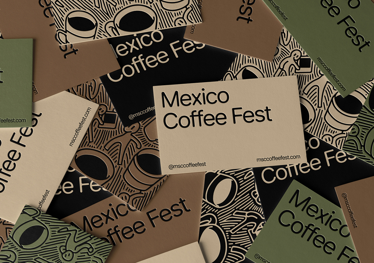
Rounded contours are also visible in the logo, repeating the thickness and smoothness of linocut transitions in the pattern. These elements are connected to each other, at the same time the logo looks modern and international. On business cards, I used debossing, which deepens the elements of the drawing and the logo itself, which also gives the atmosphere of linocut.
CREDIT
- Agency/Creative: Ildar Garifullin
- Article Title: Brand Design Concept for Mexico Coffee Fest
- Organisation/Entity: Student
- Project Type: Identity
- Project Status: Published
- Agency/Creative Country: Russia
- Agency/Creative City: Moscow
- Market Region: South America
- Project Deliverables: Brand Design, Brand Identity, Identity System, Illustration
- Industry: Food/Beverage
- Keywords: brand design, brand identity, identity system, illustration
-
Credits:
Ildar Garifullin: Ildar Garifullin
Tutor: Leonid Slavin


