


Once a year, the company “Rubankov” organizes the largest carpentry festival in the country, which attracts the best craftsmen who teach beginners carpentry.
The main task of the festival is to revive the carpenter’s profession, make it popular. Unfortunately, the festival lacks a recognizable graphic style, so I decided to create a system that would work with different graphic elements.
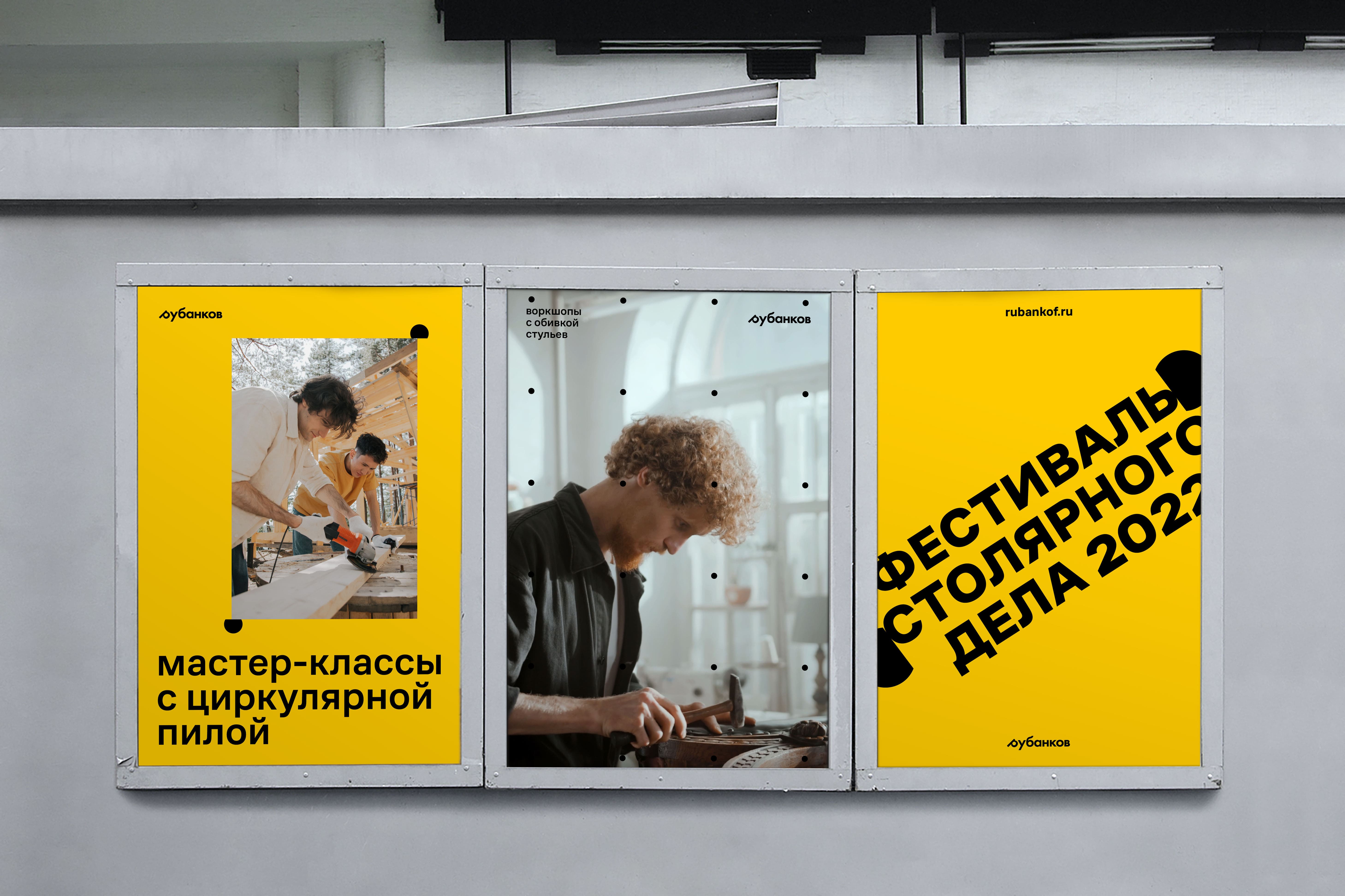
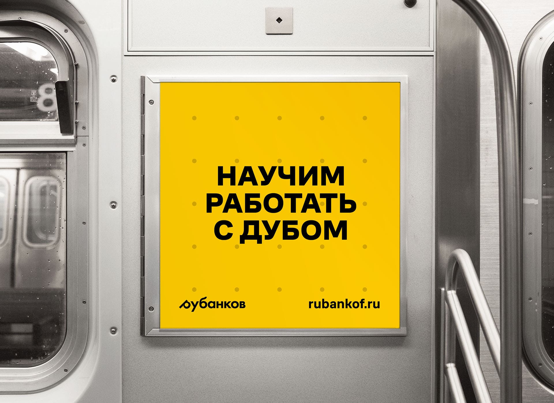
First of all, it was worth considering that wooden products can be completely different: from funny toys for children to large oak chests of drawers. Therefore, it was necessary to find colors, font and graphic language that would be clean, but recognizable.
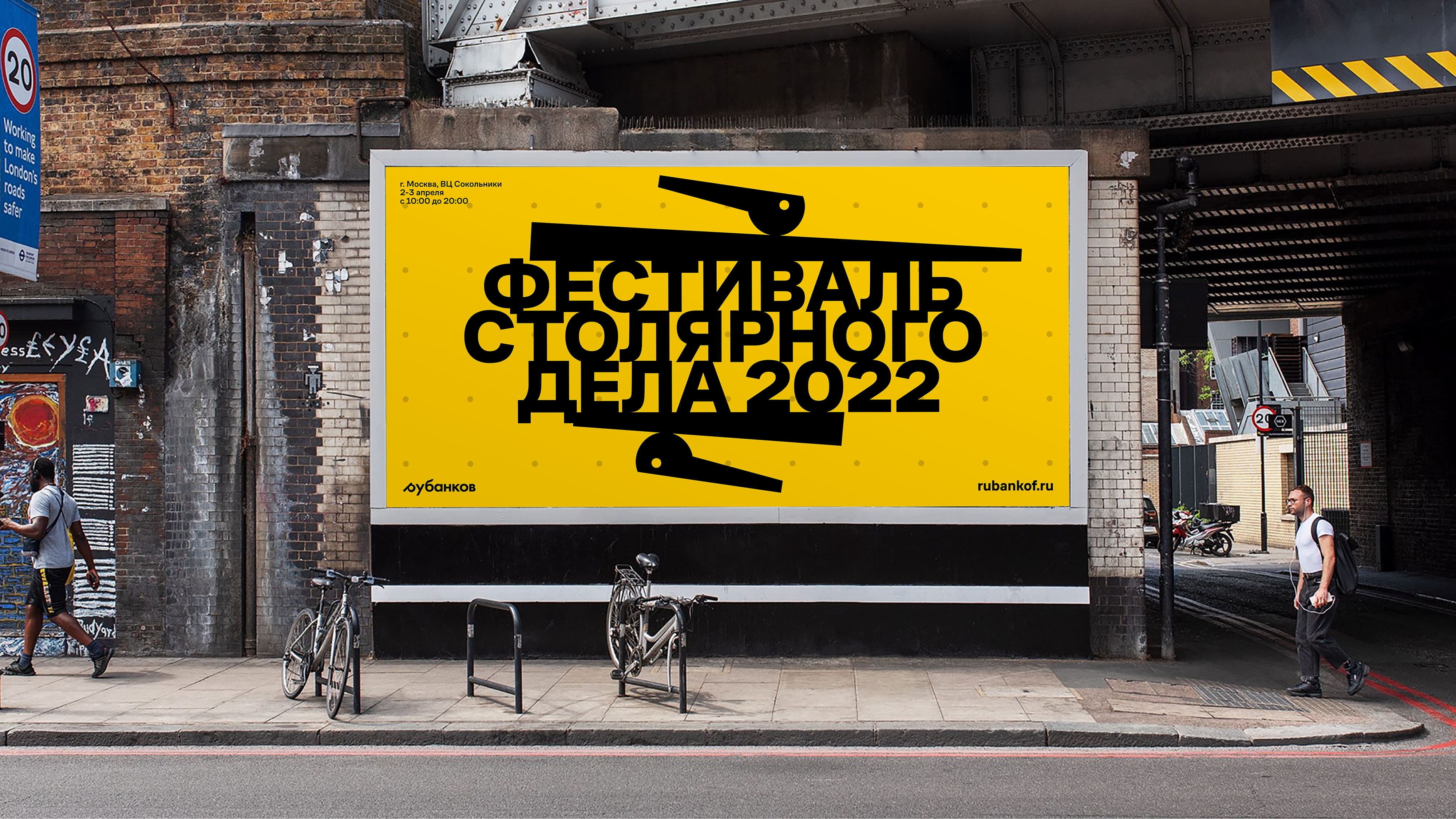
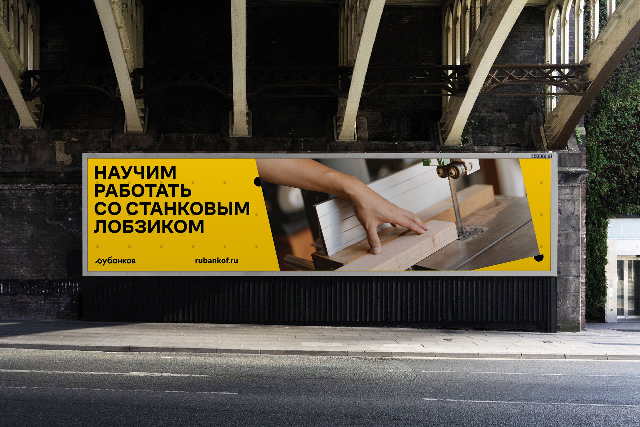
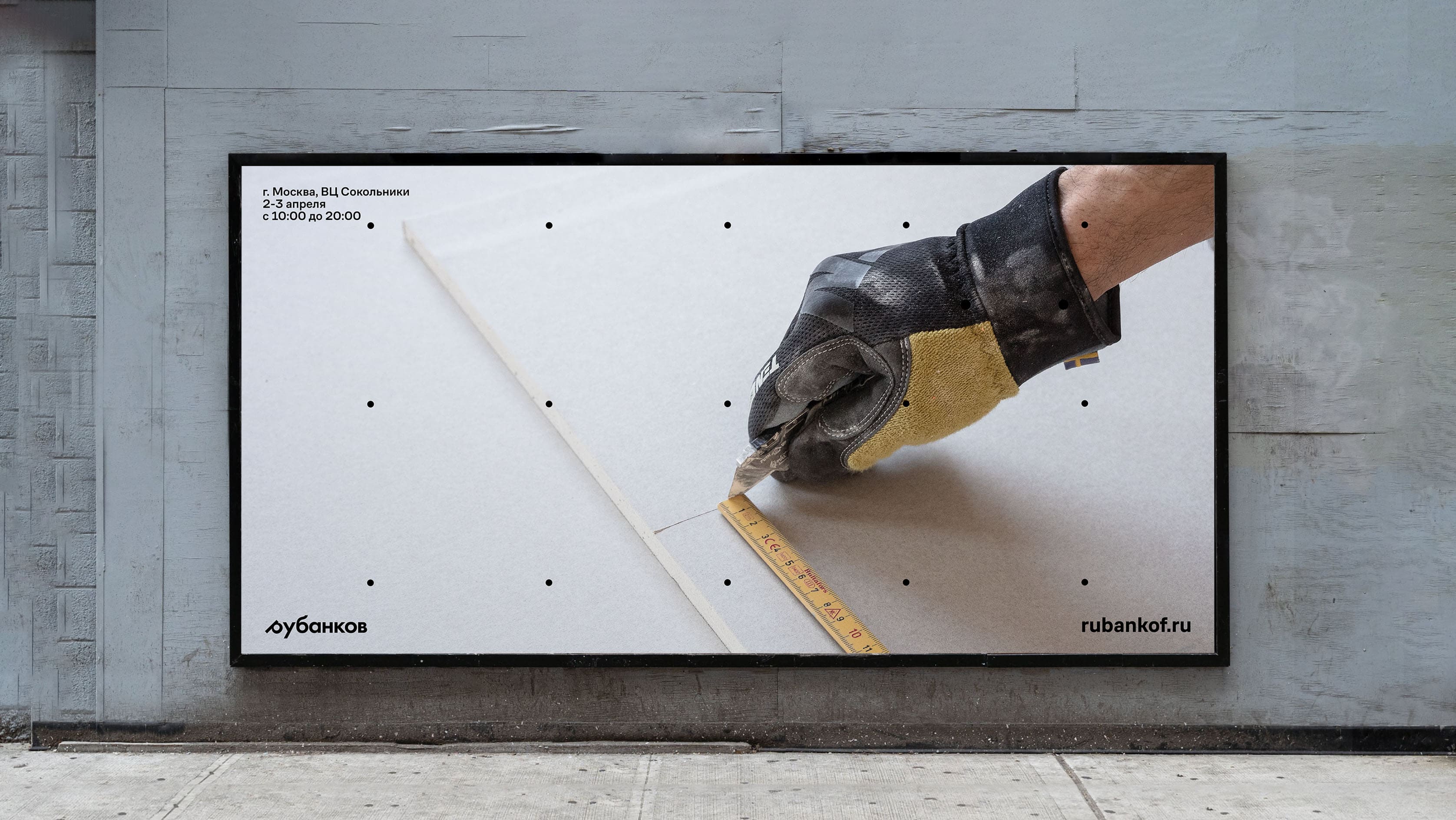
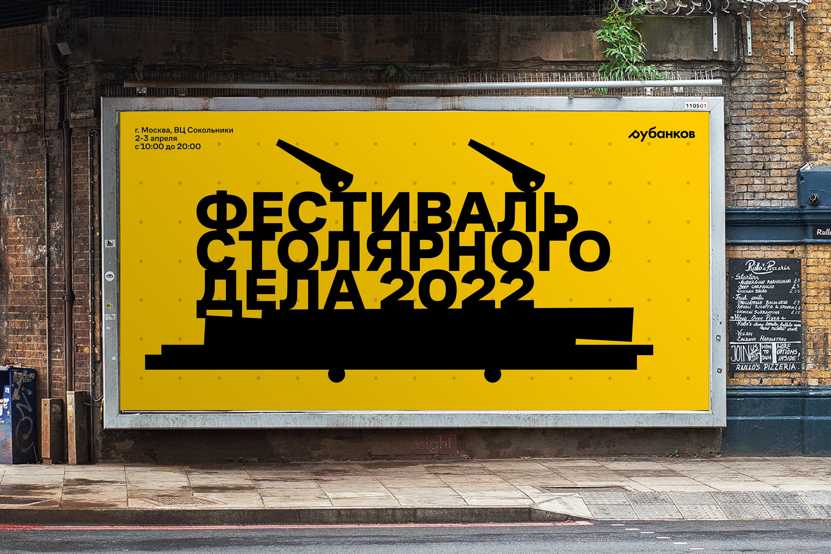
I laid the basis of the style on a workbench with characteristic holes, as well as clamps and “stumps” that can clamp a variety of content.
The colors of the Dewalt tools made such a strict system moderately friendly and open, and the CoFo Sans typeface created by Contrast Foundry studio became the basis for text messages.
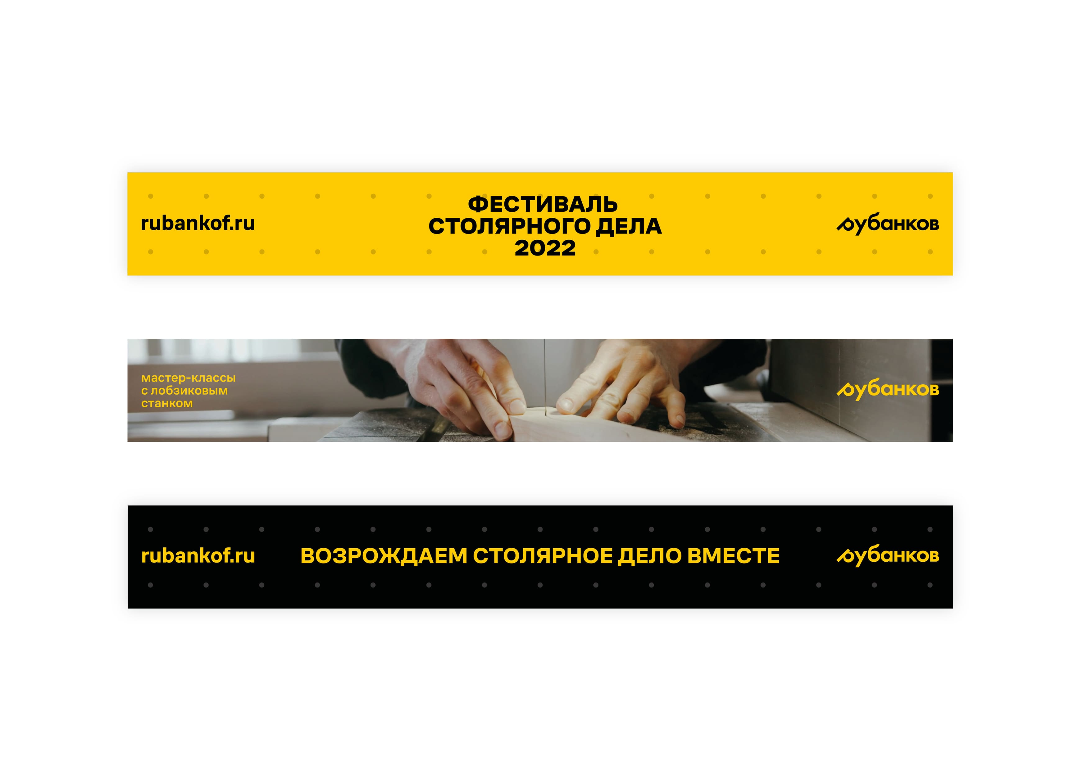
In addition to clamping photos with clamps, this technique can also work with texts. Due to the negative values between the lines, a feeling of compactness and tightness is achieved. This technique also plays out well in motion for social networks or digital banners in cities. Despite the fact that the tools turned out to be quite strong from a graphical point of view, they do not argue with the rest of the content of the layouts.
In conclusion, I can say that the identity for the carpentry festival from the company “Rubankov” turned out to be moderately strict and open, which will attract young people who are able to return their value and popularity to carpentry.

CREDIT
- Agency/Creative: George Sapozhkov
- Article Title: Brand Design Concept for Carpentry Festival
- Organisation/Entity: Student
- Project Type: Identity
- Project Status: Published
- Agency/Creative Country: Russia
- Agency/Creative City: Moscow
- Market Region: Europe
- Project Deliverables: Brand Design, Brand Identity, Identity System
- Industry: Technology
- Keywords: carpentry festival, wood, chisel
-
Credits:
creator: George Sapozhkov
curator: Evgeny Kashirin


