


Norman Walsh was founded in 1961 in Bolton, England, and is a famous British outdoor sports running shoe brand practicing “classic retro style”. It has become one of the representative brands of British training shoes in the past three decades. Today, Walsh continues to be loved for its sleek, flexibility, comfort, lightness, and well-made. Since its entry into the China market, the Walsh has been at the forefront of emerging brands with its small and exquisite direction, and localized approach. It completed its digital transformation in mid-2021 with a flexible supply chain transformation that allows for both personalization and industrial mass production. Pocca was invited by Walsh (China), Norman Walsh’s independent brand operator in China, to systematically optimize and develop the brand’s visual identity system in the China market in order to help the brand improve its overall quality in the visual communication dimension.
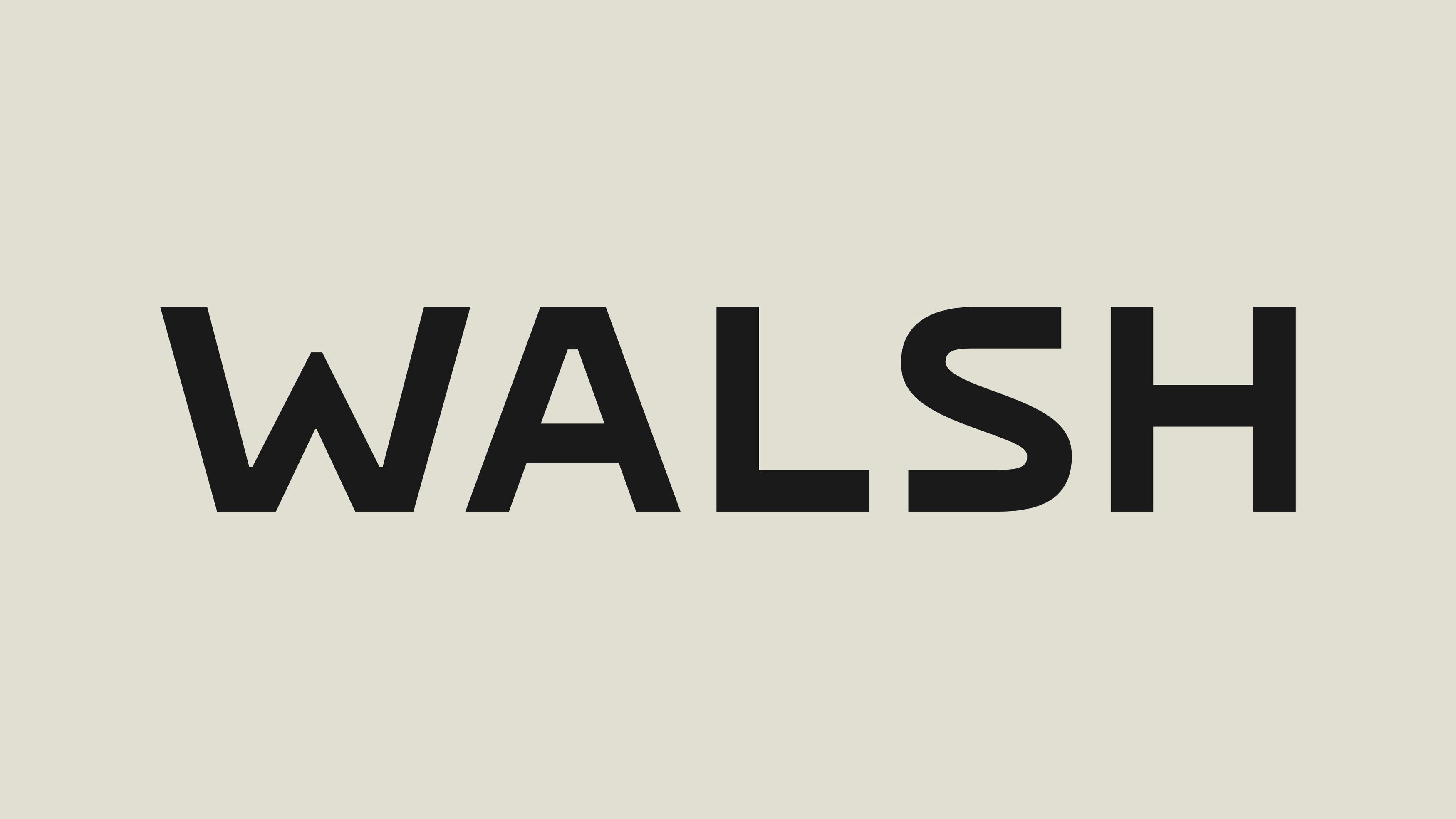
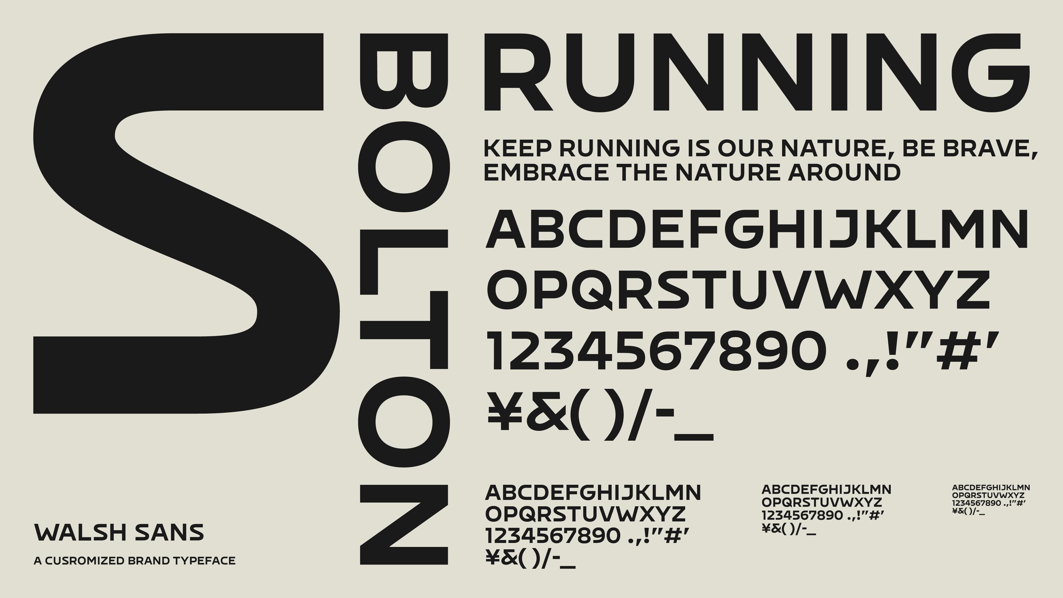
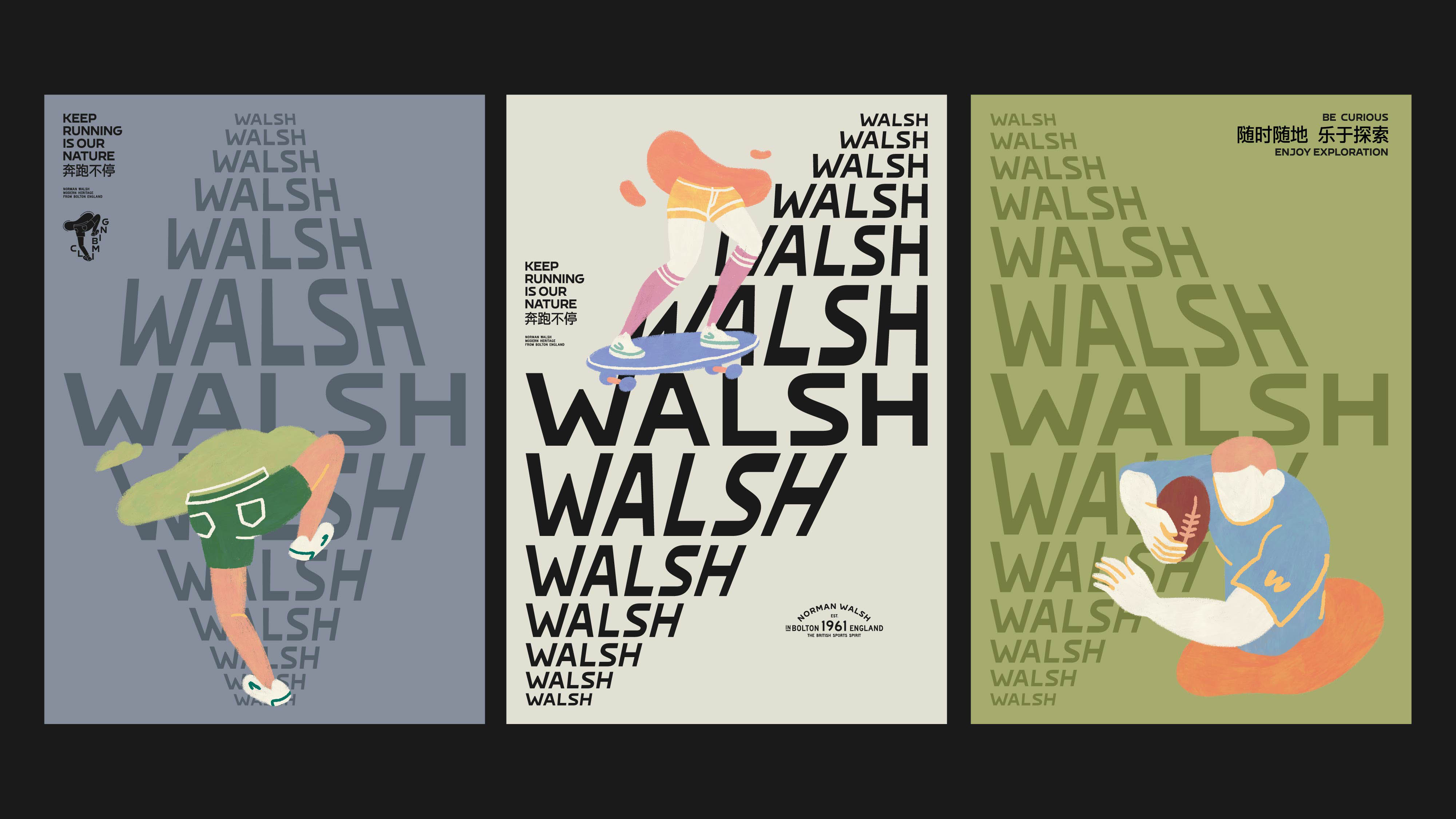
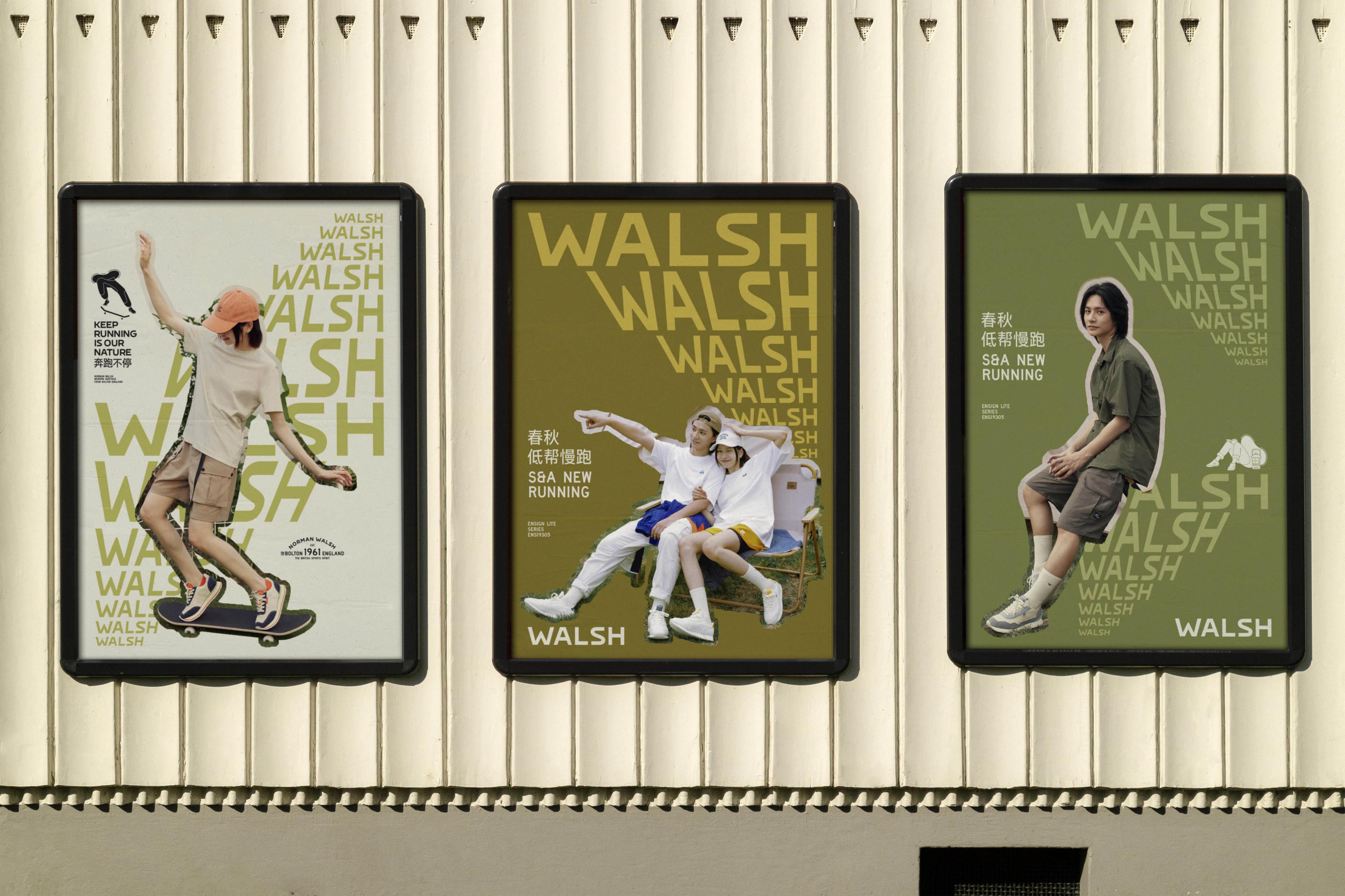
In this project, we first adjusted the brand’s original logotype. While retaining the flush shape of the uppercase S and maintaining the slightly flat, rounded, and clean visual appearance of the overall letterform, we modified and improved the details that were not quite consistent in the original, resulting in a new logotype that inherited the original one and was more in line with modern visual aesthetics. It was then further expanded into a set of customized and branded headline typeface, Walsh Sans, based on the typeface design in the logotype. In the process of creating the font, we were assisted a lot by 3Type to carefully adjust and optimize the kernings of 921 pairs in 76 characters.
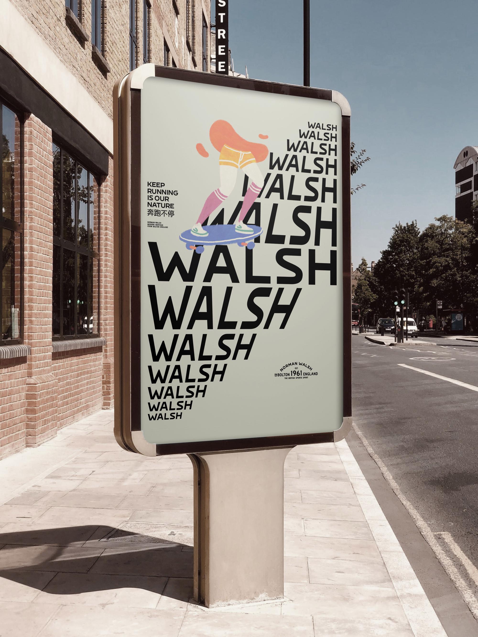
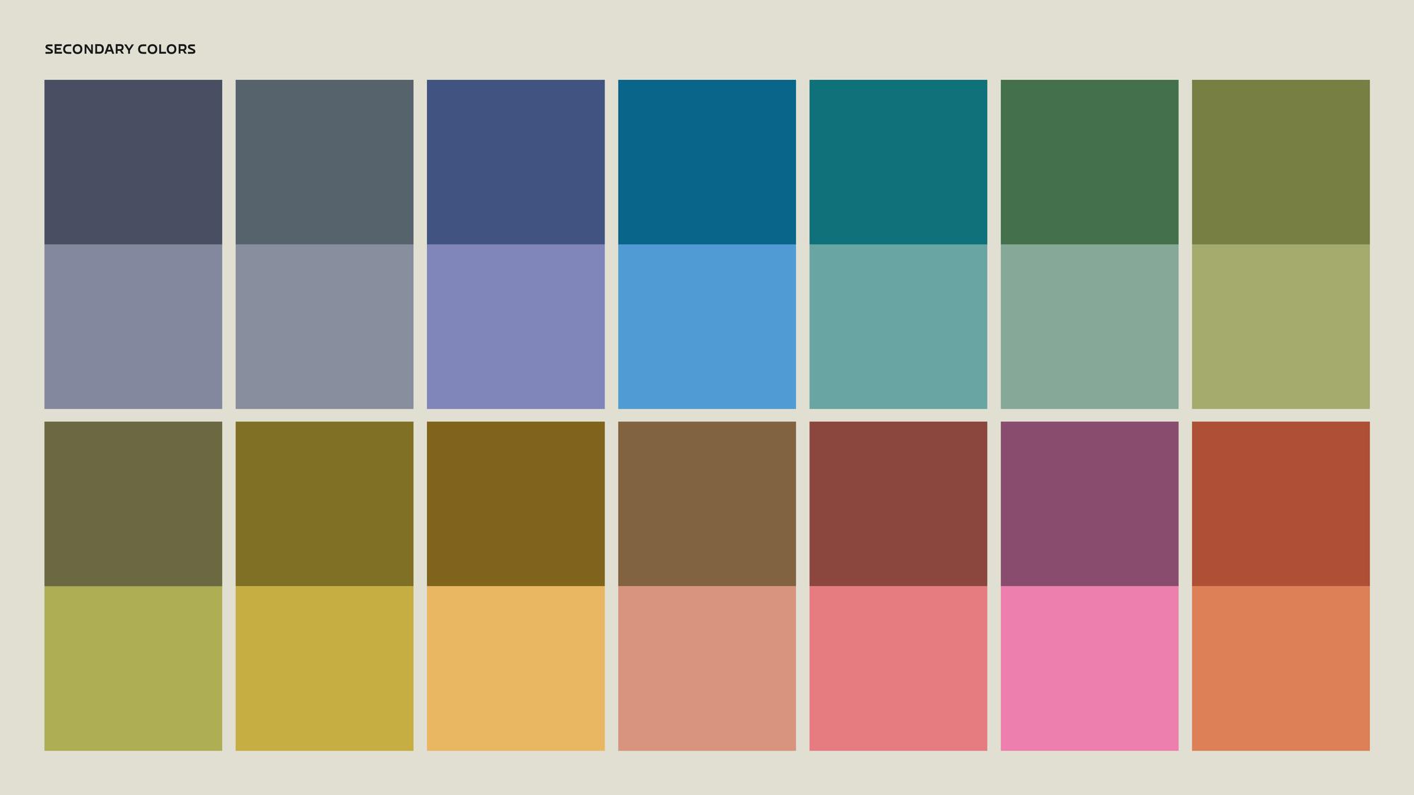
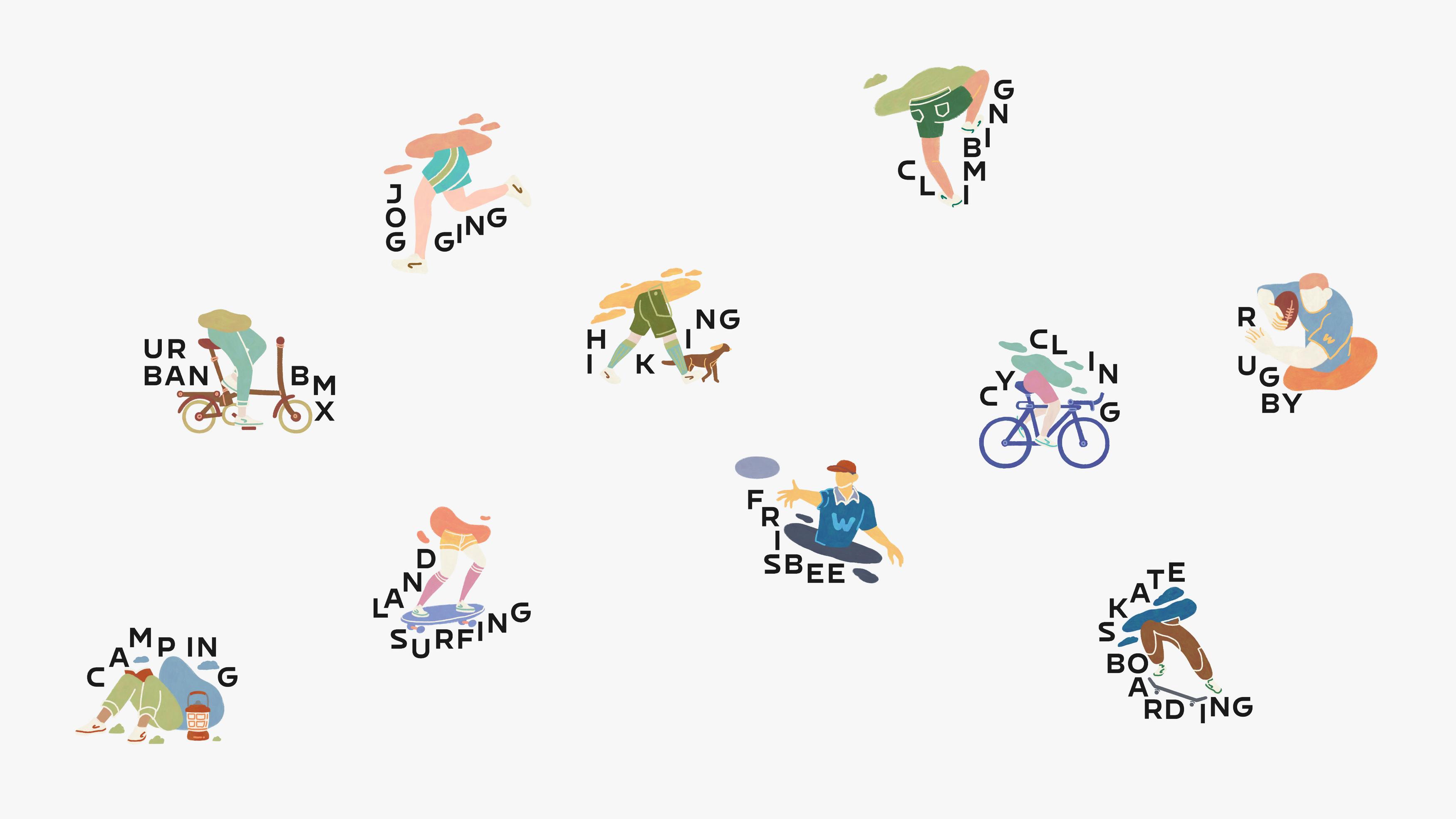
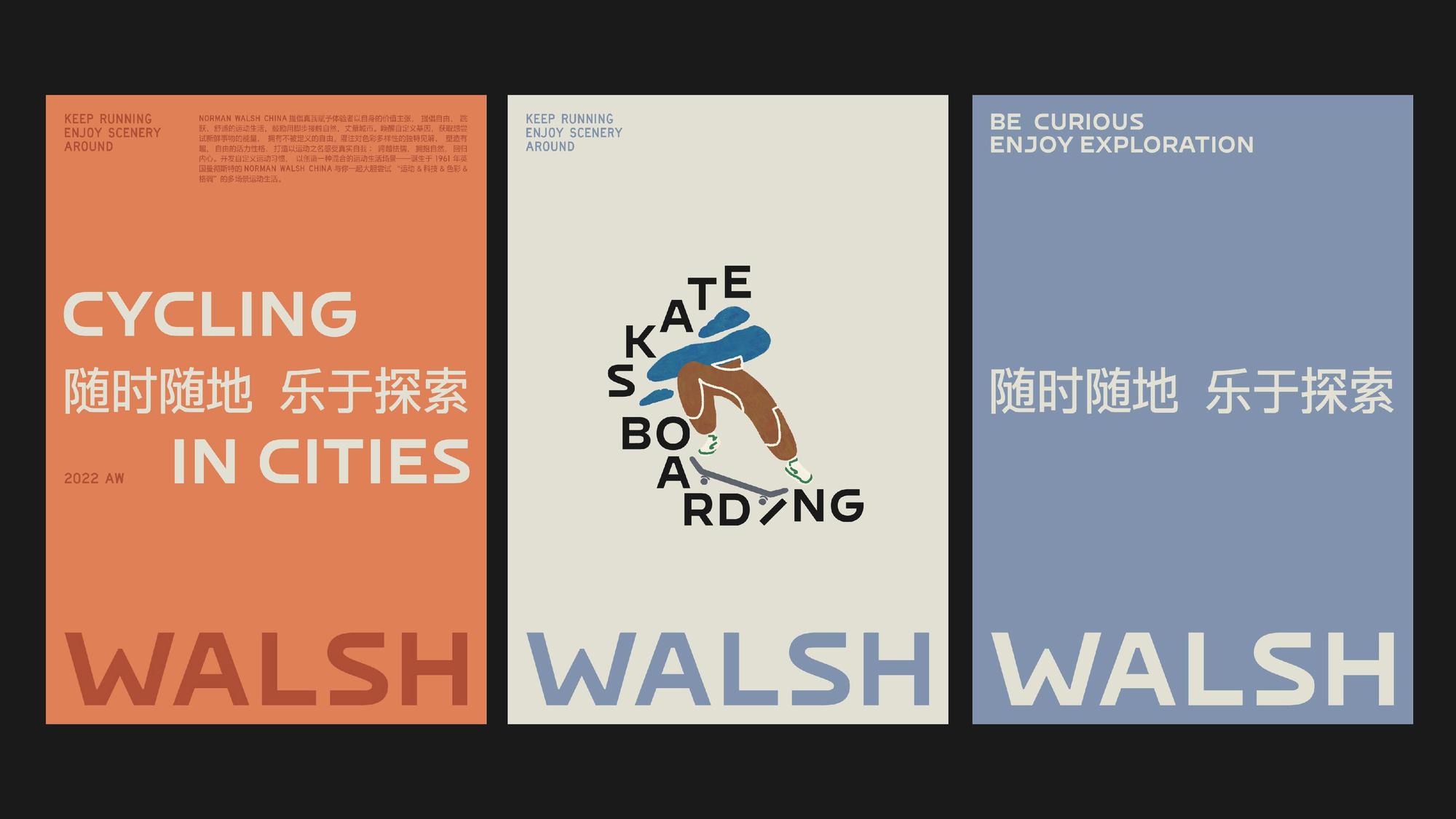
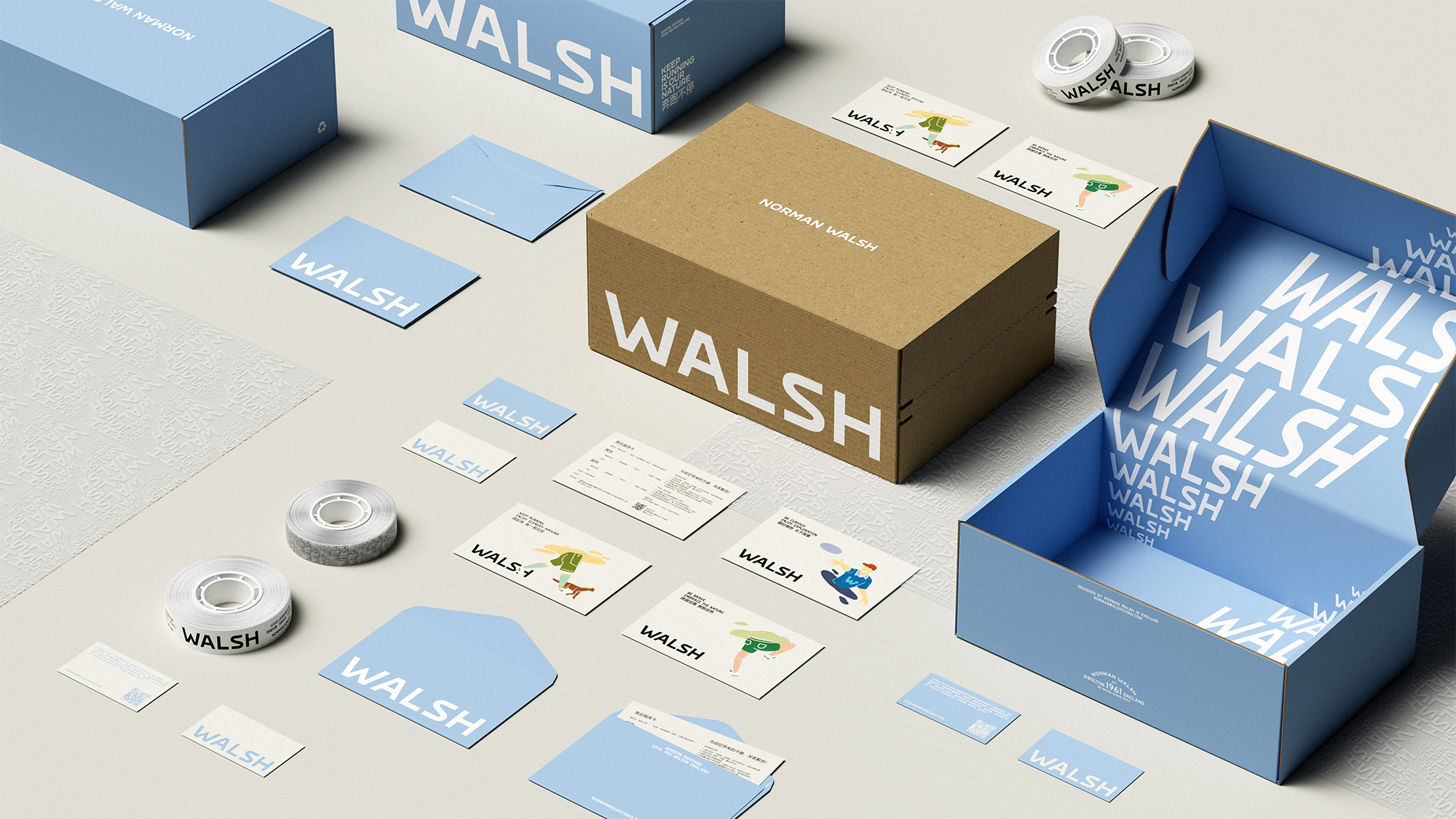
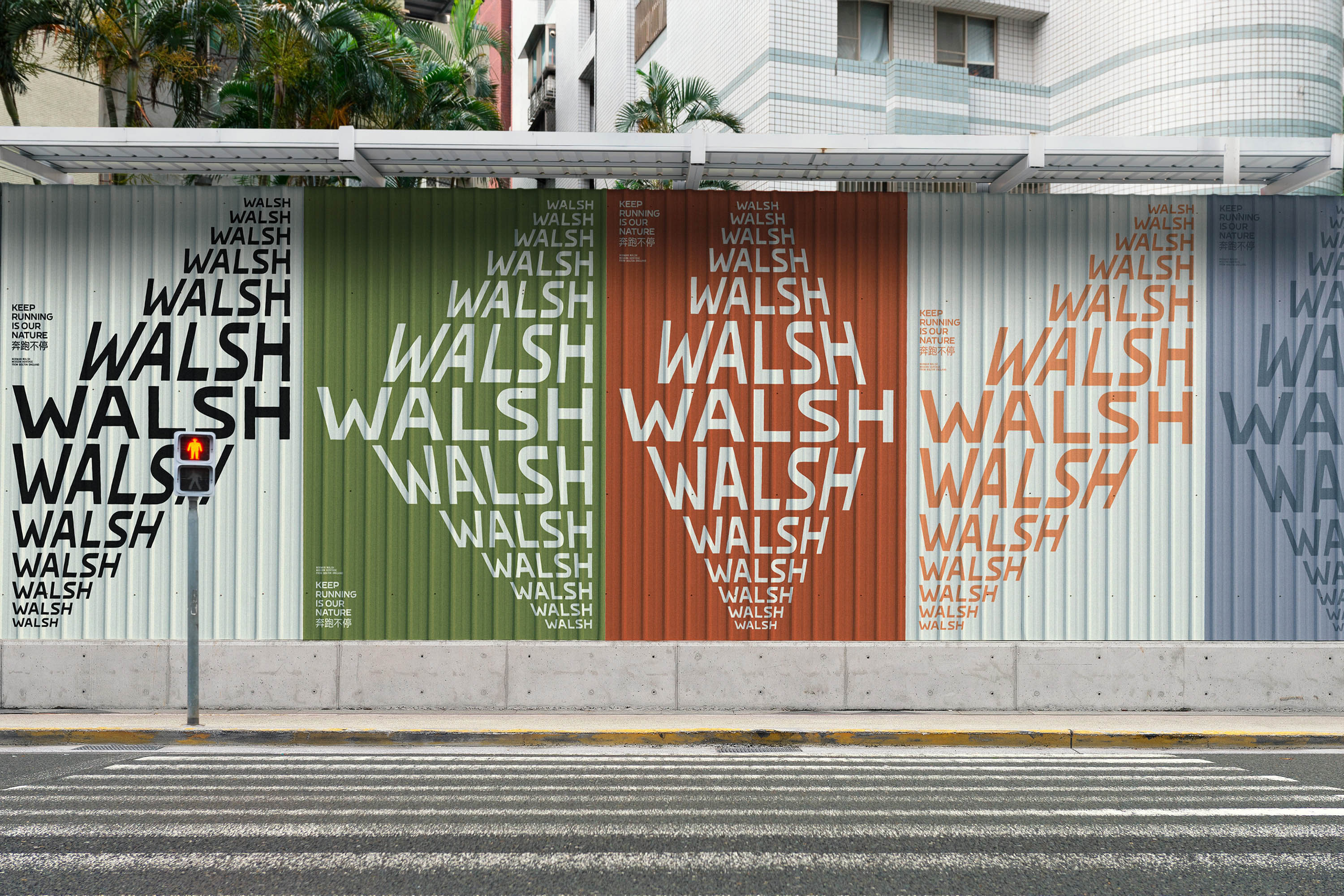
While maintaining Walsh’s classic retro style and outdoor sports attributes as the overall design tone, we added ‘off-blue’ and ‘off-white’ as the main colors for the core of the product packaging and visual system; and a new set of optimized retro and contemporary color palette to help expand the richness and fun of the brand in all of the promotional touchpoint, which will also be used as a reference for product design. To continue Walsh’s long-standing tendency for fun in the Chinese market, we created a series of illustrations based on the sports theme embraced by the youth today in China. A grid system was developed to help unify online and offline visual information. Finally, based on this rich and flexible visual system, the new packaging system for Norman Walsh (China) and the accompanying range of supporting materials were designed in a simpler setting in contrast to the promotional visuals, in order to reinforce the brand’s memory in today’s information-rich environment and to give more of a touch to Walsh’s footwear itself.
CREDIT
- Agency/Creative: Pocca
- Article Title: Brand Design and Visual Identity for Norman Walsh (China)
- Organisation/Entity: Agency
- Project Type: Identity
- Project Status: Published
- Agency/Creative Country: China
- Agency/Creative City: Shanghai
- Market Region: Asia
- Project Deliverables: Art Direction, Brand Identity, Brand Redesign, Graphic Design, Identity System, Illustration, Logo Design, Packaging Guidelines, Poster Design, Rebranding, Type Design, Typography
- Industry: Fashion
- Keywords: Sports Shoe, UK, Outdoor, Lifestyle
-
Credits:
Art Director: Zhihua Duan


