Antonia Skaraki A.S. Advertising – Saristi
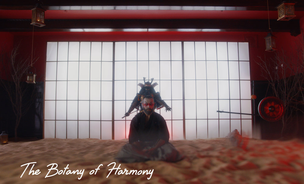
“ The botany of harmony
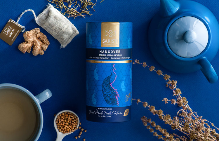
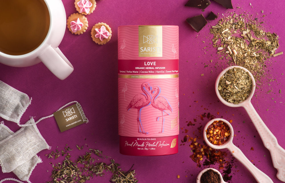
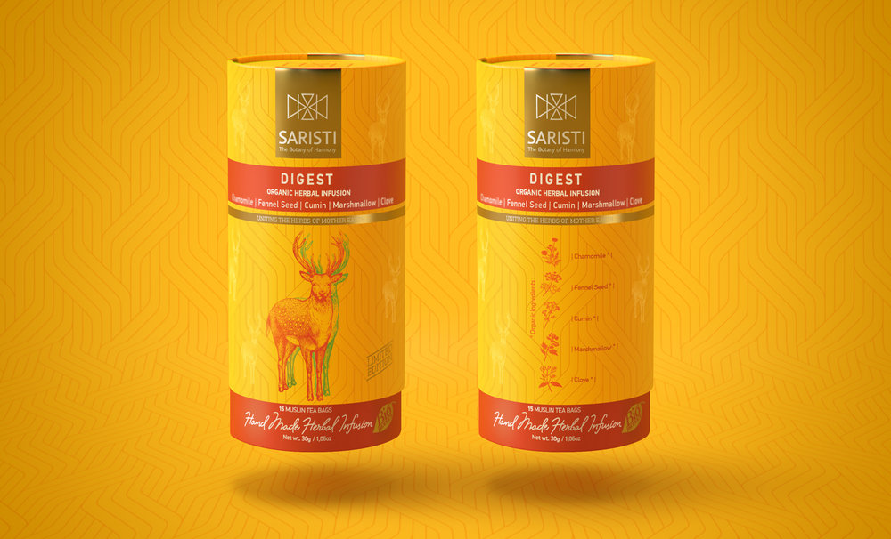
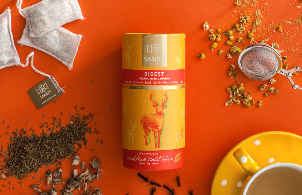
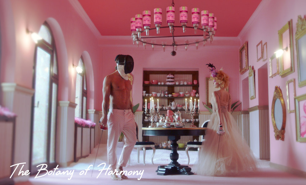
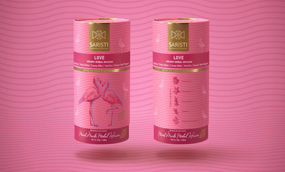
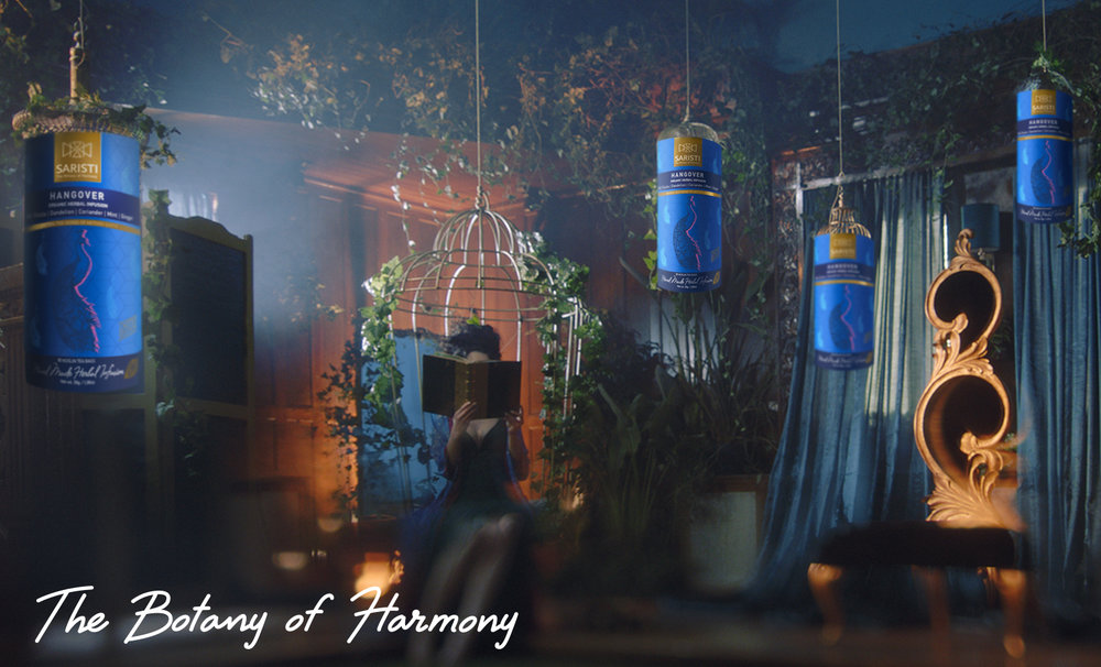
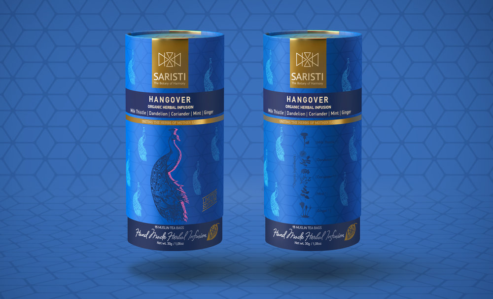
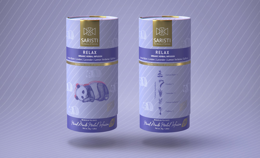
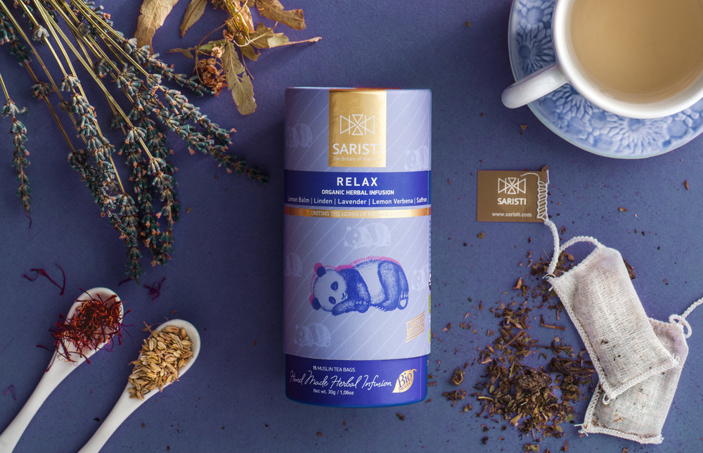
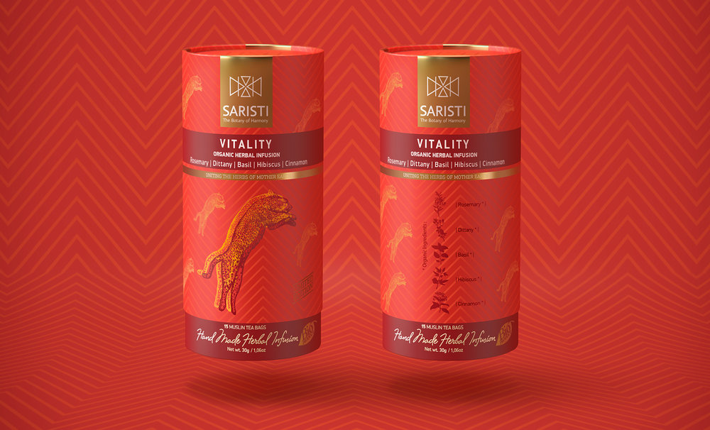
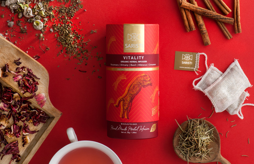
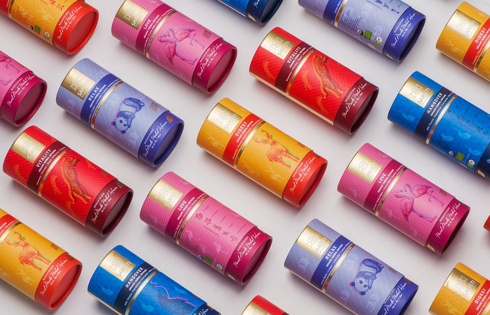
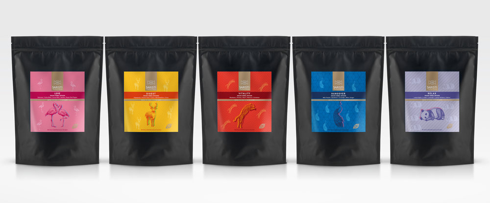
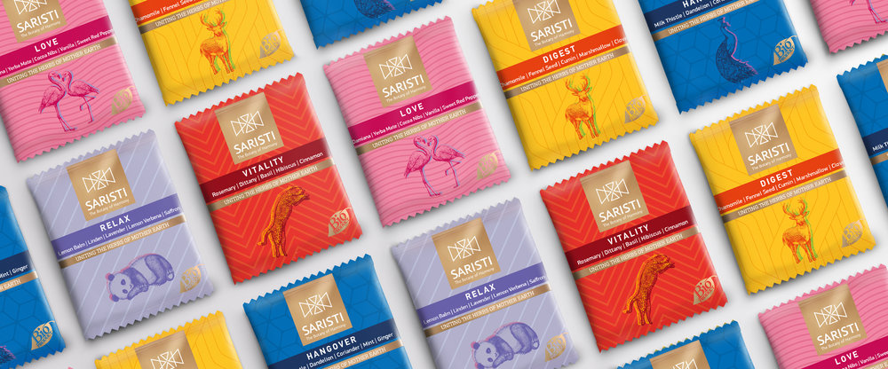
A logo, inspired by the 4 elements of nature: Water, Fire, Air and Earth. Saristi blends, have mastered the 4 elements of nature and joined countries and continents through unique organic herbal blends. The Saristi symbol is inspired by the dominant vibrations of these elements. The perfect balance of the animal kingdom and the colors of the packaging, turn the consumer into a fantastic taste traveler. The philosophy of Saristi infusions for life is to maintain both mental and physical health. This is reflected through the harmony and positive vibes of the packaging. We stir the design of a promising brand.”



CREDIT
- Agency/Creative: Antonia Skaraki A.S. Advertising
- Article Title: Brand Botany Creation of Tea Harmony and Infusion from Greece
- Organisation/Entity: Agency Commercial / Published
- Project Type: Packaging
- Agency/Creative Country: Greece
- Market Region: Multiple Regions
- Format: Box, Pouch
- Substrate: Pulp Carton, Pulp Paper
FEEDBACK
Relevance: Solution/idea in relation to brand, product or service
Implementation: Attention, detailing and finishing of final solution
Presentation: Text, visualisation and quality of the presentation


