


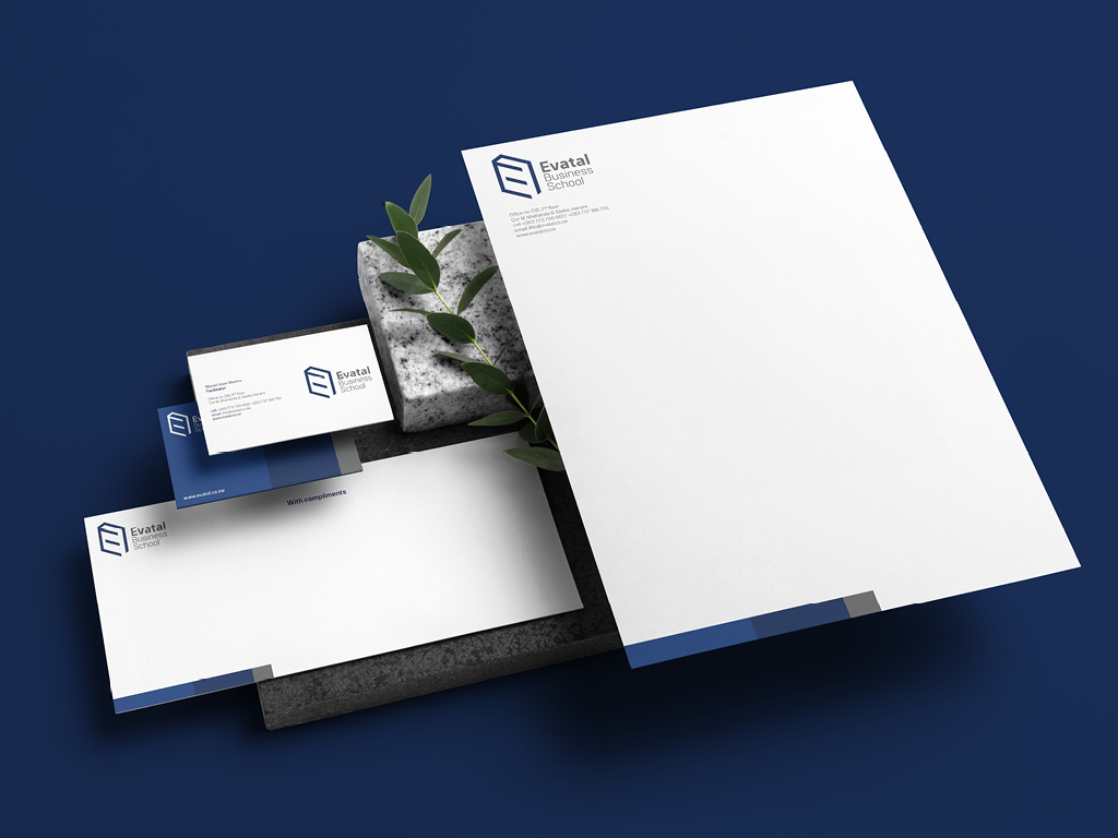
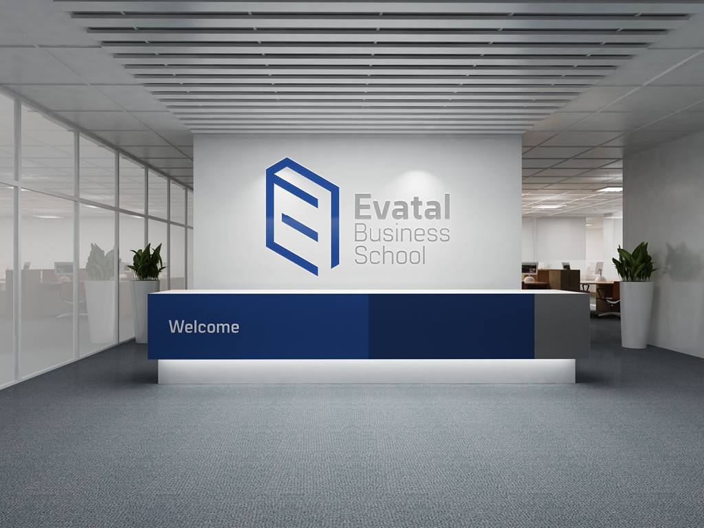
Evatal Business School delivers the tools and expertise needed for business transformation and growth.
We developed an identity designed to reflect the brand strategic intent to stimulate transformation and growth through education.
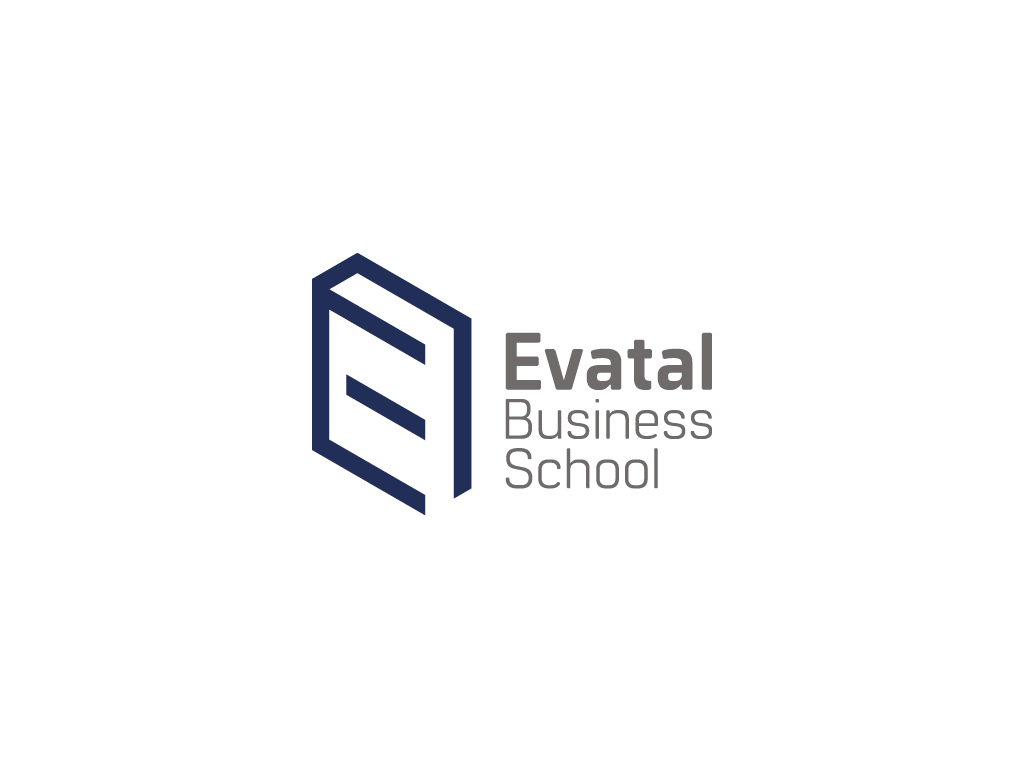
Inspired by minimalist yet structured design philosophy, a book was used as our primary logo device, brought to life through the use of straight lines. The letter ‘E’ was then also embedded in the book as the focal point of the concept, and the adjacent logotype was neatly aligned next to it for balance.
The result? A sleek, clean yet unconventional design that exudes professionalism

CREDIT
- Agency/Creative: Xitombe Studio
- Article Title: Brand Architeture for Evatal Business School
- Organisation/Entity: Agency, Published Commercial Design
- Project Type: Identity
- Agency/Creative Country: Zimbabwe
- Market Region: Africa
- Project Deliverables: Brand Architecture, Brand Guidelines, Brand Identity, Brand Redesign, Branding, Graphic Design, Identity System, Product Architecture, Tone of Voice
- Industry: Education
- Keywords: minimalism, clever logo, sleek, clean, logo, business school,
FEEDBACK
Relevance: Solution/idea in relation to brand, product or service
Implementation: Attention, detailing and finishing of final solution
Presentation: Text, visualisation and quality of the presentation


