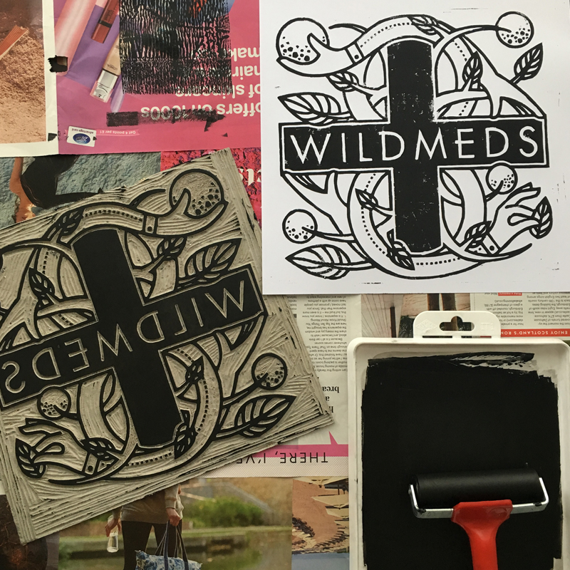
Hawk & Handsaw – Wildmeds
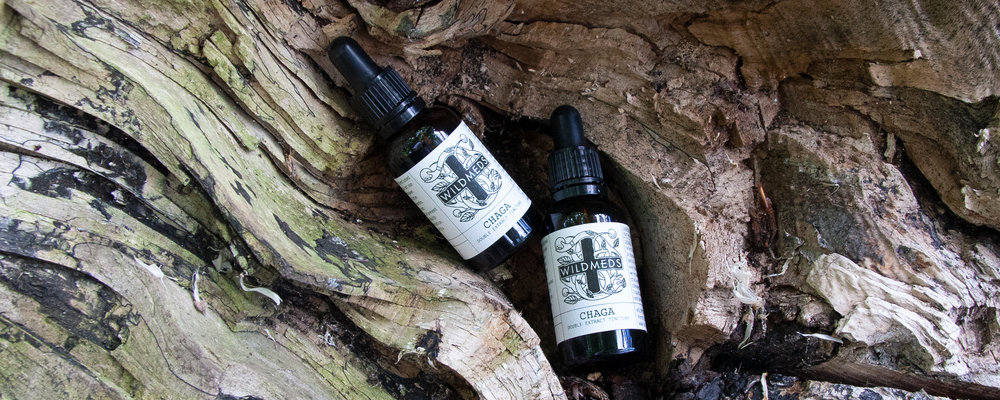
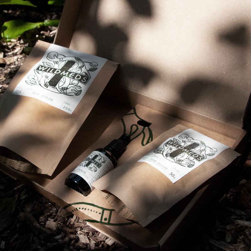
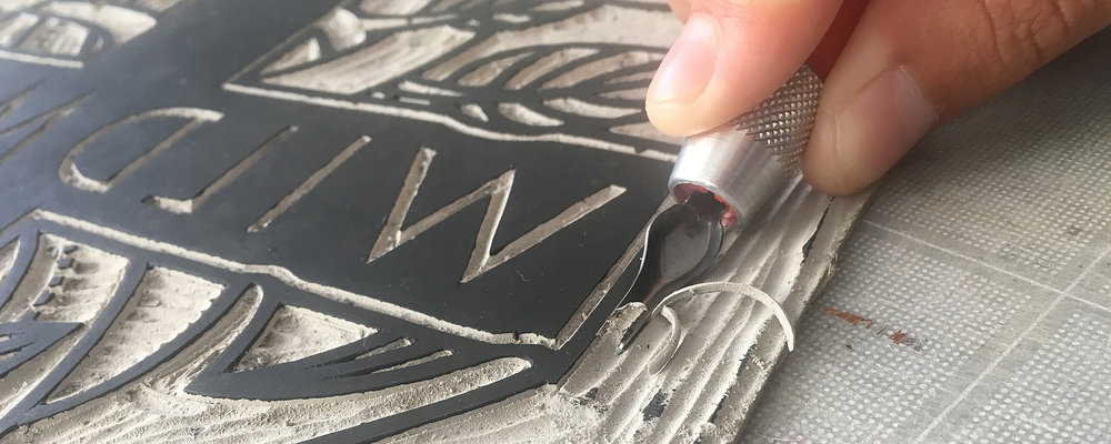
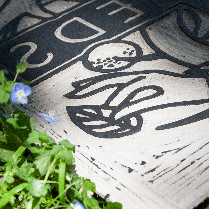
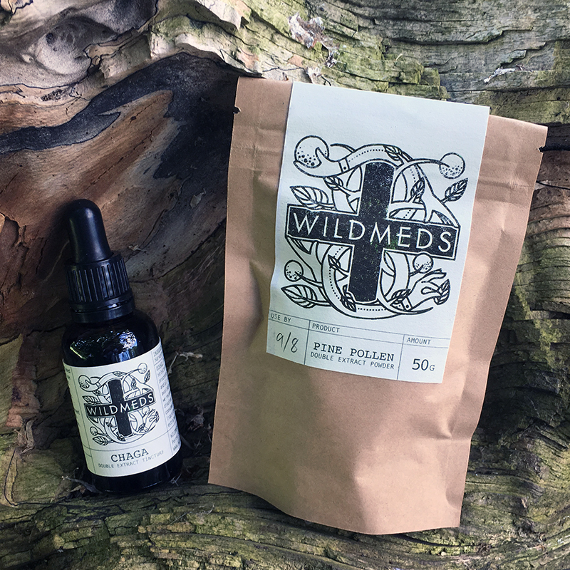
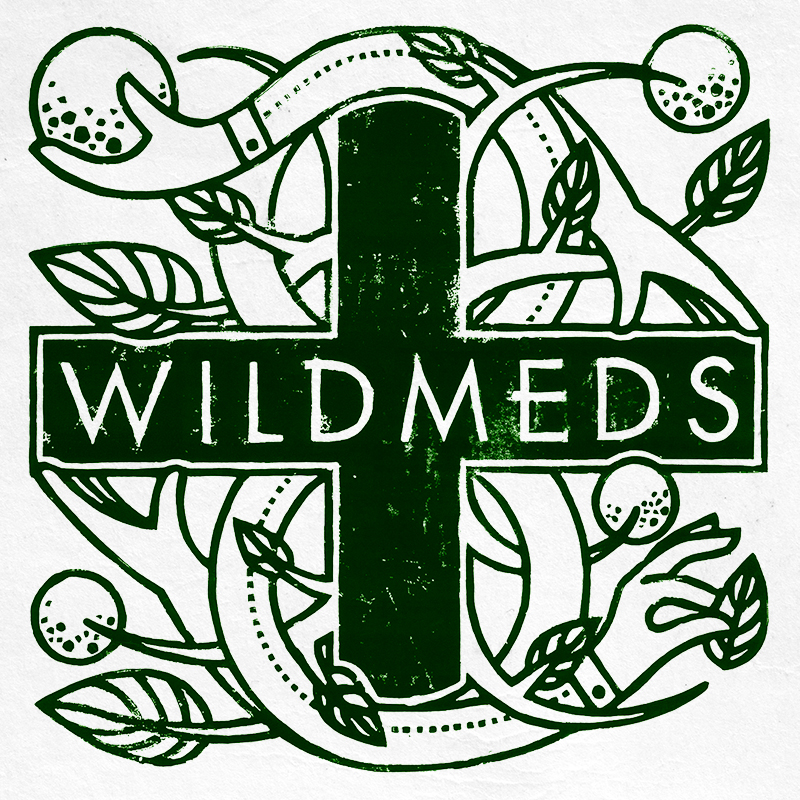
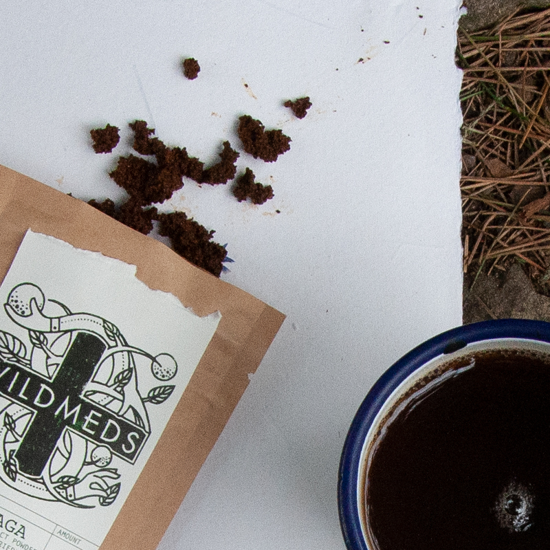
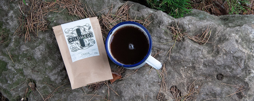
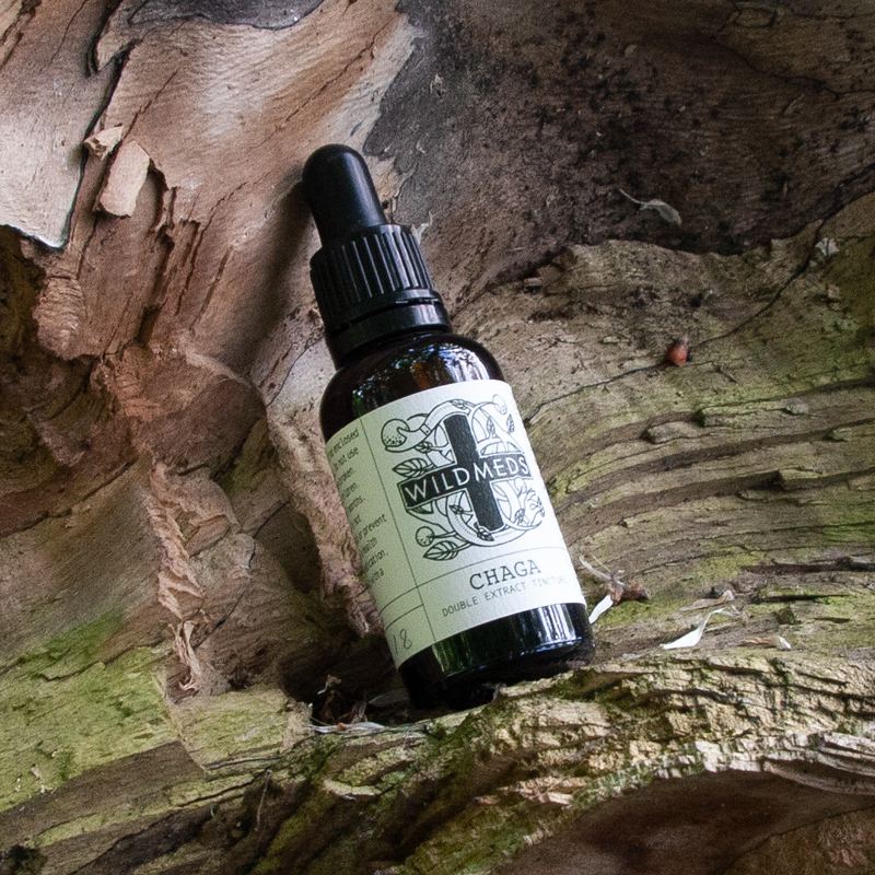
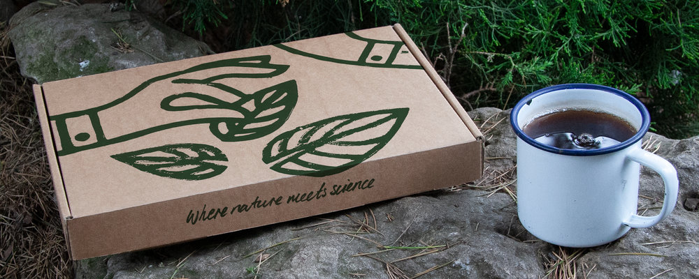
” The team at Wildmeds pride themselves on foraging for the highest quality and most effective natural medicines. Together they distribute all manner of natural wonders to the nation. Hawk & Handsaw joined them at the beginning of their journey to build a brand and packaging solution in harmony with their values.The brand identity harmoniously combines the classic medicinal cross while re-purposing the traditional twin serpents as the hands of the forager. The brand therefore supports the human being as well as the environment. The dual focus on the environment and the people within it is central to the entire brand and all of it’s touchpoints. We hand-cut the logo from lino and printed it for the natural, raw finish we wanted.The packaging graphics reference the prescription look and feel which both reinforces a medicinal notion while being environmentally responsible. Small, single colour labels on recycled paper are all that’s needed.From mountains to mailboxes we worked to ensure the packaging could hold various combinations of order while fitting neatly through letter-boxes. And, in the fashion of the brand the packaging is as bio-degradable, recyclable and environmentally healthy as current standards will allow.”
CREDIT
- Agency/Creative: Hawk & Handsaw
- Article Title: Brand and Packaging Solution Natural Medicines
- Organisation/Entity: Agency Commercial / Published
- Project Type: Packaging
- Agency/Creative Country: United Kingdom
- Market Region: Europe


