


Onfire Design – Hansells Fruit Syrups
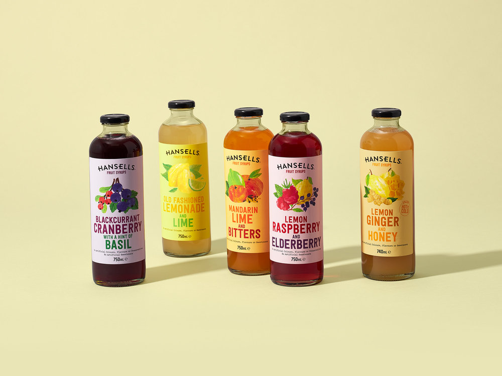
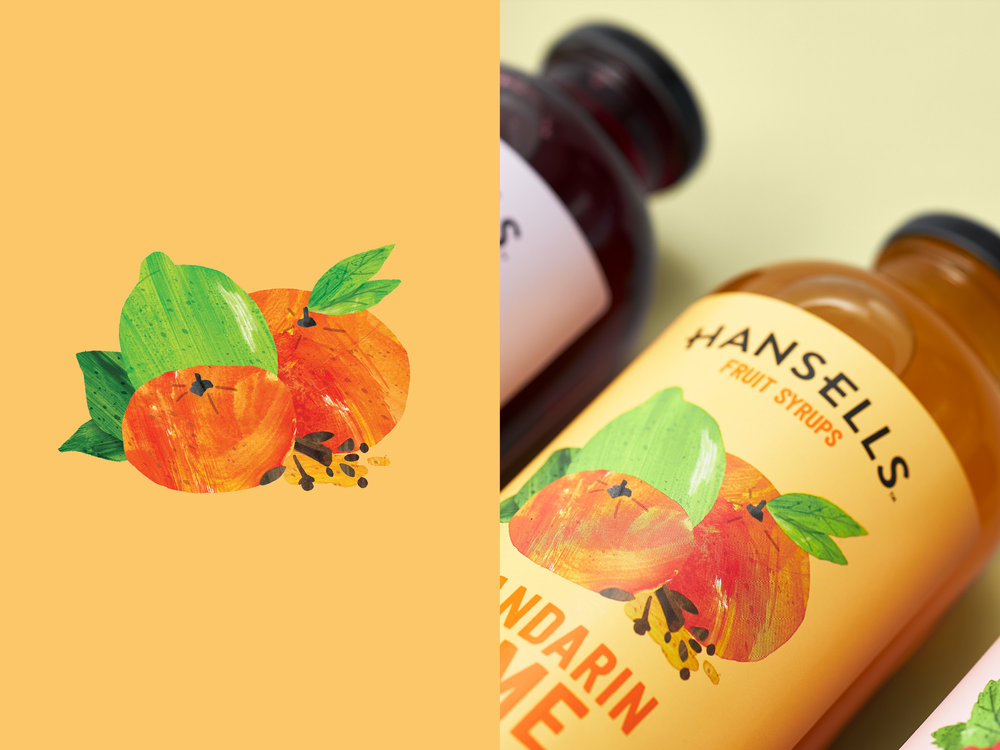
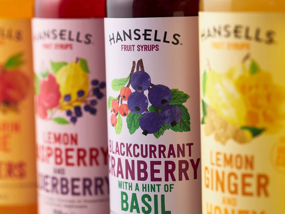
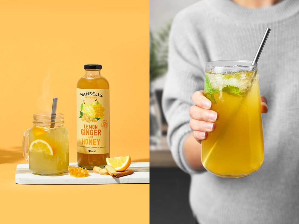
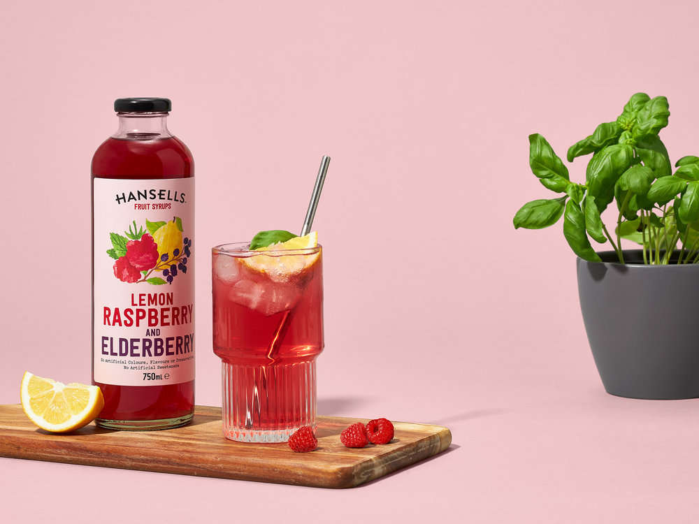
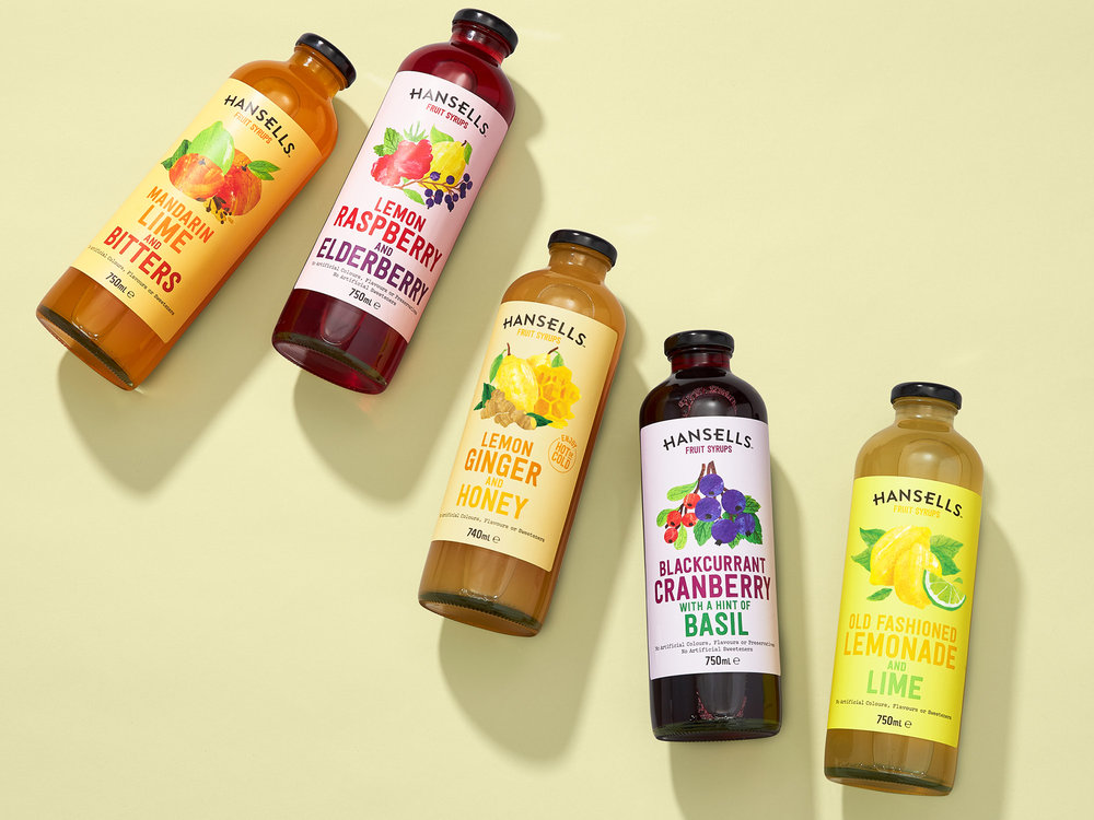
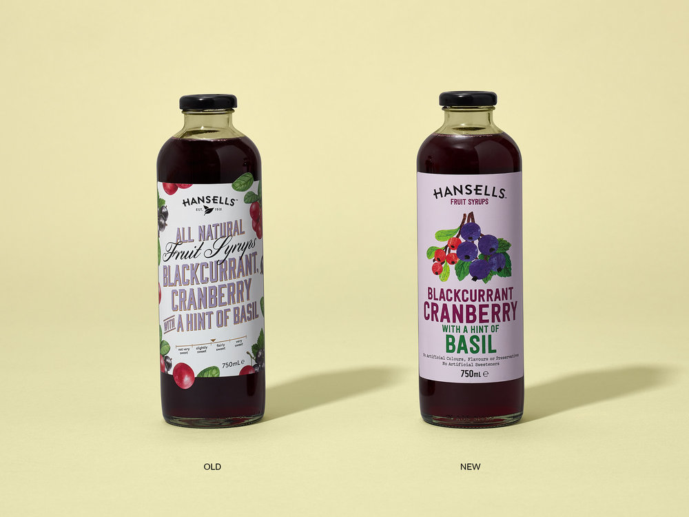
Hansells is a born and bred New Zealand brand. Helping families experience authentic worldly flavours with all-natural soups, yoghurts, baking essentials and fruit syrups.As part of a more comprehensive project of refreshing the Hansells brand for the modern foodie consumer, we re-engineered the family favourite fruit syrups. In a category dominated by heritage brands, the new Hansells brand had the opportunity to declutter the bottles and detangle itself from previous nostalgia messaging to get to the heart of the range proposition – great tasting, all natural syrups packing full-on flavours. Whereas the category norm is white labels, the new Hansells range focuses on colour. Bright and fresh pastel backgrounds help turn the volume up on the natural textured illustrations. Loud, no-nonsense typography proudly calls out the flavour recipes. The new labels are a unique, bold expression, with a simplified retro modern expression and immediate brand recognition, making flavour the hero while creating a distinct point of difference on the shelf. Onwards and upwards for the Hansells brand.

CREDIT
- Agency/Creative: Onfire Design
- Article Title: Brand and Packaging Refresh of Hansells Fruit Syrups
- Organisation/Entity: Agency, Published Commercial Design
- Project Type: Packaging
- Agency/Creative Country: New Zealand
- Market Region: Oceania
- Format: Bottle
- Substrate: Glass


