Brown&co – Thorndown
“Brief
Achieve on-shelf standout in an overcrowded and ‘safe’ category. Use a start-up budget to create a strong platform on which to build the brand.
Problem
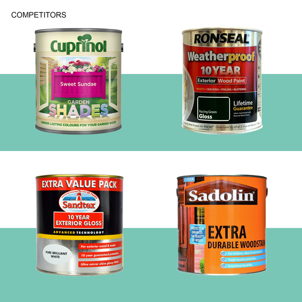
The outdoor paint market is saturated and addresses purely the functionality of the products. Not only that, at point of sale, range navigation and messaging tends to be confusing and cluttered, with uninspired brands struggling to differentiate themselves. The client approached Brown&co (B&co) to create a new brand from scratch that would stand out in this crowded and bland marketplace.
Solution
Together with their client, B&co, identified a clear gap for a more design-oriented and aesthetically-considered brand that could elevate the entire category.
Exterior Design was born.
B&co brought perceptions of exterior wood care out of being purely industrial and functional and into the realm of design. This implied form with function, art with science, aesthetic beauty with hard-wearing protection. The objective was to help house-proud homeowners think about the exteriors of their home with the same attention as their interiors and provide the products and solutions to help make these ideas a reality.
To do this B&co tapped into the origins of the paint manufacturer, The West Country, England, to create ‘character’ for the paint. The West Country is known for its creativity and pragmatism, for its outdoorsy lifestyle, for its crazy weather, for having the best of both city and country life. Who better to deliver outdoor products and ideas that combine aesthetic flair with practical durability?
Name
An entire graphic language was created for the brand including iconography, colour palettes and typography. The brand was named ‘Thorndown.’ The family behind the paint are the Thornborough husband and wife team. Thorns are hardy, practical, plant structures. Down is soft and delicate. The name ‘Thorndown’ captures this combination of science and art and this ethos was transposed to the logo with its sharp strong ‘T’ and down feather accent.
Brand
Typically, outdoor paint brands consist of browns and greens. B&co create a colour palette that drew on the orchards found in The West Country broadening the spectrum.
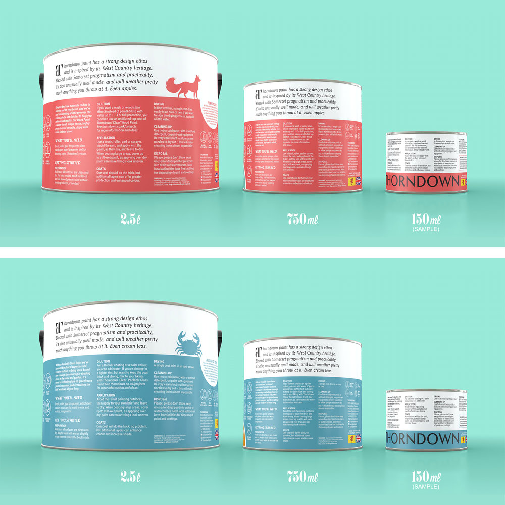
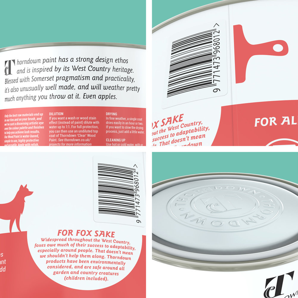
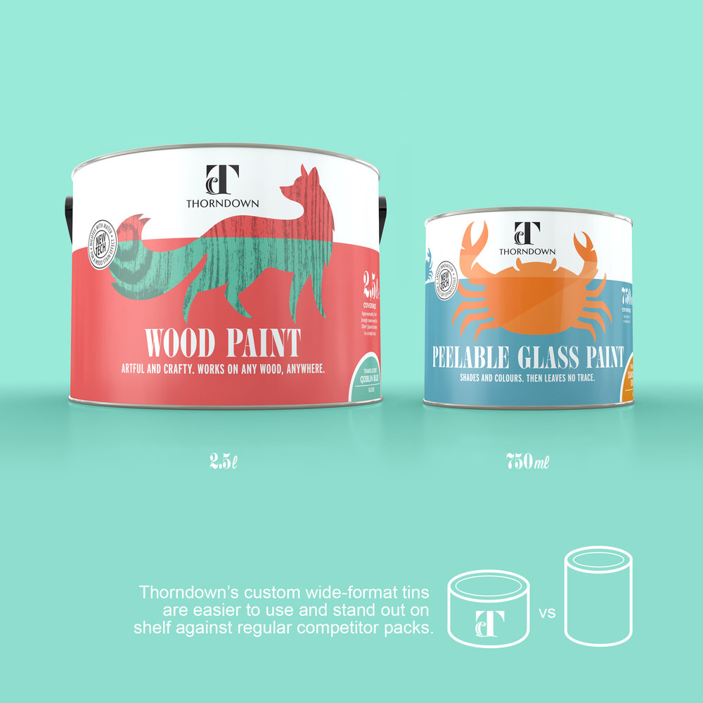
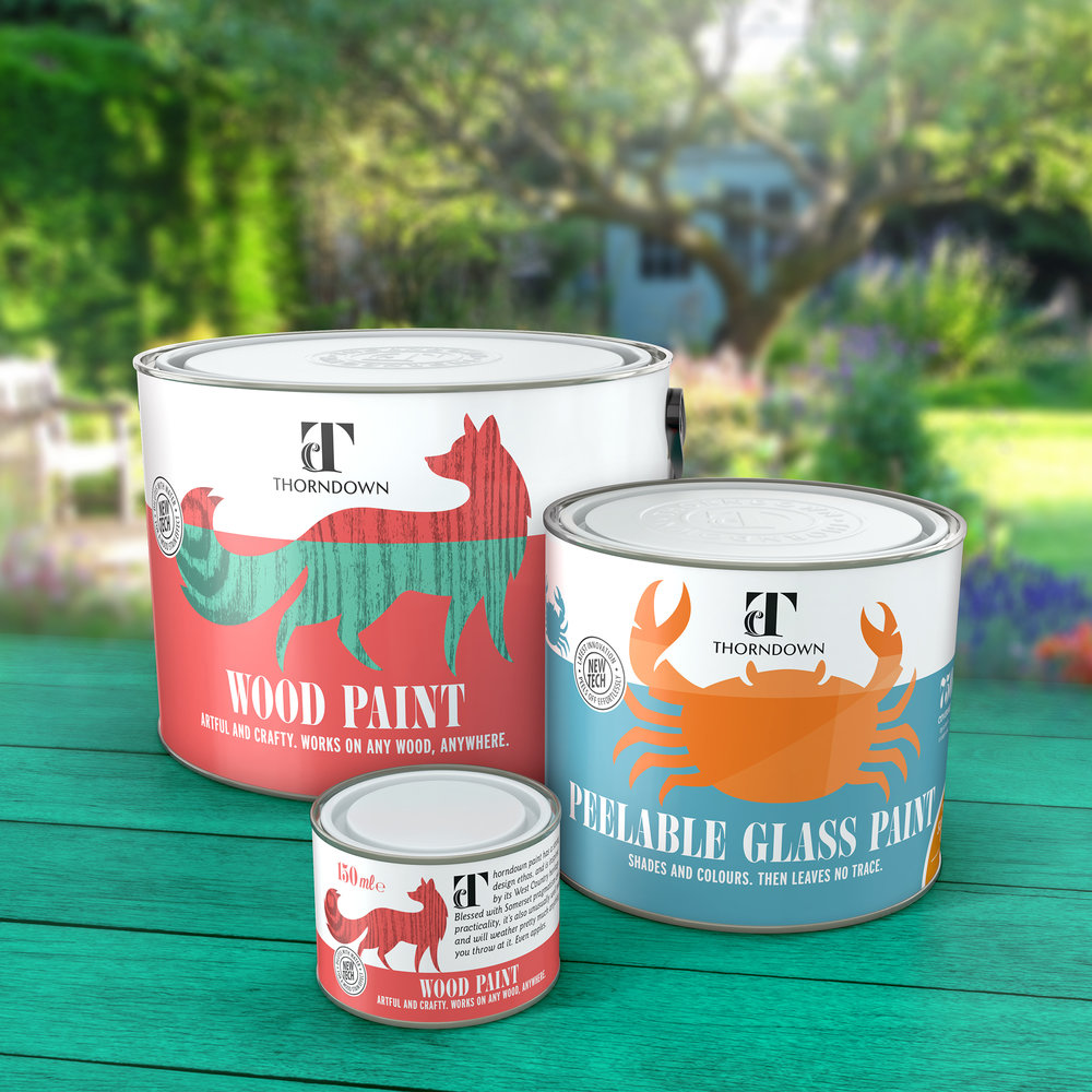
In addition to this, they erred away from the imagery used to sell outdoor paints – pictures of sheds and fences – and instead chose animals and icons associated with The West Country, which in turn represented the objectives of the paint with a story being told on the labels. These animals and icons also echo the environmental aspects of the paints that use predominantly natural pigments and oils, avoiding chemicals where at all possible.
Packaging
Thorndown will be sold in an entirely different tin dimension to the rest of the market. One of the lead designers at B&co is an avid painter. He questioned why tins always come in standard sizes which he thinks are impractical – and he also hoped to design something that would stand out from the crowd. After thorough research, a shorter fatter pot is now being produced which boasts practical benefits for users, like a wider opening for paintbrushes. Of course, the unconventional design will also create a distinctive and eye-catching shape on shelf. Remarkably, all modifications to the standard paint tin specifications were created with zero extra cost in the manufacturing process.
B&co also decided labels would be printed on special paper and wrapped round the pots to highlight the ‘craft’ element of the paints. This is another departure from conventional tin design, where the label is printed directly onto the metal.
The Thorndown identity and packaging designed by Brown&co is a game changer and a great way to launch a new brand into a staid market.”
