


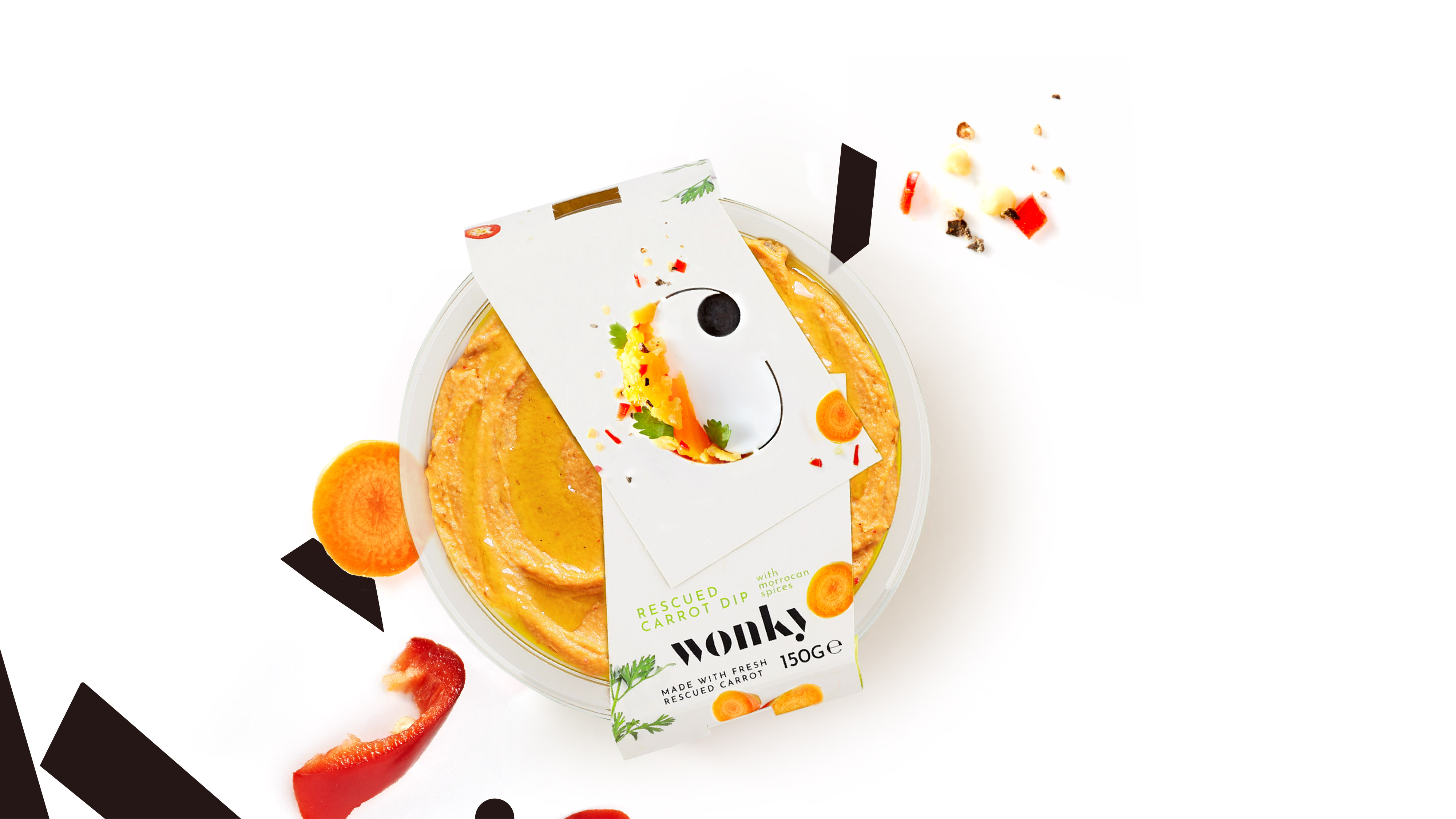
The Packaging
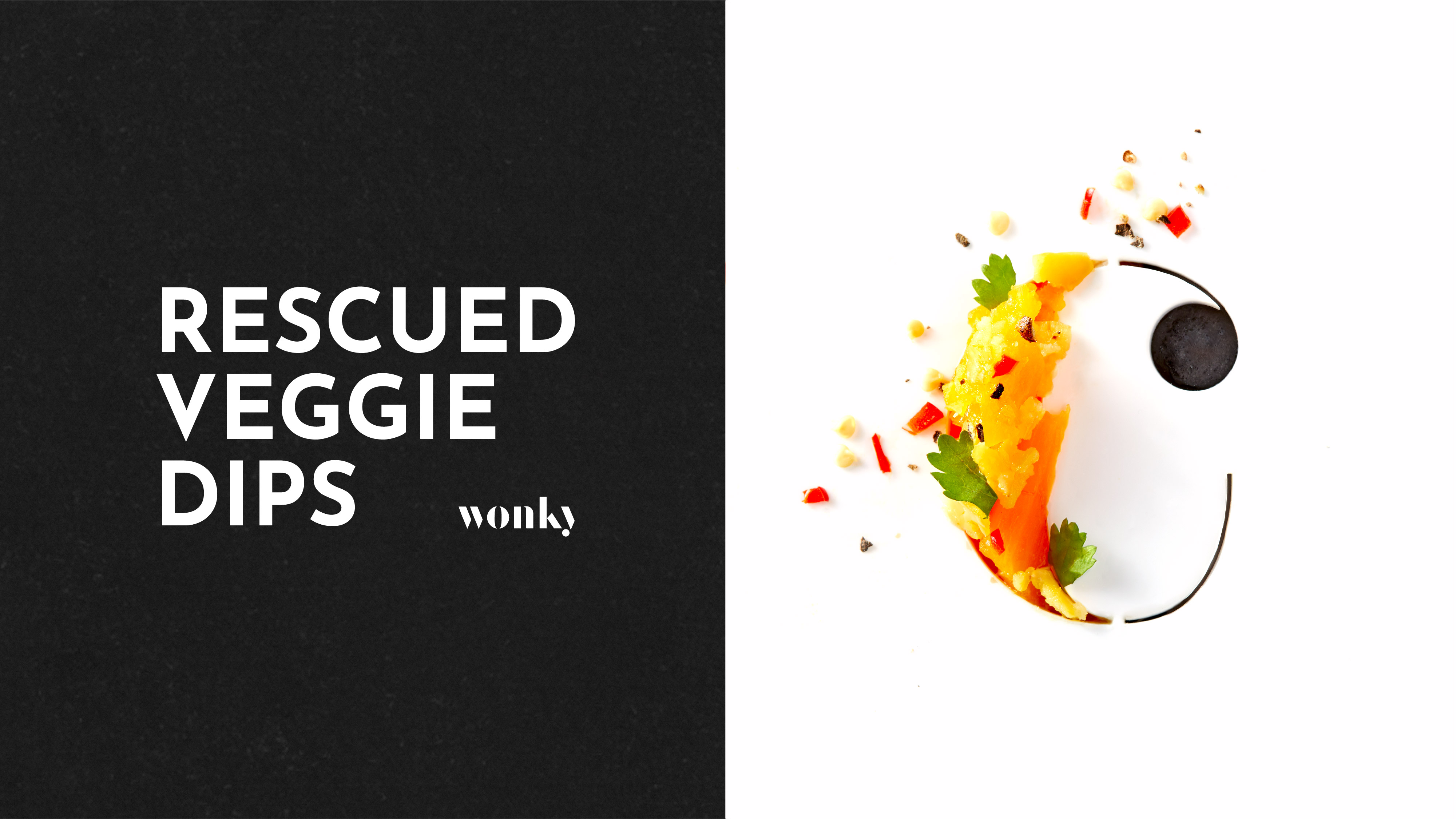
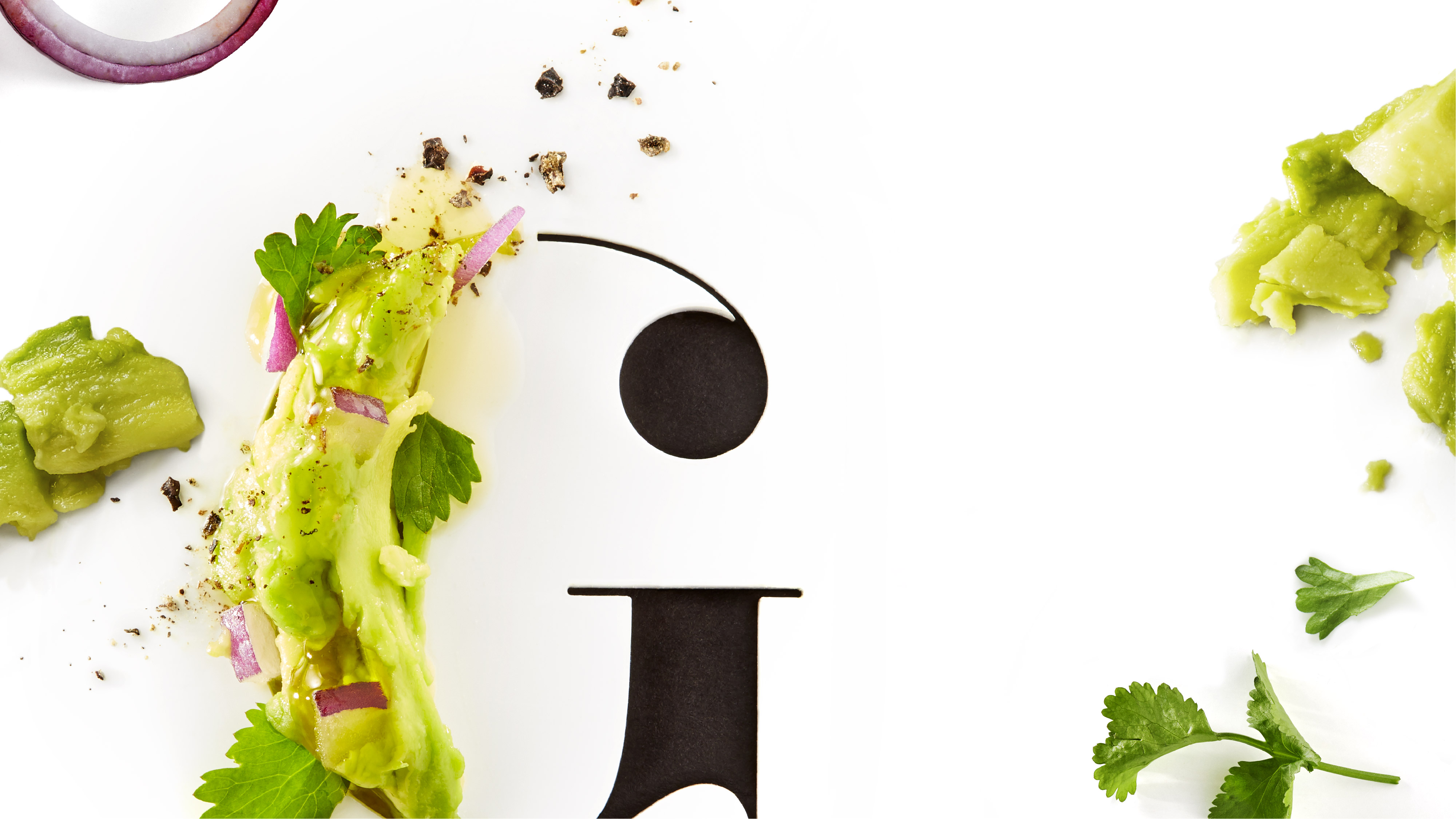
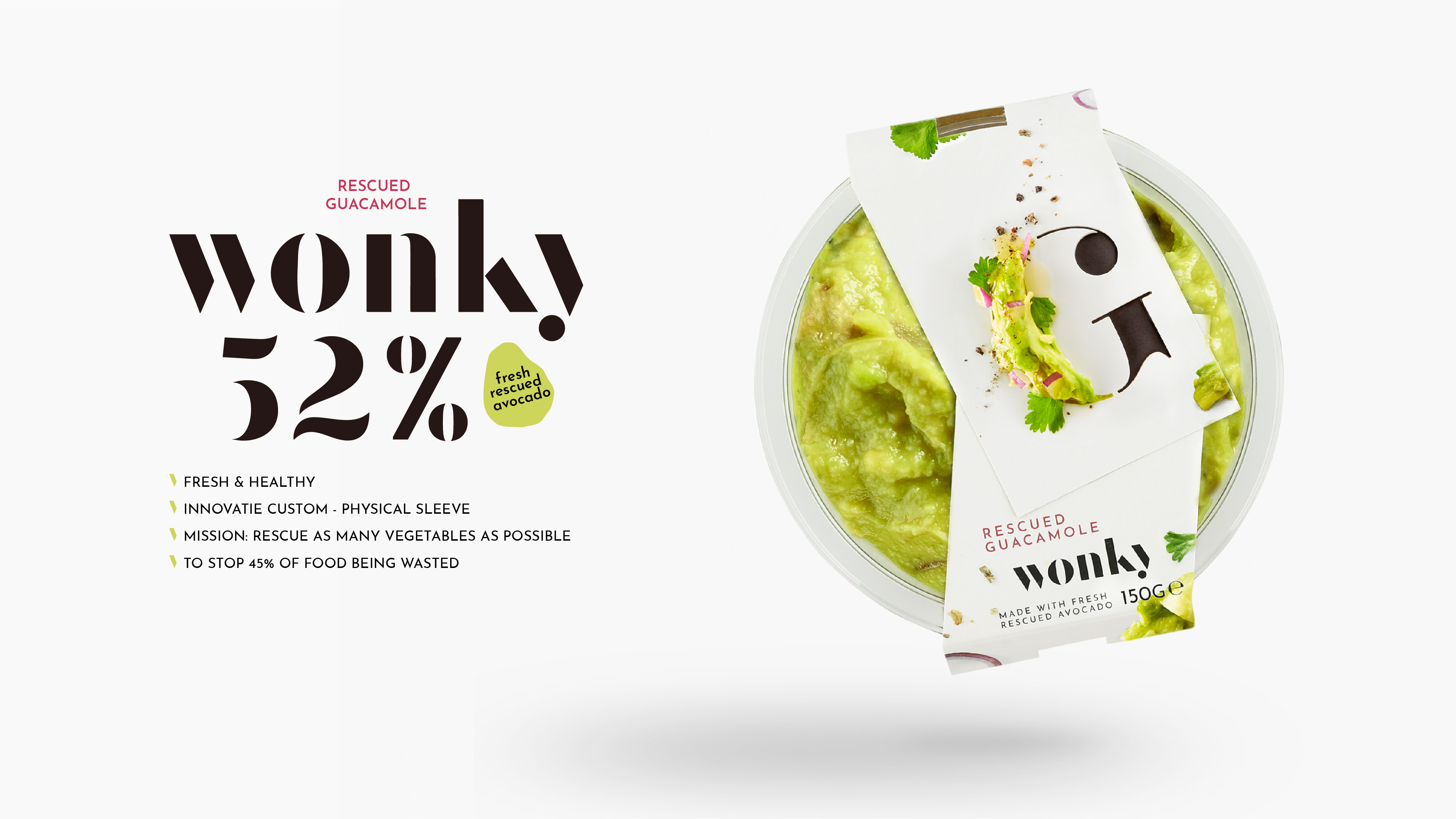
Just like the name suggests, there is something Wonky going on in the world of fruit and vegetables; 45% of all vegetables are wasted. What we are doing with Wonky is correcting the skewed proportions and simply processing all imperfect vegetables into a delicious Wonky dip.
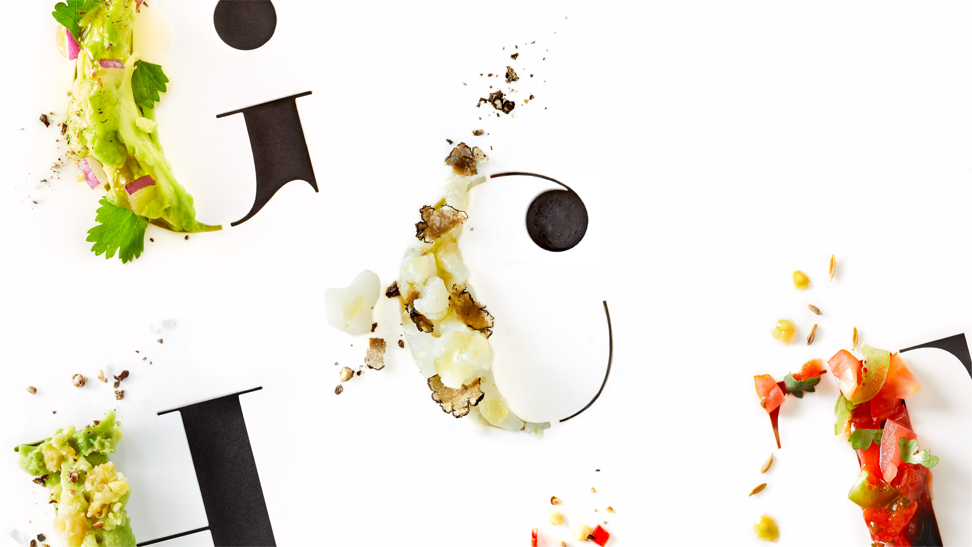
In the brand and packaging, the incompleteness can be seen in the apparently skewed sleeve and the incomplete font of the brand. The flavour designation is a classic foodie font. From this beautiful font, the dip and ingredients literally splash off the packaging due to the powerful photography. Together, all the missing parts form a perfect whole.
Background Product and Brand Development
Wonky, the tastiest dips from rescued vegetables, has been given a new look by the international team. Wonky’s mission is to reduce food waste. That was the starting point in 2016 and it still is today. However, an update of the brand and packaging was needed to do justice to the delicious flavours and the fight against food waste.
Syros NV, the company that took Wonky under it’s wing in 2018, called upon Isabel Verstraete for this. She started with a European market analysis and identified important consumer trends that Wonky could capitalise on.
Since Wonky is a small brand with a big mission, it was decided to tackle the most important touchpoint, ie the packaging, first.
The Team
An international team was put together to not only give the brand a new fresh look & feel, but also to make the packaging, photography and tone of voice more relevant, contemporary and accessible to a wider target group.
Dutch brand & packaging design agency Snow Donuts was called upon. In addition to the ‘wonky’ sleeve, they also did the brand design & created a new, fitting logo. The photography was outsourced to the Dutch food photographer Christian Fielden.
The brand manifesto and the tone of voice come from the pen of the English copywriter Mary Wear.
About Wonky
Wonky makes the tastiest, healthy, fresh, pure and 100% natural dips and spreads from these rescued vegetables.
In the 100% recycled packaging, the emphasis is now even more on the fresh ingredients that are used in the dips. All 7 variants contain at least 50% rescued vegetables, are vegetarian – most even vegan – and contain no flavour or colouring.

CREDIT
- Agency/Creative: Snow Donuts
- Article Title: Brand and Packaging Design for Wonkey Created by Snow Donuts
- Organisation/Entity: Agency
- Project Type: Packaging
- Project Status: Published
- Agency/Creative Country: Netherlands
- Agency/Creative City: The Hague
- Market Region: Europe
- Project Deliverables: Packaging Design
- Format: Sleeve
- Substrate: Pulp Carton
- Industry: Food/Beverage
- Keywords: Art Direction, Brand Design, Graphic Design, Packaging Design, Photography, Positioning, Structural Packaging Design, Avocado, Dips - Sustainable, Food, Foodwaste, Healthy Rescued Vegetables, Packaging, Packaging Design, Rescued vegetables
-
Credits:
Photographer: Christian Fielden
Copywrtier: Mary Wear


