Redfire Design – Wesbrook Winery
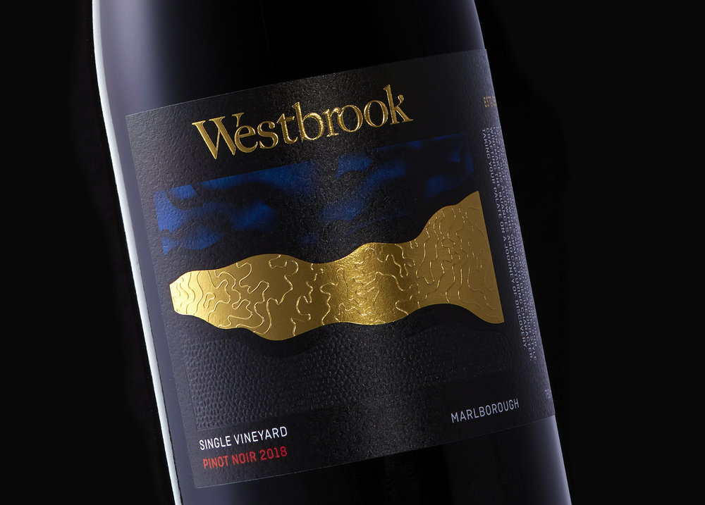
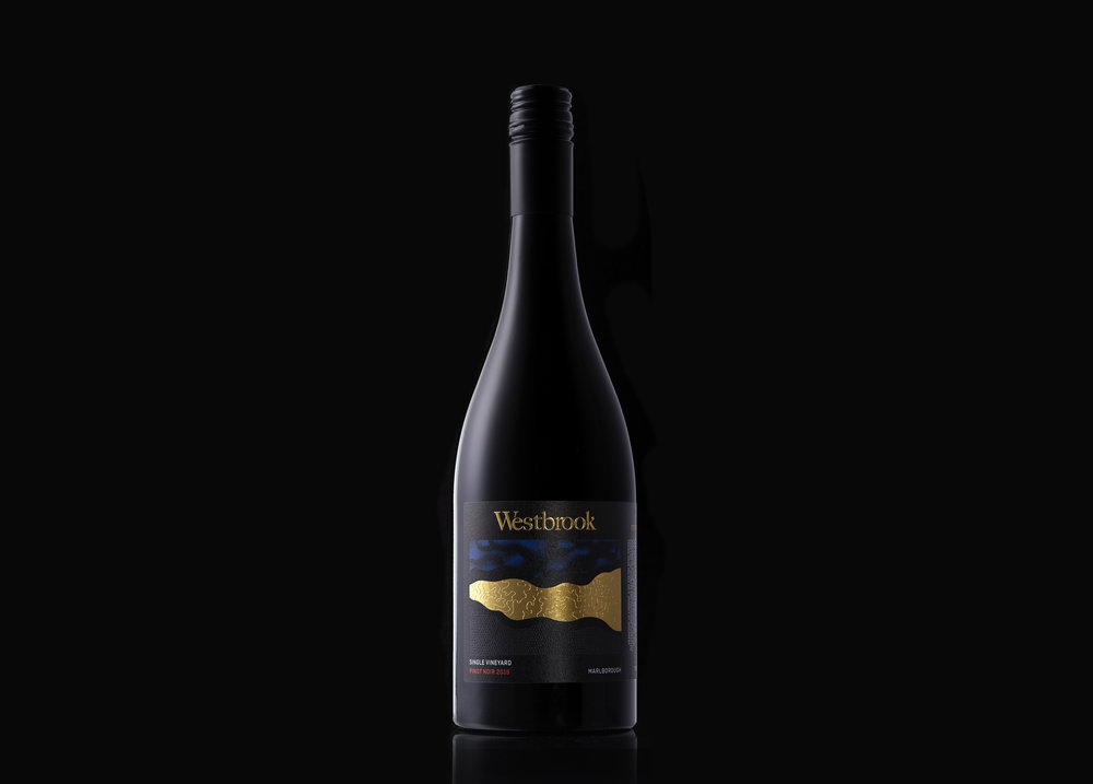
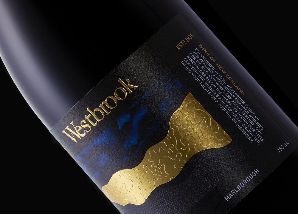
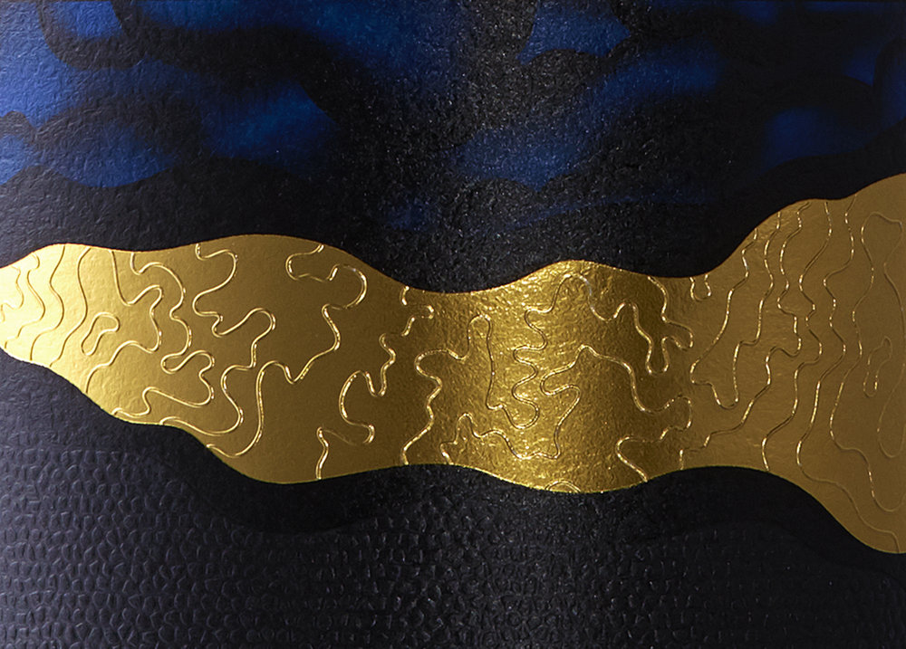
The roots run deep at Westbrook. One of New Zealand’s oldest wineries, Established in 1935, Westbrook is New Zealand’s most highly awarded winery for its size. Their highly crafted wines are all about texture where the winemakers allow the grapes to decide the style, crafting the nuances and capturing character, taking your palate on a journey of discovery. Our brief:Refresh the Westbrook brand and packaging.“Be the bottle of wine you would be proud to take to a dinner party.”Our thinking:Westbrook Winery has the perfect location and terroir to produce outstanding wines. We couldn’t help but be inspired by the estate’s location, Waimauku and the surrounding Kumeu region renown for predominantly clay soils overlying a sandstone base. What better way to tell a story than through the amazing terroir. Geology is proof that the land endures. This set the foundation for our design direction. We wanted to hold on to the existing Westbrook mantra “flows from the land”. However, we needed to take a giant leap forward.Our Creative ExecutionThe brand mark was simplified from West Brook to Westbrook – driven by research that clearly identified it was pronounced as one word. Our packaging hierarchy was designed to be brand led to reinforce the premium brand position and grow the Westbrook brand.We elevated the heritage “Estd. 1935” and brand story to the front of the pack, to run alongside Made in New Zealand – giving cues to support Westbrook’s premium pricing and positioning and to engage our audience with storytelling. 3 Stripes – (Sky, Topography, Terroir ) dominate the packaging design with solid bold visuals, using textural finishing with both de-bossing and embossing over foil and seals supporting our inspiration from Westbrook’s unique terroir and textural characteristics produced in every wine.The sky features in the upper section of the label, with clouds in simplistic gradient tones of blue and black with de-bossed etchings and gloss seals are designed to catch the light. In fact, the packaging labels change dependent on light – providing a unique mood and view at any time. The key focal point is the centre section of the label. We mapped Westbrook’s topography and hand-drew topography lines that is foiled with both de-bossing and embossing. Terroir, represented at the lower section has a textural finish with matt seal and de-bossing. This is printed as 90% black to give a chalky clay finish and reflect the unique soils of the estate. The 3 elements are unique, individual, and visually draw together, showcasing highly crafted and complex wines, both in nature and in texture.Key outcomeYes – I would be proud to take this fine wine to a dinner party.


CREDIT
- Agency/Creative: Redfire Design
- Article Title: Brand and Packaging Design for Westbrook Winery from New Zealand
- Organisation/Entity: Agency, Published Commercial Design
- Project Type: Packaging
- Agency/Creative Country: New Zealand
- Market Region: AsiaBottle
- Format: Bottle
- Substrate: Glass, Pulp Paper


