Double D Creative – The King’s Dairy Yogurt
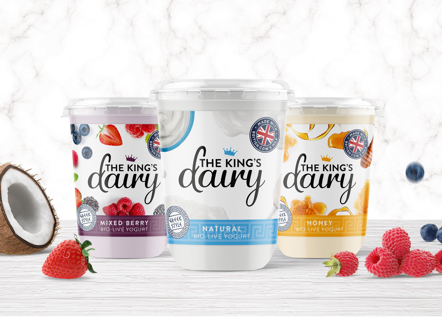
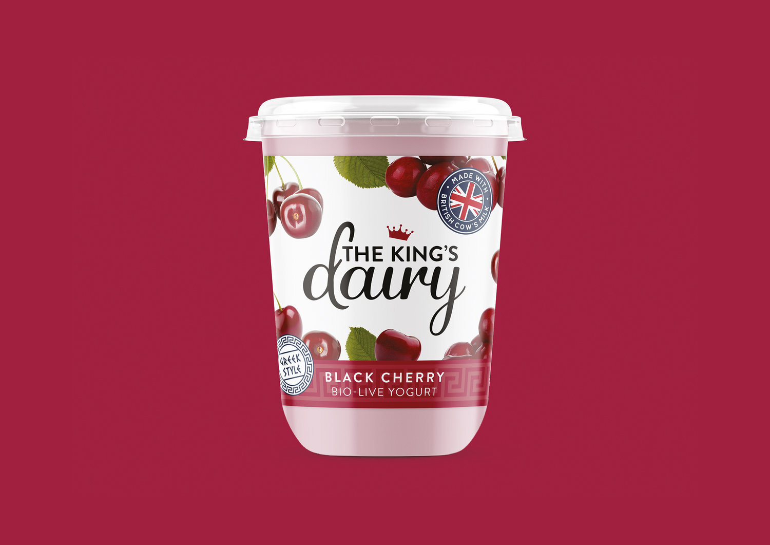
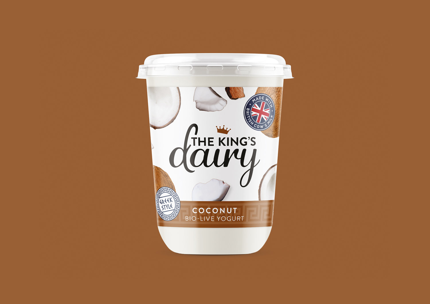
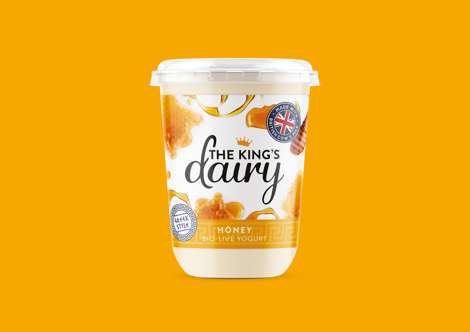
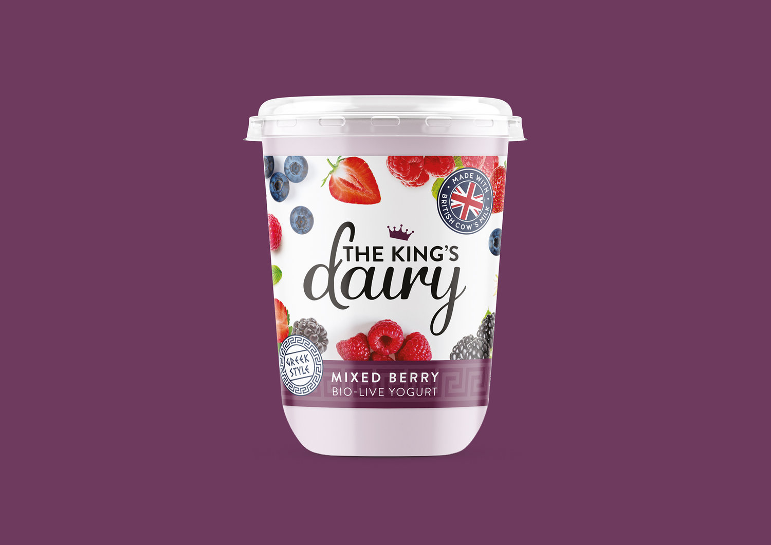
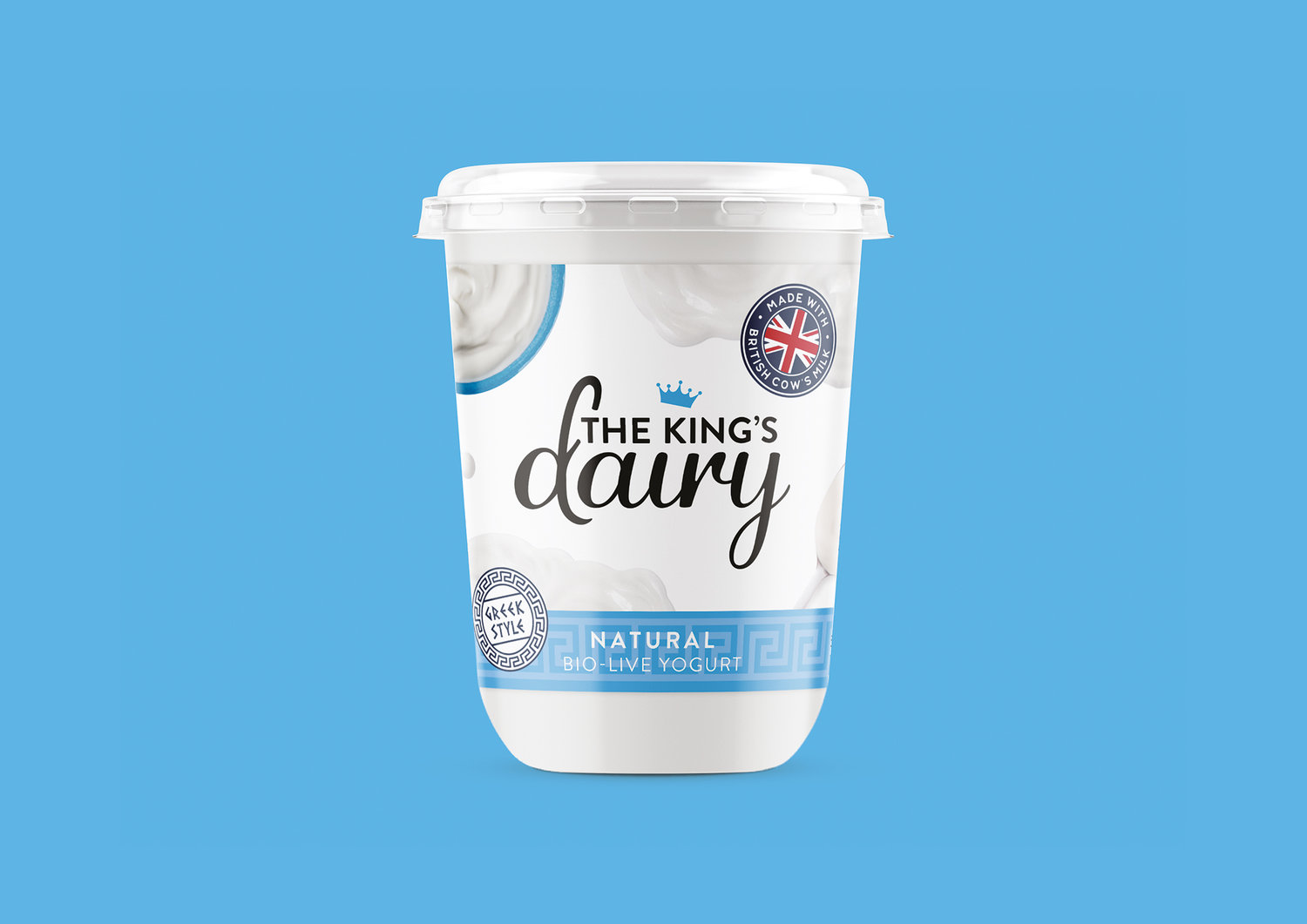
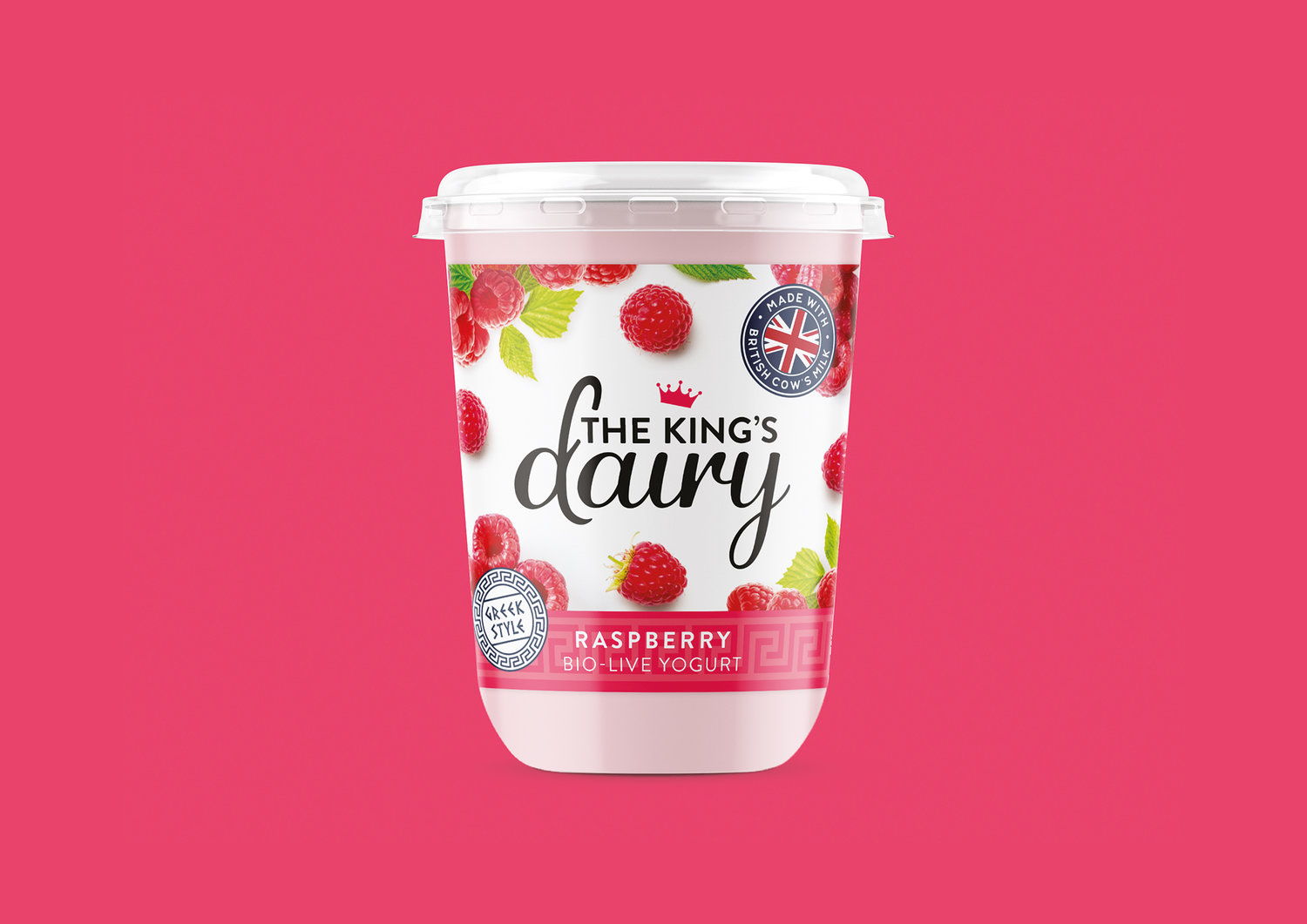
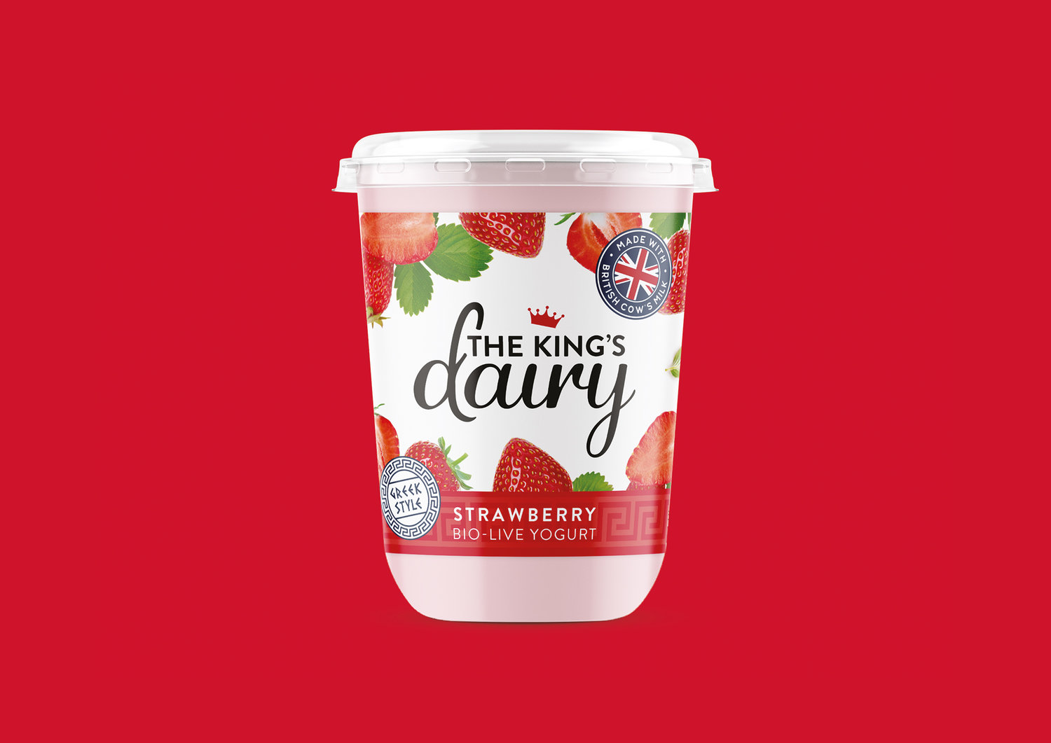
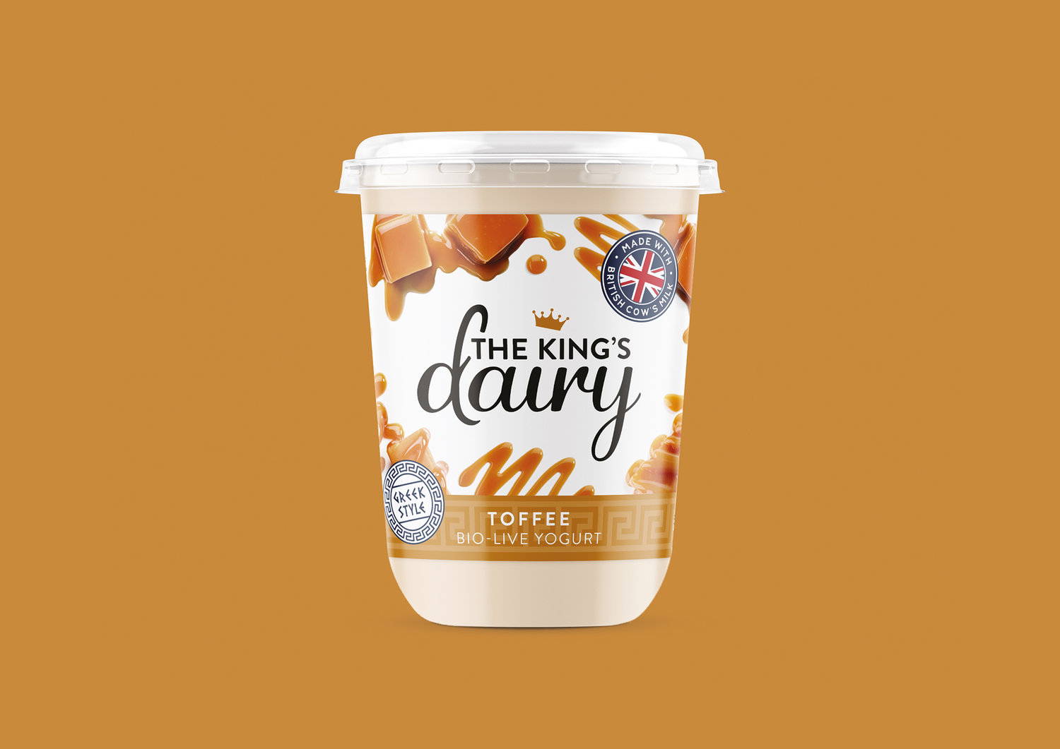
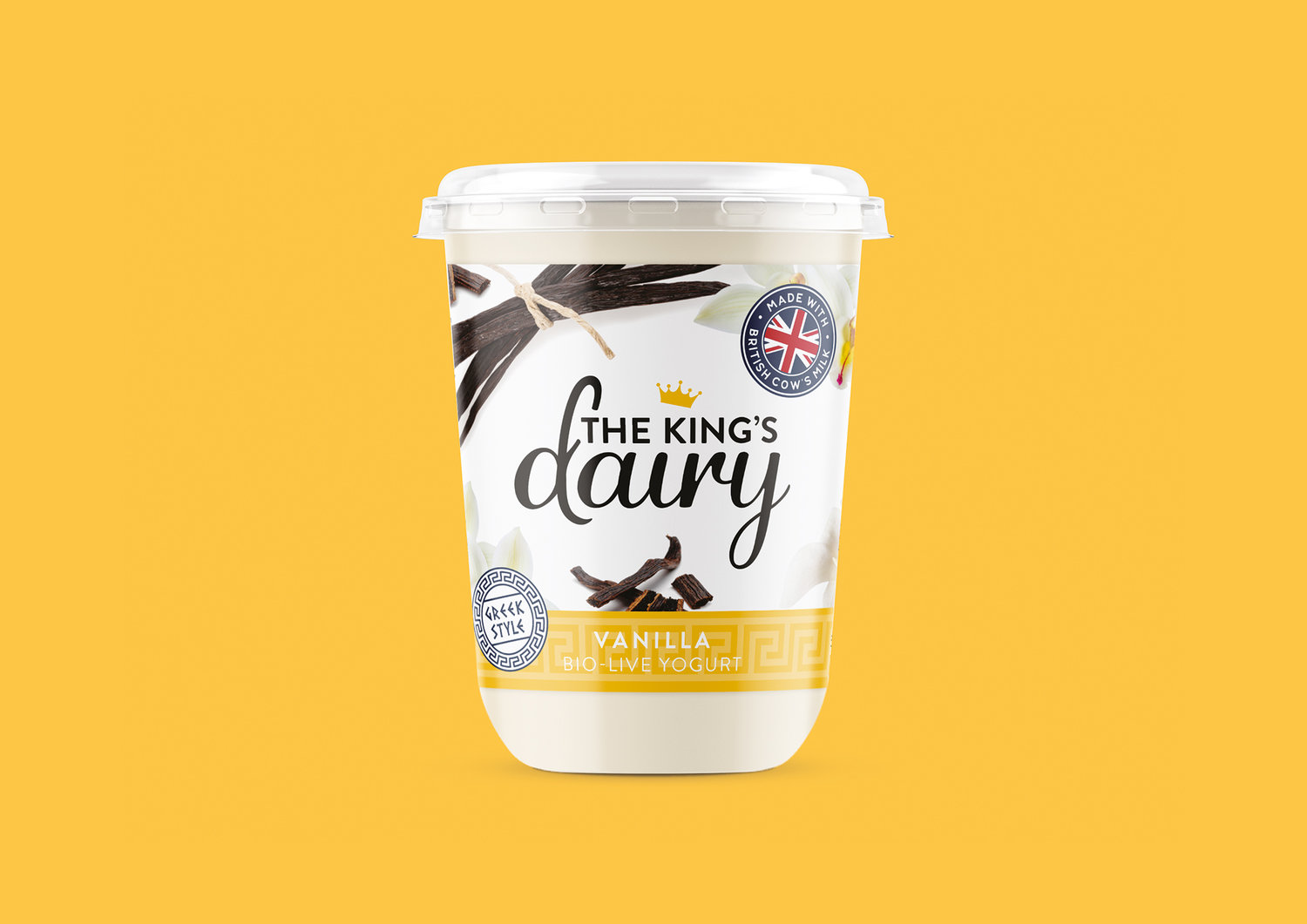
We were approached by Smylies, for whom we had previously created The King’s Deli range of crisps. Much like the previous project, we were initially asked to create an original brand with a distinctly British feel, to appeal to the export market. However, this time for a yoghurt brand instead of crisps. As the project progressed, the brief evolved into creating an umbrella brand for not only Yoghurt but Cheese too.We began by researching the yoghurt market and our name generation led us to use ‘Daisy’s Dairy’ as an early concept. This was run across pack mock-ups for two flavours and then fed back to the client. The designs were similar in style to the King’s Deli packs, with inviting ingredient imagery used to entice consumers.With feedback received it was decided that it would be an excellent opportunity to follow up on the success of The King’s Deli crisps and change the Dairy brand’s name to ‘The King’s Dairy’.This, in turn, led us to develop a logo and packaging that tied in with the existing King’s Deli branding. The product descriptor was then added below the main lockup. This has the added benefit of easier integration for any future products to be released under the King’s Dairy moniker, as the main logo won’t need to be changed.The King’s Dairy Yogurt packaging reflects the clean white colour of the yoghurt itself contrasted by the ingredients for each flavour around the edge, much like the King’s Deli Crisps range.
CREDIT
- Agency/Creative: Double D Creative
- Article Title: Brand and Packaging Design for The King’s Dairy Yogurt
- Organisation/Entity: Agency, Published Commercial Design
- Project Type: Packaging
- Agency/Creative Country: United Kingdom
- Market Region: Europe
- Format: Pot
- Substrate: Plastic


