


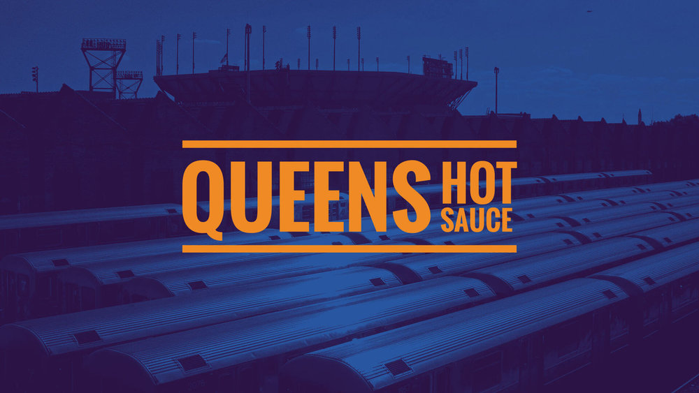
Chargefield – Queens Hot Sauce
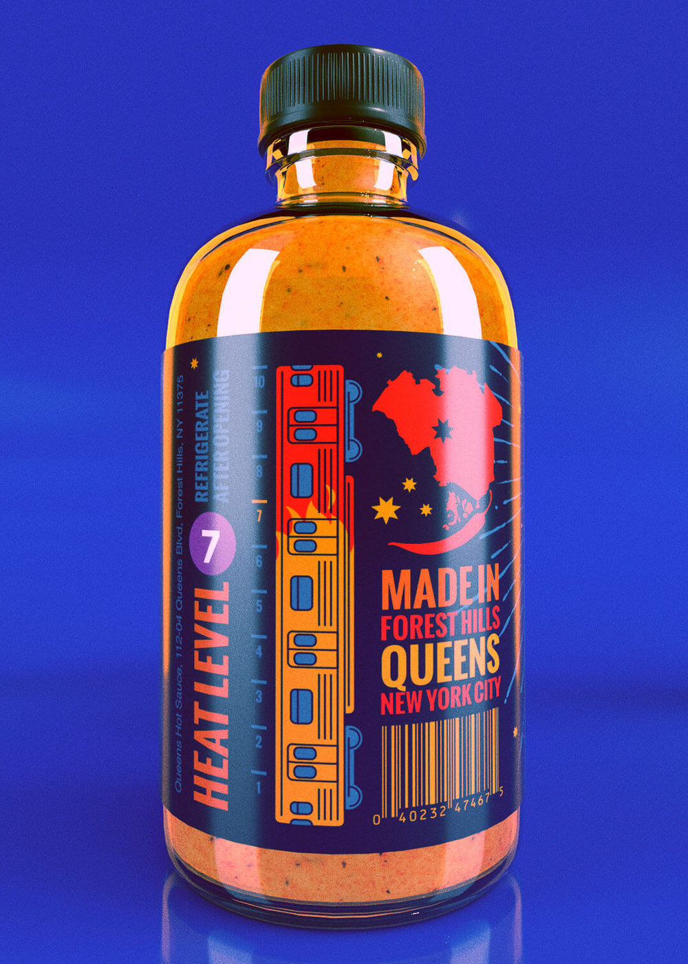
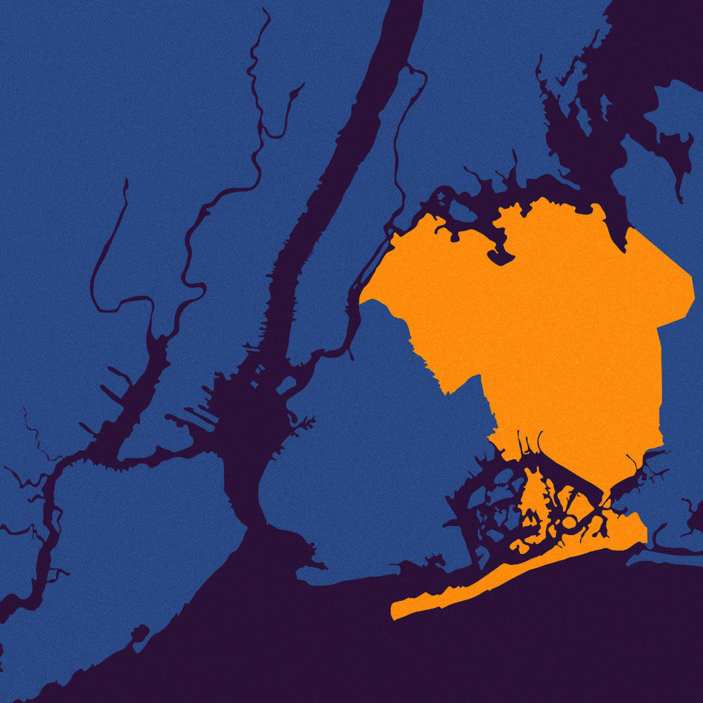
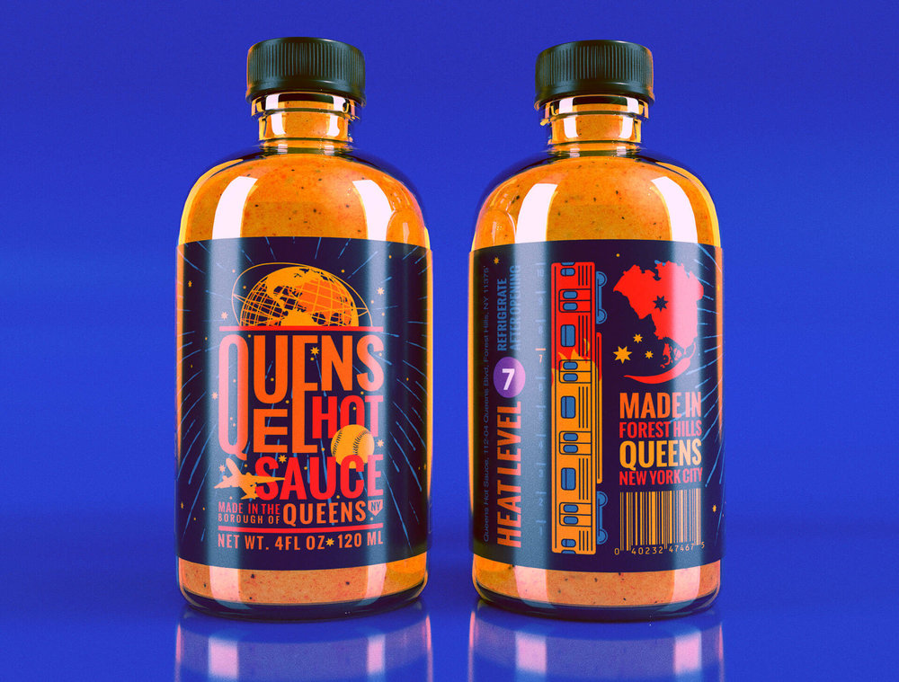
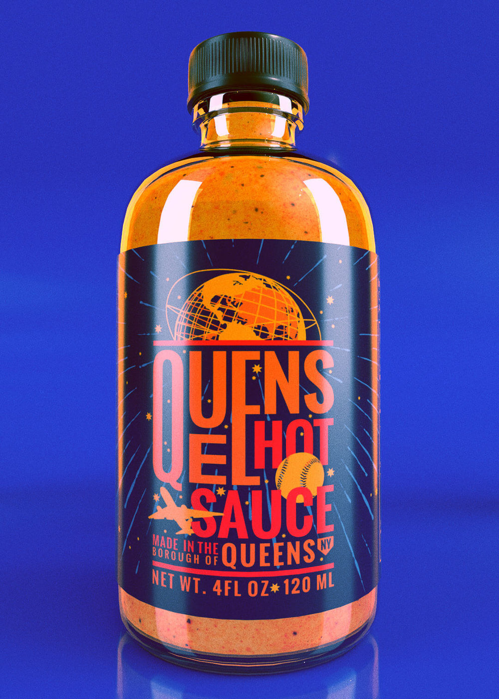
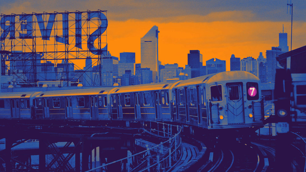
“Queens Hot Sauce wanted a label that represented notable physical landmarks from the largest borough of New York: the Unisphere in Flushing Meadows-Corona Park from the 1964 World fair; Citi Field, home of the New York Mets; and LaGuardia Airport. Put together, a “Planet Queens” visual theme emerged that tied the landmark references together, due to the spherical nature of the Unisphere and baseball, and the transportive nature of an airplane. This also alludes to Queens and New York’s status of a vibrant melting pot of cultures.Some graphical easter eggs that tied Queens and hot sauce together were conceptualized, such as a map of Queens where Rockaway Peninsula is replaced by a hot pepper. Also, the hot sauce has a heat rating of 7, so there was an opportunity to represent the 7 Flushing Local train that runs through Queens as the “heat meter”, as well as representing the number 7 graphically as it appears on the train: in a purple circle.”


CREDIT
- Agency/Creative: Chargefield
- Article Title: Brand and Packaging Design for New York’s Queens Spicy Hot Sauce
- Organisation/Entity: Agency Commercial / Published
- Project Type: Packaging
- Agency/Creative Country: Canada
- Market Region: North America
- Format: Bottle
- Substrate: Glass


