


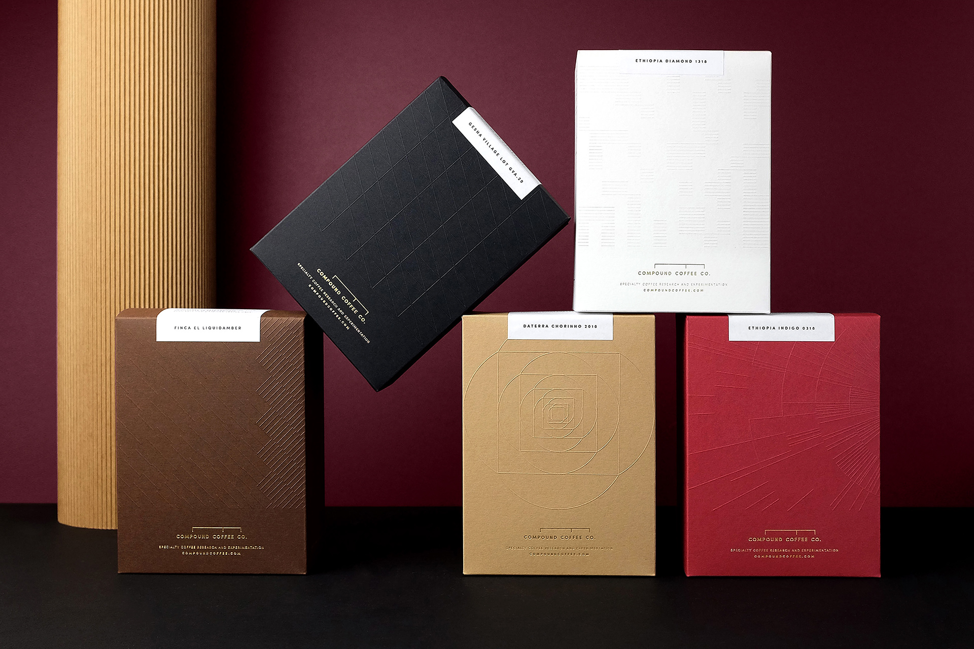
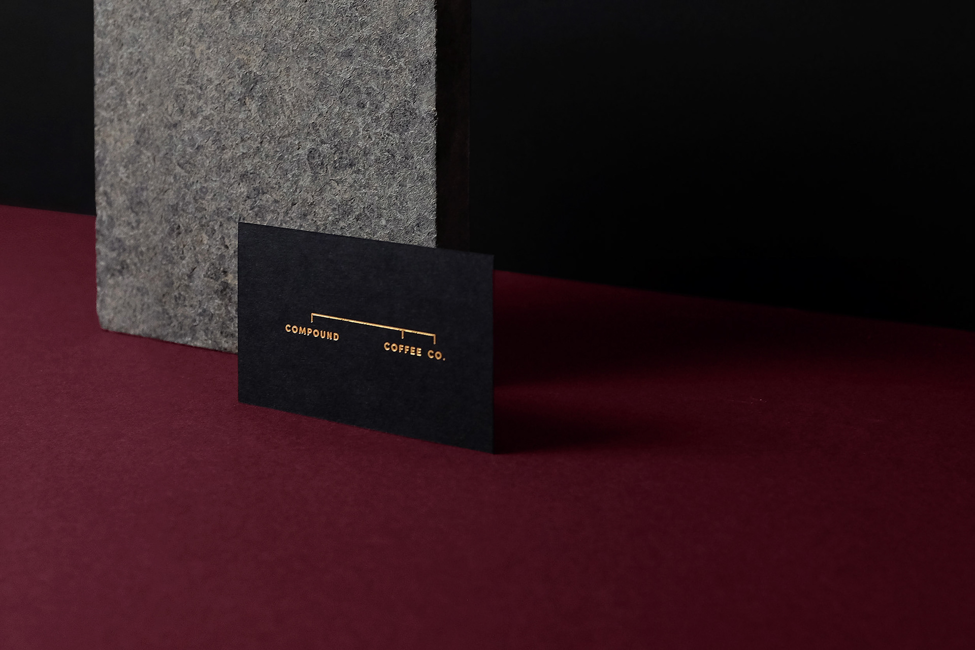
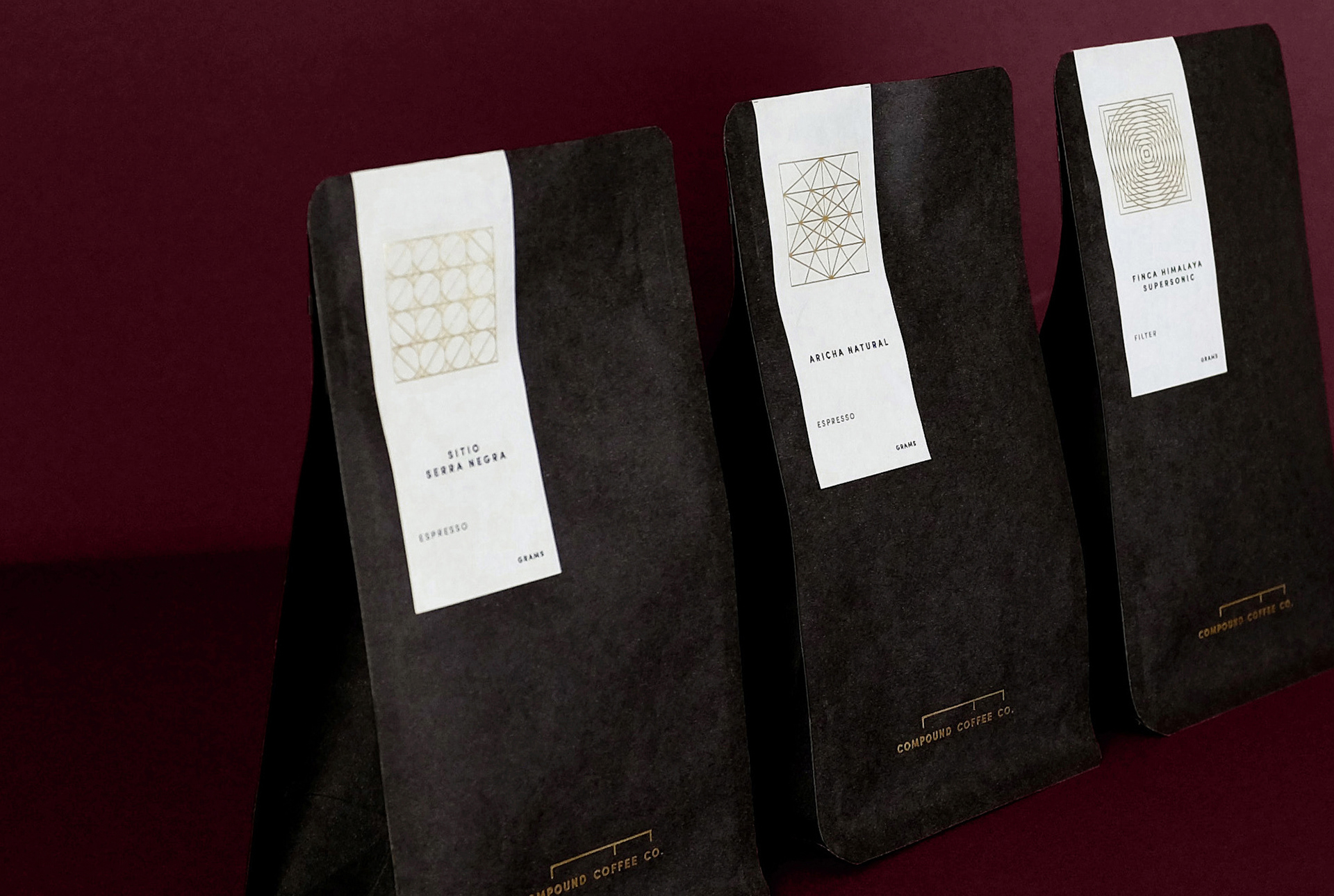
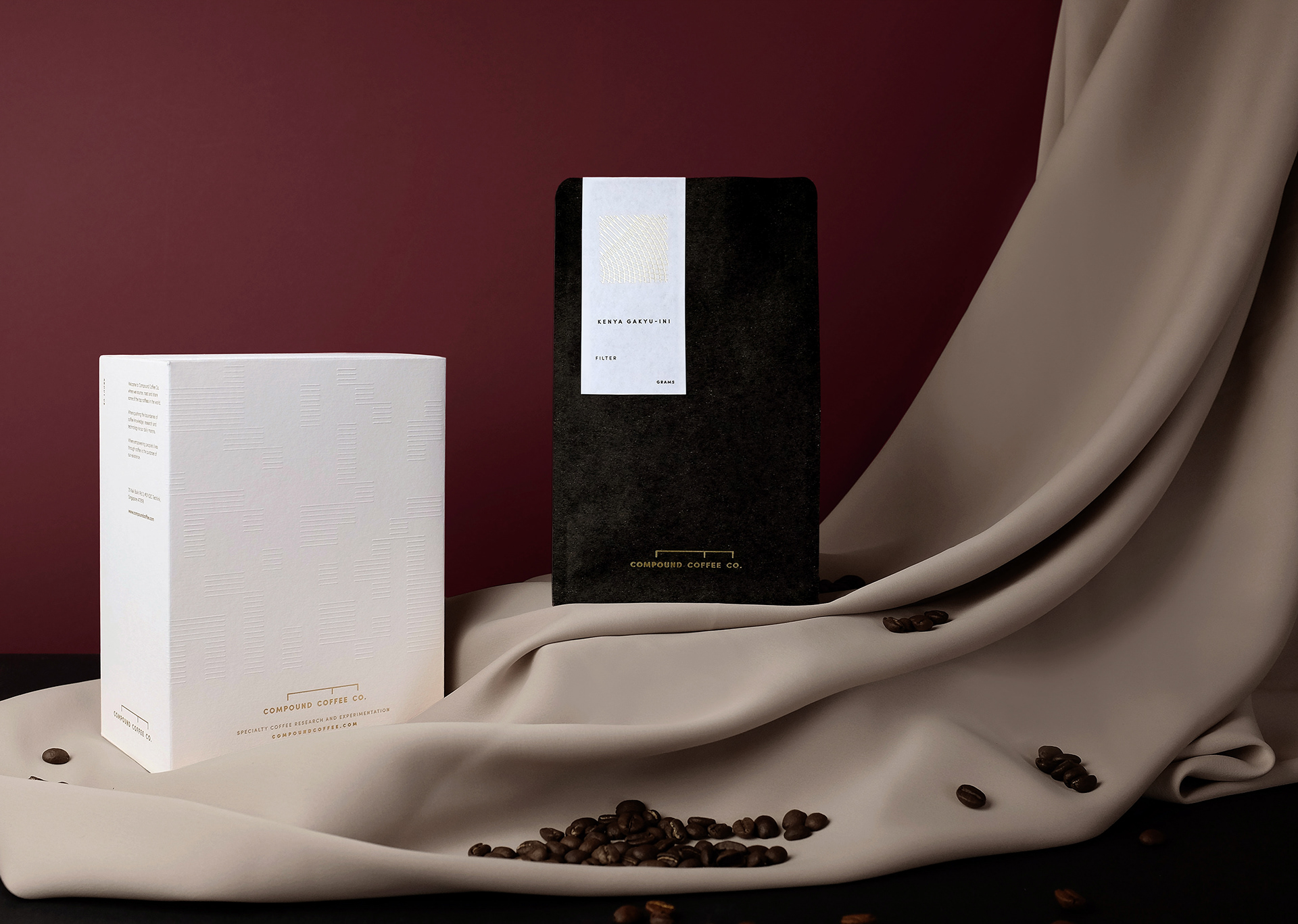
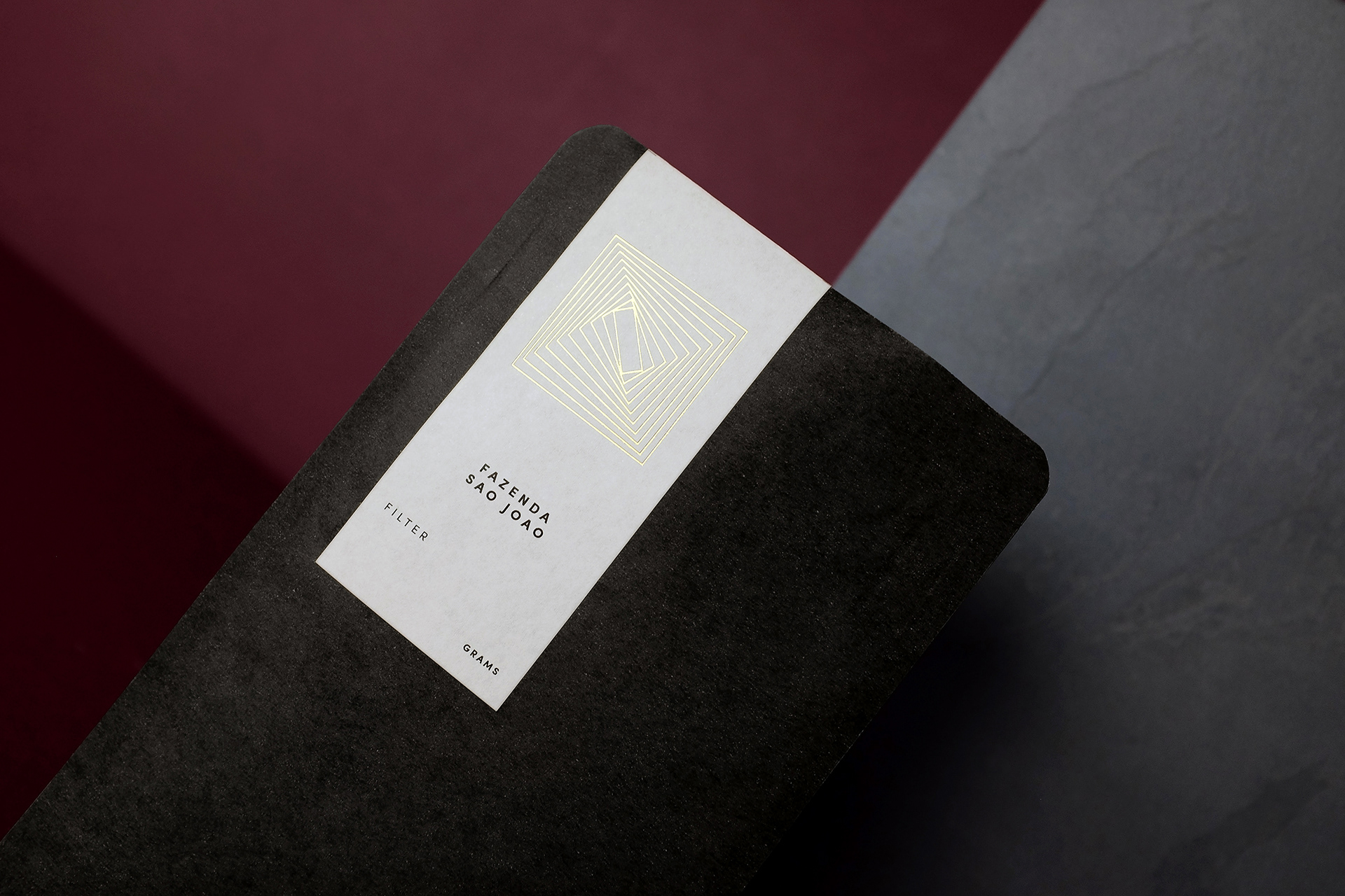
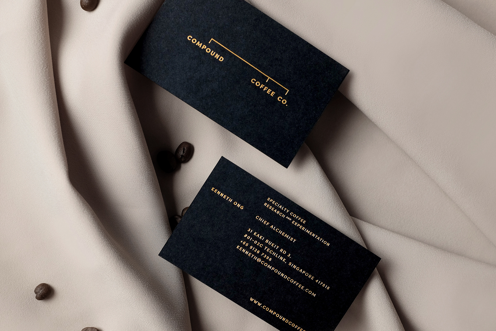
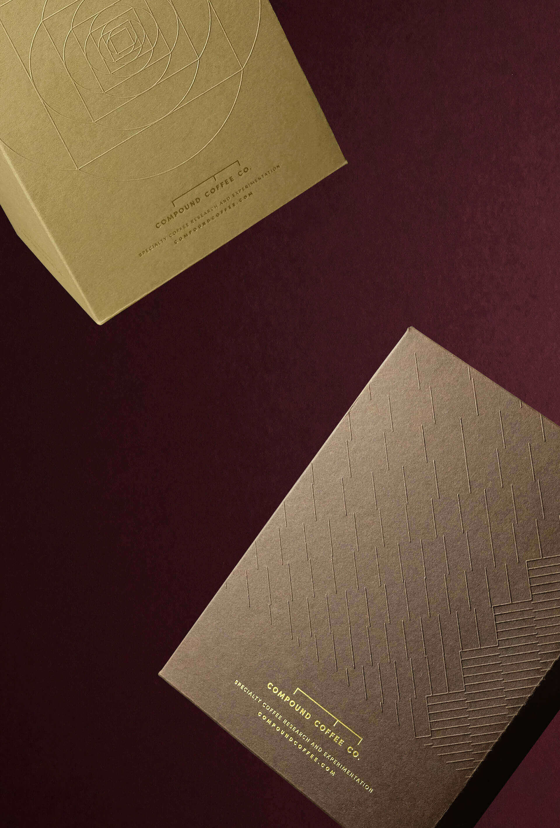
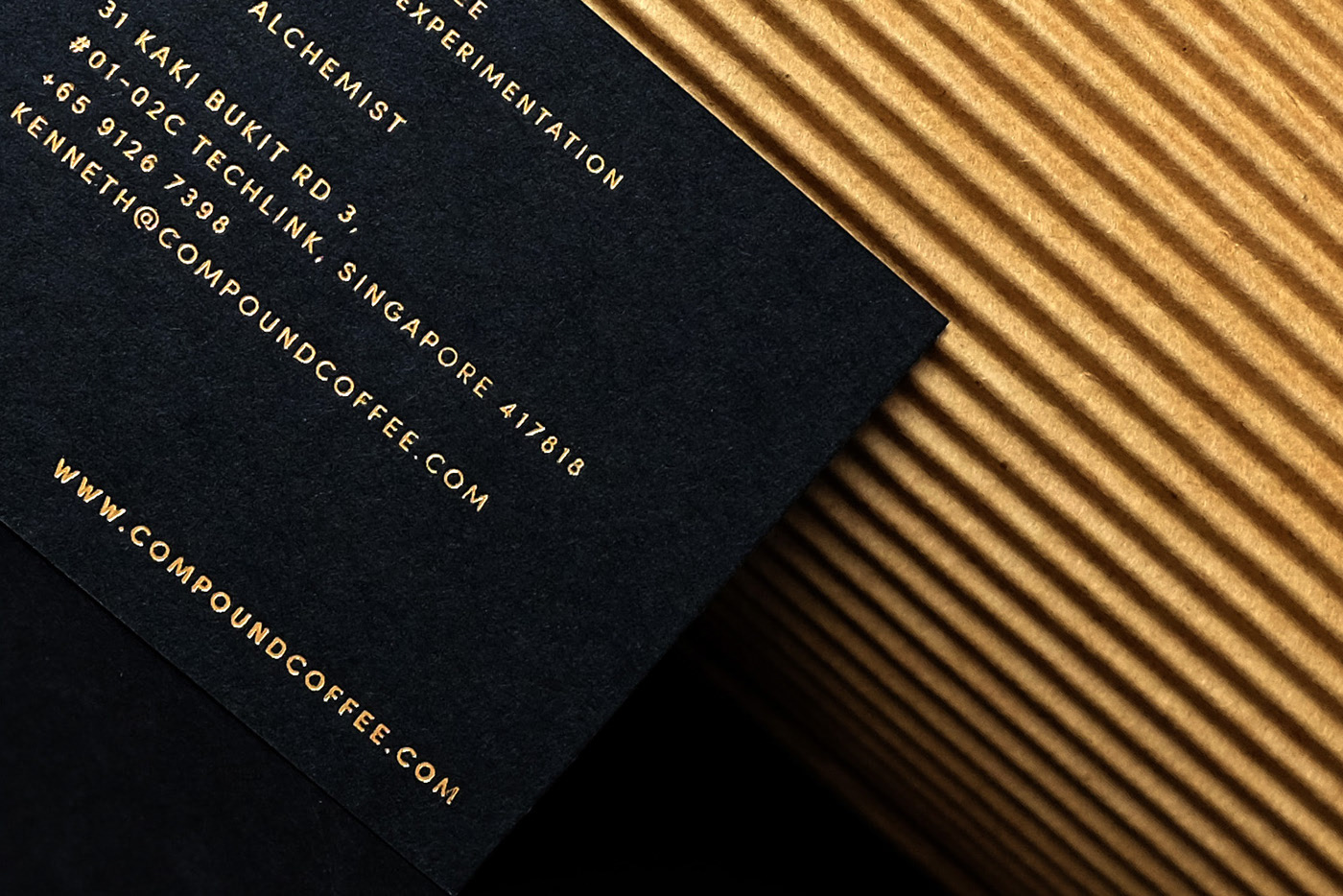
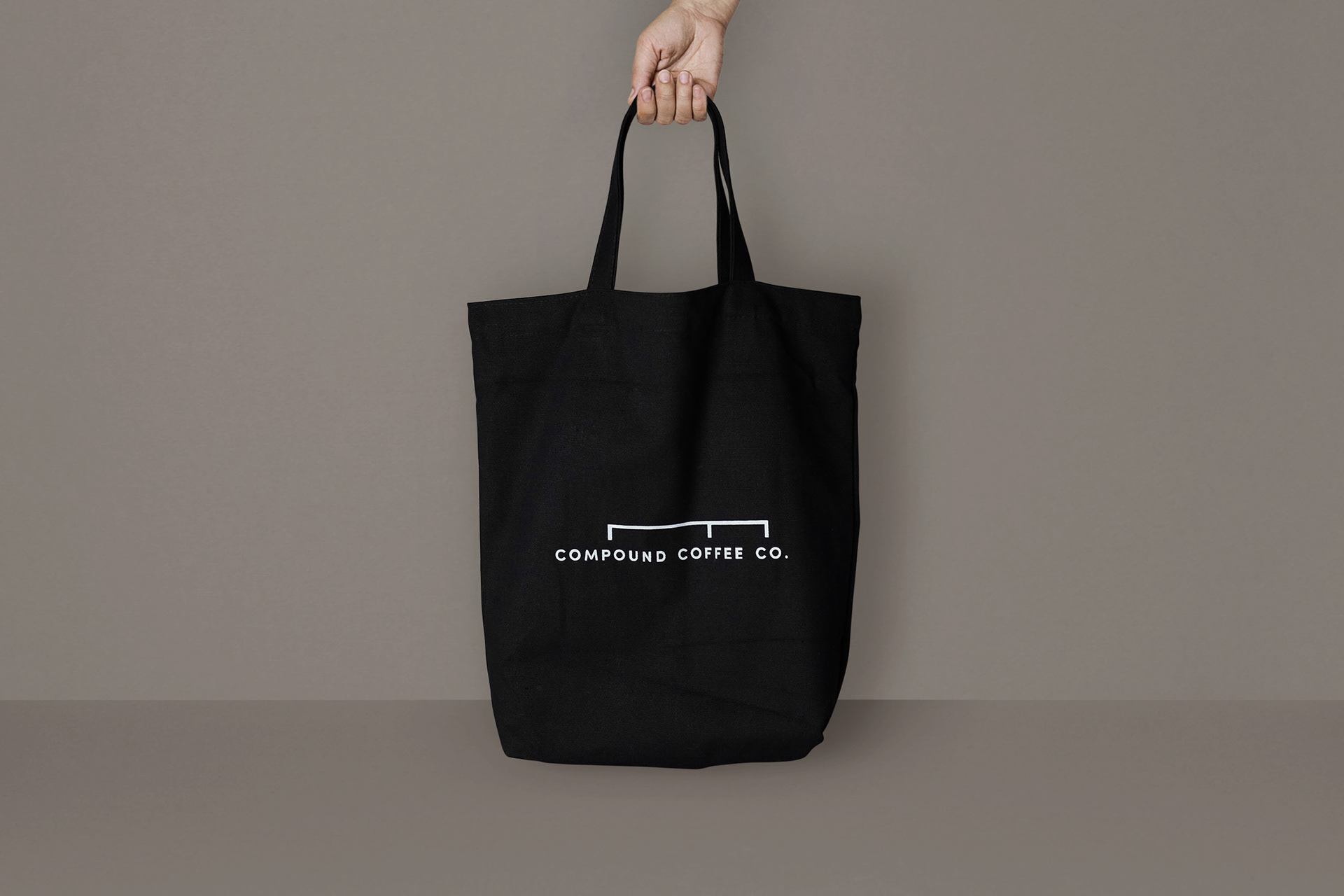
Compound: A new substance made when two or more substances chemically combine. The Logotype is directly inspired by chemistry flow charts. It immediately associates the business name with the visual identity and does not leave much room for brand confusion.
With just a glance, the presentation seems almost scientific, which resonates with the company’s vision to be Singapore’s leading coffee roastery in specialty coffee research and experimentation. The design which features a “link” also highlights the founder’s belief that good coffee is a combined effort from many aspects – from the farmers to the roasters and finally, the barista.
CREDIT
- Agency/Creative: Darling Visual Communications
- Article Title: Brand and Packaging Design for Compound Coffee Company
- Organisation/Entity: Agency, Published Commercial Design
- Project Type: Identity
- Agency/Creative Country: Singapore
- Market Region: Asia
- Project Deliverables: Brand Identity, Brand Strategy, Branding, Packaging Design, Tone of Voice
- Industry: Food/Beverage
- Keywords: Brand Identity, Packaging Design, Coffee, Retail
FEEDBACK
Relevance: Solution/idea in relation to brand, product or service
Implementation: Attention, detailing and finishing of final solution
Presentation: Text, visualisation and quality of the presentation


