


The Confectionery House are a small, Melbourne-based, father and son confectioner, specialising in high quality, traditionally made, sustainably sourced chocolate products. Having learnt their trade at one of Australia’s iconic chocolate makers, they set up their own business in 1985.
We worked with them to develop a new, high end chocolate honeycomb brand based on an evident consumer need for this type of product and a clear gap in the Australian market.
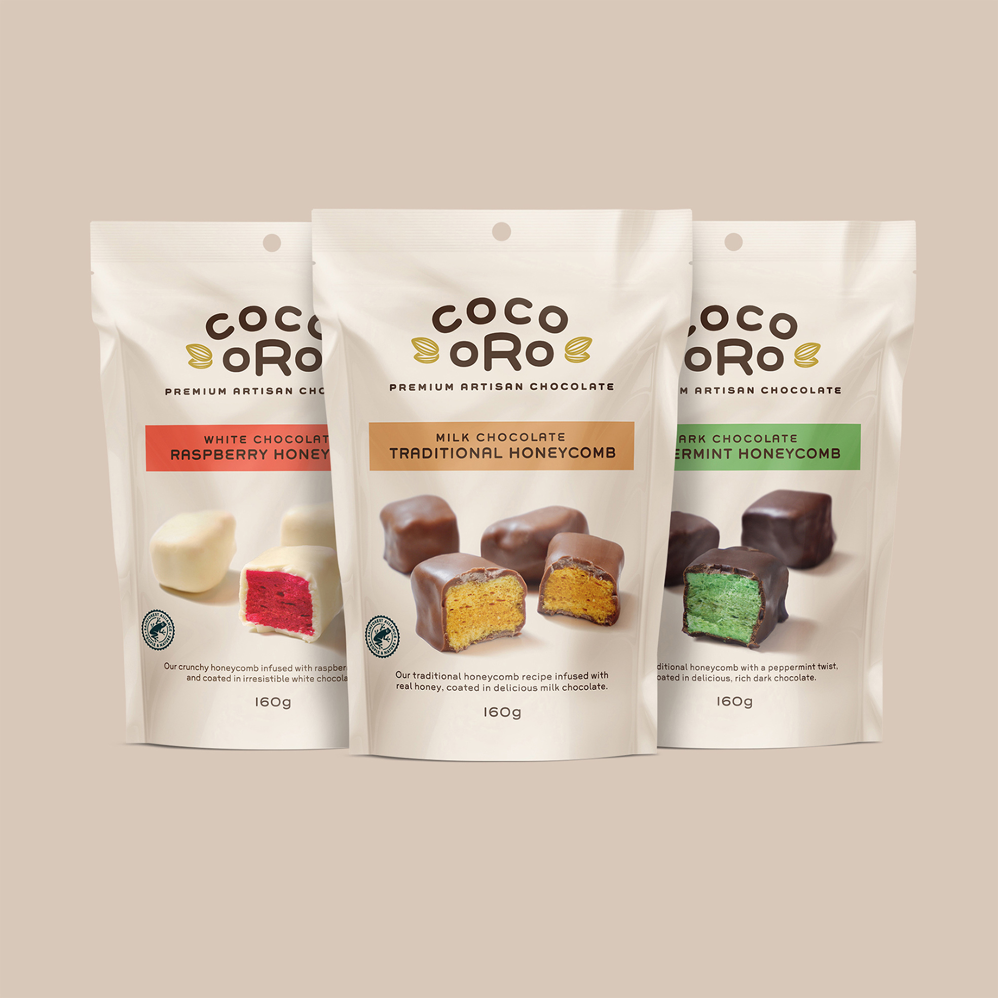
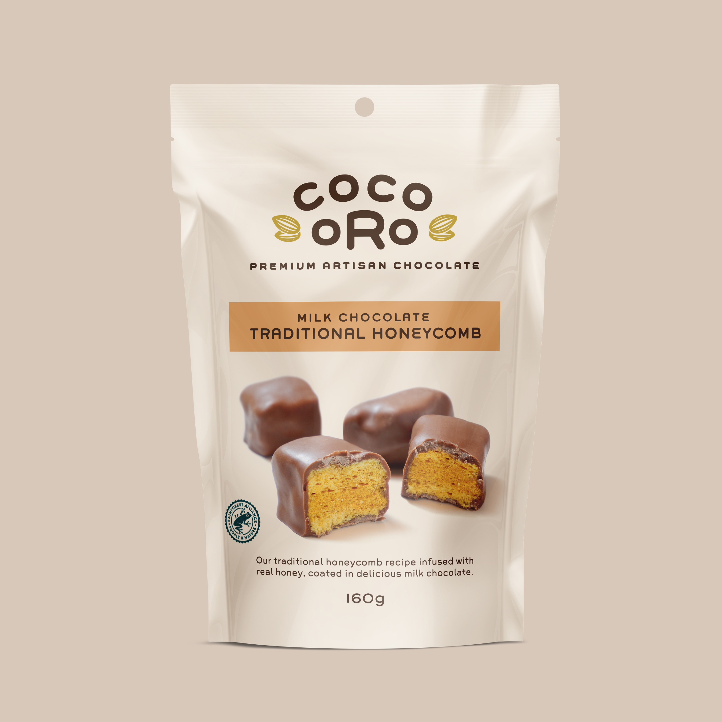
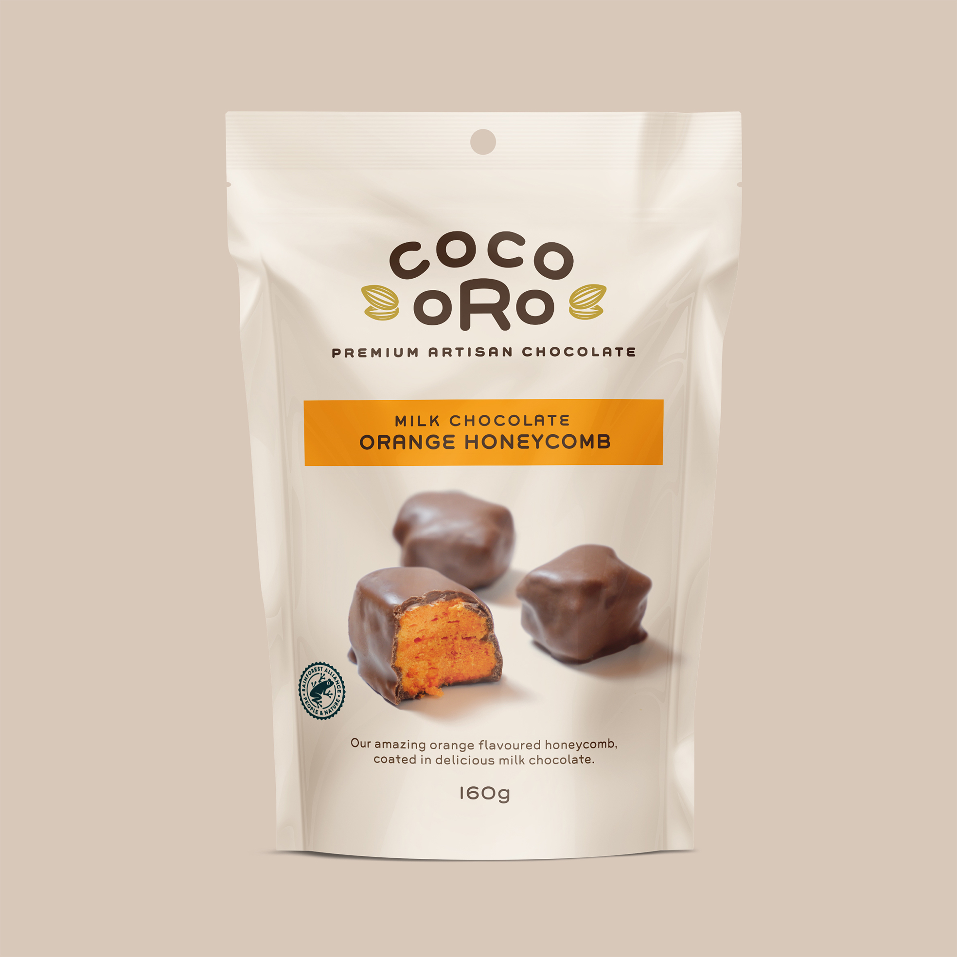
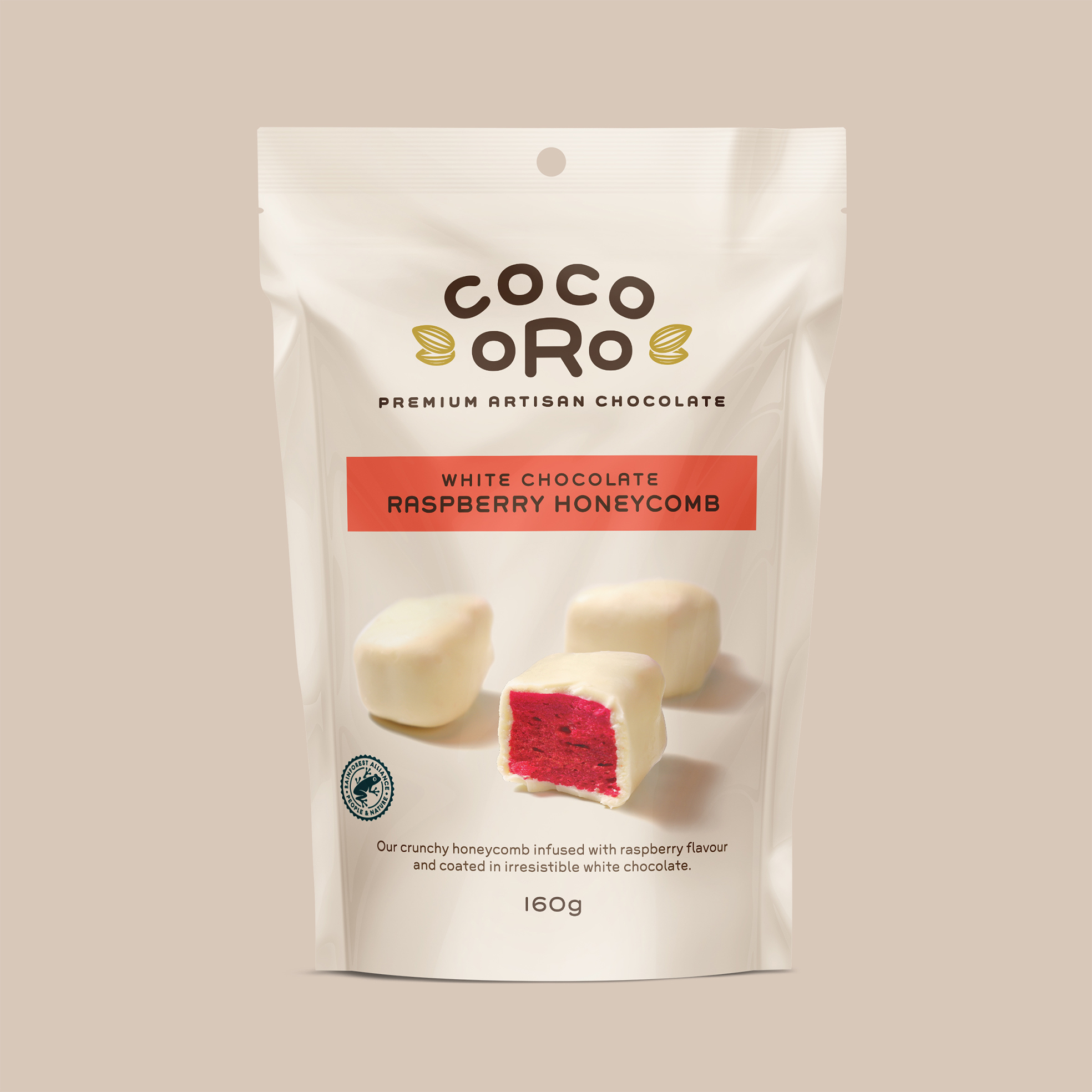
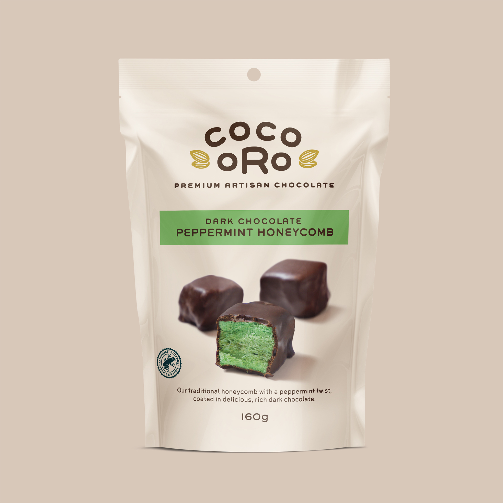
The brand is positioned as an artisan challenger brand. In a market dominated by cheaply made multi-national brands it’s point of difference is that it’s a contemporary, locally made offer with ethically sourced, high quality ingredients made using traditional, artisanal methods.
Our naming process led to a beautiful, simple and catchy name that immediately expresses the quality positioning of the brand. We also ensured that the brand name had longevity and was broad enough to allow the brand to expand into other confectionery categories in the future.
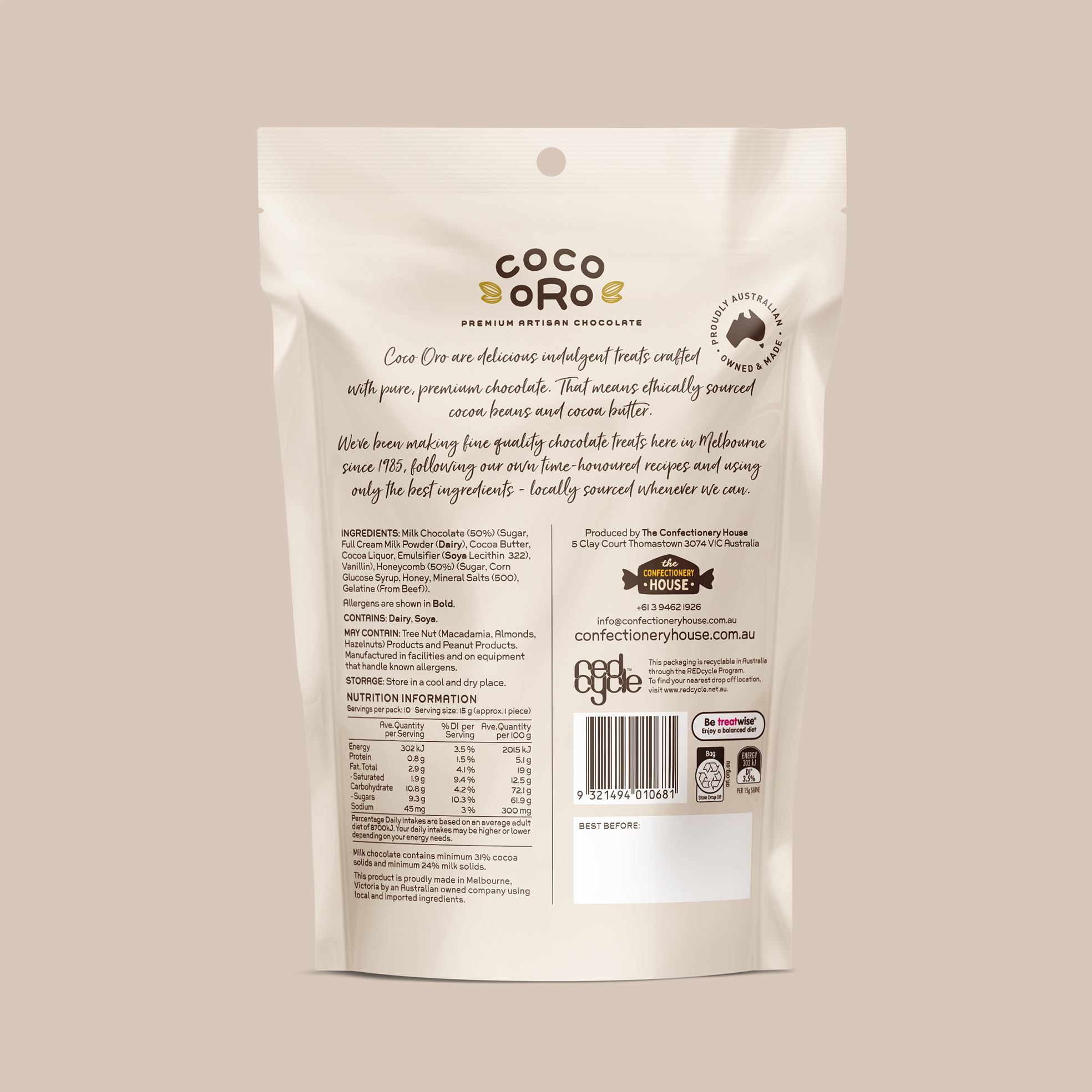
In bringing the brand and packaging to life, we used a minimalist and elegant aesthetic, deliberately juxtaposing traditional graphic style with a single, modern font. This ensures that the packaging has a confident, established feel while also being firmly grounded in the present. We also consciously avoided the cliché of using black to denote premium, instead using an inviting, chocolaty cream as the primary pack colour.
The bold and uncluttered editorial style product photography with its shallow depth of field makes it the hero of the pack and ensures that taste appeal is the key motivator in consumer purchase intent.
The Coco Oro range has been a hit with the public and has opened up new retail opportunities for The Confectionery House. It is a crucial part of a broader repositioning, rebranding and repackaging process they are undertaking with us.
CREDIT
- Agency/Creative: Asprey Creative
- Article Title: Brand and Packaging Design for Coco Oro
- Organisation/Entity: Agency
- Project Type: Packaging
- Project Status: Published
- Agency/Creative Country: Australia
- Agency/Creative City: Melbourne
- Market Region: Oceania
- Project Deliverables: Brand Creation, Packaging Design
- Format: Bag
- Substrate: Plastic
- Industry: Food/Beverage
- Keywords: Packaging Chocolate Premium
-
Credits:
Creative Director: Peter Asprey


