


Juan Jose Montes – KOS
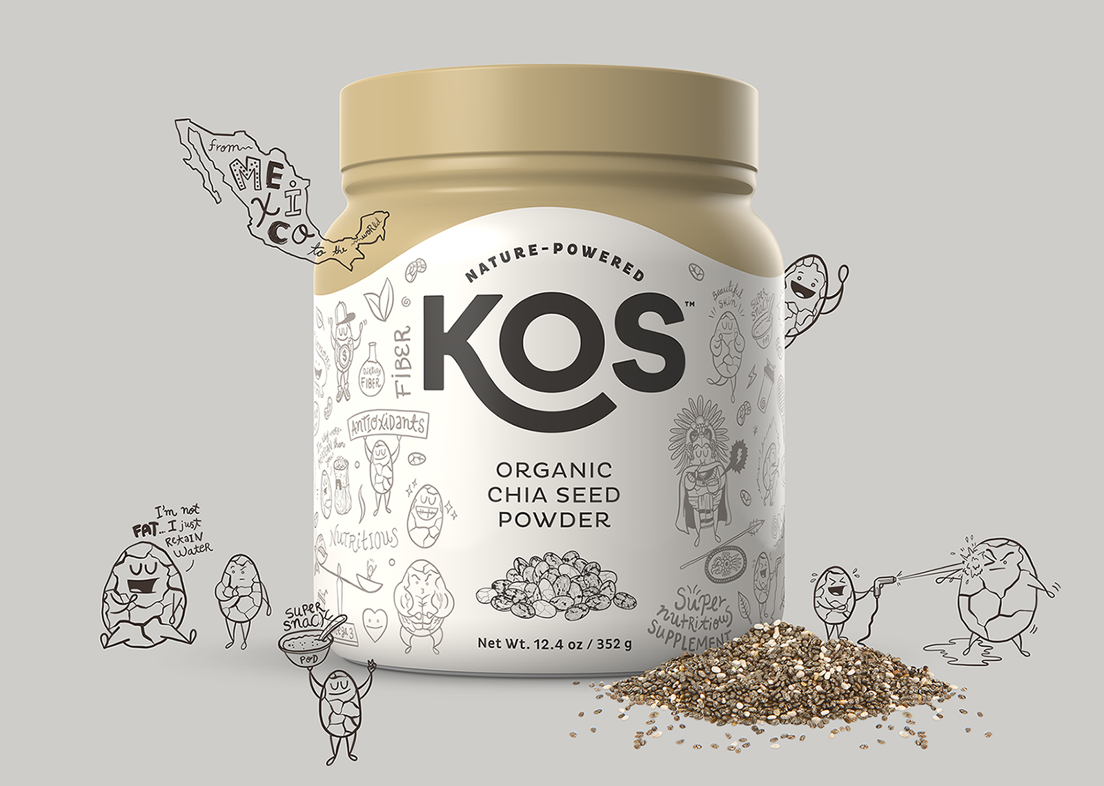
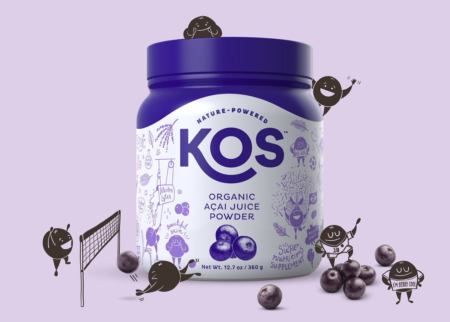
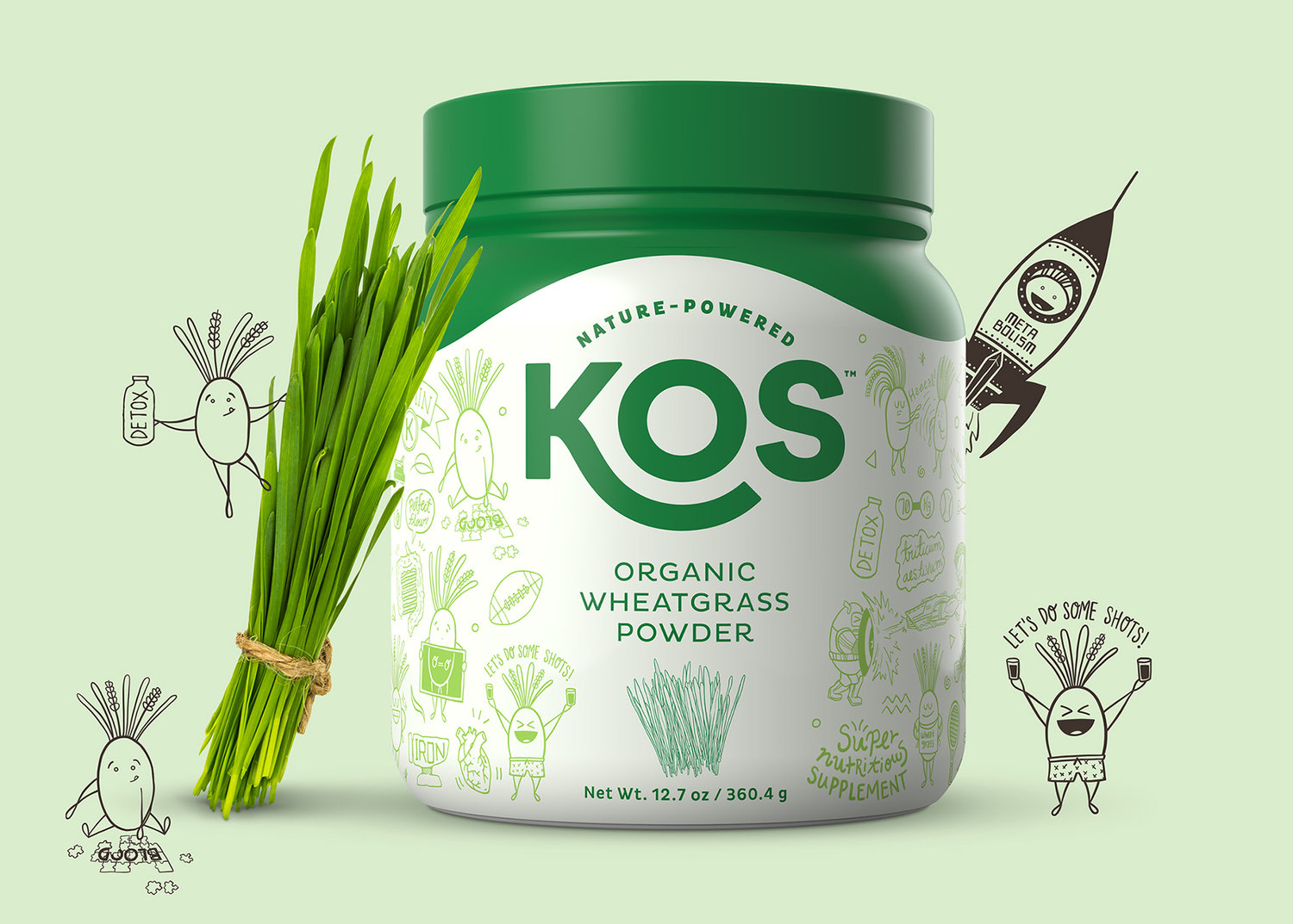
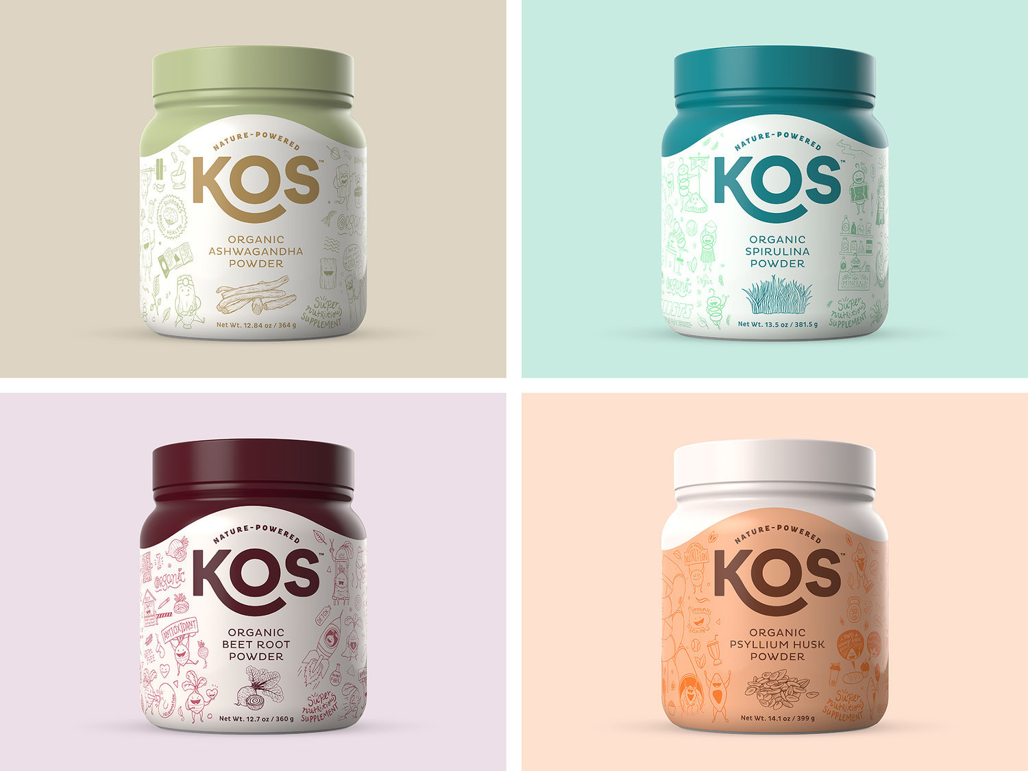
KOS is a brand of natural – and plant-based – solutions created to provide easy and healthy nutritional alternatives for everyone, focusing (for now) on powdered superfoods. The story of KOS begins with Tony and Allan, two guys in their 40’s living in Santa Barbara (California) that decided to launch their own superfoods brand to offer easy-to-use solutions with high nutritional value. They wanted their products to stand out in the marketplace through a bold identity that allowed the company to connect with their customers in a very human and down-to-earth way, because they had seen how boring and non-emotinal their competitors were.The solution came as a very clean, straight-forward and colorful identity and packaging where doodle-type illustrations are used to depict each products’ specific benefits and characteristics through the personification of their ingredients (character design) and through situations from every day life, pop culture, TV shows, movies and even the ingredients‘ physical qualities. In other terms, each product has its very own set of customized illustrations that will get the attention of anyone who comes across them. Humor has been very important throughout the whole design and illustration process; it has allowed us to communicate very dull – but important – information in a very whimsical and fun way that we realized was not being exploited by any of their competitors. We realized most of the competition fell under the same scheme, the apparent category’s status quo: pictures of the ingredients and listed benefits on the front, all so similar between them that seemed to us like they wanted to blend rather than stand out. That’s what KOS wanted to avoid at all cost, and that’s why they dared stand out. And the results have been more than ideal: After their first year of existence, the company has built a solid social media presence, good positioning on amazon and most importantly, a loyal fan base that has allowed them to keep launching new products and developing new solutions with real nutritional value. That’s also why, this year, after only running on their plant-based protein powder as a test drive, they started to launch their new family of single-ingredient powders called KOS Pantry. Imagining what an ideal kitchen pantry should contain, they came up with some amazing ingredients and ways to include them easily into healthy meals, beverages and snacks. Açai, Reishi mushroom, Wheatgrass, Spirulina, Beetroot, Lion’s mane mushroom and Ashwagandha powders are just some of the 20+ references they have just introduced into the KOS product family. And this is just the beginning.


CREDIT
- Agency/Creative: Juan Jose Montes
- Article Title: Brand and Packaging Design for a Family of Organic Plant-Based Products
- Organisation/Entity: Freelance, Published Commercial Design
- Project Type: Packaging
- Agency/Creative Country: Colombia
- Market Region: North America
- Format: Bottle
- Substrate: Plastic


