


Branding for the Extreme: Arceon’s Identity Design
Introduction: Arceon’s Innovation
Founded in 2018, Arceon has revolutionized the production of advanced materials, making them cost-effective, scalable and high-performing. Originally focused on the space and defence sectors in the Netherlands, Arceon’s innovative approach has catapulted them across Europe as the go-to manufacturing partner for companies seeking advanced material solutions.
Arceon’s groundbreaking work lies in their ability to simplify the manufacturing process of advanced materials, once considered exotic and unattainable. They produce carbon fiber reinforced composites capable of withstanding temperatures up to 2800°C. This innovation opens up new possibilities for sectors like Space, Defense, Semiconductor and Energy, offering them materials that enhance their innovations significantly.
But innovation like this needed a brand that could match its ambition.
For this, Arceon partnered with Studio Carbon to build a holistic brand identity that reflects the resilience, boldness and future-forward nature of their mission. We were tasked with designing everything from brand philosophy, visual language, and collateral designs to devising an entire nomenclature system.
The Challenge
How do you design a brand identity for something that exists on the frontier of science?
Arceon’s biggest challenge wasn’t its technology. They had it figured out. Their challenge was translation. How do you communicate the value of thermostructural composites to an audience that ranges from government agencies to deep-tech founders? How do you evoke the emotion of possibility and hope, without overwhelming them with complexity?
Our challenge therefore, was to build a brand that balanced the radical innovation of Arceon’s materials with an accessible, aspirational brand identity that felt bold, scientific and yet, human.
The Brand System
After a detailed kickoff workshop with the founders, we started mapping everything from the brand origins, vision, aspirations and target groups. We did extensive market study, competitor analysis and synthesis of our research to narrow down the area where Arceon needed to be. We began by articulating Arceon’s core ethos: Transcend Boundaries. This tagline later became the north star for every design decision.
We started ideation and mood boarding for the brand, and thus started the process of designing a complete design system:
As part of this system, we created:
1. Brand Narrative: A story of transformation, resilience and scientific daring.
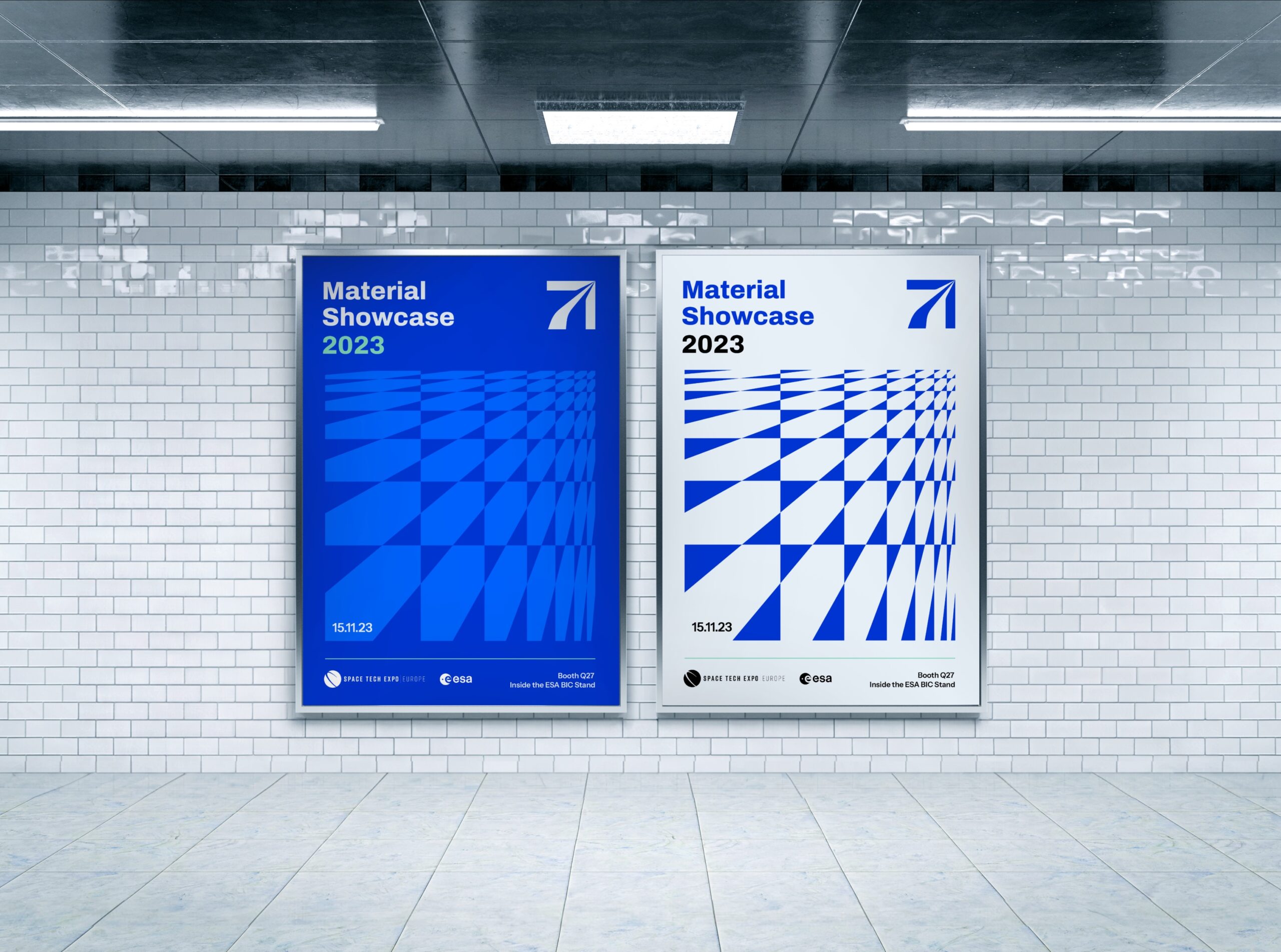
2. Visual Identity: A sharp, futuristic wordmark, along with a unique pictogram.
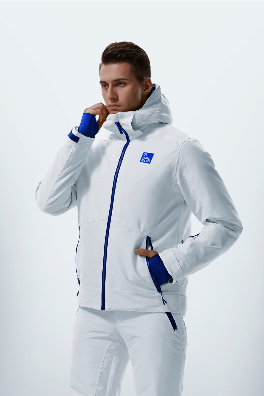
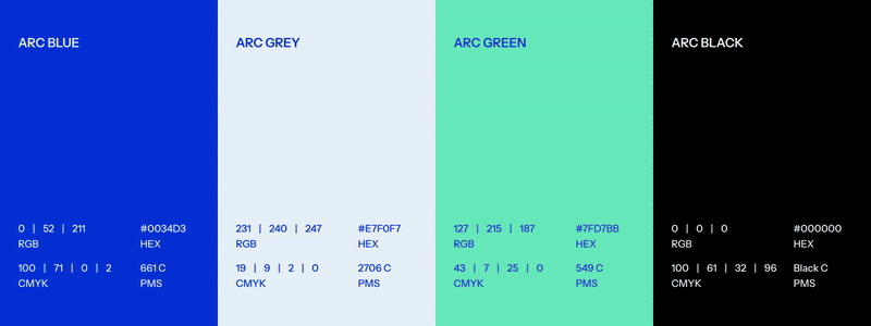
3. Colour System: A palette that perfectly portrays the extreme nature of Arceon’s work. Each colour fulfilling a different purpose – Arc Blue (trust and clarity), High-Tech Green (pioneering spirit), Deep Black (technical depth), and Soft Grey (stability and neutrality).
4. Typography: We zeroed in on functional and contemporary sans-serif fonts with subtle design nuances that add uniqueness, without compromising readability.
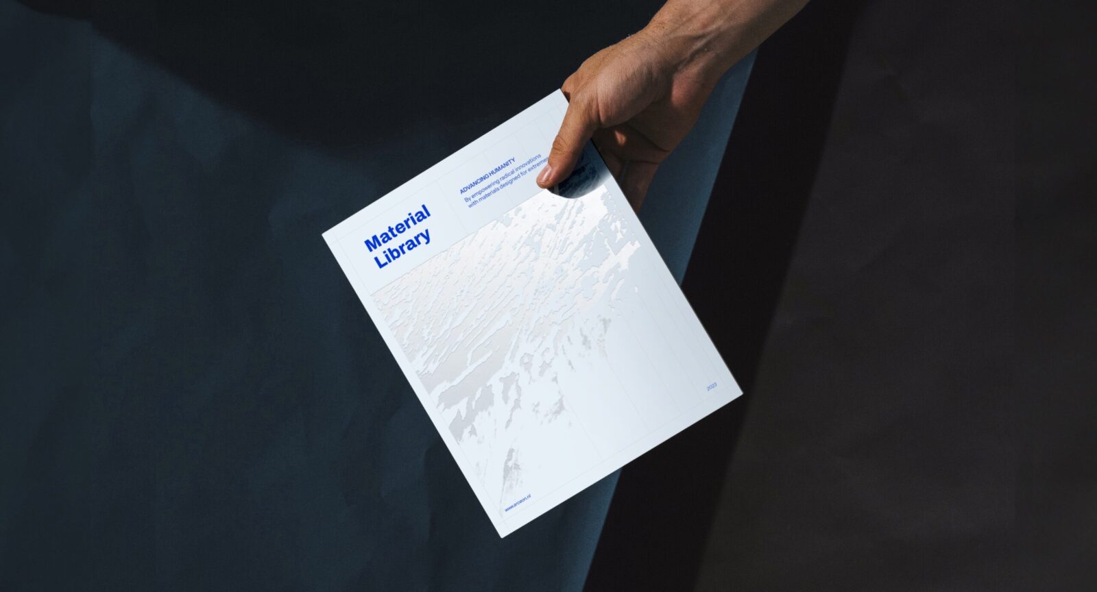
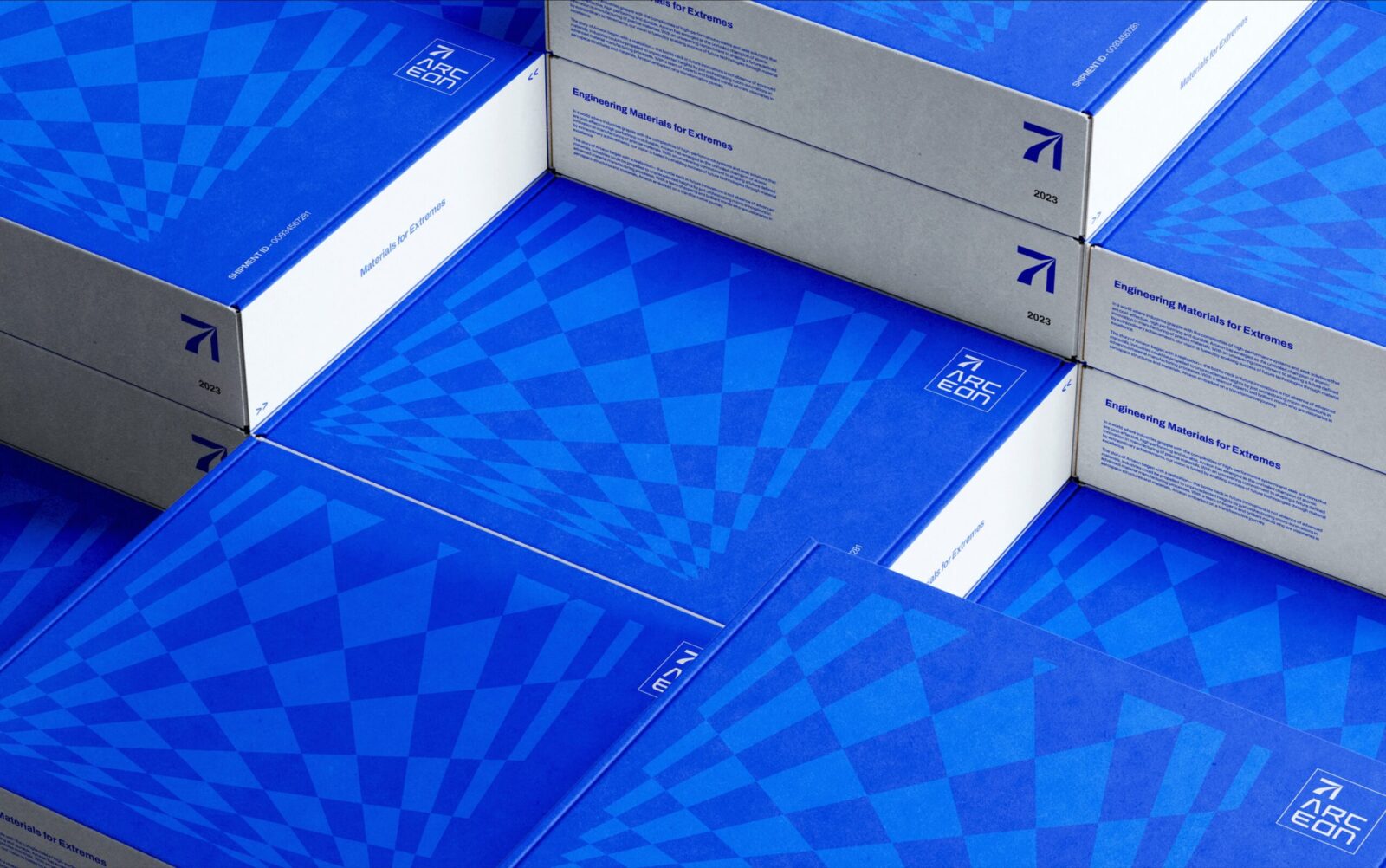
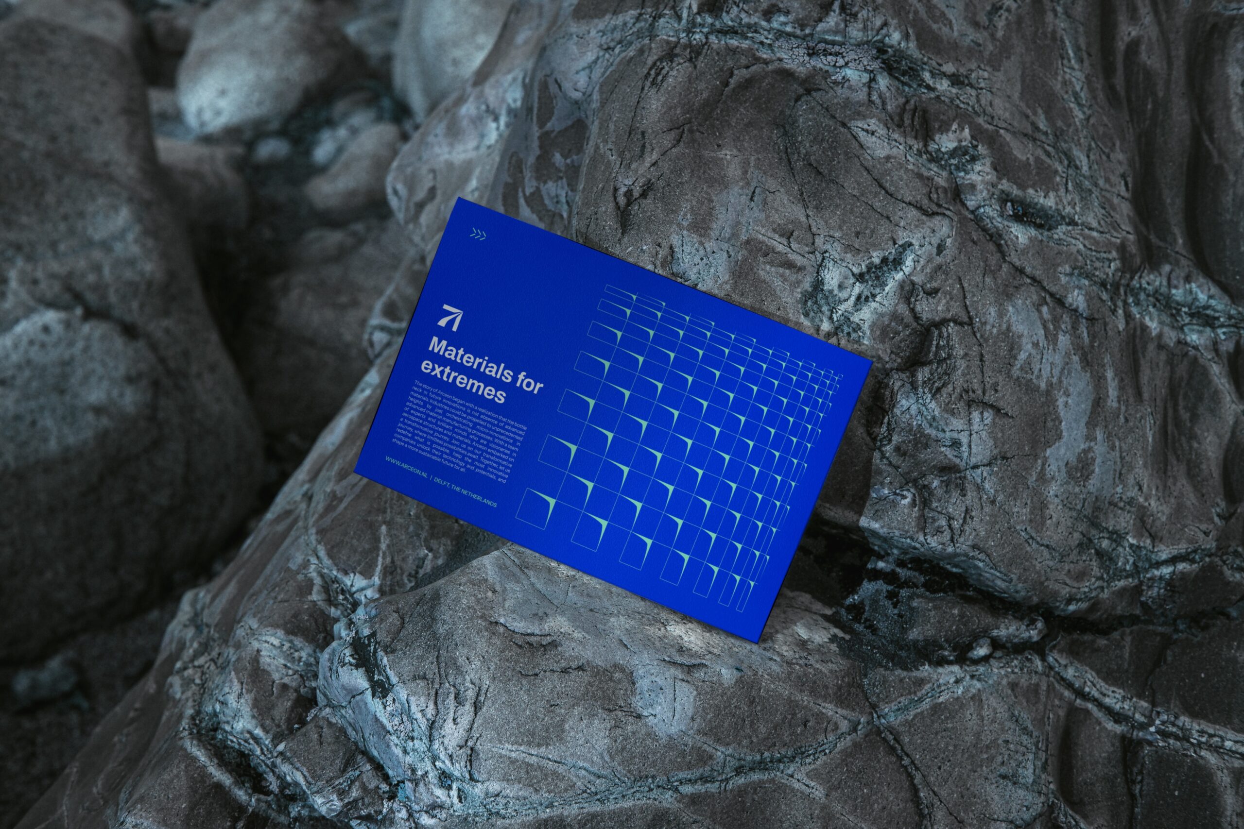
5. Brand Patterns: Graphic assets for Arceon were inspired by real-life material samples, tactility and surface textures.
Material as Medium
One of the things we did different with Arceon’s branding was the experimentation and use of tactile surfaces in developing textures and patterns for various use cases.
During this process, we conducted a series of tactile and digital explorations, drawing from textures of different weaves, stones, ceramic fracture patterns etc. These were later abstracted into a modular visual system that could be used across brand communications, in presentations, posters, brochures and digital platforms.
The system we designed was communicative. Each pattern was designed to subtly reflect the properties of extremity, strength and structure within the natural chaos.
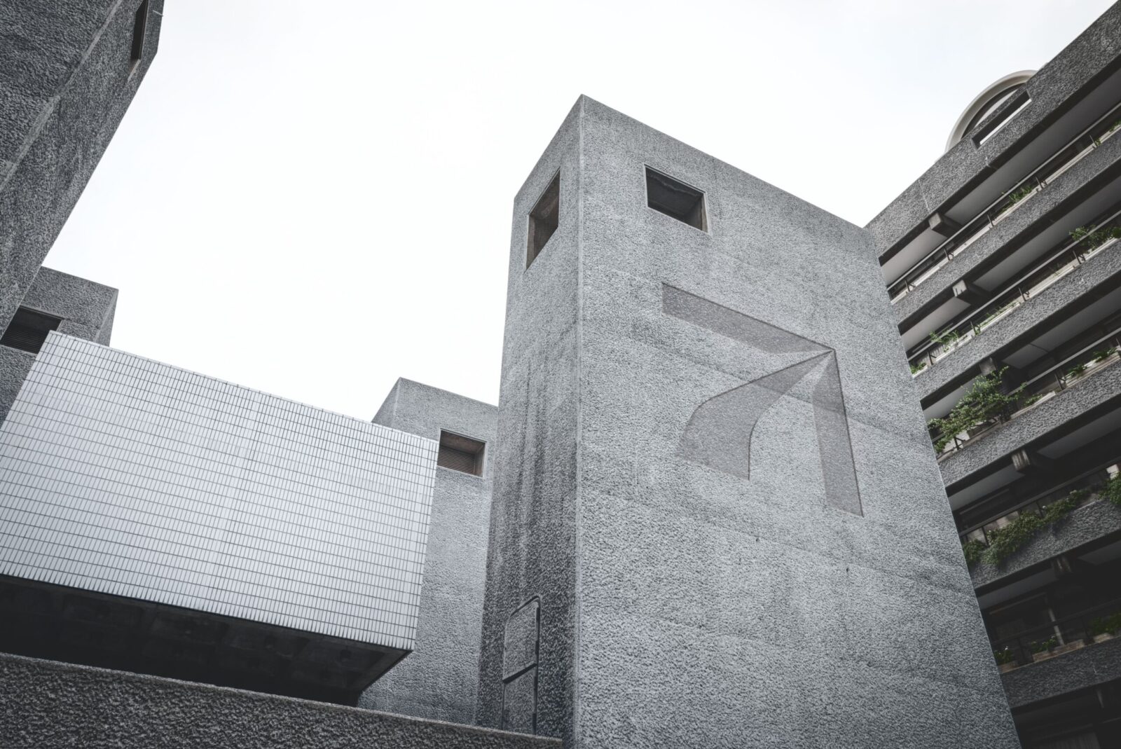
The Logo Story
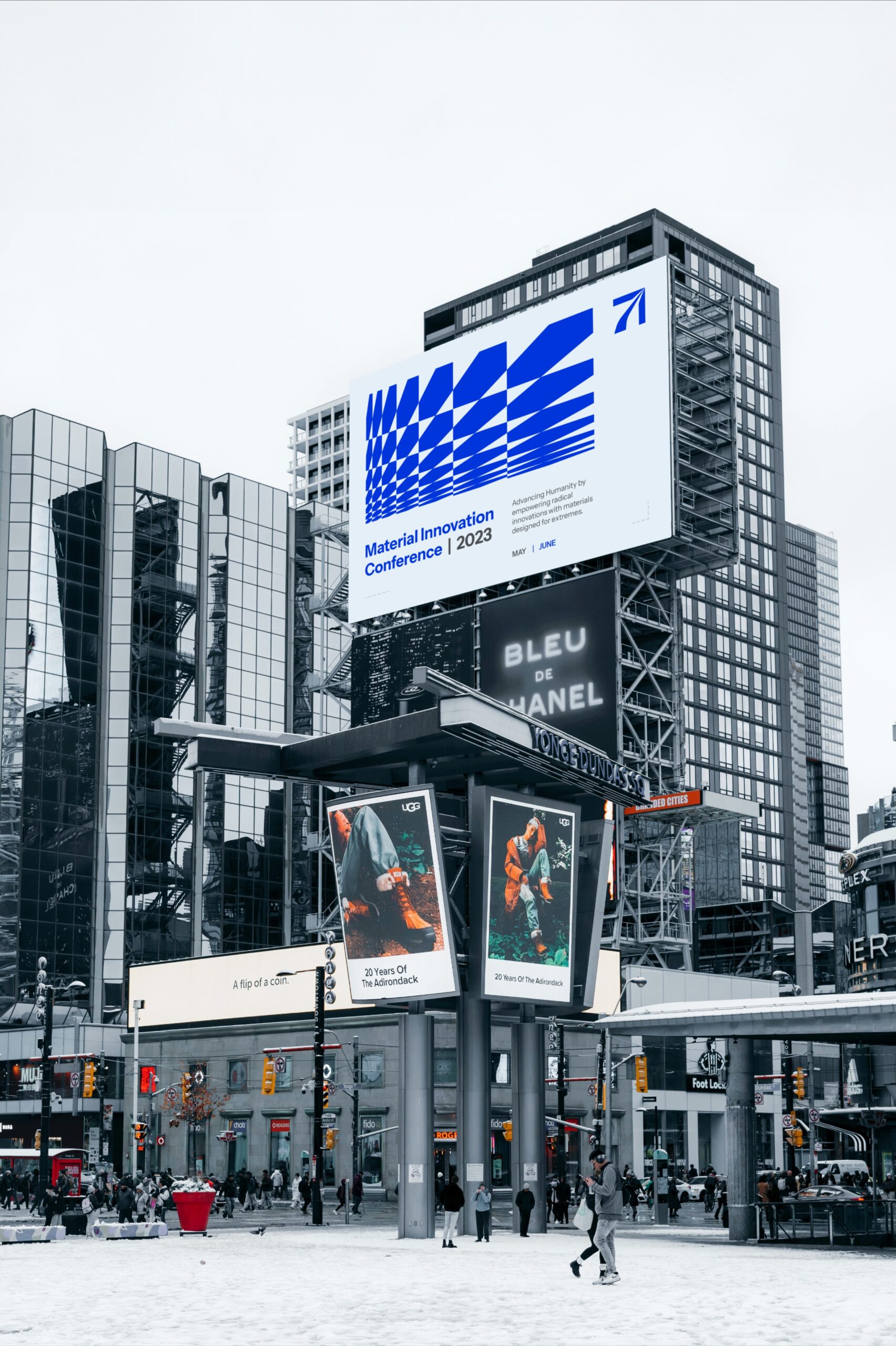
At the heart of Arceon’s new identity is a bold, bespoke wordmark. Its sharp angles and strong lines echo the strength of their advanced composites, while the subtle curves hint at their adaptability. The ‘A’ in the logo doubles as a unique pictogram, representing Arceon’s ability to transcend boundaries.
The logo represents an upward trajectory, a nod to aerospace and aspirational design.
The letterforms strike a balance between cutting-edge sharpness and structured clarity, giving Arceon a distinct, legible presence. Every cut, corner, and curve was designed to feel engineered, futuristic, resilient.
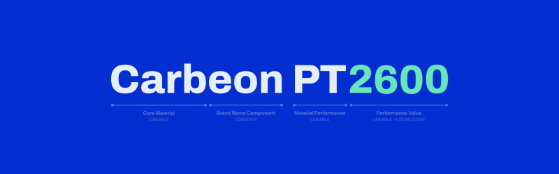
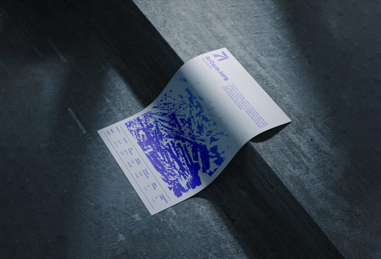
Material Nomenclature System
Arceon works with several proprietary materials, each with unique properties and applications. We created a nomenclature and sub-branding system where every material type has a visual sub-identity tied back to the parent brand.
The name for each composite gave a lot of crucial information, such as:
– The core material
– Extreme conditions it is made for
– Performance values
This scalable system improves recognition across technical documentation and marketing, while giving each material its own vocabulary. A big leap from traditional alphanumeric codes.
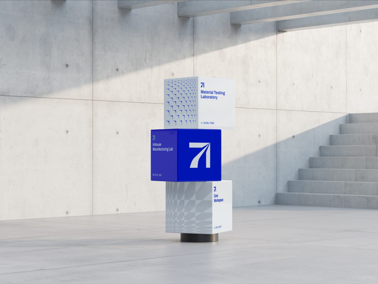
Applications and Outputs
The brand was designed to be implemented across a wide range of assets:
1. Print Collaterals: Business cards, letterheads, datasheets, reports
2. Presentation Systems: Branded templates for investor decks, pitch decks and proposals
3. Packaging: Labels and visual systems for engineering samples
4. Digital Design: Website design concept, social media assets, brand launch campaign
5. Documentation Templates: For patents, material sheets and internal documentation
All outputs were designed to be usable by both technical teams and marketing staff, thus achieving seamless consistency.
Outcome and Impact
This rebranding exercise has proved to be a game changer for Arceon.
1. The new brand drastically improved Arceon’s market position and brand perception.
2. The cohesive visual identity system enhanced Arceon’s brand recall and market presence.
3. The strong, unified brand identity positioned Arceon as a leader in the advanced materials industry, strengthening it’s appeal to key sectors like Space, Defense, Semiconductor, and Energy.
4. The material nomenclature system introduced a scalable way to categorize Arceon’s products, facilitating better customer engagement.
Beyond the more apparent outcomes, what we created was belief. The brand now feels as advanced as the materials it represents. It gives Arceon the confidence to walk into any room and own their identity.
Why this Matters
In a world increasingly shaped by frontier science, brands must go beyond selling products. They must tell stories of vision, grit and transformation.
Studio Carbon’s work with Arceon is a testament to what design can achieve when it moves beyond surface aesthetics and deeply integrates with scientific ambition.
With this rebranding exercise, we went beyond just creating some colours and logo. We created a language. A language that speaks of strength and resilience. Of aerospace and atoms. Of transcending boundaries.
This is what branding for the extreme looks like.


CREDIT
- Agency/Creative: Studio Carbon
- Article Title: Brand and Identity Design for Arceon – Materials for Extremes by Studio Carbon
- Organisation/Entity: Agency
- Project Status: Published
- Agency/Creative Country: India
- Agency/Creative City: Gandhinagar
- Market Region: Europe
- Project Deliverables: Brand Design, Brand Guidelines, Brand Identity, Brand Redesign, Brand Strategy, Brand Tone of Voice, Branding, Copywriting, Creative Direction, Design, Graphic Design, Identity System, Logo Design, Pattern Design, Product Naming, Rebranding, Research, Tone of Voice, Type Design
- Industry: Aerospace
- Keywords: WBDS Agency Design Awards 2025/26 , brand, system, material, design, nomenclature, logo, identity, extreme, deeptech, science, tactile, texture, future, typography, colour
-
Credits:
Systems Design & Client Communications: Itika Gupta
Brand Design: Siddhi Kansara
Brand Design: Shageera Mazid
Motion Design: Pavan Sachaniya
Creative Direction: Naveen Kumar Gonga
Naming System Design: Shubham Raut
Brand Researcher and Copywriting: Eremika Patarh-Ebere


