


“Morozproduct” is one of the biggest ice cream producers in Belarus. “Frudoza” is a niche brand created in 2014 for ice cream with pieces of real fruit and berries, its “fruitiness” is reflected in the name that basically means “a fruit dose”. Brama Branding was tasked with package and logo redesign.
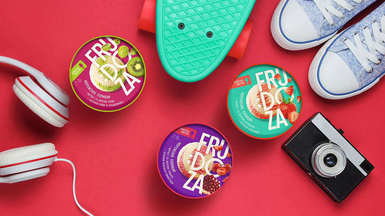
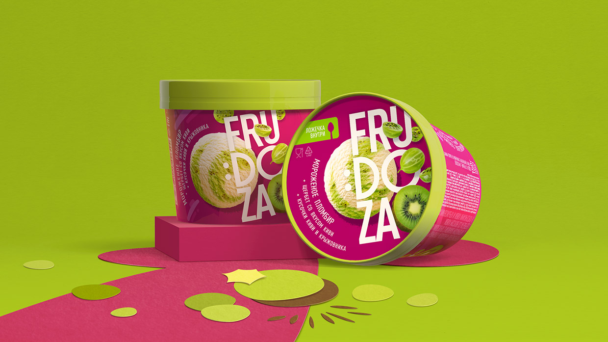
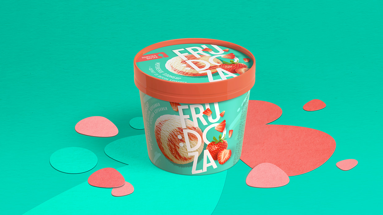
The starting point are changes in the format of the packaging and the product positioning: a paper cup becomes smaller and now there is a wooden spoon under the lid. This portion can easily be consumed by just one person, out of home and on the go – a shift from a family-sofa treat to a dynamic ego-format.
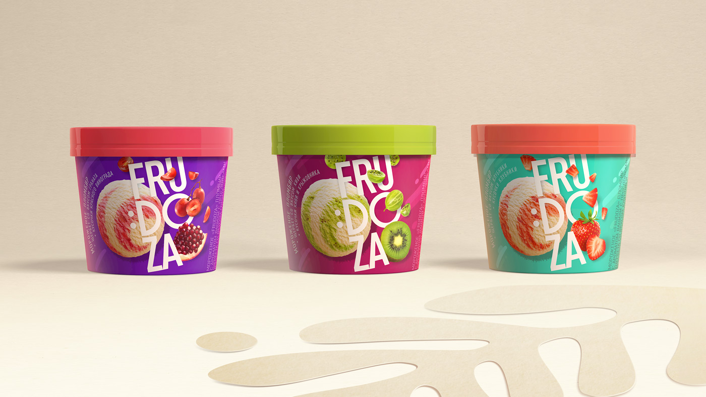
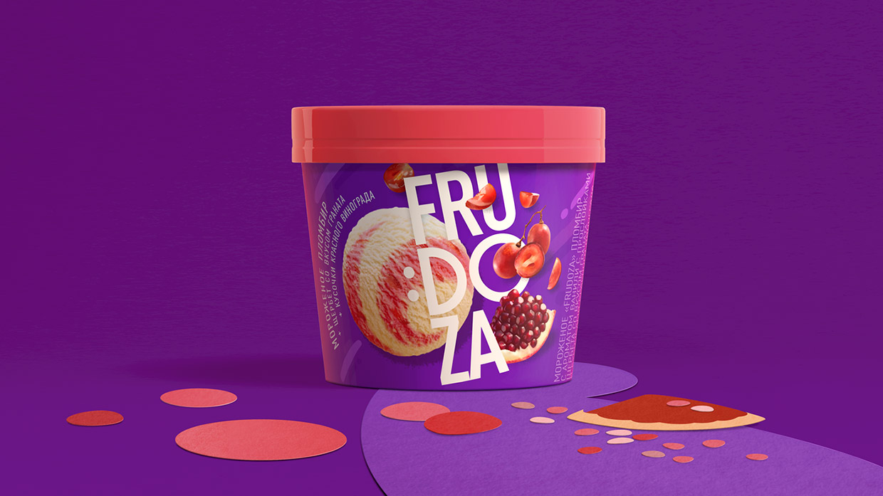
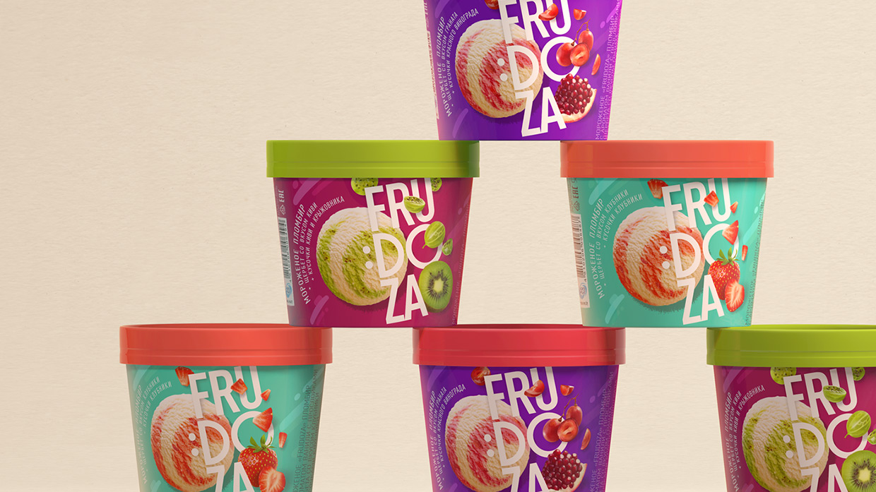
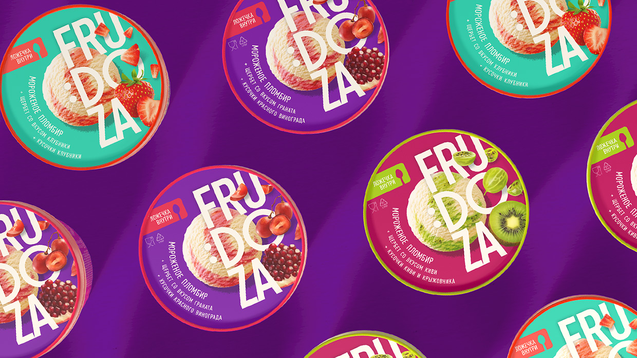
The visual solution is based on the contrast of bright colors: an immodest number of berries and fruit in the ice cream calls for a juicy palette.
The ice-cream ball is the center of gravity, around it the “universe” is unwinding: fruit and berry pieces, logo typography. The decision to use the key composition twice takes into account possible layout methods. The cup side and the lid work equally efficiently.
A wide confident smile shines in an updated brand logo to boost the “Dose of happiness” brand idea.

CREDIT
- Agency/Creative: Brama Branding
- Article Title: Brama Branding Creates Bold New Look for Frudoza Ice Cream
- Organisation/Entity: Agency, Published Commercial Design
- Project Type: Packaging
- Agency/Creative Country: Belarus
- Market Region: Europe
- Project Deliverables: Brand Identity, Brand Strategy, Graphic Design, Packaging Design
- Format: Cup
- Substrate: Pulp Carton, Pulp Paper


