Outra História is a curatorship that creates content and cultural experience. It’s engaged in updating stories and bringing them to people’s routine, contributing to enrich the cultural scene. To the brand, there is always the possibility for a new perspective about the narrative. There are many ways to tell the same story.
The content produced can be used in many media formats, like events, exhibitions, online publications and museums. So, we needed to design a new visual identity that can be applied in different contexts.
The team worked for two months, from the beginning to the final delivery, involving two designers, a project manager and validations with the entire office team during decision-making and collaboration moments.
The methodology went through an initial briefing meeting, development of reference panels, a workshop with the client to define aesthetic directions, generation of alternatives with the design team, design critique for selection of the alternative for presentation, refinement of the visual identity, and the presentation of the solution.
After client approval, we developed the brand manual with all application guidelines to maintain the brand’s proper use and consistency across all touchpoints.
The objective of the project was to contribute to the launch of a new brand that reflected its essence and purpose in the visual identity. With a complete and well-structured visual identity, the client aimed to enhance its entry into the cultural scene, a market with strong entry barriers for new entrepreneurs. As Another Story’s premise was the possibility of a new perspective on a narrative, it was necessary to build an original visual identity that could also adapt to the creation of events and cultural exhibitions with different themes.
It was through immersion in the brand’s purpose that we understood the need to create a visual identity as rich and interesting as a story to be told. This “richness” is evident in the project’s details.
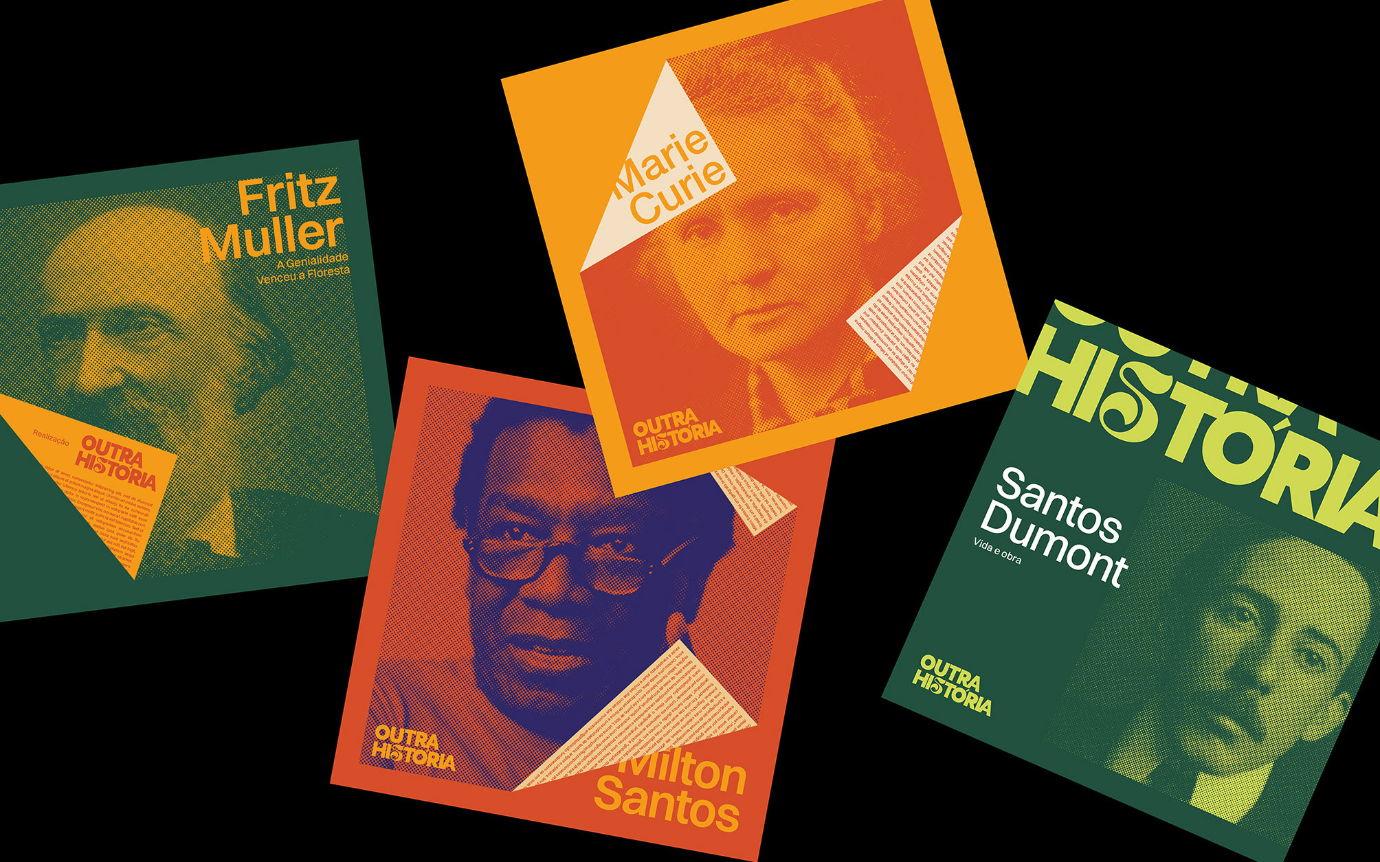
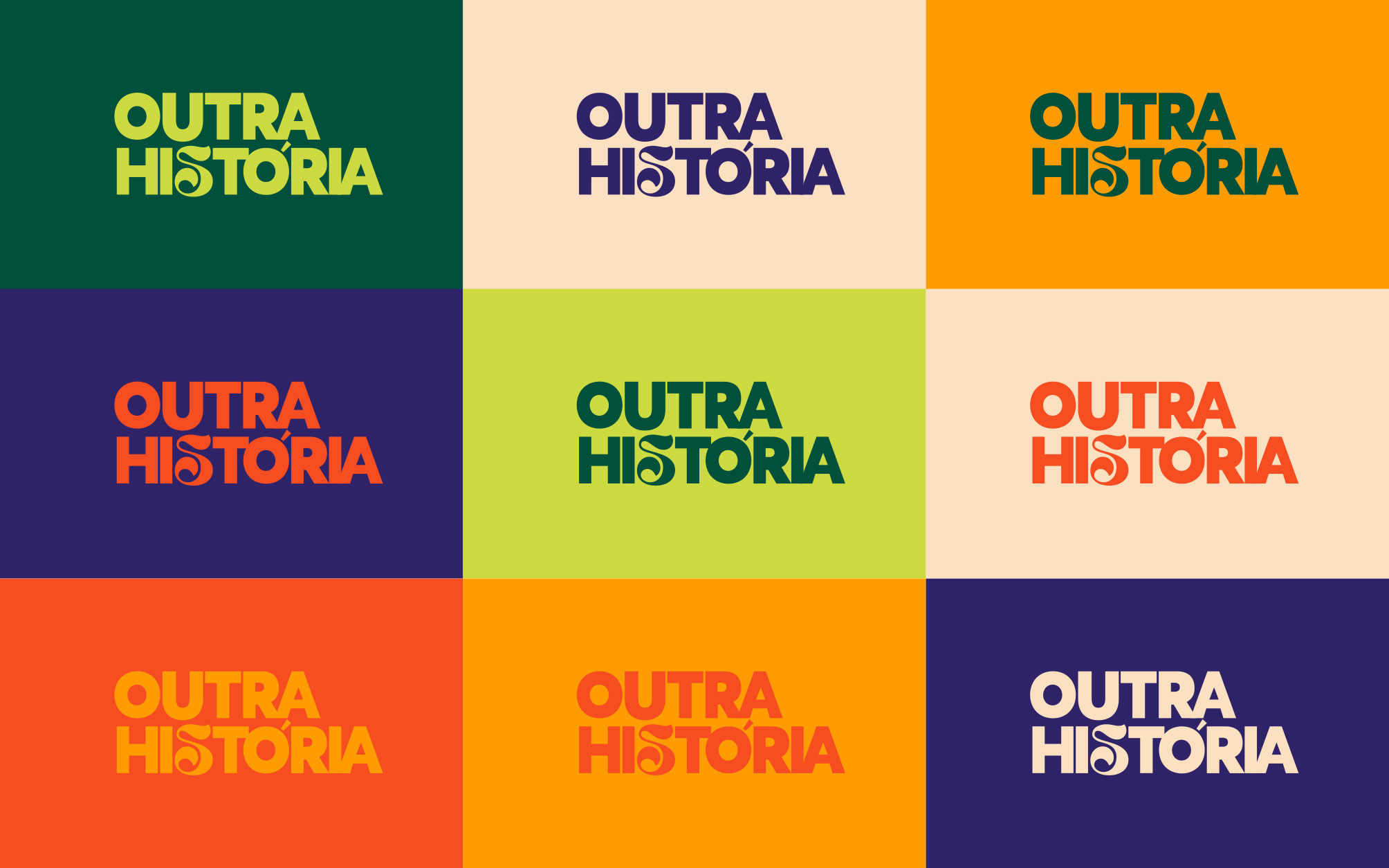
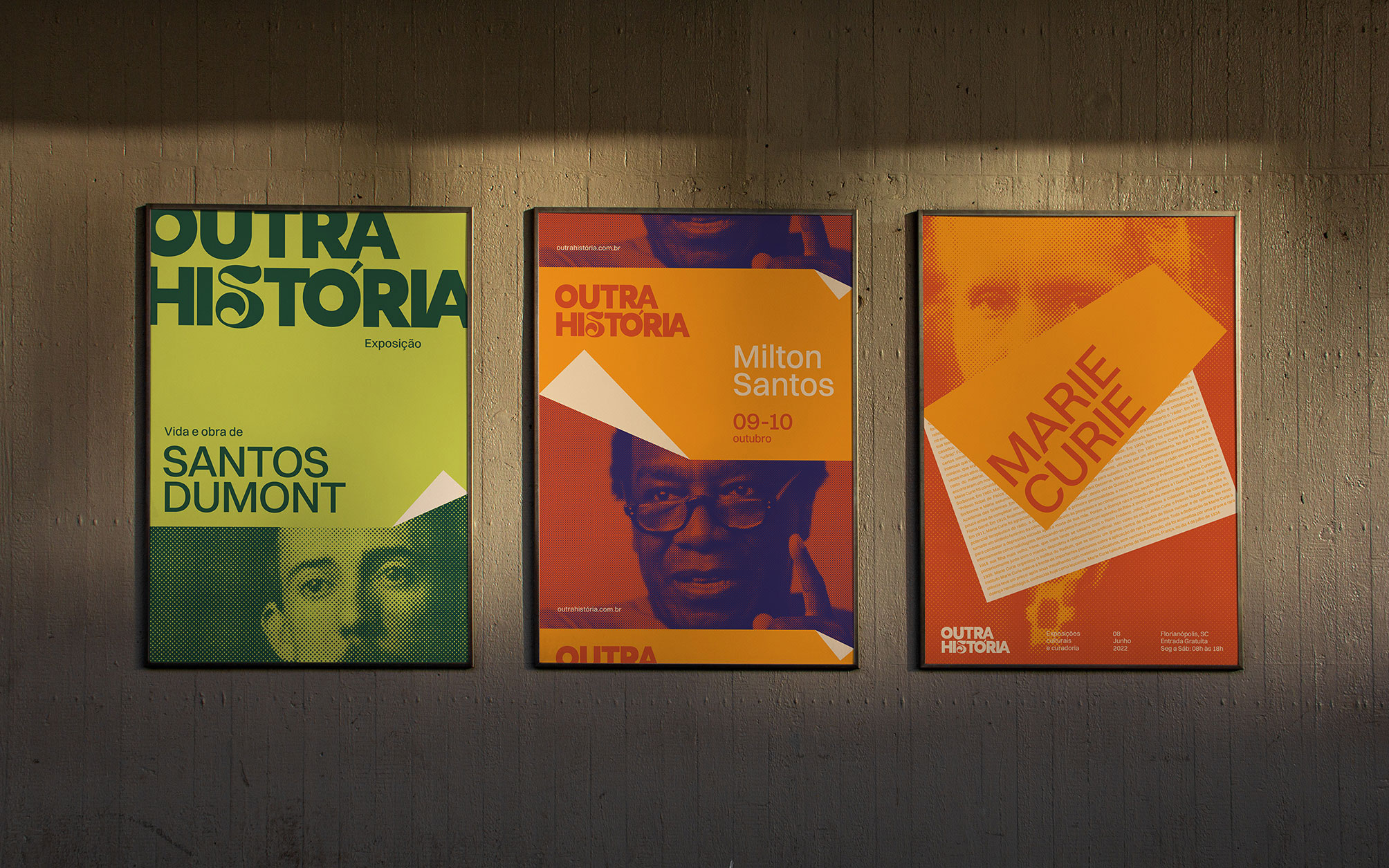
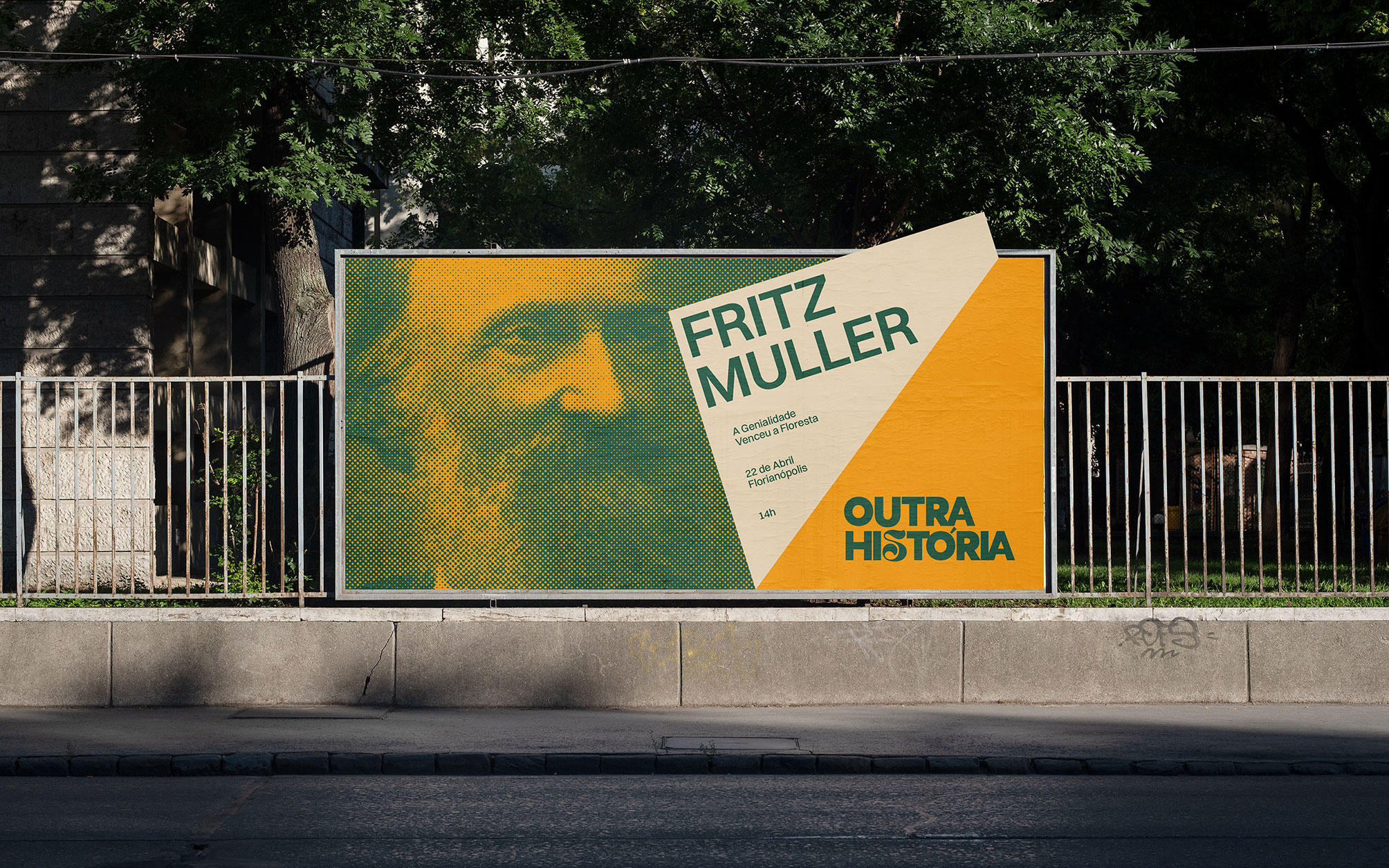
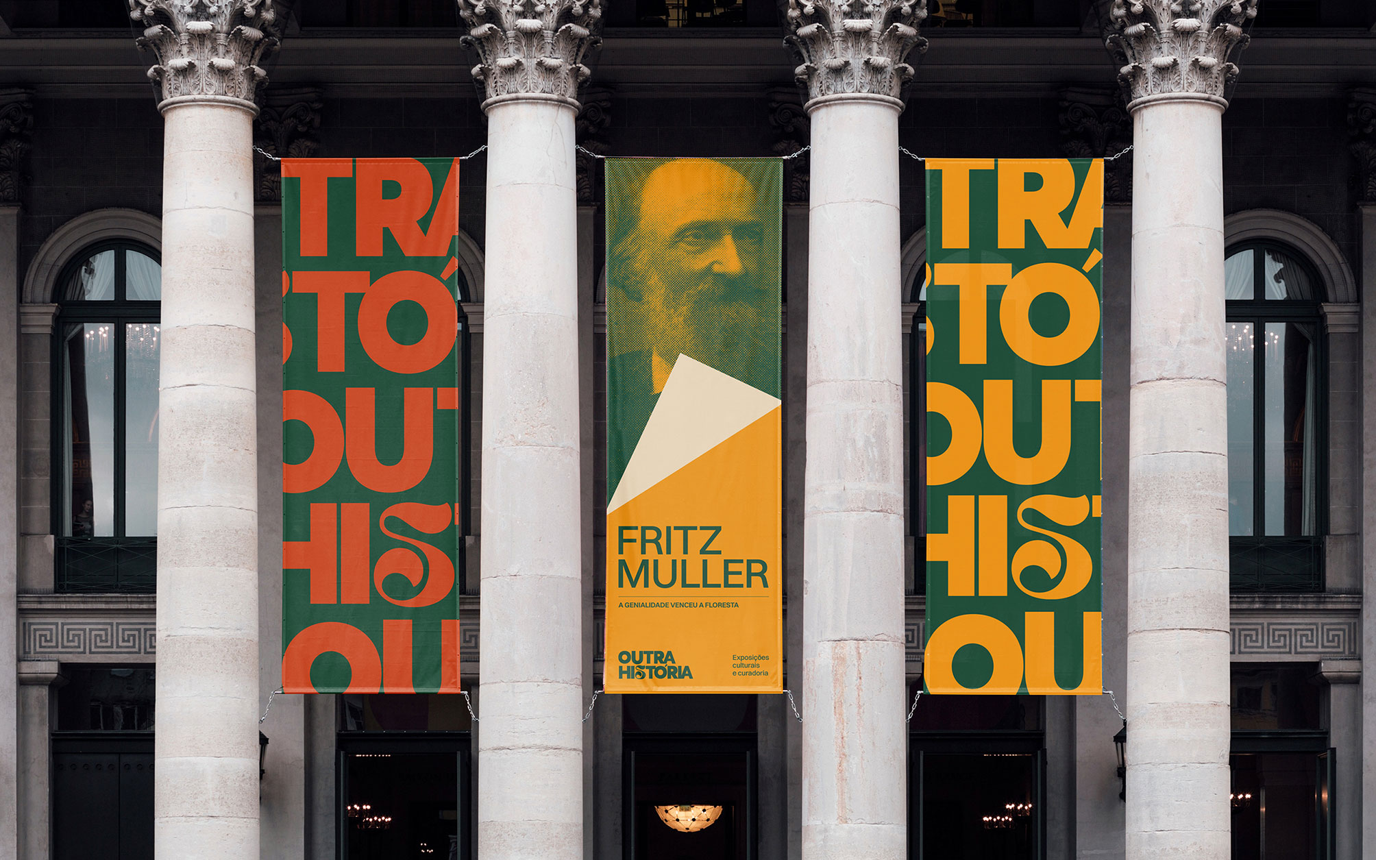
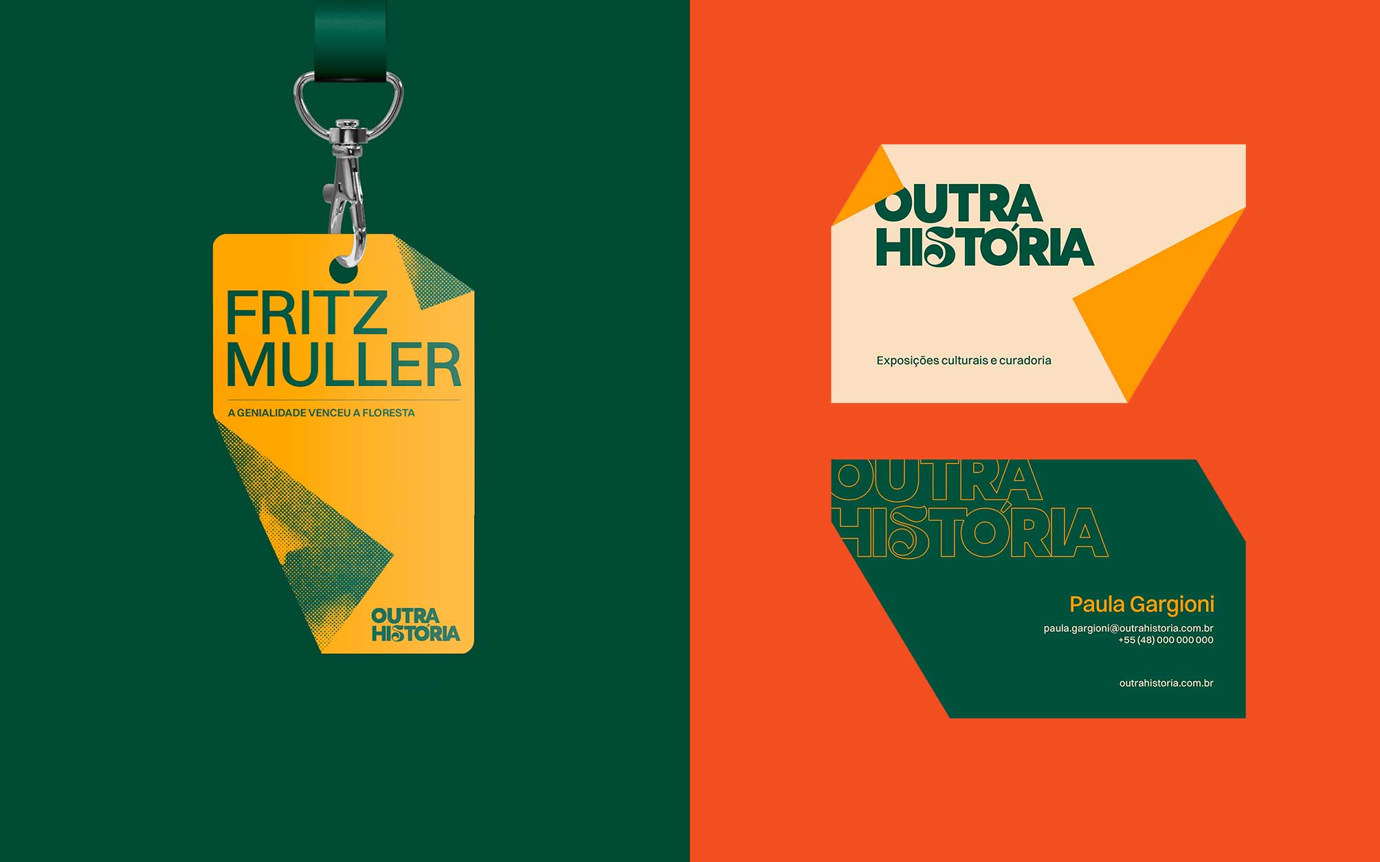
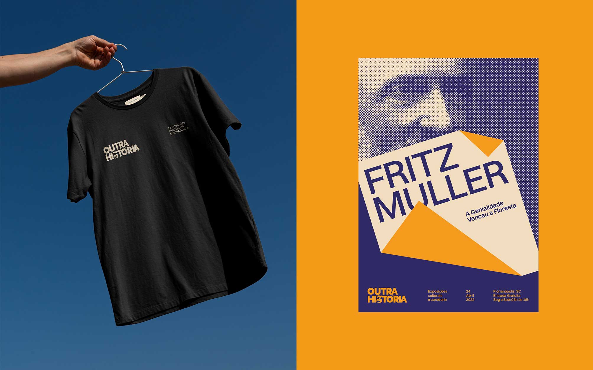
From the construction of the logo to the vast color palette, we opened up a range of possibilities for application. In the visual universe, we also introduced the resource of folded paper and old photo filters, metaphors for turning the page of a book, which reinforces the brand name and its proposal.
The brand Outra História features a visual identity that invites and activates people’s curiosity about the cultural scene. Through conversations with the client and research for references, it was possible to establish some important points for the brand’s construction.
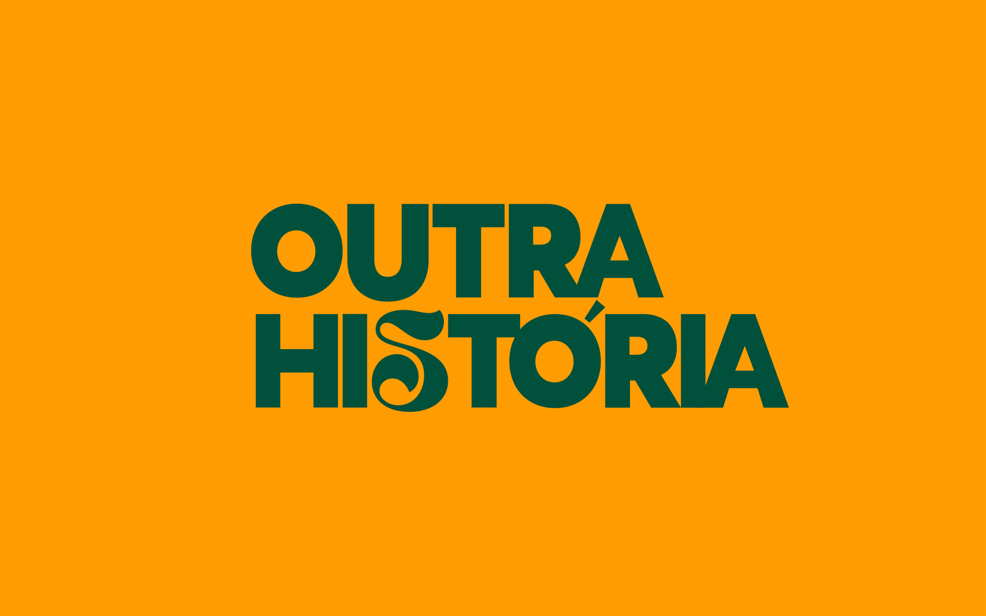
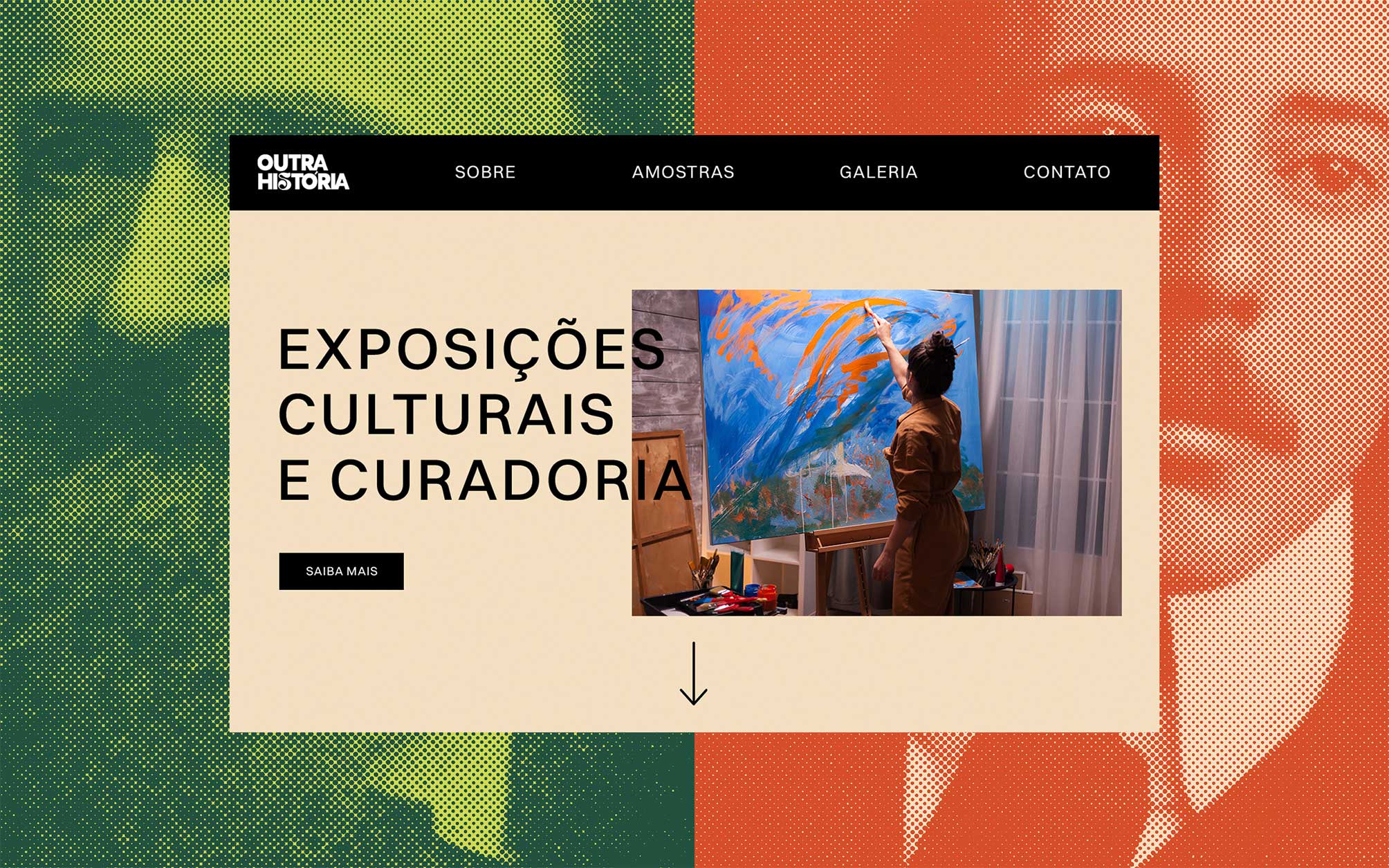
As a result, we arrived at a dynamic, lively, and inviting visual identity. Although it has a traditional typography, it features a stylized “S” with an artistic touch, making the composition relaxed and light. It also works with photo filters and page cutouts, and the vast and wide color palette allows for a series of possibilities. It’s a different path, breaking away from the standard of a limited palette, allowing for different combinations.
CREDIT
- Agency/Creative: Bradda Design
- Article Title: Bradda Design Develops New Visual Identity for Outra História a Curatorship of Content and Cultural Experience
- Organisation/Entity: Agency
- Project Type: Identity
- Project Status: Published
- Agency/Creative Country: Brazil
- Agency/Creative City: Florianópolis
- Market Region: South America
- Project Deliverables: Art Direction, Brand Identity
- Industry: Entertainment
- Keywords: Branding, Visual Identity, Cultural
-
Credits:
Graphic Designer: Lucas Guidi
Graphic Designer: Bruno Folchini
Project Manager: Hemelyn Haertel
Motion Designer: Andru00e9 Holzmann


