


Alvorô was born with a clear ideal: to champion real food, free from additives or disguises. Its initial portfolio features sweet and savory granolas crafted with clean ingredients, NCPS (Non-Conventional Plant Species), and underutilized Brazilian ingredients such as ora-pro-nóbis and cumaru (tonka bean). Inspired by nature and its cycles, the brand proposes a more conscious and emotional relationship with food, celebrating the genuine pleasure of eating well.
As the business grew, the original name and visual identity could no longer sustain the brand’s potential for differentiation and expansion. It was time to evolve into a more strategic, memorable, and proprietary territory. The challenge was to create a new name and a visual identity system capable of capturing the brand’s essence: lightness, inspiration, and authenticity. A brand with charisma and presence, designed to spark curiosity and anticipate the vibrant sensory experience found in every product.
Strategy & Naming
The strategy began as an invitation to reconnect with the simple and natural: food that nourishes the body, inspires new habits, and cultivates well-being. This direction was structured around four core pillars—truth, inspiration, lightness, and authenticity—reflected in the choice of real ingredients, nature as a source of discovery, and a deep loyalty to the brand’s roots and family origins.
From this strategic territory, Alvorô was born. An affective neologism derived from alvoroço (a joyful stir or commotion), it evokes unexpected joy, pleasant surprises, and the enthusiasm that arises when something truly enchants us—much like the explosion of flavor, color, and texture found in the products.
Simultaneously, the name symbolically carries the essence of alvorada (dawn): the freshness of new beginnings, everyday transformations, and nature’s cycles as a constant source of inspiration.
Beyond merely identifying the brand, the name unfolds naturally within its discourse. Expressions such as “Life asks for more Alvorô” turn the name into an attitude, seamlessly expanding its narrative territory.
Visual Identity
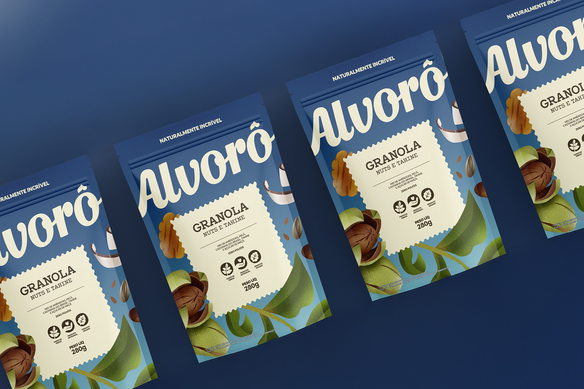
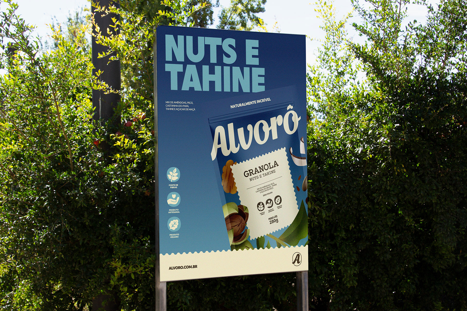
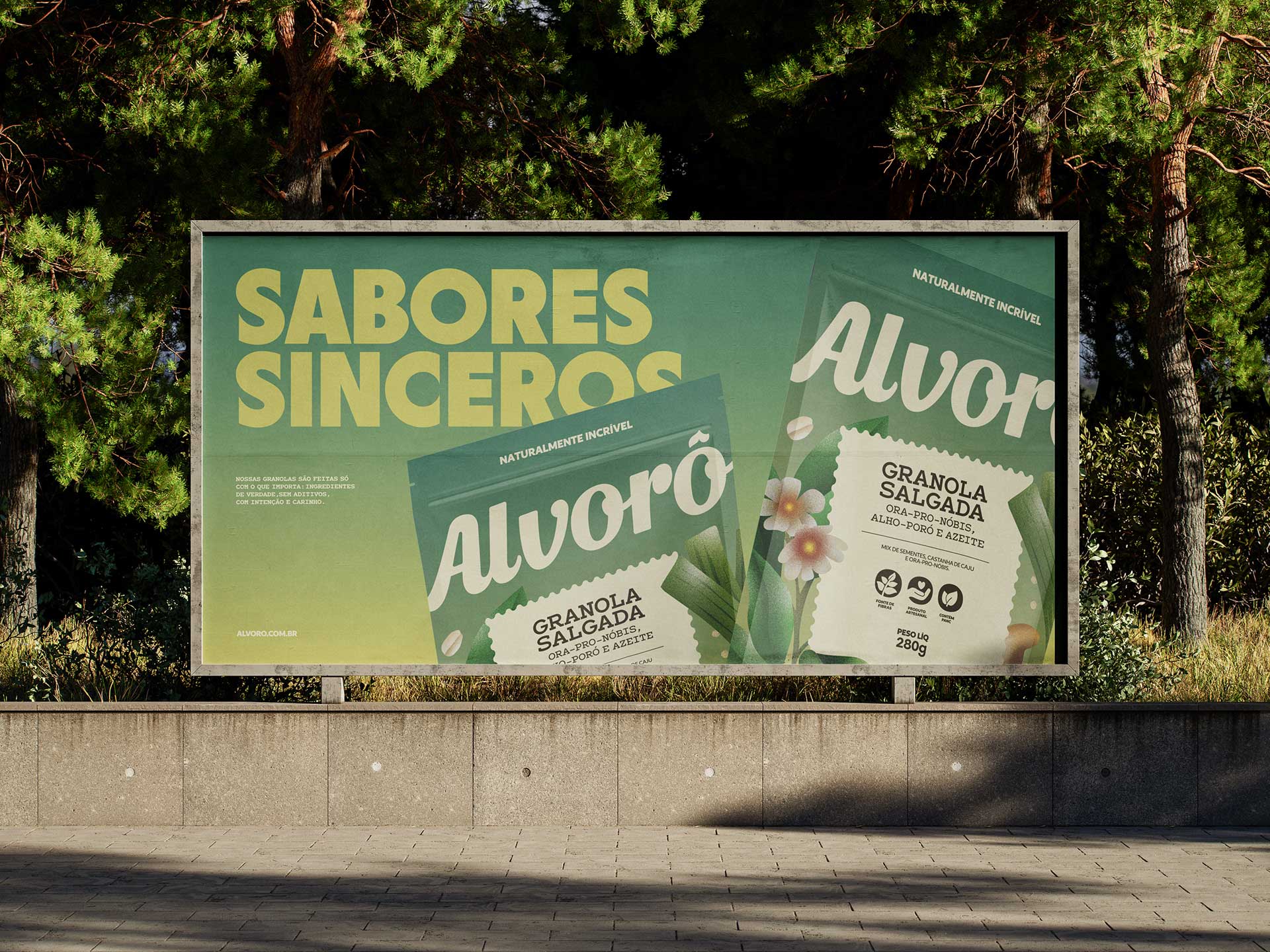
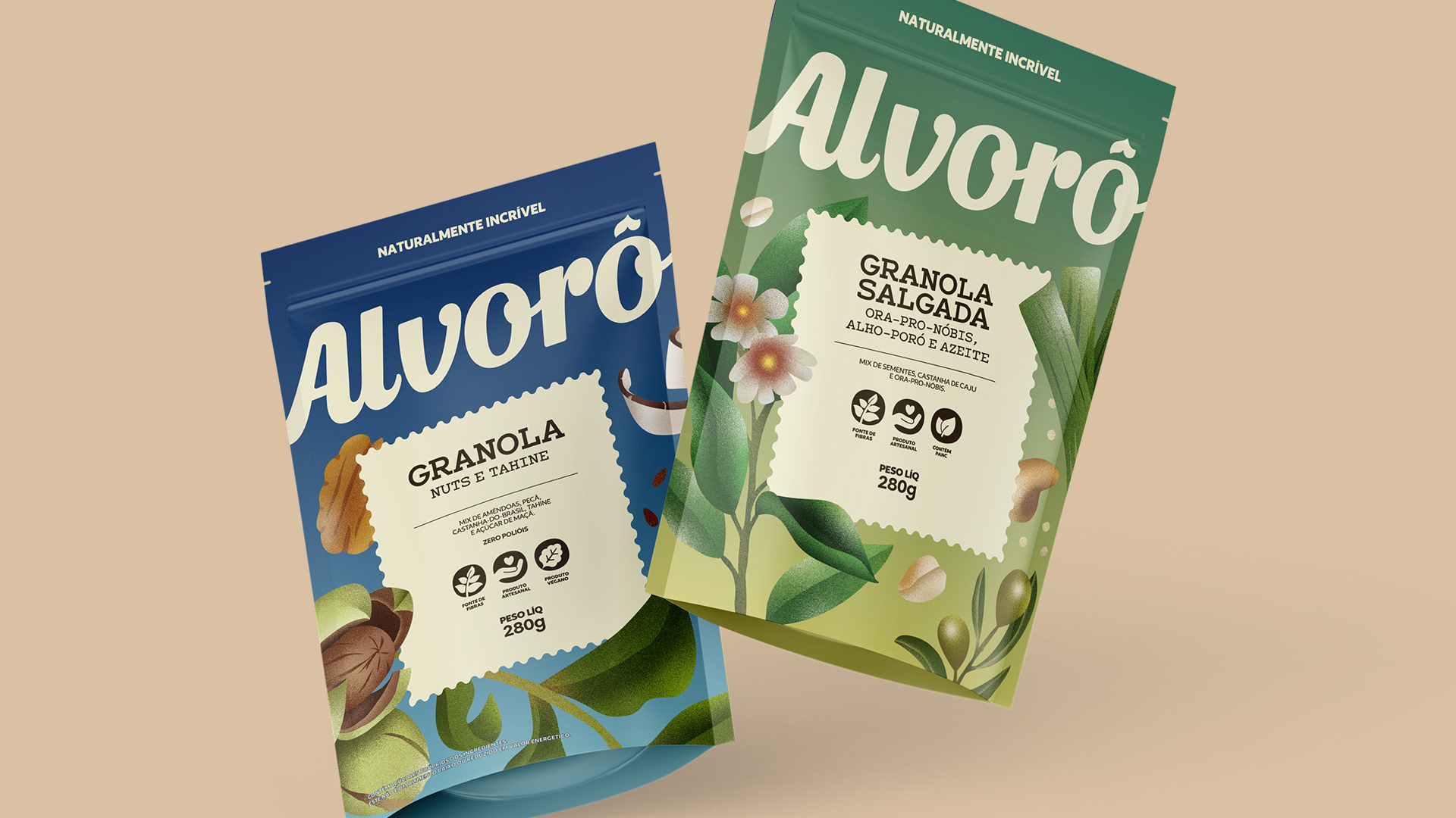
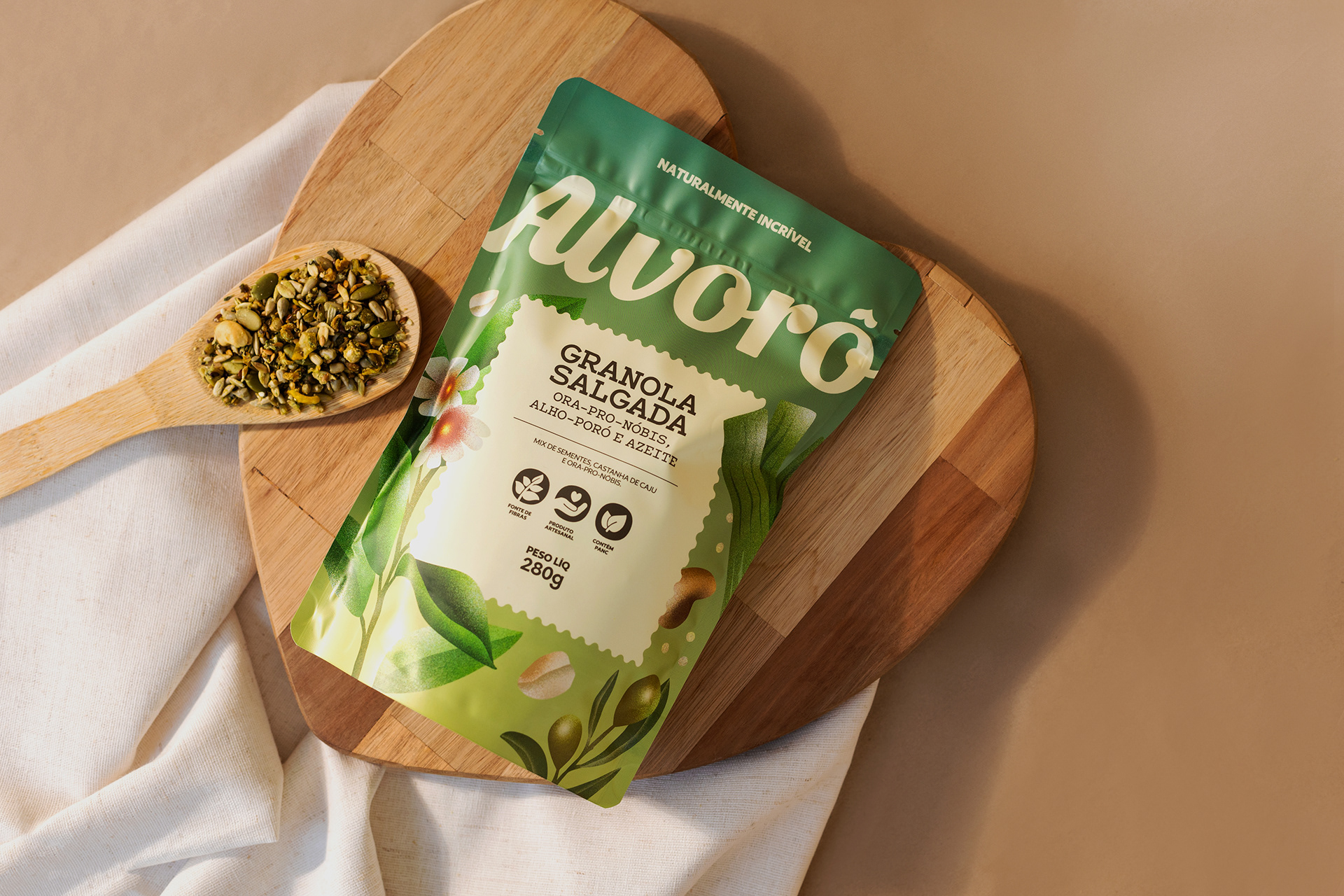
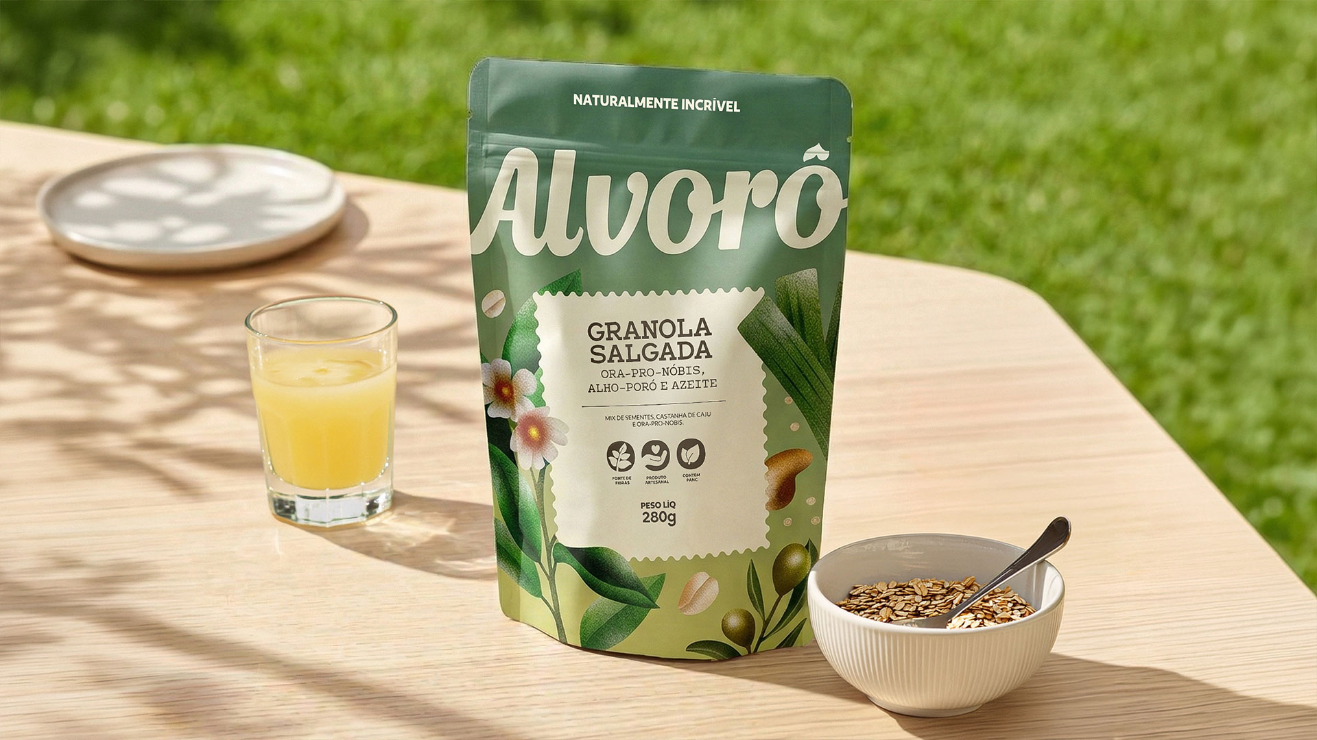
The visual identity translates the energy and sensitivity inherent in the brand’s name and strategy. The logo was crafted using calligraphic typography with fluid strokes, evoking an artisanal, handmade feel. Its organic shapes convey spontaneity, warmth, and movement, reinforcing the naturalness and affection at the brand’s core.
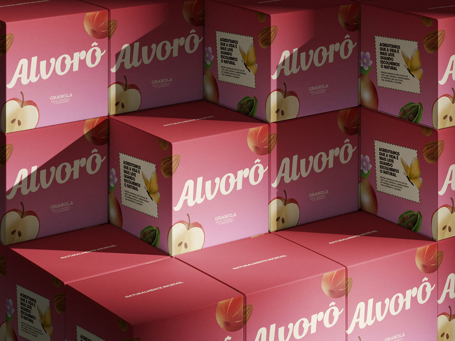
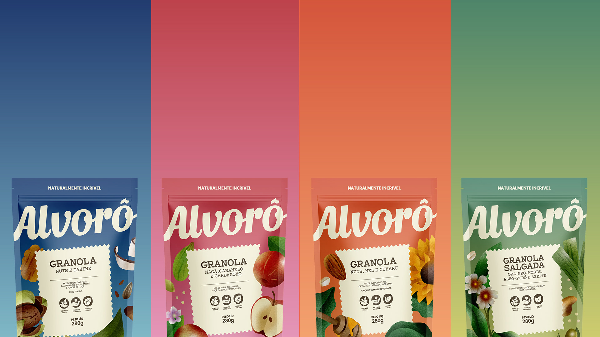
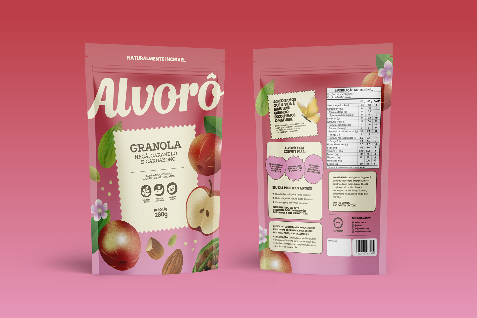
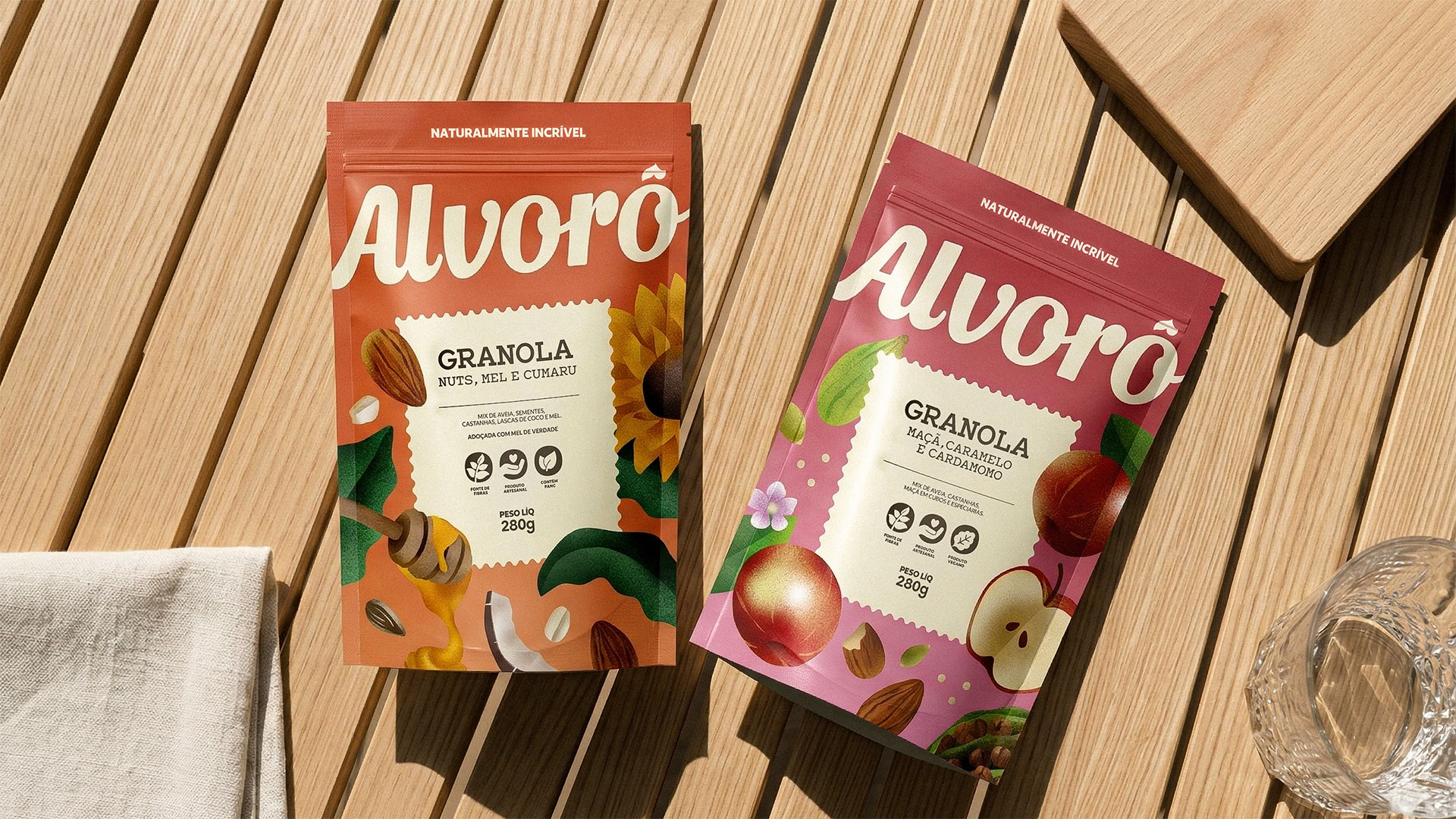
The color palette is inspired by the hues of dawn, where earthy tones emphasize origin and raw materials, while vibrant oranges translate energy, flavor, and vitality. Beige serves as a neutral base, providing breathing room and balance to the composition. The illustrations adopt a more realistic style, highlighting the sincerity of the ingredients and the beauty of natural elements, drawing the eye closer to the origin of the flavors and reinforcing the brand’s sensory dimension.
On the packaging—the system’s primary touchpoint—the logo and illustrations take center stage within a clear structure that differentiates flavors through color coding. A central box featured across the entire line acts as a seal of authenticity inspired by postage stamps, evoking origin, memory, and connection. Ultimately, the system was designed to allow for future portfolio expansion while maintaining consistency and recognition.
CREDIT
- Agency/Creative: Bradda Design
- Article Title: Bradda Design Develops Alvorô as a Natural Food Brand Identity Rooted in Brazilian Ingredients and Conscious Eating
- Organisation/Entity: In-House
- Project Type: Identity
- Project Status: Published
- Agency/Creative Country: Brazil
- Agency/Creative City: Florianópolis
- Market Region: South America
- Project Deliverables: Brand Design, Brand Naming, Brand Strategy, Graphic Design, Packaging Design
- Industry: Food/Beverage
- Keywords: alvorô, braddadesign
-
Credits:
Project Manager: Natalia Favero
Strategy & Naming: Rafaela Sotuyo
Strategy & Naming: Hemelyn Haertel
Strategy & Naming: Letícia Marcondes
Design: Lucas Guidi
Design: Lauro Henn
Illustration: Martina Hotzel
Motion: Lauro Henn
Photography: Maiara Bortoluzzi


