


In a market where bakery branding often leans toward decorative nostalgia or overt luxury cues, Pema Patisserie takes a more cultivated direction. Founded in Hanoi and shaped by the founder’s formal training in France, Pema has built its reputation on precision, restraint, and respect for the discipline of French pâtisserie. Each entremet is conceived not simply as a dessert, but as a composed work—constructed with intention, technical rigor, and emotional clarity. As the brand prepared for expansion and long-term growth, it faced a pivotal question: how could its philosophy of craft and refinement be translated into a coherent identity system capable of scaling without dilution? Bracom Agency was commissioned to design an identity that would articulate Pema’s values with structure, elegance, and enduring relevance rather than visual excess.
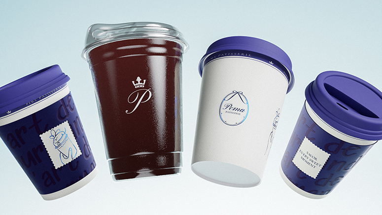
At the core of the new identity lies a system of restrained symbolism. The crown positioned above the letter “P” is not an ornamental gesture of luxury; it signifies authorship and mastery. In haute pâtisserie, excellence is expressed through discipline and consistency, not spectacle. The crown embodies this quiet authority, marking a standard upheld by craft. The ribbon element integrated within the full logo references the ritual of gifting embedded in French pastry culture. Every cake is conceived as an offering, carefully prepared and thoughtfully presented. Rather than functioning as sentimentality, the ribbon encodes intention—an acknowledgment that presentation and meaning are inseparable. Together, these elements create a logo that feels poised and deliberate, balancing romance with structural control.
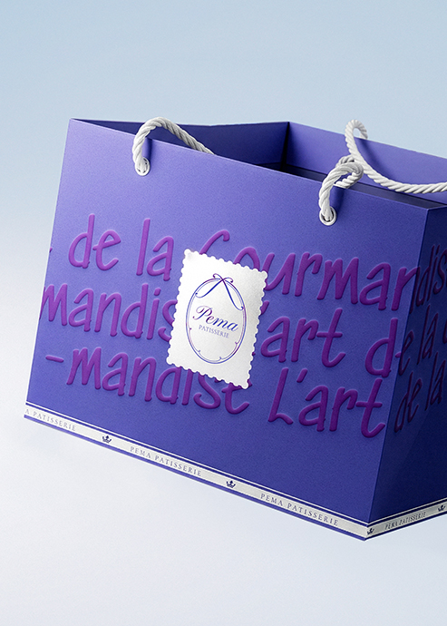
The conceptual foundation of the system draws from the idea of a love letter, interpreted with refinement rather than overt emotion. The calligraphic quality of the logotype introduces intimacy, yet its proportions and spacing remain disciplined. This balance reflects Pema’s brand philosophy: softness governed by rigor. Typography extends this dialogue. A classical serif foundation conveys editorial heritage and credibility, while subtle handwritten nuances introduce warmth without undermining sophistication. The hierarchy ensures clarity across applications, from packaging to digital interfaces, reinforcing consistency as the brand scales.
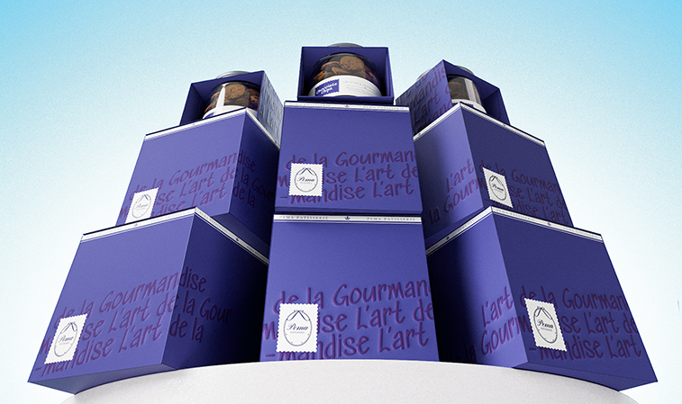
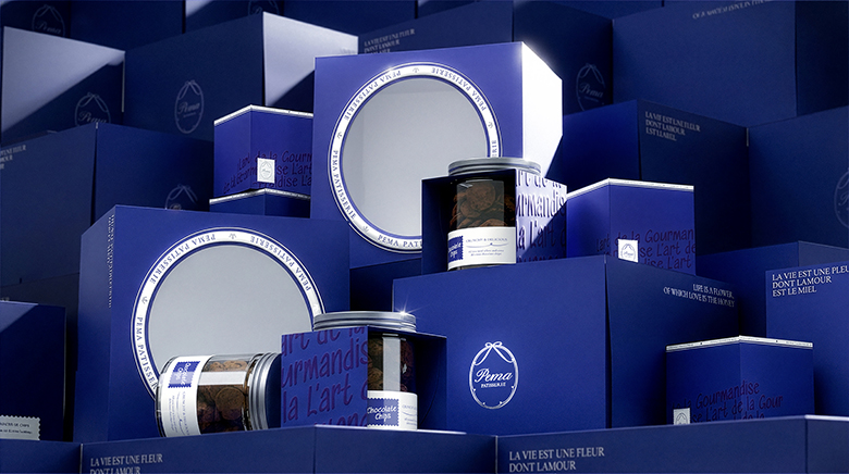
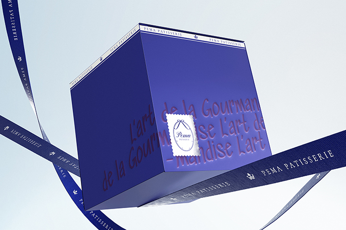
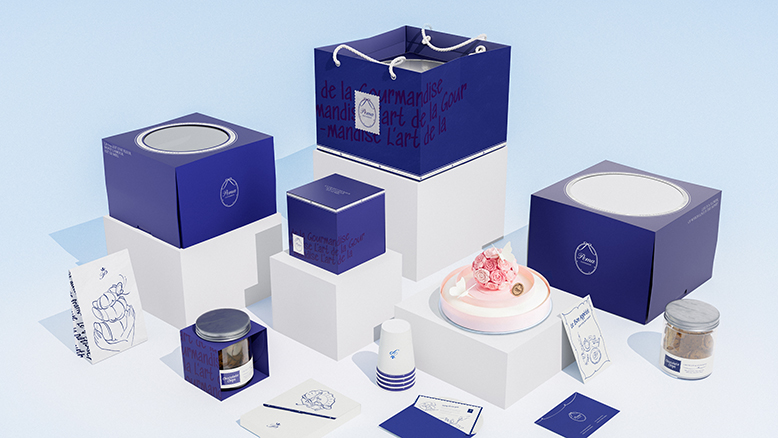
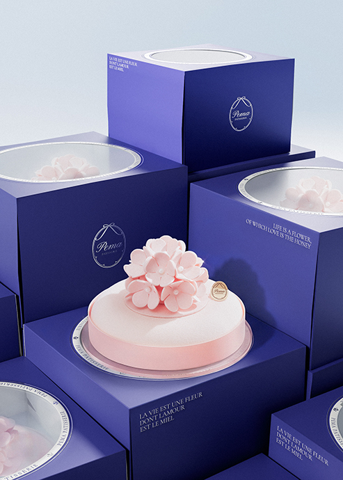
Color further strengthens the brand’s composure. A deep signature blue anchors the identity, evoking stability, heritage, and quiet confidence. Supporting tones inspired by pastry textures add delicacy without drifting into cliché. This restrained palette allows the brand to remain timeless and cultivated, distancing itself from trend-based bakery aesthetics. Hand-drawn illustrations depicting cakes, ribbons, and hands in motion subtly emphasize craftsmanship and human presence. These elements do not overwhelm the system; instead, they function as quiet affirmations of the manual discipline behind each creation.
Across all applications, Bracom Agency structured the identity to prioritize proportion, white space, and compositional control. The emblematic crown adapts seamlessly in compact contexts, while the full logo preserves narrative richness in ceremonial or expressive settings. The result is a scalable system that maintains coherence without sacrificing intimacy.
Pema Patisserie’s rebranding stands as a study in cultivated elegance. By translating craft philosophy into symbolic clarity and disciplined structure, Bracom Agency has designed an identity that speaks through restraint rather than ornament. The crown asserts mastery. The ribbon encodes intention. The calligraphic gesture introduces intimacy governed by control. Together, they establish a refined brand language capable of growing with the business while safeguarding its origin. In an industry often driven by spectacle, this identity affirms that the most powerful luxury is one expressed through meaning, precision, and quiet confidence.


CREDIT
- Agency/Creative: Bracom Agency
- Article Title: Bracom Agency Designs a Refined Identity for Pema Patisserie, Elevating French Craft into a Language of Symbol and Discipline
- Organisation/Entity: Agency
- Project Type: Identity
- Project Status: Published
- Agency/Creative Country: Vietnam
- Agency/Creative City: HOCHIMINH CITY
- Market Region: Asia
- Project Deliverables: 3D Motion, Brand Design, Brand Strategy, Identity System, Illustration, Logo Design, Packaging Design
- Industry: Food/Beverage
- Keywords: bracom, bracomagency, creative, agency, branding, brandingdesign, brandingagency, design, identitydesign, brandidentity, packaging, brandingagency, pema, pemapatisserie, BakeryBranding, vietnam, saigon
-
Credits:
Executive Creative Director: Andy Ho
Project Manager: Van Duc Hoa
Lead Designer: Do Thanh Tung
Brand Designer: Tung Do, Tram Ngo
3D Visualization: Kim Bao, Dat Vu


