Founded in 1987, Stolf is a family company that operates in the field of kitchen and home utilities. With an increasingly strong presence, both in Brazilian and international markets, Stolf came to us to restructure its communication to face the major players in the market and prepare them for the future.
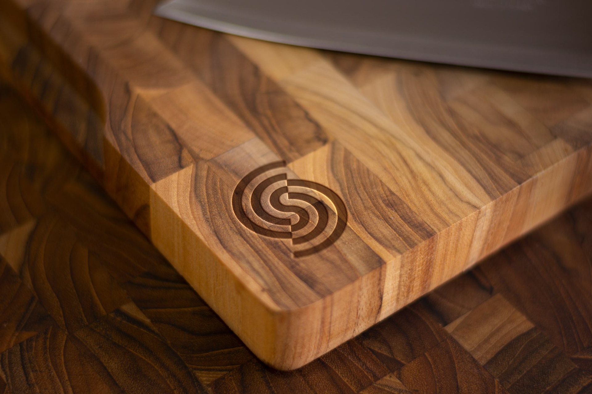
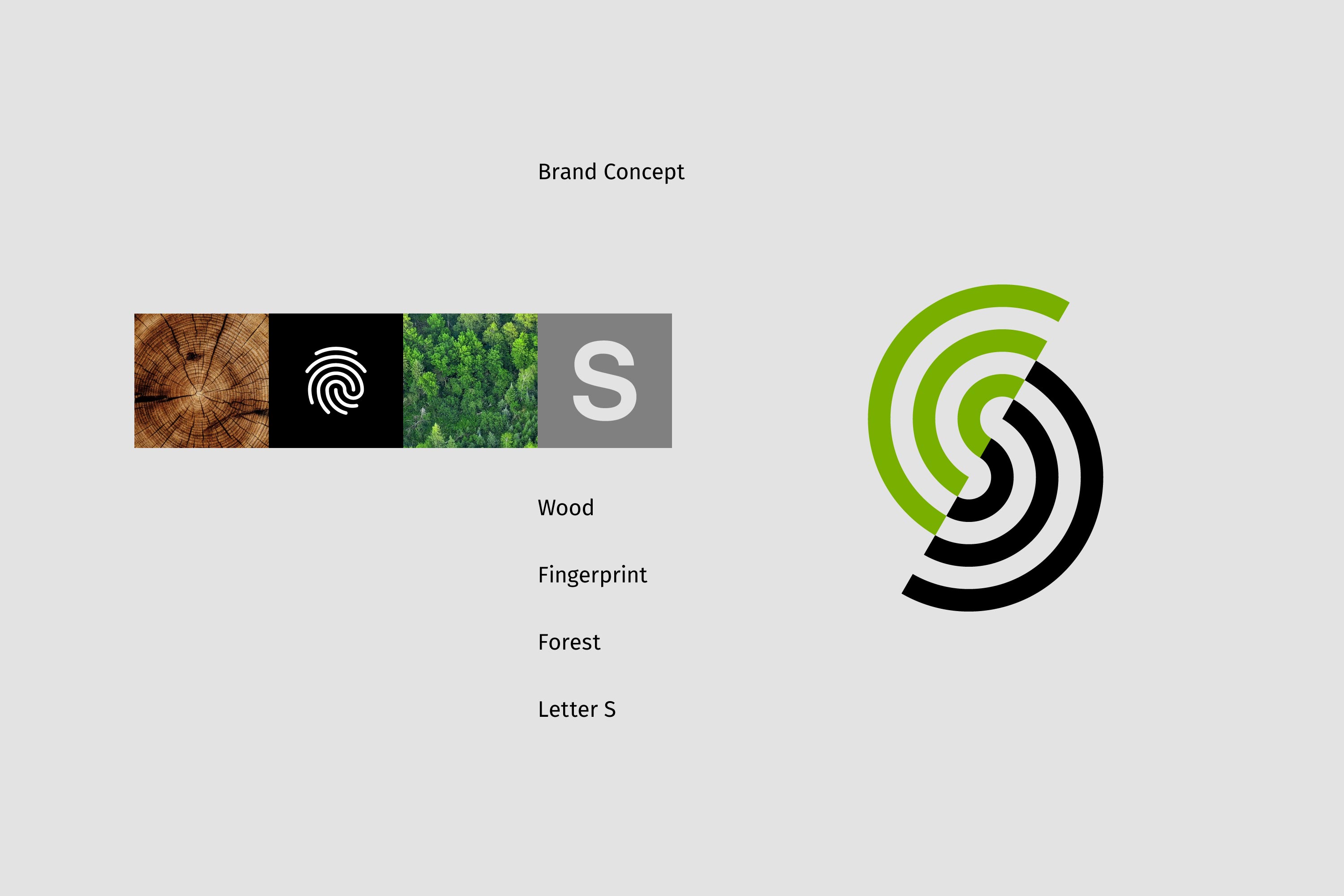
Our work started with an immersion in the segment and Stolf’s particular characteristics. In this research, we found the four main elements that gave rise to the new brand: the forest, which represents the constant concern with the environment; wood, raw material for most products; the fingerprint, which denotes Stolf’s unique way of being; and finally, the letter S.
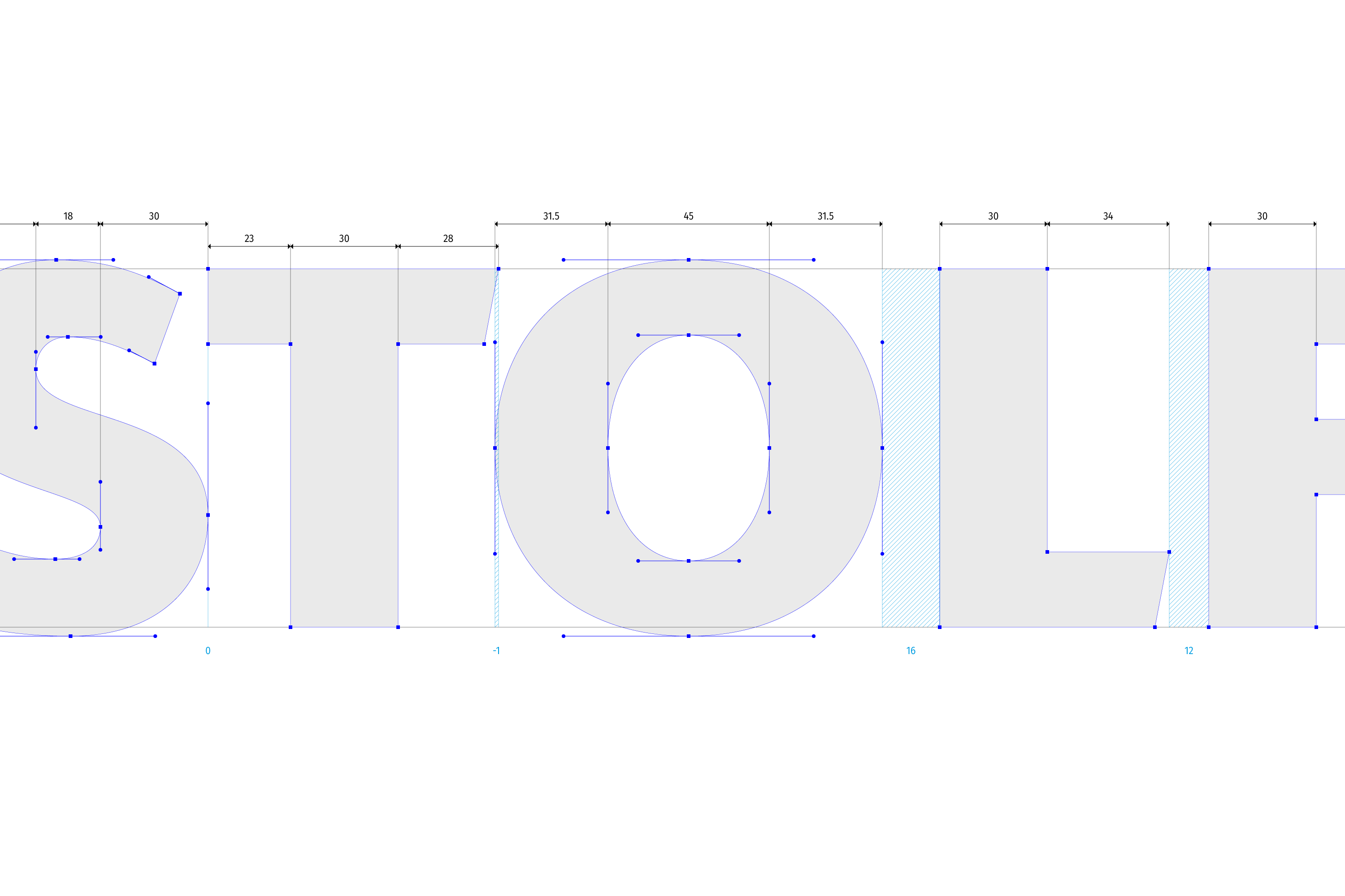
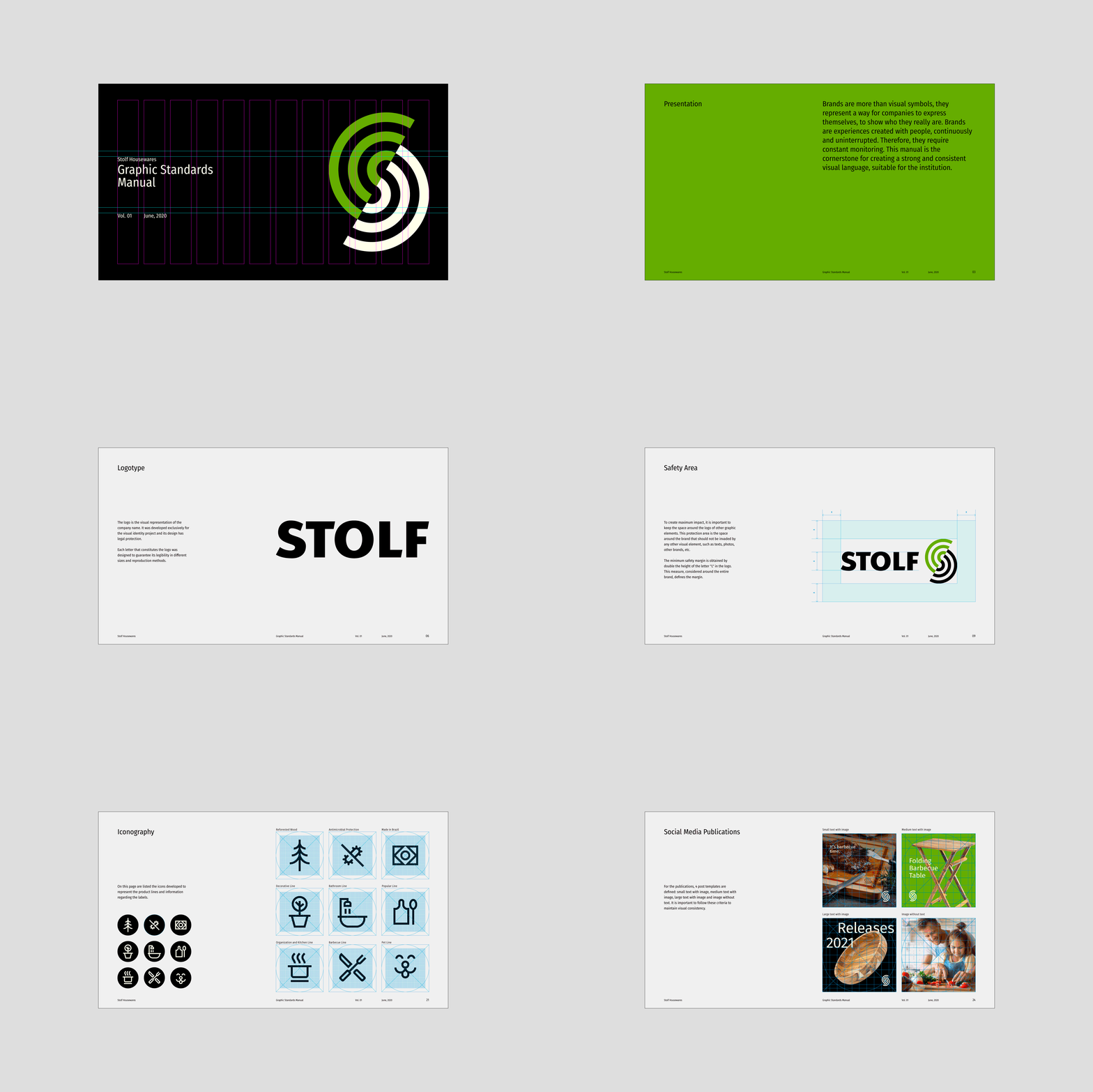
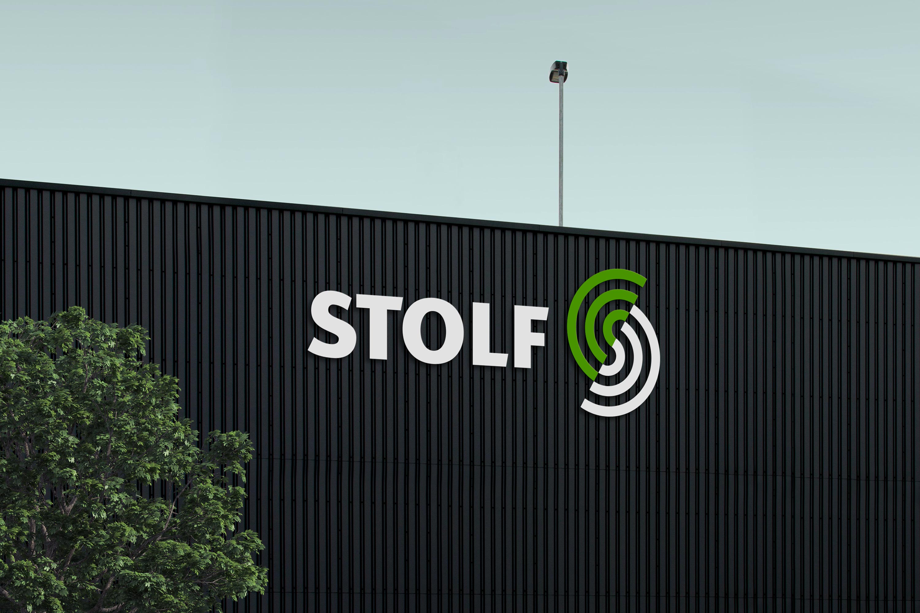
We created a complete identity system that started with the basic issues of corporate communication, such as the symbol, the logo, the definition of colors, typographies, support graphics, and the rules for the use of these elements. Afterward, we developed internal communication, such as corporate materials, uniforms, signage, as well as institutional communication and a complete label design system.
The constant launch of products, combined with the lack of a systemic project and improvised solutions, resulted in labels that did not represent the company properly, deteriorating Stolf’s image. To solve these problems, we have created a new layout system for labels that is flexible enough to accommodate the growing demand for new products.
CREDIT
- Agency/Creative: Braaco Design
- Article Title: Braaco Design Creates a New Brand Identity for Stolf Housewares Company
- Organisation/Entity: Agency, Published Commercial Design
- Project Type: Identity
- Agency/Creative Country: Brazil
- Market Region: South America
- Project Deliverables: Brand Guidelines, Brand Identity, Brand Redesign, Brand Strategy, Branding, Graphic Design, Identity System, Packaging Design, Rebranding, Research
- Industry: Manufacturing
- Keywords: Housewares, Identity, Packaging, Signage, Brand Guidelines


