


” B+P Creality developed together with the family-owned company Iden the new brand + packaging design for their brand Idena. Idena, whose product range now covers around 1,000 articles, received a new high-contrast, eye-catching packaging design. Office products, paper and writing materials were the first to change their look. 65 packages designed by B+P Creality have already been presented at a trade fair and were received very well by the customers.
The Idena brand, whose history dates back to the 1960s, currently occupies a particular market niche and enjoys the loyalty of its regular customers. However, these make very special demands on the packaging. With every change the brand first needs to adapt to the target group of the “Smart Shoppers” and to maintain its position as “a fair product at a fair price”. Additionally, Idena stands for new ideas, creativity and diversity which is expressed by the slogan “Idena. Wir leben Ideen” (Eng.: Idena. We live ideas).
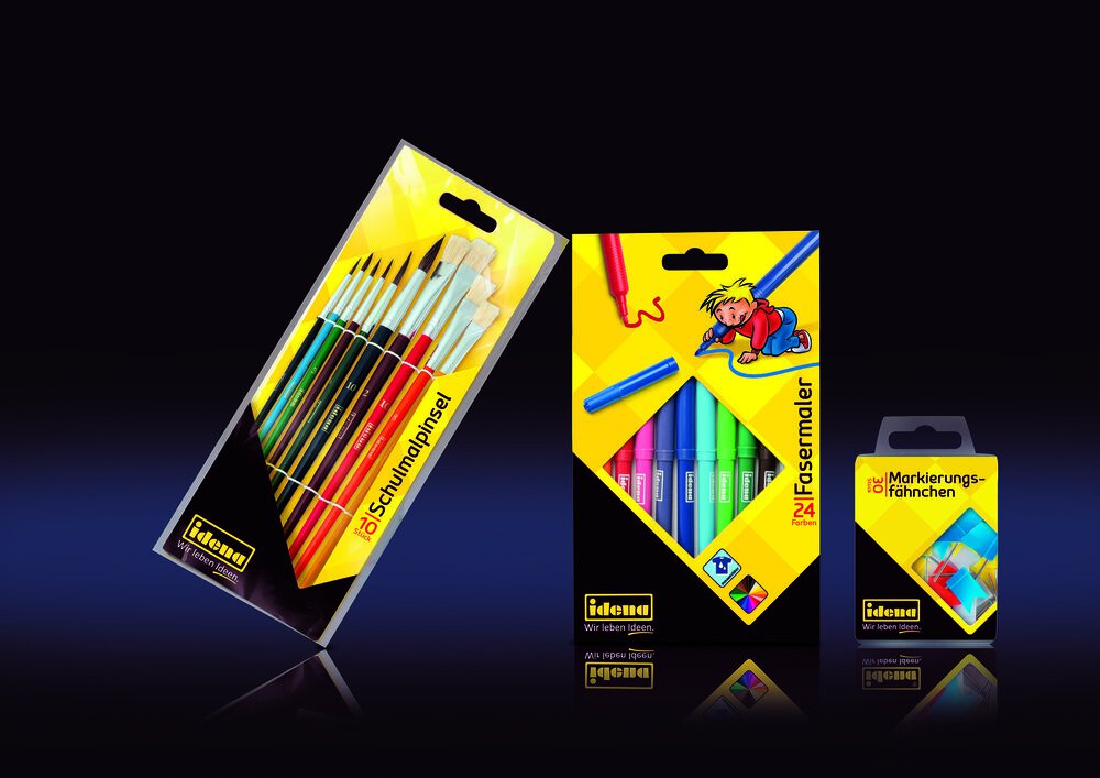
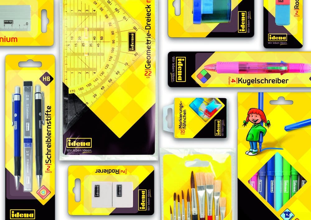
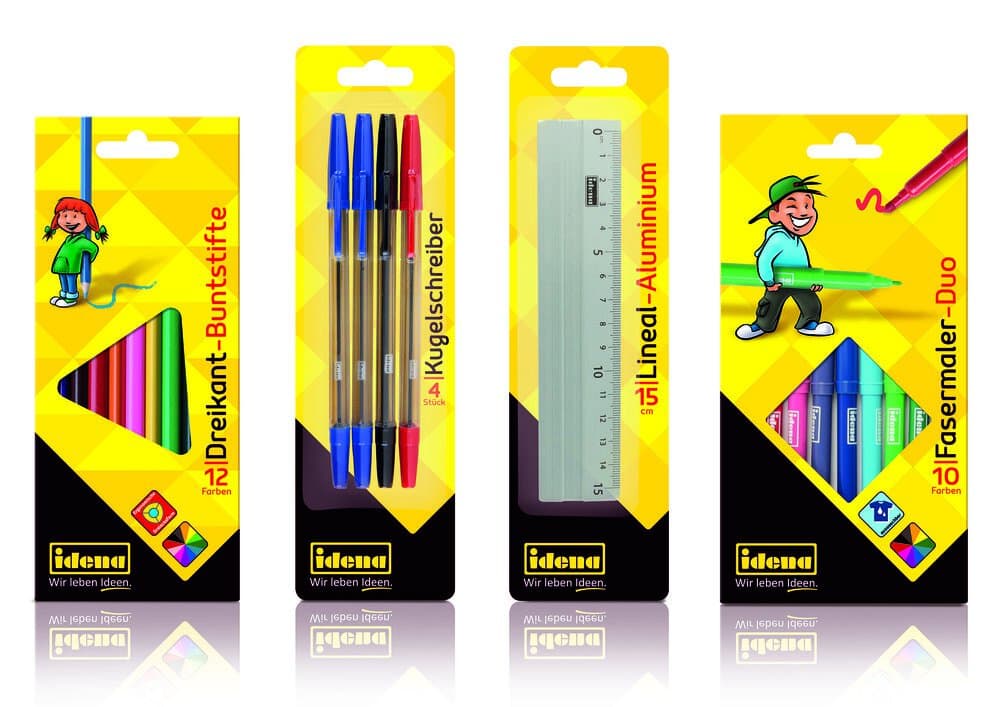
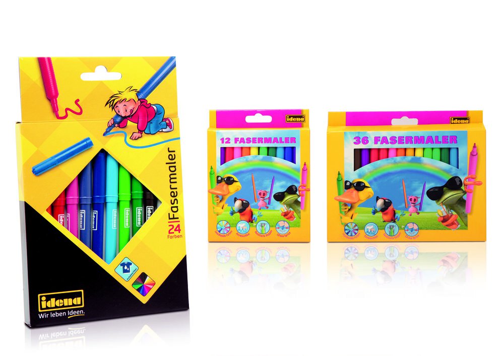
The B+P Creality team took these requirements as a special challenge. Inspired by natural color combinations and simple geometric shapes, the designer created a high-contrast, two-color packaging. The packaging colors repeat the colors of the company logo and thus form a united ensemble. The color edges and viewing windows are designed in checkered or triangular shapes, which continue in the background in different shades of yellow. Additional graphic elements were developed for the children´s projects, namely the small, cute mini-people with the oversized products in their hands. Vibrant graphic elements are more likely to attract customers’ attention and therefore enhance the effect of the balanced packaging.
In the course of a market analysis B+P Creality found that a logo applied in the upper part of the packaging often gets unintentionally hidden when placed on a store shelf. That is why B+P Creality took the innovative decision to move the Idena logo to the bottom side. Thereby a stable, black, very striking foundation with the logo was created, which ensures that the logo will no longer be overlooked on the shop shelves. Additionally, the upper part of the package was rotated in order to provide the designers with more workspace for graphic elements.
Dirk Rose, B+P Creality Director Design Strategy says: “From the design perspective we created a design system with the black bottom and the yellow checks which we will use for future projects. The next challenge is to develop this system into different directions”. ”
CREDIT
- Agency/Creative: B+P Creality
- Article Title: B+P Creality – Idena
- Project Type: Packaging
- Format: Box
- Substrate: Pulp Carton


