Markela Bgiala – Tapia Olive Oil
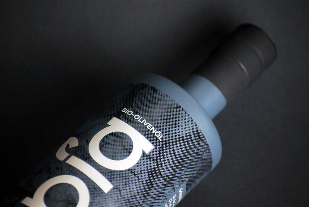
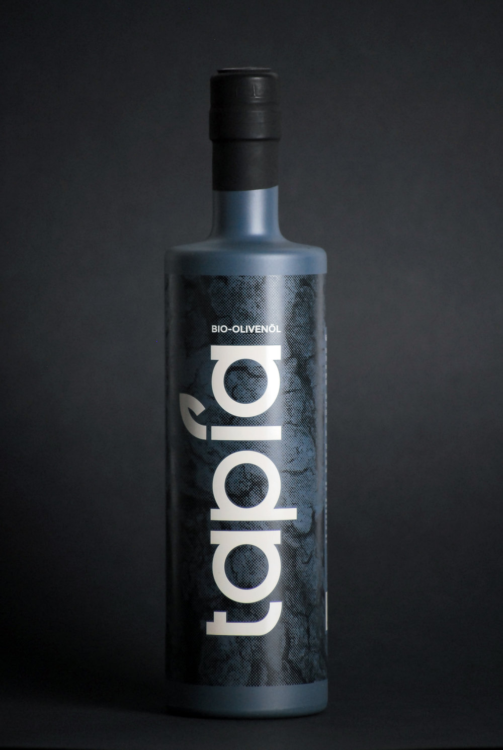
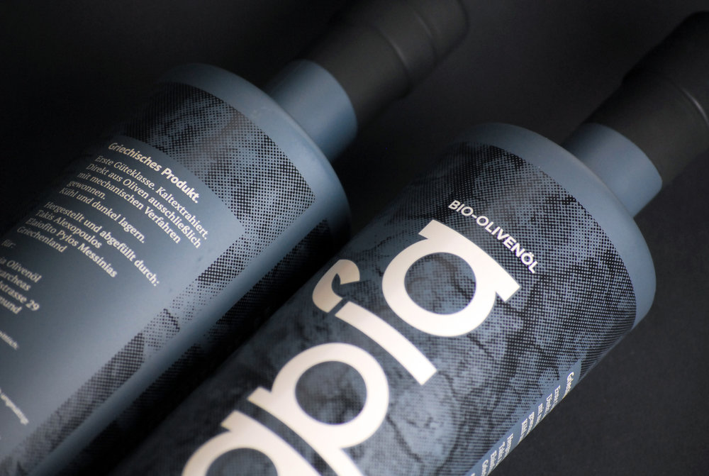
A logo created with a custom made typography and the potential to be used on multiple products in the future.The idea of the bottle design was to have a reference of the natural surroundings of the place the olive oil is coming from. I wanted to break any stereotypes around olive oil package design and Greece. I used a picture of the olive oil trunk to make the tester layer and petrol color which is a mix of blue and green keeping the sea and the olive leaf as a reference. Mm


CREDIT
- Agency/Creative: Markela Bgiala
- Article Title: Bottle and Logo Design for ‘Tapia’ Greek Organic Olive Oil
- Organisation/Entity: Agency Commercial, Published
- Project Type: Packaging
- Agency/Creative Country: Germany
- Market Region: Europe
- Format: Bottle
- Substrate: Glass
FEEDBACK
Relevance: Solution/idea in relation to brand, product or service
Implementation: Attention, detailing and finishing of final solution
Presentation: Text, visualisation and quality of the presentation


