Overview
Bottega is a women-owned and led food company that specializes in a select range of sustainable pantry goods. The brand’s mission is to stand out in a saturated market by bringing authenticity and integrity to their products. With a focus on sustainability and quality, Bottega aims to connect with a young, discerning audience that values both simplicity and authenticity in the foods they choose.
Identity
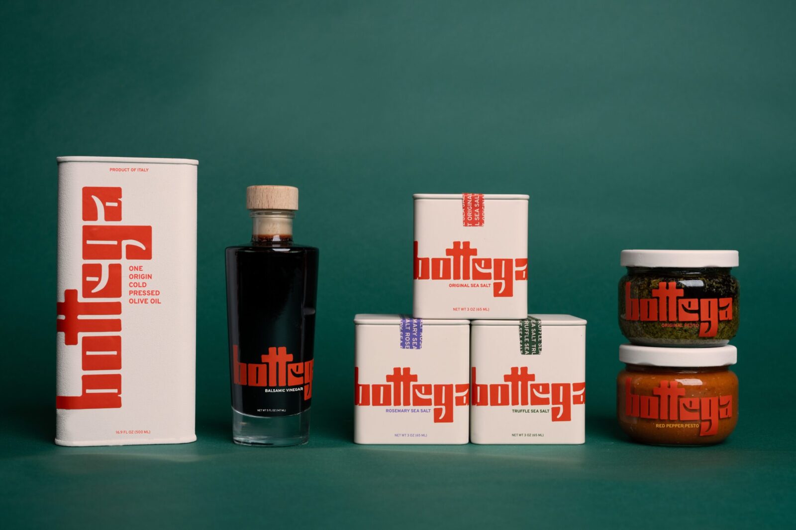
The conception of Bottega’s brand identity began with the creation of a unique logotype, which quickly evolved into the development of an entire bespoke typeface. This custom typeface is central to the brand’s visual language, serving as the wordmark and being used as the primary display typeface for key brand messaging. The typeface is inspired by the quaint signage found in small Italian corner stores, evoking a sense of tradition and artisanal quality that aligns with Bottega’s values.
Packaging
Packaging for Bottega’s products is designed to be consistent and visually striking. The logotype is applied in an oversized format across various substrates and packaging forms, creating a bold and cohesive brand presence on the shelf. This approach ensures that Bottega’s products are easily recognizable and convey a sense of quality and authenticity at first glance.
Digital
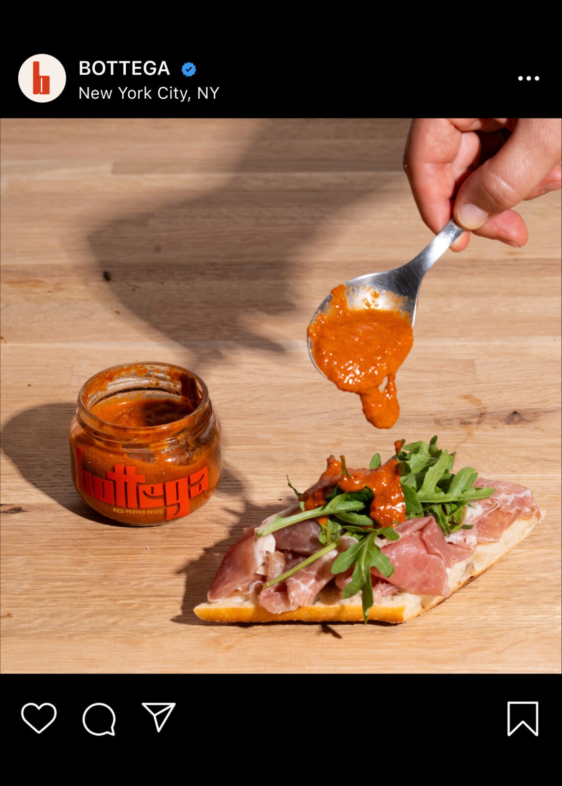
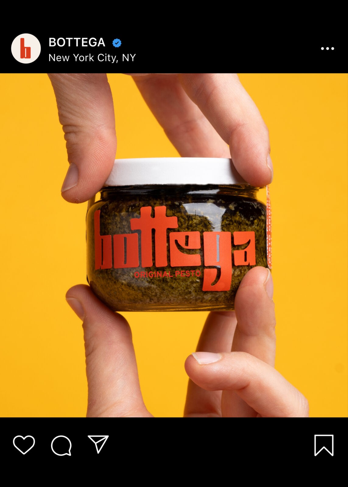
The e-commerce website is designed to mirror the brand’s commitment to fun and delight. The interface is clean and intuitive, making it easy for customers to explore the curated selection of products. The website also incorporates custom lifestyle photography, showcasing Bottega’s products being used in a variety of attractive recipes and lifestyle settings. This imagery not only highlights the versatility of the products but also reinforces the brand’s connection to a wholesome, sustainable lifestyle.
In addition to its visual appeal, the website features attractive animations and interactions that elevate the user experience and further enhance the brand’s modern, sophisticated identity. These digital elements, combined with the strong visual language established by the custom typeface and packaging, help Bottega differentiate itself in a crowded market and build a loyal customer base.


CREDIT
- Agency/Creative: Robi Ruocco
- Article Title: Bottega’s Oversized Logotype and Custom Typeface Bring Modernity to Sustainable Food Packaging by Student Robi Ruocco
- Organisation/Entity: Student
- Project Status: Non Published
- Agency/Creative Country: United States of America
- Agency/Creative City: San Diego
- Project Deliverables: Packaging Design
- Industry: Food/Beverage
- Keywords: WBDS Student Design Awards 2024/25 , Packaging Design: Product Creation
- Keywords: WBDS Student Design Awards 2024/25


