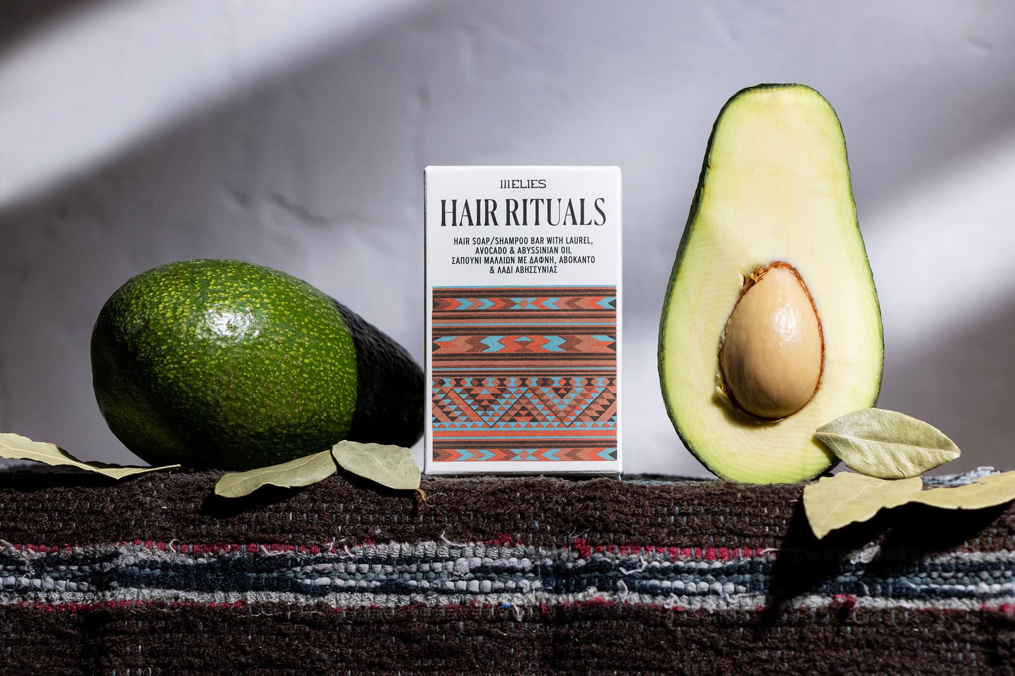
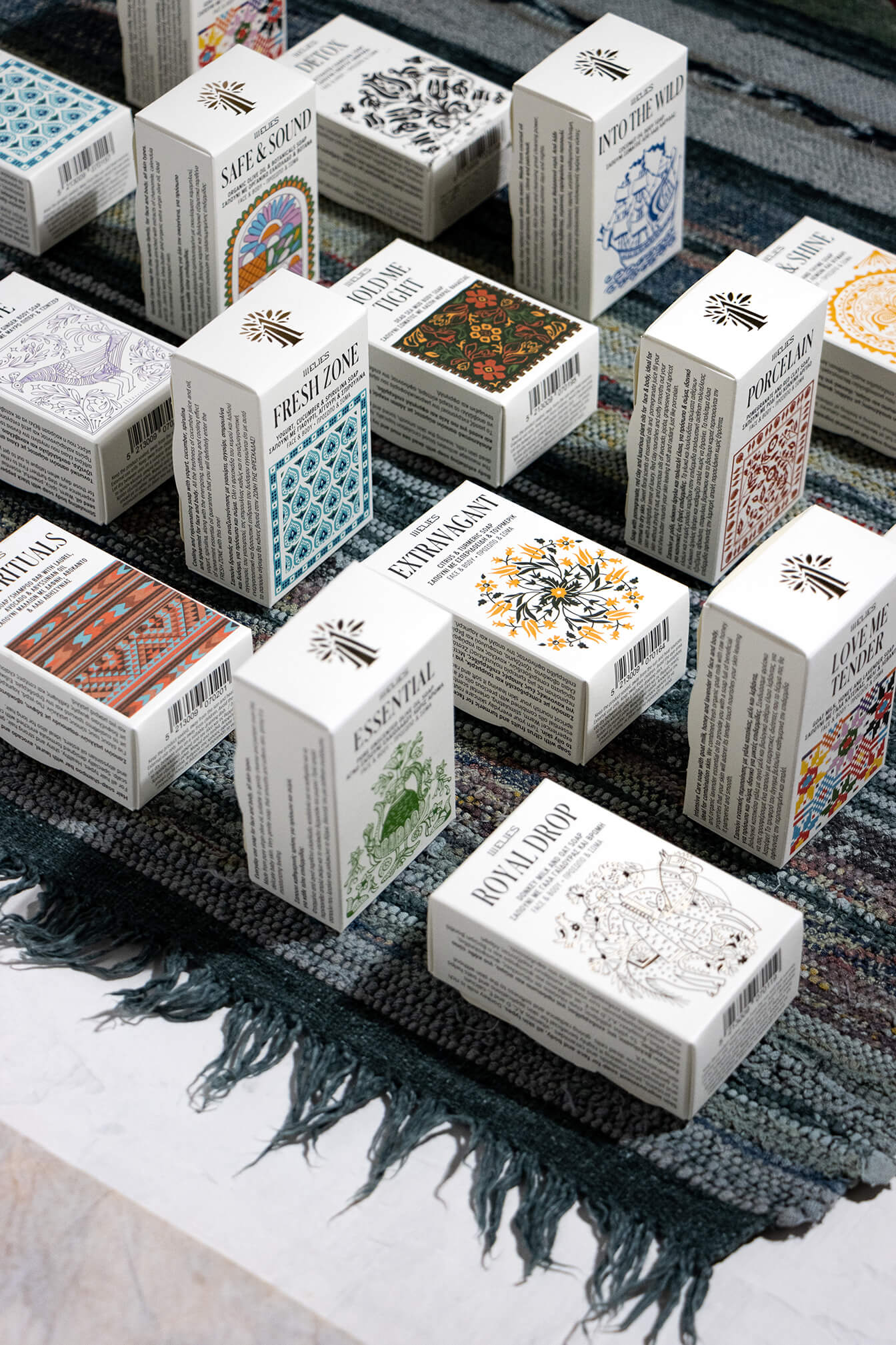
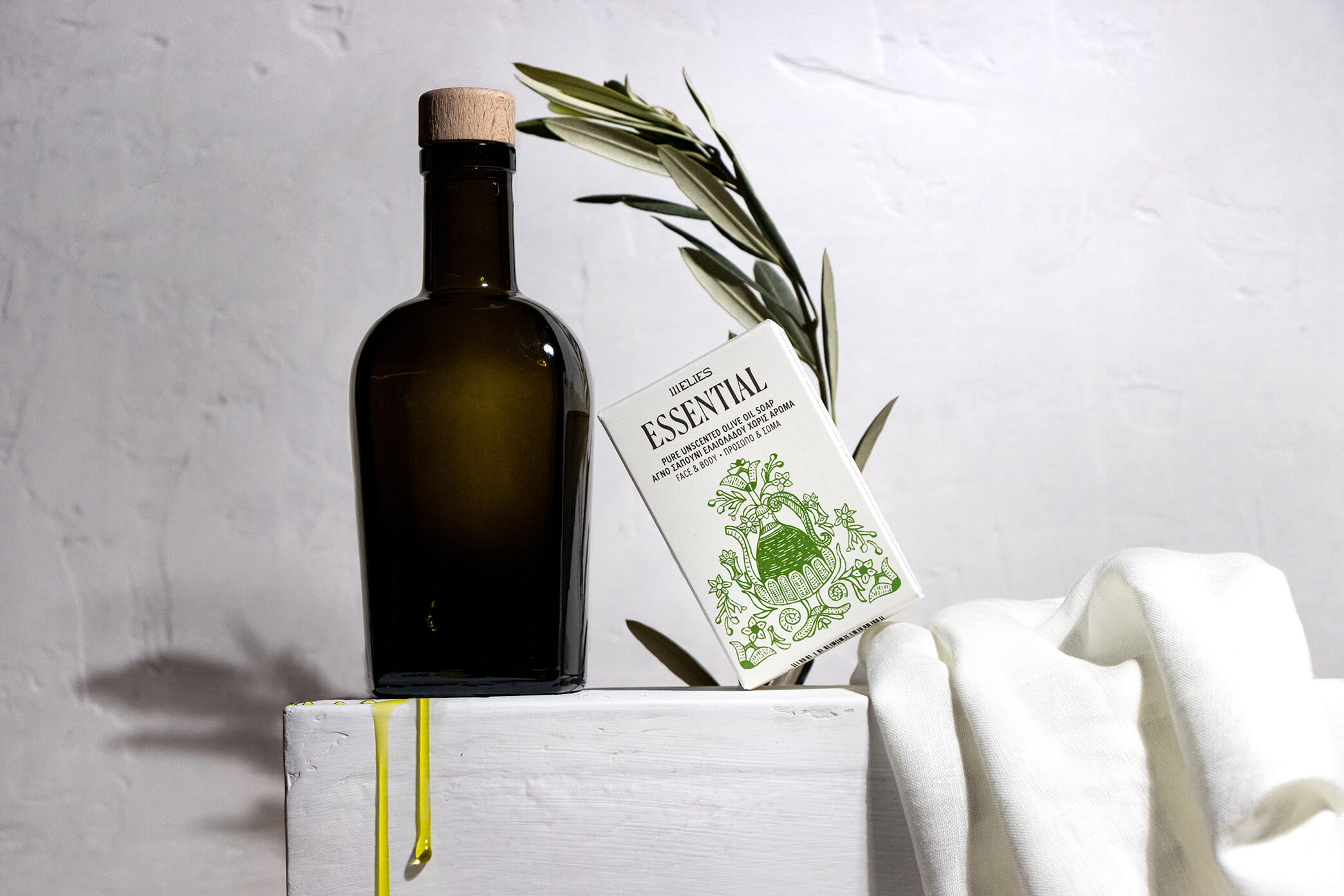
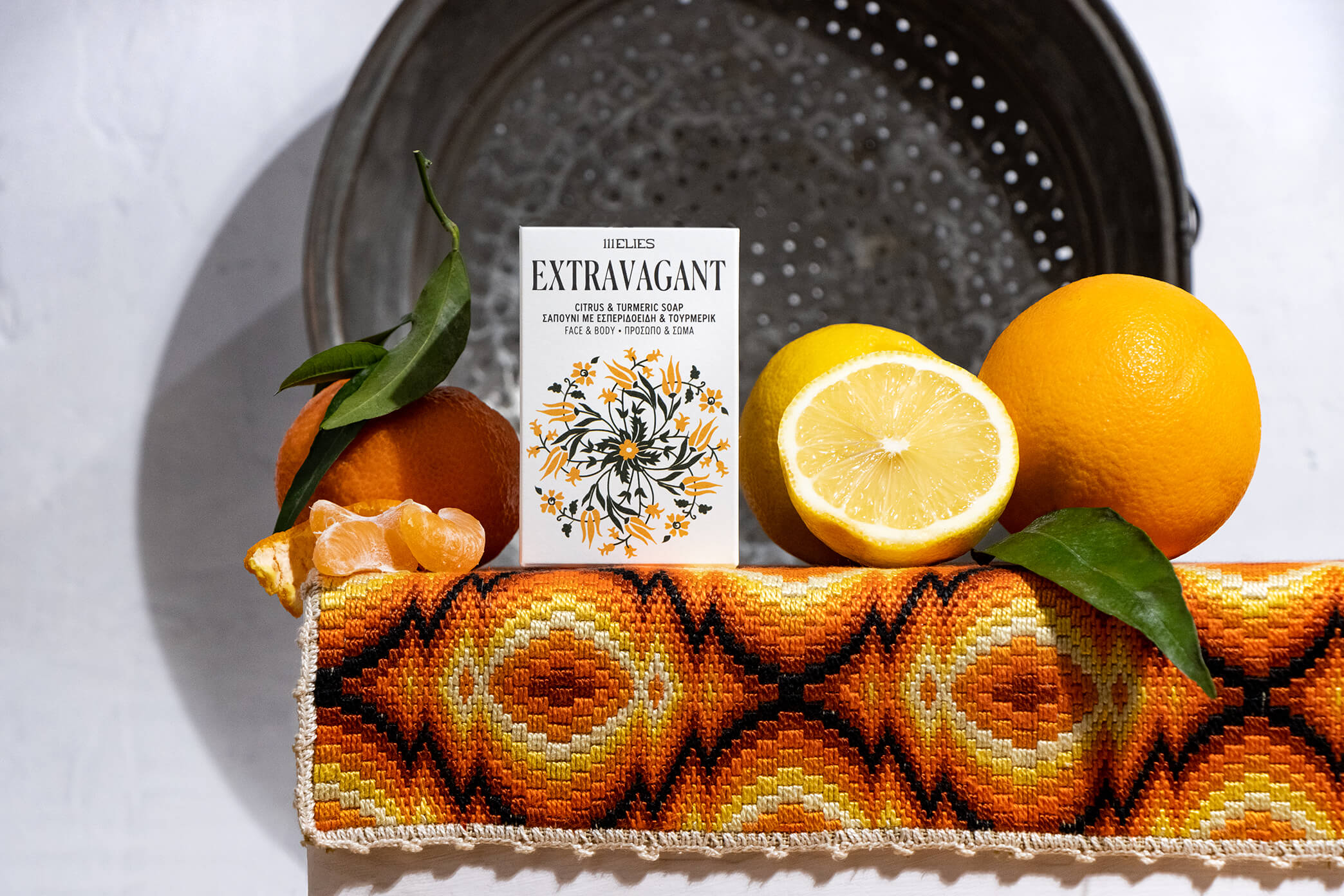
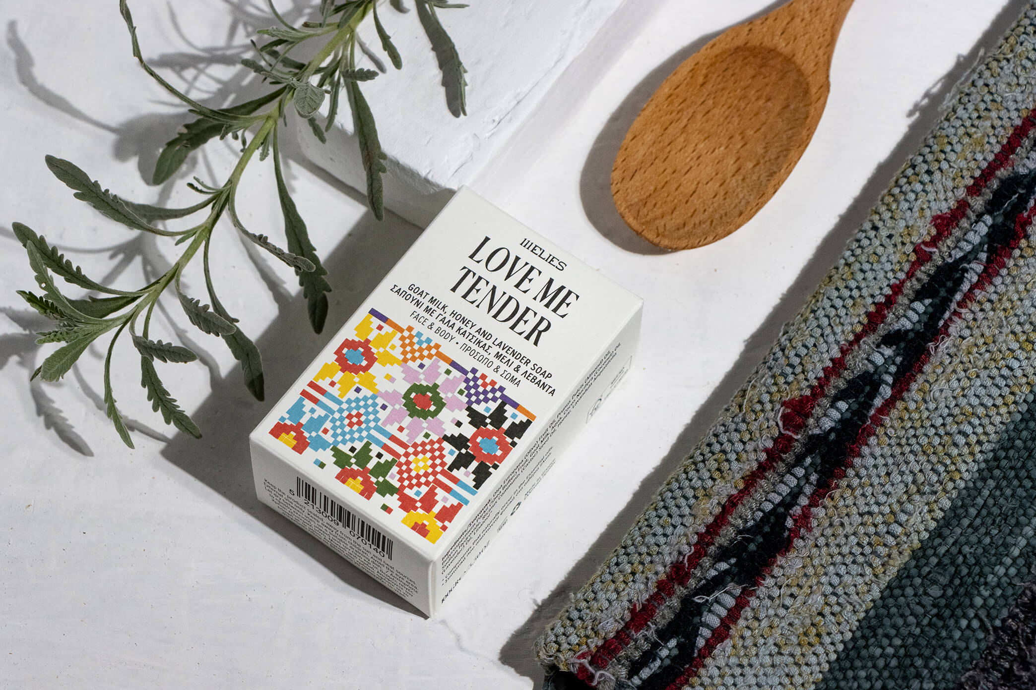
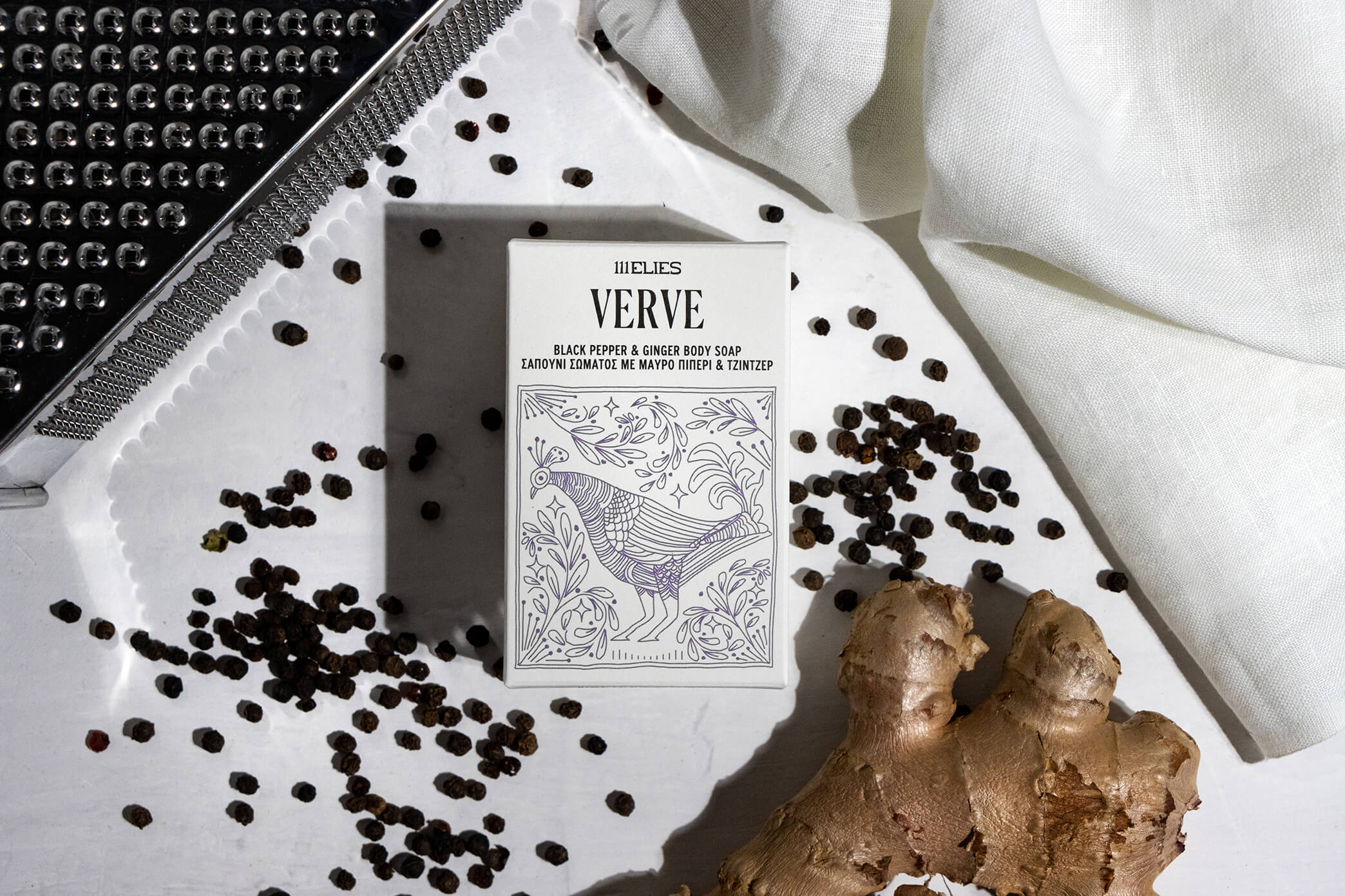
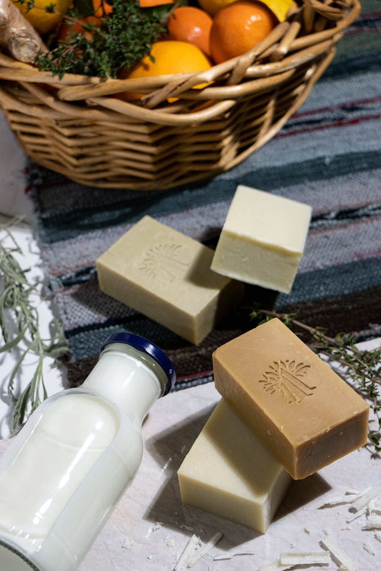
The love of nature’s grandeur and noble simplicity is deeply engraved in the philosophy of this creative journey. The devotion of our client, 111Elies, to natural ingredients and planet-friendly processes, shaped this project into an ode to organic simplicity and traditional practices. The client’s company name translates into “111Olives” in Greek, referring to the 111 olive trees planted in the family-owned field that nourished their passion for making natural products and kickstarted their business. The first stage of project involved designing the packaging of their line of 13 skin and hair care soap bars, each with distinct active ingredients, scents and benefits. All lovingly produced to protect and nourish.
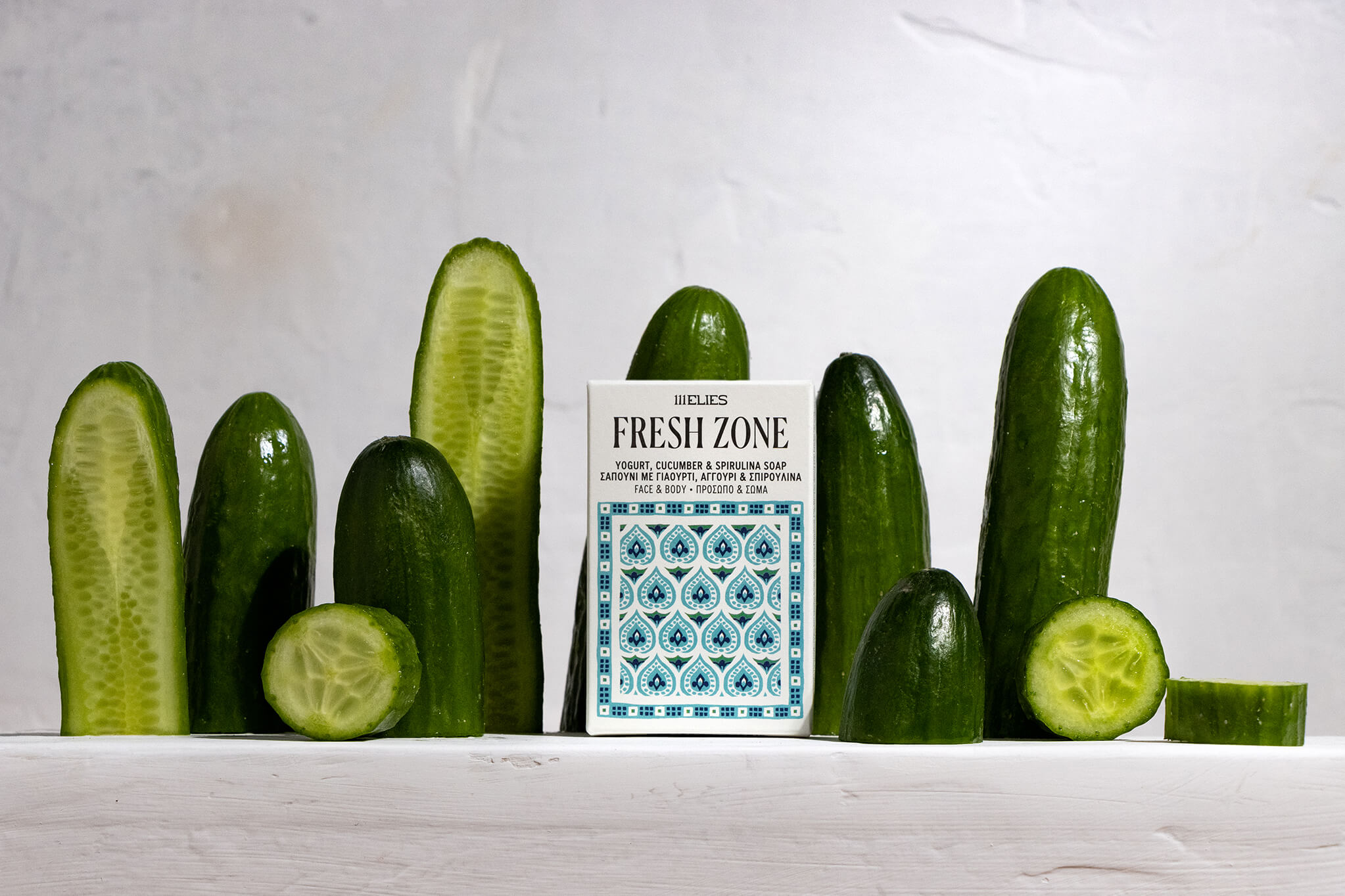
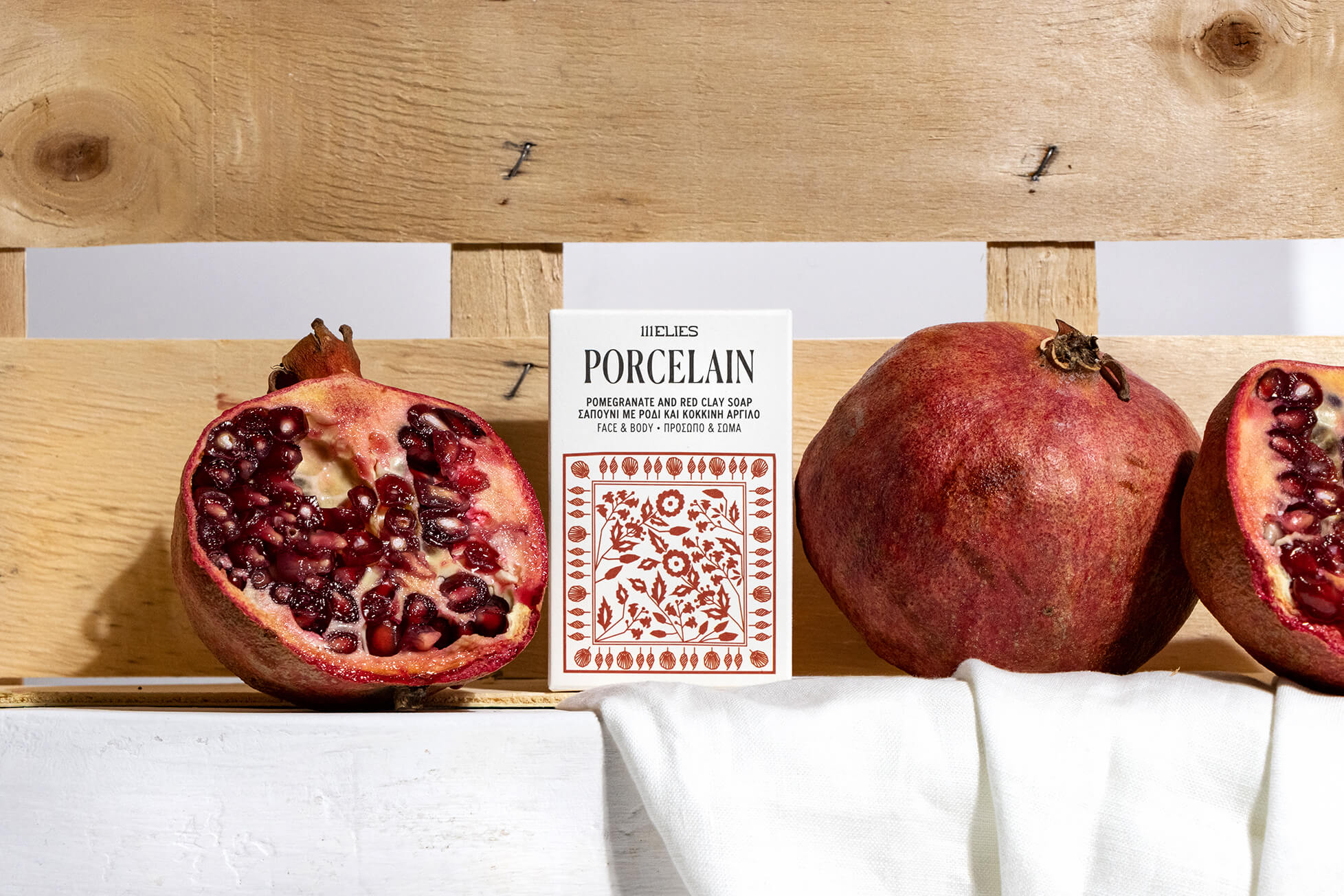
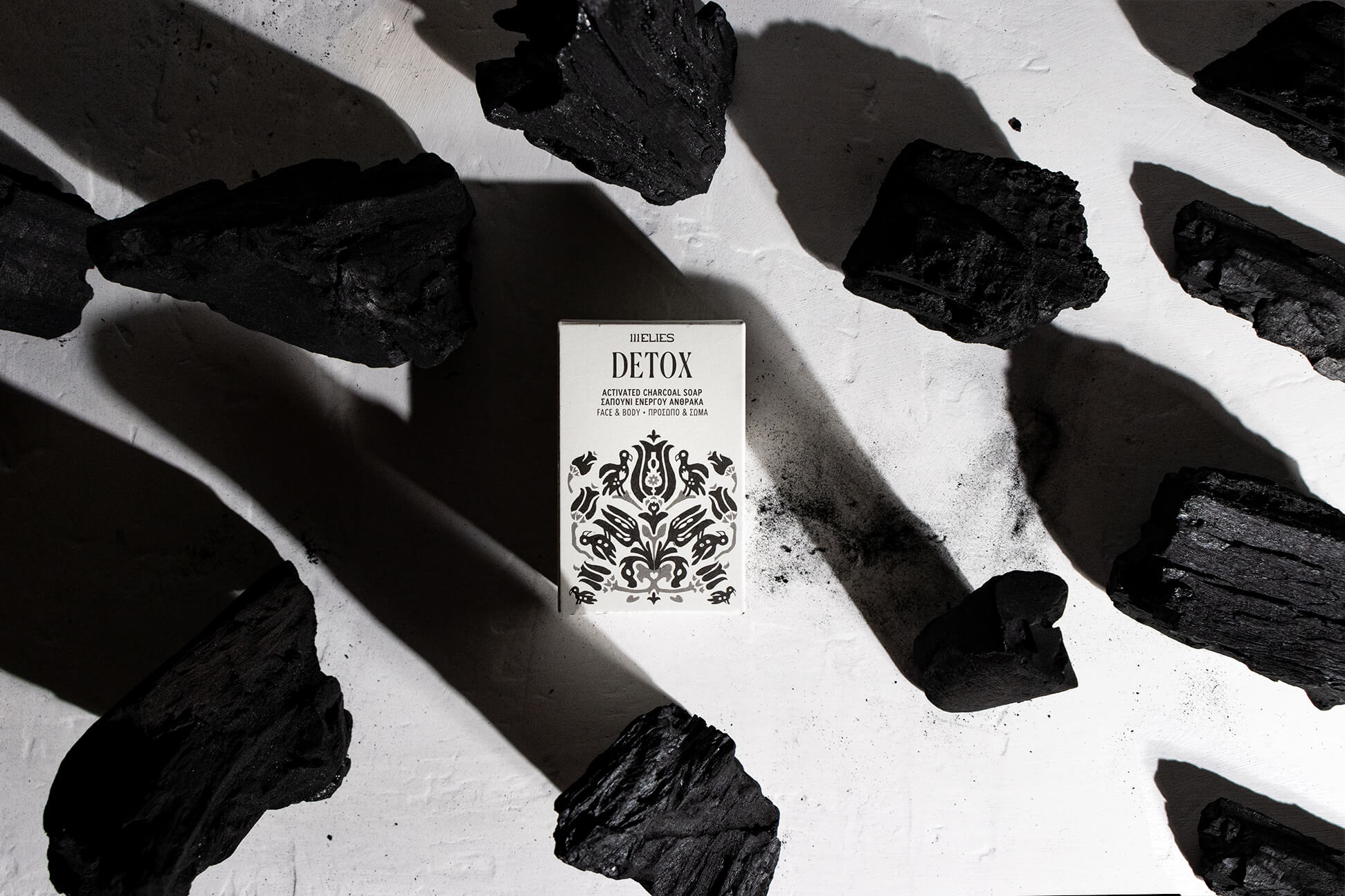
Our design solution was extracted through highlighting the combination of two basic values; product locality and design intricacy. An element from the past, representing the folklore and handmade, was what we needed to spice things up and spark memories. After extensive research into the archives of Eommex (Hellenic Organisation of Small and Medium Enterprises and Handicraft), featuring traditional/folk Greek motifs and compositions from carpets, ceramics, fabrics, and others, various elements were highlighted and translated into a visual language applicable to the product range. Using this as a base of reference, we carefully illustrated a composition for the packaging of each of the 13 soap bars. Each one loosely reflects the soap’s characteristics and follows the natural colour palette of its main ingredients.
The design’s typographic treatment reflects the elegance and delicacy of the products, featuring an intricate serif font which embraces the illustrative compositions along with a bolder, san-serif font for the descriptions.
The logo design is full of character, both in its text and symbol. Organic shapes that take the form of trees create the number “111”, distinctive to the brand. Shapes of leaves and dots, referring to olives, complete the image of a forest of olive trees. The text follows the lines of a serif font but its hand-lettering elements help make it modern and unique.
CREDIT
- Agency/Creative: Boo Republic
- Article Title: Boo Republic Create 111 Elies Soap Bars Visual Identity and Packaging Design
- Organisation/Entity: Agency
- Project Type: Packaging
- Project Status: Published
- Agency/Creative Country: Greece
- Agency/Creative City: Thessaloniki
- Market Region: Europe
- Project Deliverables: Brand Identity, Illustration, Packaging Design
- Format: Box
- Substrate: Pulp Paper
- Industry: Health Care
- Keywords: natural, soap, beauty regiment, skincare, cold extracted soap, traditional, artisanal, small batch, handmade
-
Credits:
Branding & packaging: Boo Republic


