An illustration of an owl has been gracing the packaging of Royal Armenia coffees for many years. The distinctiveness of the mascot has been so impactful that it has led to widespread recognition, to the extent that people identify the product as “boo” (which translates to “owl” in the Armenian language).
Facing the need for a revitalized look, Royal Armenia engaged us to undertake the endeavor of reimagining their coffee and iced tea packaging. The impetus behind this initiative was rooted in the acknowledgment that their existing design no longer resonated effectively with the contemporary preferences of their audience. In response, they entrusted us with the challenge of breathing new life into their packaging, aligning it with current trends and consumer expectations.
They emphasized the significance of upholding the brand’s recognizable features and asked us to integrate the much-loved owl emblem into the new design.
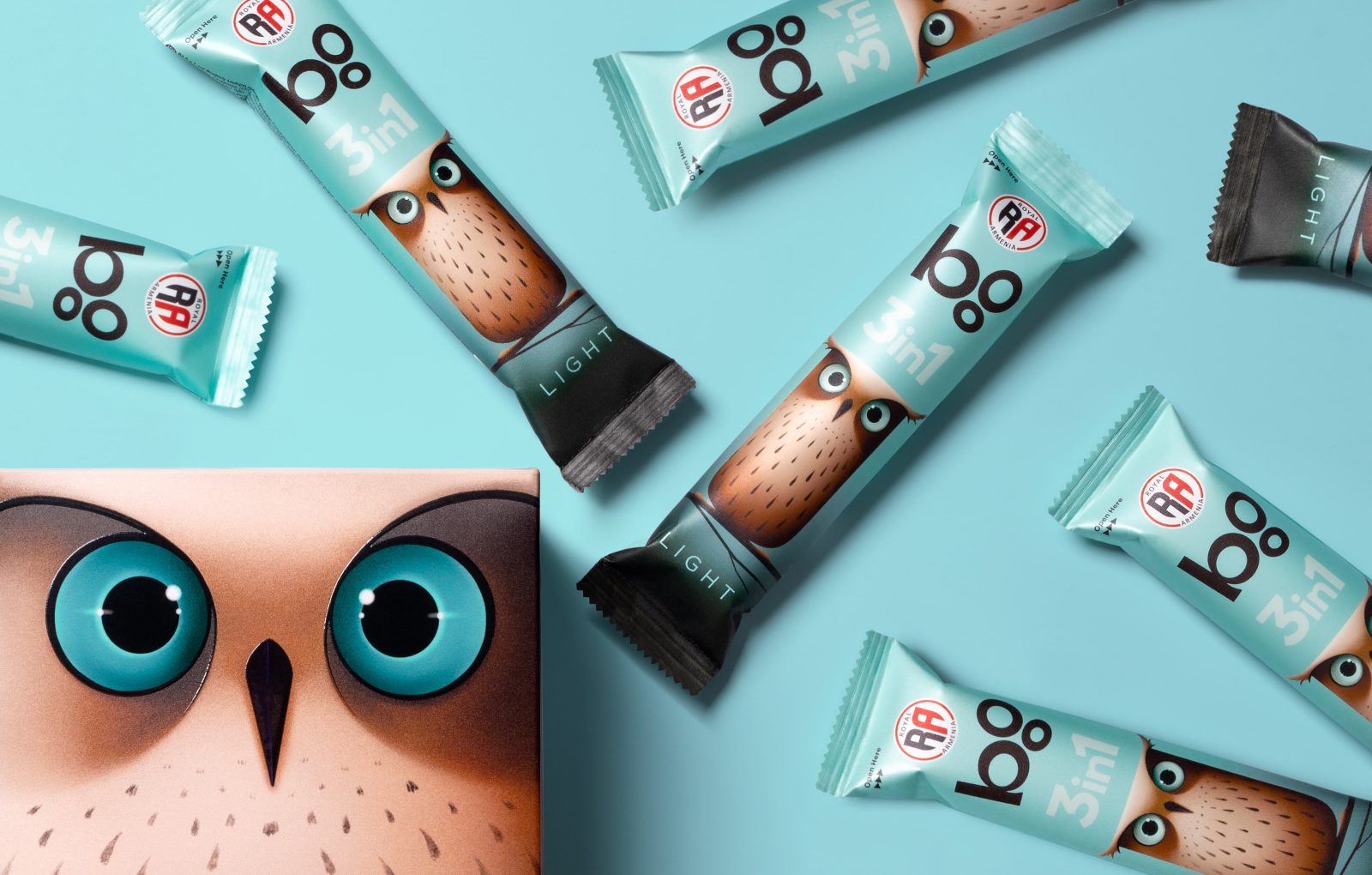
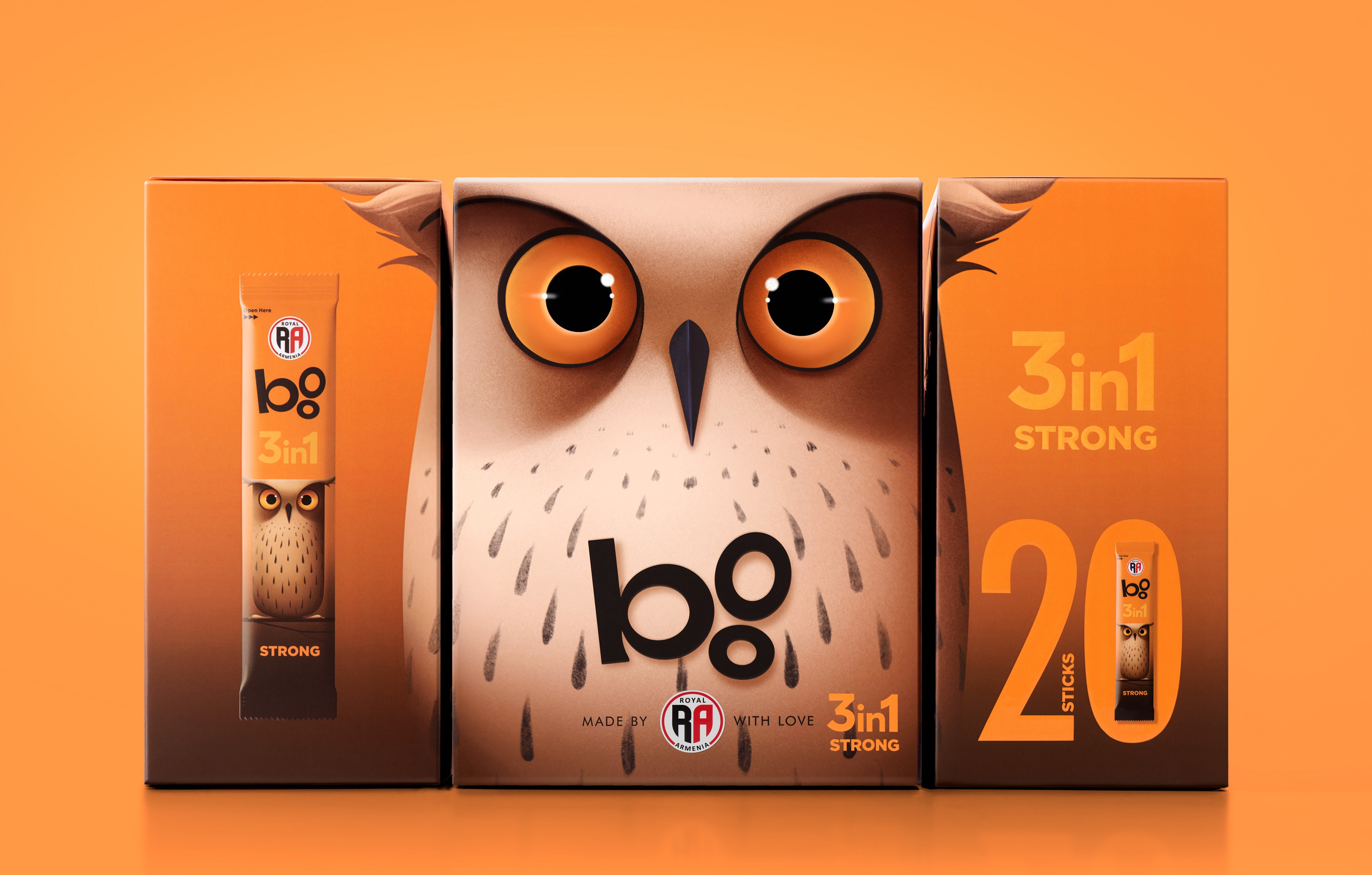
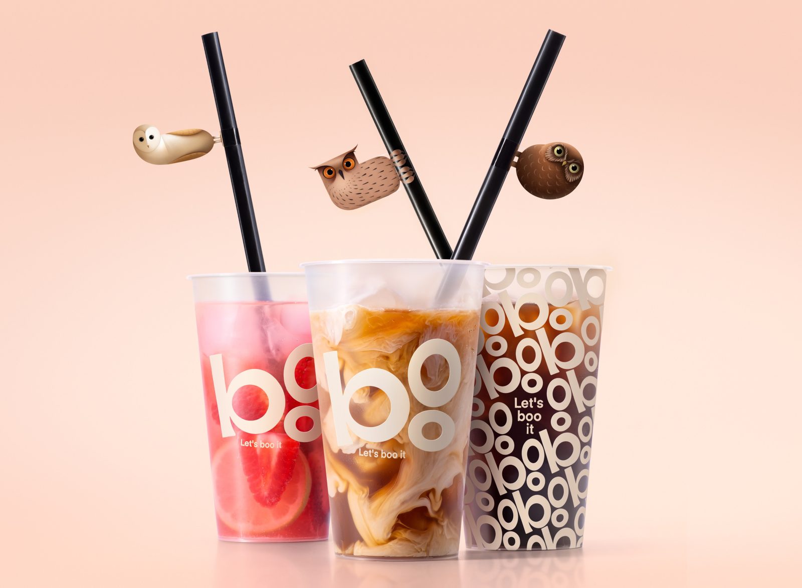
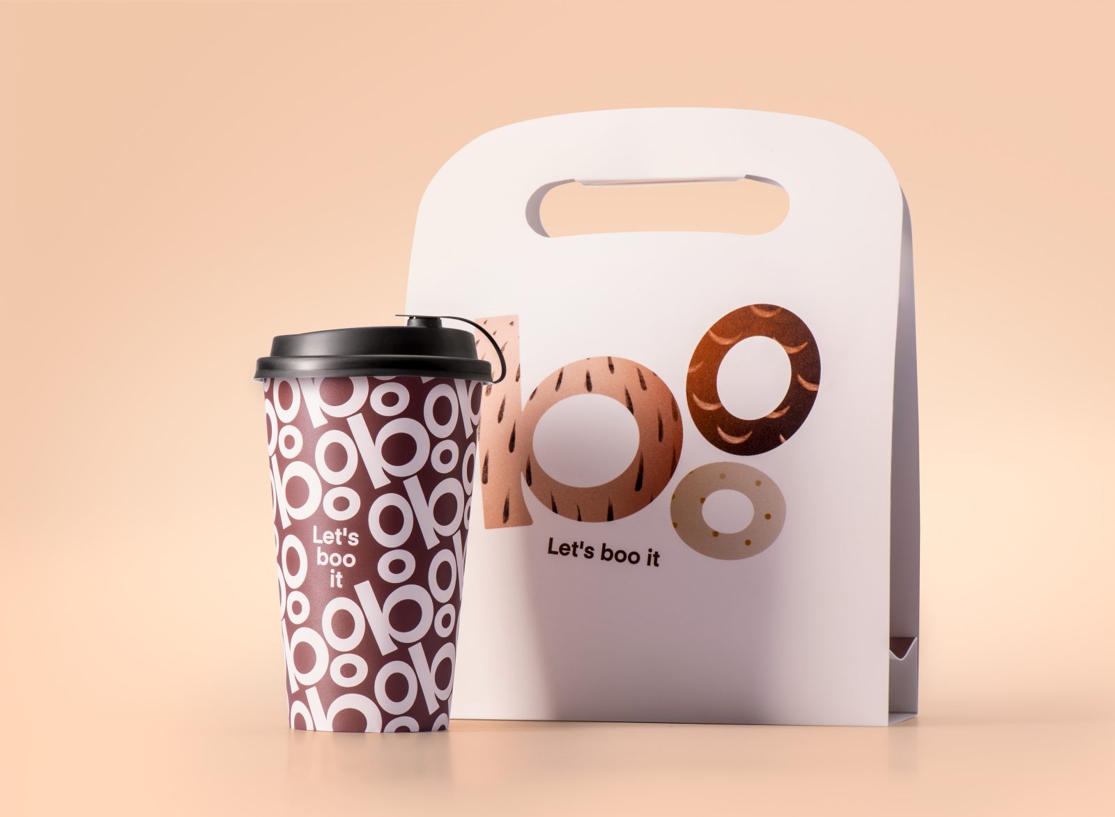
Recognizing the resonance of a name that people have used for years, we made a deliberate and strategic choice to introduce a subbrand called “Boo” (owl). This choice not only retained the endearing connection with their audience but also effectively encapsulated the essence of their beloved owl symbol. Building upon this foundation, we seamlessly transformed “Boo” into a typographic logo.
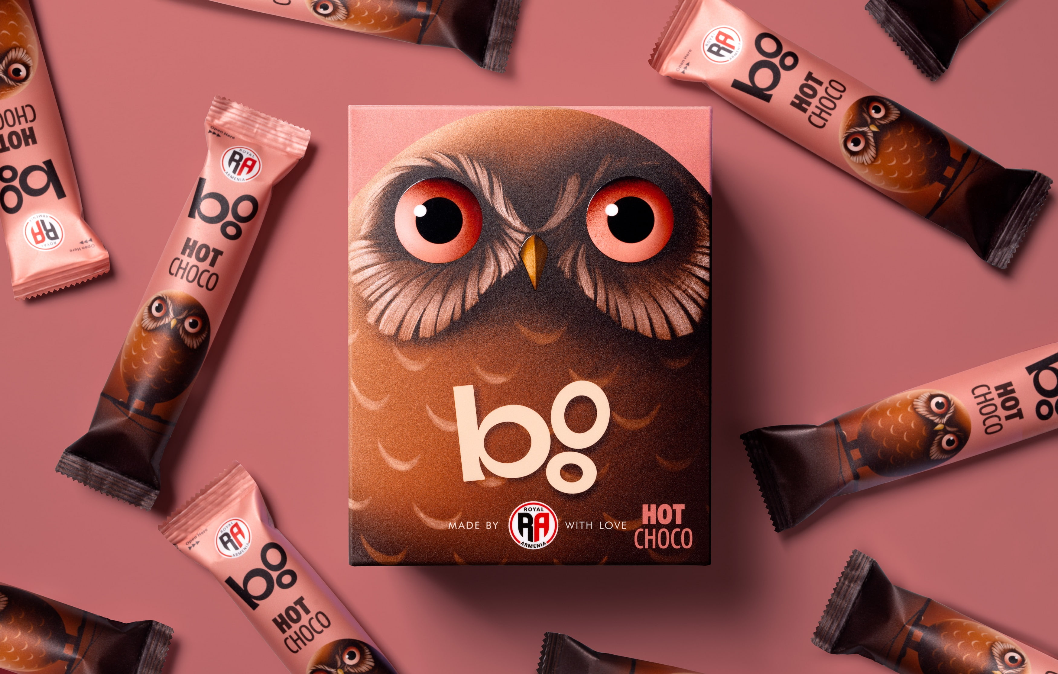
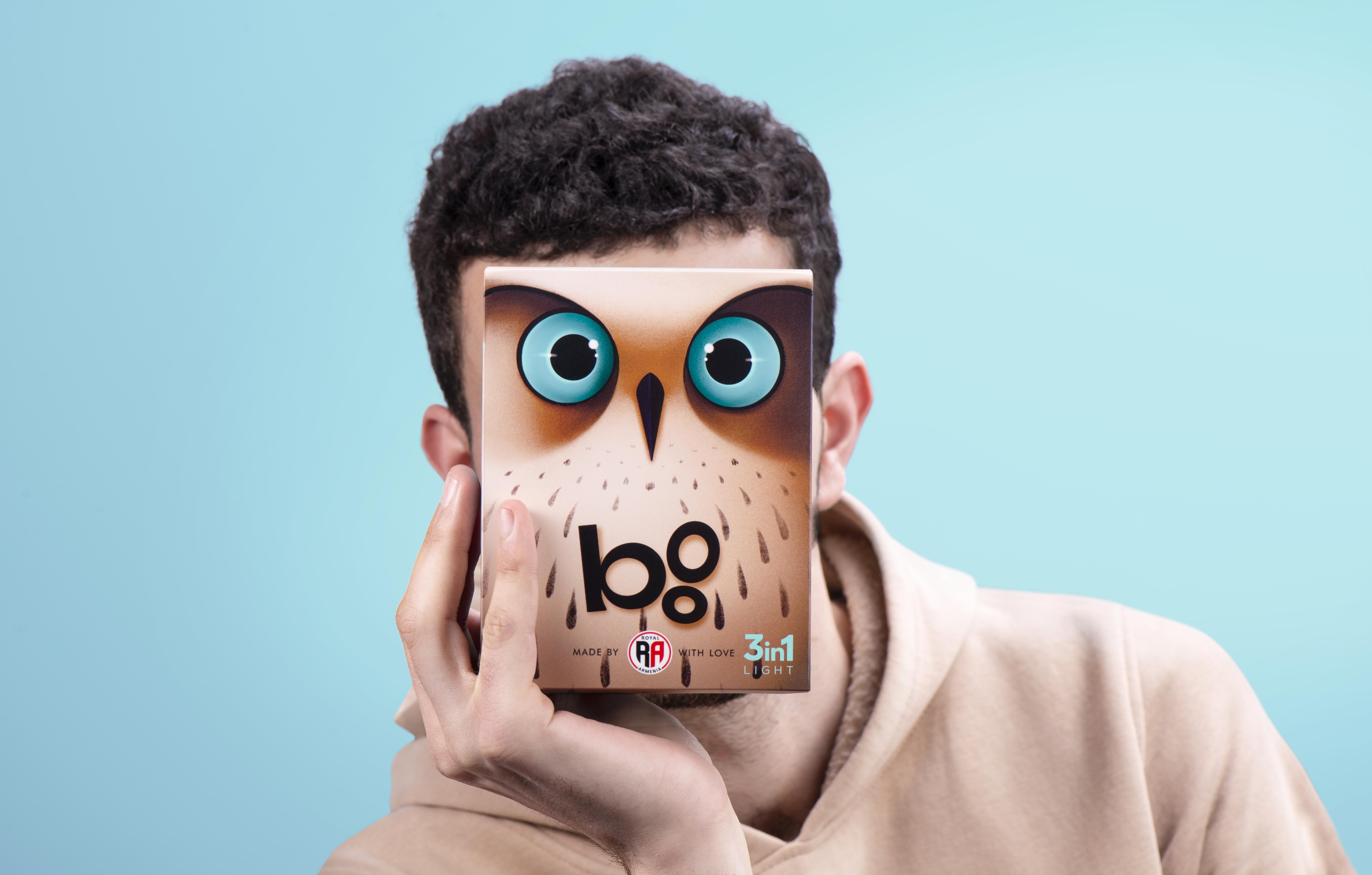
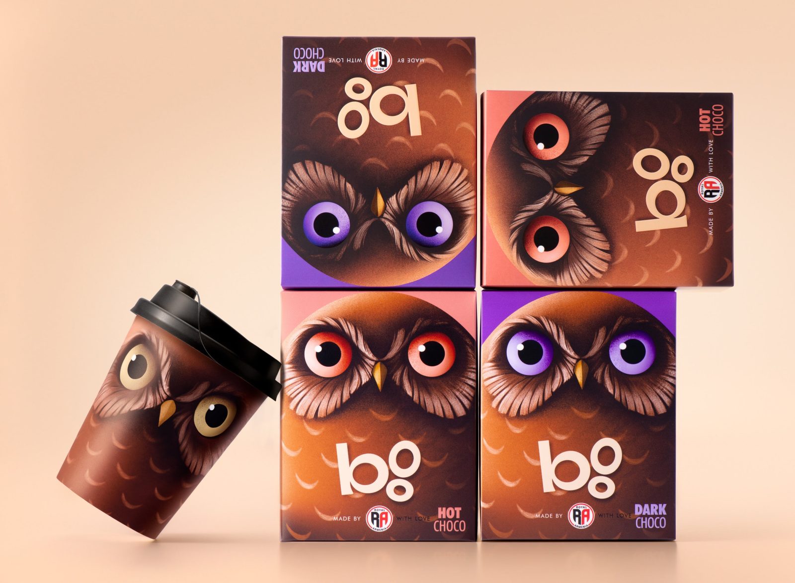
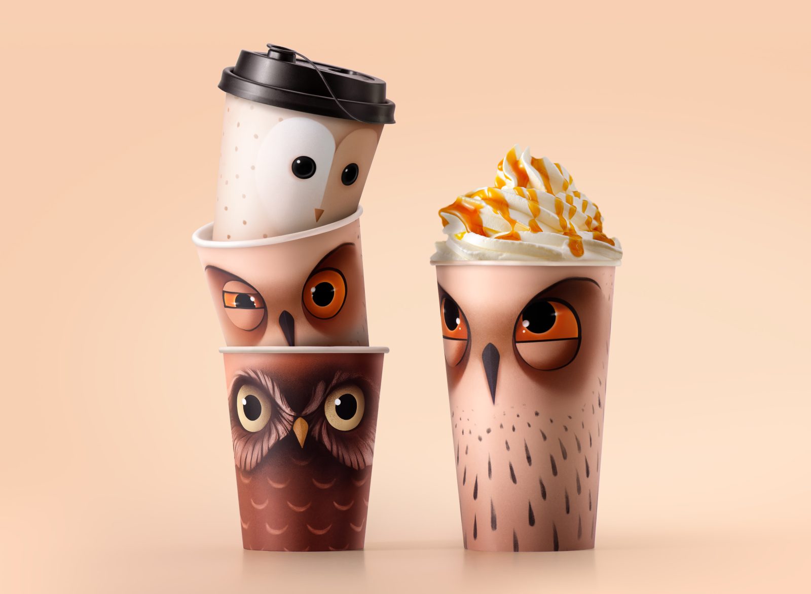
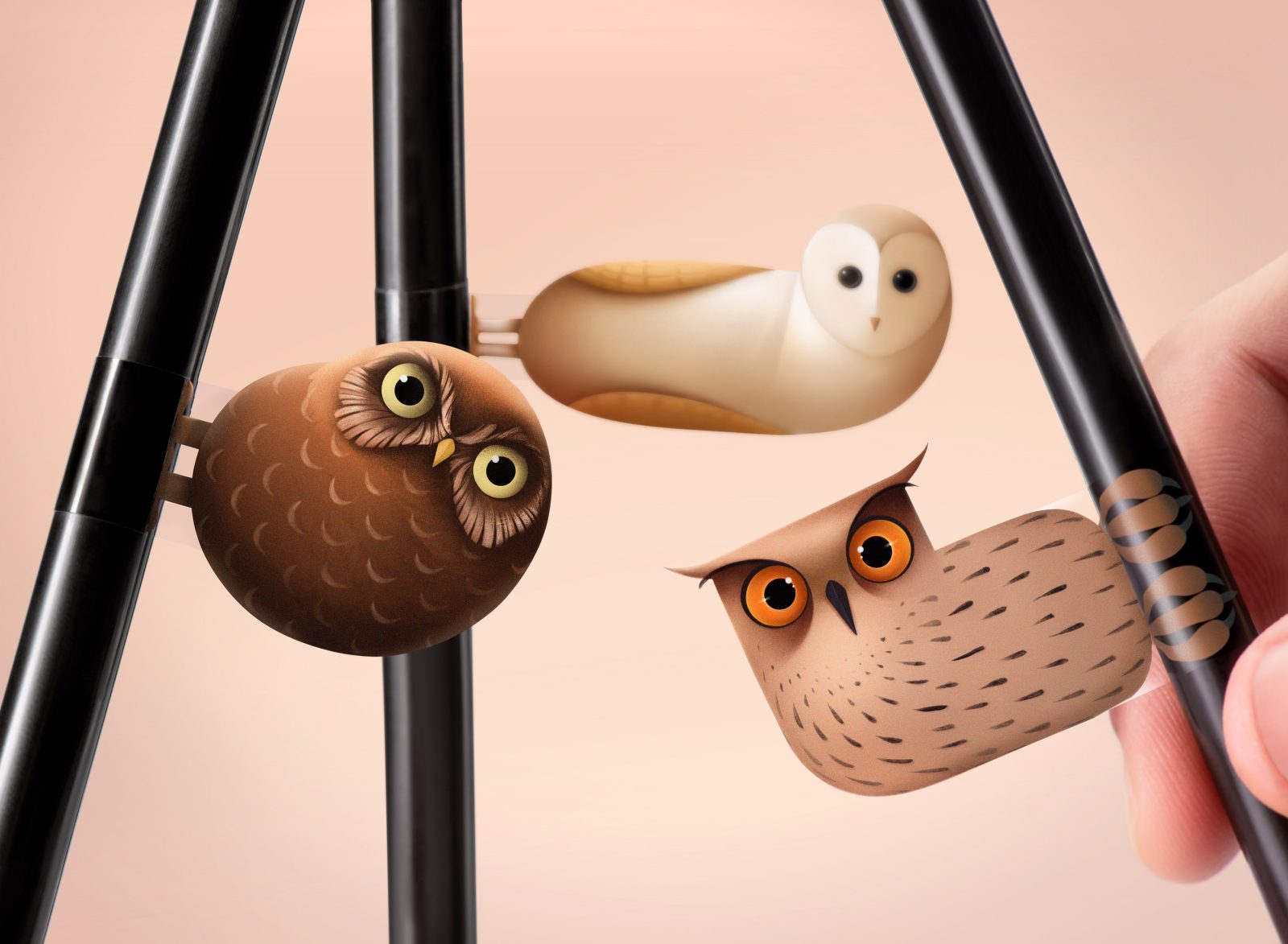
Through our creative process, we embarked on a comprehensive redesign of the owl motif, placing it at the forefront of the packaging concept as the main visual element. This reimagination resulted in a more dynamic and engaging owl, characterized by its increased size and playfulness. In addition to this, we expanded our artistic vision to introduce two new owl characters, each tailored to distinct product lines, enriching the brand’s visual narrative. Remaining mindful of the color palette used in the previous packaging, we employed a subtle yet effective differentiation technique by applying these hues to the eyes of the owl characters, to differentiate various types of coffee. This approach not only serves as a visual cue for distinguishing coffee types but also pays homage to the brand’s heritage, fostering a sense of familiarity and unity across the product range.
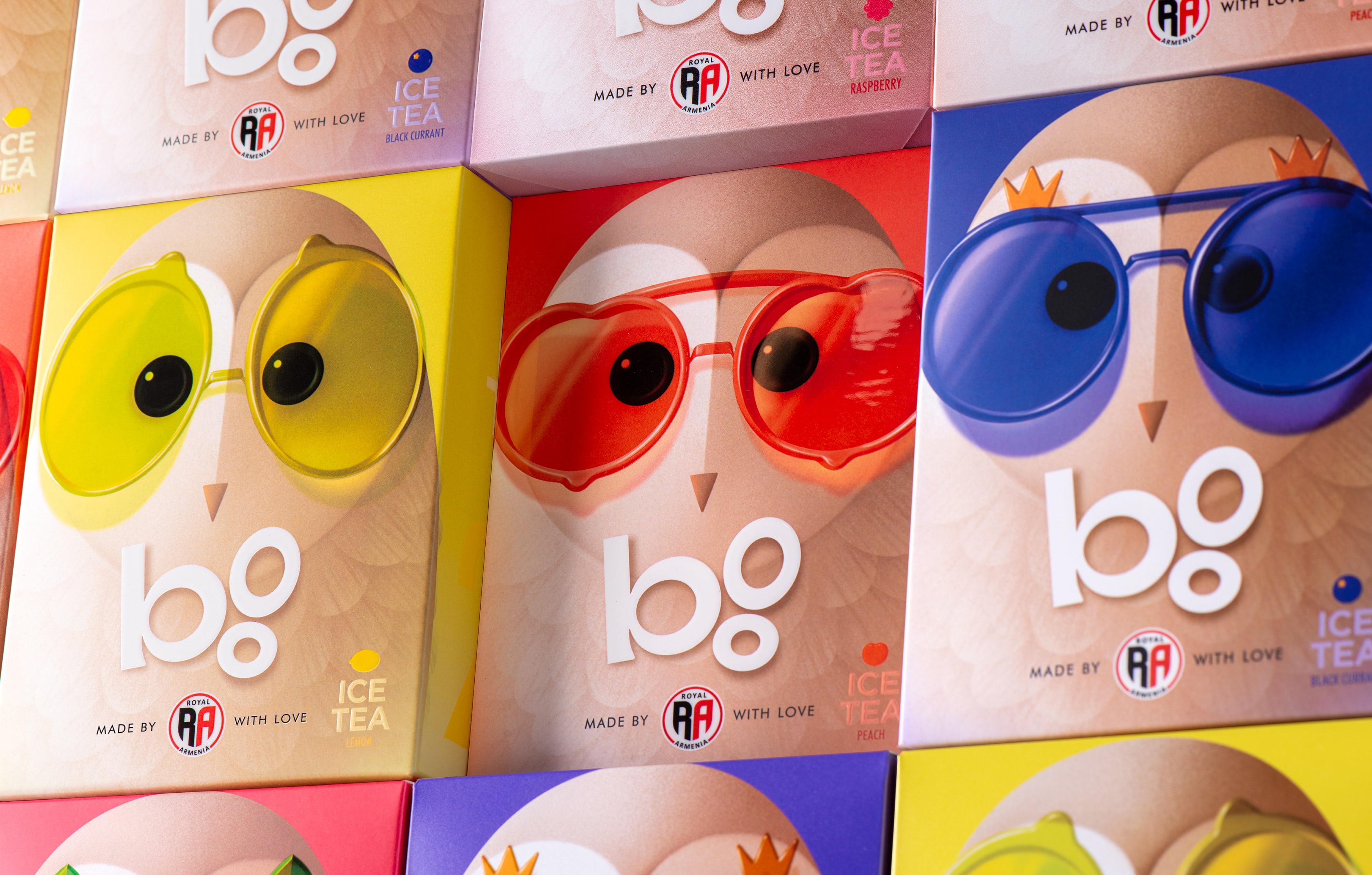
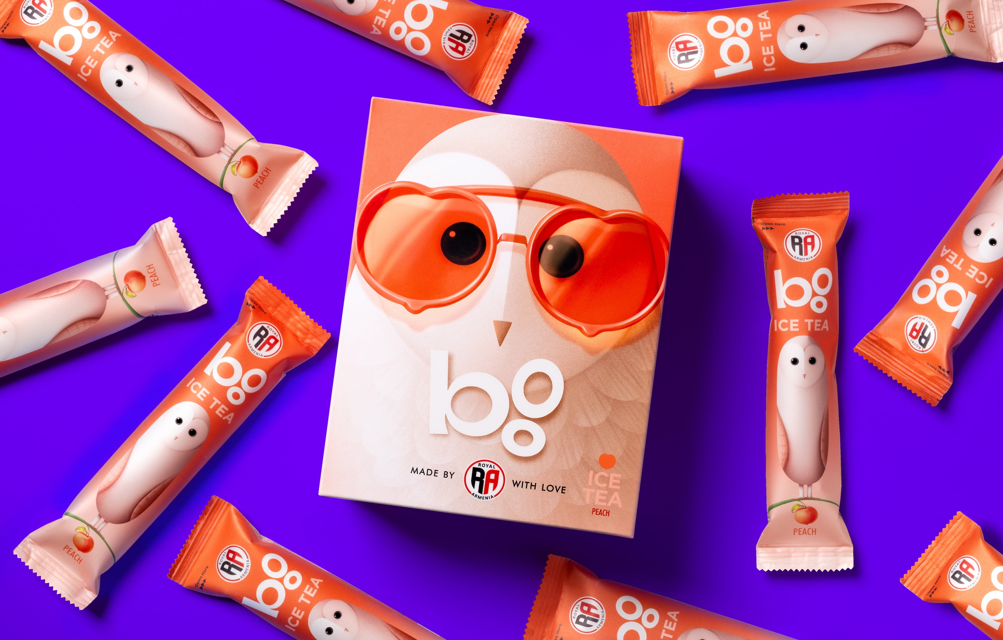
Furthermore, in our selection of iced teas, the owl characters wear fashionable glasses in diverse shades and frames, embodying the wide array of fruits and flavors that distinctly characterize each tea blend.
CREDIT
- Agency/Creative: Backbone Branding (''Artstep'' LLC)
- Article Title: ‘Boo’ Owl Takes Center Stage in Royal Armenia’s Redesigned Packaging
- Organisation/Entity: Agency
- Project Type: Packaging
- Project Status: Published
- Agency/Creative Country: Armenia
- Agency/Creative City: Yerevan
- Market Region: Middle East
- Project Deliverables: Graphic Design, Illustration, Packaging Design
- Format: Box, Sachet
- Industry: Food/Beverage
- Keywords: Packaging Design, Product Refinement , Product Redesign , Structural Development
-
Credits:
Creative Direction: Stepan Azaryan
Illustrator: Mariam Stepanyan
Graphic Designer: Ashot Hayrapetyan
Illustrator: Elina Barseghyan


