The Bon Appétit project is based on the premise that war takes away the possibility of access to food, making life and the satisfaction of basic human needs significantly more difficult. This situation is like closing the can opener inside a tin can. The relationship between war and famine is a complex, mutually reinforcing vicious circle, where the conditions of war contribute to food insecurity, and the consequences of famine can further exacerbate the conditions leading to conflict.
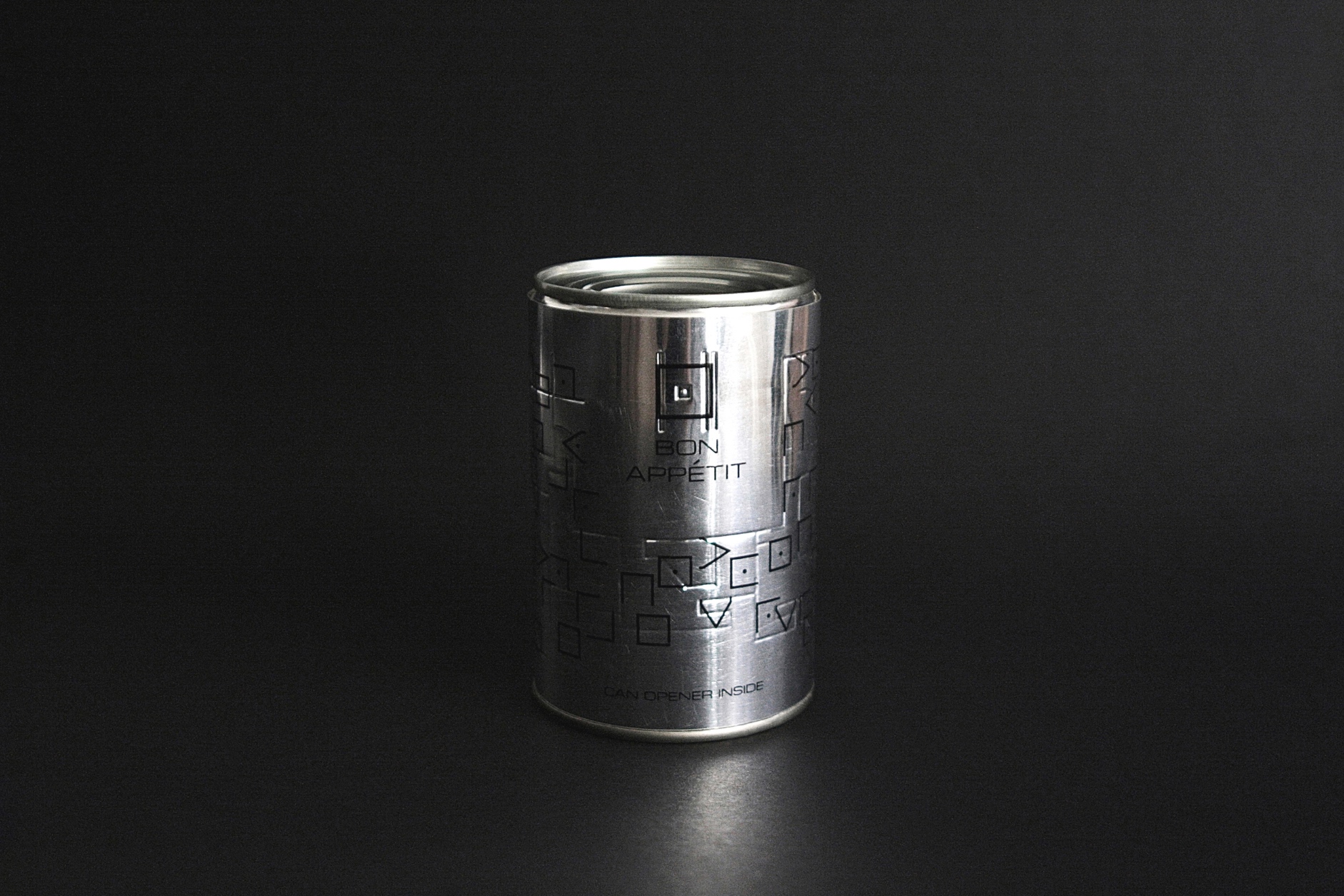
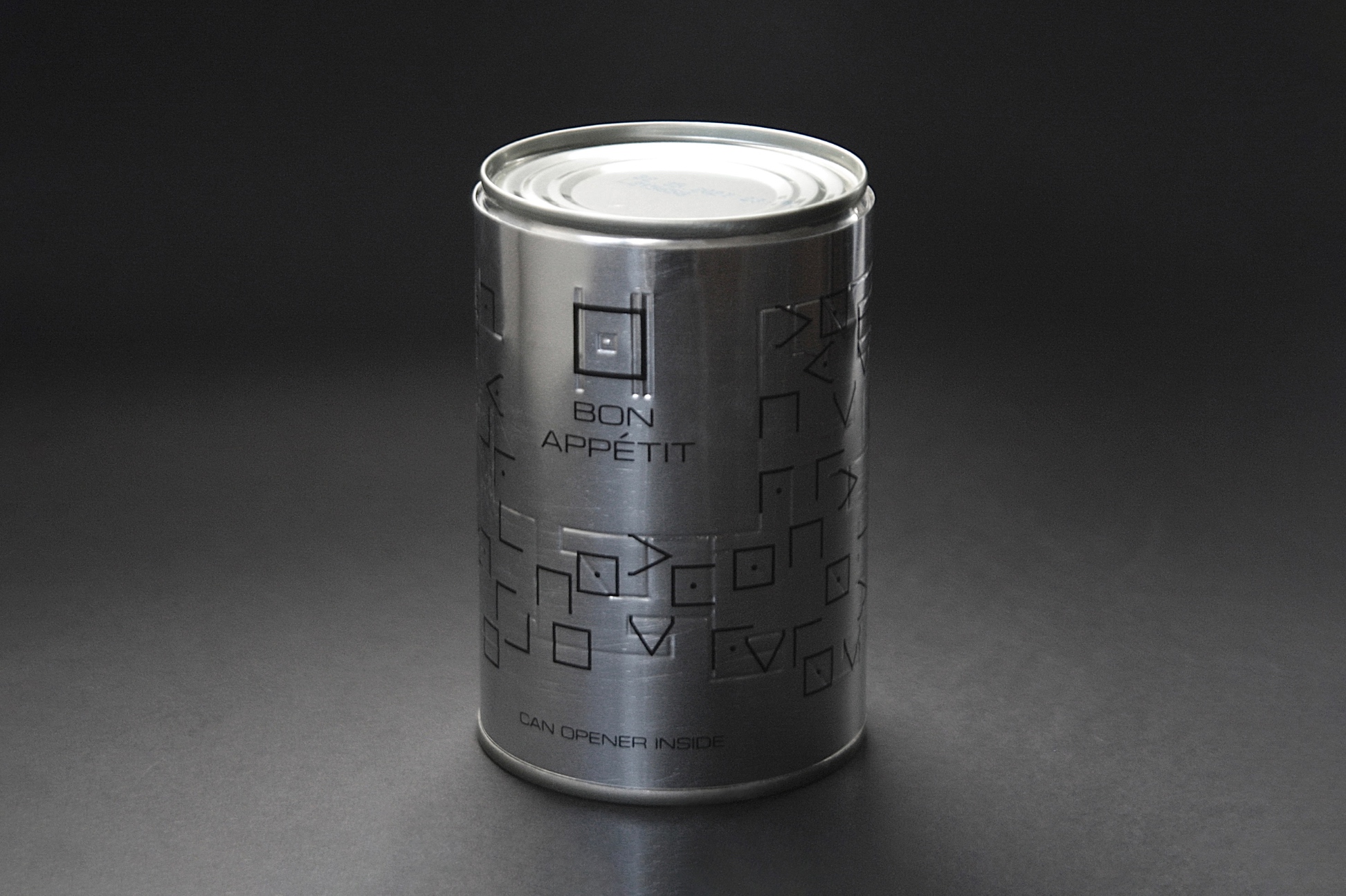
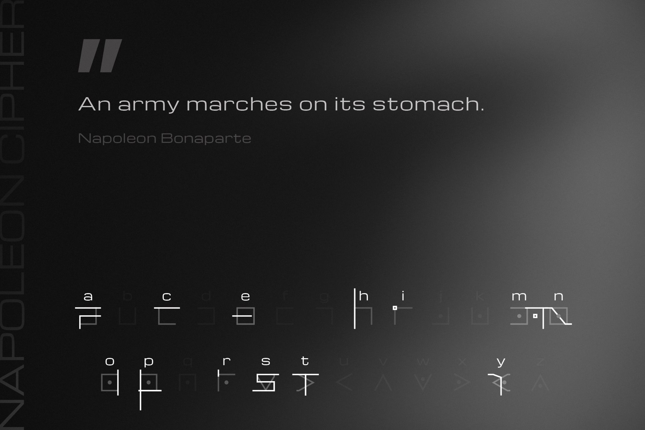
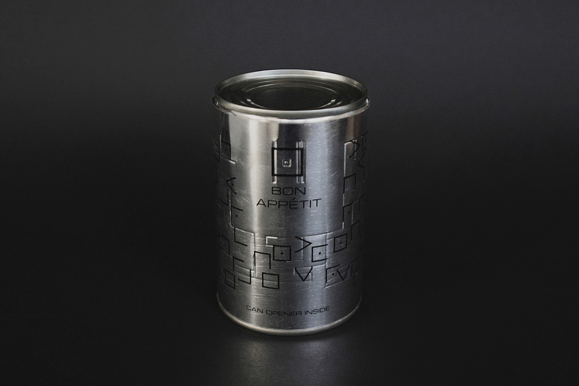
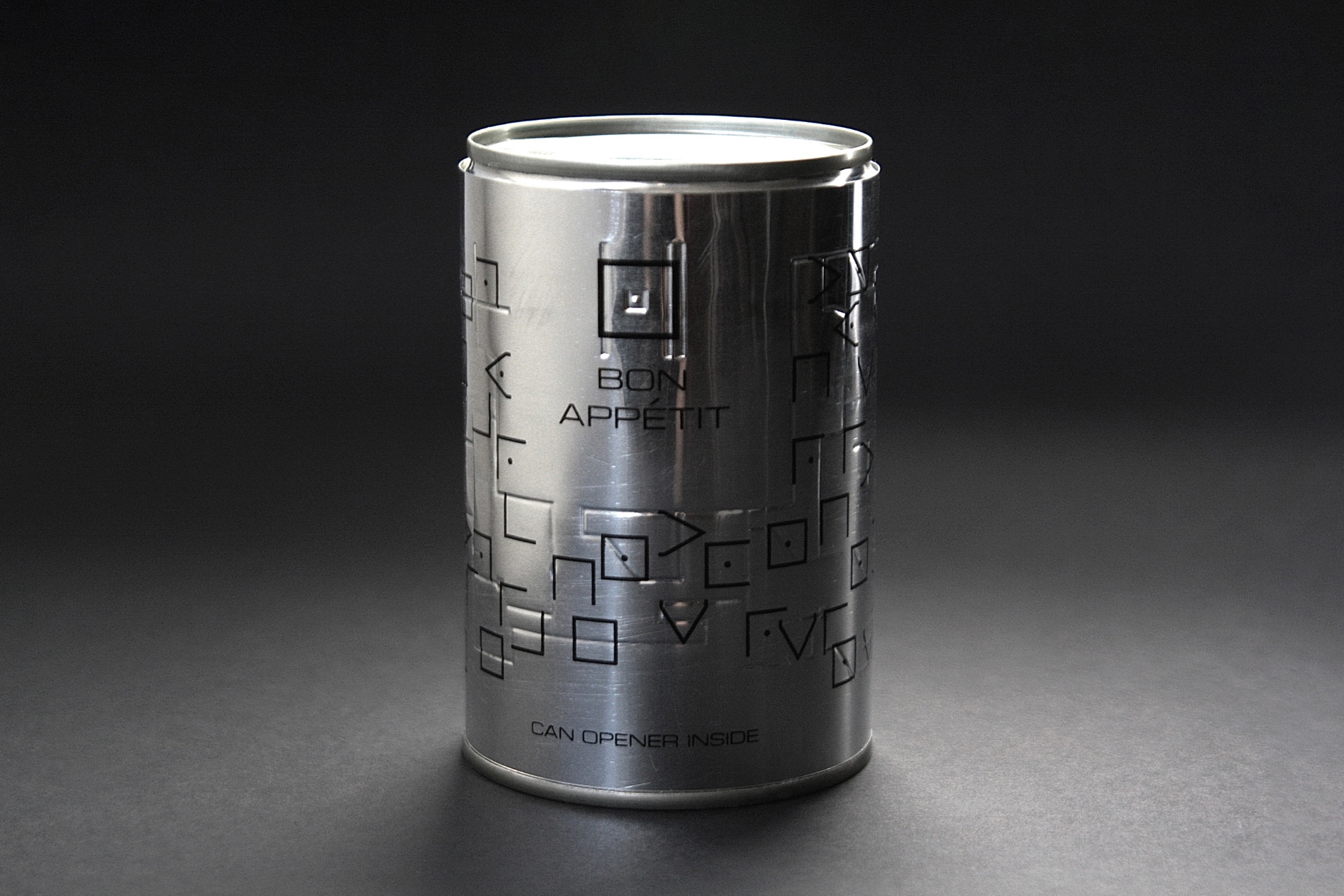
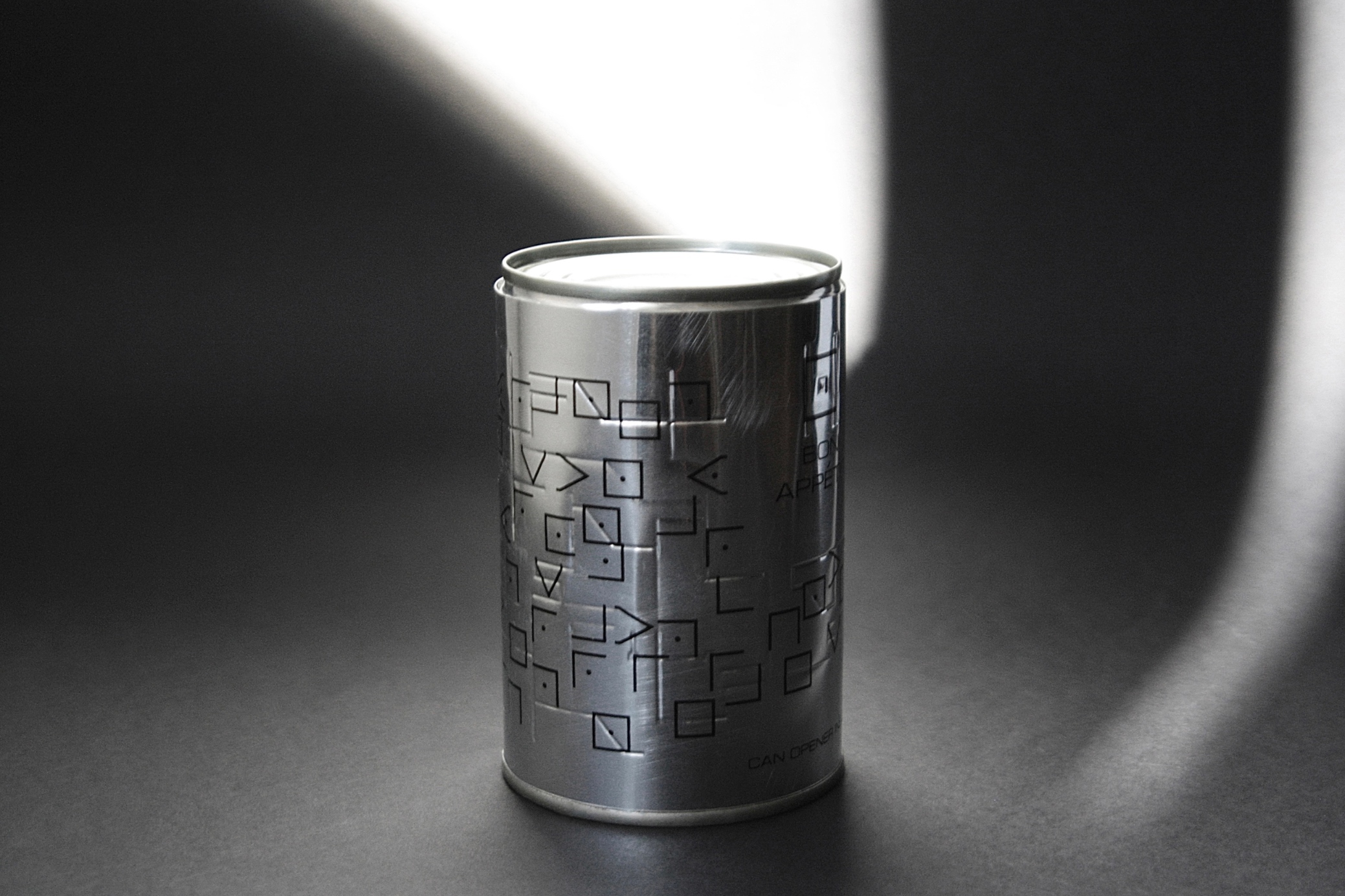
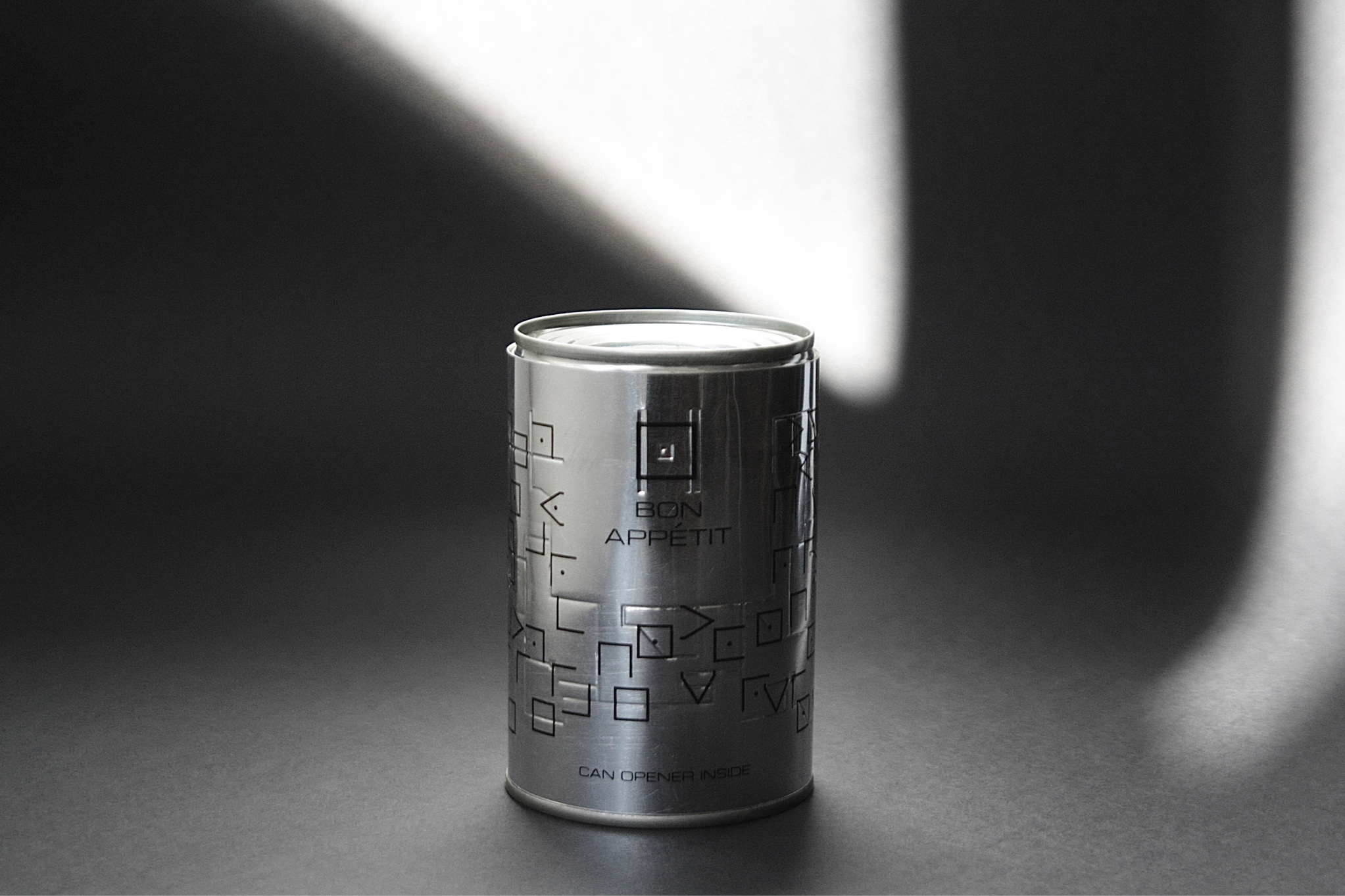
As an eloquent symbol of food as a basic human need, a tin can became the center of the project as the final product. The birth of the tin cans dates back to the Napoleonic Wars, when the emperor himself urged the development of an invention that could help solve the army’s food problems. To quote Napoleon’s famous phrase „An army marches on its stomach”. Although the tin can was developed not long after, the can opener was only invented decades later. As a reference to this paradox and the vicious circle of war and famine, the Bon Appétit tin can contains not food but a can opener.
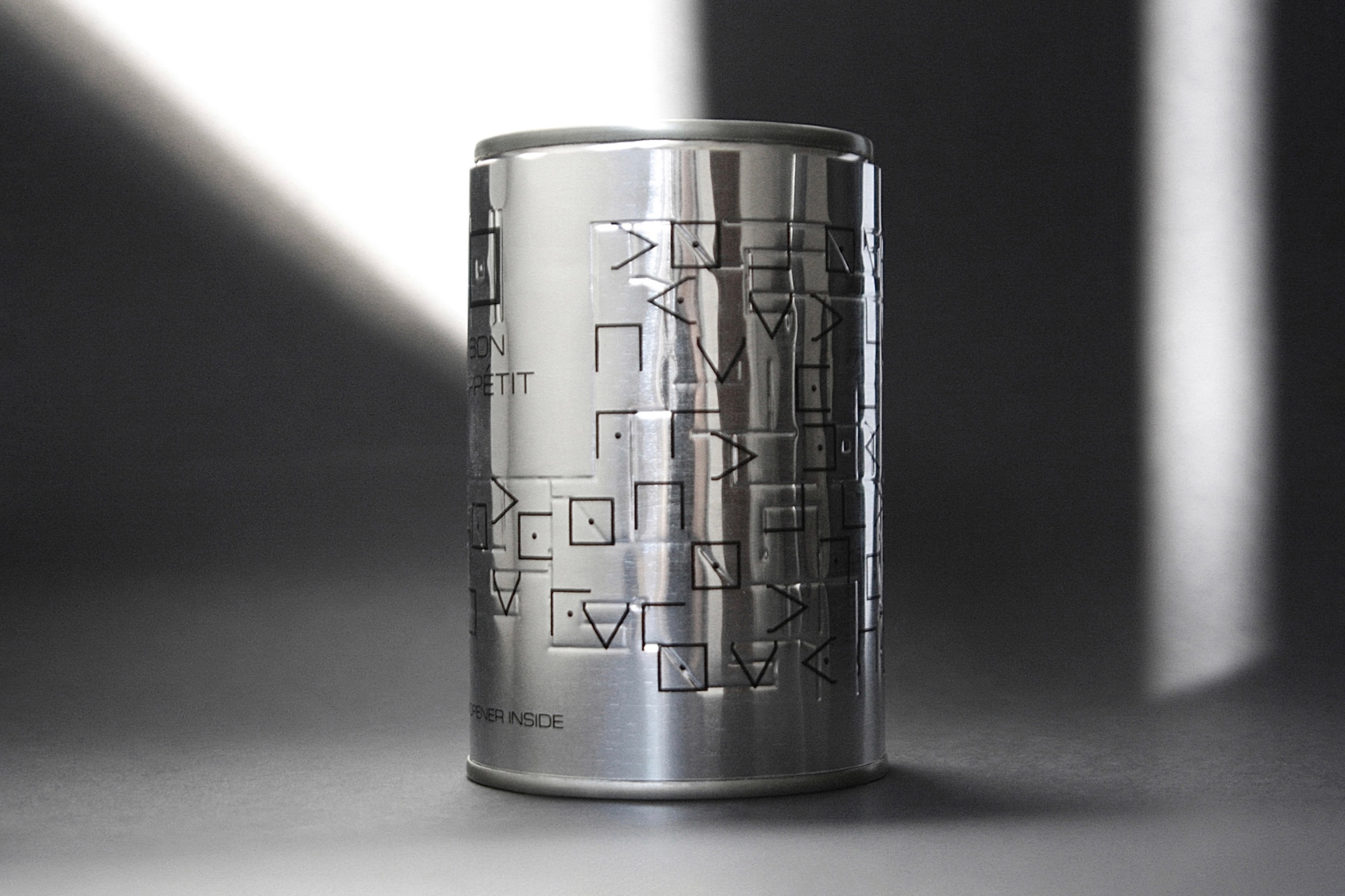
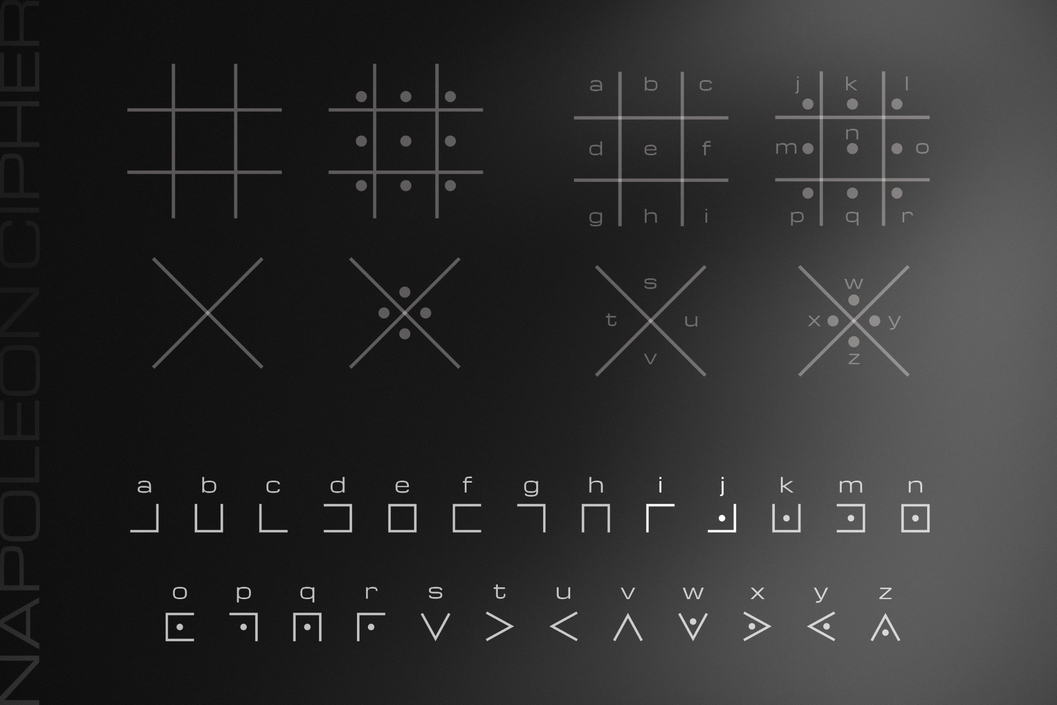
The graphic basis of the packaging is a custom-designed experimental typography, a fusion of the Latin alphabet and the geometric shapes of the Napoleon cipher – also known as the Pigpen / Freemason / Masonic / tic-tac-toe cipher. The way war takes away the possibility of easy access to the basic human need, food, the additions to letterforms also deprive the cipher of its essence, its inextricability.
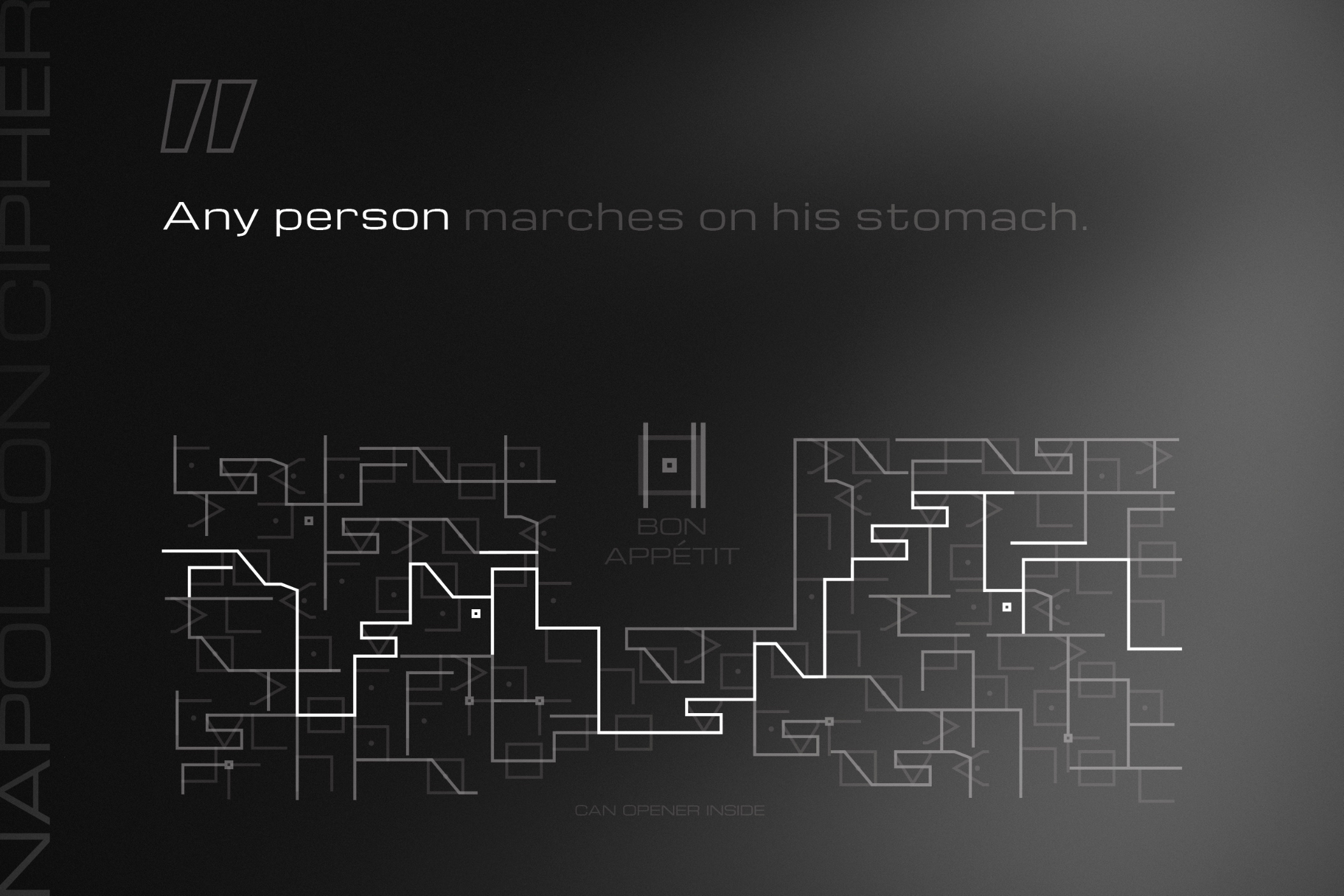
On the tin can, we find a typographical maze made of these letterforms, which, reinforcing the key idea of problem-solving ability, logic and reason essential in cryptography and crisis situations, offers only one viable path to read a meaningful sentence, the message. This is in response to Napoleon’s famous phrase, the following:
„Any person marches on his stomach.”
In today’s crisis-ridden conditions, the can opener found in the Bon Appétit tin can was born with an eye-opening, empathy-boosting, humanitarian purpose. The tool is given, the only question is what we do with it.
CREDIT
- Agency/Creative: Nóra Boronyák
- Article Title: Bon Appétit Student Packaging Design Concept
- Organisation/Entity: Student
- Project Type: Packaging
- Project Status: Non Published
- Agency/Creative Country: Hungary
- Agency/Creative City: Budapest
- Market Region: Europe
- Project Deliverables: Packaging Design
- Format: Can, Tin
- Industry: Food/Beverage
- Keywords: WBDS Student Design Awards 2023/24
- Keywords: Packaging Design
-
Credits:
Educational Institution: Budapest Metropolitan University - Art and Creative Industries / Visual Communication
Educator's Name: Norbert Szlama, Tamás Tóth


