


Bomba has been the leader in the sale of electronics and household appliances on the Moldovan market for over 20 years. During this time, 31 stores were opened in 20 cities of the country. The brand is close to people throughout their lives, participating in important and everyday affairs. In addition to selling goods, Bomba is represented in related categories: microfinance, delivery, repair and installation of equipment, etc., which are important for the seamless interaction of the main business with consumers.
The company believes that every person in Moldova, regardless of place of residence and income level, deserves to have their needs for comfort and home coziness fully satisfied.
The company is making ambitious plans to be present in all new shopping centers in cities with a population of over 35,000 people. To achieve this strategic goal, it is important that the Bomba brand covers the key needs of the target audience, offering the widest range of household appliances and electronics, car accessories, home and sports goods. The company offers a convenient omnichannel experience, and also demonstrates leadership in terms of innovation and technology. Among the first on the market, the company offers new products and the latest releases of products from key technology brands.
The team of strategists from LINII agency conducted a series of expert interviews with the company’s management to immerse themselves in the business and market context, conducted familiarization shopping tours in the brand’s stores and competitors in Moldova, and together with the client’s team visited Romania to analyze benchmarks in the retail category. In addition, a segmentation study was conducted to assess the perception of key players in the market.
The findings of the analytical stage of the client and agency teams were discussed at a strategic session.
The result was an updated positioning for Bomba with an ambitious brand promise and its role: Game Changer, who sets his own rules of the game.
It does not compromise on the quality of goods and services, the best possible offer on the market, a fair and honest price. It knows the needs of it’s clients very well, wants to create an environment for them in which everything is clear, predictable and simple. The brand archetype combines the best of the worlds of the Ruler and the Hero, and the developed brand architecture forms a portfolio of products and services “for growth” with the possibility of its development to create an ecosystem in the future.
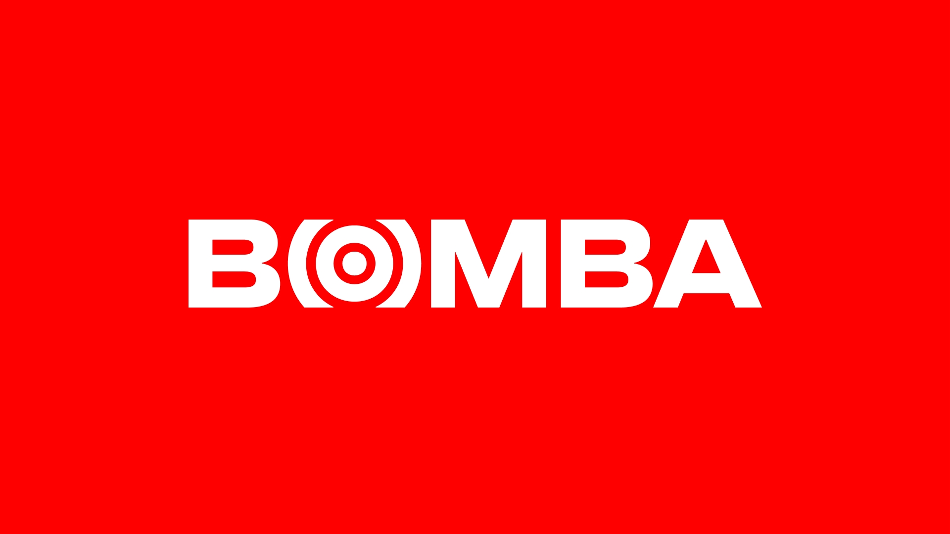
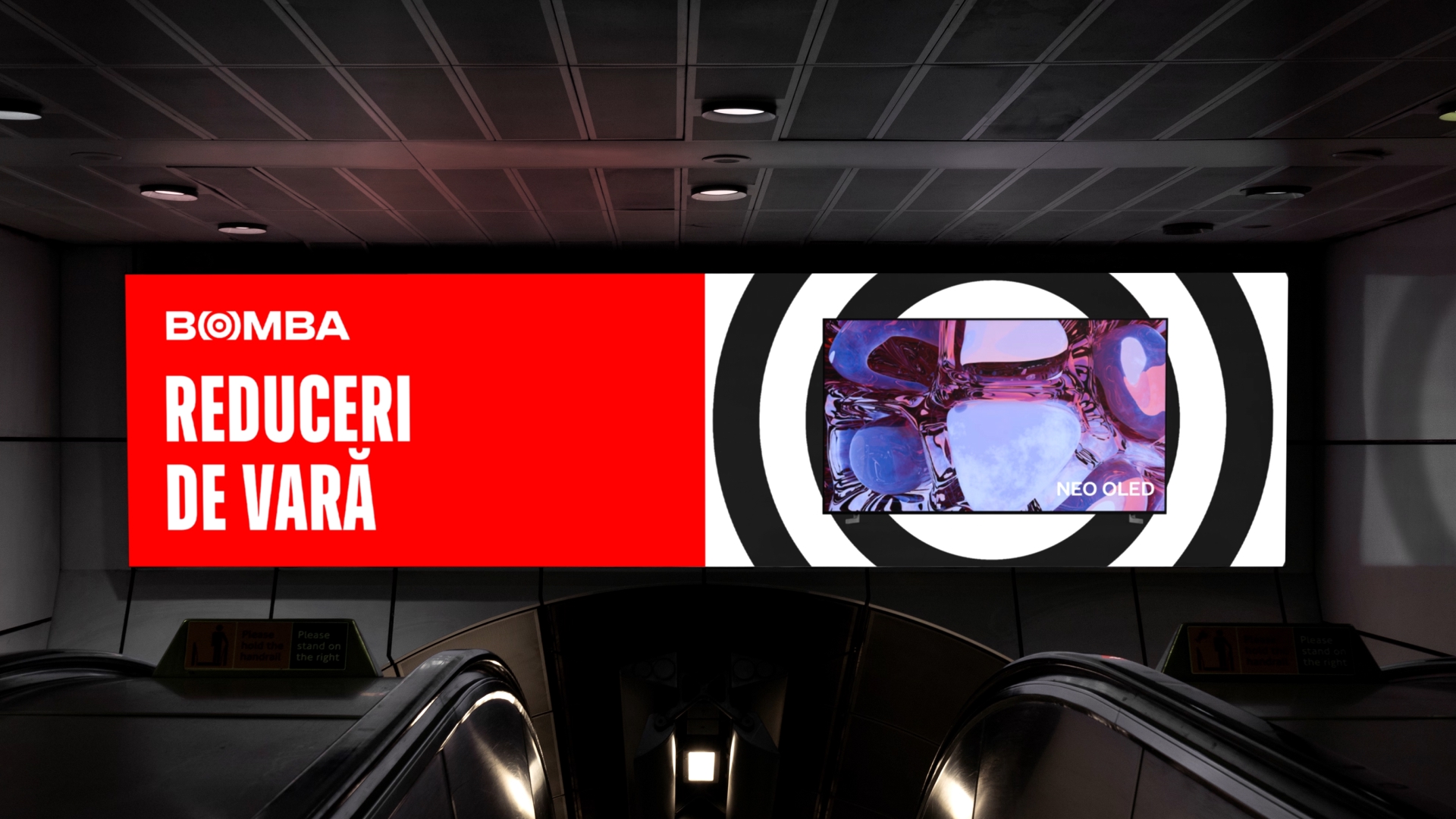
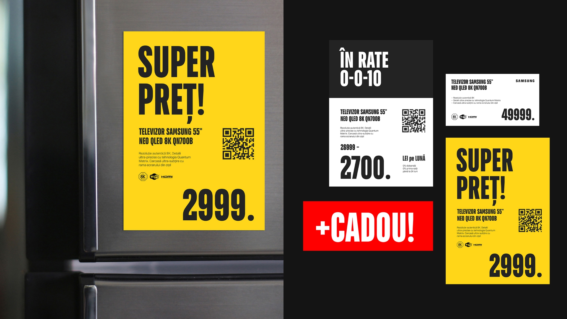
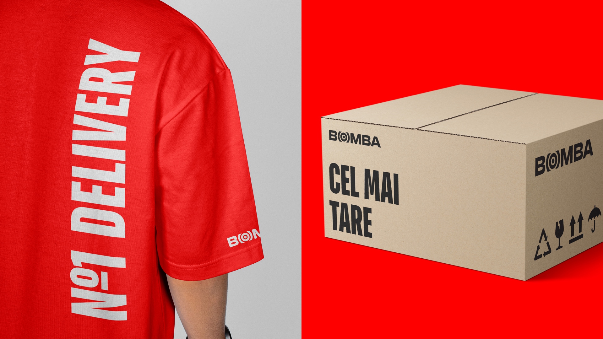
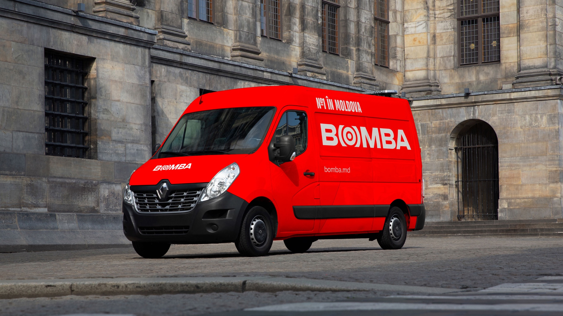
The logo is an evolutionary development of the historically established sign and represents the brand name with a stylized letter “O”, symbolizing a target-radius.
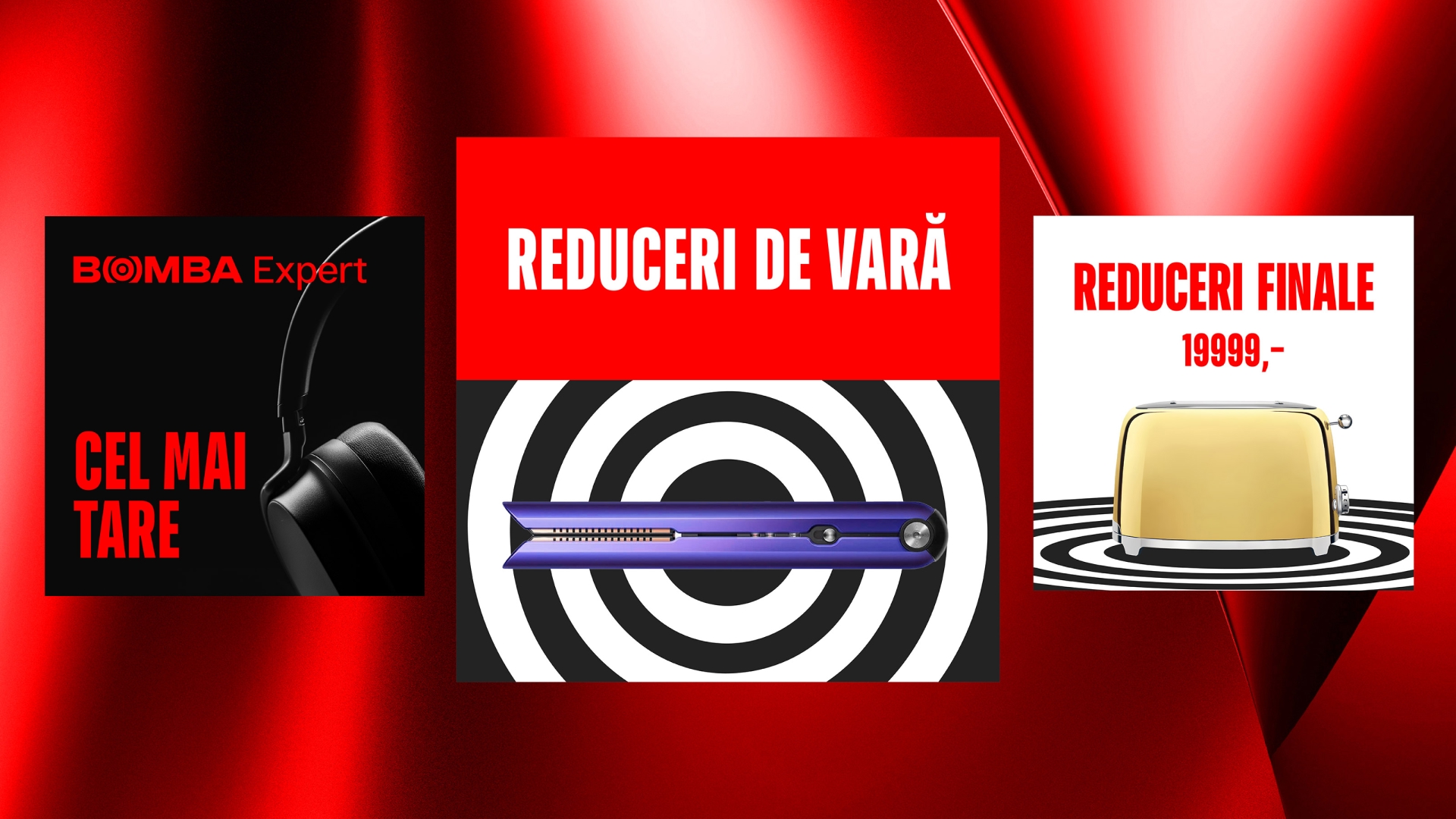
All corporate graphics are built on the variability of radii – static frontal and dynamic perspective. The theme of isometric radii is used in corporate decorative backgrounds, substrates and masks. Radii are the main design elements that can be used to brand any communication, regardless of its type and format.
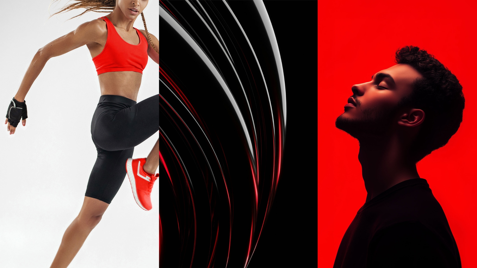
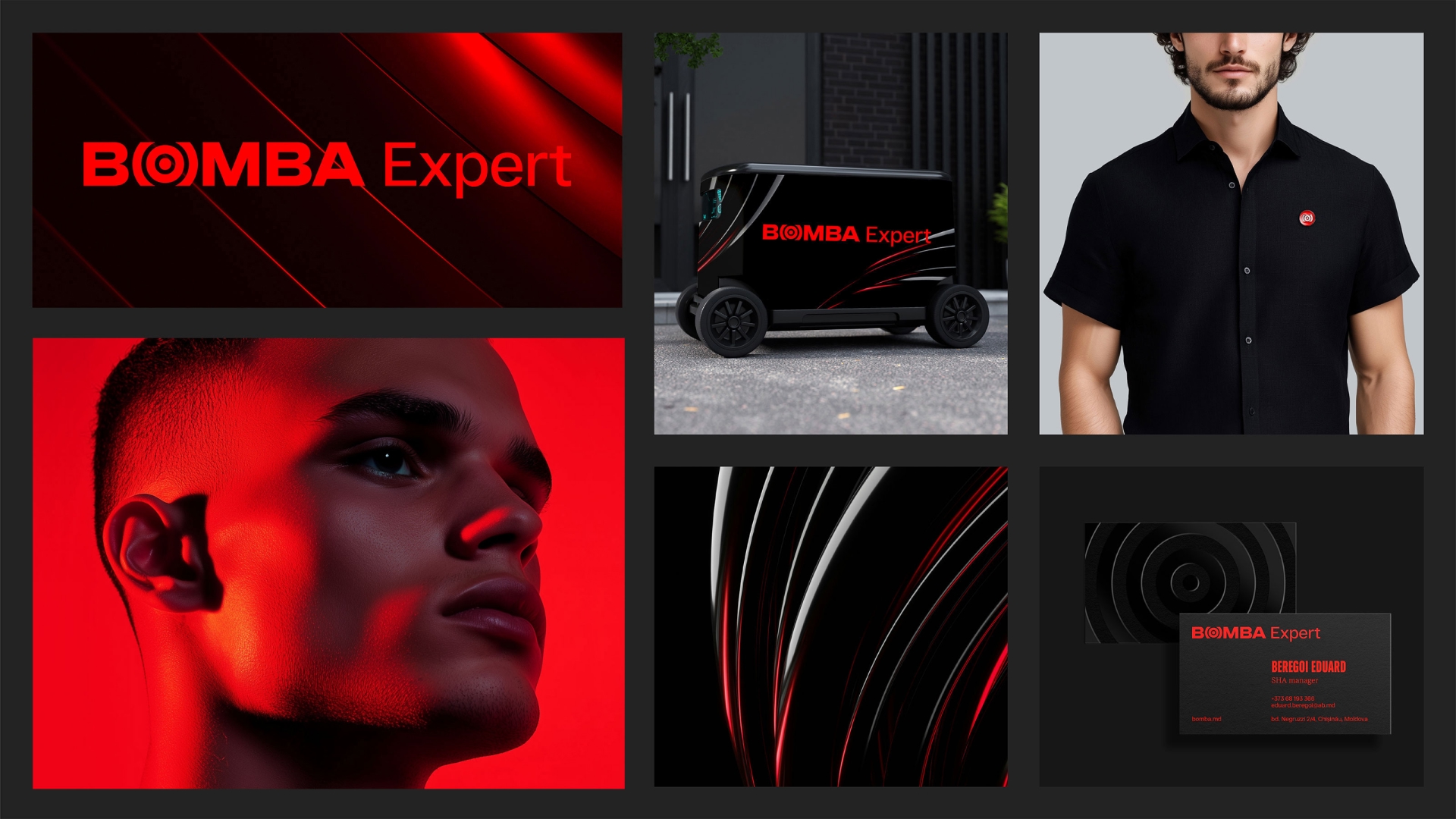
The Bomba brand identity was developed by designers in intense colors – the leader’s red, graphite, white in different proportions depending on the sub-brands Expert (with an emphasis on graphite) and Sport (with an emphasis on red).
The brand’s image photo style focuses on people and their natural, non-staged emotions. Another important point is the presence of red in the background elements, in clothing or in the central object.
The photo style with people for the BOMBA Expert sub-brand is distinguished by its strictness and precision. The defining element here is neutral or red lighting, a dark background, smooth textures and the presence of 3D objects in minimalist abstract compositions.
Bomba Sport uses dynamic images of people and plays with themes of different sports.
The brand book contains all the options for using the corporate identity on digital and analog media. When creating images for the Bomba brand book, LINII team used a neural network.
The development of the general conceptual direction of the retail brand and the organization of the retail space was based on the results of the audit using the Retail Space 360 methodology, research into customer experience and key trends in offline retail.
In the external design, LINII retail team proposed to use the entire available width of the facade: a large logo and a light pattern, moving from one side of the building to the other, in order to make the store noticeable in the urban environment and demonstrate the brand’s leadership position in its category.
The retail concept called “Space of Opportunities” conveys leadership, confident movement forward, readiness to change and adapt to a new reality, constantly expanding the boundaries of one’s capabilities. The idea of expansion, movement, adaptability, embedded in the identity, goes into the design of the store and is reflected in lighting and graphic solutions.
The customer zone became the center of the sales area, combining the information service, credit department, cash desks and after-sales service, as well as a zone with self-service terminals with access to the full range of the online store and the ability to place an order with home delivery. Departments are located around this zone, so the customer’s route is built in a circle and takes the client through all categories of goods. And the first on the way is the Bomba Expert zone with high-tech goods, broadcasting the brand’s expertise.
The overall color scheme of the store’s interior is light, this sets it apart from competitors who use dark colors in the decoration and equipment. Bright accents in the space are the service zone and the sub-brand zone: Expert and Sport.
Clear contrasts and bright, active color accents in the retail space reflect the paired brand archetype Hero + Ruler.

CREDIT
- Agency/Creative: LINII
- Article Title: Bomba’s New Brand Identity Reinforces Its Leadership in Electronics and Retail
- Organisation/Entity: Agency
- Project Type: Identity
- Project Status: Published
- Agency/Creative Country: Russia
- Agency/Creative City: Moscow
- Market Region: Europe
- Project Deliverables: Brand Architecture, Brand Design, Brand Experience, Brand Guidelines, Brand Redesign, Brand Strategy, Photography, Retail Design
- Industry: Retail
- Keywords: Moldova, retail, bomba, rebranding, electronics
-
Credits:
Strategy Director: Polina Vasilyeva
Creative Director: Tema Semenov
Creative Director for Retail Design: Katya Kolotilova
Designer: Alena Gorbacheva
Designer: Polina Savina
Designer: Anton Andreev
Designer: Evgeny Revenko
Retail Designer: Ksenia Sapozhkova
Project Architect, MAN Project: Polina Gladova
Project Manager: Alena Razzhivina
Retail Project Manager: Dmitry Novikov
Leading Architect-Designer: Marina Kharisova
Art Director: Anya Pazyuk
Designer: Daria Panyukova


