


The Chocolate Society are an independent family business based in rural Somerset. At the heart of the business is a desire to innovate and bring new forms and experiences in chocolate to consumers with no compromise on taste.
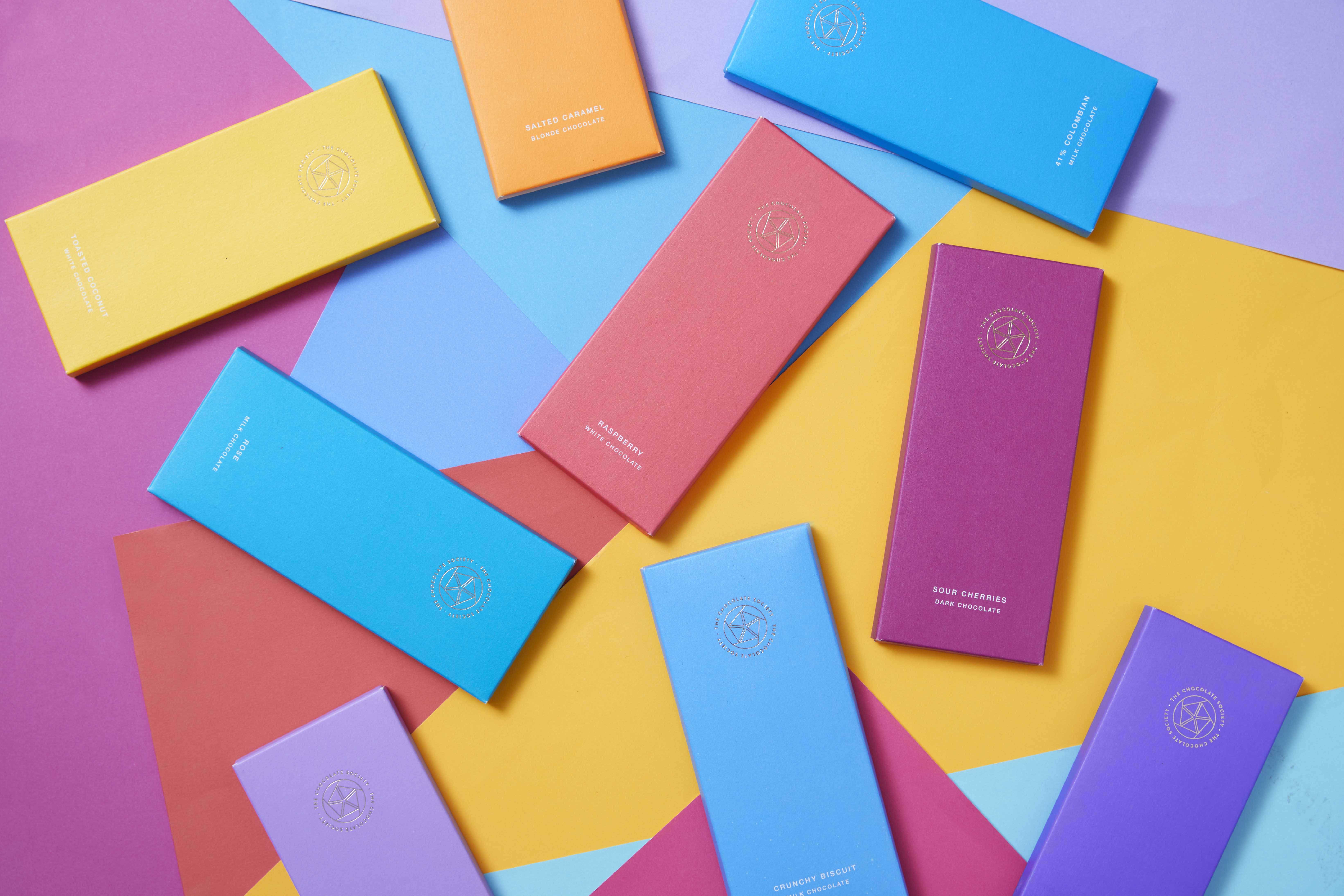
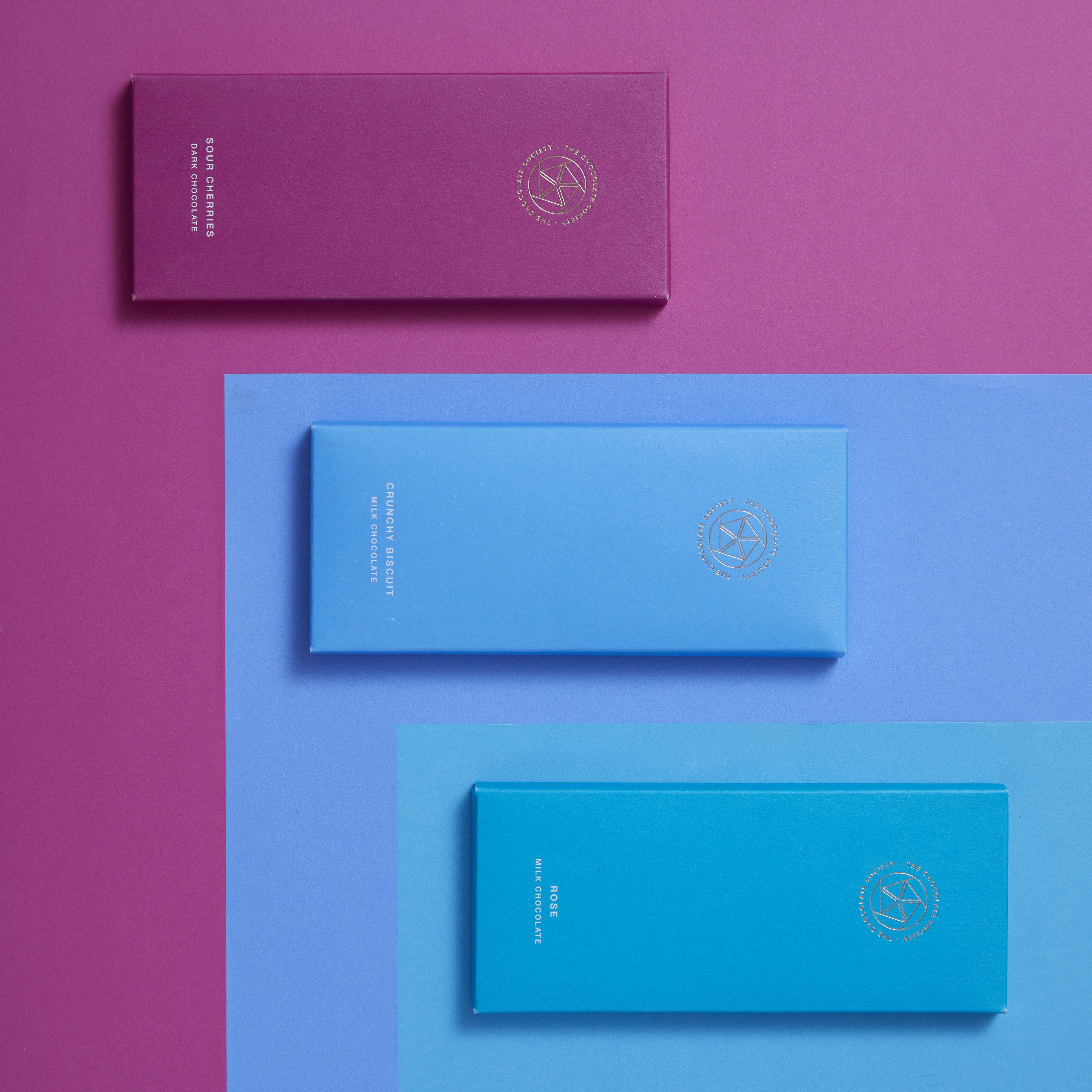
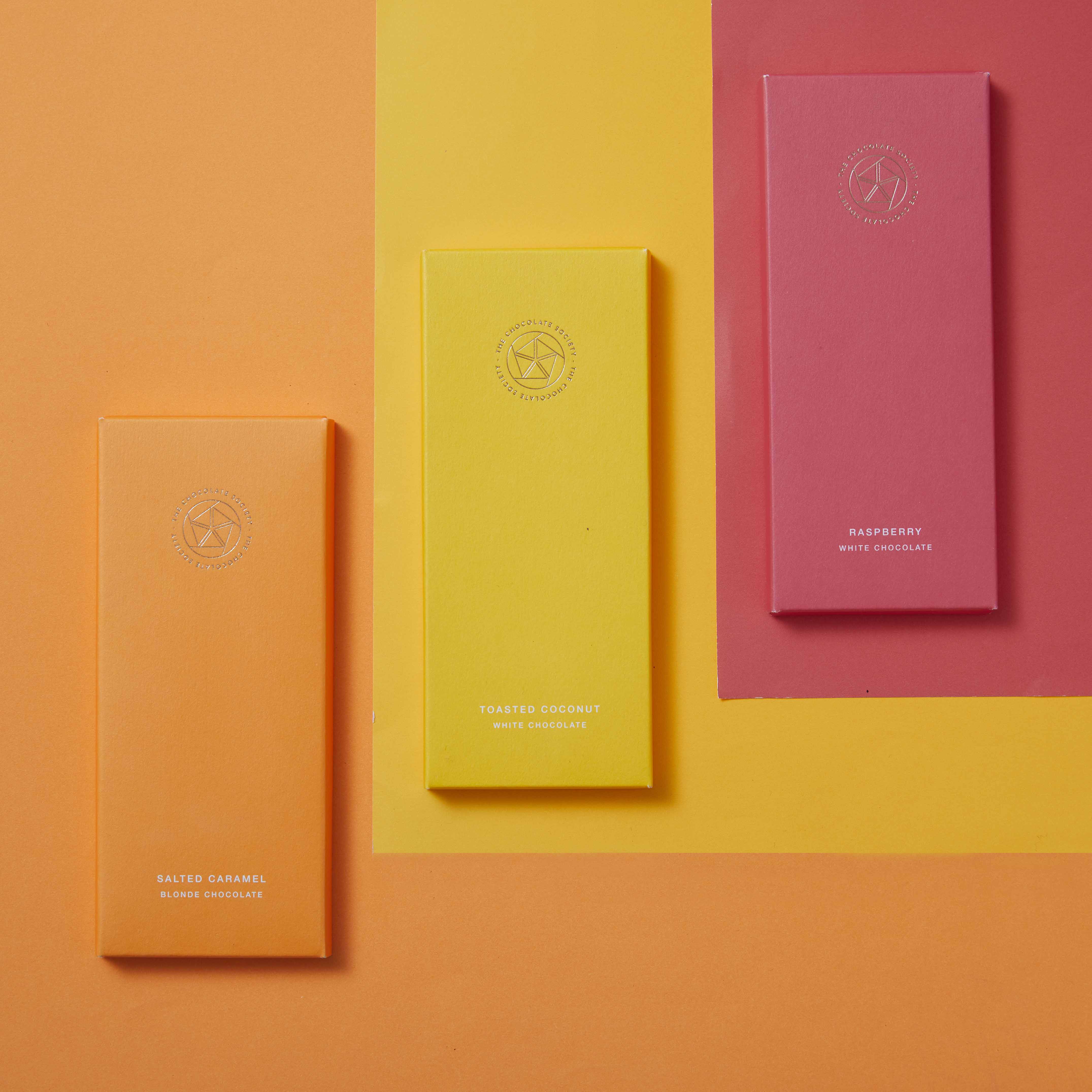
The logo takes inspiration from the cocoa pod abstracted into a geometric form complemented by a clean san-serif typeface.The geometric pod contains five cocoa beans representing the five ‘pillars’ of The Chocolate Society; customers, suppliers, team, environment and innovation.
To stand out against the current trend of patterned packaging in the chocolate space Bolter wanted to create something eye catching and bold marrying complex flavours with vivid colours and beautiful textures.

CREDIT
- Agency/Creative: Bolter Design
- Article Title: Bolter Design Re-brands and Creates New Chocolate Packaging
- Organisation/Entity: Agency, Published Commercial Design
- Project Type: Packaging
- Agency/Creative Country: United Kingdom
- Market Region: Europe
- Project Deliverables: Brand Redesign, Graphic Design, Packaging Design, Rebranding, Research, Tone of Voice
- Format: Box, Sleeve
- Substrate: Pulp Paper
FEEDBACK
Relevance: Solution/idea in relation to brand, product or service
Implementation: Attention, detailing and finishing of final solution
Presentation: Text, visualisation and quality of the presentation


