


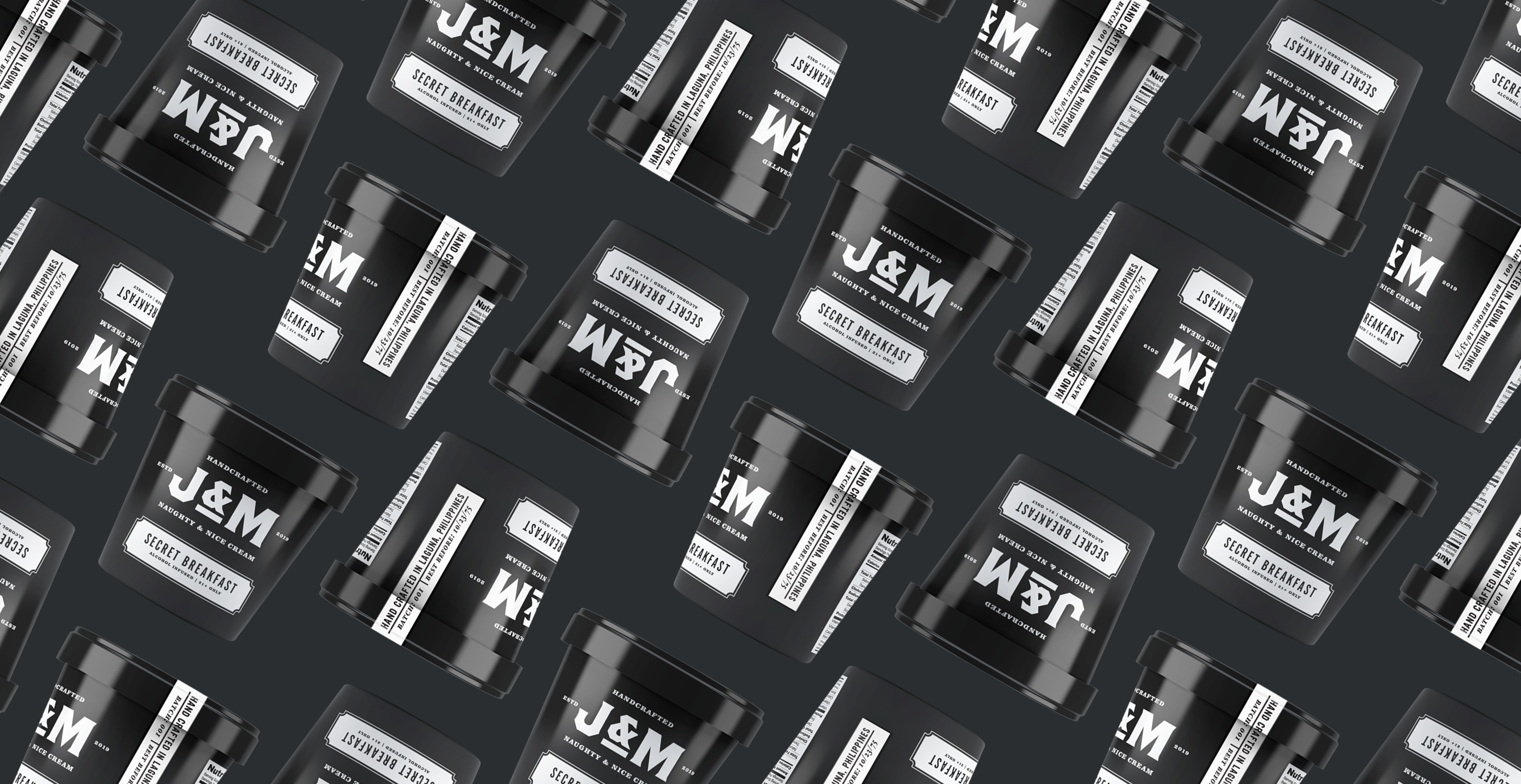
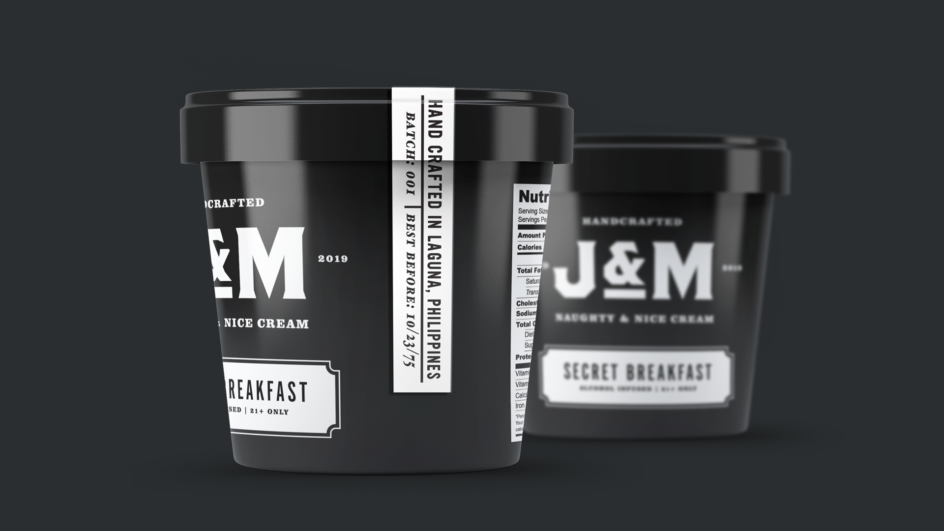
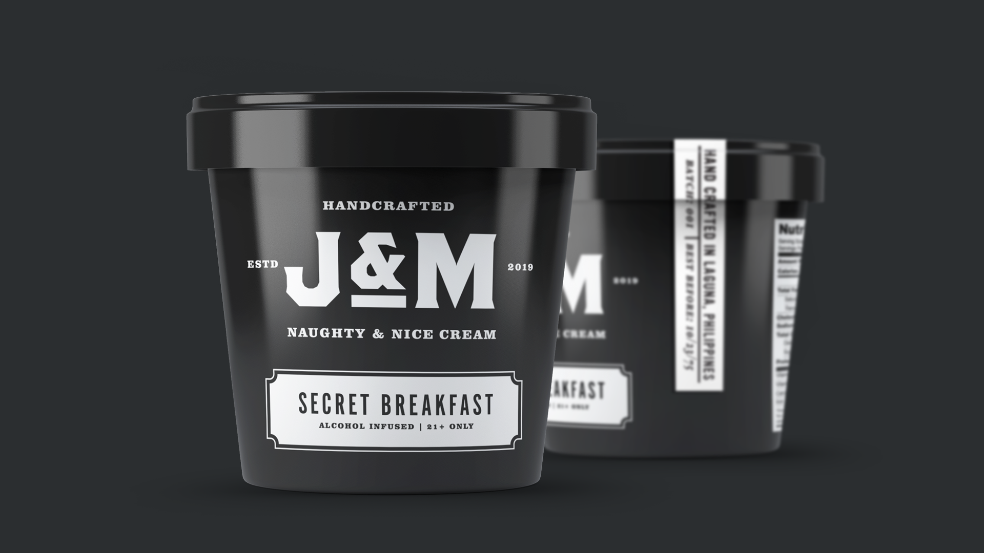
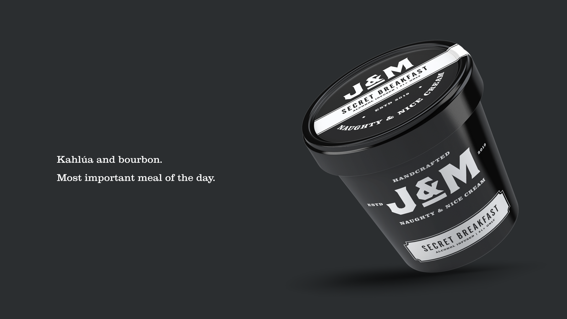
The brief was to design the logo and label for a new line of alcohol-infused ice cream. J&M stands for Jaime & Mikey, the owner’s sons. The new line is much bolder and for the drinking crowd. So the design reflects something like a more classy alcoholic brand, rather than typical ice cream identities.
CREDIT
- Agency/Creative: AJ Dimarucot
- Article Title: Bold Work for Small-batch Alcohol-infused Ice Cream
- Organisation/Entity: Freelance, Published Commercial Design
- Project Type: Packaging
- Agency/Creative Country: Philippines
- Market Region: Asia
- Project Deliverables: Brand Identity, Branding, Graphic Design, Packaging Design, Tone of Voice
- Format: Cup
- Substrate: Pulp Carton
FEEDBACK
Relevance: Solution/idea in relation to brand, product or service
Implementation: Attention, detailing and finishing of final solution
Presentation: Text, visualisation and quality of the presentation


