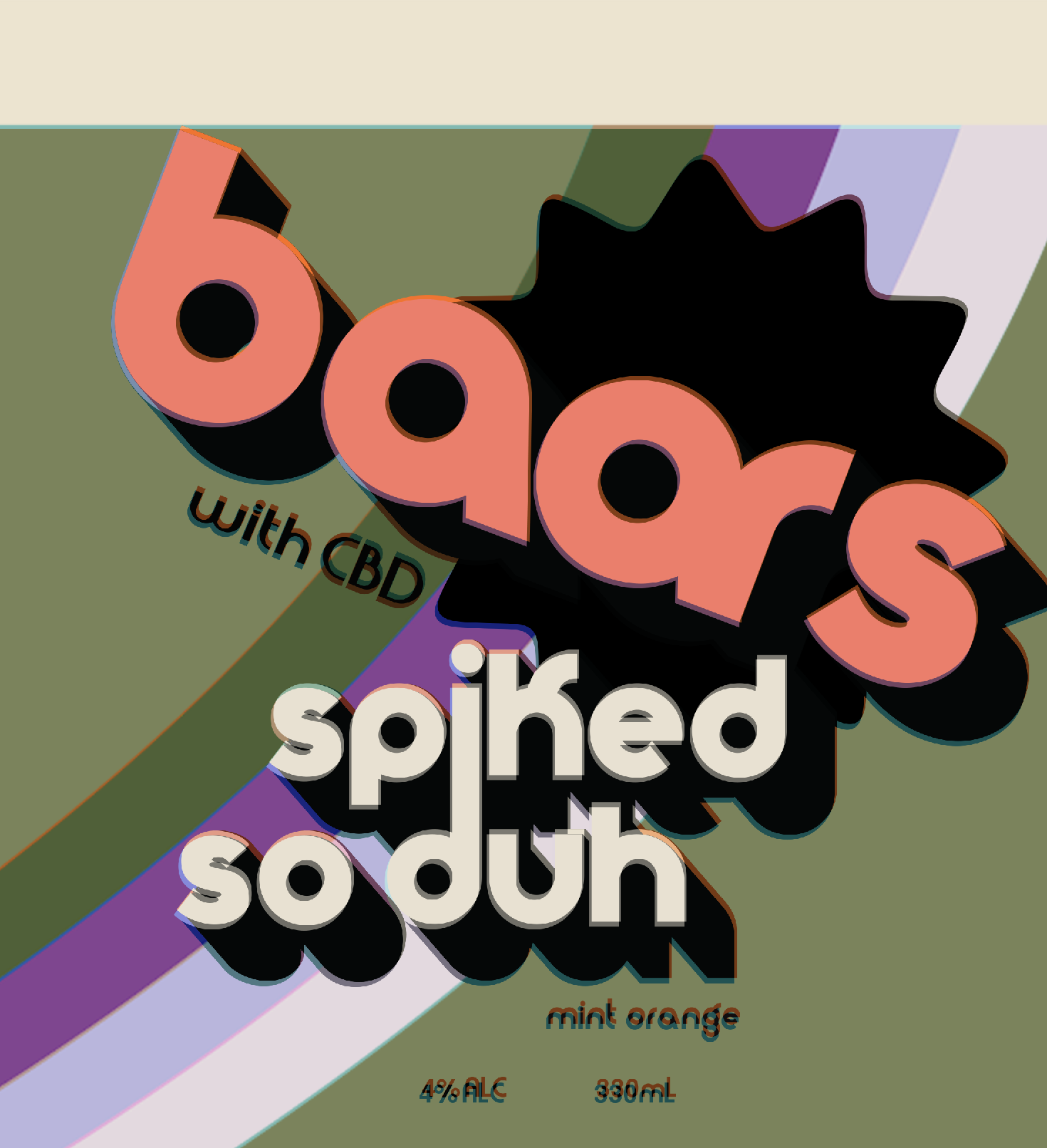
Our U.S clients wanted to create a unique CBD infused spiked soda to the market without lifting creative from other sources so we set out to create something totally unique that could be their own. Many creative agencies take creative elements from popular posts and typographers and try to reimagine it into their own work which is common practice but lazy! lazy!
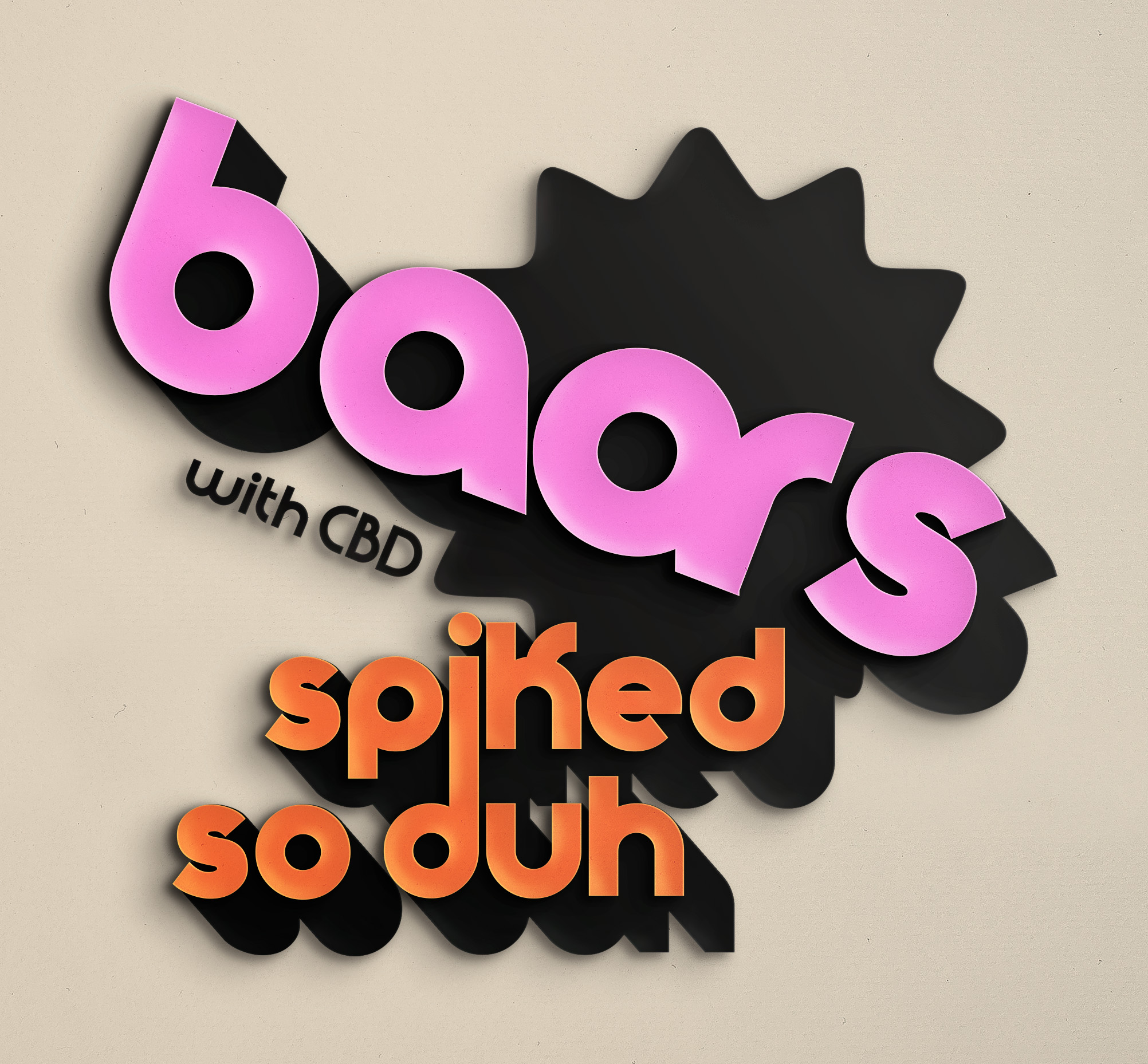
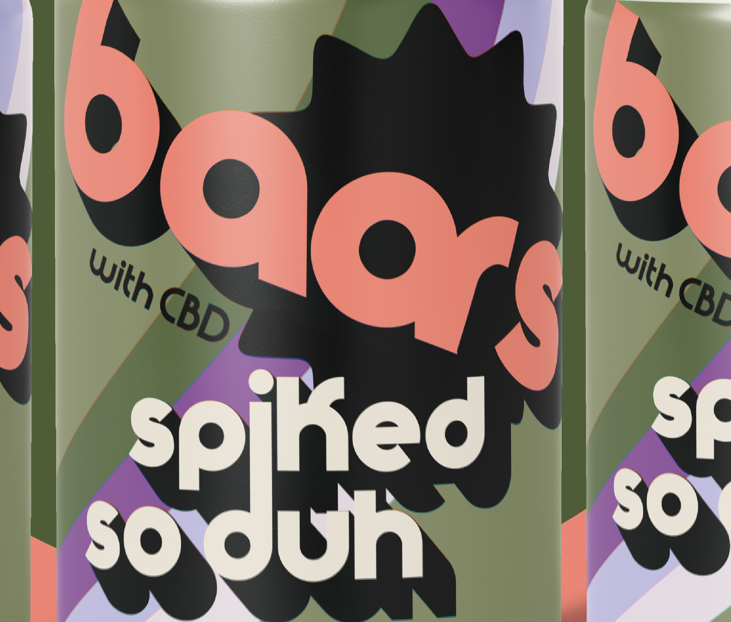
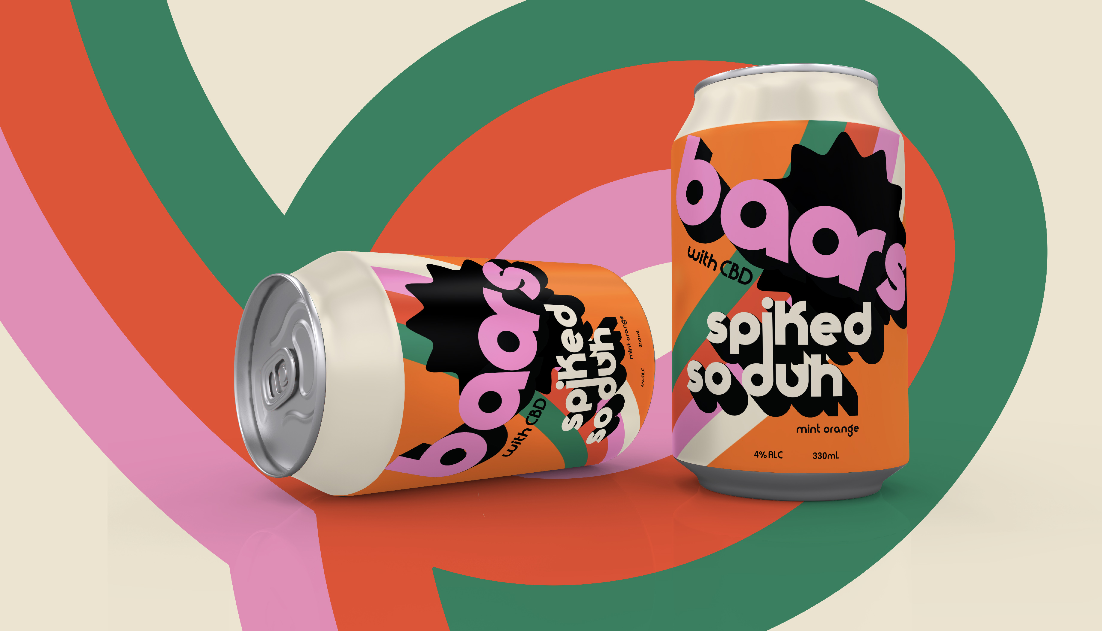
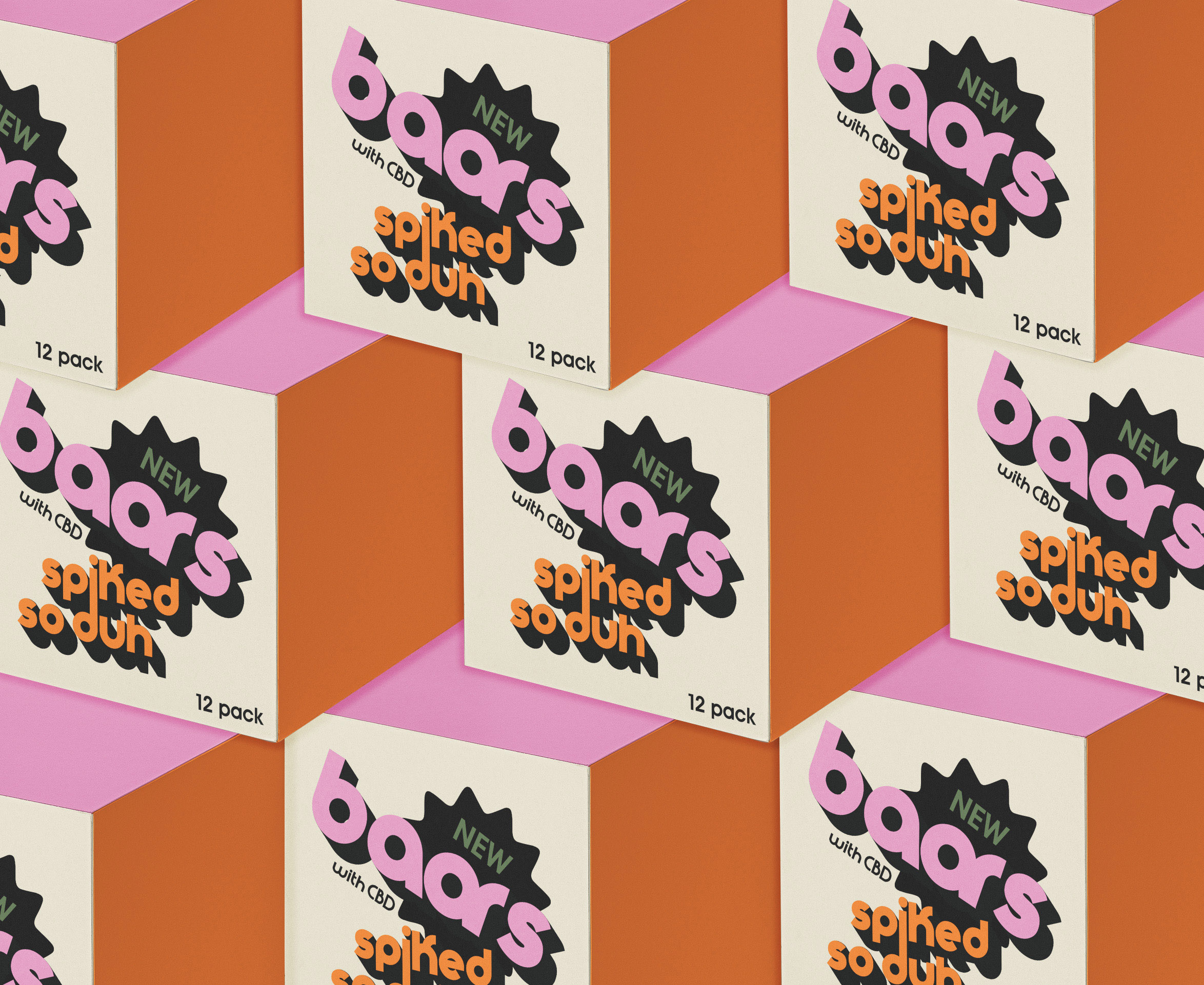
Inspired by all things 70’s this spiked soda nods to clockwork orange and vintage retro vibes like the old school food courts and bold post modern typefaces of yesteryear – the retro movement currently in vogue to go back to all things bold an iconic is not lost in our studio and we spearheaded the rewind aesthetic years ago to reinstate the glory days of design where the saturated competitive capitalist markets of the 70’2 and 80’s produced some of the worlds greatest word marks and branding/re-branding in history.
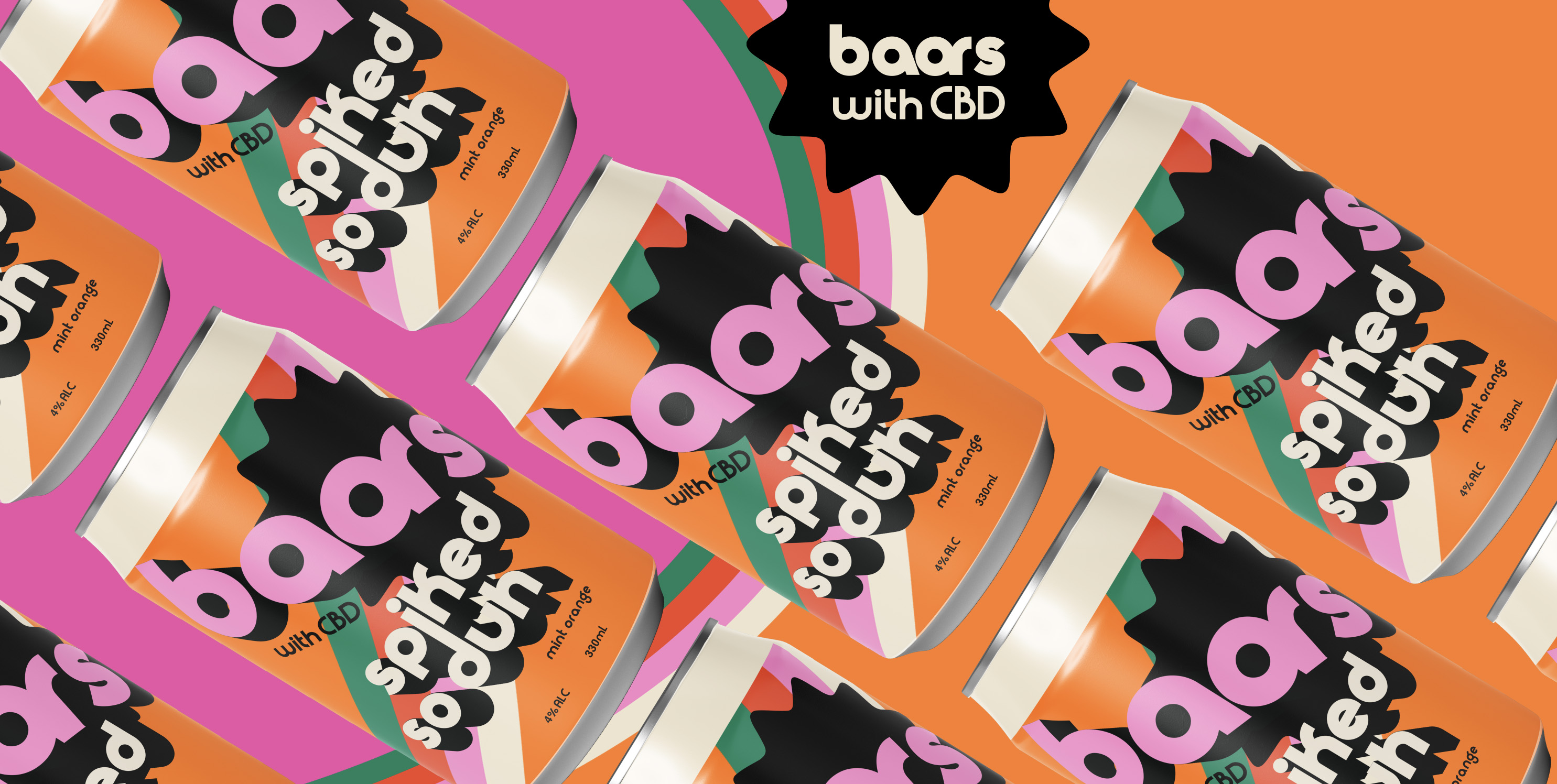
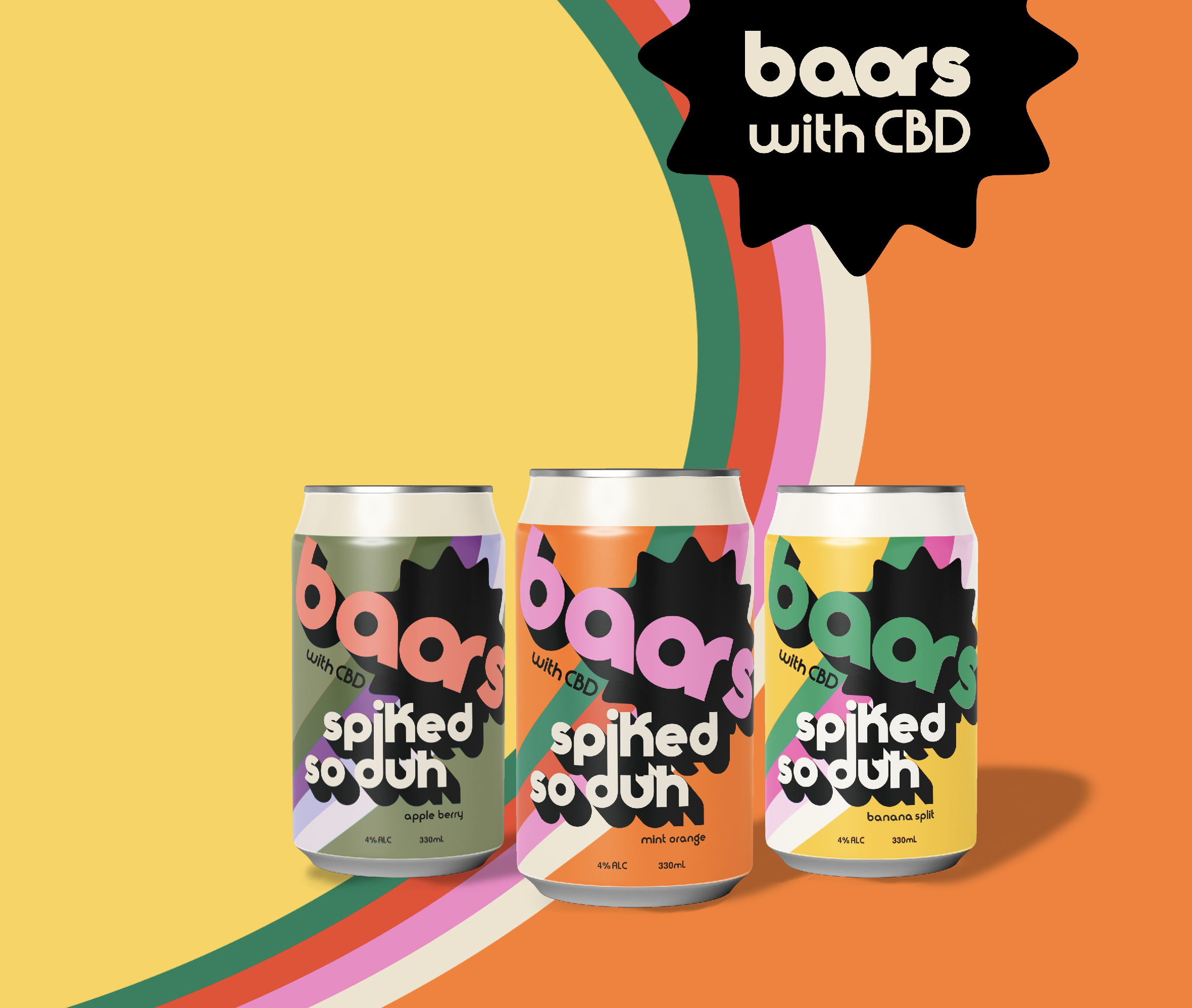
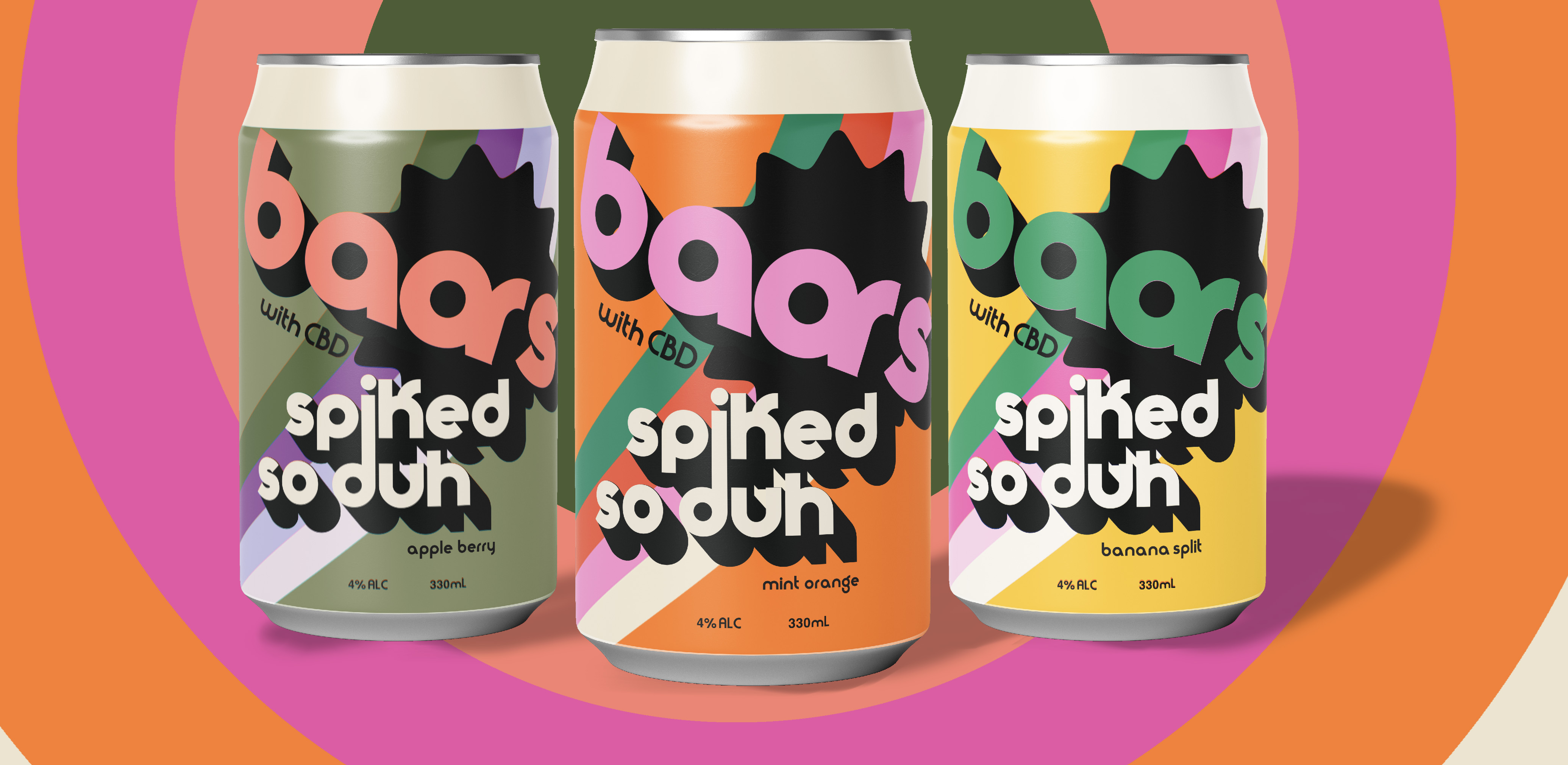
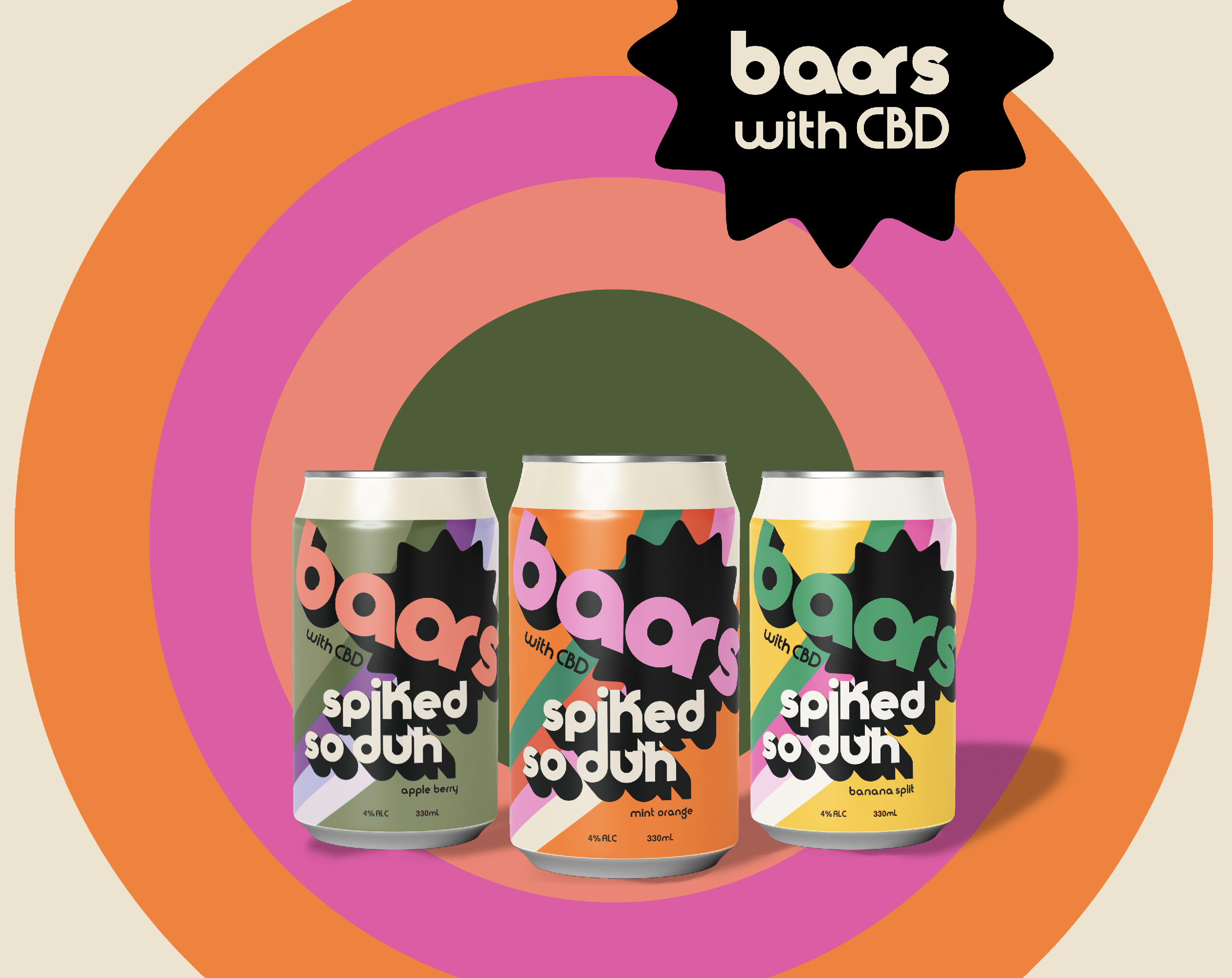
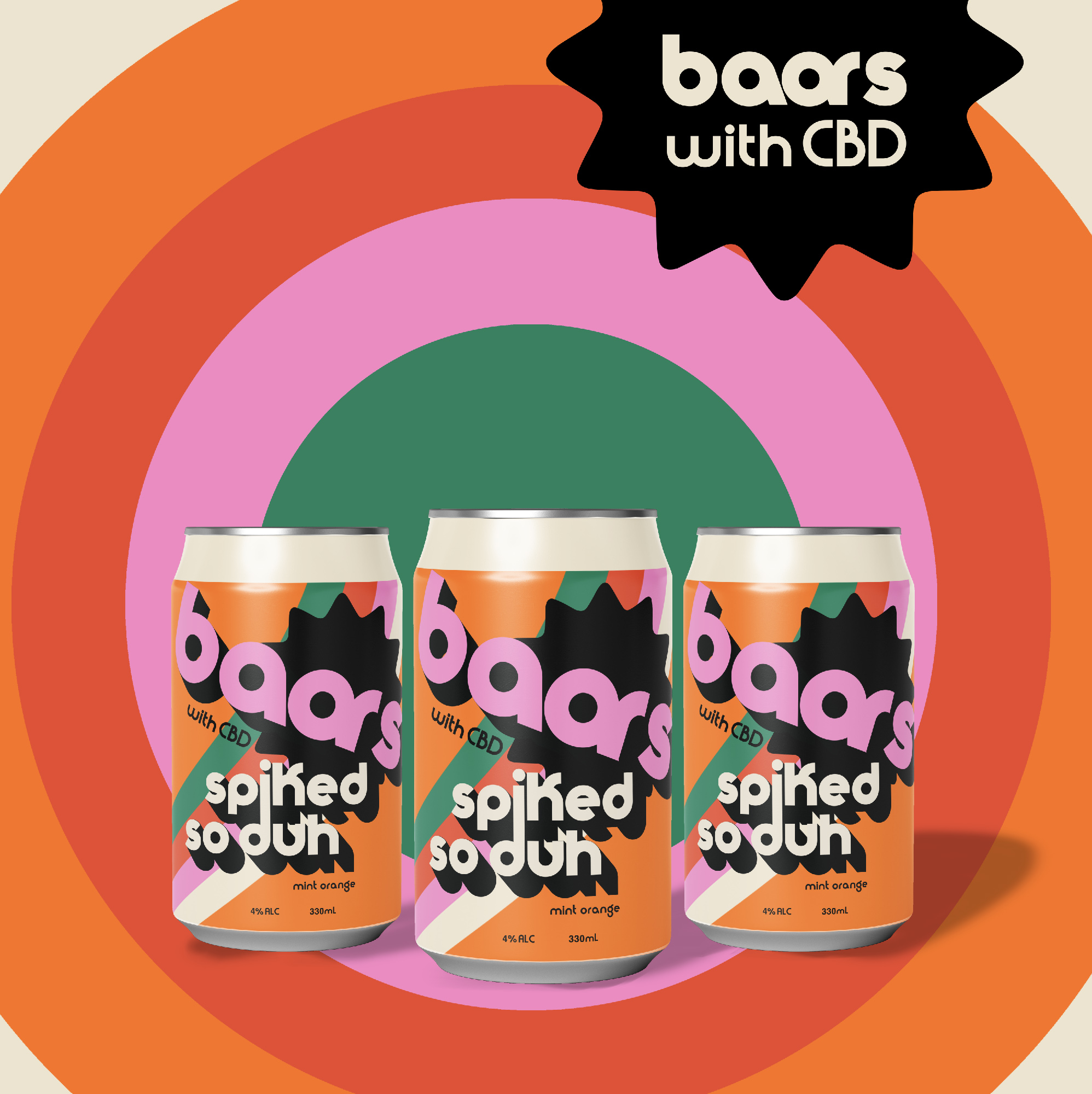
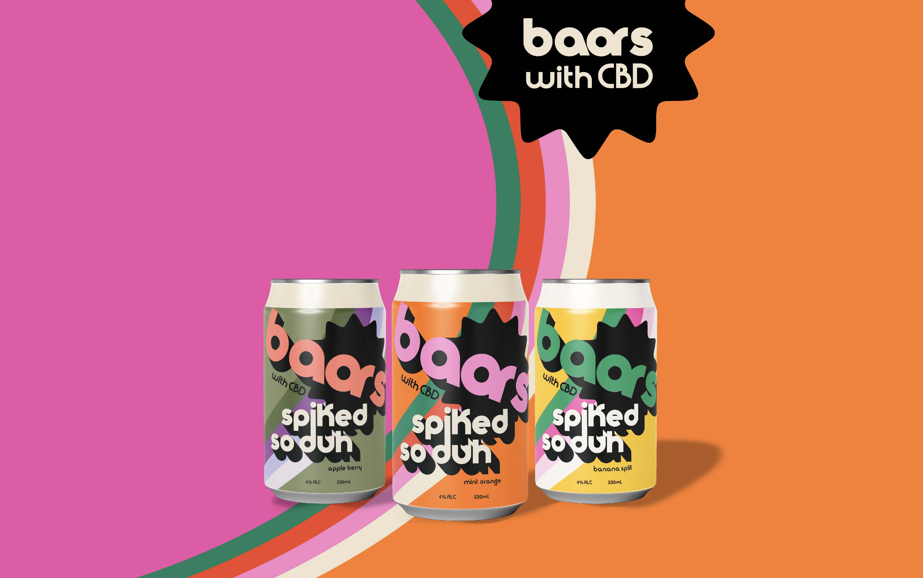
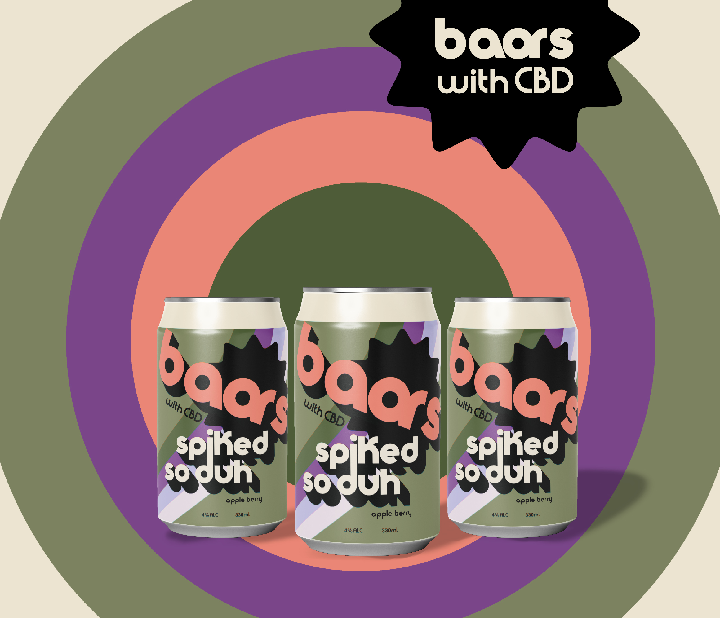
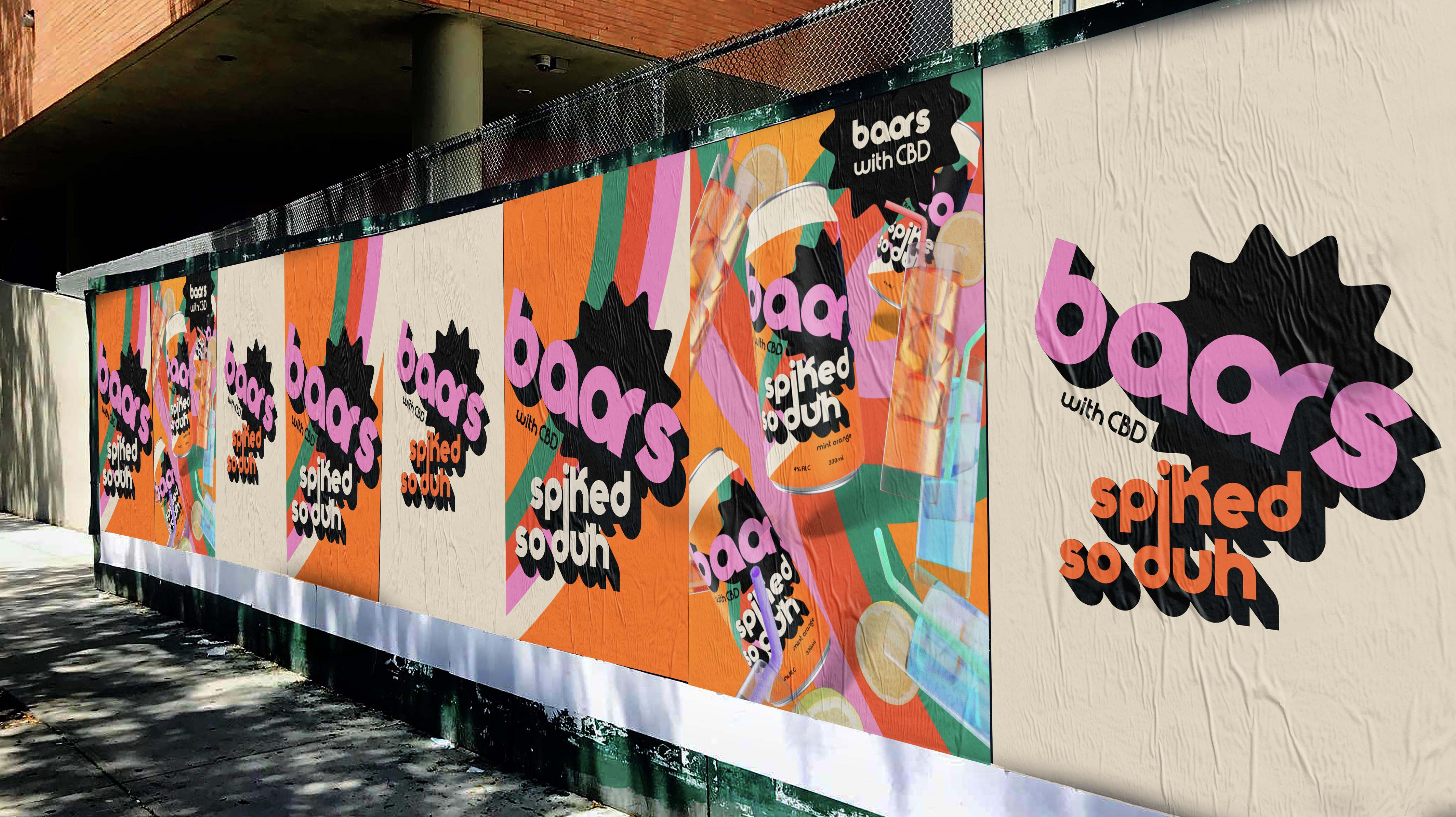
Using bold colours but veering away from the gory kitsch pop art aesthetic which is often more miss than hit, Baars spiked so duh uses a more sophisticated palette with both candy colours and mutated retro tans and greens to nod to the CBD element of the brand.
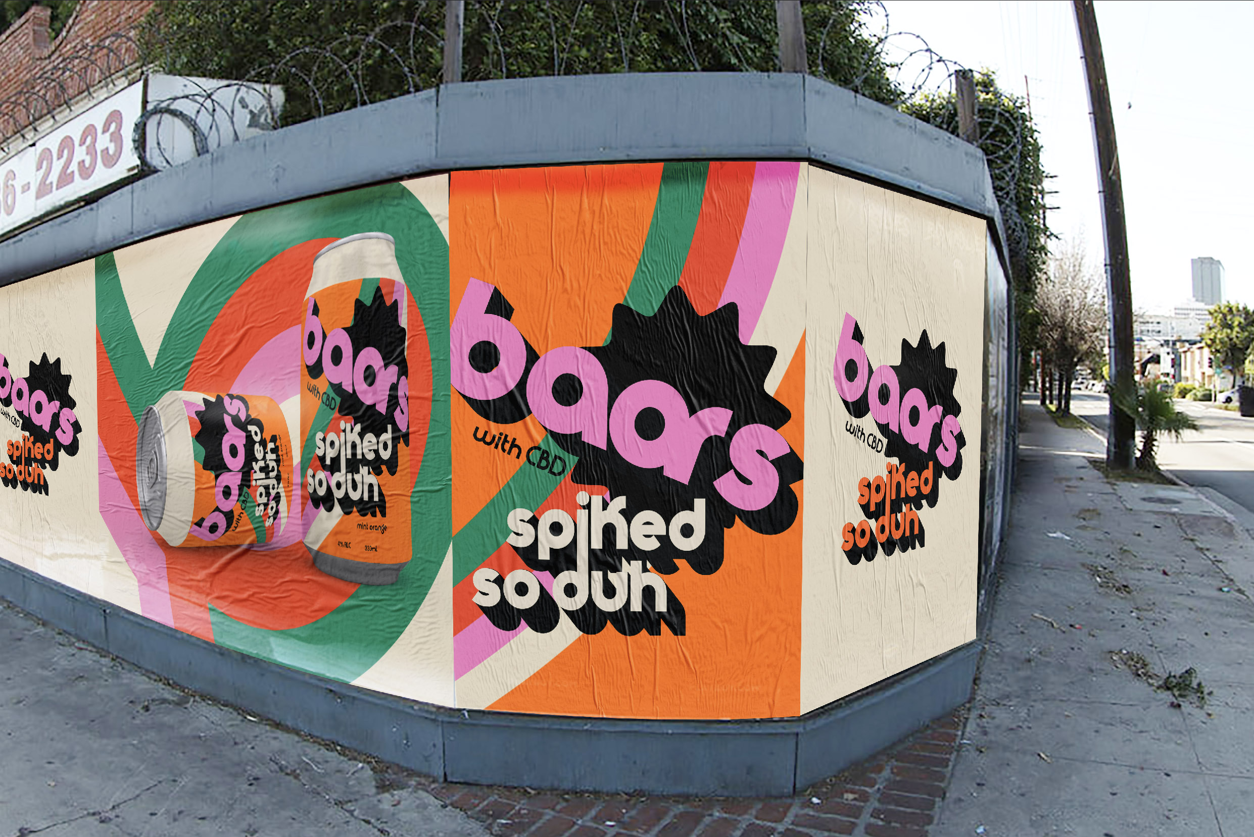
Our bold background warner brothers style circular stage makes our cans POP making the Baars so duh centre stage.
Environmental aluminium cans are always our preference and glass as a studio we steer our clients away from single use packaging as we don’t want to see our artistic efforts floating through the oceans we love.
Blurring the line between retro and modern CBD infusion, there is no beating the made for now with the best of yesteryear fun of Baars spiked so duh “To candybrophycreative can art and branding is everything,” added Candy brophy, Candy Creative Director and Founder. “It’s a real nod to the 70’s and takes me back to food halls and my grandparents home aesthetic, being born in 1980 my kids think it looked like stranger things but it looked more like the 70’s for most of the early 80’s and then when the branding and VM caught up to the 80’s the 90’s happened…its always entertaining to observe the waves of design”. We love how Baars so duh came out and cannot wait for production to commence and to hold it in our hands!
CREDIT
- Agency/Creative: candybrophycreative
- Article Title: Bold Retro 70’s Brands Baars Created by candybrophycreative
- Organisation/Entity: Agency, Published Commercial Design
- Project Type: Packaging
- Agency/Creative Country: Australia
- Market Region: Multiple Regions
- Project Deliverables: Brand Architecture, Brand Identity, Brand Naming, Branding
- Format: Can
- Substrate: Metal


