In a world that never seems to slow down, Bankabox offers a sanctuary for those who appreciate the blend of hard work, exhilarating play, and the soothing embrace of restful days and holidays. Founded by Kristen Vance, a passionate ‘comfort hunter,’ Bankabox is a lifestyle brand that redefines the importance of comfort in our lives. It isn’t just a luxury; it’s a way of life.
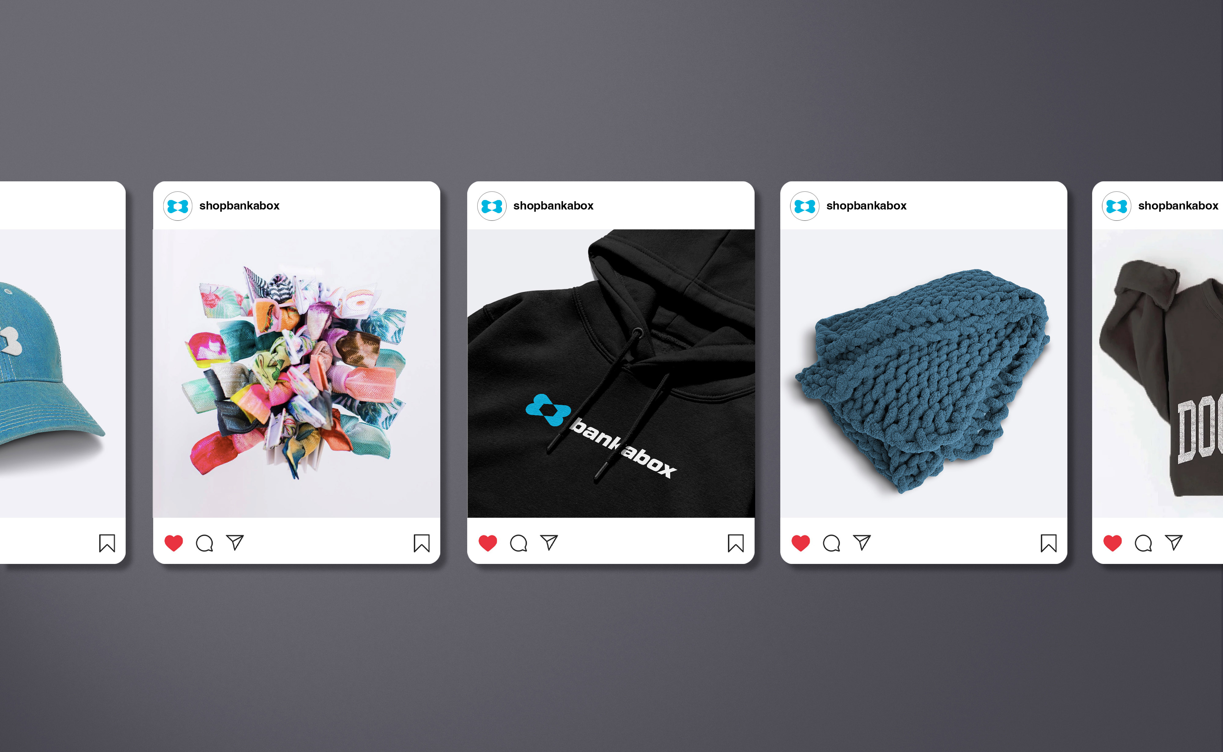
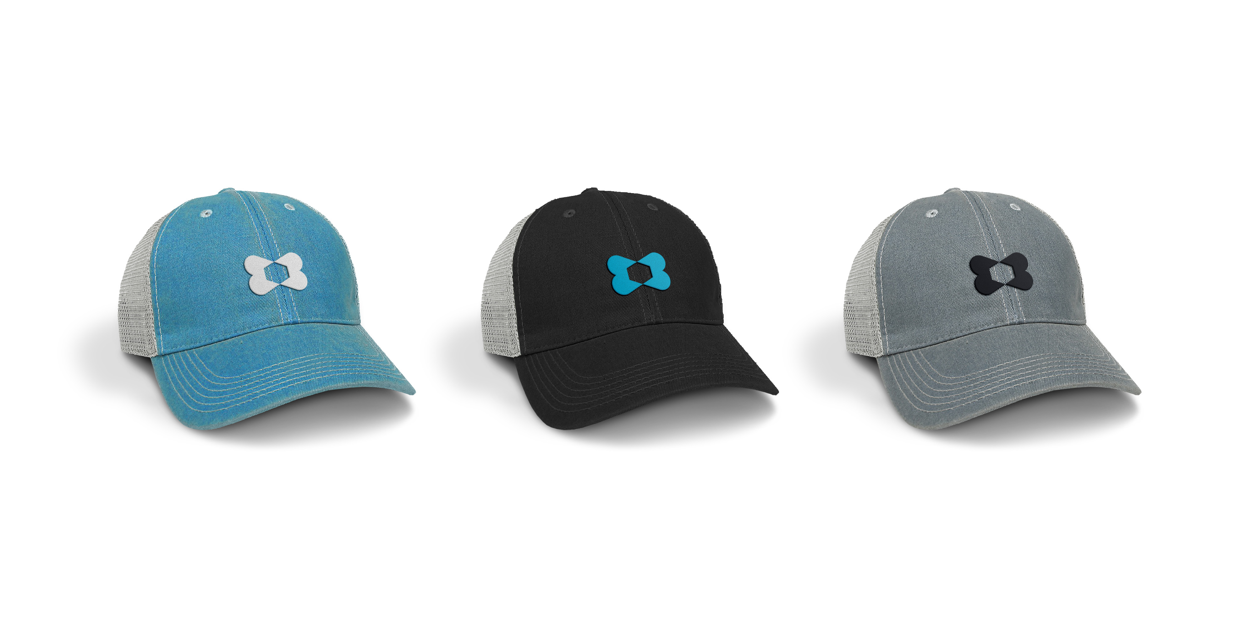
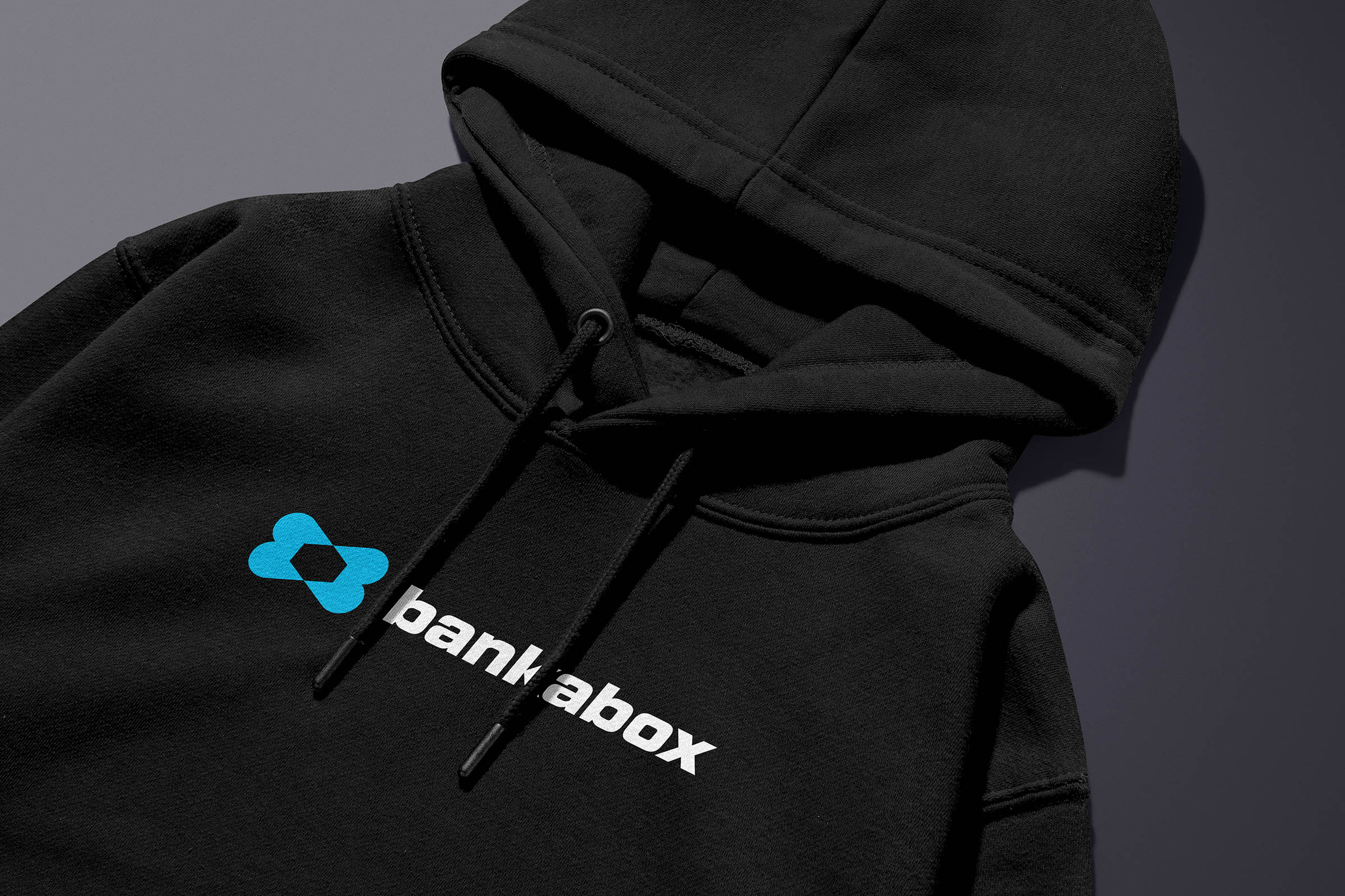
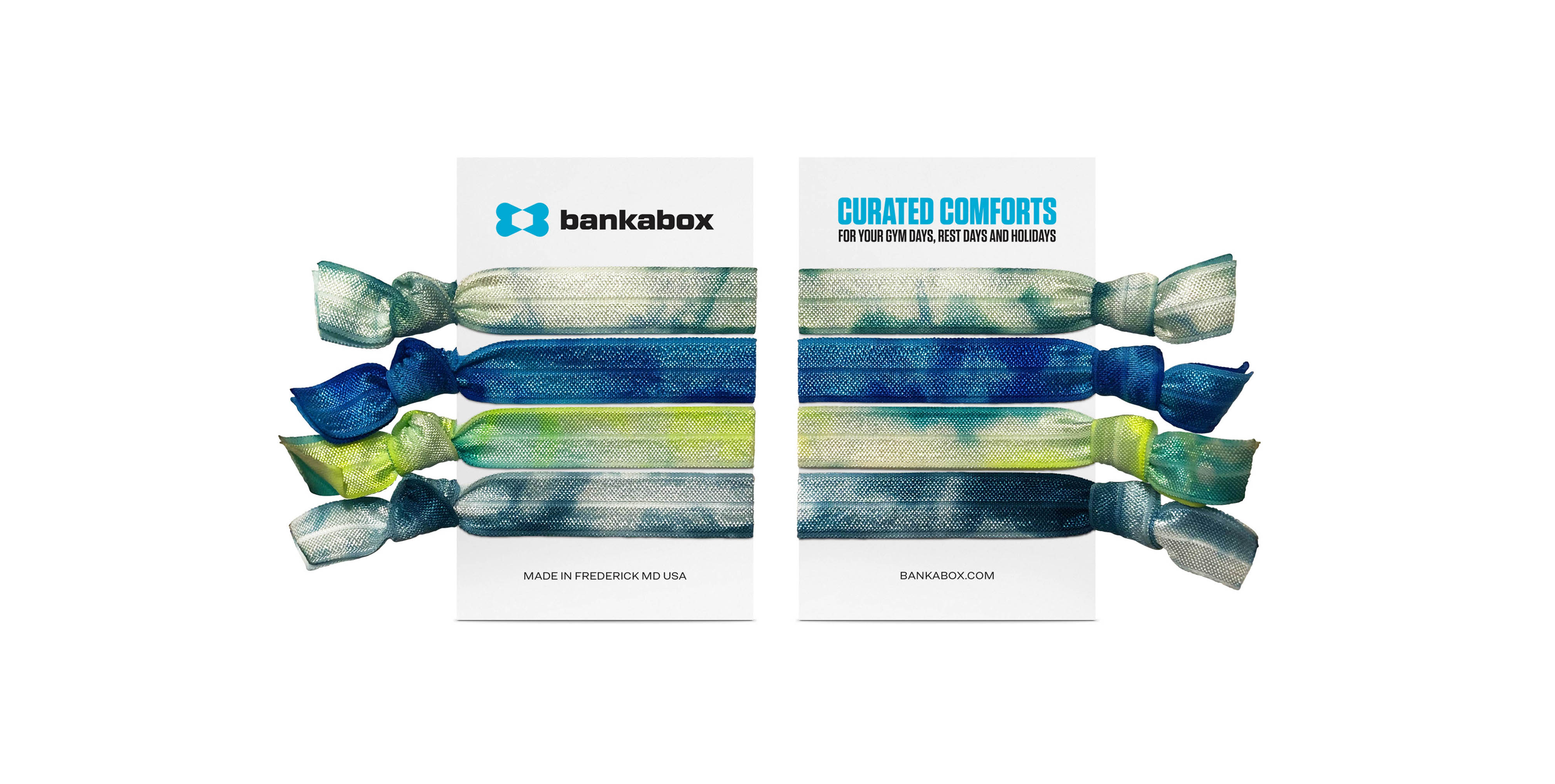
Kristen’s vision gave birth to a unique concept, where high-quality, comfy favorites are carefully curated and offered online at bankabox.com. These must-haves range from cozy hoodies, stylish distressed ball caps, and ‘bankaband’ hair ties, to Turkish towels, chunky knit blankets, and more. At Bankabox, the driving belief is that comfort is more than just a physical sensation; it’s a catalyst for enhanced performance, boosted confidence, and inner peace. This unwavering conviction fuels their passion for crafting and curating exceptional comfy favorites that elevate gym days, rest days, and holidays.
Recognizing the need for a brand that resonates with their target audience, Bankabox turned to Lisa Sirbaugh Creative to embark on a transformative rebrand. The objective was clear: elevate Bankabox’s brand and visual identity to mirror the craftsmanship, culture, and brand values they ardently stand by. The result: a brand that leaves their audience musing, “How did I not know about this sooner?”
What’s in a name? For Bankabox, it’s a fusion of Kristen’s maiden name, Banka, and her roots in Crossfit, where the gym is referred to as a ‘box.’ With the brand name squared away, we embarked on a comprehensive discovery and research process to anchor the identity and extend the brand. Our target audience was defined as athletic, outdoorsy, and health-conscious women aged 28–68, who relish lake, mountain, and coastal holidays, with the disposable income to embrace a healthy-luxe lifestyle.
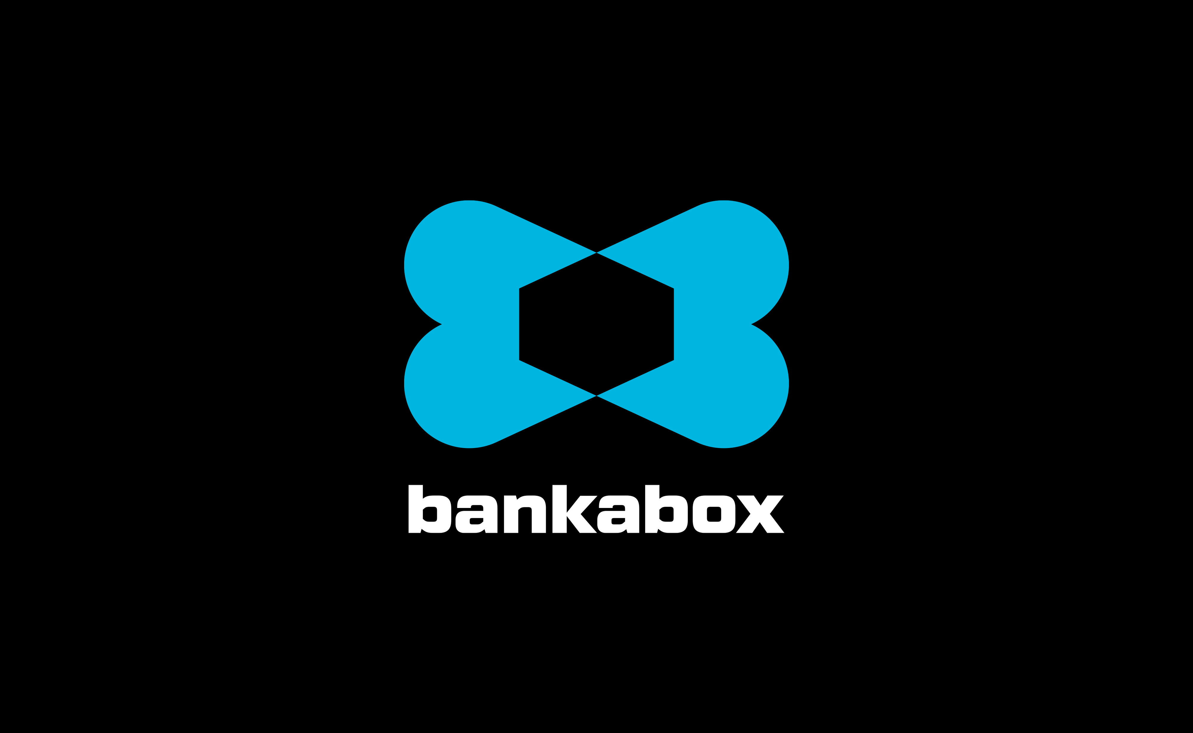
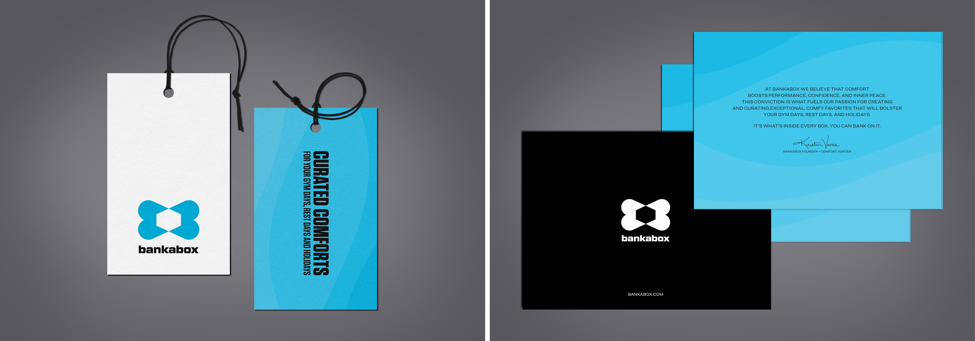
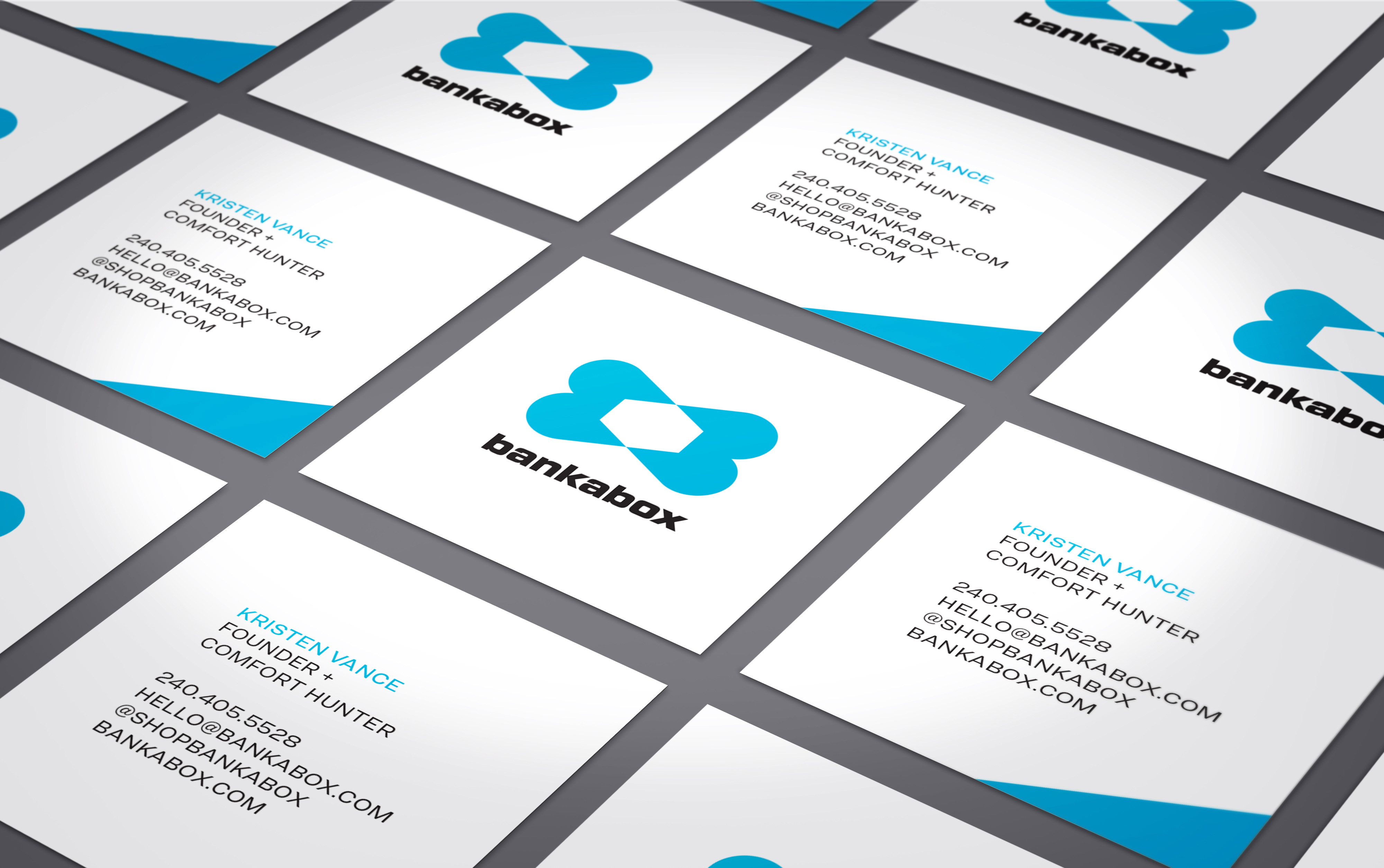
The mission was to create a brand that’s simple, memorable, strong, fun, and synonymous with elevated quality. At the heart of the new visual identity is a bold ‘X’ brandmark, formed by mirrored ‘B’s’ and a 3-dimensional box at its core. The mark encapsulates the company’s name and its origins while paying homage to the athletic and healthy lifestyle of Bankabox’s target audience. A strong industrial-style typeface was carefully selected for the logotype and customized to harmonize with the brandmark. Bankabox’s new color palette features a striking blue that draws attention, fosters trust, and elicits feelings of freedom and joy, complemented by the powerful and luxurious presence of black.
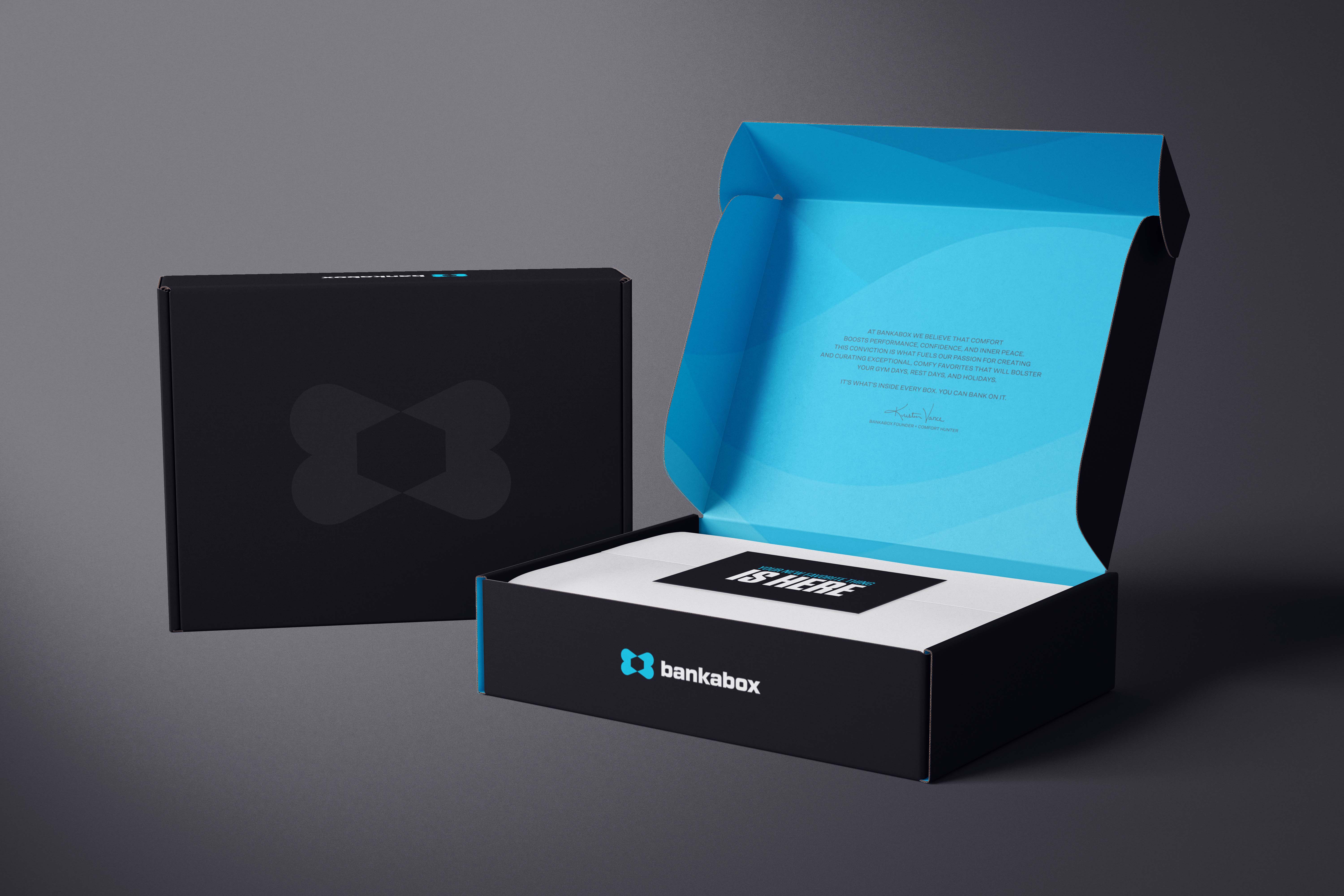
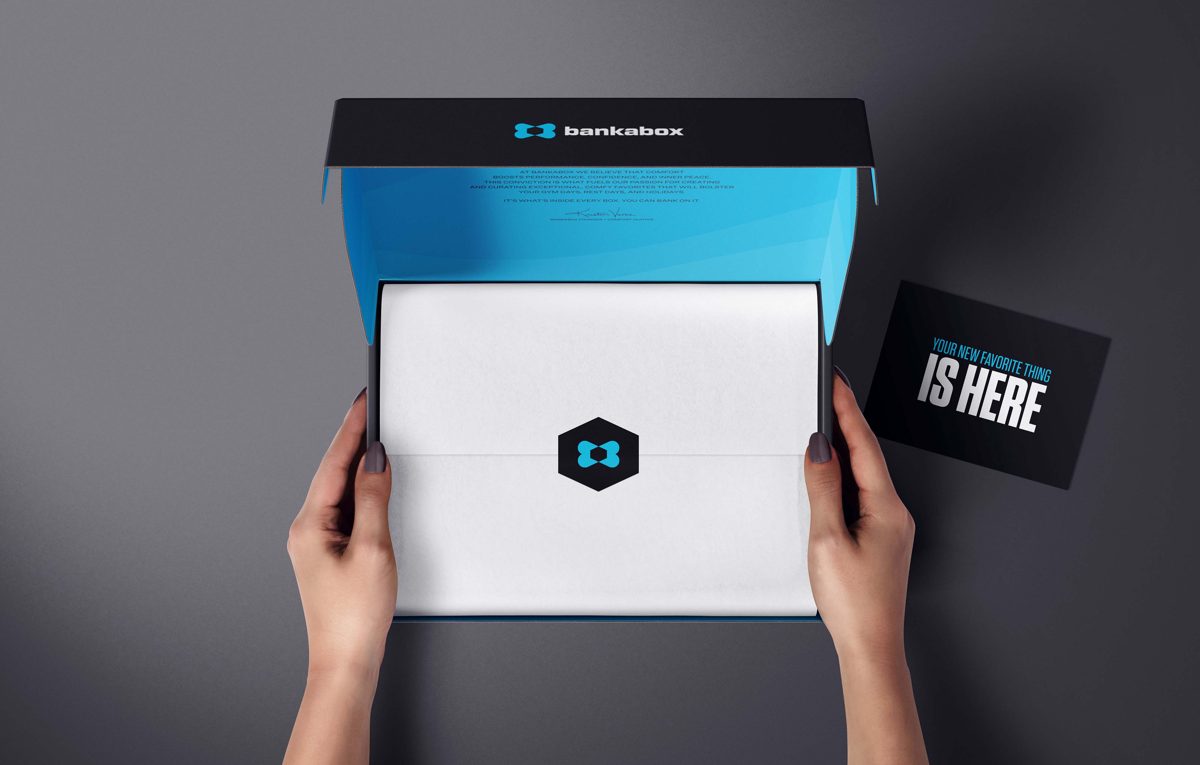
The project scope encompassed a complete brand identity suite, collateral design, packaging design, and social media asset design. In crafting Bankabox’s new brand, visual identity, and all associated touchpoints, we aimed to create an enduring and resonant impression, setting the stage for the brand to flourish in the hearts and minds of its target audience. When it comes to hunting down the very best, you can bank on a brand that reflects what’s inside the box as well as what’s on the outside.
CREDIT
- Agency/Creative: Lisa Sirbaugh Creative
- Article Title: Bold Rebrand for Bankabox by Lisa Sirbaugh Creative
- Organisation/Entity: Agency
- Project Type: Identity
- Project Status: Published
- Agency/Creative Country: United States
- Agency/Creative City: Frederick
- Market Region: North America
- Project Deliverables: Brand Design, Brand Identity, Brand Mark, Brand Redesign, Copywriting, Creative Direction, Graphic Design, Identity System, Logo Design, Packaging Design, Rebranding
- Industry: Retail
- Keywords: Branding, Brand, Rebrand, Brand Identity, Visual Identity, Identity System, Logo, Logo Design, Brandmark, Brand Collateral Design, Print, Packaging Design, Retail, Apparel, Merchandise
-
Credits:
Creative Director + Designer: Lisa Sirbaugh
Case Study Copywriter: Kate Sonnick


