


Bold is a Dubai-based real estate developer operating in one of the most competitive construction landscapes in the region. The design challenge was clear from the outset: the brand needed a visual identity capable of standing apart in a saturated market, while still echoing the essence of what it does.
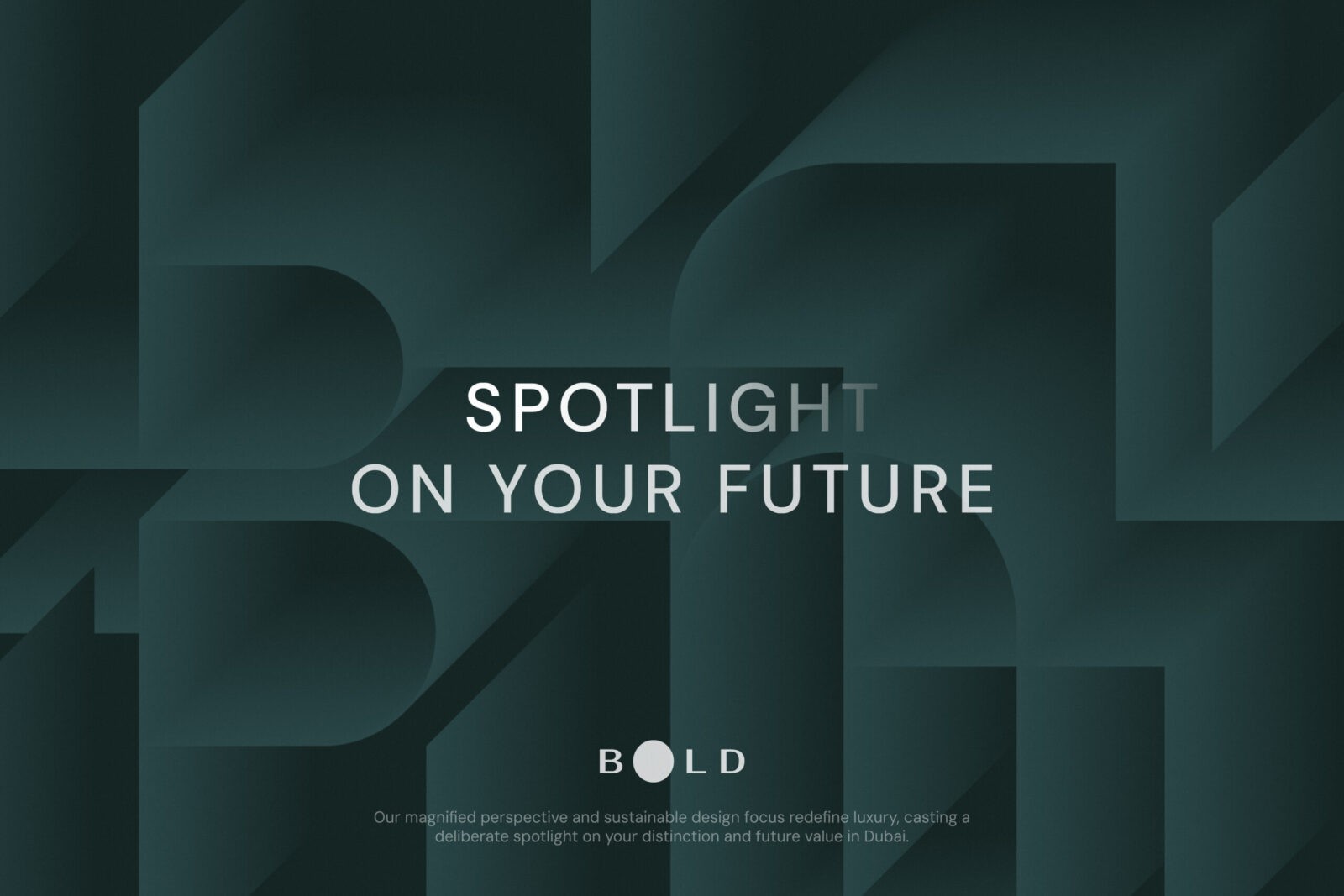
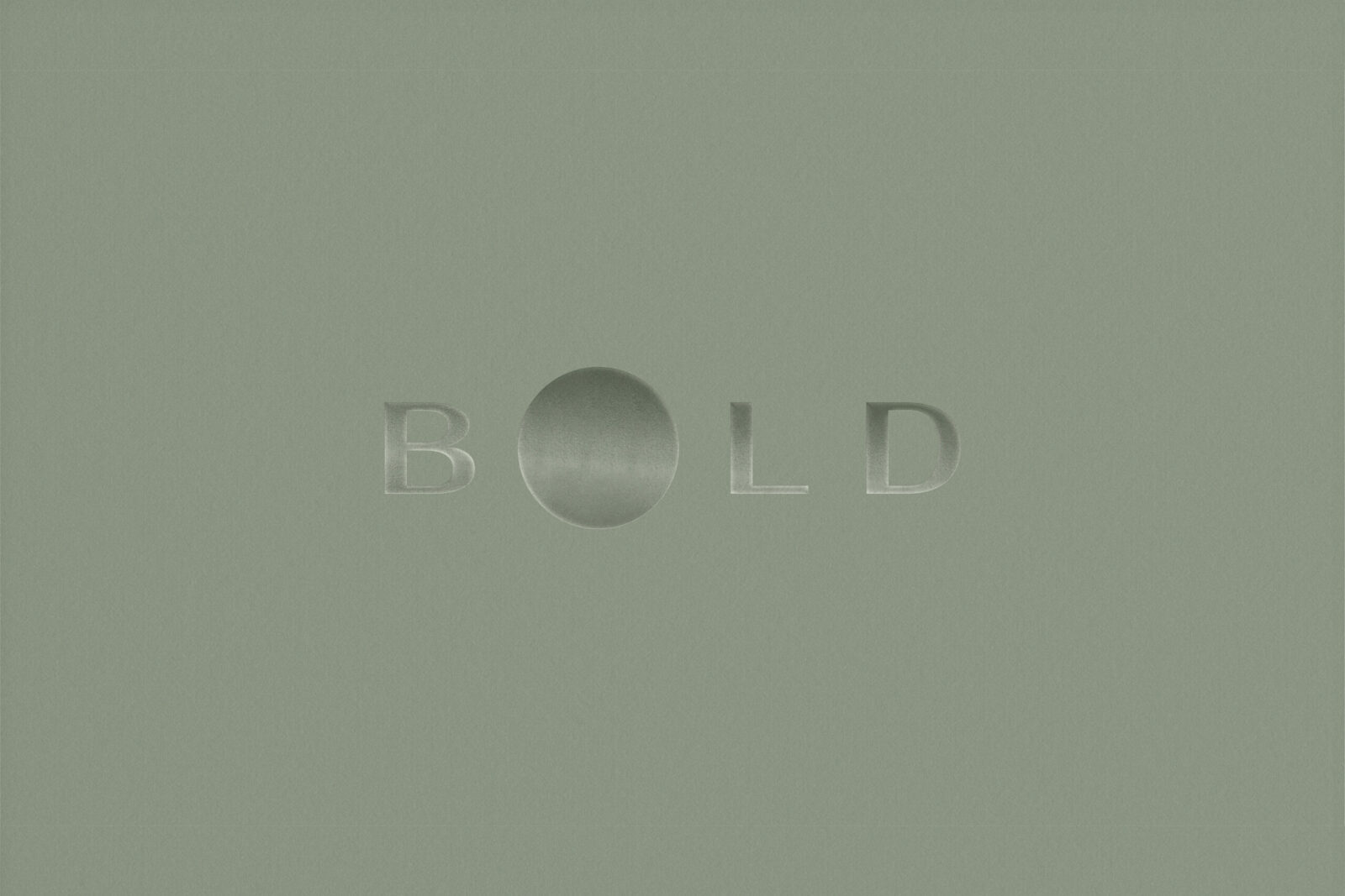
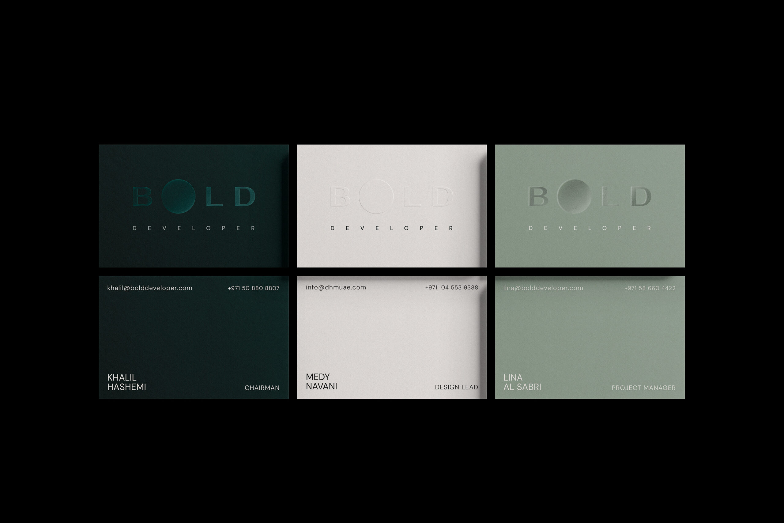
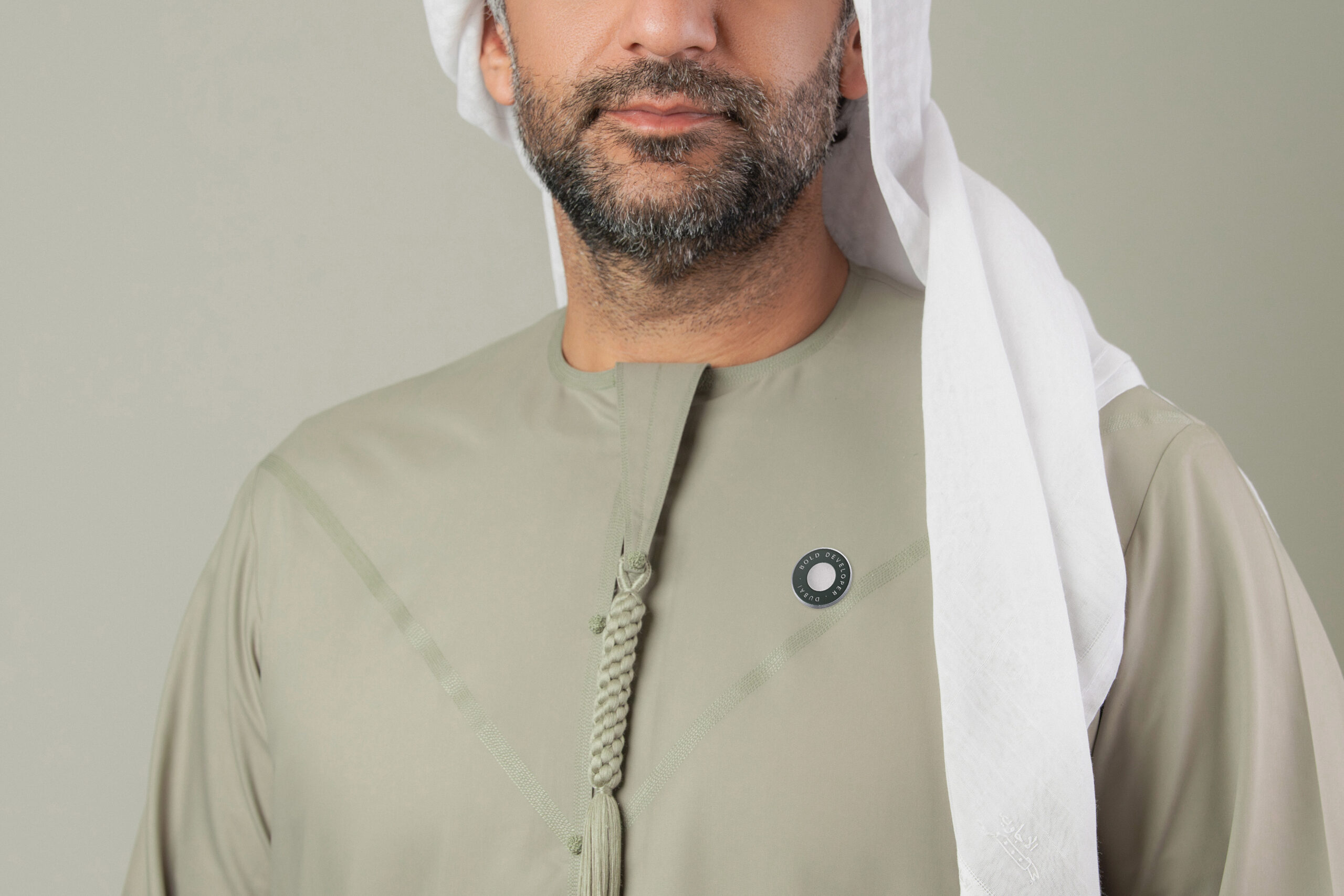
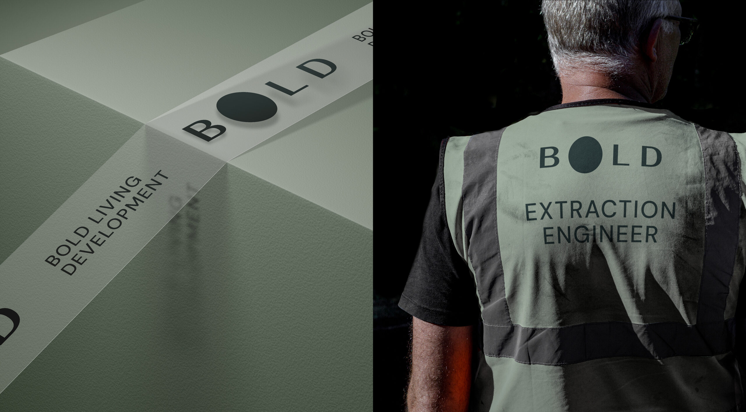
The brand’s philosophy is expressed into the logotype, where the central O is intentionally magnified as a heavy, solid form. This choice is not merely stylistic; it suggests a spotlight or a discerning lens, a bold move. This spotlight effect focuses attention on the user, and symbolizes a brand that ensures the homeowner, their investment, and their future truly stand out. This sense of dynamism reflects the brand’s forward-thinking approach.
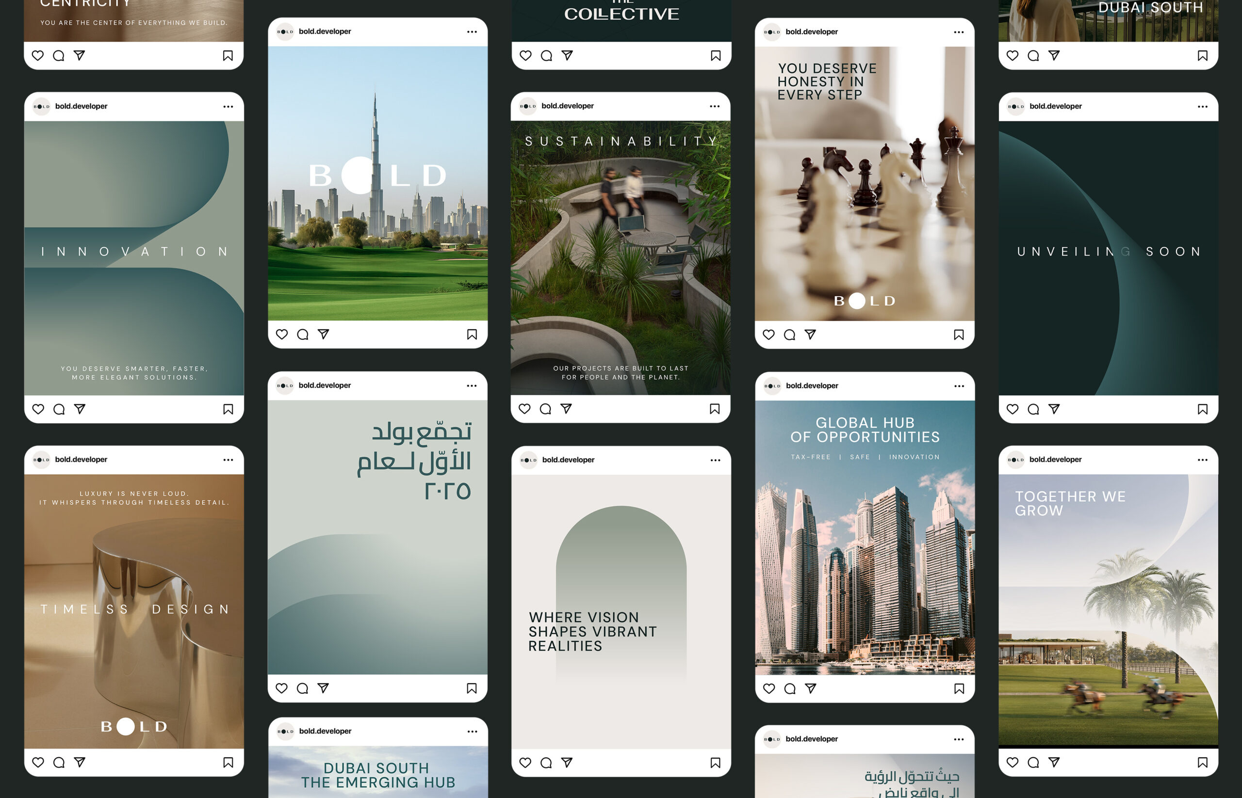
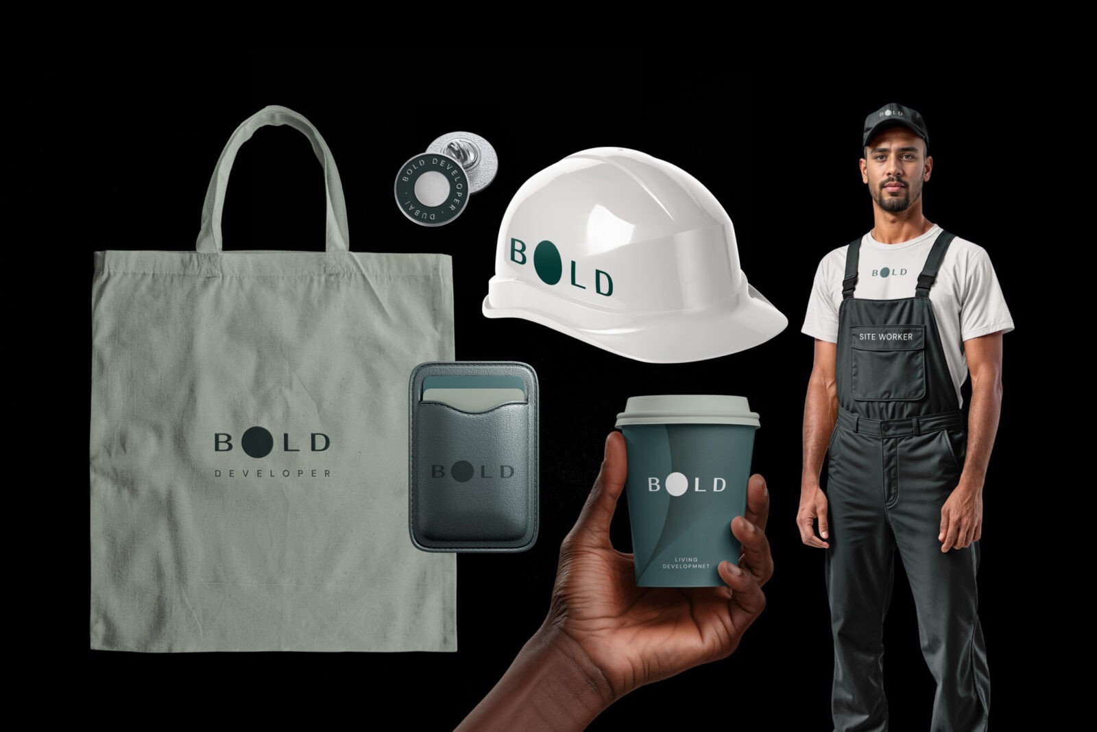
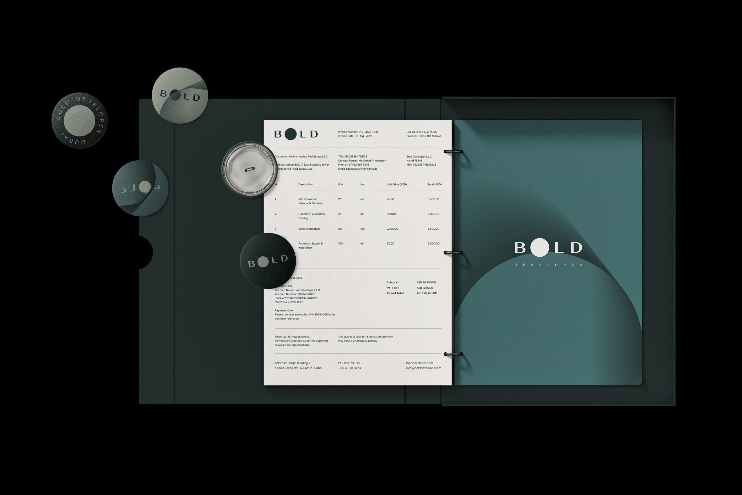
Color played an equally strategic role. Rather than adopting the ostentatious luxury aesthetic commonly seen in the region, Bold’s palette relies on cool, sophisticated blue-green hues. These tones were chosen to communicate sustainability, ecological responsibility, and modern refinement. The presence of green also nods to Bold’s efforts in integrating sustainability into its projects. For a developer committed to responsible construction, true luxury is expressed through thoughtful, sustainable design.
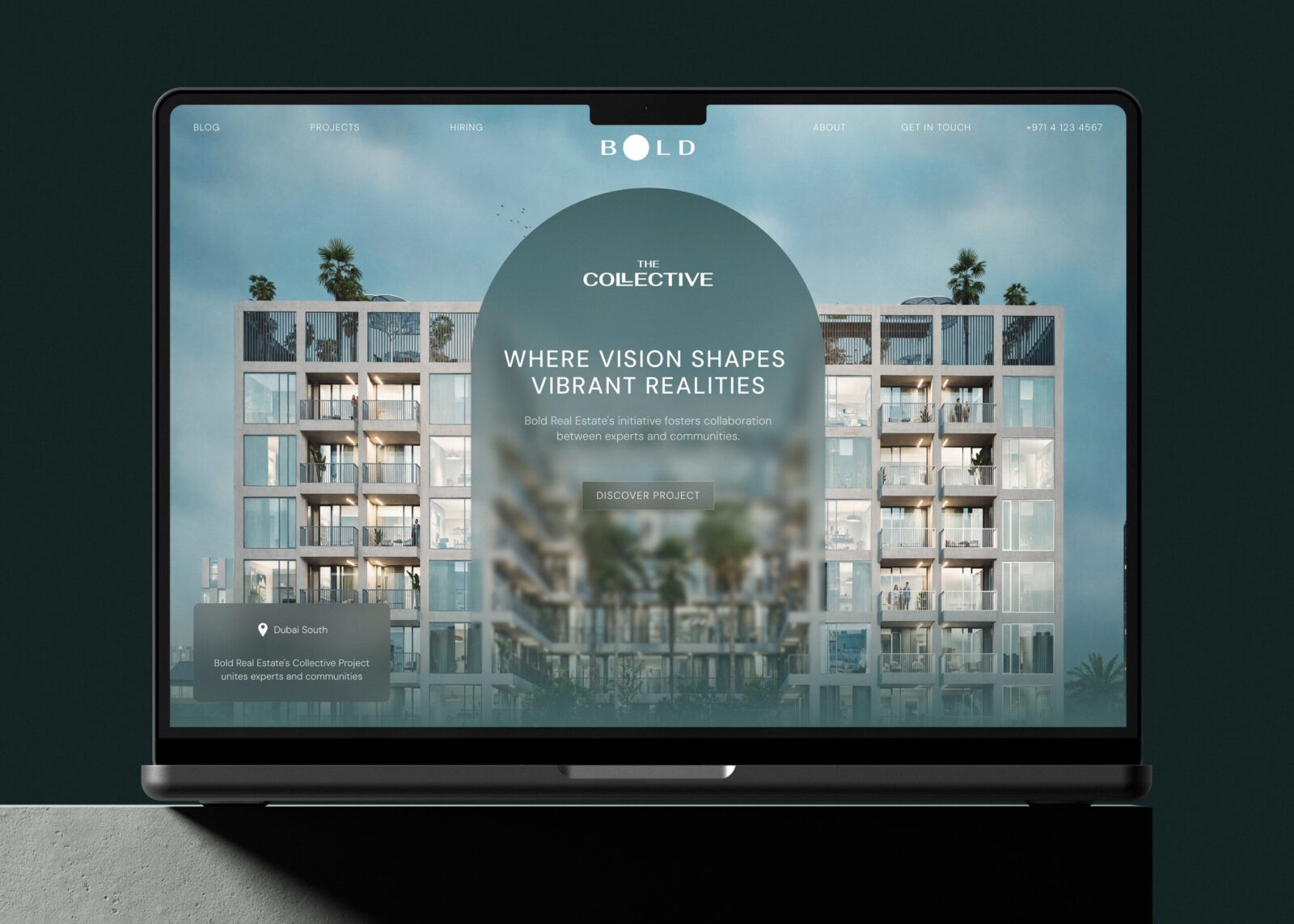
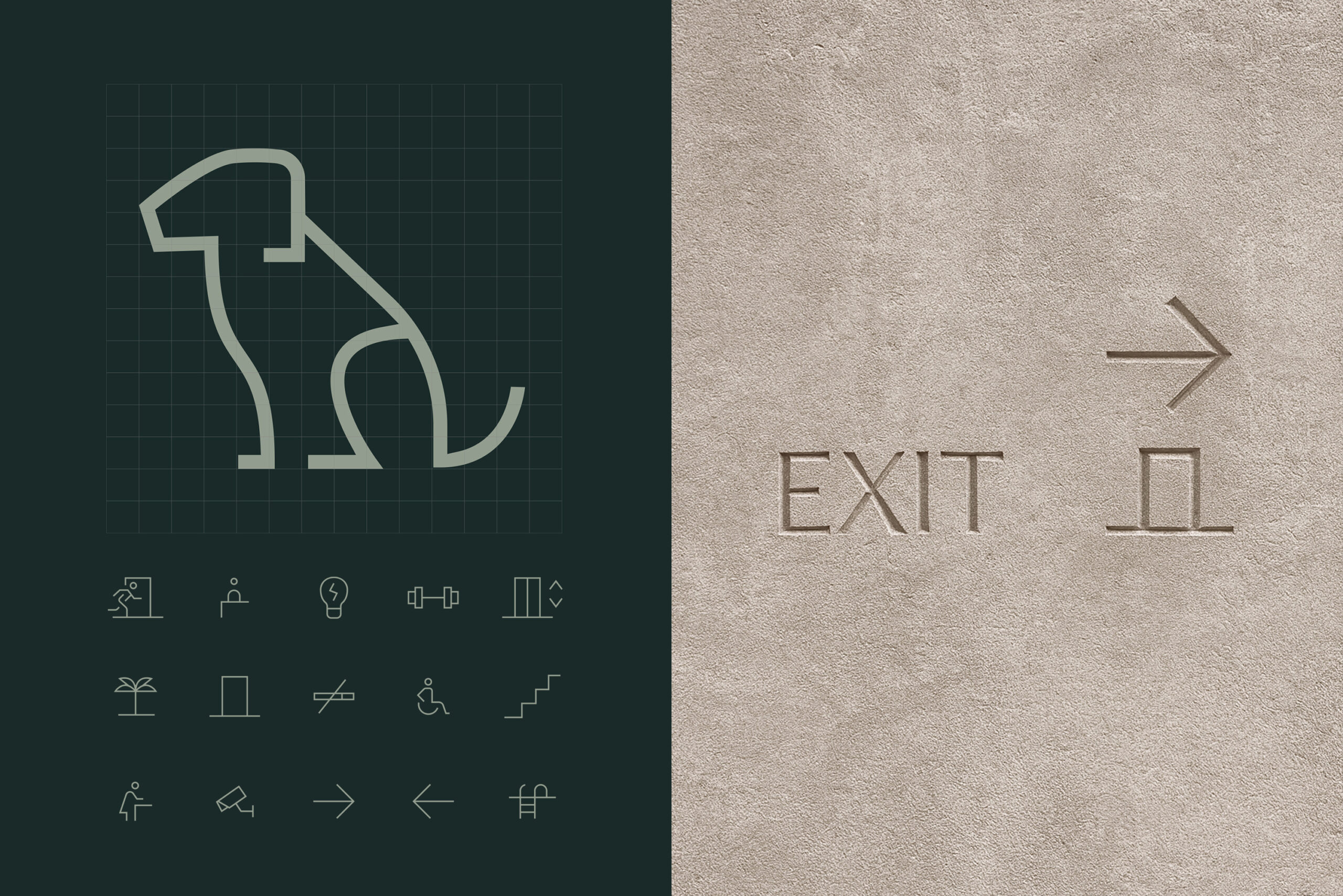
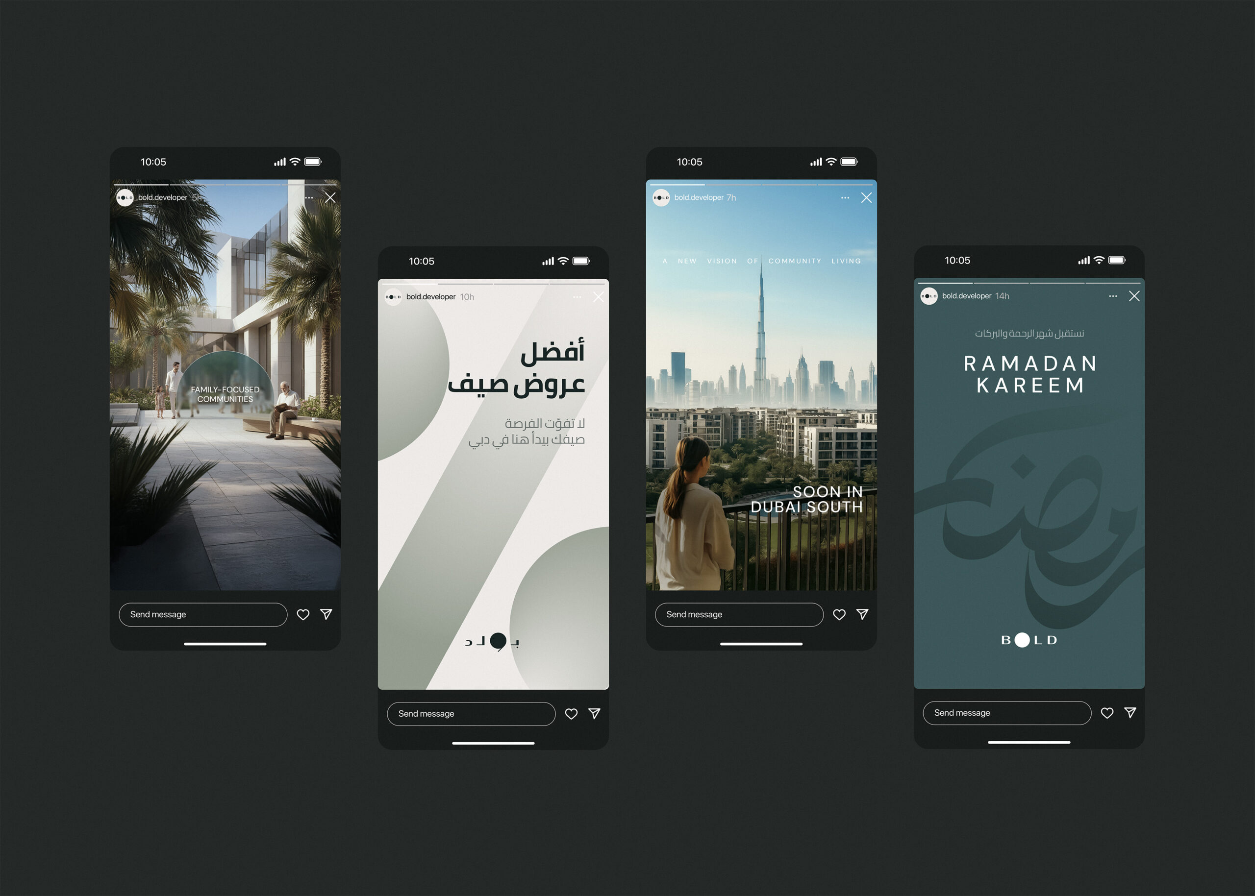
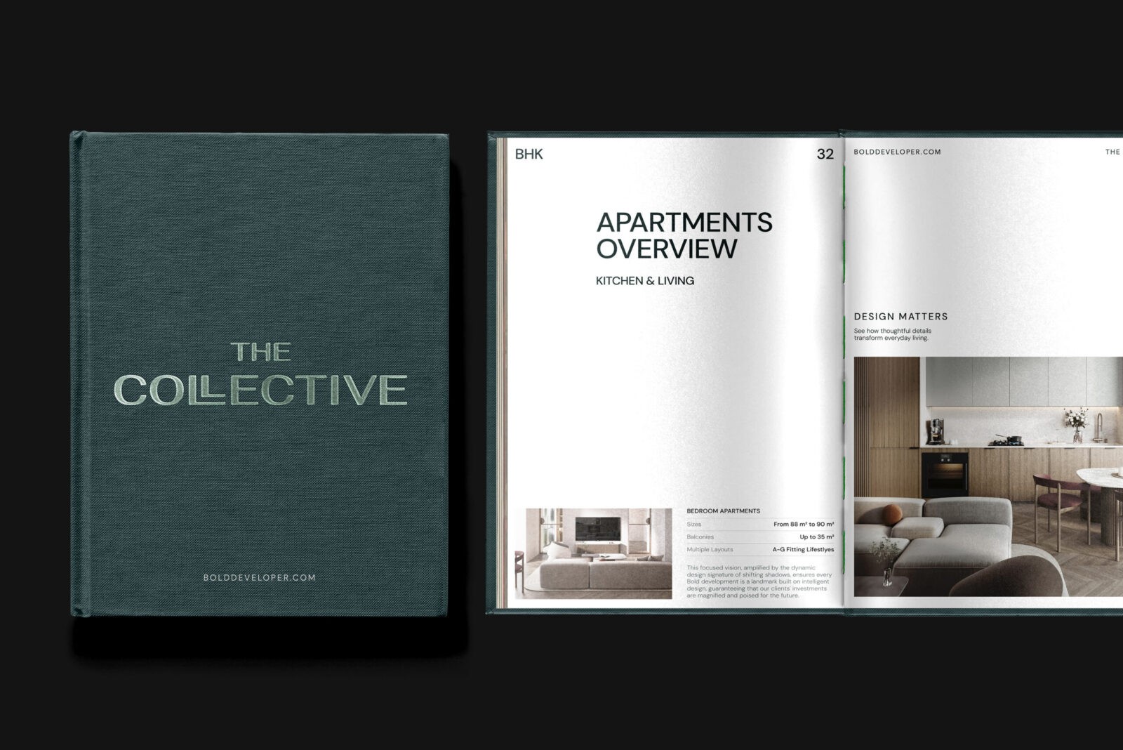
The visual language extends the architectural spirit of Dubai: vertical and horizontal lines inspired by buildings, arches, skyscrapers, and the ever-rising skyline of Dubai. These lines appear to move through space, breaking their two-dimensional boundaries to create depth and volume. The system of lines is capable of shifting, expanding, and generating new compositions across every platform. From printed materials and construction environments to digital interfaces, and social media.
The result is an abstracted interpretation of Dubai’s construction culture, expressed into a visual system rooted in corporate modernism; clean, purposeful and practical.
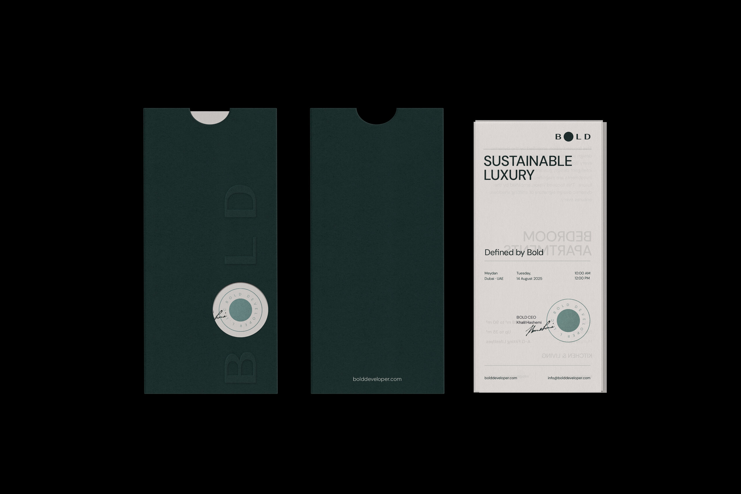
Since Bold operates within the GCC region, we also developed an Arabic logotype to ensure cultural resonance and support the brand’s adaptability for expansion across the Gulf.


CREDIT
- Agency/Creative: A4DH Branding Services
- Article Title: Bold by A4DH Branding Services Presents a Forward Looking Identity Inspired by Dubai’s Skyline
- Organisation/Entity: Agency
- Project Status: Published
- Agency/Creative Country: United Arab Emirates
- Agency/Creative City: Dubai
- Market Region: GCC
- Project Deliverables: Art Direction, Brand Creation, Brand Design, Brand Guidelines, Brand Identity, Branding, Creative Direction, Graphic Design, Icon Design, Logo Design
- Industry: Construction
- Keywords: WBDS Agency Design Awards 2025/26 , Art Direction, Brand Creation, Brand Design, Brand Experience, Brand Guidelines, Bran Identity, Brand Strategy, Branding, Design, Graphic design, Illustration, Interior Design, Logo Design
-
Credits:
Creative Director: Mehdi Javadinasab
Design Director: Amir Asgharzadeh
Designers: Amir Asgharzadeh, Mehdi Javadinasab, Mohammad Reza Rad, Mohammad Rajabi, Sepideh Chamani
Motion Designer: Pariya Tabrizi
Ui Designers: Fatemeh Abbasi, Mohammad Rajabi
Website Developers: Mohammad zare, Nazwa Pathukkalan
Project Manager: Zahra Hashemi
Account Director: Baha Khatambakhsh
Account Manager: Kamand Khorasani
Public Relations: Ghazal Babajani


