How can design amplify the impact of a nonprofit?
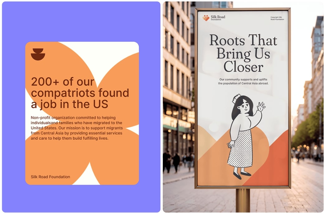
For Silk Road Foundation, a New York-based charity supporting education and cultural initiatives, we set out to create a visual identity that would not only represent the organization’s mission but also resonate emotionally with its audience. The result is a bold, illustration-driven design that blends warmth, accessibility, and storytelling into a distinctive brand identity.
Illustrations That Connect and Inspire
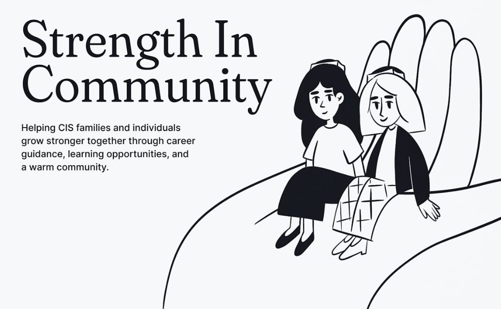
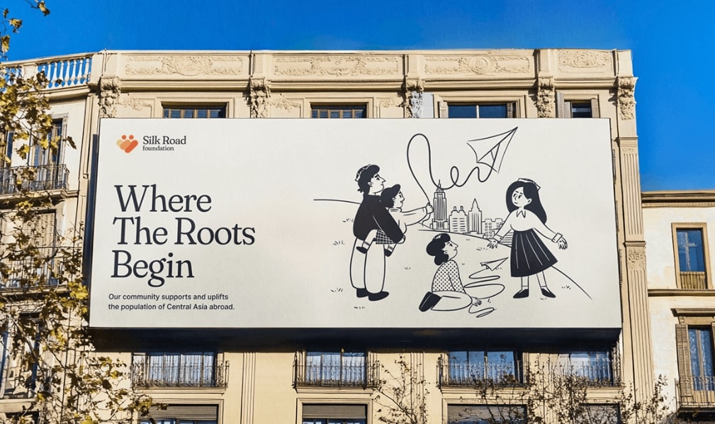
At the heart of the Silk Road Foundation’s identity are vibrant, hand-drawn illustrations that celebrate cultural exchange, education, and philanthropy. We moved away from corporate minimalism and instead embraced a lively, human-centered approach — one that feels both personal and engaging. The illustration style is reminiscent of sketchbook linework, bringing an organic and approachable feel to the brand.
Each character and scene tells a story, reinforcing the foundation’s commitment to bringing people together through knowledge and shared experiences. The visual language is expressive and full of movement, making the brand dynamic and easy to recognize across different formats.
A Color Palette That Speaks Volumes
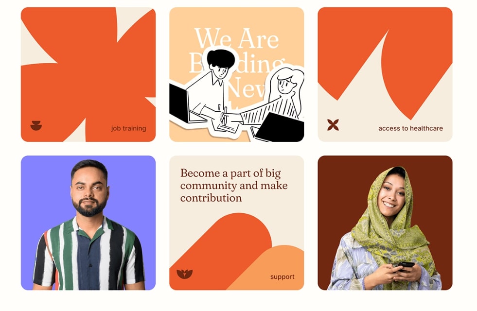
To ensure the brand identity stands out, we developed a rich and engaging color palette that balances warmth and vibrancy. The colors evoke energy, optimism, and inclusivity, aligning perfectly with the foundation’s mission to inspire and empower communities. By using bold contrasts and dynamic combinations, we created a sense of movement and connection that mirrors the nonprofit’s impact.
Typography That Balances Confidence and Approachability
For the typography, we sought a balance between authority and friendliness. The chosen fonts are clear and confident, ensuring legibility, while maintaining a human touch that keeps the brand approachable. This combination allows the foundation’s messaging to be both professional and inviting, making it easier to engage potential donors, volunteers, and beneficiaries.
More Than a Brand — A Storytelling Tool
The Silk Road Foundation’s new identity does more than just define its visual presence — it acts as a powerful storytelling tool. The design choices help humanize the brand, create emotional connections, and make its mission impossible to ignore. Whether featured on a website, social media, or printed materials, the identity is instantly recognizable and deeply impactful.
This project showcases how nonprofit branding can be just as dynamic and expressive as commercial design — when done right, it doesn’t just inform, it inspires action.


CREDIT
- Agency/Creative: Pickles Team
- Article Title: Bold, Bright, and Meaningful: Silk Road Foundation’s Nonprofit Identity by Pickles Team
- Organisation/Entity: Agency
- Project Type: Illustration
- Project Status: Published
- Agency/Creative Country: United States
- Agency/Creative City: New York
- Market Region: North America
- Project Deliverables: Brand Refinement, Brand Tone of Voice, Illustration
- Industry: Non-Profit
- Keywords: Nonprofit branding, Nonprofit organization New York, Bold illustration, Charity visual identity, Human-centered branding, Storytelling through design
-
Credits:
Art Director: Dmitry Lee


